Bandit Books is the two-pronged business of my friend Katy Meegan, focusing on bookkeeping for creative businesses as well as bookmaking and creative projects. Katy and I met at the IPRC over a decade ago as fellow letterpress teachers. We continued our friendship and shared love of books at Em Space, and for many many years Katy was half of the duo Keegan Meegan which offered letterpress and design services.
This summer Katy was taking her next professional step in combining her organizational and bookkeeping skills to help other creatives with their businesses. Over some evenings drawing together in my nook we talked about how that would look, which led to working together on her logo.
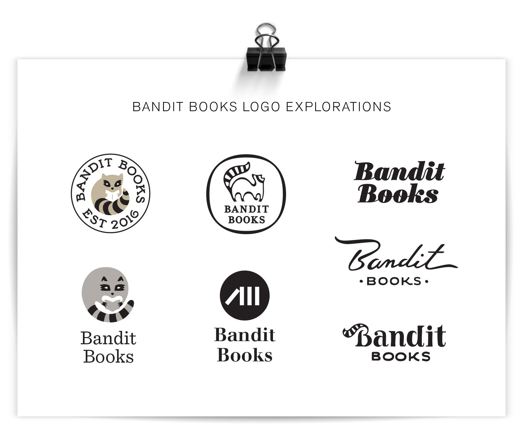
Katy knew she wanted a raccoon in her logo – it was her spirit animal and spoke to her as a symbol for not being your regular bookkeeper. Because of this, the first round of logos was very specific and concentrated on coons. Coons! Coons! Coons! I am a big fan of character studies, so I went about it trying to answer things such as: Can a raccoon reliably hold a book? If a raccoon were a typeface how would it look? How would a minimalist Scandinavian designer make a raccoon icon? Can a raccoon be as clever in a logo as in real life? The logo process shows the efforts of answering these questions.

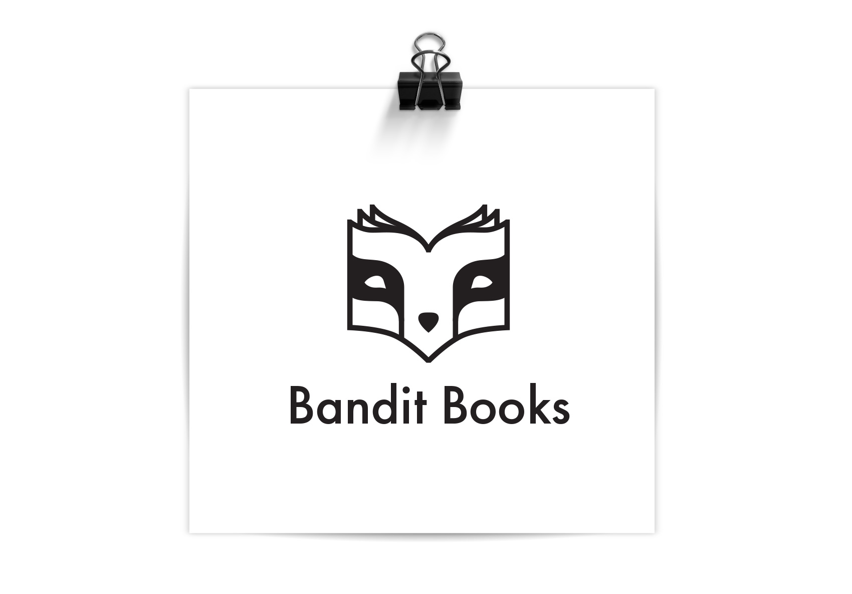
After the first round, Katy was certain that the right raccoon for her was a mashup of a monoline raccoon portrait and the profile of a book, and the face of Bandit Books was born. The quality of the logo lent itself well to reproduction in letterpress, paying dues to Katy’s background in that arena, and the font was chosen so she could hand typeset other materials in the job case workhorse Futura. I’ll be posting more explorations on the brand materials soon. In the meantime, if you know a creative business looking for financial organization, you know who to call: Bandit Books.
