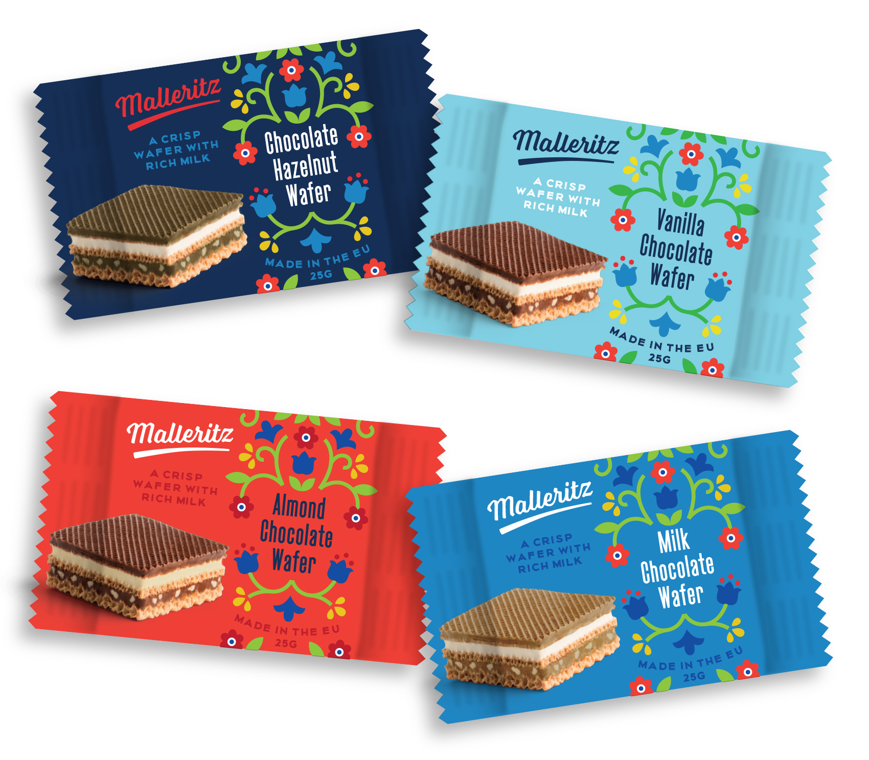
One of my favorite types of design projects is packaging – specifically food packaging. It is also one of the more fickle types of projects. Sometimes products miss their window of opportunity, sometimes start-ups aren’t able to get an investor to put the product on shelves, sometimes budgets fall through or a product line is re-oriented. Specialty products are sometimes explored up until launch, at which point they are deemed unviable. Once an entire project was derailed due to a macadamia nut shortage. You just can’t plan ahead for these kinds of things!
Because of this, I have worked on almost as many packaging projects that have been shelved than have actually reached shelves. Gelateria Naia is my one exceptional client that has taken every product I’ve worked on to market (see a few projects here and here, with more in the works!). Even the packaging projects that make it to market often take a YEAR OR TWO between packaging design and hitting shelves. This is like 1,948,465 years in “designer years” – it’s definitely not an exercise in instant gratification.
Last year I worked on chocolate wafer packaging for a company that packages US and European products for the Chinese market. Because of quality perception and some food scares, the design brief presented an interesting mix of designing in a way the Chinese market was used to (bold, zingy, pop!) while making the product look and feel European-based. Unfortunately the project was put on hold, but I wanted to share a direction from the initial design round (with a placeholder product name). A more traditional approach was selected as the final, where I got to practice drawing the Swiss Alps and milk splashes, but is not shown here because it hasn’t been released. So while not everything makes it to market, it doesn’t mean it isn’t sweet!
