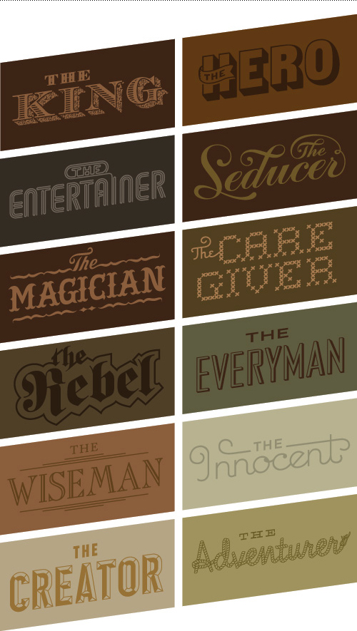
One of the larger projects I helped on this past summer while completing a freelance contract at Bessermachen was an internal packaging project. It was made for Bessermachen’s parent company, Brandhouse, and was the third annual edition of “CWA”. Twelve archetypes are used communicate Brandhouse’s way of approaching brands, and the delivery method is a series of chocolate packaging. My main role was to develop the typography that portrayed these archetypes.
Choosing or creating a typeface to convey an archetype, and having each archetype be distinct within the group, for an audience that isn’t designers is a good (challenging) challenge. The twelve archetypes included: The Everyman, The Innocent, The Entertainer , The Creator, The King, The Hero, The Adventurer, The Rebel, The Wise Man, The Caregiver, The Magician, and The Seducer.
To see the full case study and packaging series by Bessermachen, visit their website, or check out the packaging featured on the blog The Dieline.

These are so wonderful Mette!
NOM, NOM, NOM! I like The Rebel the most. It reminds me of the dMob logo!