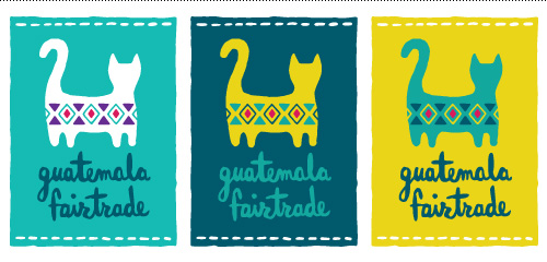
Sometimes a client has a really clear idea of they want. When this is communicated upfront, it can be a great thing – focusing the design efforts of a project in the right direction or providing a starting point to finding a good solution. This was the case on a logo made for Guatemala Fairtrade.
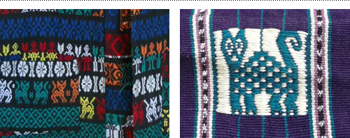
After returning from a long stay abroad in Guatemala and connecting with Maya Traditions Foundation, Ditte Tøfting-Kristiansen was ready to start her own business selling fair-trade Guatemalan products in Denmark. She knew that she wanted the logo to reflect the handmade nature of the products and connect with the town she stayed in, which used a cat as their local embroidery symbol.
Using the client-provided inspiration gave plenty of options within a framework to come up with an embroidered cat icon and hand lettered brush type as the logo. Below are two images to show a great example of visual ‘input’ and ‘output’.


Guatemala Fairtrade currently is on Facebook and has an online shop selling scarves, shoes, bags and other fairtrade items.