“Happy families are all alike; every unhappy family is unhappy in its own way.” So starts the novel Anna Karenina, which was the subject of a poster project I completed a while ago. It was the first time I had worked directly for another creative entity (a local theater company), and I was excited to be working on a topic of literature with a fuzzy deadline entire months away.
After talking about the creative process we decided that we would volley ideas back and forth in various levels of completeness, ranging from very rough sketches to more refined digital comps, until we arrived at a final poster design. The first round of creative went over well, focusing on some main themes from the book.
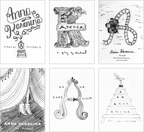
The art director and I decided the strongest idea was the smoke type (upper left sketch), and that I should explore that further before we chose a final executional style.
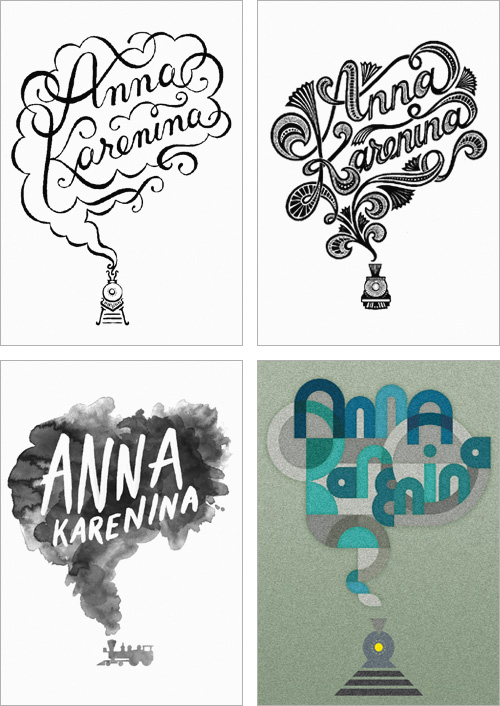
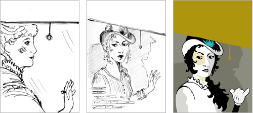
We were both pleased with the details that emerged, so it was now time to send the sketches up the ranks for sign-off on the idea. Turns out, the higher-ups had a completely different idea of what the poster should be, and gave the new direction of: Passion. Longing. A woman looking out of a train window.
Not much to be interpreted there, but I tried to work a few angles on the passion/longing front to expand on the feedback. I also began to wonder if they were aware that my experience with drawing human faces ended in the 2nd grade.
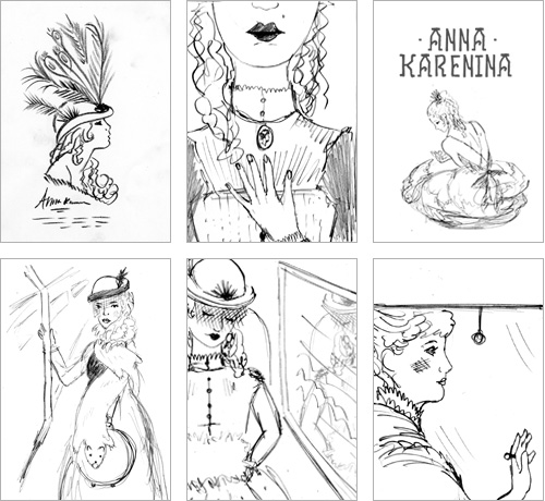
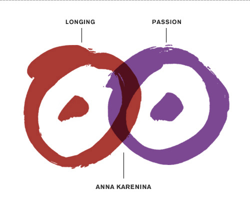
You guessed it, the woman looking out of a train window won (lower right sketch). The only additional feedback was to “make her hotter”. At this point, things were starting to be less fun. So I entertained myself by reinterpreting the creative direction into this diagram. Please note that this was for internal use only.
A few iterative sketches later and we arrived at the final composition, which we decided should be done in a loose brush stroke style. Several more rounds and a fixed-fee budget blown by 400% brought us to the final version of Anna. I feel for you Anna K, I do.
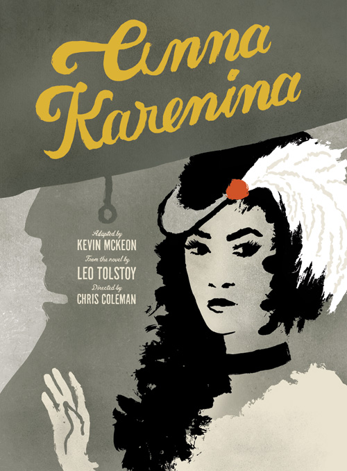
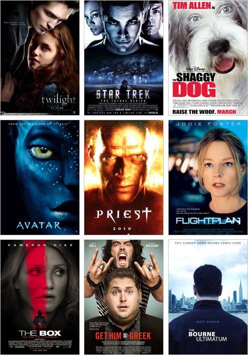
The final result is like the 1800’s version of a blockbuster movie poster where the supermegastar’s image is plastered real big under the title. Here are just a few examples, wherein I learned that Matt Damon’s head has so much star power that you only need to show the back of it.
Was it the most interesting interpretation of the novel Anna Karenina? Not really. Did it play to my strengths as a designer? Not so much. But it did allow me to experiment in a style and medium that I generally wouldn’t have a chance to dabble in, and reinforced some lessons that will serve well on any project I work on.
1. Having a schedule helps keep the project focused and on-budget.
2. Knowing who the key decision maker is, and having access to them, is vital.
3. Don’t present something unless you would be satisfied with it being chosen as the final design.
Live and learn, that’s what it’s all about.
I really love the bottom right from the first round. That distant train is enormously spooky.
Very intriguing to see the story behind the picture. Very captivating image. Great job, Mette
Love those round two sketches. Also have to admit, kinda sad the Mickey hand was dropped.
Thanks Luke! The Mickey hand was another joke to make me smile.