In September I landed one of the larger projects I’ve tackled since going solo – branding and packaging for a start-up Hawaiian gift company. I love to work on packaging, especially if it is food related, so this was a great gig. Unfortunately, due to a macadamia drought, the packaging component was put on hold midway through the project. Major bummer! Designers get used to strange things derailing projects, but I never imagined a nut shortage would be one of those things.
Nuts or no nuts, the client still needed a logo and website, so I finished up those elements while we waited for the macadamias to make a comeback (still waiting).

I created a straightforward logotype with tone-on-tone sky and surf colors, intentionally steering clear of the clichéd palm trees and hula girls that adorn many a Hawaiian logo. The logo needed to be used in various situations, so a few options were created to accommodate different uses.

The variations of the logo required a few tweaks to make sure everything looked up to snuff. The channels between the two blue colors needed to be adjusted so that when the logo was scaled, the channels appeared the same size. Placing a light colored logo on a dark background also required that the letterforms be thicker, with rounder serifs to decrease color vibration at the tips, as well as widening the channels so they wouldn’t fill in. The gold logos below correspond with the logo variations show above.

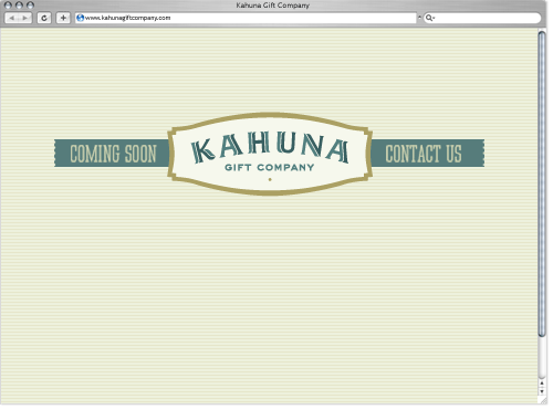
Until a full website is unveiled with the macadamia-filled product line, a splash page was created to keep up appearances. Sweet and simple did the trick…after all, not everybody needs to know the nutty backstory.

Lovely, Mette!
NUTZ!
But not smoked.
Very nice job, i hope the drought comes to and end soon so we can see some awesome packaging!