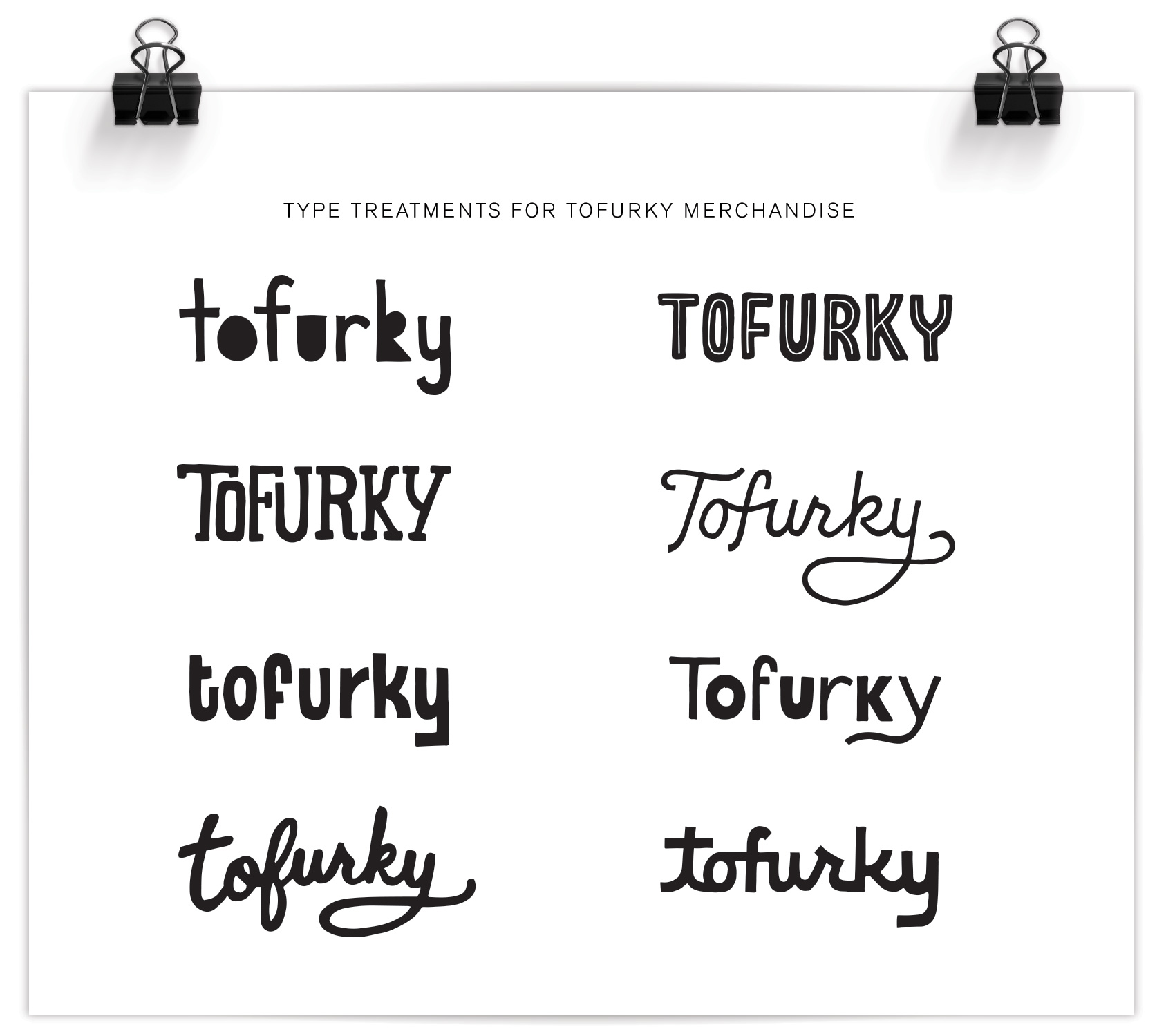
Here is another snippet from a longer-term lettering project I’ve been working on for Tofurky. Below is the second set of two series exploring their company name in a casual, hand drawn style (see the first set here).

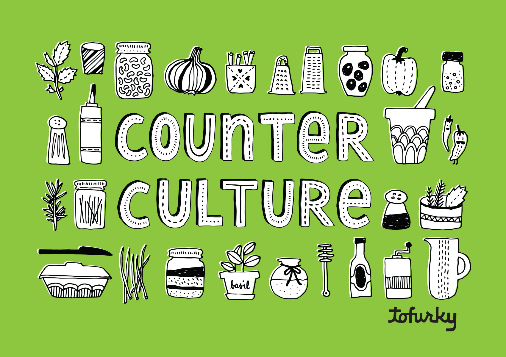
As part of their online content the company posts recipes and tips under the name Counter Culture, which I gave some bling in this lettering piece. I also got to draw a bunch of small ingredients to go along with the type (matching their current brand illustration look), and implement one of the type treatments from above.
