Olympia Provisions Holiday Card
I’ve recently been designing collateral and packaging for Olympia Provisions, a fine meat-centric cluster of restaurants in Portland, Oregon and purveyor of American Charcuterie. Their branding is already top notch, so when the opportunity popped up to create their holiday postcard, it was purely fun. The process on this was super succinct with just a rough sketch of the idea before approval for design & illustration. Guess you can’t fail with the formula of meat + wreath. Meaty Christmas to all!
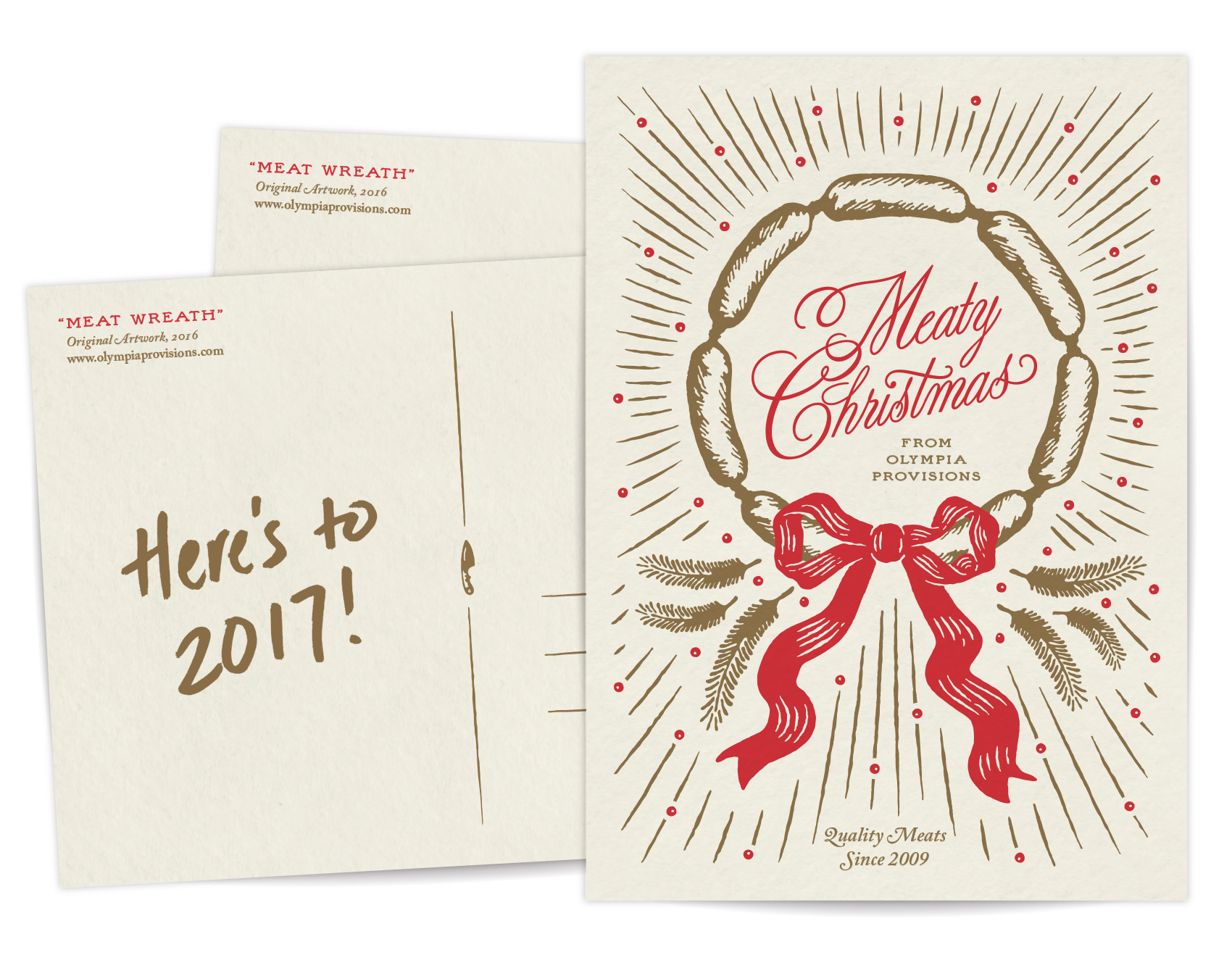
Thanks to Hayden Walker for illustration skills that helped keep the project on time and on budget. A recent graduate, Hayden is a new to Portland and has helped the Bureau over the last few months on several projects, including the Oregon VS Oregon beer label design by decade.
Bandit Books Logo
Bandit Books is the two-pronged business of my friend Katy Meegan, focusing on bookkeeping for creative businesses as well as bookmaking and creative projects. Katy and I met at the IPRC over a decade ago as fellow letterpress teachers. We continued our friendship and shared love of books at Em Space, and for many many years Katy was half of the duo Keegan Meegan which offered letterpress and design services.
This summer Katy was taking her next professional step in combining her organizational and bookkeeping skills to help other creatives with their businesses. Over some evenings drawing together in my nook we talked about how that would look, which led to working together on her logo.
Katy knew she wanted a raccoon in her logo – it was her spirit animal and spoke to her as a symbol for not being your regular bookkeeper. Because of this, the first round of logos was very specific and concentrated on coons. Coons! Coons! Coons! I am a big fan of character studies, so I went about it trying to answer things such as: Can a raccoon reliably hold a book? If a raccoon were a typeface how would it look? How would a minimalist Scandinavian designer make a raccoon icon? Can a raccoon be as clever in a logo as in real life? The logo process shows the efforts of answering these questions.
![]()
After the first round, Katy was certain that the right raccoon for her was a mashup of a monoline raccoon portrait and the profile of a book, and the face of Bandit Books was born. The quality of the logo lent itself well to reproduction in letterpress, paying dues to Katy’s background in that arena, and the font was chosen so she could hand typeset other materials in the job case workhorse Futura. I’ll be posting more explorations on the brand materials soon. In the meantime, if you know a creative business looking for financial organization, you know who to call: Bandit Books.
![]()
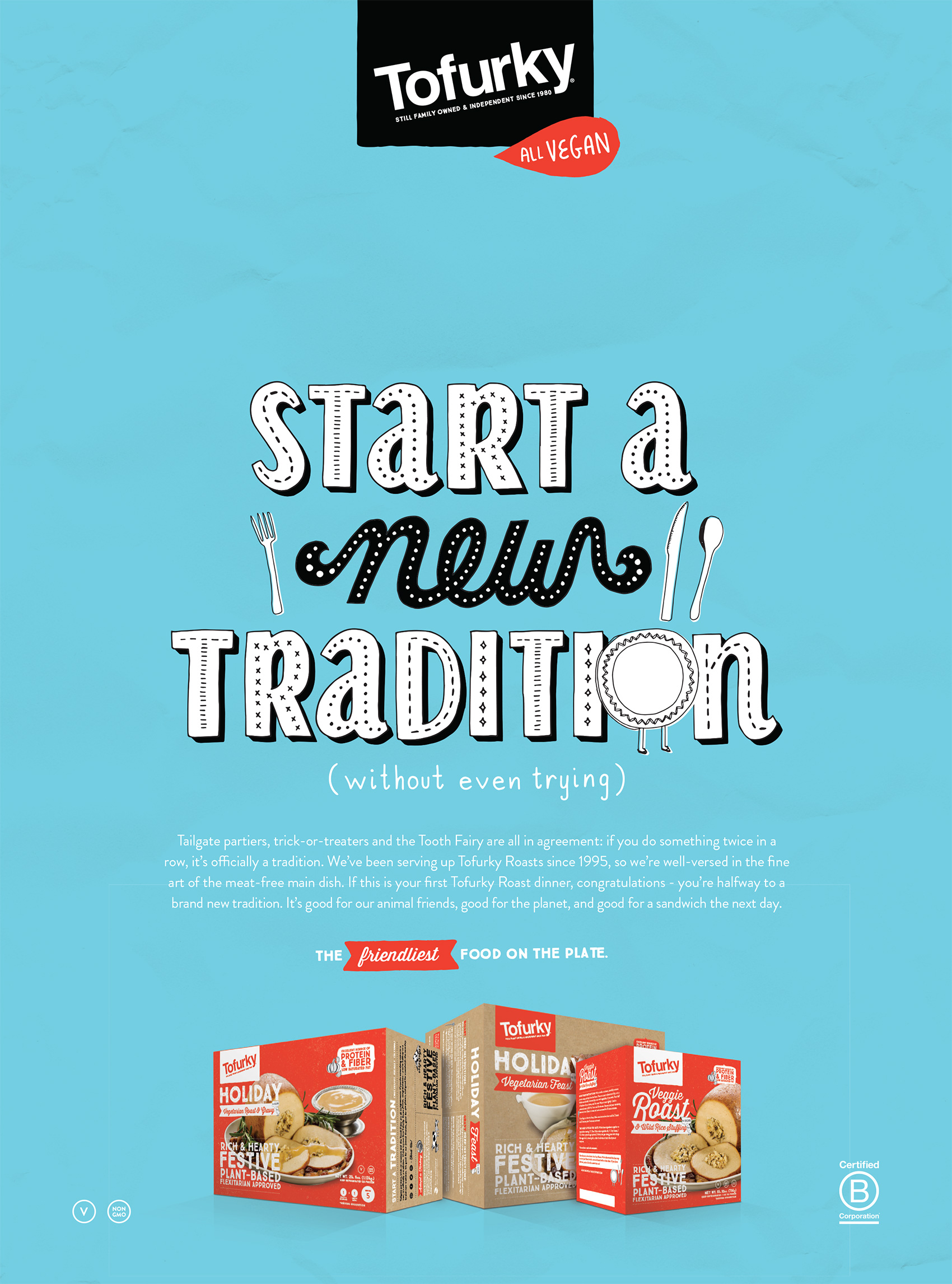
Tofurky Holiday Headline
Here is a headline I lettered for Tofurky (through CD Gary Huck) to use in their holiday ads promoting their meat alternative products geared towards Thanksgiving, Christmas and the like. It was created in the same vein as the lettering library I created for Tofurky, but with a (relatively) more formal feel to the piece.
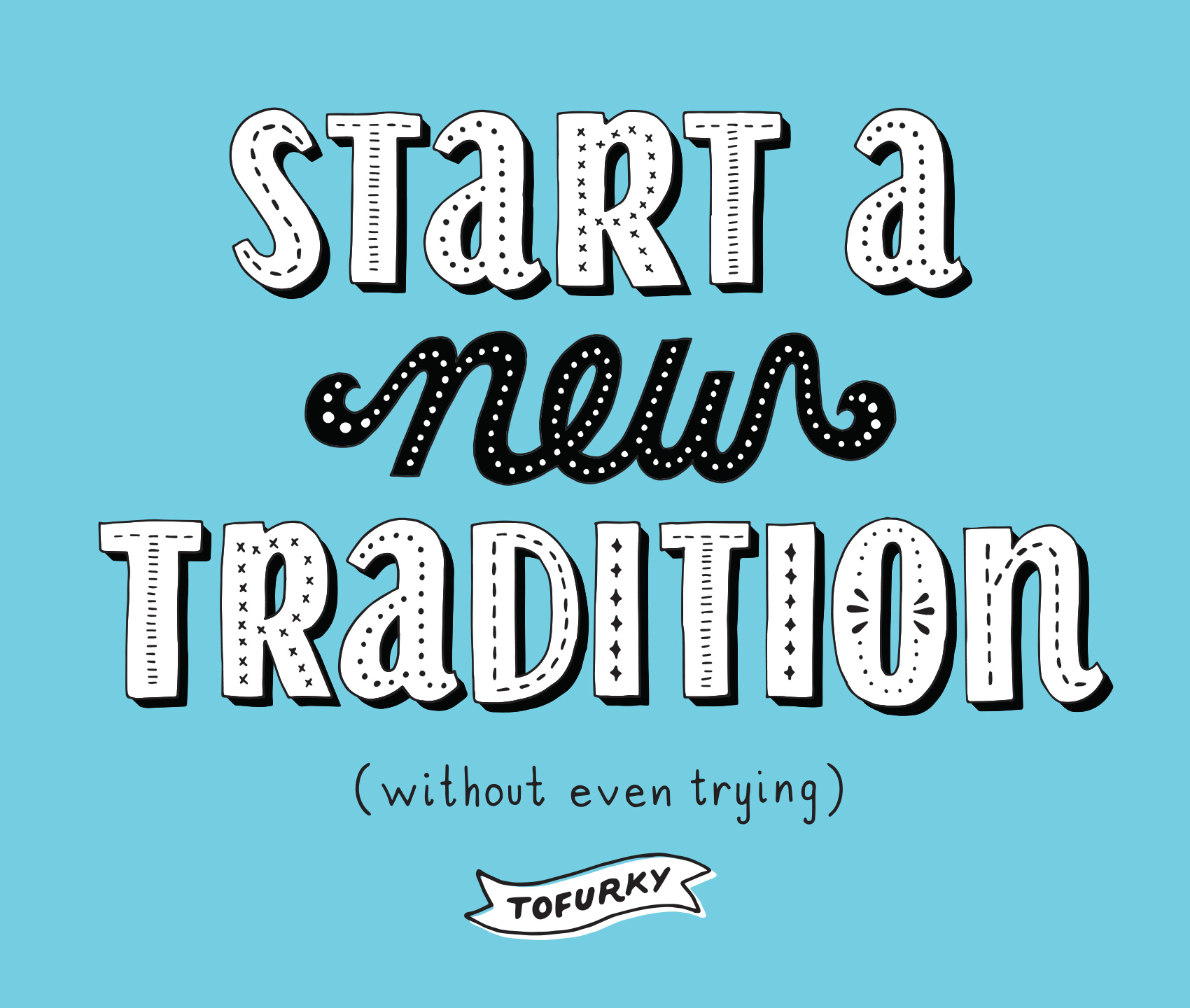
As a person very focused on food, and traditions, and therefore food traditions, I liked the message of this. Being a carnivore, I skate carefree through each meal eating whatever I please. Pretty much the only thing that stops me in my tracks is a stewed cabbage. For vegetarians and vegans it isn’t always as easy, especially during traditional meals centered around meat or in areas where people aren’t as aware of what being vegetarian/vegan means. So all you vegginuts, Tofurky has you covered for whatever tempeh/soy/non-meat based holiday feast you might want to gorge on. Here is the lettering incorporated into one of the ads.
Ducks VS Beavers “Civil War” Beer Design Series
Each year, Oregon descends into sports madness when the Ducks (University of Oregon) and Beavers (Oregon State) face off at the “Civil War” football game, the biggest sporting event in the state. The tradition dates back to 1894 with over 115 games on record. Every November sport pennants fly proudly from cars, allegiances are sworn and catcalls are common. For the most part, I stay completely out of the mêlée. Until this year.
Which brings me to the Ducks VS Beavers Civil War “Beer Design by Decade” project! For every decade that the Ducks and Beavers have been competing against each other I created a beer label for both teams. Design wise I focused on the simplest execution possible to represent the styles, tropes, themes and feeling from that decade.
While having participated in sports in high school with great fervor but mediocre talent, most of my 20’s and 30’s have been spent in front of a computer or a book. My sister, on the other hand, can most often be found cheering on her favorite sports team and alma mater: the Ducks. She probably inherited this from my dad who used to have a sport for every season which he watched dutifully and on the edge of his seat, can of peanuts and Pabst in hand. Realizing that my sister’s fandom would probably never subside, I decided to join in the only ways I knew how – eating guacamole during games and designing beer labels for the respective teams. Here are the labels zoomed in and side by side for each decade.
Oh yeah, this years Civil War is on Saturday November 26th at Reser Stadium.
Thanks to:
Hayden Walker, a new Portland design transplant who helped with research and design as I balanced client work and a project effort that I underestimated greatly. See his work or Dribbble. Also to Tess Wojahn for helping with research (I’m sure a process post with inspiration images will follow at some point). See her work.
My playground friends from Madras, Oregon circa 1988 for spurring my alternative sports involvement when we wrote a rap about how great the Trail Blazers were (those were the days!).
My dad, who watched sports and drank beer and seemed to know infinitely more than both coaches and players based on the color commentary provided. He probably did know quite a bit as an ex-college and army ball player in both baseball & basketball. Those tense moments of accidentally running in front of the TV during an important play or daring to speak during a key game decision and being reprimanded with the Rankin glare will never be forgotten.
There you have it!
Tofurky Trot Tee
My latest collaboration with Tofurky and creative director Gary Huck was creating an illustration treatment for their annual Tofurky Trot. Title ‘Chase Compassion’ this year, the trot is a 5K charity event run in both Portland and Los Angeles. Or, for the super organized, something you can organize in your own hometown. My artwork was used on the website and on the race participation shirt.
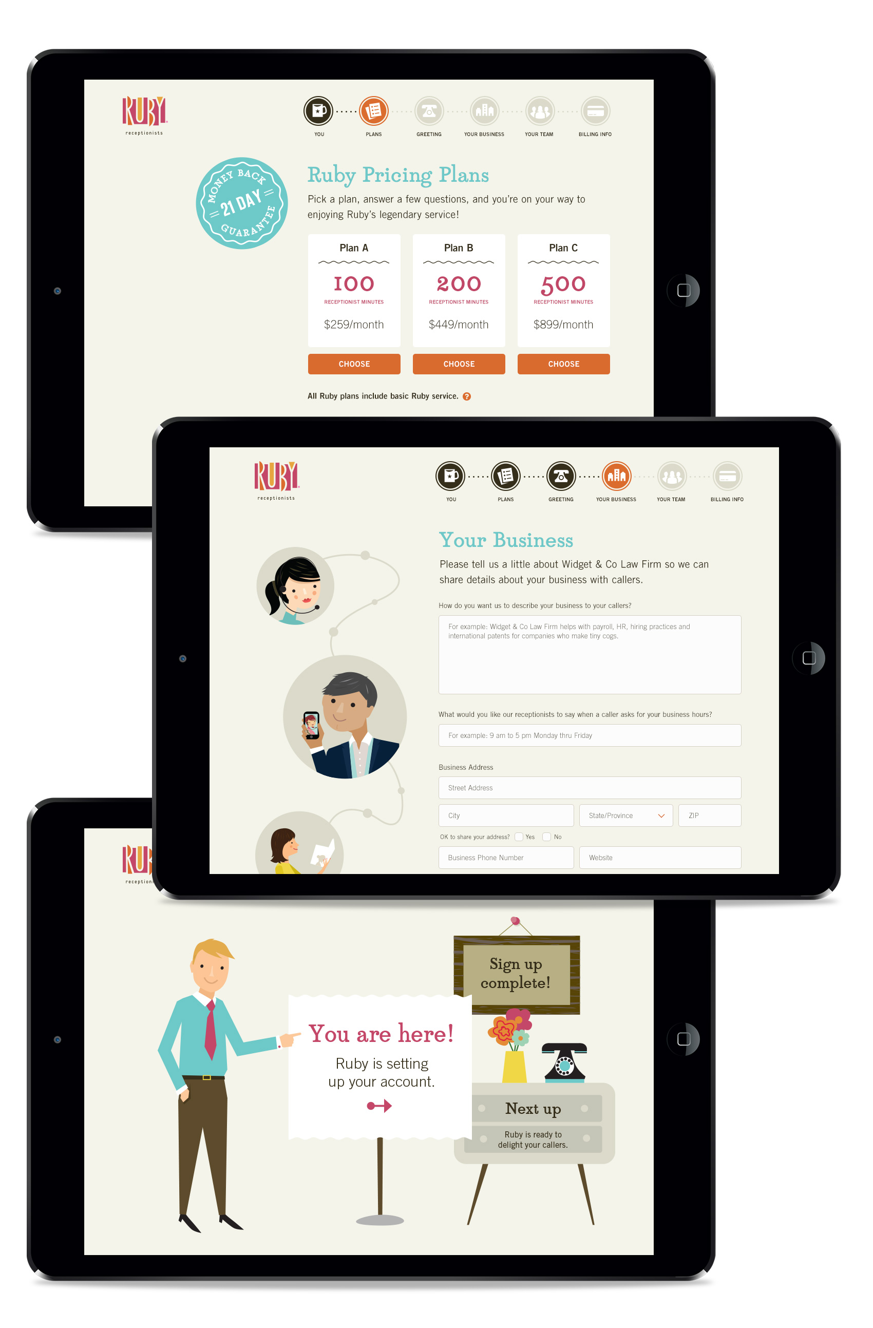
Ruby Receptionists online sign-up website
Another Ruby project from the last few months was helping the team, led by Terri Haswell, UX manager, to provide graphic assets for their online sign-up site. In addition to the structure and content getting an overhaul, the graphics were designed to make the process simpler and easy to understand while getting the basic information needed to help and retain new customers, all while providing a great first impression of what working with Ruby feels like.
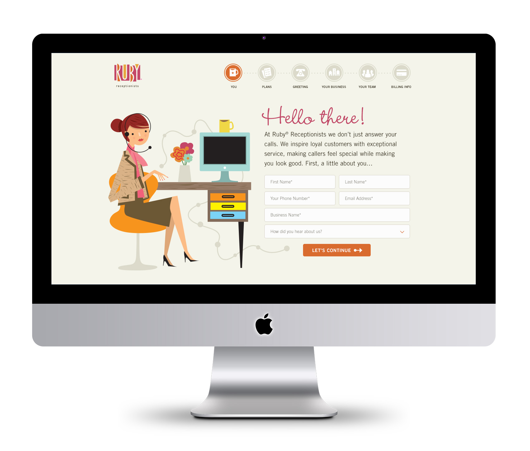
I love working with Ruby’s illustration library and creating new scenes with the Ruby character and all her accoutrements. To reinforce the step-by-step process of signing up, we created an iconographic navigation path that highlights user progress. Translating the usually large and detailed illustrations into small icons was a good challenge in keeping the Ruby flair intact at a small size.
![]()
At each step along the way, Ruby and her cohorts provide friendly assistance and encouragement in filling out 1) personal information, 2) choosing a plan, 3) selecting a greeting, 4) completing business information, 5) filling in team members, and 6) payment. Here are several more screens (the last screen is a “designer pick” that wasn’t used as a final).
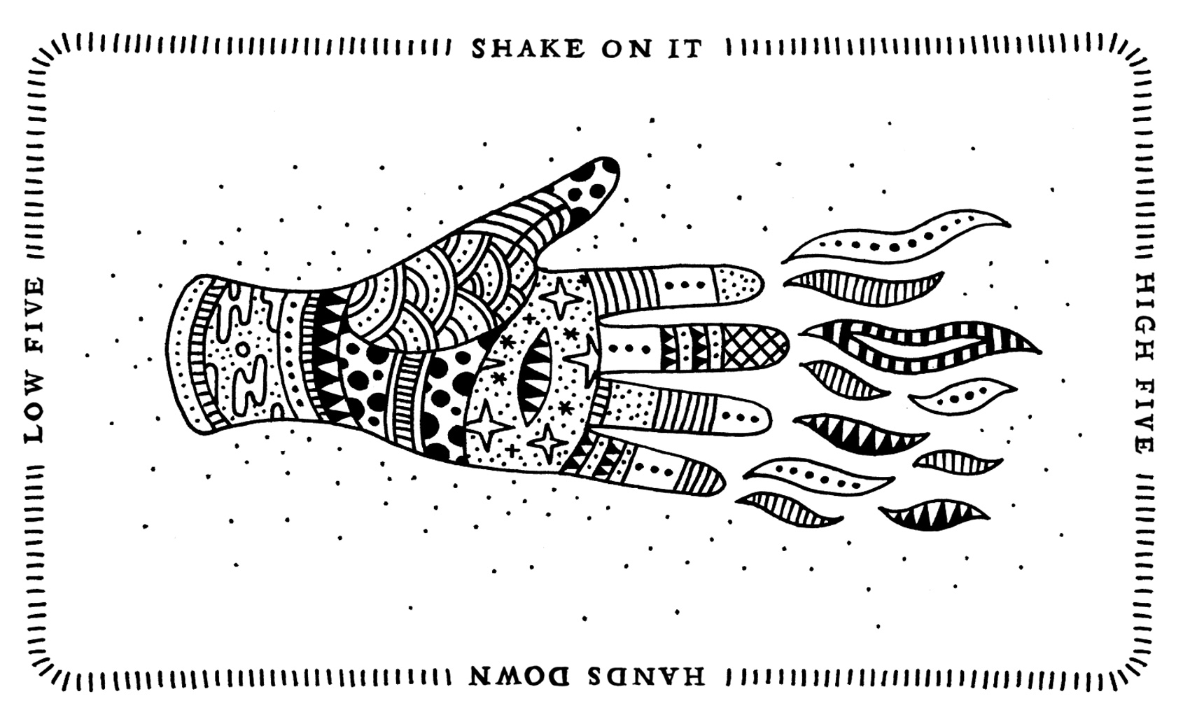
Four Way Handshake
Ruby Receptionists icons
Over the past year I’ve done several projects with Ruby Receptionists. A virtual receptionist company that focuses on friendly service, their brand is characterized by colorful and cute 50s-60s inspired illustrations of Ruby and her cohorts. And when I say “friendly service”, I really mean it. Think about the warm fuzzy feeling you get from, say, watching an old episode of Sesame Street where all the characters hug after an adventure. Well, that’s how it feels to correspond with Ruby. In that vein, one of my efforts was working with Marcella Vail, Director of Employee Engagement, to create an icon library for internal use in presentations, powerpoints, online media and generally peppy publications for the Ruby team.
![]()
Sketchbook Project print for sale
Several years ago I participated in the Sketchbook Project. My submission was a derivative on the theme adhere to me and I made a book titled “Things that Stick”. You can see it in its entirety here.
After many years of mobile tours and growing the Sketchbook Project, an online shop of selected spreads has been opened at The Brooklyn Art Library, touted as the world’s largest collection of sketchbooks. And one of my illustrations is included! It is one of my more minimal pages of the character Label Head. Poor Label Head has an entire short story written about him on index cards that is sitting in the second drawer of my office stuff. Maybe I should take him back out and finish that up. At least for now he is immortalized and available for sharing with others.
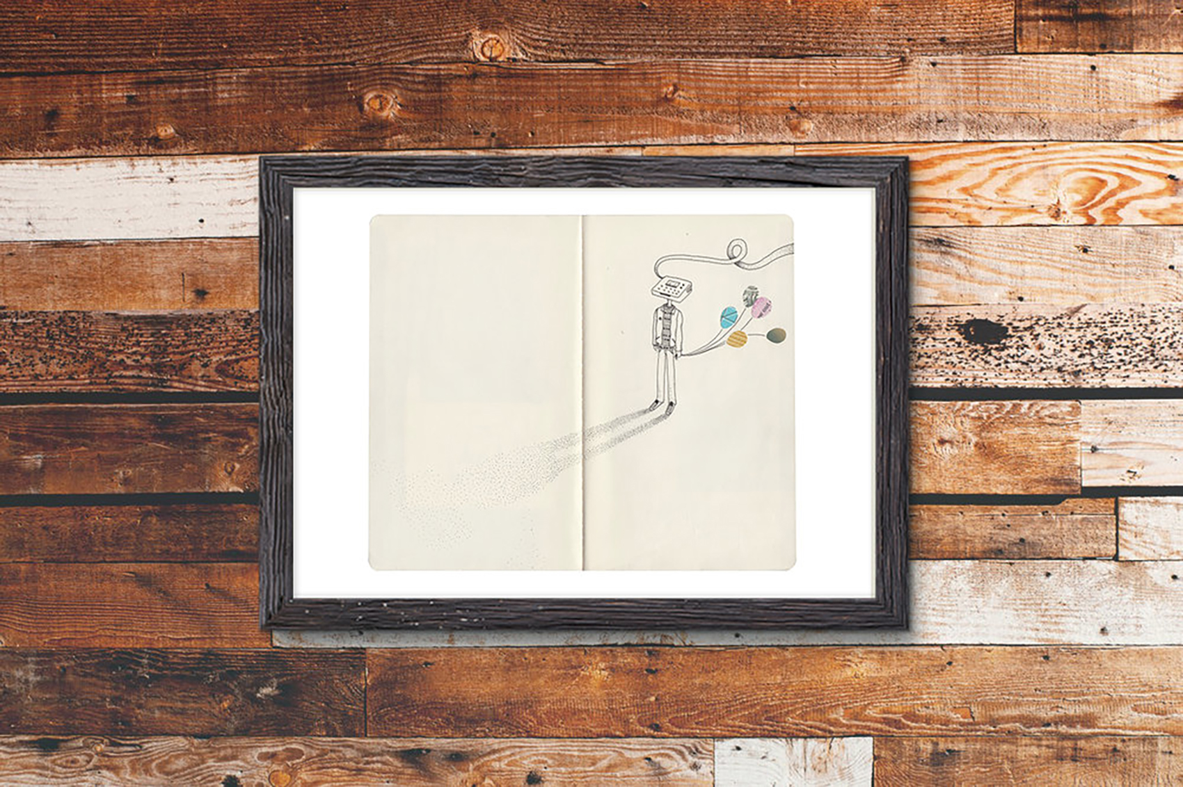
I’ve also chosen to donate all artist proceeds (30%) to helping low-income schools get their own library of sketchbooks.