New Site!


THE SHORT VERSION
Check out my new website! New content, new design!

THE LONG VERSION
The last iteration of this website was launched in 2010 when I started my freelance career (or as I like to call it, being an independent designer). It showcased the work I had done over the course of 5 years while working at Sockeye Creative and Morrow McKenzie Design in Portland, Oregon. My years spent there gave me a great start in doing the work I love and let me learn so much. The site was also built for small screens, when retina displays were a thing of the future and responsive design wasn’t super mainstream. When I realized the time spent designing independently was greater than my time spent at agencies, I knew it was time to update the Bureau online.

The new site focuses on both technical updates (big images, responsive design, portfolio sorting) as well as the work I’ve done independently (although it still has a few of my favorite projects from my agency days). Since 2010, I’ve gained a lot of experience in managing projects, working directly with clients, illustrating in different styles, and working abroad for almost 3 years in Copenhagen, Denmark. Looking back, quite a lot has happened…

I published 550 blog posts in that time (almost all of it original content), and opened 178 job tickets. The blog effort includes over 75 pioneer rabbit illustrations and a whole slew of outfits as well as creating a pop-up adult lemonade stand and outfitting a vending machine to look like a monster. I also illustrated not one but two entire books, developed my lettering skills (proof A and proof B), and completed perhaps one of my favorite projects to date – branding a new ice cream product. In the middle of that I had a baby (once) and moved transcontinentally (twice). Sometimes I wish there was more time for napping.

All of that to say, I’m very proud to share my work with you in its most recent incarnation – I hope you enjoy it!

(Thanks to Monumental for the technical side of the website making process!)
The Bad Touch


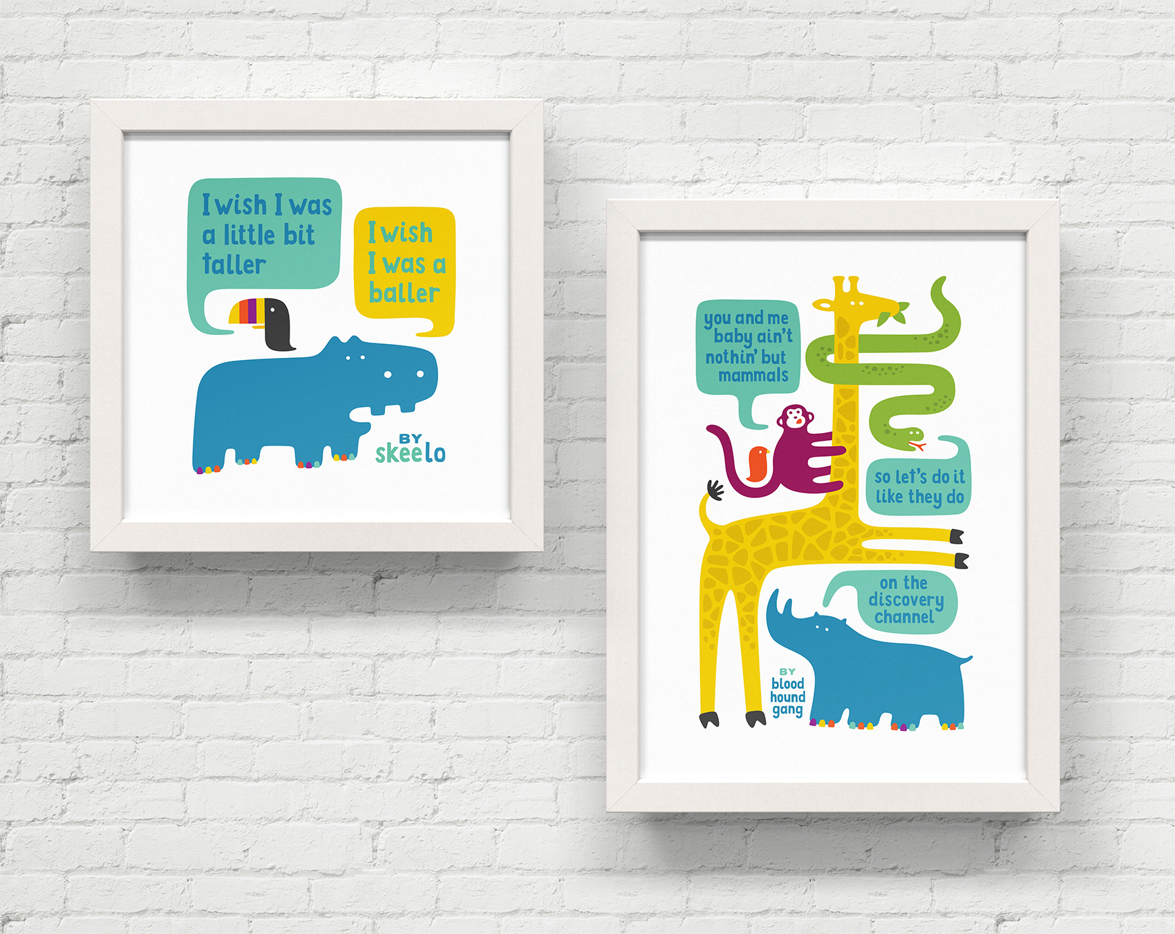
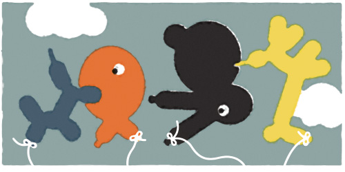
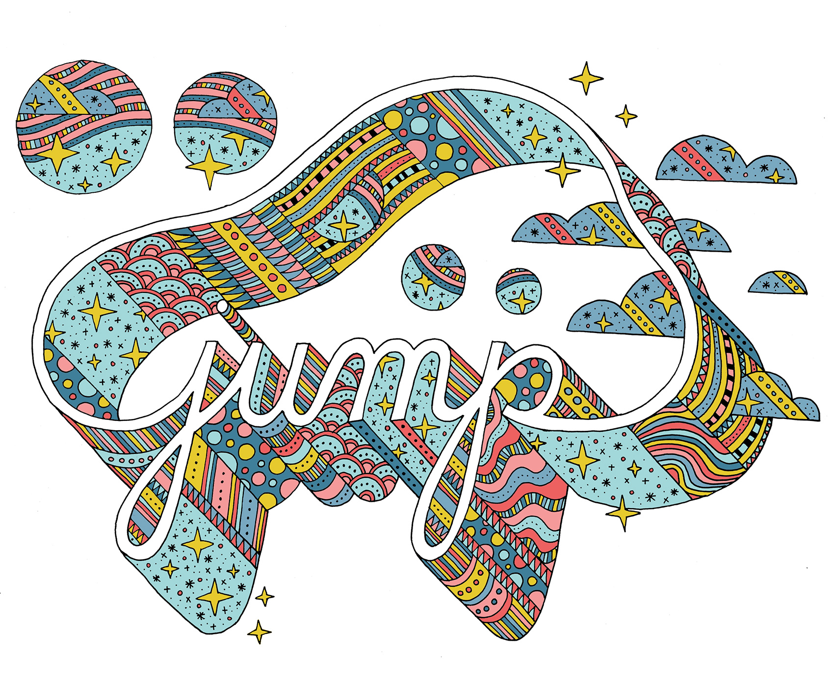
A follow up to Jungle Animal Rap, this idea started and ended within 3 seconds when the song The Bad Touch popped into my head and I saw this animal collage in my head. The obvious next step is to get it out on paper or screen as fast as possible before you think it’s a bad idea. So here ya go (jury is still out)!

The typography is a hand-drawn creation blending the attributes of Knockout Junior Liteweight and Block Berthold. I wonder if Hoefler & Co ever considered releasing a version called “Knockout Baby Steps”.

Jungle animal depiction of the Bloodhound Gang song The Bad Touch with the lyrics: you and me baby ain't nothing but mammals, so let's do it like they do on the Discovery Channel. Have fun giraffe, monkey, boa, bird and rhino. Uh yeah.

Home Cranked Packaging


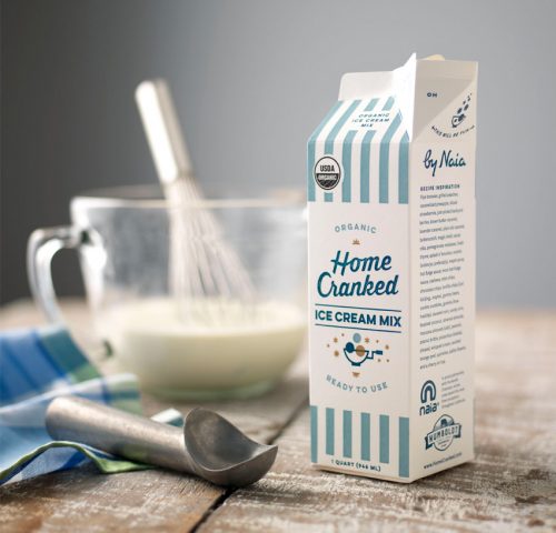
I’m excited to finally say TA-DA and share a special project from last year – packaging and branding for Home Cranked ice cream mix. This is an organic and premium quality ice cream base that you can use to make any flavor imaginable, brought to you by the folks at Naia Gelateria. Just use the plain base to add any ingredient to make crowd pleasing flavors or perhaps a palate-testing flavor for your more adventurous ice cream eating cohorts. Or if you’re in a pinch, chug the plain base straight from the carton to satisfy instant ice cream cravings. Any way you cut it, YOU WIN.

Packaging design for Home Cranked ice cream mix.

This project was in my wheelhouse for oh so many reasons. First, ice cream. I mean, ICE CREAM. Second, it was a print packaging project which had the fun limitations of being 4 colors and printed with flexography that has certain parameters in which it looks good. The design also needed to accommodate for potential new products. Lastly, I got to work with a crack team.

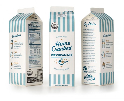
Carton packaging design for Home Cranked ice cream mix, showing all three side of the carton.

I was brought in by Owen Jones to help Naia create the Home Cranked brand from scratch. The Bureau created the logo, packaging, illustrations, branding and guidelines while Owen managed the project, implemented the site, marketing, social media strategy, and additional brand efforts. I even got to pull in food writer Jen Stevenson to make a delicious contribution of words that really made the packaging sing. Having worked with both Owen and Naia in the past, it was a trifecta of design positivity and collaboration. Or, as Jen would say: scoop savant, this is your destiny!

Currently Home Cranked is on a test run in Whole Foods Markets in California, but if things go well it could be coming to a store near you. Stay tuned for a more in-depth post on the logo, branding and icon set soon…in the meantime check out Home Cranked online.

Scandinavian Winter


People often talk of Scandinavian summers with daylight nearing 20 hours a day, slim blond girls riding bikes everywhere, and public parks blanketed in sun revelers. Not many people talk about the Scandinavian winter. Maybe because they are inside under a blanket eating æbleskiver and pretending the 45 tea lights in the room are an acceptable substitute for sunlight. Nonetheless, the darkness lends a special matte sheen to everything, and the flickering of firelights emitted from every pane gives different sense of community.

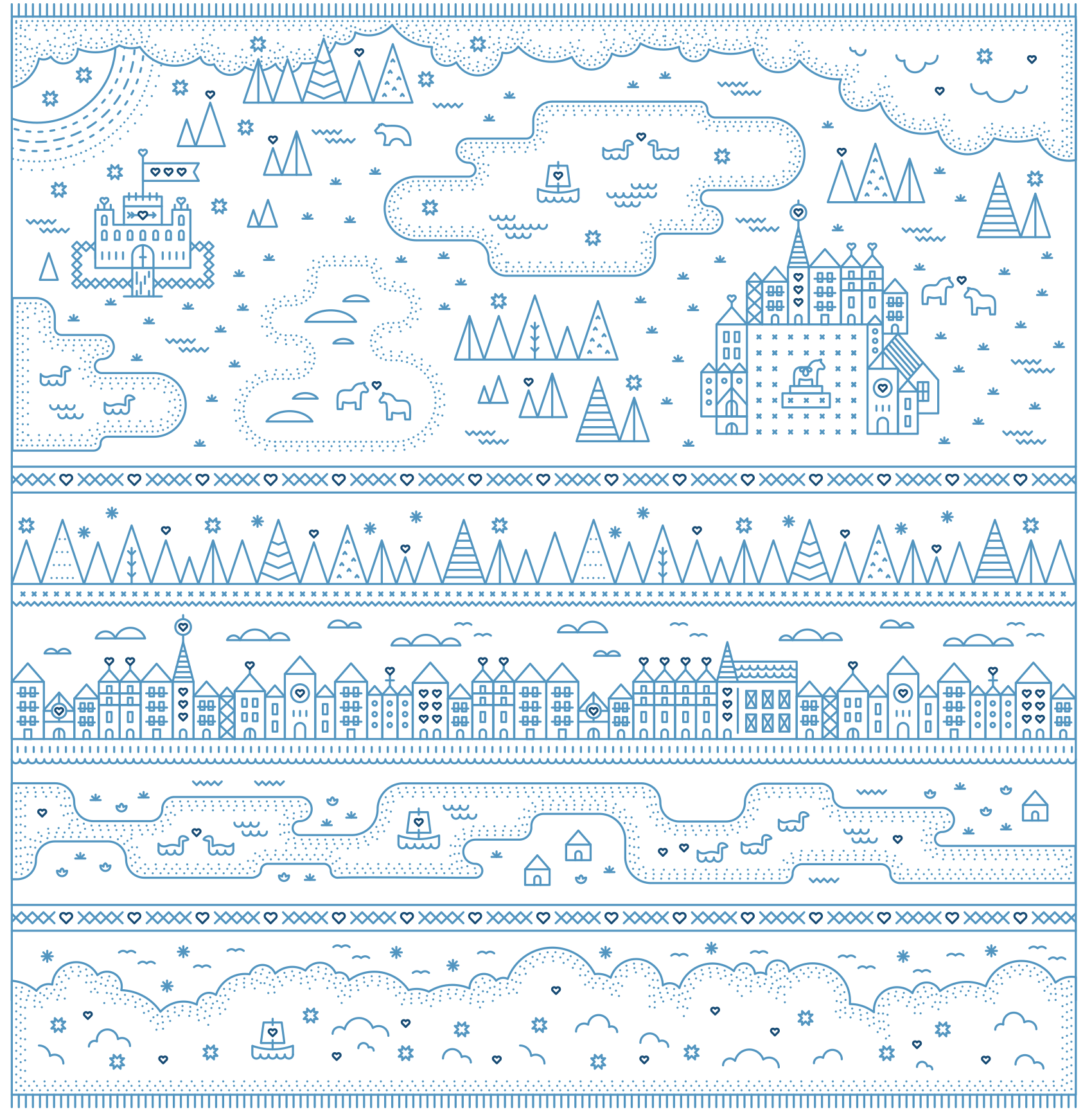
Formatted somewhat after the long tapestries and woven rugs that are prevalent in castle museums, here is my tableau of Nordic wintertide.

scandinavian winter, dala horses, castles, swans, viking ships, tea lights, and the winter solstice

Portrait Sketch 1


I don’t sketch in my free time. I don’t have a sketchbook I’m always doodling in. I don’t go out and observe my surroundings with a pencil in hand. I only sketch for money, on projects that have a process and an end result. Bad, bad designer! Which from a creative standpoint doesn’t allow for much exploration. Sad, sad designer!

That’s why I force myself to be spontaneous by inviting friends over to creative nights at my house, where I must be stationed at a table and peer pressured into creating something during the time at hand. Go, go designer!

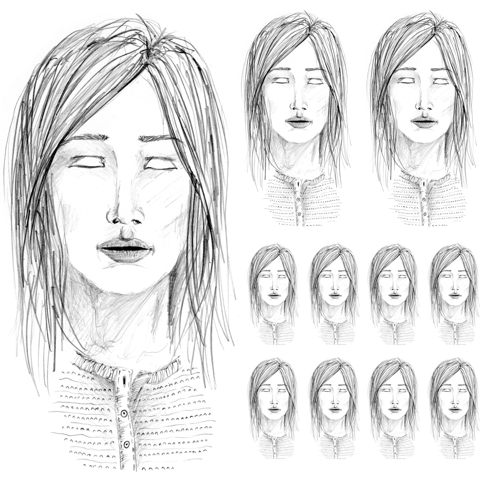
At a recent creative night I revisited my drawing focus as a 14-year-old, when I had just come out of a 7-year horse drawing phase and moved on to people’s faces. A true sketch, drawn from no reference.

pencil sketch without eyes, in school portrait layout format

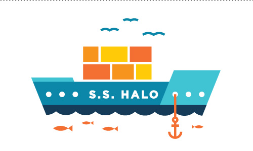
SS Halo Logo: Study for Singled Sided Hearing


This illustration was a done as a favor for a friend in the medical field. The project was for a grad school course involving a mock research grant proposal for a study on single-sided hearing – the proposed research would invoke youth with single sided hearing loss and quality of life outcomes.

The Seattle-based team wanted a ship to represent their study, called SS Halo, and from a few digital sketches chose this one to use as their icon. The only requirements were that it should have some orange and blue to feel connected to the Seattle Children’s Hospital and the name be prominent in the clean and simple illustration.

One of the options not chosen was a more whimsical style that led to the series “Famous Ships in Bottles”. I often find that cast offs from paid creative work is what I am most drawn to and helps inspire side projects and personal illustrations.

The SS Halo
The SS Halo