Free Typography
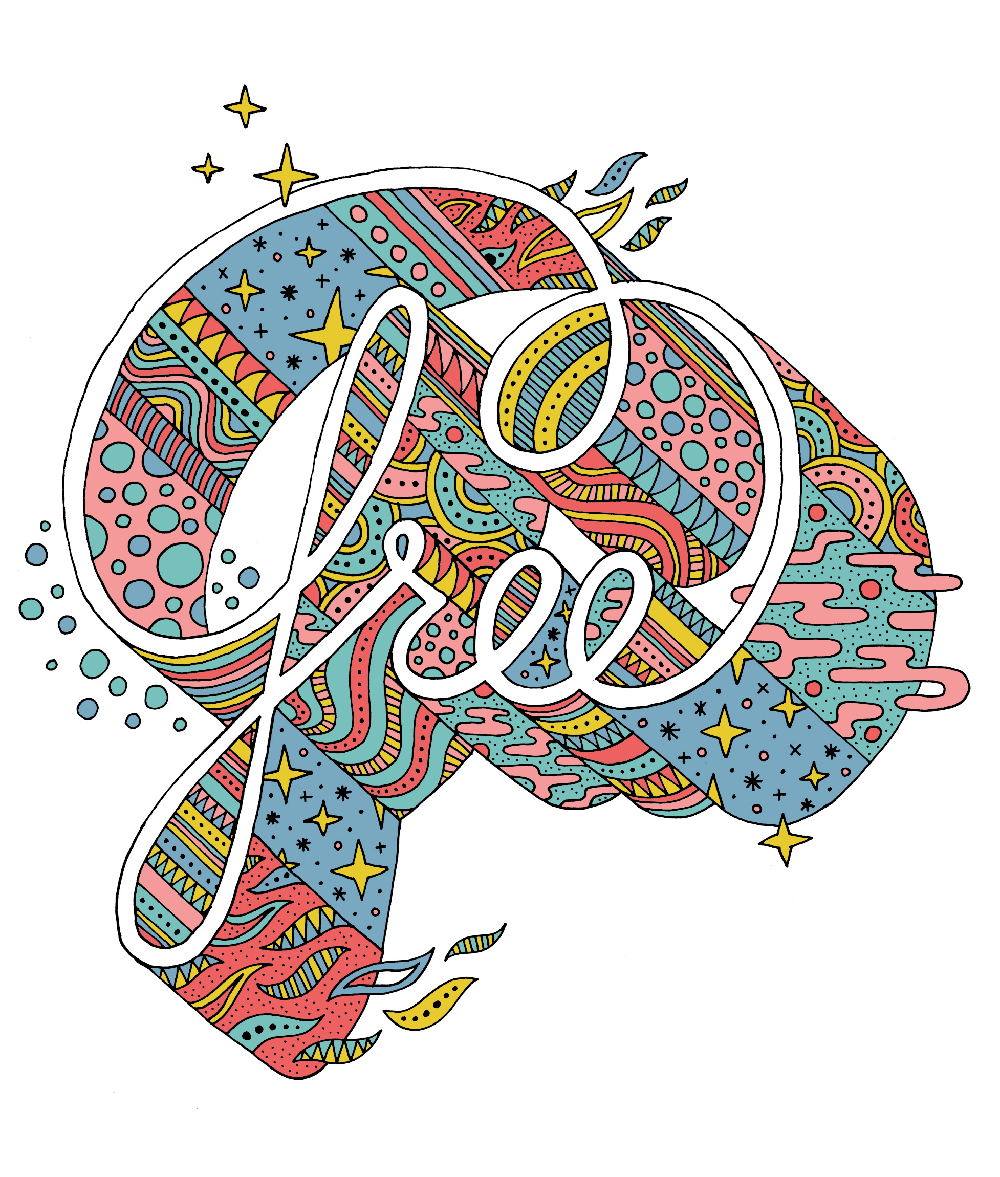
Over the years I’ve worked on pairing type and pattern together in my illustration in various levels of complexity. Of all the kinds of typographic illustration and tests that I do, this is the style I keep coming back to when given carte blanche. Here is the latest iteration of what I am finding rewarding in this realm, and a sidebar story on how it was put to the test in public at the Portland Art Museum’s monster drawing rally.
Dog Explains Darwin
Tandem Activity Book
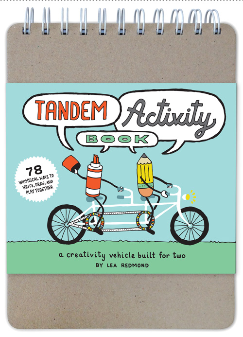
I am so excited to share a project that I worked on last fall and winter through Chronicle Books. SO EXCITED! Combining creativity, illustration, and a test of my design stamina, this is the kind of project my ilk live for. It’s a Tandem Activity Book – a type of journal you complete with other people.
I love this book because it is good for all ages, and is the exact opposite of going to a coffee shop to “chat” and then surfing on your iPhone for an hour next to the person you came with. This book should be an iPhone replacement in 90% of coffee shop interactions! It also reminds me of my childhood when we made up activities for ourselves that entertained us for hours and days and weeks – it’s a series of mini-games that don’t have a winner or a loser, just fun. Does it sound like I enjoyed this project? I DID.
Continue reading “Tandem Activity Book”
Famous Ships in Bottles
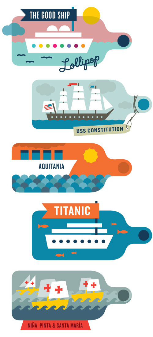
A few fun facts from around the internet about the Bureau’s version of famous ships in bottles…
The Good Ship Lollipop
The “ship” in Good Ship Lollipop actually refers to an aircraft which was featured in the song sung by Shirley Temple that takes passengers to a land of candy – immortalized in a very beta music video.
USS Constitution
Nicknamed “Old Ironsides” for its indestructible build, the USS Constitution is the world’s oldest naval vessel. In addition to spending time in battle, it has also been a training ship, museum, freighted artwork, and has sailed around the world. Pretty much an overachiever among watercraft.
RMS Aquitania
Known as “Ship Beautiful”, she served in both World Wars in between being a passenger liner, and was the last of the 4-funnel (smokestack) liners.
The Titanic
Considered to be unsinkable, the Titanic managed only 2 hours and 40 minutes of sailing before its demise, taking over 1,500 passengers down with it. Iceberg: 1, Ship: 0.
The Niña, Pinta and Santa Maria
Used by Christopher Columbus in 1492 when he sailed the blue to the “New World”, the Niña, Pinta and Santa Maria have been memorized by school children ever since. Santa Maria, the largest of the three ships, was 62 feet long and 18 feet wide and had seven crew members named Juan aboard. Pinta, the fastest ship, was a smaller caravel. Niña, who formal name was Santa Clara, avoided both destruction in a hurricane and capture by pirates.
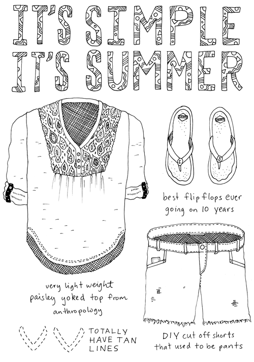
Outfit No. 65
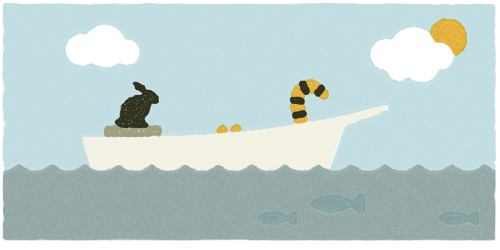
Me and My Pioneer Rabbit, on a Boat with a Tiger
SHARE: Typographic Fire Doodle
Last night I went to an improv creator’s night called SHARE. The format of the event involves bringing together a group of creatives, giving them a one-word prompt, and then seeing what they make over the course of 2 hours that is related to the word. At the end, each person shares what they have made.
I had attended several years before and made some felt collages. This time I decided to use the evening as an exercise in practicing a certain style of illustration. The only materials I brought with me were pencils & pens, and a light table.
The prompt: FIRE.
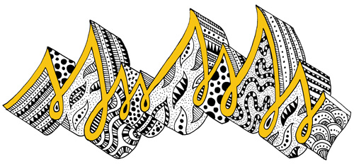
I immediately thought of some music quotes that used the word fire, and wanted to make a typographic illustration. After some sketching it became clear that two hours wasn’t enough time to complete this idea, so I switched to doodling instead. The doodles felt a bit like typography in their rhythmic nature, so I decided to make a representation of fire that felt typographic.
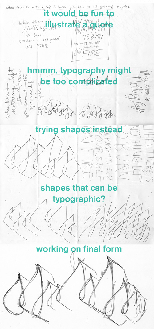
I spent about 15 minutes pre-snacking, 45 minutes sketching, a 5 minute snack break, 45 minutes illustrating, and 10 minutes staring out the window. While illustrating, I kept track of how long each panel took, so I would be sure I could finish in time. This is also where the motto “when in doubt, stipple” was put into practice. Here is the finished illustration created from the prompt FIRE.
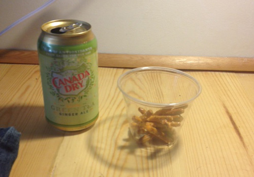
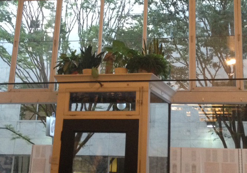
While drawing, I had a snack that reminded me of airplane trips. When I was done, I took additional advantage of the snack table and looked out the very tall windows and doortop plant arrangement.
SHARE #23 participants included:
Dave Benz, artist
Brad Cohen, writer
Alex Harris, designer
Kathleen Lane, writer
Katherine McDowell, visual artist
Leann O’Rourke, photographer
Alyson Osborn, actor
Jennifer Rabin, conceptual artist/writer
Mette Hornung Rankin, designer/illustrator
Liz Scott, writer
Toni Tabora-Roberts, multi
Cara Ungar, thinker
Bill Wadhams, musician
Gary Wiseman, artist
SHARE is organized by Margaret Malone and Kathleen Lane.
Flags of Portland
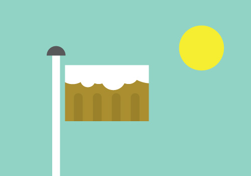
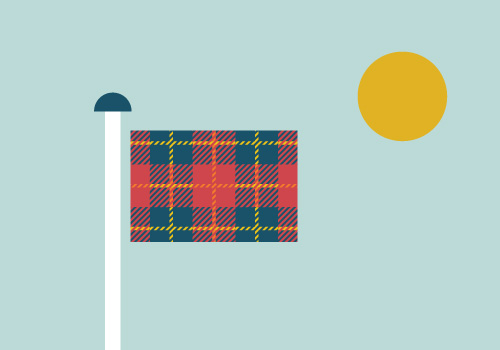
Since Portland is so hip, I thought it might appreciate its own series of flags featuring the caricature building traits that garner it a TV show all its own. Definitely not comprehensive, I could see some of these flying proudly on poles around Portland. What would your perfectly personalized Portland flag look like?



Piano! Push Play!
Each year I usually tackle one side project that takes me off the beaten path of my typical work-for-hire jobs. This is how the Goodie Monster was born, I manned a lemonade stand in Copenhagen, and made a fuzzy printed poster about moose falling in love. This year, I painted a piano. It is now out in the world for anybody to play thanks to the group Piano! Push Play!
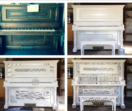
Piano! Push Play! partnered with the Portland Art Museum and Portland Parks & Rec to create an installation of 10 designer pianos, which were featured in a concert on June 26th at the Museum. From there, the pianos move to various sidewalk and park locations to be played by passers-by for a few weeks before they are donated to schools, community centers and other organizations unable to purchase pianos on their own.
For my piano design, a glossy white enamel paint coat topped with black illustration was a simple way to stay true to the piano’s form and accentuate the features of the instrument as an individual. Patterning and texture were used to mimic the variety and nuance that pianos are capable of and to show the feeling of how it is when you play.