Piano. Push. Play. Preview…
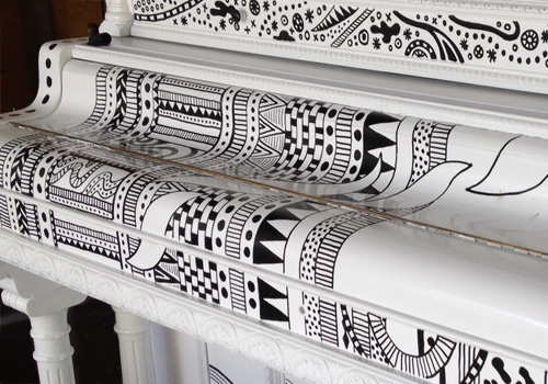
Here is a quick sneak peek of what I’m working on right now, along with an invite to come see it in action. The Portland Art Museum is partnering with Piano! Push Play! to create an installation of 10 designer pianos, which will be featured in a concert on June 26th at the Museum. From there, the pianos move to various sidewalk and park locations to be played by passers-by for a few weeks before they are donated to schools, community centers and other organizations unable to purchase pianos on their own.
That’s right, I’m painting an entire piano for anybody to play.
Piano! Push Play! Concert
Friday, June 26th at 7:00pm
Portland Art Museum
1219 SW Park Ave, Portland, Oregon 97205
FREE to the public!
Check out the event on Facebook for more details.
Hip Hip Portland
As a native Oregonian who grew up on the east side where tumbleweeds blow and it took an hour to drive to the “local” movie theater, Portland was the mecca of civilization. Malls, stoplights, and my grandma’s house were all big city attractions that wowed me during childhood visits in the 80s and 90s. As an adult I moved to Portland after getting degreed to chase the creative dream. So far so good.
After a solid stretch in Portland, I moved to Copenhagen Denmark for a few years. When I returned to Portland, my memory of the up-and-coming town was forced to reconcile with all the changes that had occurred while away. Now, Portland was…hip. So, so hip. It was no longer just a simple place to be, but self aware.
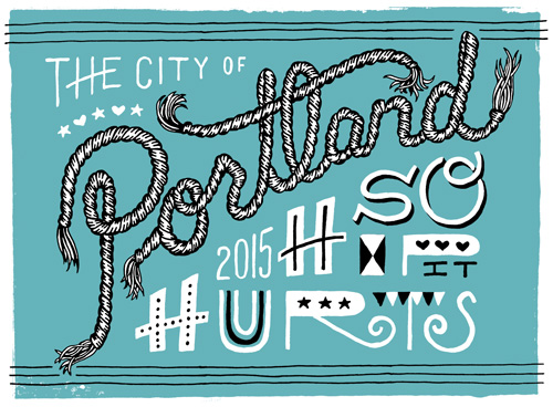
So here’s a typographic ode to my burg that has changed so much over the last 3 decades for good and for bad. I still love you Portland, just please don’t get too big for your britches.
B is for Black Hole
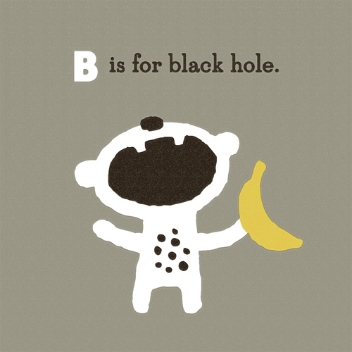
“B is for Black Hole” is part of an on-going alphabet series for kids using math, science and geography vocabulary. Have an idea for a good word? Send it my way!
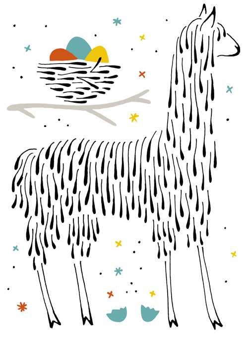
Llama Lays Magic Eggs
Here is a third test in drawing animals in a ‘teardrop’ style. Previously I tried out various birds, plus a rabbit, skunk and porcupine. I’m not sure if llamas can actually lay eggs. Maybe they just guard them for birds who are on a trip to the worm store. But somebody is bound to get a talking to when the creature in charge gets home.
Umpqua Promo Magazine
I’ve done many projects with Umpqua Bank, from the buttoned-up online identity for their Private Bank to a giant mural of a birds nest for a new store opening. Our latest collaboration was no less ambitious in the greatest direct mail piece I’ve ever seen. Yes, I have designed my first ever direct mail piece, and I’m proud of it!
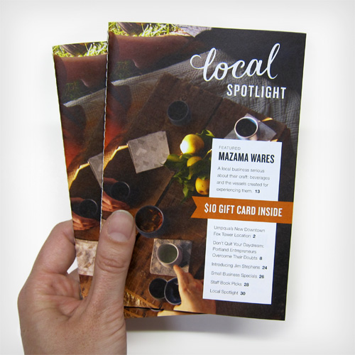
Just the phrase “direct mail” sends shivers down my spine, so one goal while working on the piece was to make it as personal and relevant as possible. Sewn binding on the book and having a precisely fit clear sleeve presented it well from the outside. Inside, working with a great photo library was a boon – nary a stock image was used! Professional architectural photos of Umpqua as well as brand images from Mazama Wares created a cohesive visual narrative. A diminutive format (the magazine fits easily in your hand) and 32 pages of editorial and lifestyle centered content made it both useful and interesting.
Continue reading “Umpqua Promo Magazine”
L is for Luminosity
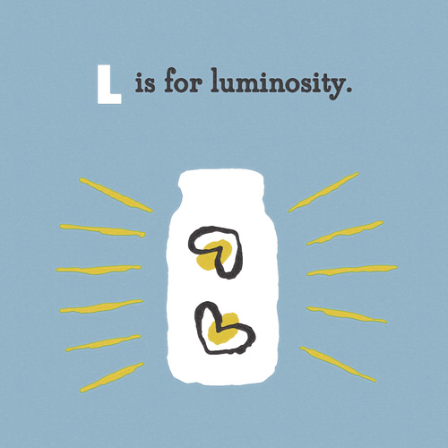
“L is for Luminosity” is part of an on-going alphabet series for kids using math, science and geography vocabulary. Have an idea for a good word? Send it my way!
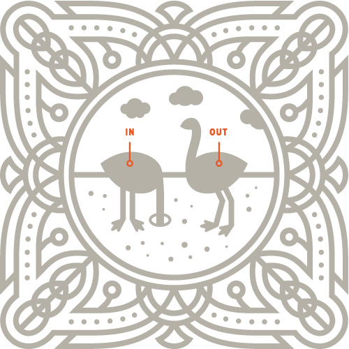
Ostrich Explains the Basics
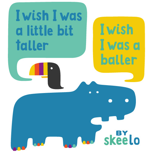
Jungle Animal Rap
Shoes! Shoes! Shoes!
Over the past few years I have made many black & white pen illustrations of my outfits (special or not) and the stories that go along with them. Taking just an excerpt of these drawings – the shoes – makes me pause at the volume of visual recording I have done on this subject. And makes me think…if I owned all the shoes I have drawn, I would need a bigger closet.
