Upward Partners Branding
A recent collaboration with a Portland-based consultant resulted in rebranding his small company to present a more cohesive visual front. Upward Partners is a company that builds infrastructure for fast growing companies, and its founder, Brian, wanted a brand that reflected his way of doing business: results driven but also fun and innovative.
Working primarily with numbers, data, money, and other cold hard facts doesn’t always lend itself to an inspiring logo. To stand out in the field of CFO’ing and COO’ing we opted for a Northwest influenced motif of a mountain range. With a ‘slight chart & graph’ vibe, the icon also reinforced his positively-geared business name.
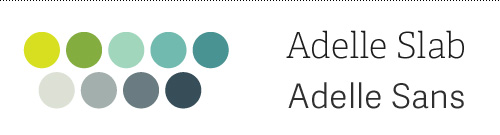
The typography was set to focus on the action part of the name and give it the same uplifting feeling as the mountain icon. Combining that with a nuanced color palette gave plenty of options for leeway in future materials. The font Adelle proved its worth by being both approachable and serious in its serif and sans versions.
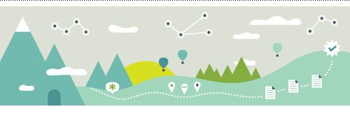
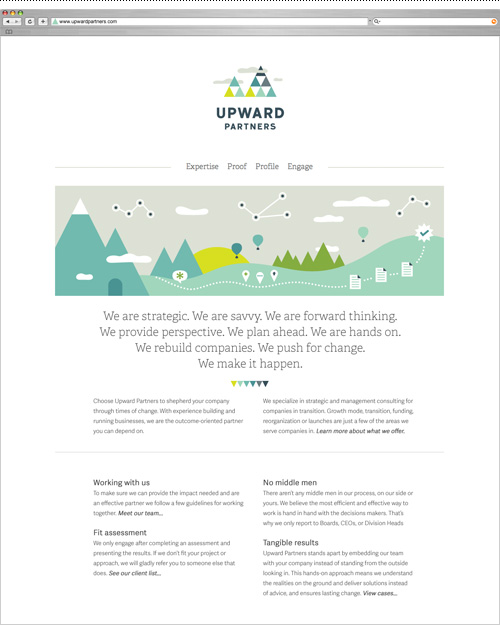
Various illustrated elements were combined into a banner graphic that did some heavy lifting on the homepage, which had previously been bare of graphic elements save for a background pattern.
A large part of this project was determining Upward Partners’ written voice, as the previous site had been a somewhat dry list of business ingredients. Jargon-free speech and easily digestible explanations of complex business scenarios made it easy to understand their approach and work. A mantra-like introduction was created to describe the essence of the business, leaving the technical points for sub copy.
Using icons to support key areas of expertise upgraded the straight-forward content from bullet points, and let the new long-form content call out the key differentiators Upward Partners asserts – a pre-engagement fit assessment and no middle-men in the work process leads to tangible results from their consulting efforts.
The culmination of writing, designing, and organizing resulted in a new website to be used in presenting Upward Partners’ work to both current and prospective clients. The site was built in Squarespace to allow full editing capability by the client. Check it out at www.upwardpartners.com.
And because before and after shots are so satisfying…
I’m excited to debut this small business rebrand and hope it helps Brian go forth and conquer. I look forward to expanding this flexible and fun brand to bring a fresh look to a category of business I don’t usually work with. Maybe I’ll even pick up some additional business acumen along the way…but for now I’ll just keep on keeping on with some kpi and metrics creation to optimize securing some series b funding. Or something like that.
Outfit No. 64
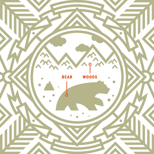
Bear Explains the Obvious
On the tail of Penguin Explains the Universe and Fish Explains the Facts of Life, here is a colloquialism my dad was apt to throw around if I asked a silly question. Feel free to use it when the chase must be cut and the answer is yes.
Mod Burger Concept Menu
Trying new illustration styles is always fun, but sometimes there isn’t time or budget for experimentation, or a client has a specific style they want from the start. On this recent project for Must Have Menus, there was plenty of creative leeway to create something from scratch.
The Must Have Menu’s website provides editable online menu templates for restaurants so that they can manage, update, and print their menus directly. The assignment was to use their menu building tool to show how templates can vary from the stock set of layouts provided online.
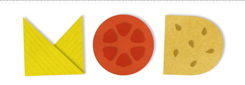
The concept of a modular burger restaurant influenced a mod-retro type treatment and a layered “paper cut” digital illustration of iconic burger parts. Choosing any ingredients from a long list of options and building your own perfect burger? Get me a reservation!
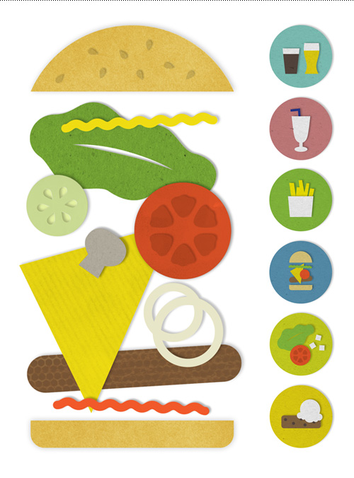
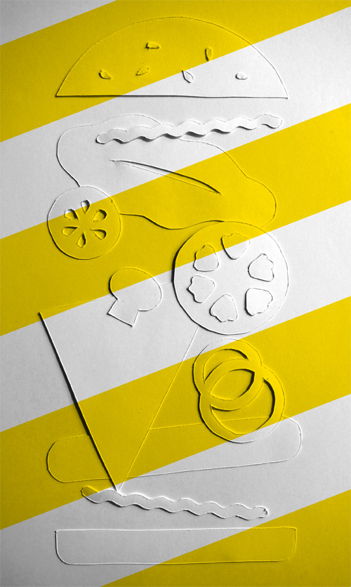
Hoping to photograph the piece turned out to be too time consuming for this small project’s limited budget, but using textures and Photoshop did enough of the trick to get the idea across.
W is for Wavelength
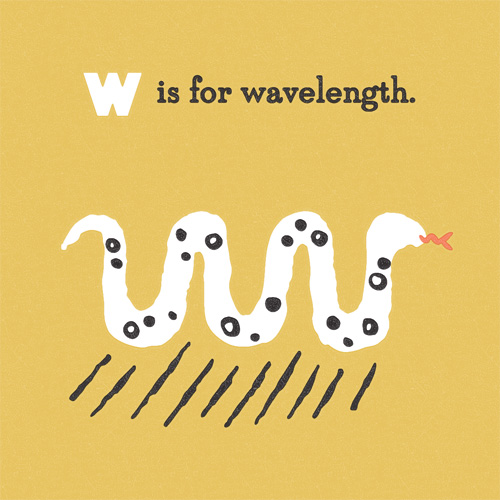
“W is for Wavelength” is part of an on-going alphabet series for kids using math, science and geography vocabulary. Have an idea for a good word? Send it my way!
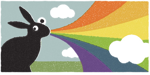
Me and My Pioneer Rabbit, and the Technicolor Yodel
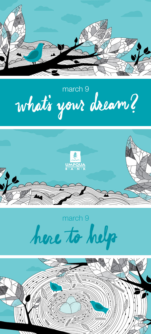
Umpqua Fox Tower Mural
My latest collaboration with Umpqua Bank was to create artwork for their new Fox Tower store windows while construction was taking place. Eschewing the standard construction site graphics of some big type declaring “coming soon”, we opted for a truly Portland vignette by putting a bird on it.
Helping customers attain their goals and dreams and tending to their finances as a part of that was visualized through a bird finding home to its nest, which was carefully being watched. A hand drawn script reinforced Umpqua’s friendly and conversational message: what’s your dream? here to help…
Capturing large scale work is a feat when competing with construction, Max lines running by, the strange appearance of Portland sun glancing off the glass clad building, and crowds constantly walking by. But I did get this shot of a hungry luncher walking by one of the window sections.
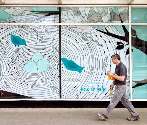
Much of my work is smallish – books, shoeboxes, beer bottles, iPhone covers, t-shirts. Even vending machines are kind of person-sized. But a 50 foot wide illustration is…big. Creating a piece that was both complex enough to be interesting but simple enough to read well was a good challenge, and reinforced the sage advice applicable for anybody working in making real things: measure twice, cut once.
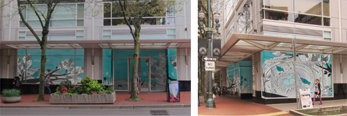
The new store opens March 9th (today!) and will soon host its first event featuring small Portland businesses and their founders speaking on how they got their start. Find the Fox Tower bank online at: umpquabank.com/foxtower, or come to their first event…
Don’t Quit Your Daydream
Portland Entrepreneurs Overcome Their Doubts
Visit the new store for inspiring start-up stories and exceptionally tasty Breakside brews and Cheese & Crack snacks. The event is on Thursday, March 19 from 6:00-7:00pm at 750 SW Yamhill Street. Get tickets online.
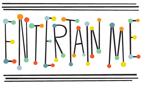
Entertain Me Typography
When all the deadlines are delivered and it is Friday afternoon, the best wind down for a week is sometimes to make some off-the-cuff typography. This time around it was some 50’s circus retro broadway billboard type screaming…
Well Vegan Illustrations + Site Update
I’ve enjoyed working on the Well Vegan brand over the years, starting with their initial logo and branding and continuing with an eBook cover, promo materials, and a series of DIY postcards (here, here, here, and here).
Our latest collaboration was to update their website based on user analysis to increase sign-up and promote their new eBook Starter Guide. To do this we streamlined the front page with a large either/or graphic focusing on the plan and the book.
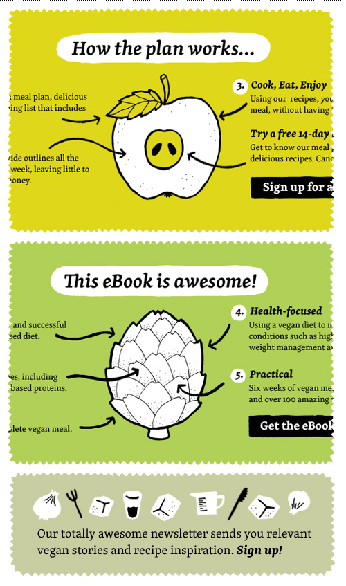
The Plan and The Starter Guide got their own secondary pages that had more in-depth information that was previously outlined on the homepage. And all that new content was a great excuse to create more small plates!
The homepage was also adjusted below the fold to highlight the resources section and recipes section, and make the all of the content more scannable. Four resource icons were made for this.
Even though I’m not a vegan, vegetarian, or any other label of imbiber other than equal opportunist, I enjoy getting their weekly newsletter of recipes – always handy when veggie-only friends visit. If you need a hit of cooking inspiration, just visit their extensive library of home-tested recipes.