F is for Fusion
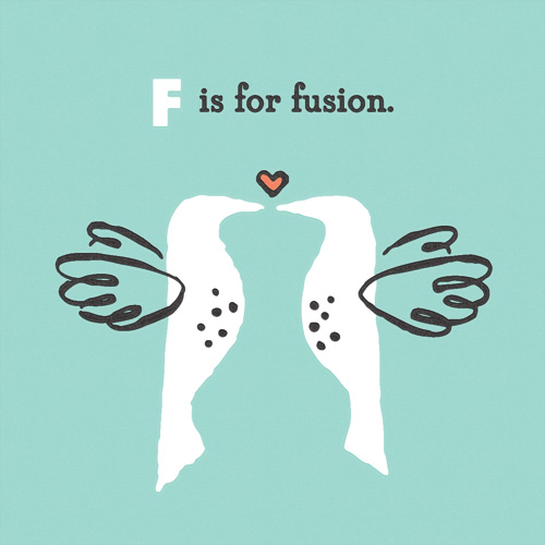
“F is for Fusion” is part of an on-going alphabet series for kids using math, science and geography vocabulary. Have an idea for a good word? Send it my way!
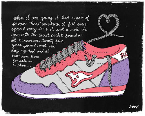
I Heart My Roos
When I was young I had a pair of prized “Roos” sneakers. I felt very special every time I put a note or coin into the secret pocket found on all Kangaroos. Twenty-five years passed, and one day my dad and I saw some Roos for sale in a shop…
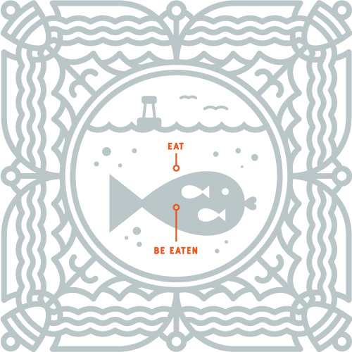
Fish Explains the Facts of Life
As a sequel to Penguin Explains the Universe, here is a little ditty about the bare reality of life at sea (or land or air). So when Monday comes and slaps you upside the face, don’t say fish didn’t warn you.
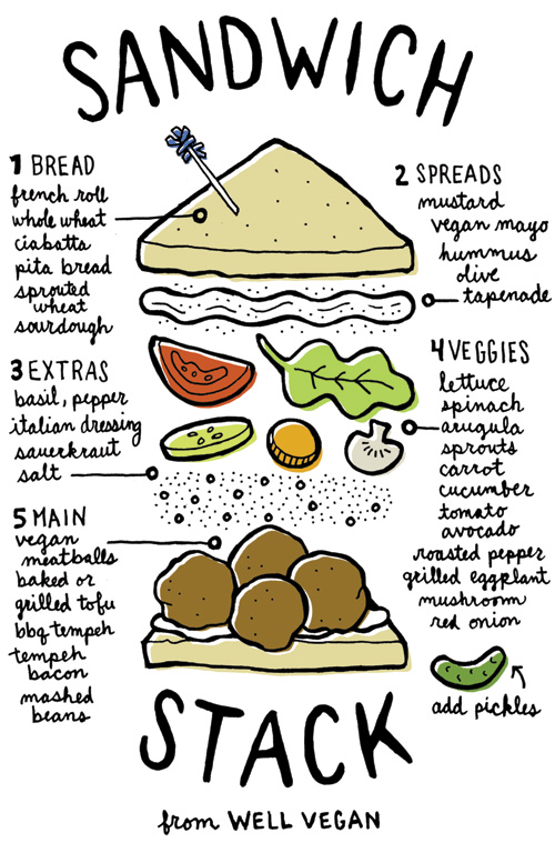
Well Vegan Sandwich Stack
This handy slip of fridge door inspiration is part of a series that so far includes how to make a salad in a jar and mix and match ingredients for a perfect smoothie. For a more detailed report on becoming an expert sandwich stacker, read further on Well Vegan’s blog.
Me and My Pioneer Rabbit, Taking a Turn in the Tumbler
Scoop Love Branding
Just in time for the end of summer, here comes another ice cream project (I hear the first project, Gelato by Naia, is available at Zupan’s on Belmont – after tasting 6 flavors I can guarantee they are delicious)!
This gig was for a small home-grown ice cream vendor from Charleston, South Carolina, who works under the name Scoop Love. More grassroots than most, the ice cream is only available at the local farmer’s market with scoops being served from a small ice cream cart.
Inspired by the 50s ice cream culture and parlor style, the branding is as simple as possible in a throwback analog way. Most items are 2 colors and the use of elements is repetitive and straight forward. The entire system relies on only an iconic waffle cone pattern, a circle, and a heart here and there.
Continue reading “Scoop Love Branding”
More Icebreakers Book Illustrations
Here are more illustrations for the Icebreakers book I’ve posted about previously here and here. The illustration style was a new one for me, catering to the client’s need for a large quantity of illustrations that were unique for a small budget. Drawing people can be time consuming, but in this case we substituted the painstaking details such as faces, hands and feet for colors and patterns on bendy-bodies that were easy to contort into many shapes without needing to be realistic.
I enjoyed the challenge of this and the project limitations giving way to something I normally wouldn’t try at first glance. The result was a very easy and functional way of drawing characters in an endless variety of personalities.
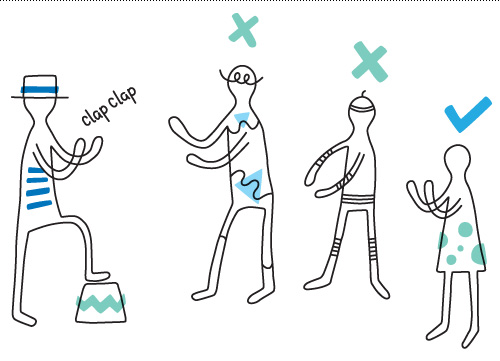
Another part of this project was creating vocal symbols that, for the most part, weren’t based in a specific language, since Postyr Project travels all over the world with their a cappella group. The spirals, crosses, dots and hash marks serve their pictographic purpose well, and remind me of the difficulty of pronouncing something your tongue is not used to twisting. For example when anybody Danish tries out the word squirrel – it might as well be a squiggly line in a speech bubble. Don’t worry Danes, we can’t say “rød grød med fløde” so I think we’re even.
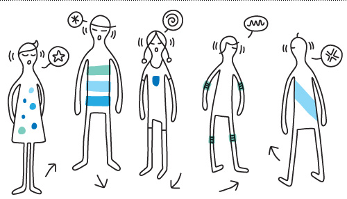
The first edition of the book is just about sold out, but you can see the authors’ website here for future editions: www.breaktheice.dk.
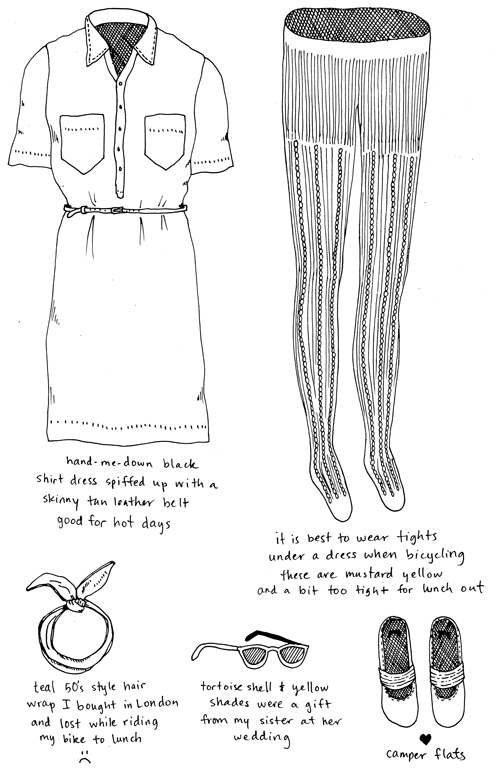
Outfit No. 62
G is for Gravity
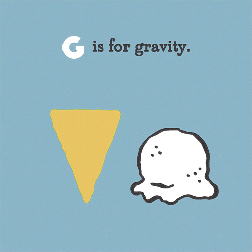
“G is for Gravity” is part of an on-going alphabet series for kids using math, science and geography vocabulary. Have an idea for a good word? Send it my way!