Shortcut
In the shared creative office space where I work, there is an old freight elevator in the middle of the room. It is surrounded by 30-foot peaked ceilings, raw ceiling beams, a view into an inner-courtyard typical of Copenhagen buildings, and all the stark and minimalistic Danish interior decorating trappings such as black and white lights, decor and social areas.
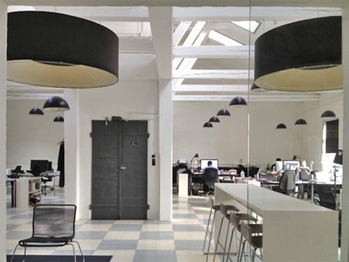
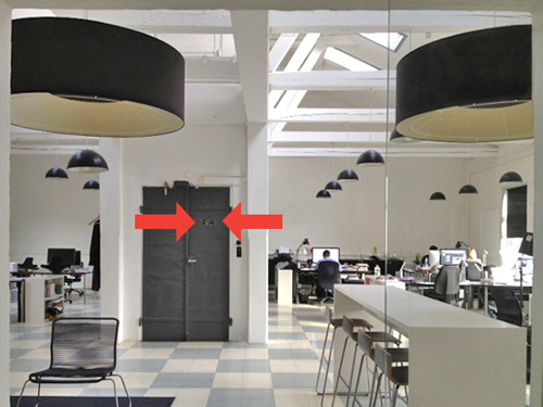
The elevator isn’t used more than once in a blue moon to haul something heavy up to the top floor – I don’t think anybody really notices it. But when I enter the light-filled room and near the elevator door on the the way to my desk each day I’m presented with this small sign, which for a second causes me pause.
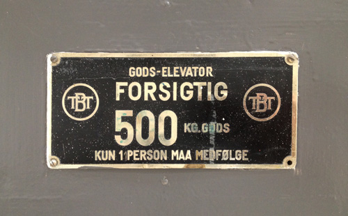
In Danish, it’s nothing special – a “goods elevator”. But in Danglish, a special blend of Danish and English which I use to navigate my multi-culti existence, this is GOD’S ELEVATOR. The full Danglish translation might read:
God’s Elevator
CAUTION
500 kg Gods
Only 1 person may accompany
Gather round all you sinners, all you thieves – I’m starting a new side business selling tickets to heaven. More details to follow once I figure out the logistics. But if I institute a price point that one might expect on such a service, I should be able to retire early.
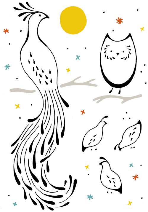
A Peacock, an Owl, some Quail
Here are a few more animals in the teardrop style I am practicing – this time all birds. Check out the first sketches of a porcupine, skunk and bunny. I’m curious to see how universally I can apply this style.
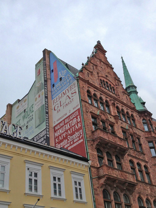
Malmø Sweden Facades
Changing of the Guard
Living in Copenhagen means that you own a bike, and that bike is like an extension of your body. The idea of driving through the city doesn’t even register as an option because it is much faster to cycle. Not only that, but the act of riding a bike makes you feel free as a bird.
Indeed, my current city of residence is the origination of the super cool Copenhagen Parts magnetic bike light and bike porter, a myriad of bike paths along with proper a PDF usage guide, and the mayor is the main sponsor behind the Copenhagen Wheel. Bikes rule the road and rightly so.
However, it is also a metropolitan area so frequently bikes go missing. So often, in fact, that the process to log a stolen bike and get insurance money for a new one is just a few clicks on your local county website. Because a Dane without a bike is like an American without a car – a panic stricken mess of transportation worry. How will I get to the bakery/pub/mini-mart 3 blocks from my house WITHOUT MY BICYCLE? It’s a relationship of dependency and affection.
It is with that affection that I have always given my bikes names. My first real two-wheeler was a saucy crimson piece dubbed the Red Rocket. Later my sister named her yellow cruiser Daisy, while I gave my gold city bike the more human moniker Olsen and the following black mountain bike was named Jack. If only my bikes would come when called, I might not have to write this blog post.
Which brings us to my most recent trusty steeds. Over the past year, both my partner and I have had our bicycles stolen from right under our noses in front of our apartment building, arriving at a depressingly empty bike rack spot to find…nothing. But even though our bikes might not have lasted long, they deserve a sort of remembrance in the form of these custom winged bike logos. Dear dear departed.
2012 Bike Line-up
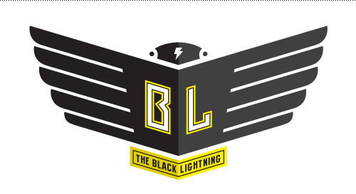
The Black Lightning was a cheap city bike with straight handlebars and a funky sound when you changed gears, and not particularly comfortable to ride on due to a narrow hard seat. I’m not sure what precipitated its purchase, but in retrospect it wasn’t a big loss since its successor, The Green Falcon, was superior in all aspects.
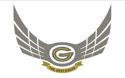
Conversely, The Gray Goose was a miracle of efficiency with just the right number of gears (7), a nice neutral color that hid dirt like a charm, and a basket on both the front AND back. This bike could transport 24 beers or an entire ingredient list for making 100 glasses of lemonade. It was a true workhorse and is still missed during large trips to the grocery store.
2014 Bike Line-up
The Green Falcon is a classic Van der Falk “grandpa bike” in forest green. Any rider is forced into an upright, stately position that makes passer by notice the dapper nature of the cyclist. Unfortunately it is not tricked out with any sort of baskets (that would be unmanly) and occasionally has a faulty back light, but all-in-all is a much better ride than its predecessor, The Black Lightning.
Bought approximately 2 hours after the discovery of the missing Gray Goose (when you need to get somewhere, you need to GET THERE), The Sage Stealth is also a Van der Falk in the women’s model with a step-through frame and an added aluminum (rust free!) front basket. Unfortunately, after a few months on the road the identifier “stealth” no longer applies, as the front brake has a tendency to get stuck and make an irritating squeaky noise.
There you have it – my household’s last few years of bike ownership. If you had to make a logo for your bike, what would it look like?
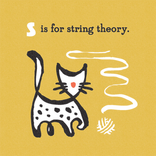
S is for String Theory
The second panel in my new side project “A Very Brainy Alphabet”. Adults explaining this to kids, or kids explaining this to adults – I think the results might be equally entertaining.
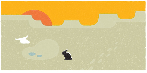
Me and My Pioneer Rabbit, High Desert Survivors?
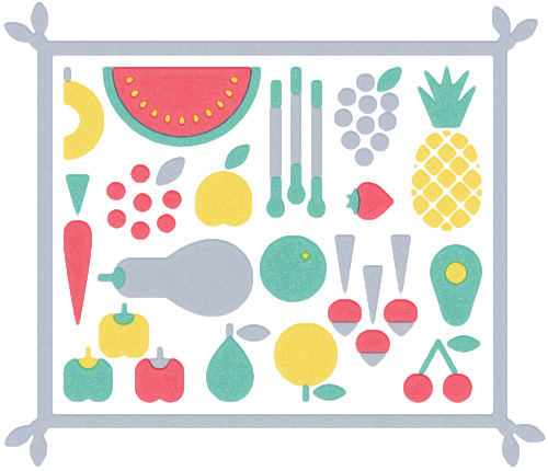
Veggie Picnic
I’m an omnivore – if it tastes good, yes please. But for some reason I am surrounded by herbivores (also known as vegetarians), and even further along on the scale of consumers, vegans. It makes eating together with friends and family a game of mix and match.
Meat, no meat? Dairy, no dairy? Beer that might possibly have touched a fish scale in the process of being made, or beer that has not? And then there are the people who only eat popcorn.
Being surrounded by such a diverse group of eaters definitely makes you think twice about the menu, especially when you arrive for a Danish Christmas dinner with 7 courses of meat topped off with a dairy laden dessert. It isn’t easy being a green-lover sometimes. So for all of those who are, here is a veggie picnic.
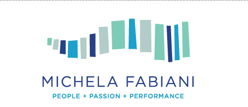
Logo for Michela Fabiani Coaching
Here is a small logo project I made for an acquaintance, Michela Fabiani, who recently made a career transition into business and life coaching. Based on client provided themes, the final logo is an abstract stair stepped path symbolizing the road her clients travel to reach new heights. The color scheme was inspired by her sunny and coastal homeland, Costa Smeralda in Sardinia, Italy.
Client website: www.michelafabiani.dk
C is for Cloning
One type of personal side-project I really enjoy working on are series. They are meditative, and you only have to start with an idea to get going. The complexity and depth of the series can be decided over time, and hopefully as the subject gets revisited it comes into focus.
A new series I’ve started is called (as of now) “A Very Brainy Alphabet”. It combines the usual visual suspects of a children’s alphabet series with brainy words that twist it a bit. The first word ready for you to take home and have a discussion with the kiddos about is…cloning.
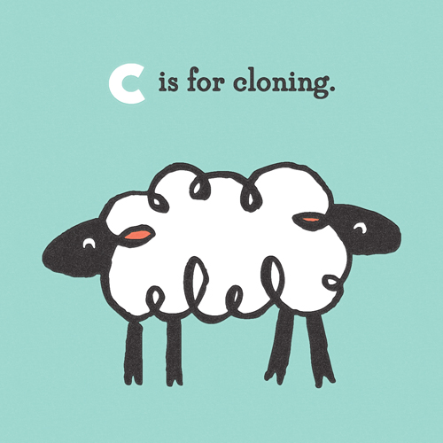
I can already tell this series will be a challenge, striking the right balance between an interesting brainy word that can also be interpreted without being too dry or literal. Stay tuned to see how it goes!