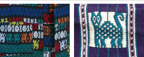
Sometimes a client has a really clear idea of they want. When this is communicated upfront, it can be a great thing – focusing the design efforts of a project in the right direction or providing a starting point to finding a good solution. This was the case on a logo made for Guatemala Fairtrade.
After returning from a long stay abroad in Guatemala and connecting with Maya Traditions Foundation, Ditte Tøfting-Kristiansen was ready to start her own business selling fair-trade Guatemalan products in Denmark. She knew that she wanted the logo to reflect the handmade nature of the products and connect with the town she stayed in, which used a cat as their local embroidery symbol.
Using the client-provided inspiration gave plenty of options within a framework to come up with an embroidered cat icon and hand lettered brush type as the logo. Below are two images to show a great example of visual ‘input’ and ‘output’.
Client-provided inspiration for local Guatemalan cat icon and embroidery.Guatemala Fairtrade logo series in tag format.
Guatemala Fairtrade currently is on Facebook and has an online shop selling scarves, shoes, bags and other fairtrade items.
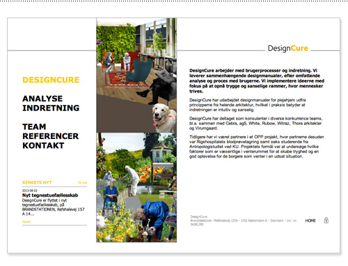
Recently I worked on a fun redesign project for two interior space designers who wanted their logo and website revamped. While logo redesigns aren’t always about doing something new and crazy, it’s a good design challenge to keep enough of the existing logo around for client recognition while updating it to something new and better.
Left: before – Right: after, with additional signature icon and DC pattern.
One of the design goals for their new website was to combine Danish simplicity with an organic, textural and hand-drawn feel. To accomplish this the structure of the site was kept simple with utilitarian fonts and text formatting, which allowed the few color pops and hand-drawn elements stand out but not overwhelm the simplicity.
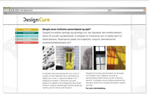
Old DesignCure website design.New DesignCure website design.
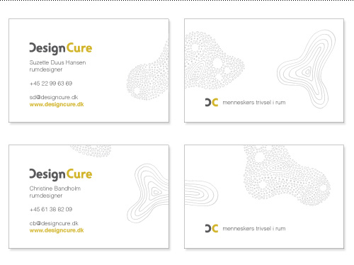
The patterned shapes were also used on the business cards to support the tagline and DesignCure’s thinking that space is organic and evolving, not structured and rigid, and even institutional spaces can be designed to feel at home in.
Business cards with variable organic shapes wrapping around the card. Tagline translates roughly to “peoples’ well-being in space”.
The amount of content on the site was minimal, so we opted for an all-on-one page design to make it easy to get to everything. The site was built in WordPress to allow for easy client updates. You can see an expanded view of the site design below, or visit the DesignCure website here. Big thanks to Refresh Media and Jip Jip for working together across continents to make the technical part of this site happen.
Between designing websites and branding and packaging and logos and books oh my, sometimes it’s nice to take a meditative break and work on some hand drawn typography. This session used one of my favorite Beatle’s quotes from the song The End to practice my script type lettering skills – “and in the end, the love you take is equal to the love you make”. It took four tracing iterations to figure out layout, script details and inking…
Many moons ago I ventured to Pendleton, Oregon for the annual Round-Up. Growing up in Central Oregon I had gone to a few local rodeos and fairs, but the Pendleton Round-Up is the BIG TIME, so there was some preparatory work to do. First off, I dug up all my childhood photo albums to relive my days as a young girl obsessed with horses. Want me to name every anatomical point of an equine? Naw, didn’t think so.
Then, I pulled up the top hits of country music from the mid-90s so I could make a playlist worthy of the 3 1/2 hour drive to Pendleton. Despite the wrinkled expressions of displeasure that I received from my car-mates, I stand by this as a totally rocking road trip mix that I dubbed “Pendleton Cheese”.
There are a lot of requirements for being a bona fide cowboy, and during our short time in Pendleton we tried to experience as many as possible. One night, Michael checked ‘being a hipster badass’ off his to-do list by being the first in the room to hop on the mechanical bull.
I knew it would be tough to look legit in a town that would certainly realize I was city folk, but anyone can aspire to be a real cowboy, and my research turned up a few nuggets of pure western gold.
A real cowboy knows how to crease a hat.A cowboy always looks cool, even leaning up against a trash can. Photo by Robert Frank.Have horse, will travel.
The Pendleton Round-Up is one of the largest rodeos in the US and dubbed the “fastest moving rodeo” because of the extreme organization of the back-to-back events. No sooner had the last bronc rider been bucked off and it was on to the next competition. One of the most exciting events was the Indian Relay Race. Those original Americans sure know how to ride.
Even the cowboys are impressed.
Another fun part of visiting Pendleton was taking a tour of the underground tunnels and the brothels. Cowboys live a hard life, and they gotta have fun sometimes. I suppose that’s why some girls go wrong.
While my friends and I didn’t necessarily go wrong, it sure was a weekend to remember: whiskey drinking, rough riding, dust in your face fun. While we might not have passed muster as a true tough-as-nails cowboys, we definitely won the belt buckle for having a good time, encapsulated perfectly in these lyrics from Garth Brooks “Rodeo”. Now, where do I find a belt sturdy enough to hold up my pelvis-plaque of honor?
Well it’s bulls and blood, it’s dust and mud, it’s the roar of a Sunday crowd…
It’s the white in his knuckles, the gold in the buckle, he’ll win the next go ’round…
It’s boots and chaps, it’s cowboy hats, it’s spurs and latigo…
It’s the ropes and the reins, and the joy and the pain, and they call the thing…
RODEO.
Almost all of the projects posted on the Bureau blog are real, live, produced projects. Hardly ever do I post a speculative project, and if something is made for personal gratification it is duly noted. Along with posting nearly 100% original content, transparency was one of my goals when starting a blog – showing what I made for fun, what I made for money, and how I got there.
To me, is important to show design that has been through the filter of client feedback, changing project needs, production specifications, budget requirements, and multiple rounds of design. So much of design is what happens between the initial idea and the end result. But a part of the job of being a designer is also getting things killed, which I’d also like to share.
A recent project for Umpqua Bank didn’t make it through a budget shift, but I am proud of the result and got permission to show some work that would otherwise never see the light of day. The project was to create a promotional sticker for a video with the title “Fall in Love”. A love parachute was drawn with Umpqua’s blue color palette, the cloud shape subtly alluding to the clouds used in their branding. The sticker evolved from a detailed illustration to a more simple line drawn design. Produced or not, the message is positive and I’m happy I got the chance to work on it.
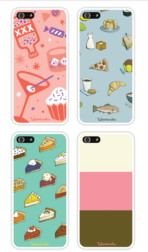
My partner in dining crime (including but not limited to: root beer taste testing, Tour de Nacho, Danish Julefrokost, and juicer extraordinaire), writer Jen Stevenson has recently launched the next step in her march towards world domination via culinary storytelling by creating the website Wordcake.
On Wordcake you can buy exhaustingly comprehensive and entertaining eating e-guides for select cities, get the book 100 Best Places to Stuff Your Faces in Portland, and protect your iPhone against food foibles with custom cases. If you’ve ever dropped your phone into a chocolate cake, you’ll know the importance of protecting it. Here are the first four designs created for Wordcake’s new line of products.
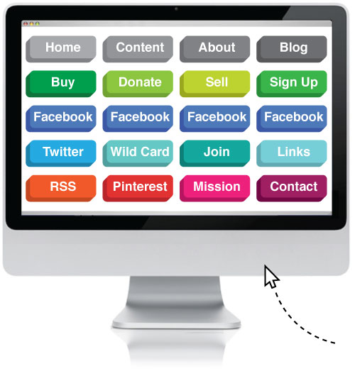
You’ll never need to make another wireframe, flow chart, content plan or other such things. That’s right, I have made an all-purpose plug-and-play website design. Merely show it to your client, see which buttons they attempt to push on the printed example, and include those in the design. If you need more Facebook, add Facebook buttons. If users are still confused about how to get back to the ‘homepage’, add another home button. There is even a wildcard slot in case I’ve forgotten something.
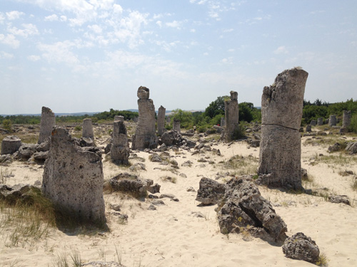
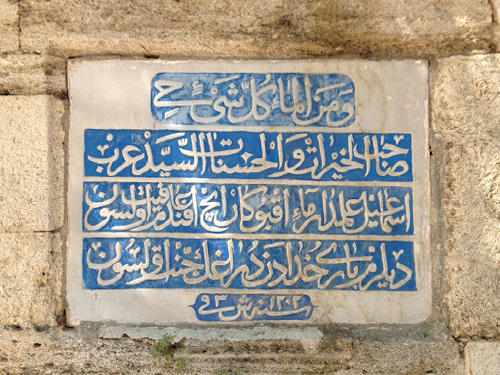
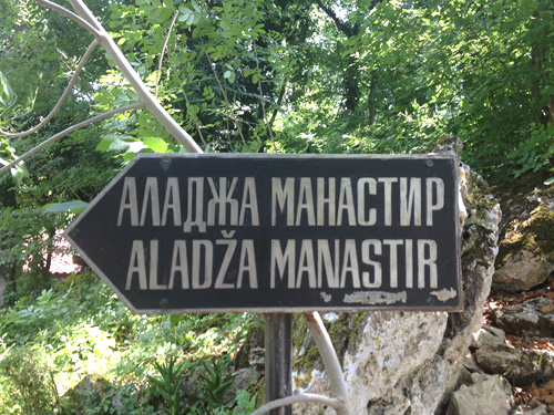
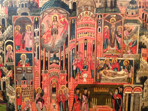
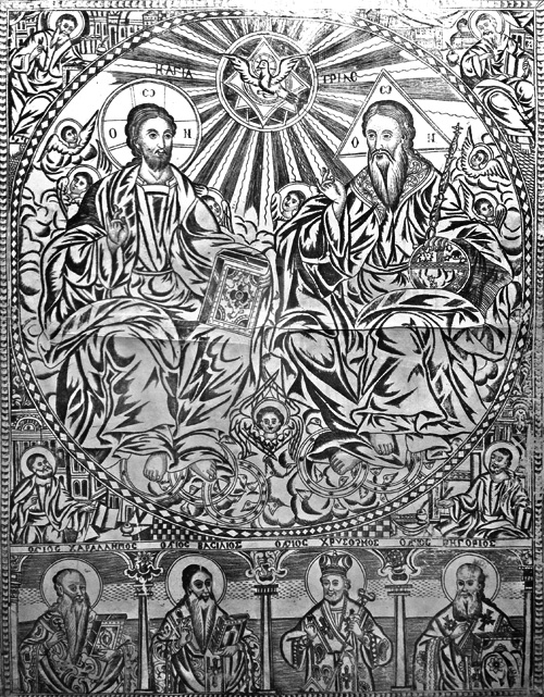
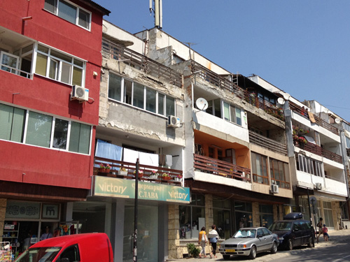
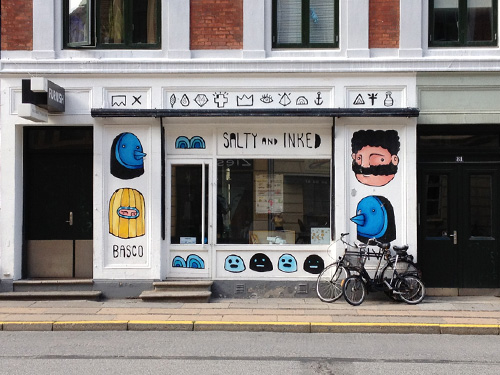
“Petrified forest” in Bulgaria.Text on a fountain in Bulgaria.Monastery that way.Artwork from a monastery in Bulgaria.Artwork from a monastery in Bulgaria.Apartments in Balchik, Bulgaria.Home again, artwork on my office space in Copenhagen.