Guard Animal Signs
It doesn’t take much to entertain me, so frequently the people closest to me are rewarded with my extra, ahem, ideas. So this is how I ended up making silly Guard Animal signs and posting them on the internet…
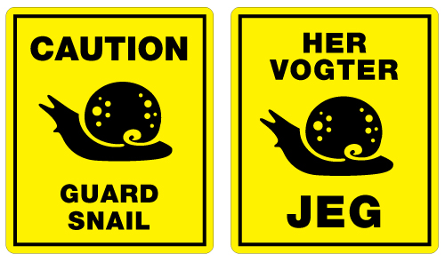
One night at dinner, some friends and I focused our conversation on a small bronze snail figurine placed between the salt and pepper shakers and the butter jar. One friend picked it up, noting its heft and pointy feelers. Another friend commented on its hidden abilities to bring an intruder to their knees if used correctly. “We should have a guard snail sign, and we should name him after Emil!” exclaimed another table member, referring to the most amicable of us in the group. DONE and DONE.
You don’t have to tell me twice to make a Guard Snail sign. At the slightest urging I’ll scuttle off and make a whole series of the most terrifying and life-threatening guard creatures ever!
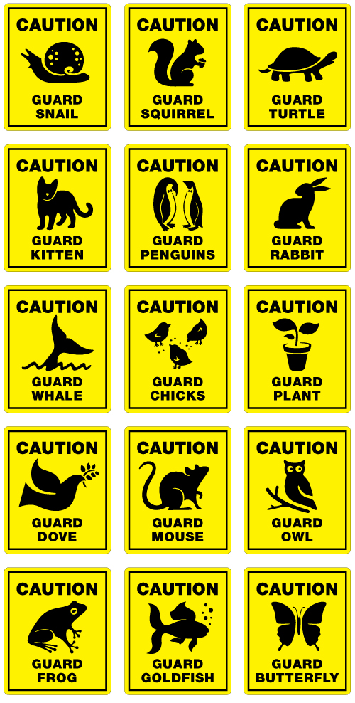
Post the Guard Squirrel on your front door and acorn thiefs will hightail it lickity split. Place the Guard Goldfish on your water closet door and no guest will ever dare leave the room smelling of other than dewdrops and roses. Put the Guard Kitten in your wallet amongst your family photos and pickpockets will walk your pilfered money sleeve to the nearest precinct. GUARANTEED.
All of these Guard Animals are available for download and personal printing in the following PDF files. Each PDF contains all Guard Animals, so find your selected weapon, print the appropriate page and cut out your sign. The signs are smallish, the the impact is large.
– Download English “Guard Animal” signs
– Download Dansk “Her Vogter Jeg” skilte
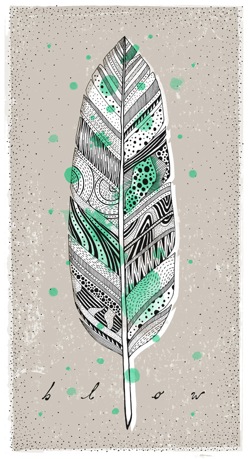
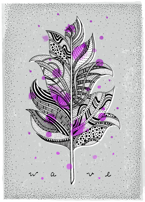
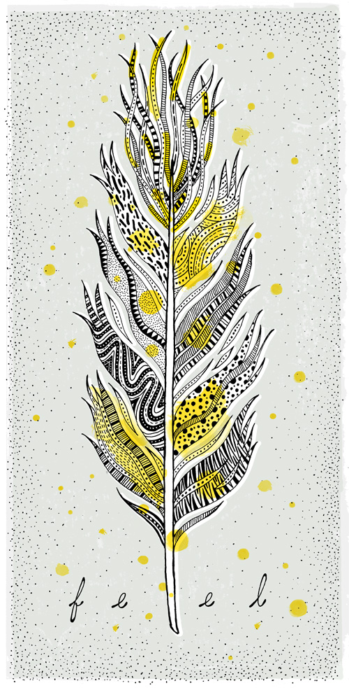
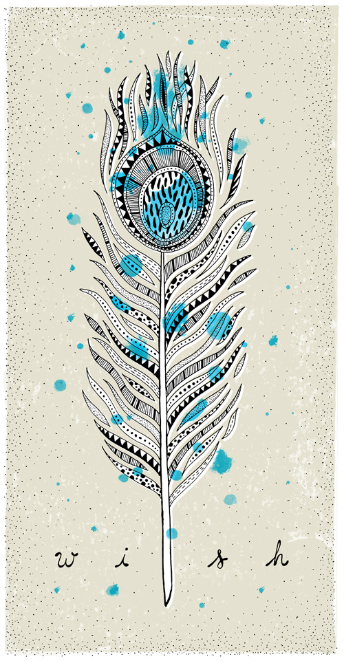
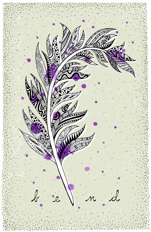
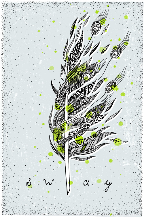
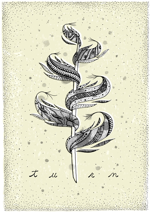
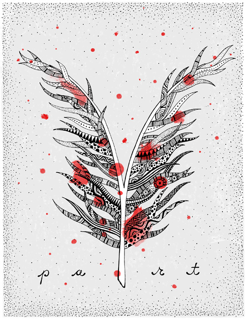
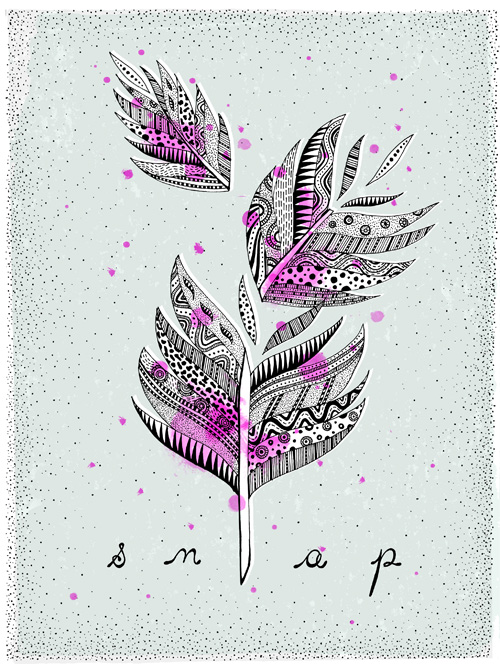
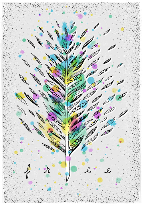
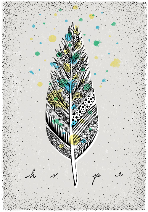
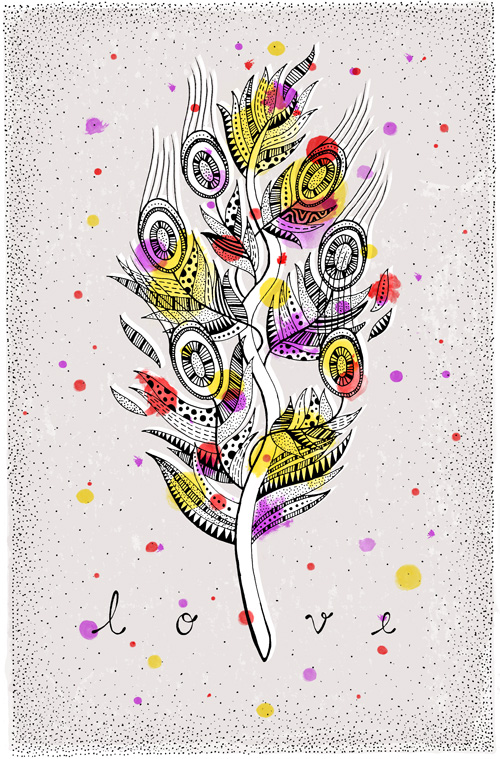
Quill Feather Illustration Series
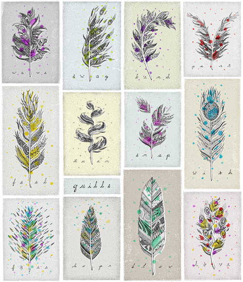
The past year has been one of words. After moving from Portland, Oregon to Copenhagen, Denmark in 2012 I was surrounded by NEW. How do you describe what is happening? What do you say to people when they ask you inanely expected or intensely personal questions? How do you document the experiment of experiencing so many new things, you can barely keep up? Which ideas survive translation, which fail? Words can be wonderfully specific or frustratingly vague, and vice versa.
The past year was spent doing quite a bit of correspondence writing. On Facebook, in emails and postcards home (yes, the kind you send in the mail), with newfound pen pals…even sending letters in a bottle. And, writing single words accompanied by a feather.
The past year resulted in twelve illustrations of quill pens, the old fashioned way of writing your thoughts. Ink and time define what you can lay on a page, extraneous thoughts are omitted in favor of measured words, exactly the ones you want to use.
Light as a Feather
To and Fro
It Tickles
Dream Maker
Coming Around
Heave Ho
Twist and Shout
Splitting Hairs
Crackle and Pop
As A Bird
Double Edged
And In The End…
And In The End…
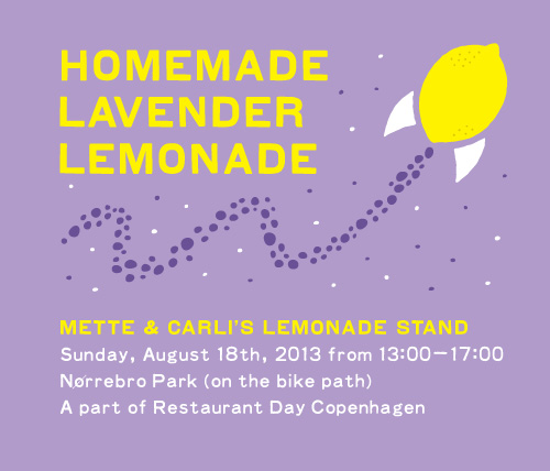
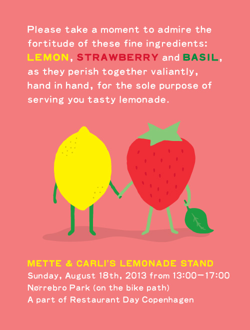
Mette and Carli’s Lemonade Stand
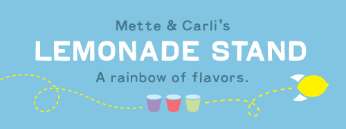
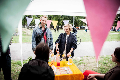
Recently my design friend Carli and I embarked upon a large side project together – making a lemonade stand for Restaurant Day, an event where anybody can make a pop-up restaurant for a day.
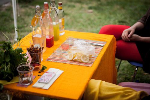
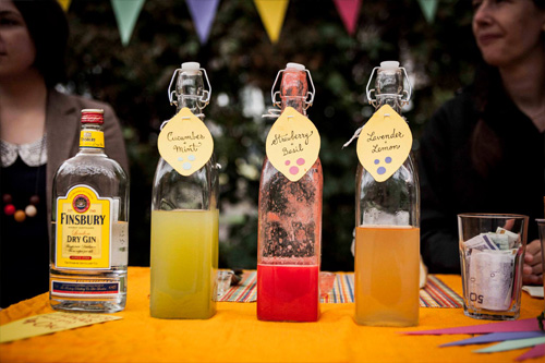
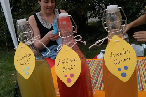
We hand-mixed three exotic flavors, created a booth with bunting and handmade signage, and even made a promotional video for our endeavor. Click here see recipes and photos from our lemonade stand adventure.
Mette and Carli's Lemonade Stand

Recently my design friend Carli and I embarked upon a large side project together – making a lemonade stand for Restaurant Day, an event where anybody can make a pop-up restaurant for a day.
We hand-mixed three exotic flavors, created a booth with bunting and handmade signage, and even made a promotional video for our endeavor. Click here see recipes and photos from our lemonade stand adventure.
Lemonade Stand for Restaurant Day
Four times a year Restaurant Day occurs around the world, where anybody can create a pop-up restaurant for a day. In Copenhagen usually 30 or so teams participate, resulting in a plethora of interesting food options for the day which you can find via a handy app.
In March of 2013, my Australian design friend Carli, her husband Wouter and I toured the booths of Restaurant Day Copenhagen. We drank koldskål on Queen Louises Bridge, tried champagne sorbet in a Nørrebro courtyard, and had a 3-course meal on the street near St. Hans Square accompanied by a Cuban band.
We had a fantastic time and vowed to participate with our own booth at the next Restaurant Day. Our contribution would be…A LEMONADE STAND.
The Lemon Rocket Video
Like any over-eager adult purveyors of handcrafted lemonade, we made a short video promoting our Lemonade Stand. If you’ve ever wondered how lemonade was made, this video reveals all. Thanks to the team at Jip Jip for animation and Matthew Matthew for the music clip.
Three Recipes
Carli and I perfected our homemade lemonade syrups to taste just so. We even employed the help of a small team of taste testers from Holland (Wouter & Family) to give us feedback on our initial recipes.
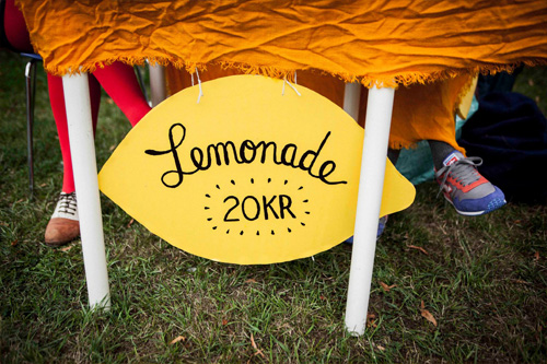
Each flavor was sold for 20kr (about $3.50) with an special upgrade to a “Grandpa’s Lemonade” (hint: add gin) for 40kr. We also shared the recipes with visitors so they could make their own homemade lemonade.
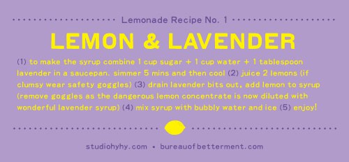
Lemon & Lavender
– in a saucepan: 1 part sugar + 1 part water + 1 tablespoon lavender
– simmer 5 mins and then cool
– juice 2 lemons
– drain lavender bits out, add lemon to make syrup
– mix syrup (approx a shot glass, or to taste) with a cup of bubbly water, lemon slice and ice
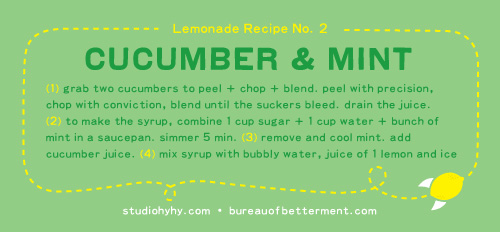
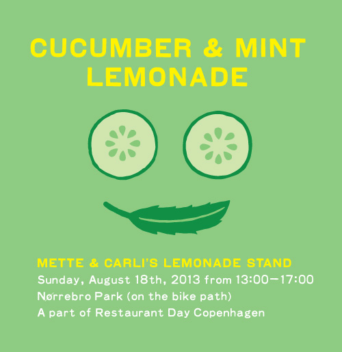
Cucumber & Mint
– two cucumbers: peel + chop + blend
– drain juice
– in a saucepan: 1 part sugar + 1 part water + bunch of mint
– simmer 5 min. remove mint. cool. add cucumber juice to make syrup.
– mix syrup (approx a shot glass, or to taste) with a cup of bubbly water, lemon slice and ice (garnish with mint)
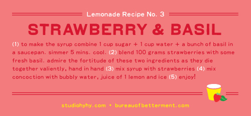
Strawberry & Basil
– in a saucepan: 1 part sugar + 1 part water + bunch of basil
– simmer 5 mins and then cool
– blend 100 grams strawberries with some fresh basil
– mix liquid with strawberries to make syrup
– mix syrup (approx a shot glass, or to taste) with a cup of bubbly water, lemon slice and ice (garnish with basic and strawberry slice)
Spreading the Word
Of course we made a Facebook event to attract customers and posted vigorously about our preparations and product offerings. At one point, an attendee commented “I get the point, I’m COMING to your Lemonade Stand!”. YAY!
We were as excited as two kids on the first day of school, and the day of reckoning was drawing nearer.
Our Lemonade Stand
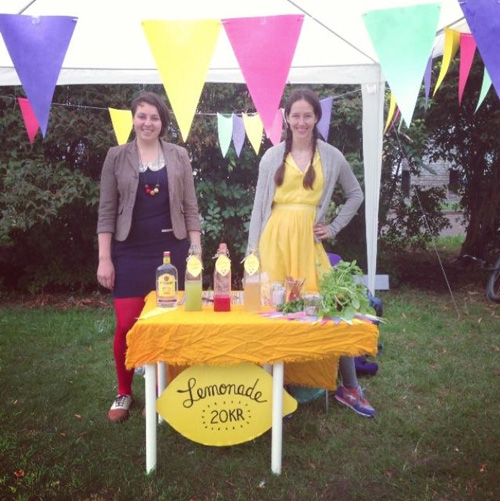
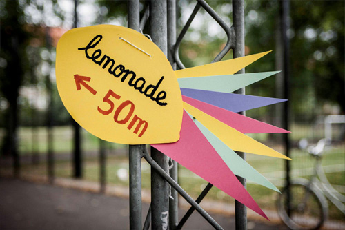
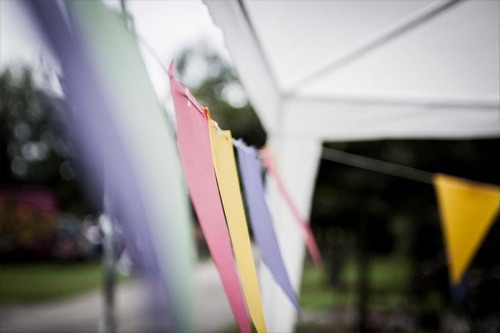
Carli and I spent hours hand painting directional lemon signage and making Pantone perfect bunting to decorate our tent. We had everything planned to a T…except the weather. Be warned future lemonade stand entrepreneurs! If there is anything that will foil your plans on a successful business model it will be BAD WEATHER.
On the day of the big event it was windy and rainy and not at all conducive to selling lemonade. A follow up project to this one could be writing the guide “How to Sell Lemonade in Inclement Weather” with the following chapter outline:
1. Don’t
2. Weather to Attendance Ratios
3. Upping Sales with Alcohol Add-Ons
4. Wind Resistant Tent Solutions
5. Frostbite Avoidance & Ice Cube Handling
6. What to do when Drunk People Request Freebies, and When Denied, Pee in the Bushes Nearby
7. If You Survive
But, our main goal was to have fun, which we accomplished in spades. We surprised customers with our unorthodox lemonade flavors, we visited with the local Jehovah Witnesses who took shelter from the rain under our stand, and we had enough leftovers to give private lemonade tastings to friends, family and co-workers.
Next up: Restaurant Day Fall 2013 (if I can convince Carli to repeat the madness…)
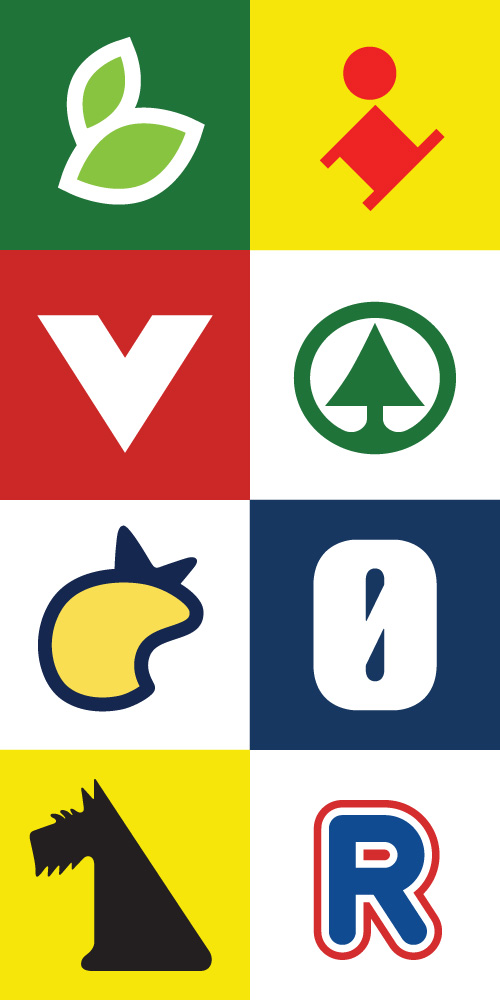
Danish Supermarket Reductive
There is a giant plastic bag culture in Denmark stemming from people recycling what they consider the “expensive expenditure” of buying supermarket bags. Bags are used again and again, not only for groceries but to freight clothes and other items from A to B, to cover bicycle seats from the elements, and even as poor-man’s galoshes on a rainy day. I’ve seen a grown and respectable business man arrive to the office with a Netto bag on one foot, and a Rema 1000 bag on the other. His fine leather shoes were spic and span – no shame in bagging your feet.
These bags, and their graphic designs, are ubiquitous, so I thought I would try and distill the various supermarket logos into their simplest but still recognizable form. Can you guess all eight?
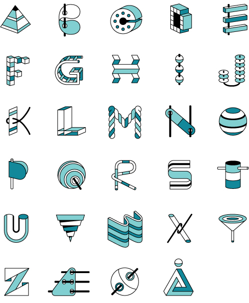
3D Alphabet
The goal of this personal project, with a self imposed deadline of completing it in a single day, was to create an alphabet where each letter had a 3D property without too many repeating elements. With a little lunchtime feedback from Jip Jip (no, I cannot make the N look like a CAT…not even a POINTY cat), the finish line was reached with fairly good results.
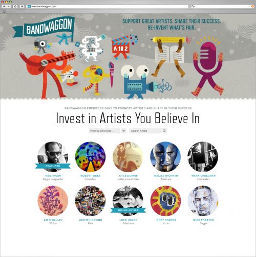
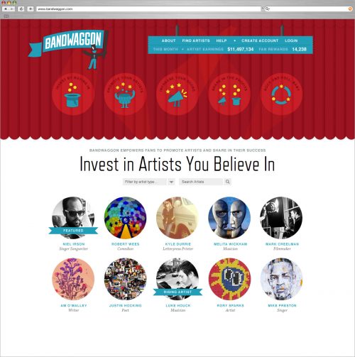
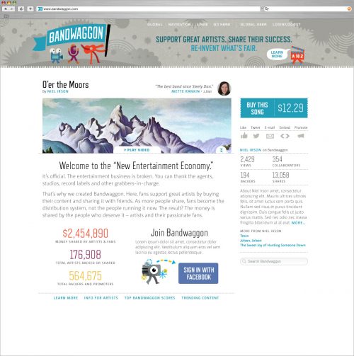
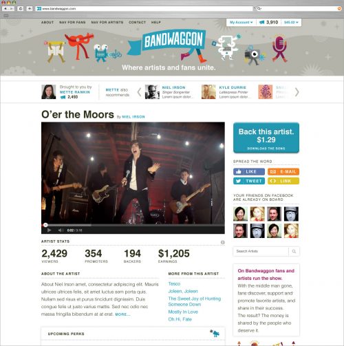
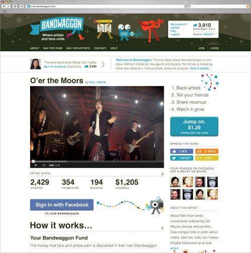
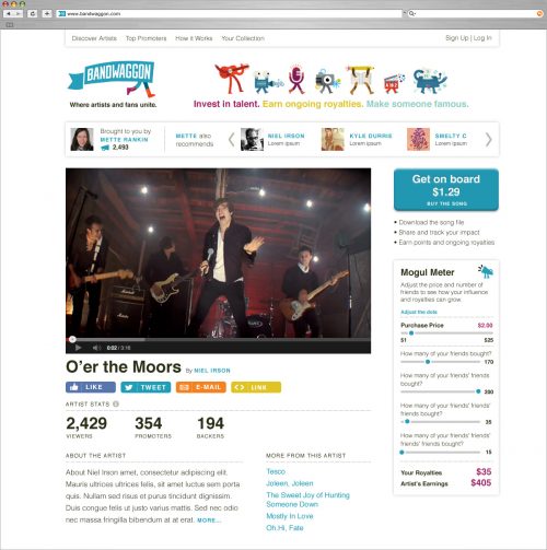
Bandwaggon Branding
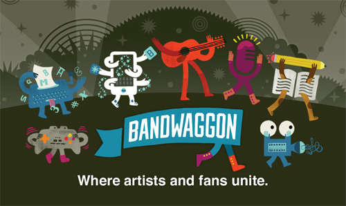
For the past 6 months I have been working on a very exciting project for a group of entrepreneurs who want to change the art and music economy. Frequently, only a few artists “make it” only to have a large part of their profits go to a label or agent. How to make a system that is more balanced? Enter the team at Bandwaggon.
Bandwaggon aims to make the process more fair by connecting fans directly with artists and letting fans helps artists succeed by sharing and promoting their work. In exchange, fans get a share of the profits – but only to a certain point; the artists always takes home the bulk of the profits. A direct artist-to-fan relationship, where they work together without the top 1% fleecing the socks off of everyone…sounds nice.
Logo
The essence of the Bandwaggon logo was found fairly early in a flag icon that leads everyone towards this new entertainment economy. Many rounds followed exploring the flag shape, how it was carried, and who was the bearer and a balance between being professional and non-slick. Ultimately the flag was brought in-line with the characters (below) as a banner with legs – no extra figure was needed to communicate that you should come along.
Characters + Icons
A series of characters were developed in the initial stages of the website to add personality and show that artists from all walks were included under the Bandwaggon flag. These characters were finalized far before the logo, which helped inspire the final logo.
A guitar rocking with its tongue out, an over communicative film strip, a clown using itself for entertainment, a book combating writer’s block, and a typewriter tripping on letters are just a few of the colorful cast of Bandwaggon. These characters are used throughout the site and other materials to emphasize that the magic comes from the artists and their wonderfully varying personalities.
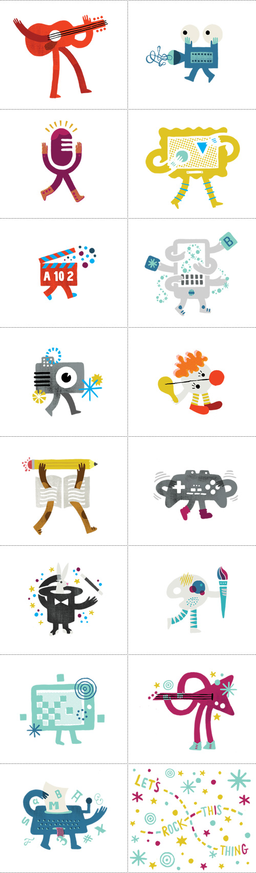
Additional icons were created to accompany text explaining in detail the process of how Bandwaggon works, as well as to draw attention to specific areas users should take action (megaphone).
Website
The website for Bandwaggon was a very fluid process compared to the “step 1-2-3 and it’s done” process. Since the development team was building in steps and the messaging was constantly evolving, the design also had to morph in response to new priorities and technology requests. Below is a range of excerpts from the site designs that were created along the way.
Please note all site images are mock-ups with fake content. Website is in beta testing so still in progress.
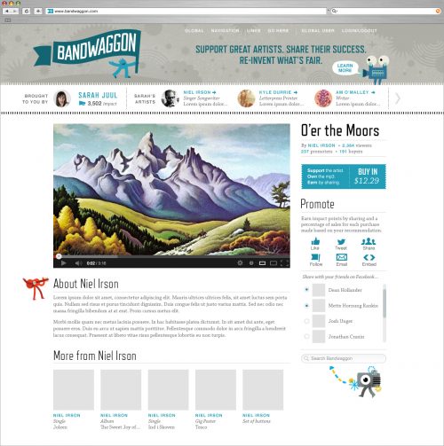
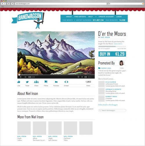
Bandwaggon is in beta-testing, so visit their and login if you’d like to help out in the early stages of their site.