Three Bird Mobile


When Brittany Watson Jepsen of The House that Lars Built asked me to contribute to her 24 days of Christmas blog series about holiday decorations, I took the opportunity to work in a new format I’d been wanting to try – mobiles. My inspiration came from a small felt bird I have placed above my doorway that my mom sewed for me when I was a baby.
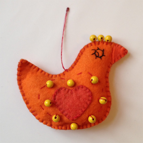
Thanks Mom!

For the simplest mobile possible, forget about balancing acts and bars and doing pseudo-math (or even real math). Just hang three things in a row with a string between them – they still spin gracefully and take up much less space than a traditional mobile.

Step 1
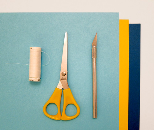
The materials you need are cheap and easy to get: thread, a needle, scissors (and an X-acto if you want to be crafty), and thick colored craft paper.
Continue reading “Three Bird Mobile”

Glider Logo


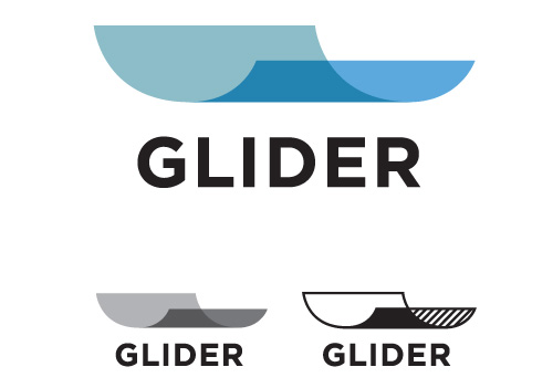
Recently I finished a logo for Glider, a company that in their own words “…is redefining word processing from the ground up to make organizing, negotiating, and signing documents as simple as it should be.”

Sounds good to me. Even though my efficiency orientated brain can easily calculate the time between meals, snacks, and how many rabbits can be drawn in the interim, my thought upon waking is not focused on BUSINESS TIME. Anybody who wants to make business time easier is a friend in my book.

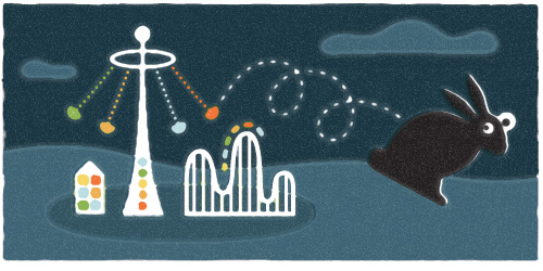
The project consisted of a lightning round of design to prepare for a presentation at TechStars Seattle Demo Day, the #1 startup accelerator in the world. Things in this world are FAST. MONEY. BUSINESS. TIME. There are no RABBITS. However, the results were just what Glider needed – a simple, iconic logo symbolizing a transparent document. VROOOM.

And, they’re hiring. If you want to be a back-end engineer, sales lead, or UI designer in beautiful Portland, Oregon check it out.

Royal Copenhagen Cat


Walking around Nørrebro in Copenhagen there are many Asian shops, all of which boast a brigade of little waving cat figurines – also known as Maneki-neko. They seem so omnipresent that I suspect they are part of a Secret Danish Surveillance System – one that makes sure you only cross the street on green and pay your taxes promptly.

These felines are the exact opposite of everything “Danish Design” is reported to be, and if I had to name a Danish counterpart to a Maneki-neko it would be Kay Bojesen’s teak monkey (nearly every Danish home has one).

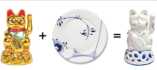
I like unlikely pairings – or perhaps my subconscious does – because one day as I walked past yet another window full of friendly cats, I pictured them painted with the Royal Copenhagen pattern, the quintessential floral design used on the most famous of Danish porcelain. And my brain doesn’t stop once it has had such an idea, so I had to make it real.

You didn't think a plastic cat and a porcelain plate could mate, but I've proven otherwise.

Continue reading “Royal Copenhagen Cat”

Yoga Space Illustration


One of the great things about illustration work is that it usually involves researching new subject matter, thus resulting in…KNOWLEDGE. Score. My general picture of yoga is “a stretch here, a stretch there, and a little inner peace”. After working on an illustration for Upswell for the Yoga Space, I now know that we have chakras. Five of them!

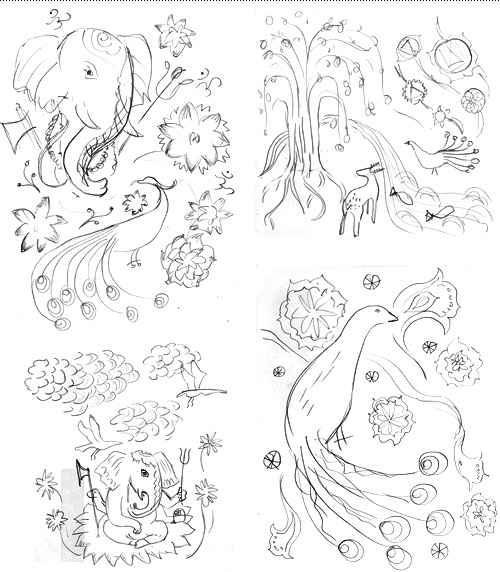
Upswell was to design a website for the Yoga Space and wanted illustration throughout the site, focused on one large illustration that could be broken into parts, each part using symbolism derived from the spiritual practice of yoga. The budget was fixed, so to make sure we were on the right track pencil sketches were explored first to get an idea of what elements should be used. This also shows that in the beginning things are ugly…or in design speak, “rough”. Usually they get better!

Four initial rough pencil sketches.

It is always a debate on how soon to show work to a client. If it is too unfinished, imagined possibilities might not be fully communicated. If it is too finished and not on target, you risk time intensive re-work. On this project it was possible to do very rough but quick iterations and get approval along the way, which saved time and allowed everybody in the project to have input where it counted.

Continue reading “Yoga Space Illustration”

Unicorn of the Unknown


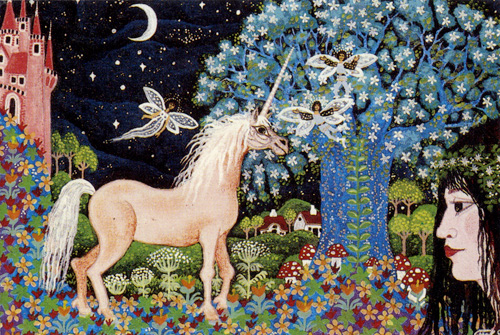
An unknown artist created this tableau, printed on the front of a tiny 3″x4.5″ envelope found in a thrift store in Central Denmark.

It reminds me of one of my favorite card games, Dixit, where players are required to verbally interpret fantastical illustrations. Interpret too literally, and you lose; interpret too abstractly, and you lose. Interpret just right and the result is perhaps a whole new meaning to a unicorn prancing in a field of flowers towards a vine-wrapped tree and fair maiden while a castle and moon look on and jester fairies fly about.

One fun part of Dixit is that it plays off of the players knowledge of each other, and how they interpret things. Sitting in a group of good friends, I might describe this card as “I wish this were my ride to work.”

I wish this were my ride to work.