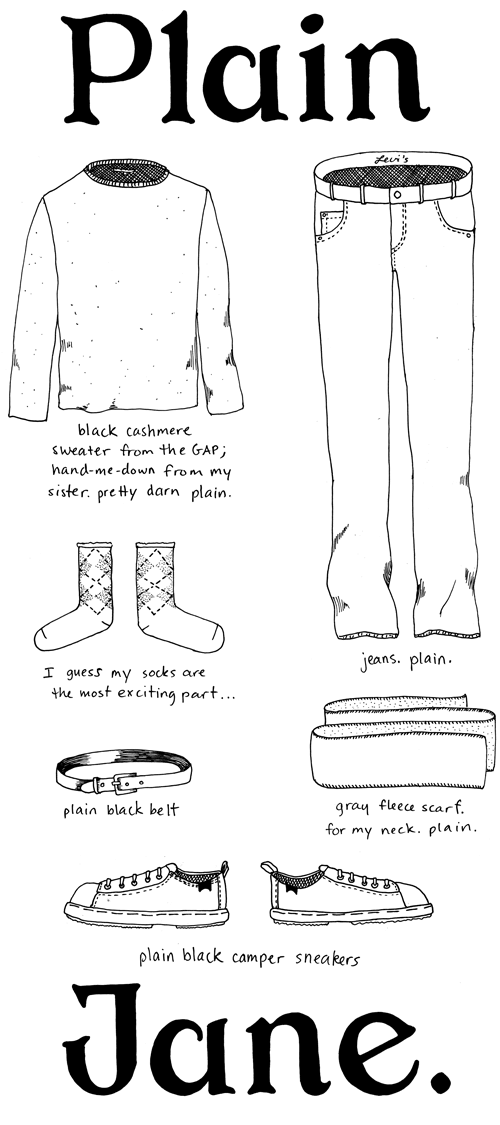
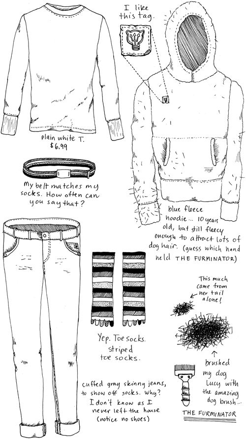
Outfit No. 41
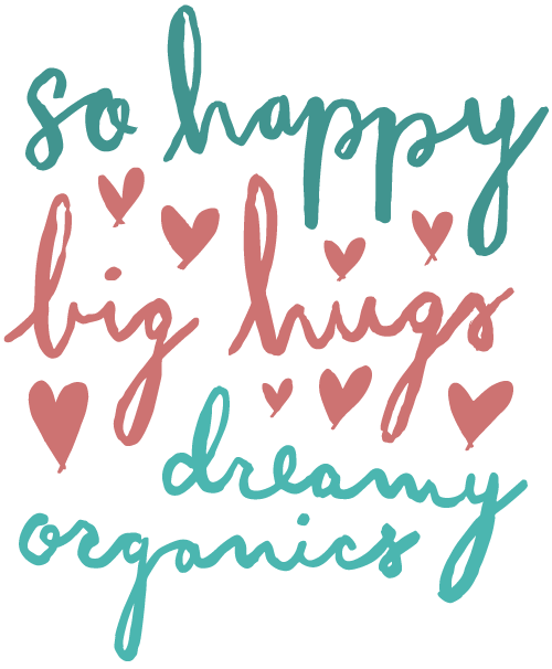
Lettering for Hanna Andersson
A few months ago I did some lettering for Hanna Andersson’s spring catalog and retail environments. In their own words, “Hanna Andersson makes soft, quality basics inspired by our Swedish heritage”…and some rad striped pajamas in sizes for the whole family!
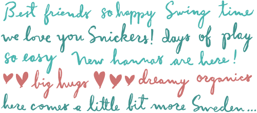
The client wanted a playful messy script that didn’t look like a font. I always enjoy working with custom type and letters, so this project was right up my alley. After completing the phrases using a brush pen, they were traced so they could be used at a large scale in-store.
The Fun Theory
When I was younger, my dad used to cut out newspaper articles and highlight the important parts for me or his students to read. Now that he’s fully emerged in the digital world, I get short, unpunctuated, uncapitalized emails telling me what to read.
His most recent recommendation was this video from The Fun Theory, a “site that is dedicated to the thought that something as simple as fun is the easiest way to change people’s behaviour for the better”. I’m all for that!
The Fun Theory is an initiative of Volkswagon. Normally I would be the first paranoid Gen-X denouncer of a big company trying to convince me to “like” something on Facebook, but for some reason this just makes me like Volkswagon more. Good job marketing team!
Watching the Fun Theory videos solidified some thoughts I had been having about my blog and its purpose. My blog is a way for me to 1) explore ideas, 2) get better at making things, and 3) bring people enjoyment or encourage thinking about things a bit differently.
Number 3 is the important one, because I believe that people are at their best when they are happy or inspired. Whatever we can do to poke at each others brains to spur positive action, the better. And if it turns out that my blog is “just fun”, well that’s not so bad either.
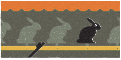
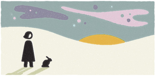
Me and My Pioneer Rabbit, Watching the Northern Lights
Outfit No. 40
Sunshine Farts
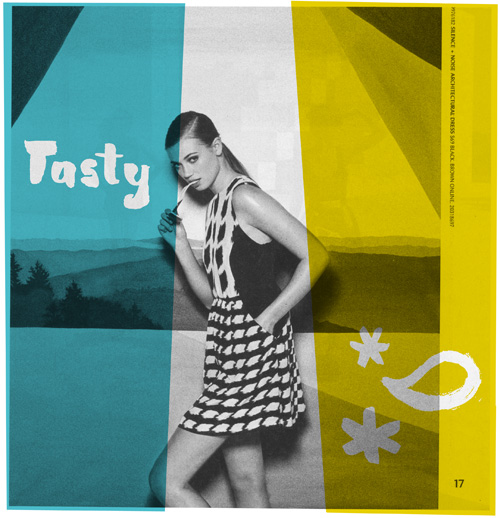
When I saw this page in the recent Urban Outfitters catalog, I knew exactly what I was going to do with it. I imagine the photographer shouting directions at this young impressionable model…”Pretend like you’re eating the sunglasses and farting sunshine!”. We’ll probably never know what really happened, so let’s go with it.
Recycled Raindrops
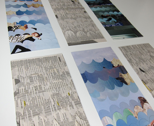
In addition to some paper ponies, I also submitted some recycled raindrops to the community contribution show Portland Paper City. What possessed me to spend hours with a gluestick (well, six gluesticks) and a DEX/YellowPages, I do not know. But the result was nine 3D raindrops that float on a wall.
Continue reading “Recycled Raindrops”
Paper Ponies
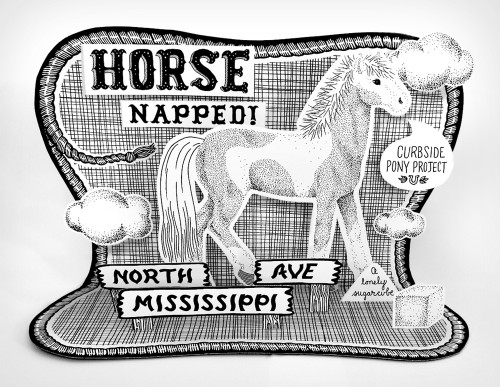
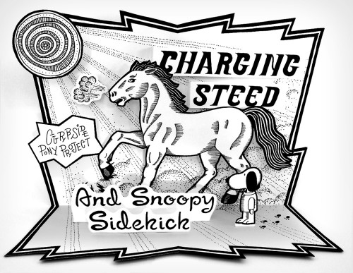
Recently I submitted some 3D paper ponies to Portland Paper City, a collaborative art show. All around Portland there are old hitching rings in the sidewalks from days gone by. Tied to some of the hitching rings are toy horses and ponies, thanks to The Horse Project. Whenever I see them they make me smile, so when I was asked to contribute something “Portland” to the show it didn’t take me long to decide on these little curbside ponies. It didn’t hurt that between ages 6 and 16 I spent 98% of my waking hours drawing horses, thinking about horses, and riding horses. Yep, I’m a horse girl.
(click on the images to zoom)
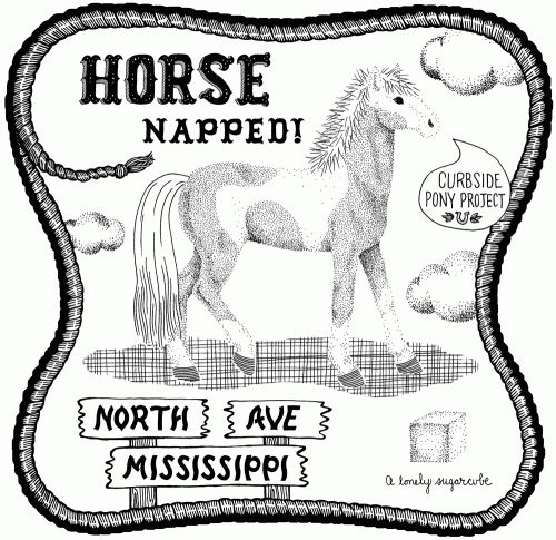
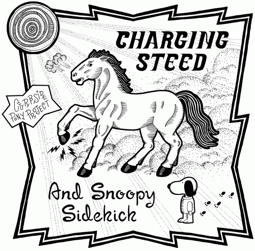
Being a horse girl, you can bet that I researched this thoroughly. There is a great Flickr set called “All The Tiny Horses” from which I picked my charges. I hope to draw some more of the horses later, because frankly, I spent wayyyyy too many hours as a child developing my equine drawing skills to let it go to waste. Yes, and after that I’ll re-read all of Walter Farley’s books!
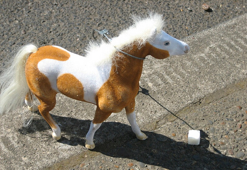
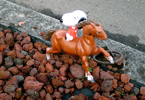
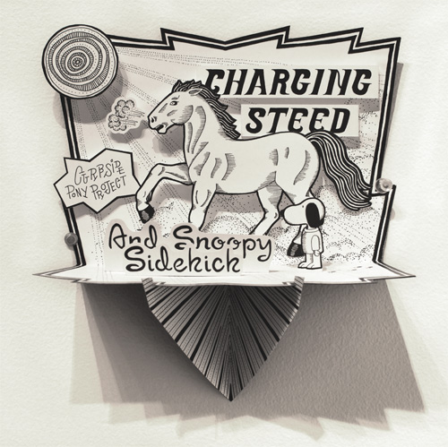
The process of putting my pony drawings into 3D was a challenge. After some prototypes and a short stint of being sidetracked by origami, I decided to put the ponies on display using an open-air type diorama with a built in stand. Below are the dioramas without the stand.
Here is a shot of Charging Steed mounted to the wall at the show.
SXSW Steer for IFC via Feel Good Anyway
You never know what job will come your way next as a free-agent designer. Case in point: drawing a cow (I really mean steer) diagram for Feel Good Anyway’s IFC promo for SXSW (appears at the 30 second mark).
This short stint of steer-drawing took me back to my childhood because I grew up in Steer Country. Every summer we would spend endless days near Grass Valley, Oregon on our friend’s farm for the annual castration/innoculation/slaughter. We played in the hay barn, took Bubba the lab with us into the hills to sic rattlers, counted how many young calves got their nuts cut off, and hand-ground pounds and pounds of beef for the year ahead.
Enough reminiscing; check out more of Feel Good Anyway’s work for the Independent Film Channel – it’s good entertainment from some very talented dudes.
