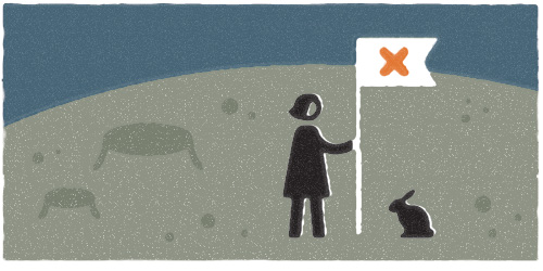
Me and My Pioneer Rabbit, Gathering Moon Rocks
Kahuna Gift Company Logo
In September I landed one of the larger projects I’ve tackled since going solo – branding and packaging for a start-up Hawaiian gift company. I love to work on packaging, especially if it is food related, so this was a great gig. Unfortunately, due to a macadamia drought, the packaging component was put on hold midway through the project. Major bummer! Designers get used to strange things derailing projects, but I never imagined a nut shortage would be one of those things.
Nuts or no nuts, the client still needed a logo and website, so I finished up those elements while we waited for the macadamias to make a comeback (still waiting).

I created a straightforward logotype with tone-on-tone sky and surf colors, intentionally steering clear of the clichéd palm trees and hula girls that adorn many a Hawaiian logo. The logo needed to be used in various situations, so a few options were created to accommodate different uses. Continue reading “Kahuna Gift Company Logo”
How Globes Are Made
My Dad was a geography, history and politics teacher, so I’ve always been surrounded by maps, atlases, and globes. My sister and I would rise early on school mornings to compete on the local radio quiz show, the Geo Bee. There were only two other families in our small town that also competed regularly in the Geo Bee, so we quickly amassed a stockpile of geography related items: map placemaps, globe-topped pencils, keychains, you name it.
When I started my studio and moved into the Povey Perch, one of the first decorations I bought was a vintage globe on a stand, featuring Czech and Slovakia united as one. So when I saw this video on how globes are made, I had to share it…
Oui, Oui: Halloween 2010
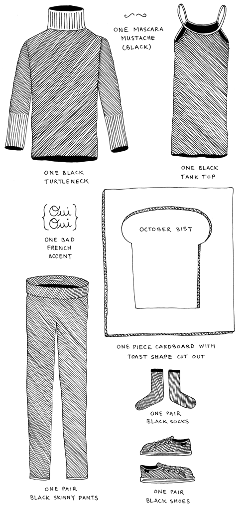
This year for Halloween I dressed up as Avant Garde French Toast. It was a subtle costume, and not exactly a crowd pleaser. There were a few French Toast embracers, but for the most part it was a flop. It wasn’t a pop culture reference, gory or scary, a knight or a princess. It wasn’t an outfit that had been “sexified” with skimpy college-era duds (although one person told me that “Sexy French Toast” would have been a better outfit). It didn’t fit into a category, and that doomed my Toastness to strange stares and obligatory “ah, haaaa, hmm, yeah OK, I get it”. I guess my outfit was more avant garde than I expected.
So, I figured I would make my first foray into creating moving pictures and shoot a short short about it. I even wrote a part for my dog Lucy, who turned out to be the consummate professional on set.
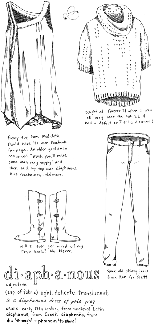
Outfit No. 32
Drypoint and Chine Collé Printmaking
I took a class at Em Space recently which was taught by two master printmakers from Japan. Ritsuko Ozeki and Takahiko Hayashi were both visiting from Tokyo because their work is on display at the Froelick Gallery thru November, and they agreed to give a three hour workshop on drypoint and chine collé.
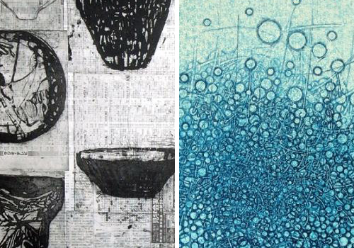
Let me tell you, it was one of the funnest printmaking classes I’ve taken! Twelve students were all able to create an etching on plexiglass using a variety of sharp tools, and then make a print of it using fancy japanese paper samples the teachers brought with them. Continue reading “Drypoint and Chine Collé Printmaking”
Welcome Jen – Yay!
Since striking out on my own, I’ve shared a 3rd floor studio in the Povey Building with a developer, Tim “Schnitzel” Trautmann, and a web designer, Darin “Factor 45” Richardson. And while I enjoy their company and conversation, sometimes it can be a bit much when they’re both grumbling about cucumbers and server modules and database errors.
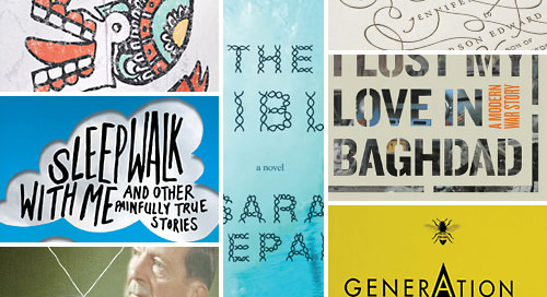
So I’m happy to say that we’ve finally formed a quartet by adding Jennifer Heuer as our final independent desk renter. Jen is a designer – yay! Jen designs books – yay! Jen is also another girl – yay! Now that Jen is here, the girls outnumber boys 3 to 2 (if you count Lucy). I have yet to give Jen a nickname, but these things take time, you know. And if you see Jen around town, say YAY!
Check out some of Jen’s work at www.jenniferheuer.com.
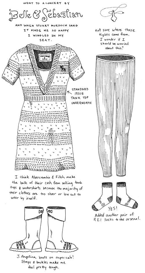
Outfit No. 31
One Bit Emotion
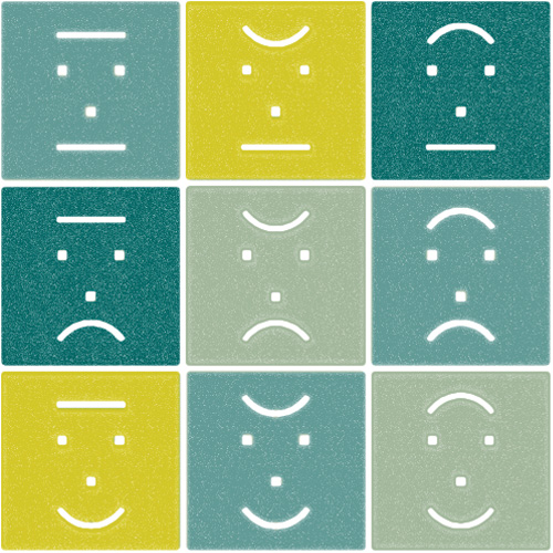
I took part in a training course at Xplane recently where we learned about super duper accelerated sketching techniques that can be used in meetings to summarize complex ideas in real-time. One of the Xplane designers, Tim May, gave us tips on how to use just 3 different types of lines to create a range of emotions. Super simple, one bit emotion. Sometimes that’s all you need to get a point across.
