While in Hamburg this summer I went to the art museum there. It was GIANT, and the only reason I made it through the whole thing in one day was because there were no English captions to increase viewing time, and I stopped for lunch during the middle of the visit. Here are a few of my favorite close-ups.
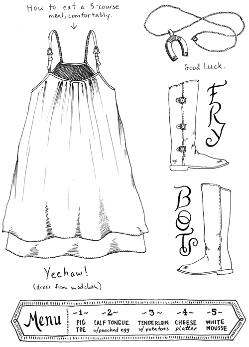
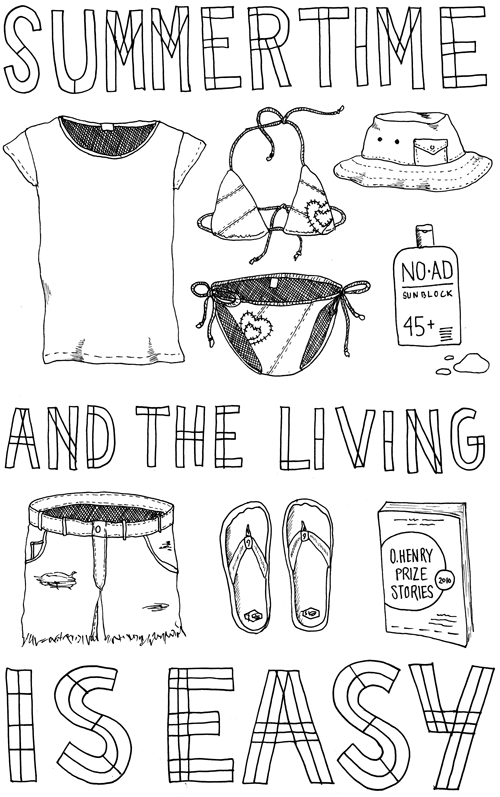
Outfit No. 28
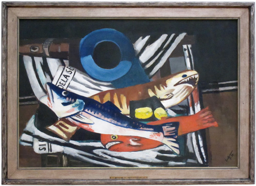
Fish Bonanza, Now We’re Talking
When I saw this painting at the Hamburg Art Museum, I felt like I had met a kindred spirit. After seeing about 200 paintings about crucifixion, I was finally among artists who understood my obsessions. A two-month long binge on tuna melt sandwiches – YES! Mackerel in tomato sauce – YES! Pickled herring by the pound – YES! Fried and breaded fish – YES! Octopus rings – YES! (Well, technically there aren’t any octopus in the picture, but a girl can dream).
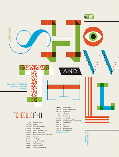
My Plans for March 10, 2011.
When Kate Bingaman Burt asked if I could come in and speak with her graphic design students at Portland State University, I said “Sure!”. Growing up in a one-horse town, I remember the excitement of having visitors come to tell us Real Life Stories of Grandeur from the World Out There.
Actually, nobody ever came to visit us in my one-horse town, but I wish they had. Which is why next March 10, 2011, I’ll be one of the many illustrious show-and-tell participants at PSU. It’s never too late to learn something new…I’m sure I will, come next March.
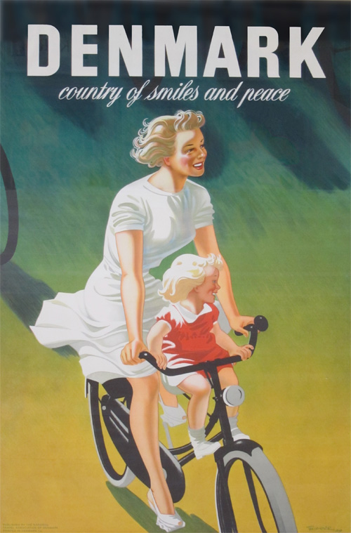
Denmark, Country of Smiles and Peace
While visiting Denmark this summer I went to Den Gamle By in Arhus where there was a travel poster display. “Genkendelsens Glæde” is a collection of classic Danish posters from the 20s-90s. When we walked unknowingly into the exhibition hall I heard my sister say “Uh, oh, we’re going to be here forever…”. I only wish. Below is one of the better pictures I could take, and also a good summation of my childhood memories of this tiny country.
The Danish Poster Museum has a partial digital archive of the collection, as well as some reproductions of various posters in large format postcards that are for sale.
Outfit No. 27
Humpty Dumpty: the Scary 80’s Version
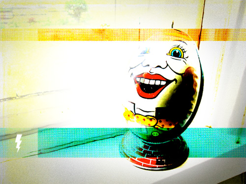
Humpty Dumpty: the Scary 80's Version

Fly Like an Eagle, New Guitar Logo, Fly!
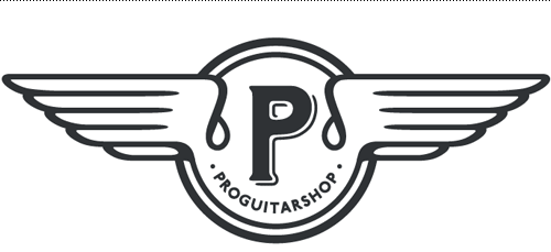
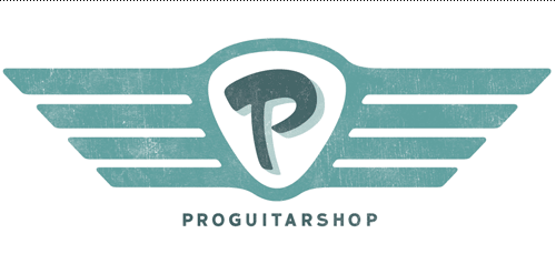
Sometimes a client knows exactly what they want, and we can get right down to business! When I recently worked with Pro Guitar Shop to create some merchandising logos, the direction from the client was wings, wings, and more wings! It’s the same thing I chant when I go out to dinner with Jen, so it wasn’t hard to get into the mindset. Plus, drawing lots of wings is a nice illustrator workout for designers.
Drawing inspiration from retro signage, hotrods, and vintage cars and of course guitar parts (all things the main audience would dig), I created a few winged logos for Pro Guitar Shop to use on their wares. Below are the two final logos.
