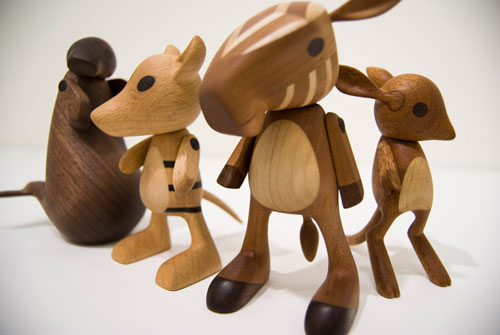
See more of Josh Finkle’s work at www.jfinkle.com.

See more of Josh Finkle’s work at www.jfinkle.com.
Like most kids I collected various things throughout my childhood, including stuffed animals, horse figurines, knives with antler handles, stamps, and a button collection. Most of my collections were given away or sold at garage sales over the years as they lost meaning or garnered scorn for their age inappropriateness (although I still keep my prize horses boxed up in the basement). Somehow, my button collection escaped the purging episodes of my mother, myself, and the multiple moves I went through.
So when my buttons resurfaced recently, I wondered…would they reveal anything about my childhood that I had forgotten? Would they say anything about my current state, 20 years later? Given the current button craze, how would my buttons stack up? Was it time to finally purge my button collection, two decades too late?
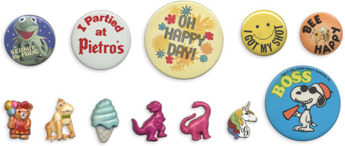
I compiled my favorite buttons (namely, the ones I actually remember) into a mini-autobiography. Come on, nobody else was going to write it, so I took matters into my own hands. Turns out, most people like it when you hand them an autobiography instead of a business card.
Continue reading “The Early Years: A Retrospective Told in Buttons and Pins”
You might have seen the vintage liqueur bottles my neighbors brought me a while back; here are a few more that didn’t seem to fit in with the first batch.
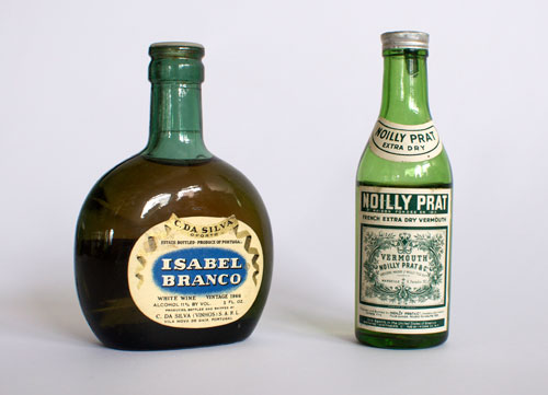
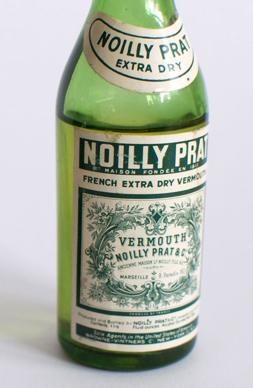
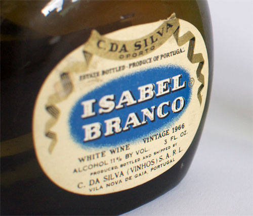
Noilly Prat and Isabel Branco seem like the alcohol version of Bonnie and Clyde in comparison to the Crema Liqueur series. If they met in dark alley, I have no doubt Noilly would off the Sabor de Platano without a second thought. Upon further scrutiny it turns out Noilly Prat is a French company that uses floofy flourishes all over their website. I’m guessing that means the “t” in Prat is silent, which negates most of the badass connotations. That ALSO means that Noilly PraT (emphasis on the “T) is up for grabs (just like the URL www.discountbordello.com).
Therefore, let it be known that I claim Noilly Prat as a pen name for times when I need go undercover to tell tales like Turkey: 1, Mormon Boyfriend: 0. Like all legendary duos, Noilly needs a comrade, so I am hereby seeking an Isabel Blanco to be my partner in crime. The position is currently undefined (I’m imagining we can have cheese eating contests, watch Buffy the Vampire Slayer: the Musical, and see what a turtle on roller skates can accomplish if they set their mind to it) and will stay open until filled.
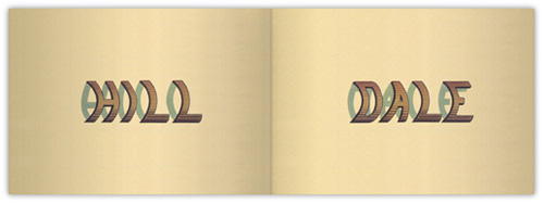
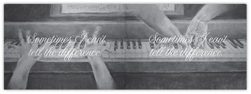
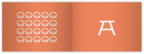
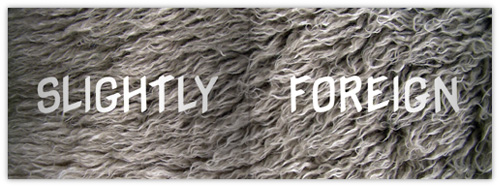
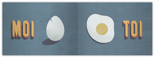
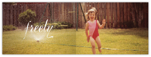
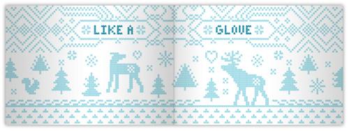
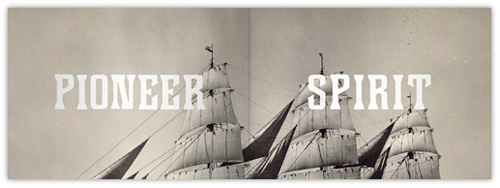
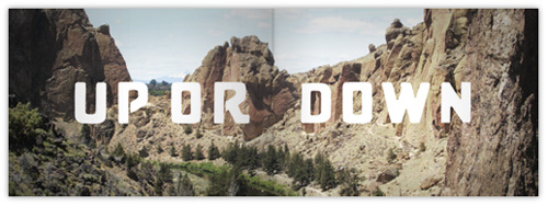
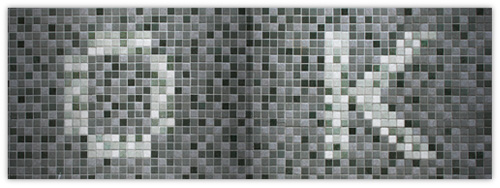
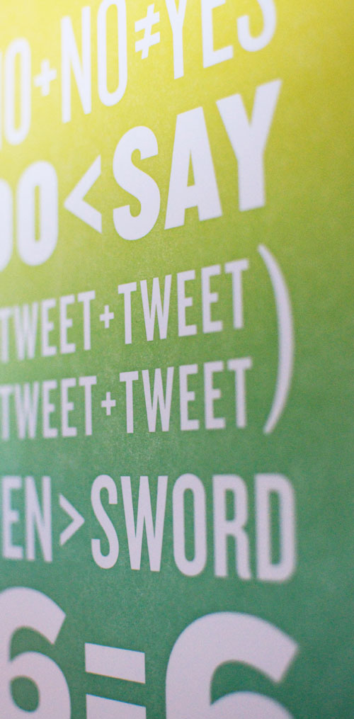
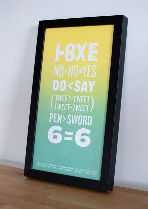
The Portland letterpress community participated in an print exchange in conjunction with Josh Kornbluth’s “Ben Franklin: Unplugged” show at Portland Center Stage. The broadside exhibit “Power of the Press” featured posters inspired by the character and spirit of Ben Franklin and Poor Richard’s Almanack. My contribution was an interpretation of proverbs entitled “Opposites Attract”.
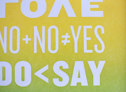
“Opposites Attract” is type-driven mash-up of some of the Almanack’s most commonly recognized proverbs and math symbols, drawing inspiration from Franklin’s interest in both the literary and scientific fields. Proverbs revisited…
Wikipedia and other sources tell us that Poor Richard’s Almanack was a yearly publication put out by Benjamin Franklin, who adopted the pseudonym of “Poor Richard” or “Richard Saunders” for this purpose. The publication appeared continually from 1732 to 1758. It was a best seller for a pamphlet published in the American colonies; print runs reached 10,000 per year.
Poor Richard’s Almanack was notable for its extensive use of wordplay, with many examples derived from the work surviving in the contemporary American vernacular. Franklin also included the occasional mathematical exercise, and the Almanack from 1750 features an early example of demographics. It is chiefly remembered, however, for being a repository of Franklin’s aphorisms and proverbs, many of which live on in American English. These maxims typically counsel thrift and courtesy, with a dash of cynicism.
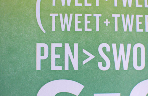
The poster was printed on a Universal III at Em Space with a single polymer plate and two hand-mixed inks. Because of the heavy ink coverage the split fountain, or rainbow roll, had to be re-inked every 15 prints or so. The paper is some sample Cougar stock I had on hand. The poster size is 12×18 with an image area of 8.5×15.5. All text is set in the wonderfully versatile font Knockout.
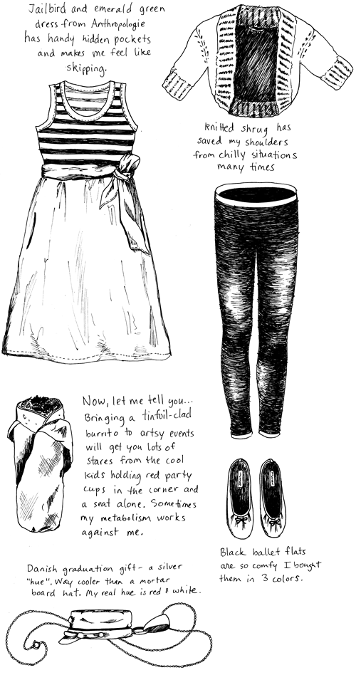
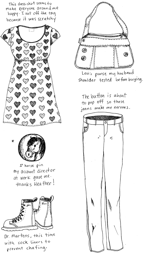
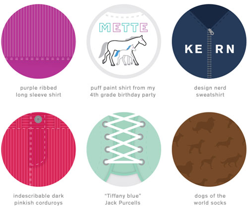
Not every day can be a fashion hole-in-one; I thought it was OK to tuck my teal sweatpants into my cowboy boots until I was fourteen. Admittedly, middle school was not kind to me. Luckily those days have passed, but traces of my oblivious self still remain, and made a reappearance when I emerged Sunday morning in my special Sunday outfit.
Within 0.3 seconds my husband bleated in dismay. I think his exact words were “No, no, no…no, nooooooo!” He bullied, he cajoled, he pleaded with me to change into something more norm-pleasing. But I was adamant. My beloved puff paint souvenir t-shirt from my 4th grade birthday party was not going to be shoved to the bottom of the drawer. Nobody puts baby in the corner!
Drawing this outfit in pen and ink just wouldn’t do it justice, so I went the extra mile to give you this graphic representation of my technicolor fashion clash.
The Povey Building (where I work) is filled with creative folk. Sometimes that leads to tangential exchanges that aren’t even understood by the people taking part. I-kid-you-not correspondence in its entirety transpired as follows. Get me my paymaster, I’m putting this on the tab.
