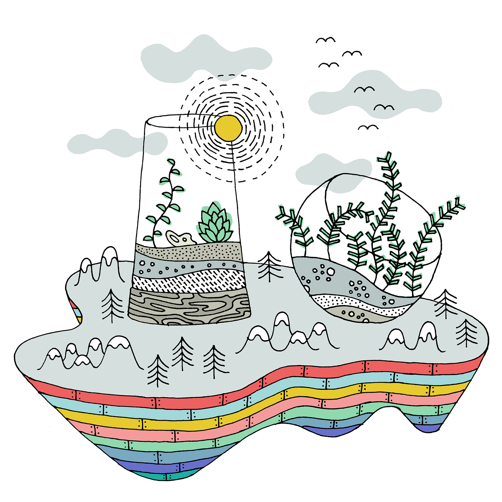
All Roads Lead To…
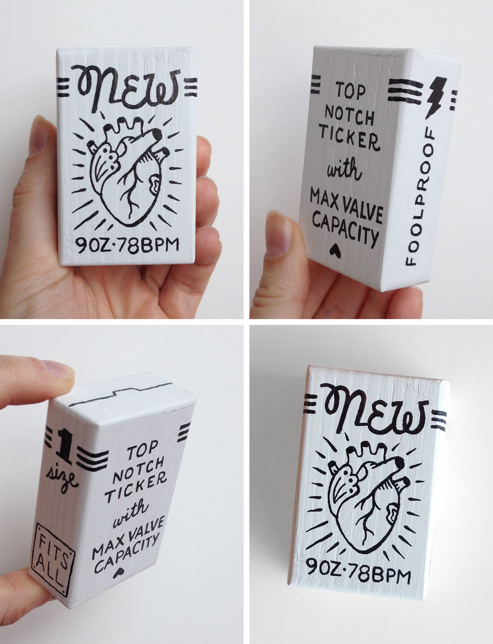
New Heart Package – Black & White Test
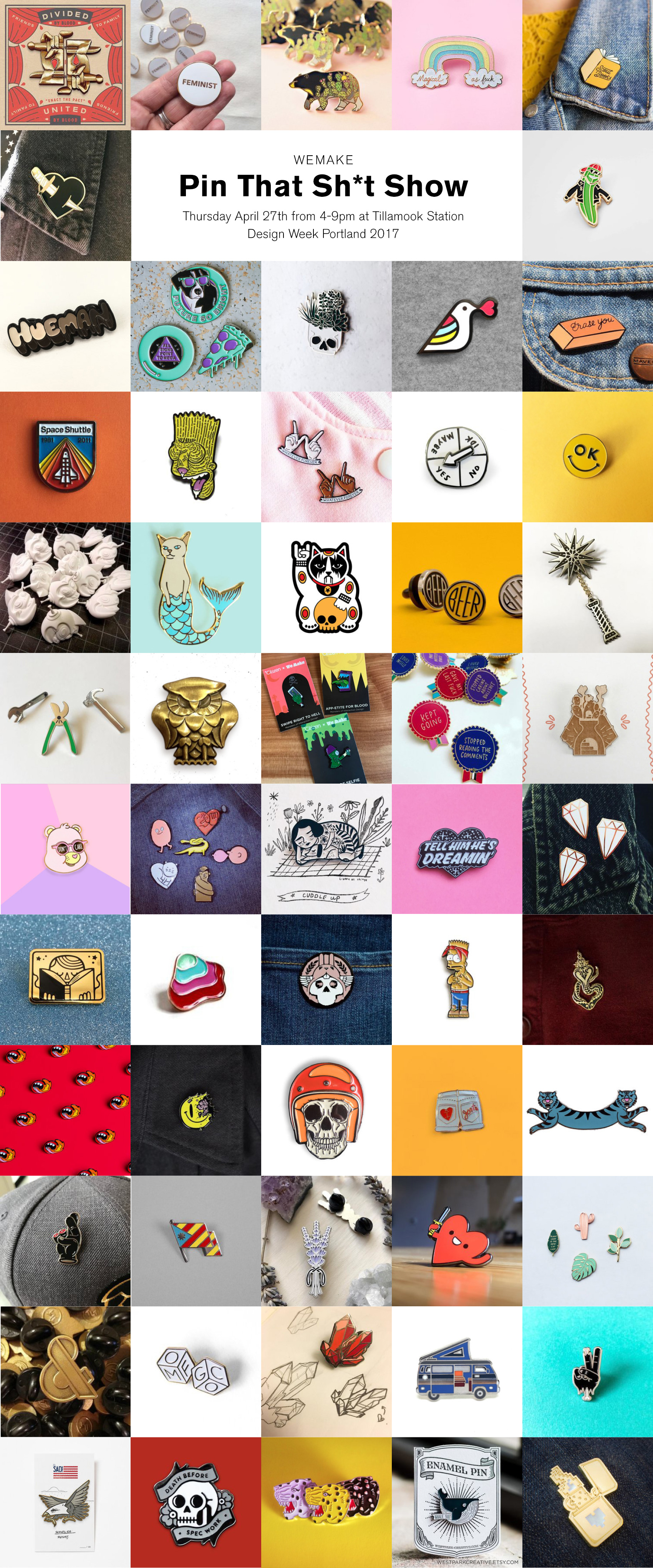
Pin That Sh*t
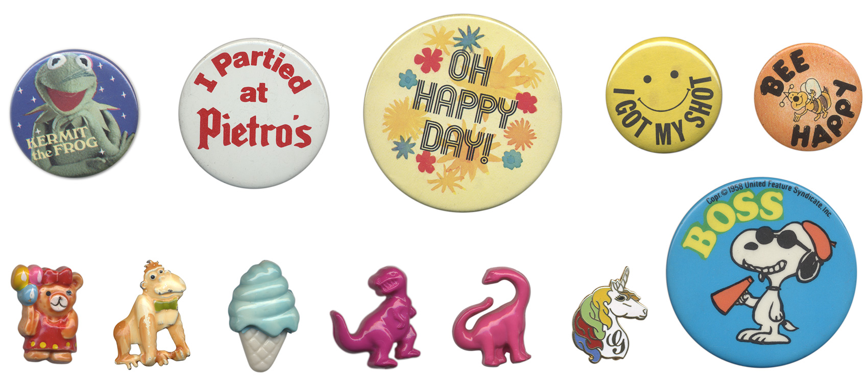
Like most kids I collected various things throughout my childhood, including buttons and pins. Most of my pins were from family travels, my parent’s political involvement in education, or participation in school events (see the full array here). Ramblin’ Rod would not have been impressed, but it was my collection and I was proud of it.
A few buttons and pins were collected of my own volition, and one of my prize pins was found in a deserted lot near my home around 8 years of age – a unicorn with gold metal accents and a multi-colored mane. Between childhood activities of building forts out of firewood stacks and popping tar bubbles on recently repaired roads, finding a monogram unicorn pin was a highlightable moment – even if it had a G on it instead of an M. Many days I wore this pin and thought “if only my name started with a G”. Alas. Here are a few favorites from my childhood collection.
So, it seemed destined that one day I would participate in a group art show called Pin That Sh*t during Design Week Portland 2017. Over 60 artists from around the world donated pins, all of which will be for sale with funds donated to support arts education. Once I learned I would be a part of the show, I revisited my 1980’s collection and started on designing something new for the show.
My brainstorming ran the gamut from textures to animals to random icons. A theme of birds became apparent which guided a more specific exploration of several bird pins, of which the top three were considered for the final piece. After feedback from studio mates, the simplest bird was adjusted to have bold black outlines, taking inspiration from my childhood unicorn pin but modernizing it in style. And really, what better way to converge ‘put a bird on it’ with the new hip trend of pinning everything in sight?
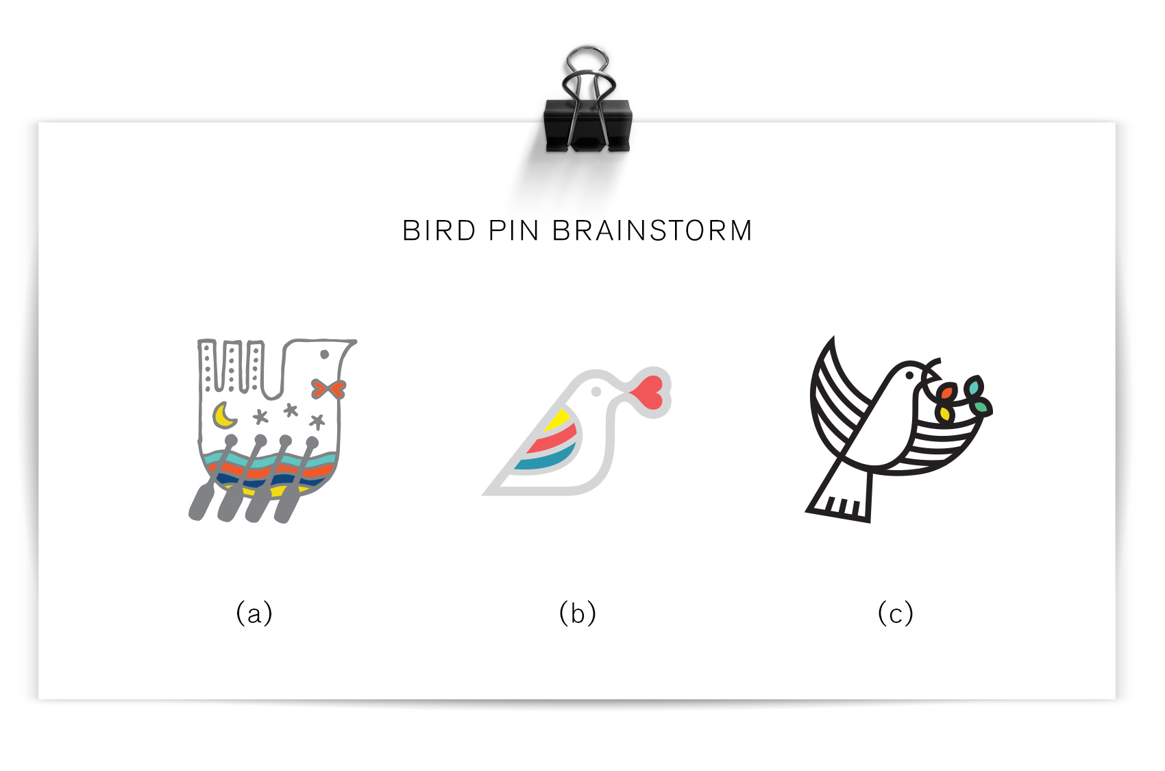
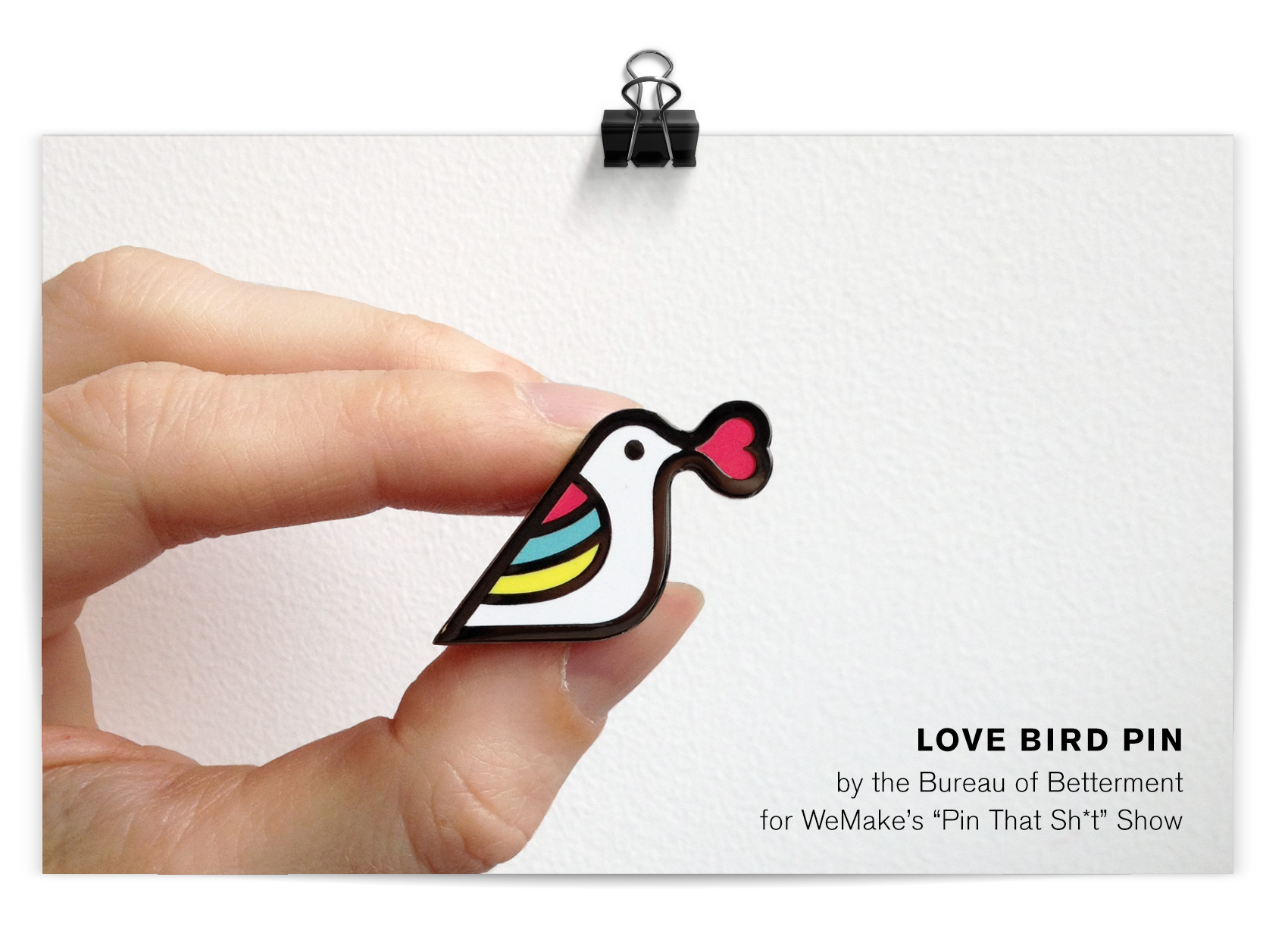
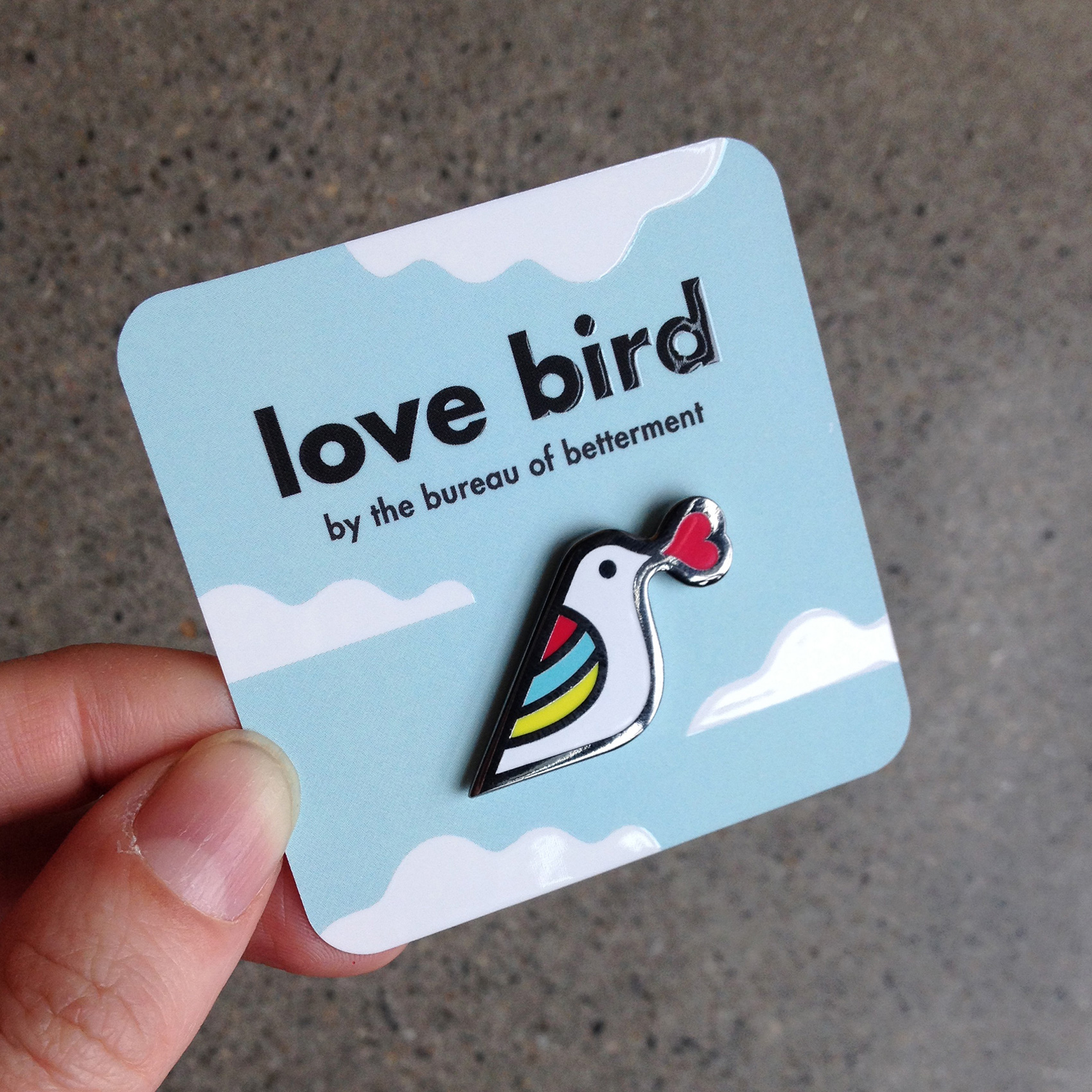
Love Bird is a tiny yet highly visible fashion partner to any wardrobe or backpack choice. With a nickel metal detail and flat polished surface, its minimal design seeks to spread love and acceptance. It’s a bird with a meaning, but it’s also just darn cute!
Two larger collections are also a part of the show from Kate Bingaman-Burt and from Brian Stowell, and many artists donated more than one pin so that there will be over 600 pins on display. For a more comprehensive list of artists and their bios, visit WeMake’s event page.
The show opens April 27th at Tillamook Station (665 N Tillamook Street in PDX, OR), from 4-9pm. In addition to the pin display there will be activities and beer. Most pins will go for about $10, also known as very affordable art. Time to find a bigger jean jacket…
The pin was produced through GS-JJ who make custom pins, patches AND belt buckles. To transport/display the love bird pin, I ordered custom cards from Moo. A square, rounded corner card with spot gloss on the title and white clouds was the perfect fit for the bird with both shiny and matte surfaces.
Self Portrait: Woman Who Draws
A new directory of women illustrators popped up on the internet recently, so I drew a portrait to be included. Visit www.womenwhodraw.com to see a glut of awesome illustrators (and hopefully my submission soon!).
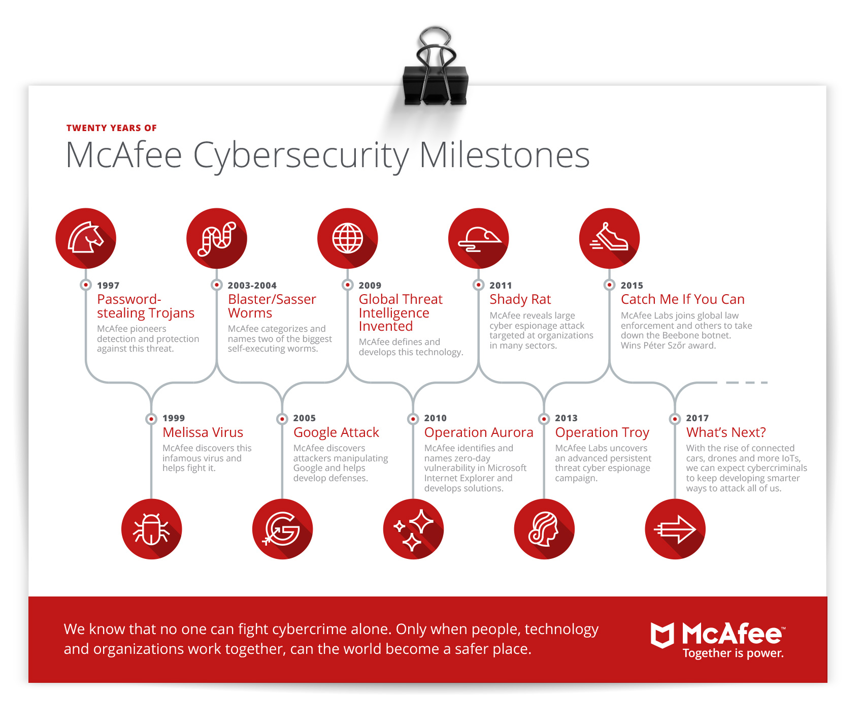
McAfee Cybersecurity Timelines
Working with Solid Branding for their client McAfee, the Bureau created a set of 20 cybersecurity related icons and a timeline infographic that was used for both McAfee’s involvement in cybersecurity and a generic version of general cybersecurity history, all done to match McAfee’s brand guidelines. Not being particularly techy or aware of the nefarious side of technology, working on this project made me a bit paranoid every time I opened up a device…are they watching?
![]()
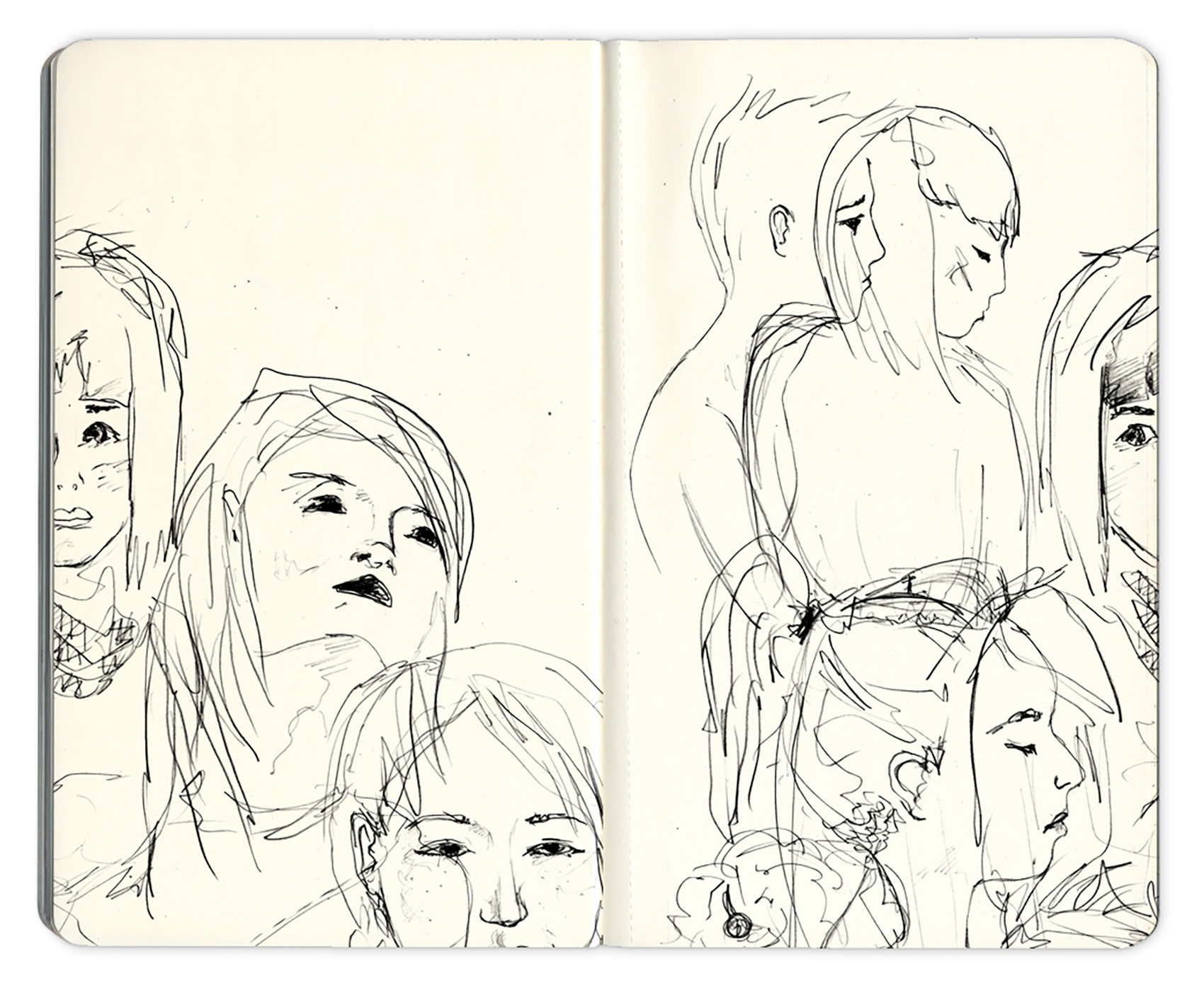
Portrait Sketches 2
Olympia Provisions Wurst Division
Drum roll please…for the opening of OP Wurst Division! Olympia Provisions’ offshoot restaurant series, Wurst, now has a new location on 3384 SE Division street. A renovation of the old Honky Tonk Taco building turned a teal & red taco joint into a high end sausage bar. You heard it – a high end sausage bar. The Bureau assisted by providing brand & signage suggestions including establishing a simple white, black and gold palette that takes advantage of the interior’s natural wood accents and a restrained use of signage combined with custom composed old-time woodcut illustrations.
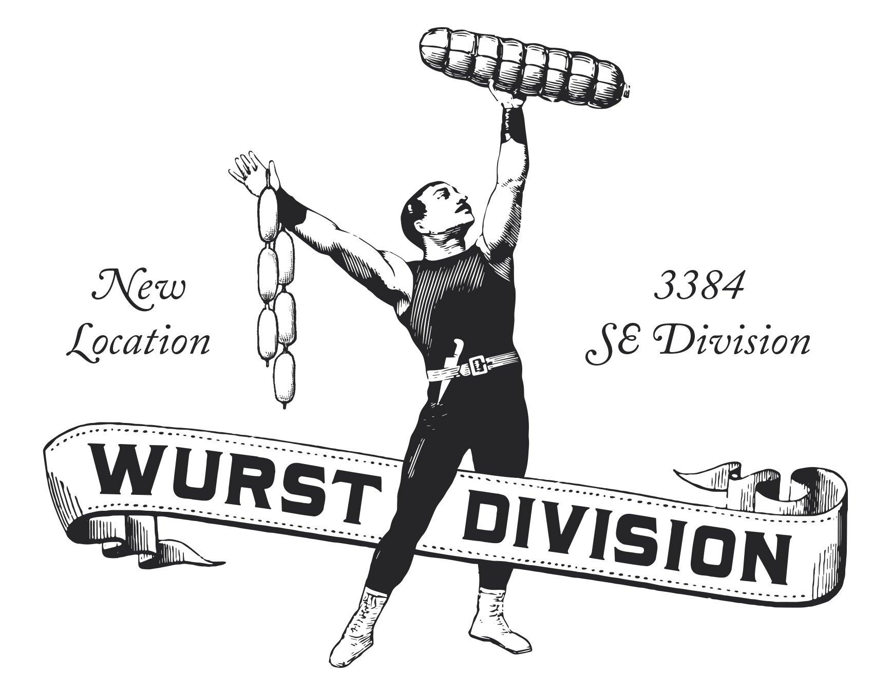
On the front facade two large backlit gold signs can be seen through the windows boasting BEER and SAUSAGE. What more do you need to know? Inspired by a hut on the top of Mount Hood that has no logo or branding other than BBQ written in 15-foot-tall letters on the roof, OP Wurst Division uses a minimal approach to great effect. The signage works double-time as cozy lighting while the bar is open and all-night-long advertising to passerby. Inside, the main impressions include a giant bar, gleaming rafters, and a newly installed fireplace in the west wing (otherwise known as the “wurst room”). When seen from outside the singular message makes sure you know what to expect. BEER. AND. SAUSAGE. (photos by Dina Avila)
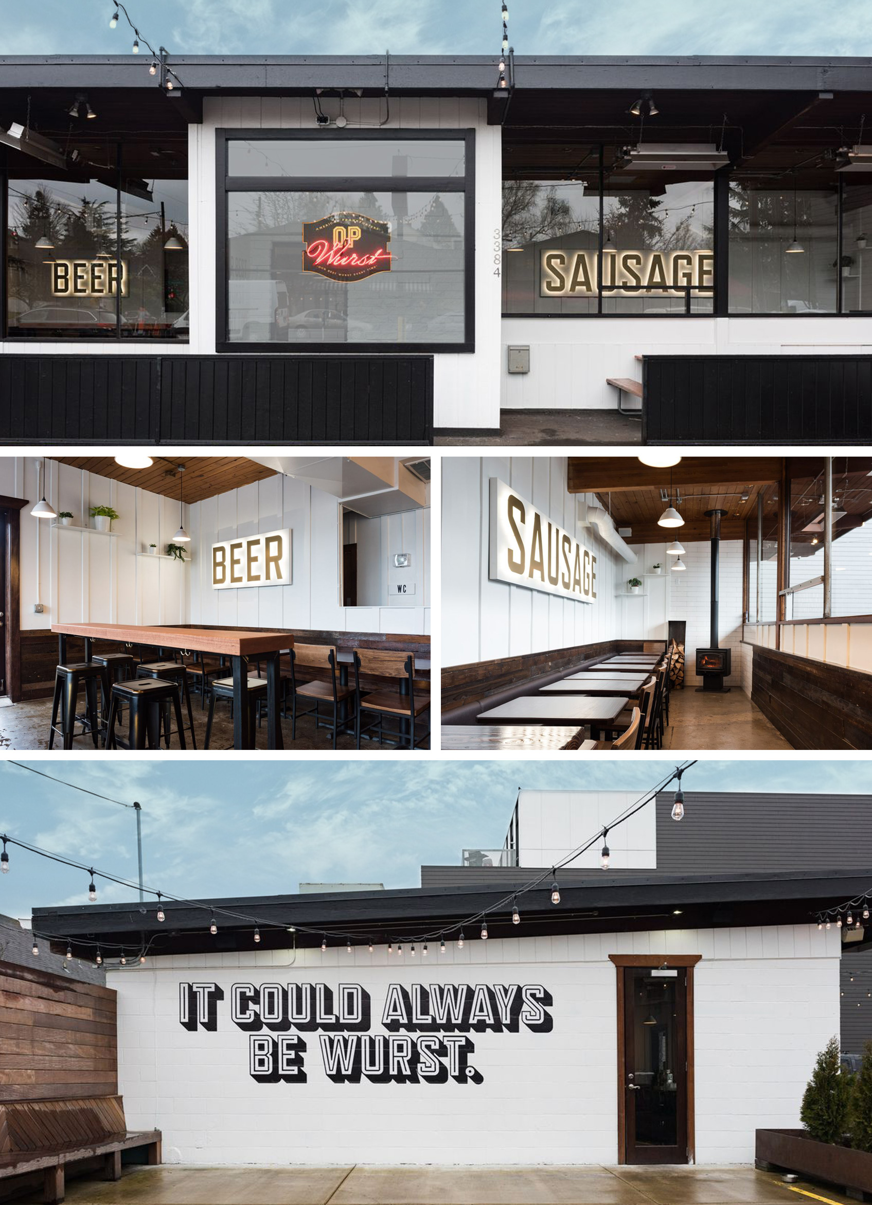
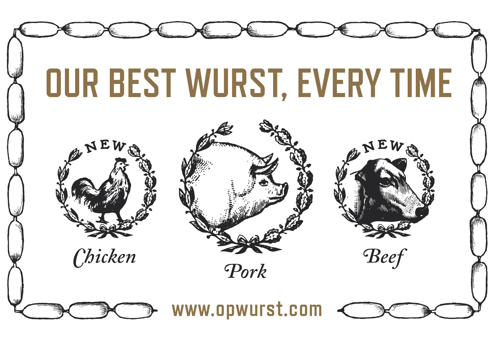
An outside patio mural boldly shouts a simple message to people near and far: It could always be wurst. Speaking of which, the menu has a plethora of hot dog options from traditional to way-out-in-left-field (there are even a few menu options for veggie lovers). In conjunction with the opening, Olympia Provisions is also expanding their sausage options from the standard pork to include both chicken and beef sausages. So hustle on over to Wurst Division and try a traditional dog or an experimental twist on the classic wurst.
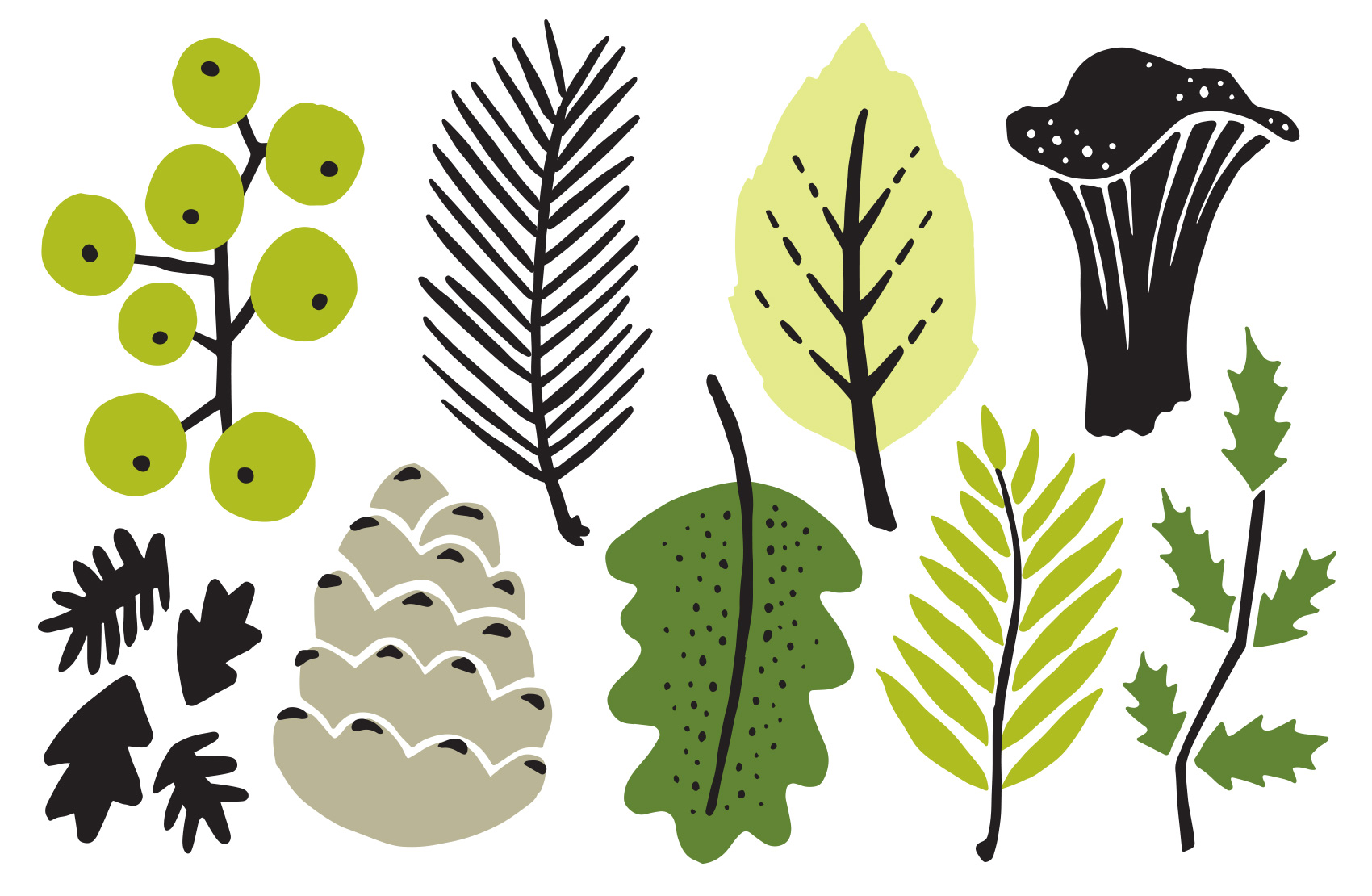
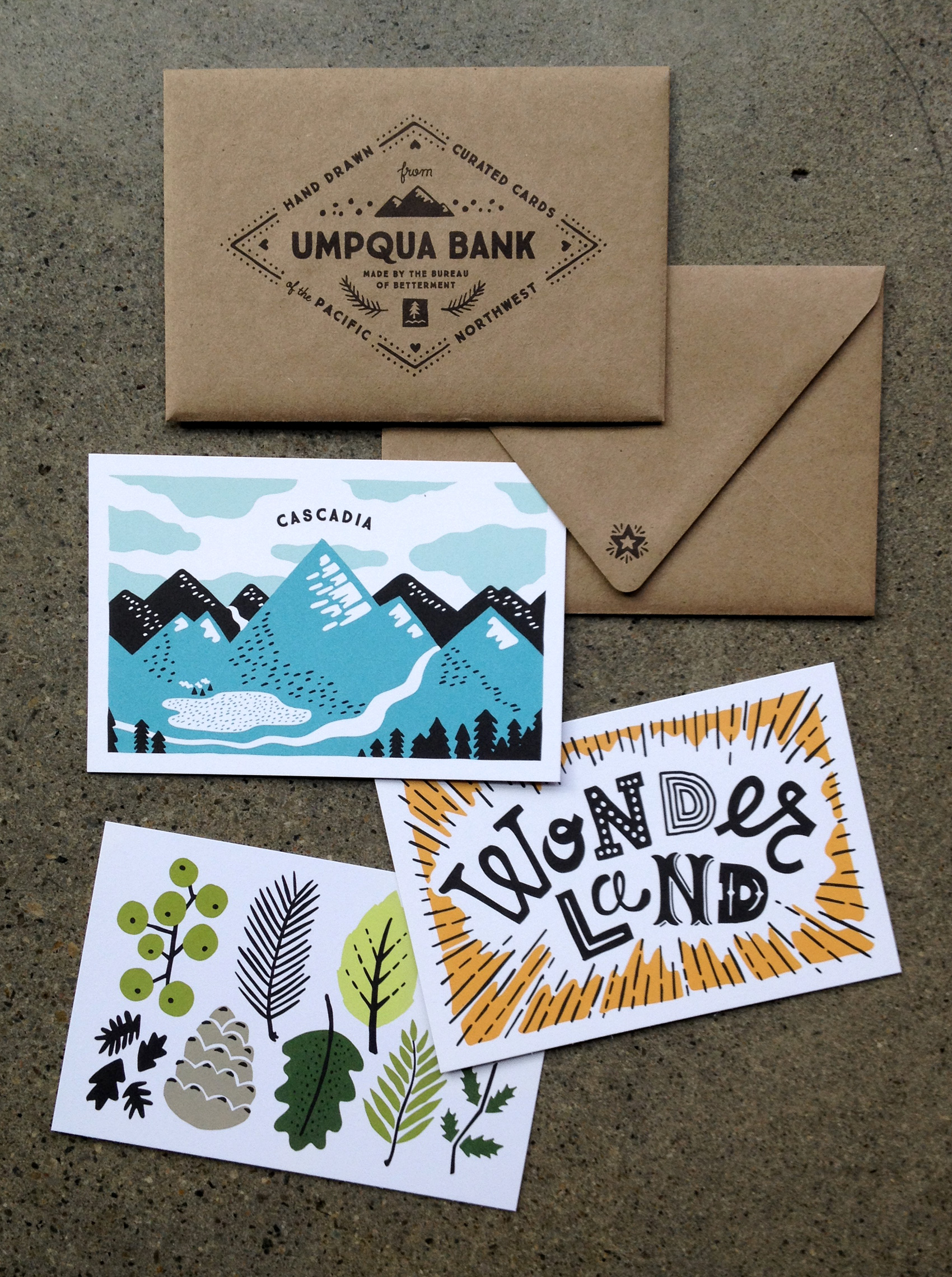
Umpqua Postcard Series: Northwest Foliage
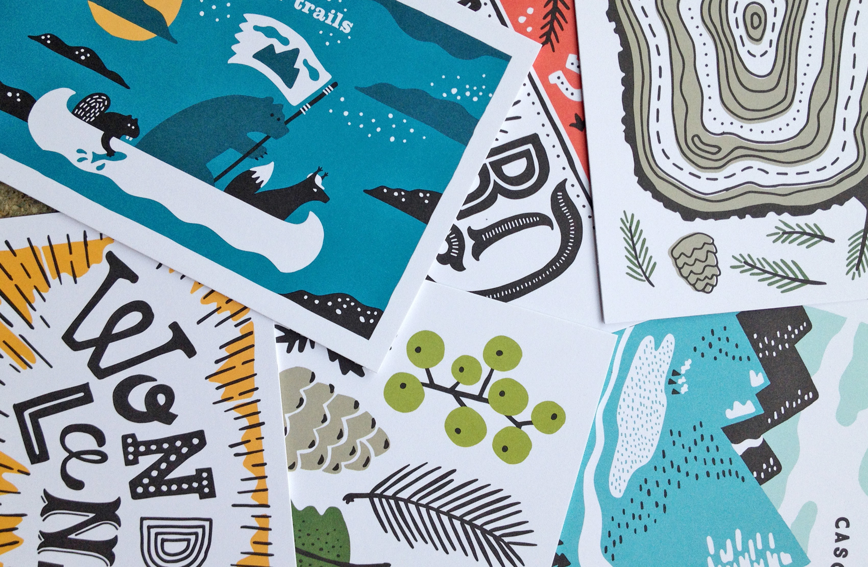
Here is the sixth and last card in a series postcards I illustrated for Umpqua Bank. They were used at the Portland Business Journal Luncheon and Seattle Design Series, mixed and matched in sets of 3 and delivered in a custom envelope. This card features NW-inspired foliage in shades of Umpqua’s lesser-used green palette.
Ruby Member Services Illustrations
I’ve had the pleasure of working on many projects with the Happiest Company in Portland*, Ruby Receptionists, and the last project was no exception. This project focused on creating illustration assets for their member services, or internal member-facing interface. Whether it is keeping track of calls, making custom availability settings, or managing contacts and data, Ruby and her accomplices are there to help every step of the way. Working from wireframes, I fleshed out the visuals needed to “Rubify” the web interface. Here are just a few outtakes from the project:
*title awarded by me, but I’m sure many would agree
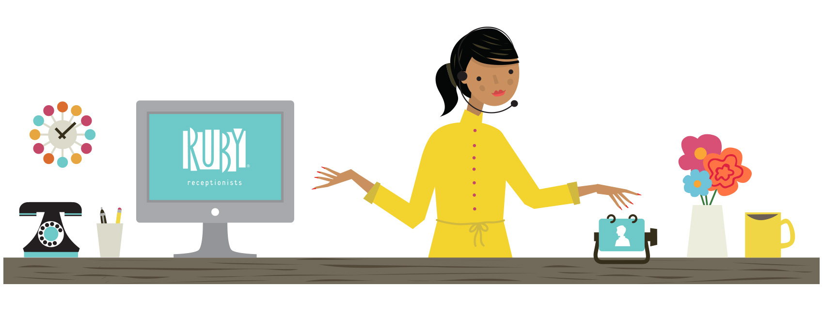
A series of large circular icons were created in a consistent style for reinforcing the tools being used. Mixing old visuals such as adding machines, retro clocks, will return signs and real live calendars adds a fun twist to using the online functions. The project scope included everything from tiny navigational icons to almost full screen illustrations, with over 30 assets created in total.
![]()
Even virtual receptionists need their beauty sleep, so a bonus round of icons for indicating it was “after hours” was made. A cocktail glass option didn’t make the cut, but I believe that Ruby might just have a little fun on Fridays after answering your phones all week.
![]()