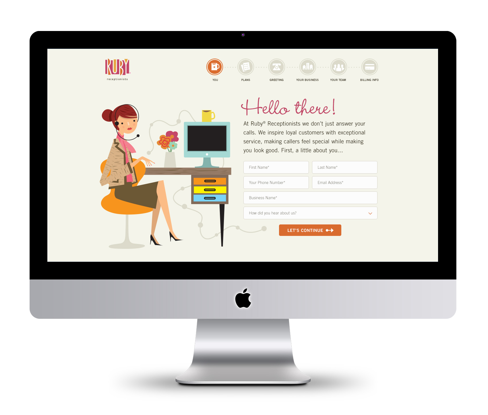
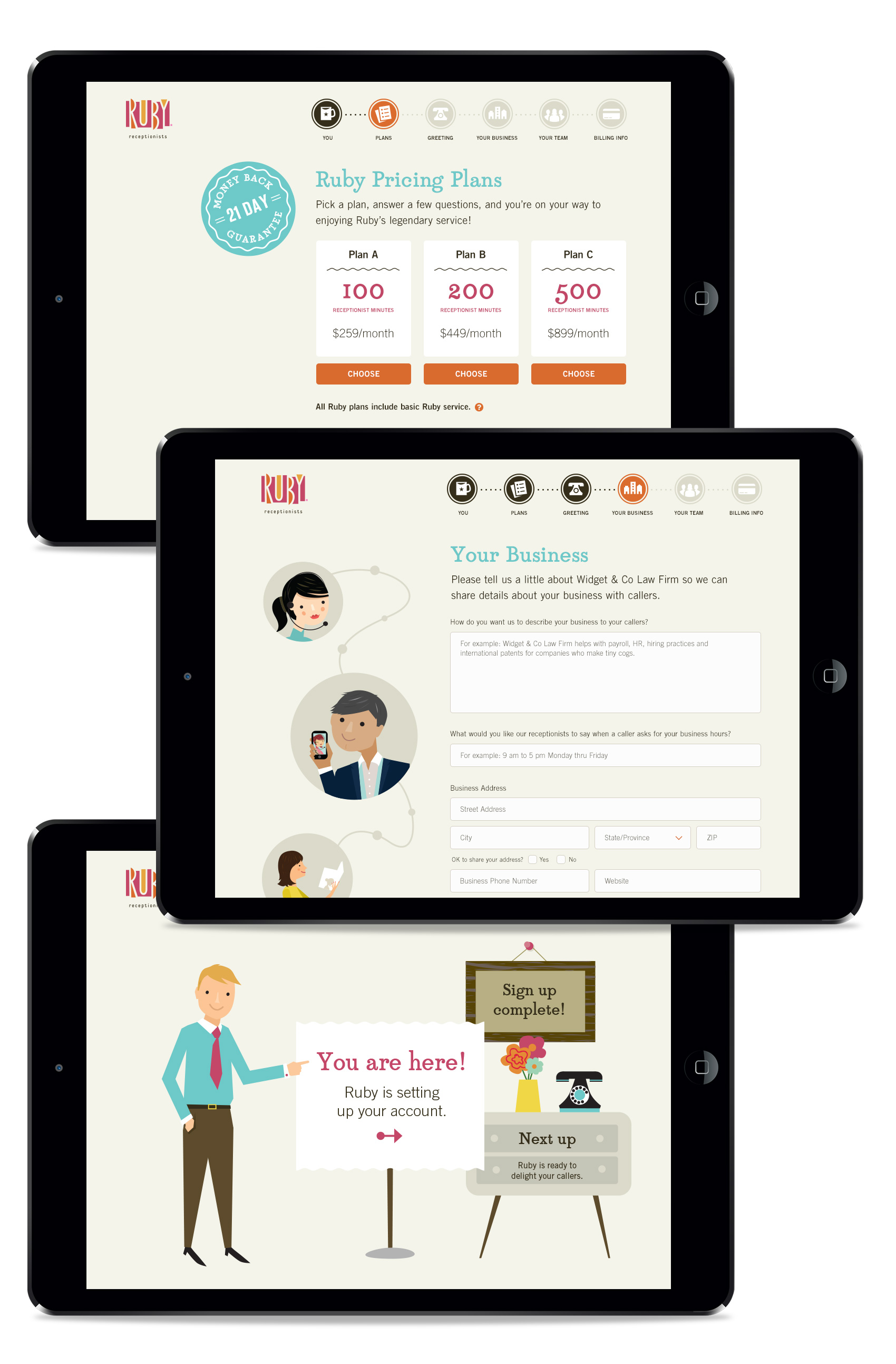
Another Ruby project from the last few months was helping the team, led by Terri Haswell, UX manager, to provide graphic assets for their online sign-up site. In addition to the structure and content getting an overhaul, the graphics were designed to make the process simpler and easy to understand while getting the basic information needed to help and retain new customers, all while providing a great first impression of what working with Ruby feels like.

I love working with Ruby’s illustration library and creating new scenes with the Ruby character and all her accoutrements. To reinforce the step-by-step process of signing up, we created an iconographic navigation path that highlights user progress. Translating the usually large and detailed illustrations into small icons was a good challenge in keeping the Ruby flair intact at a small size.
![]()
At each step along the way, Ruby and her cohorts provide friendly assistance and encouragement in filling out 1) personal information, 2) choosing a plan, 3) selecting a greeting, 4) completing business information, 5) filling in team members, and 6) payment. Here are several more screens (the last screen is a “designer pick” that wasn’t used as a final).
