Just in time for the end of summer, here comes another ice cream project (I hear the first project, Gelato by Naia, is available at Zupan’s on Belmont – after tasting 6 flavors I can guarantee they are delicious)!
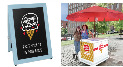
This gig was for a small home-grown ice cream vendor from Charleston, South Carolina, who works under the name Scoop Love. More grassroots than most, the ice cream is only available at the local farmer’s market with scoops being served from a small ice cream cart.
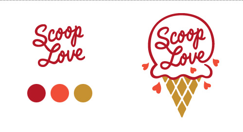
Inspired by the 50s ice cream culture and parlor style, the branding is as simple as possible in a throwback analog way. Most items are 2 colors and the use of elements is repetitive and straight forward. The entire system relies on only an iconic waffle cone pattern, a circle, and a heart here and there.
Designing so reductively was fun, and continuing good practice of the lessons of minimalistic Danish design. Taking a second look, I’m pretty sure the Danes would have cut out the waffle cone pattern and just kept the “scoop”, while trading out the script font for a nice condensed sans.
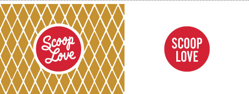
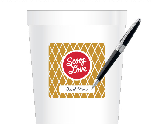
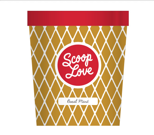
Since Scoop Love is such a fledgling business, all of the pieces needed to be designed for fitting with off-the-shelf items for small runs and one-off production. It truly is a one-woman show and the design needed to be sustainable as such. A templated sticker design was created for the ice cream pint with a fill-in-the-blank for flavors as an example of this low-fi approach to providing what the client needed.
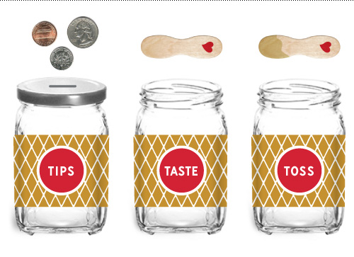
Another make-it-yourself item was a series of paper wraps that can be applied to jars for tips, spoons and used spoons – low cost but still cohesive with the brand look.
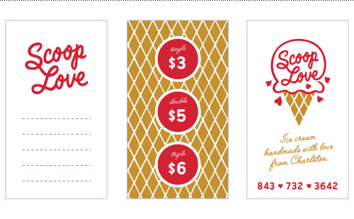
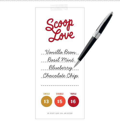
Print-at-home templates were made for trifold stands and menus which could be updated by the client either digitally or by pen.
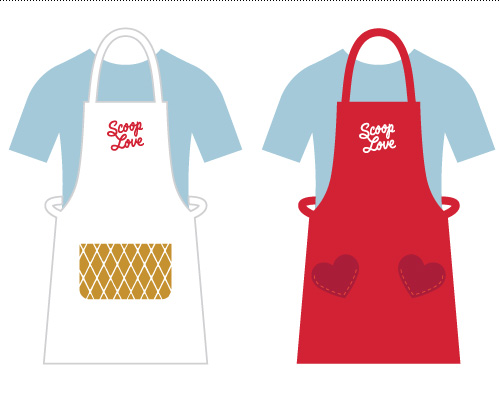
Aprons were recommended to be spiffed up with sewn on details such as waffle cone and heart pockets in addition to the logo.
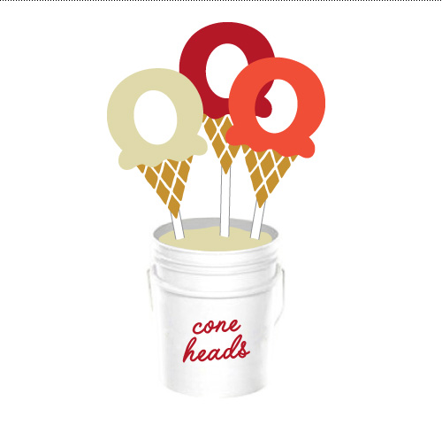
As part of the experience and a way to get exposure on the social medias, a photo-op set-up was rigged for taking “conehead” pictures – easily transportable compared to many photo booths and easy to use.
So if you’re in Charleston next summer, look for the ice cream stand right next to the pony rides and you’ll get to taste a little bit of scoop love.
Super cute!
love the cone heads.