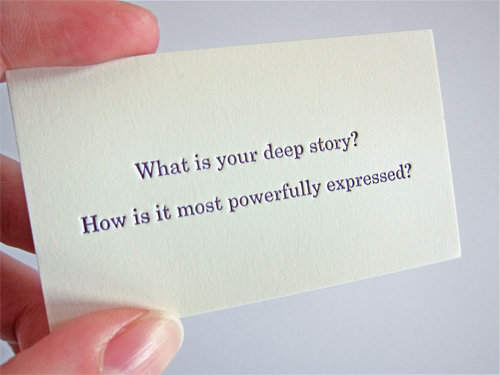
As a follow up to the business cards I designed for Jelly Helm Studio, here are some additional cards that show a little bit about how the studio approaches things. All of the cards were letter pressed on cream colored Neenah Classic Crest #165 cover.

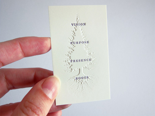
The cards were printed at Brown Printing, where they were very helpful in trying out an unusual combination of printing techniques: first embossing (raising) the paper in a tree shape, and then letter pressing text (pushing the paper down) on top of the tree shape. For all that pushing and pulling of paper with the text being pressed into both the tree and non-tree area, it turned out pretty well.

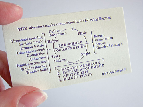
My favorite of the three cards is this reproduction of a diagram by Joseph Campbell. Wikipedia says “…his work is vast, covering many aspects of the human experience”. No small task to fit onto a 1.75×3 inch card, even with some rejiggering on our end so the large original diagram translated well to a tiny version of itself.

Brown does letterpress?!? Who knew?
Mary’s been holding out on me!
p.s. They are beautiful cards. Nice work.