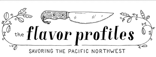
One of my favorite subjects to work with is food. I also love helping people start up their own thing, whether it’s publishing their own book, building a website service, or bringing a new product to market. So when writer Mona Johnson contacted me to create a logo and illustrations for her burgeoning food blog focused on the Pacific Northwest, it was a perfect match.
She wanted a spare and refined look paired with detailed line illustrations to punctuate her stories and beautifully understated and vibrant photography. After the first few posts, I think the combination is a success – check out her site here: www.theflavorprofiles.com.
The logo typography was hand-drawn, a trait Mona and I thought should be consistent throughout inked elements, but derived from didone fonts for cleanness and a sense of professionalism.

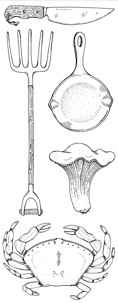
The illustrations were created at a detail level so they could be used either large and in charge, or as small icons sprinkled throughout the site.

A close up of the first five large illustrations made for The Flavor Profiles: knife, pitchfork, cast iron pan, chanterelle mushroom, and dungeness crab.
