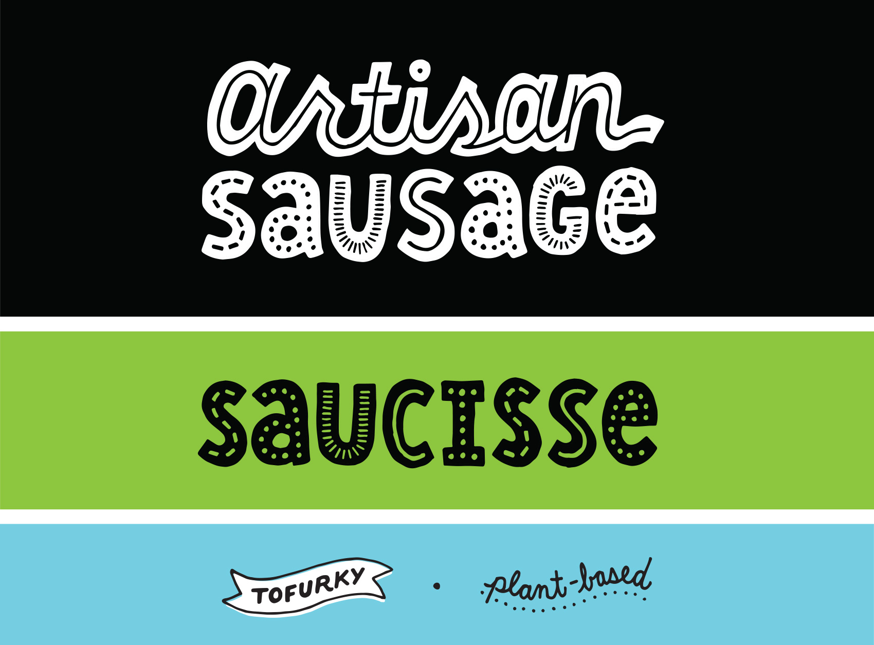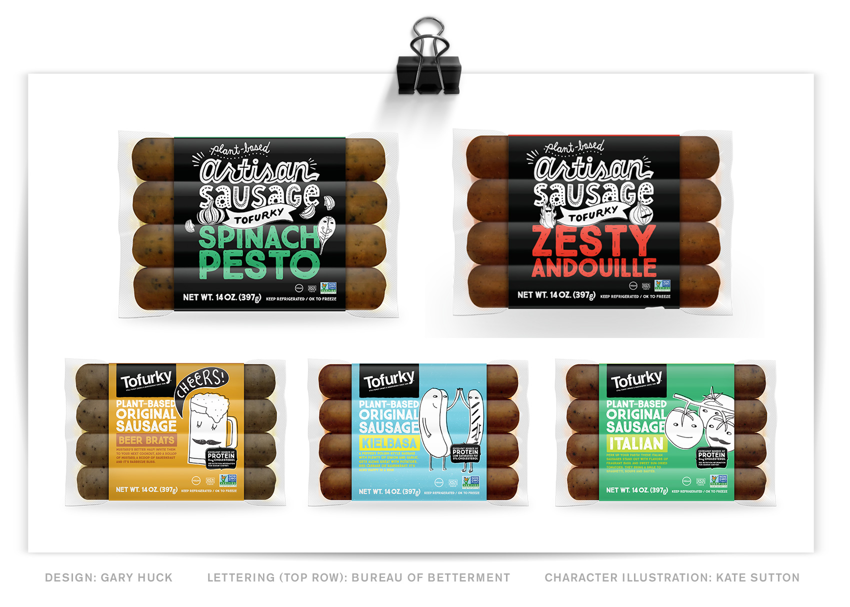
Here is a new lettering project for Tofurky, this time working on their packaging instead of general brand or advertising lettering. This project’s goal was to differentiate their artisan sausage in a way that felt true to the brand, but elevated the artisan product line into another visual space than the regular sausages.
