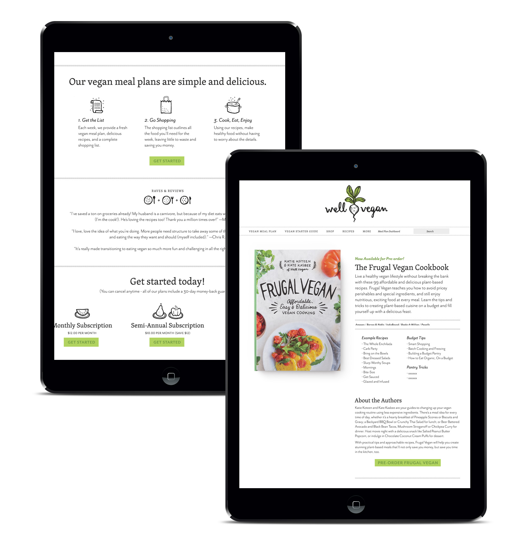
Six years ago marked Well Vegan’s launch when Bureau developed the brand from scratch for food-entrepreneur Katie Koteen to market her vegan meal plan subscription service. This spring, with a ton of new site features and her first cookbook under her belt, Katie wanted a refresh for the logo and website.
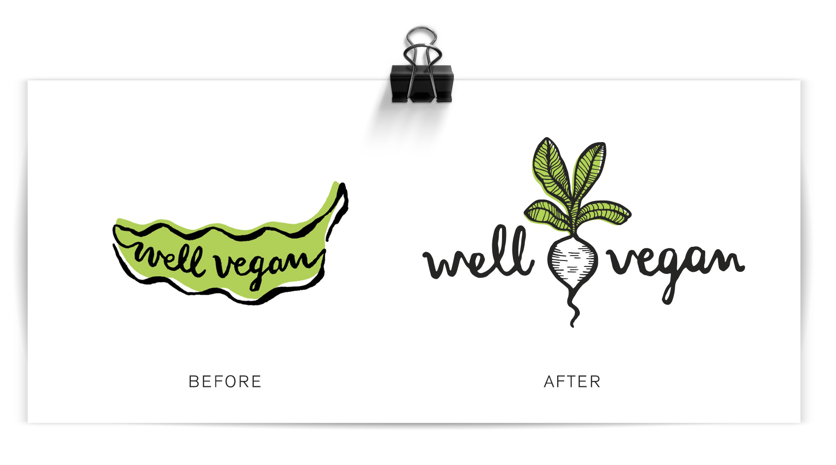
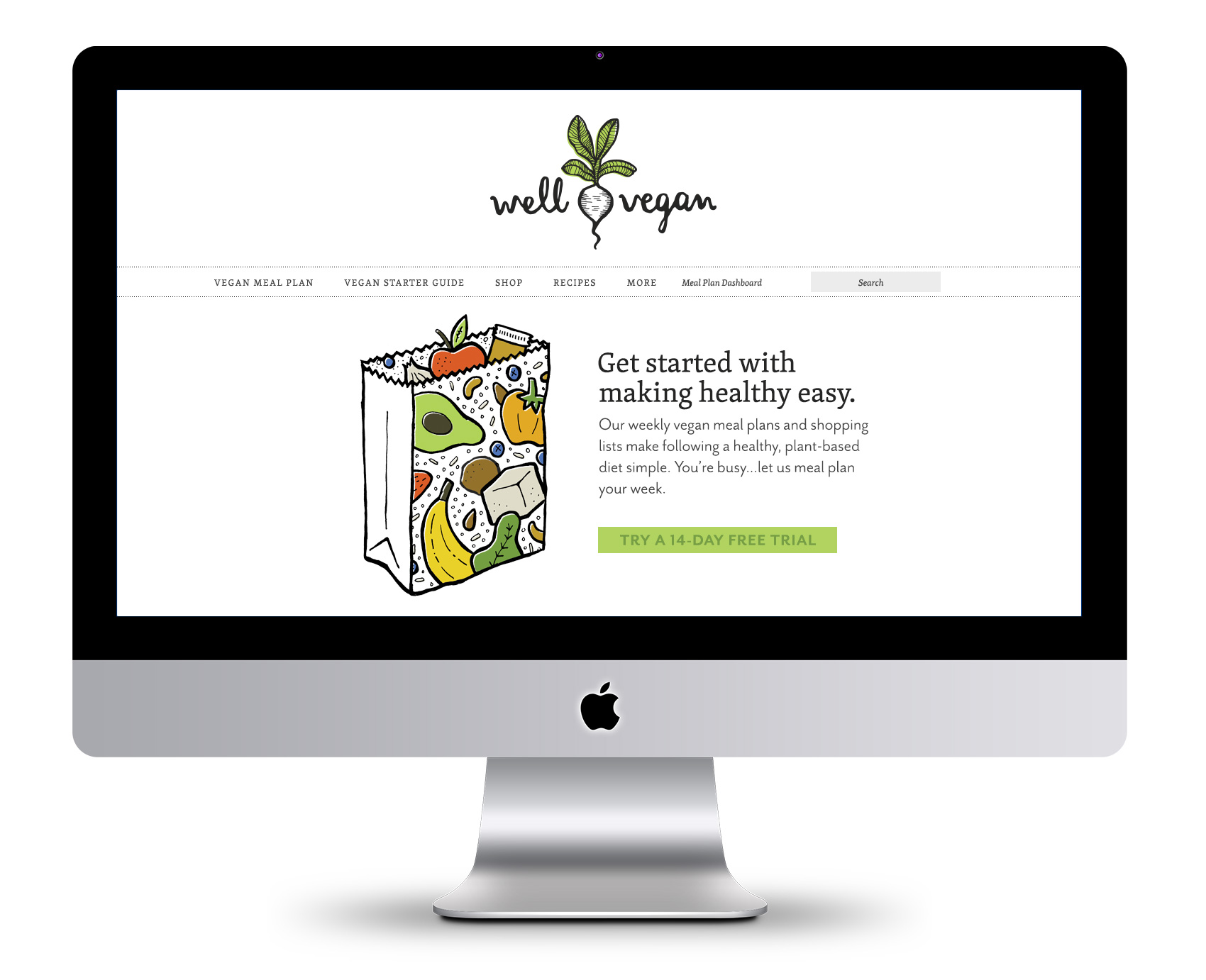
The first thing on the docket was a logo update. The friendly hand drawn script was a keeper, but legibility was increased by redrawing it on a level baseline and separating the two words with a visual – one of Katie’s favorite illustrations from the initial branding, a white radish. A pop of green was retained in the radish leaves, but the overall impression was more toned down.
The inaugural 2011 branding for Well Vegan included lots of hand drawn elements, borders, spot illustrations and illustration as main images (see it here). In 2017 Katie wanted to update the site based on the increase in photography and recipe posts, as well as make the site feel a bit simpler and cleaner rather than the homespun start-up it used to be.
A major area of focus was paring down the use of illustration and color to allow the food photography to shine. Instead of being the main focus, illustrations were used as accents and often in black & white instead of full color. The fonts also were refreshed – headline and accents were kept in the friendly legacy font (Skolar) while body and informational text was updated to the lighter, brighter Mr. Eaves.
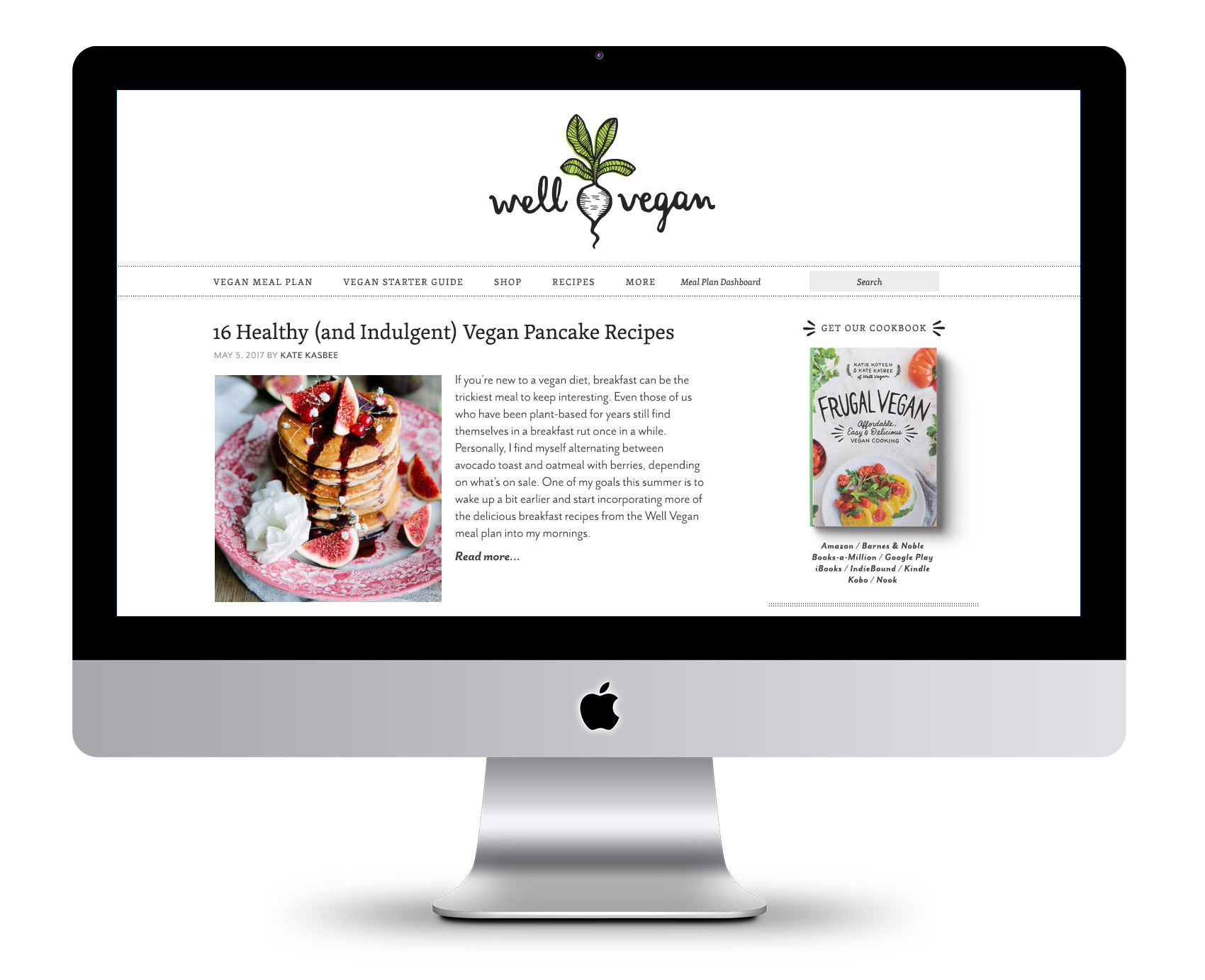
In the instances where illustration is used for main effect, we stuck with the black line-work style with color accents. This also left room for future promotional illustrations which had been a heavy favorite over the years with subscribers and the Pinterest crowd.
The new streamlined feel was leveraged lightly throughout the site and in the cookbook design, featured on the cover and as page accents. The book is currently available.
