I’ve enjoyed working on the Well Vegan brand over the years, starting with their initial logo and branding and continuing with an eBook cover, promo materials, and a series of DIY postcards (here, here, here, and here).
Our latest collaboration was to update their website based on user analysis to increase sign-up and promote their new eBook Starter Guide. To do this we streamlined the front page with a large either/or graphic focusing on the plan and the book.

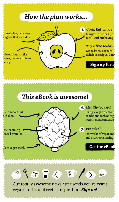
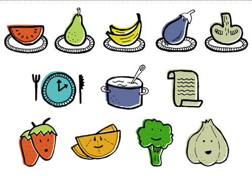
The Plan and The Starter Guide got their own secondary pages that had more in-depth information that was previously outlined on the homepage. And all that new content was a great excuse to create more small plates!

The homepage was also adjusted below the fold to highlight the resources section and recipes section, and make the all of the content more scannable. Four resource icons were made for this.

Even though I’m not a vegan, vegetarian, or any other label of imbiber other than equal opportunist, I enjoy getting their weekly newsletter of recipes – always handy when veggie-only friends visit. If you need a hit of cooking inspiration, just visit their extensive library of home-tested recipes.