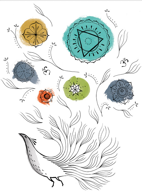
One of the great things about illustration work is that it usually involves researching new subject matter, thus resulting in…KNOWLEDGE. Score. My general picture of yoga is “a stretch here, a stretch there, and a little inner peace”. After working on an illustration for Upswell for the Yoga Space, I now know that we have chakras. Five of them!
Upswell was to design a website for the Yoga Space and wanted illustration throughout the site, focused on one large illustration that could be broken into parts, each part using symbolism derived from the spiritual practice of yoga. The budget was fixed, so to make sure we were on the right track pencil sketches were explored first to get an idea of what elements should be used. This also shows that in the beginning things are ugly…or in design speak, “rough”. Usually they get better!
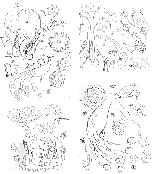
It is always a debate on how soon to show work to a client. If it is too unfinished, imagined possibilities might not be fully communicated. If it is too finished and not on target, you risk time intensive re-work. On this project it was possible to do very rough but quick iterations and get approval along the way, which saved time and allowed everybody in the project to have input where it counted.
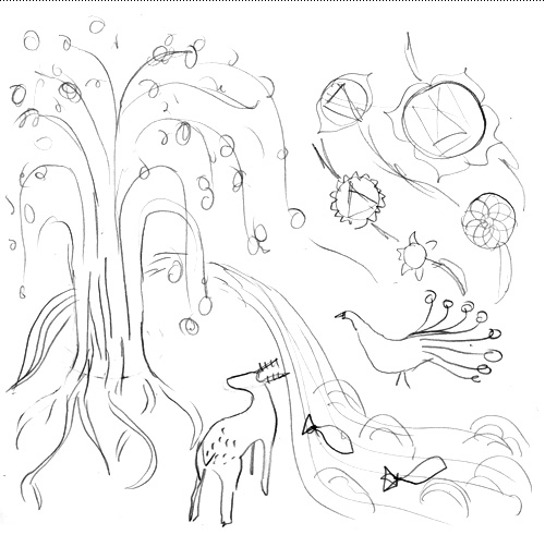
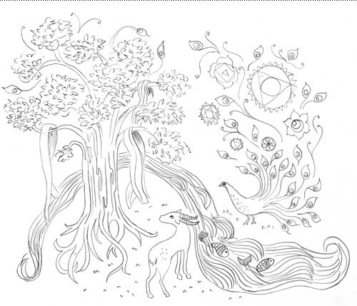
Once a general layout had been approved, we took a section of the illustration and made inked tests to further dial in on the style. Again, this was a great way to work since once the style was approved there were no big surprises for the client after the entire piece had been inked.
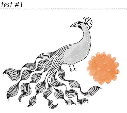
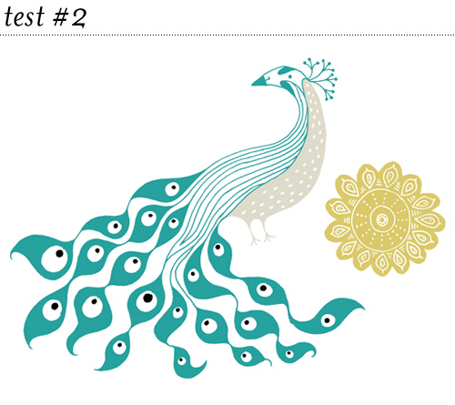
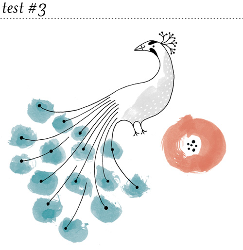
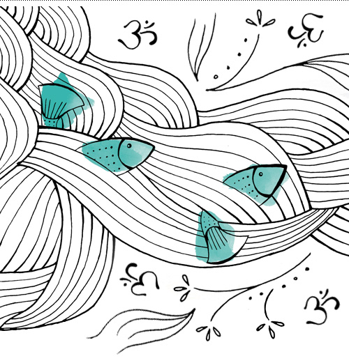
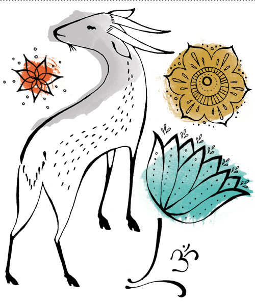
And finally, with approved pencil sketch and feedback on the ink style test, the entire illustration was created using a bodhi tree, peacock, river, fish, lotus, chakras and om character.
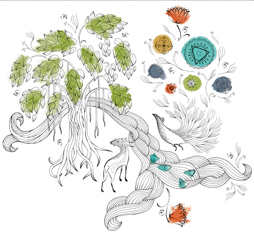
These are gorgeous. I love seeing another designer’s process, especially the rough sketches.
You’re my hero!