Dipping Oils & Olives
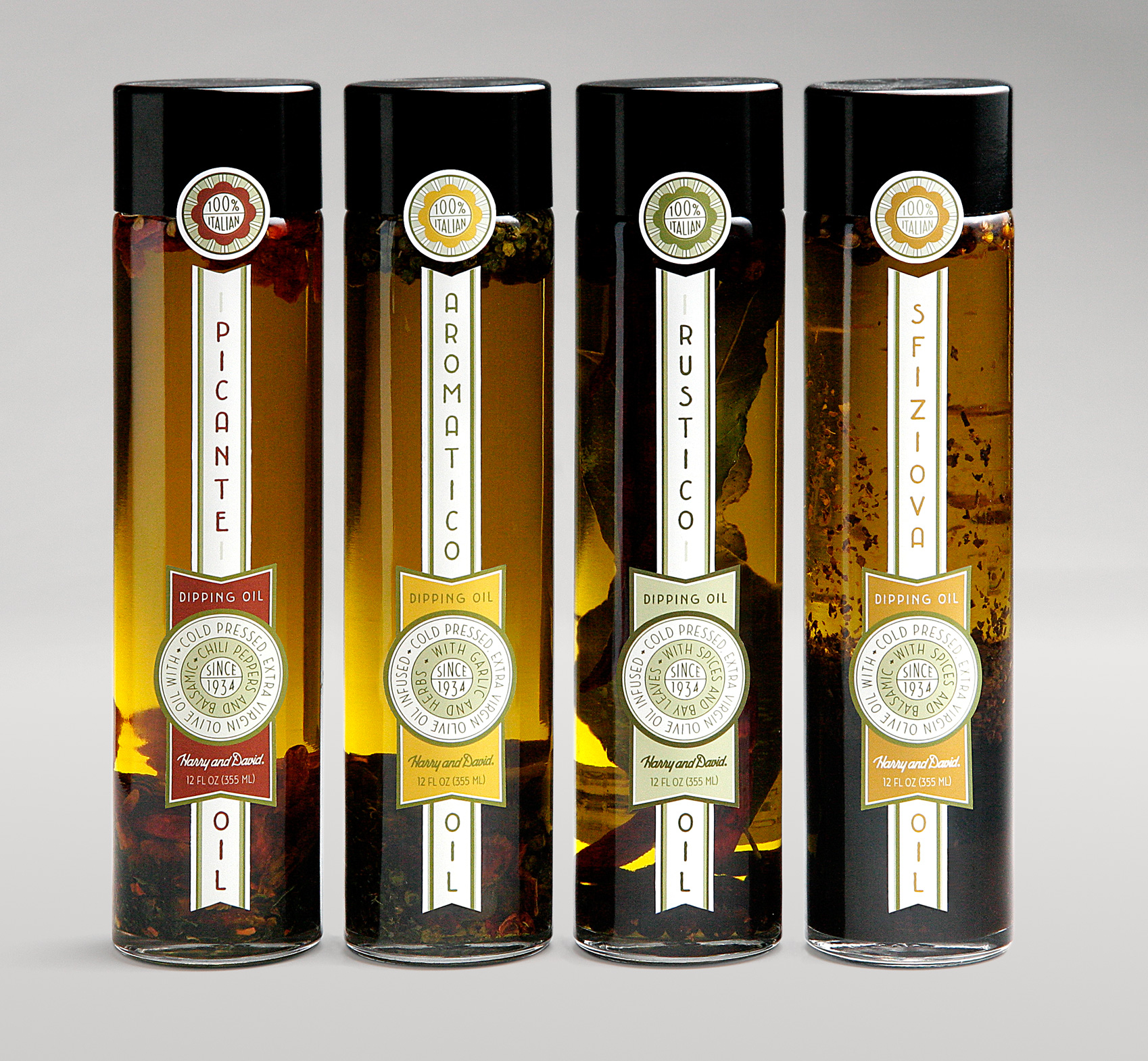
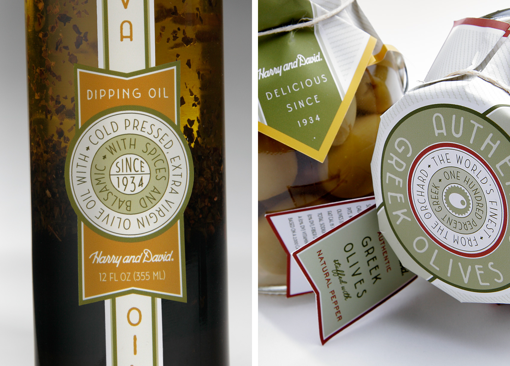
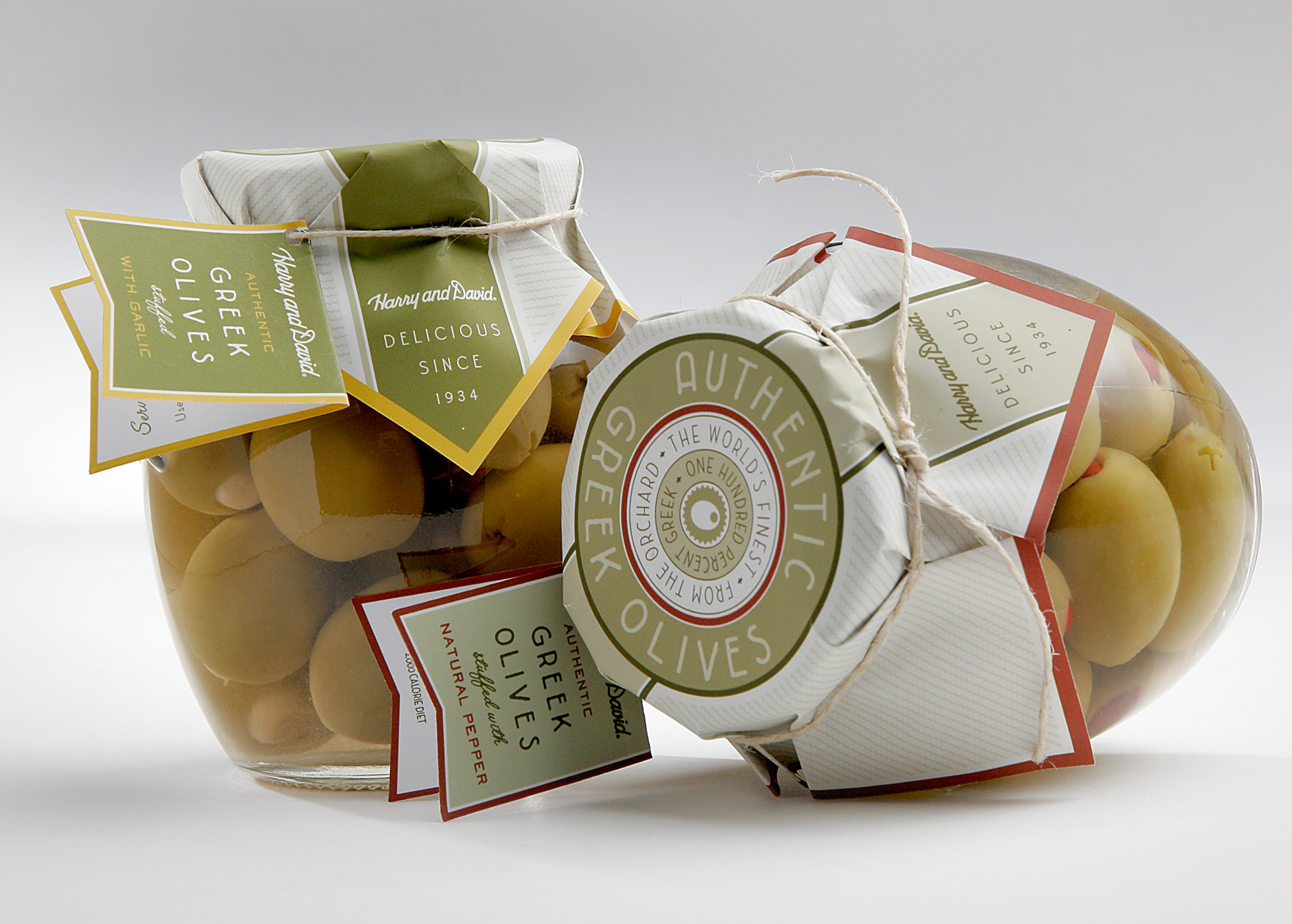
A series of dipping oils and olives were packaged as a specialty product line for Harry & David. For the dipping oils, a slim, ribbon-like label allows the product to shine through while the composition mimics the content’s tendency to separate towards the bottom of the bottle. Letters re-created from a 1930s type sample and a warm color palette add to the premium yet approachable feel. Matching jar kerchiefs were made for the two olive varieties. The series sold well and prompted the company in creating additional products for this line.
Client
Harry & David
Scope
label design, custom typography
Agency
Morrow McKenzie Design / Elizabeth Morrow McKenzie (Creative Director)
Role
designer


