The Whole Shebang from Olympia Provisions


A client that continues to provide fun and interesting projects, Olympia Provisions, recently commissioned the Bureau create a holiday gift guide (more to come on that another day). One of the main photo spreads was a compilation of all of their charcuterie in the shape of a pig, with the products placed approximately where it came from on the pig (give or take an artistic license or two).
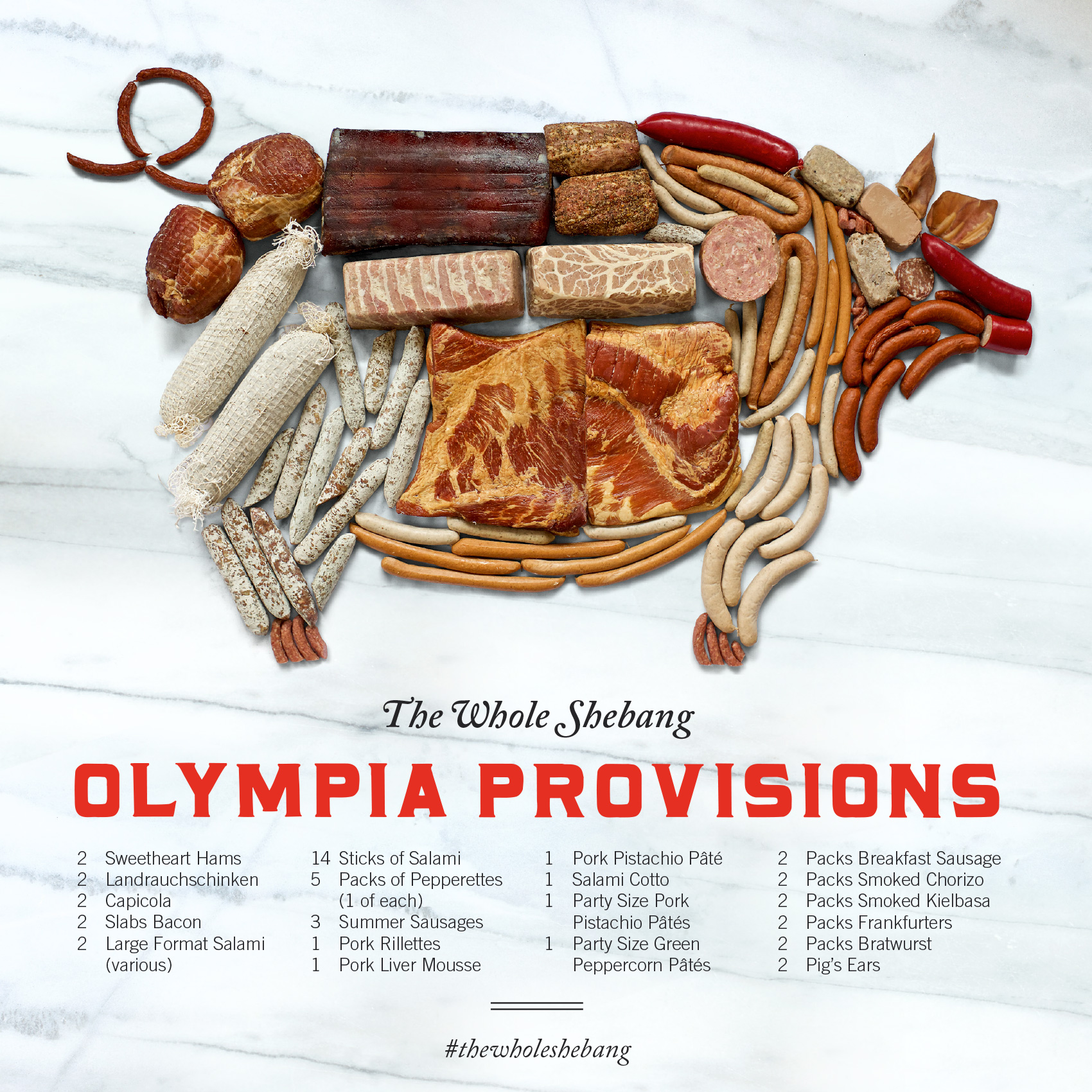
olympia provisions charcuterie selection in the shape of a pig - the whole shebang!

The image was created by salumist Elias Cairo of Olympia Provisions placing all the meats in their respective areas, then myself adjusting the placement until it looked like your friendly neighborhood oinker if you were looking at it with X-ray meat vision. Photographer David Reamer shot the piece from a ladder, top down on a white sheet. The white marble was added in post production to give the pig a neutral background and showcase the variety of colors and textures (apparently fat marbling is a big deal in the meat world).

Now, I’m not averse to meat. I eat it. I enjoy it. I’ve even spent time in slaughter rooms on Eastern Oregon ranches during my youth and had my dad chase me to the hay barn brandishing a cow’s tongue (scary for an 8 year old). But in my last two decades of life I haven’t handled that much meat because a) I’m not the main cook in the house, and b) I live with a vegetarian. But handling 50 pieces of meat several times each for over an hour is a bit beyond what I ever though my job as a designer would entail. Suffice to say, I fulfilled my meat handling quota for the year on this project!

And, since this was a small part of their annual consumer-side catalog project, you can indeed buy The Whole Shebang (which is technically classified as a “half pig”) when holiday season rolls around. It’s a no-lose situation, and as we described this unique offering in the catalog…

Last minute dinner guests? Need to throw a party for a hundred of your best friends or business associates? Fear not—with our half pig, you’ll never experience a pork shortage again. Includes everything listed! Assembly required.
Ceek Logo and Website


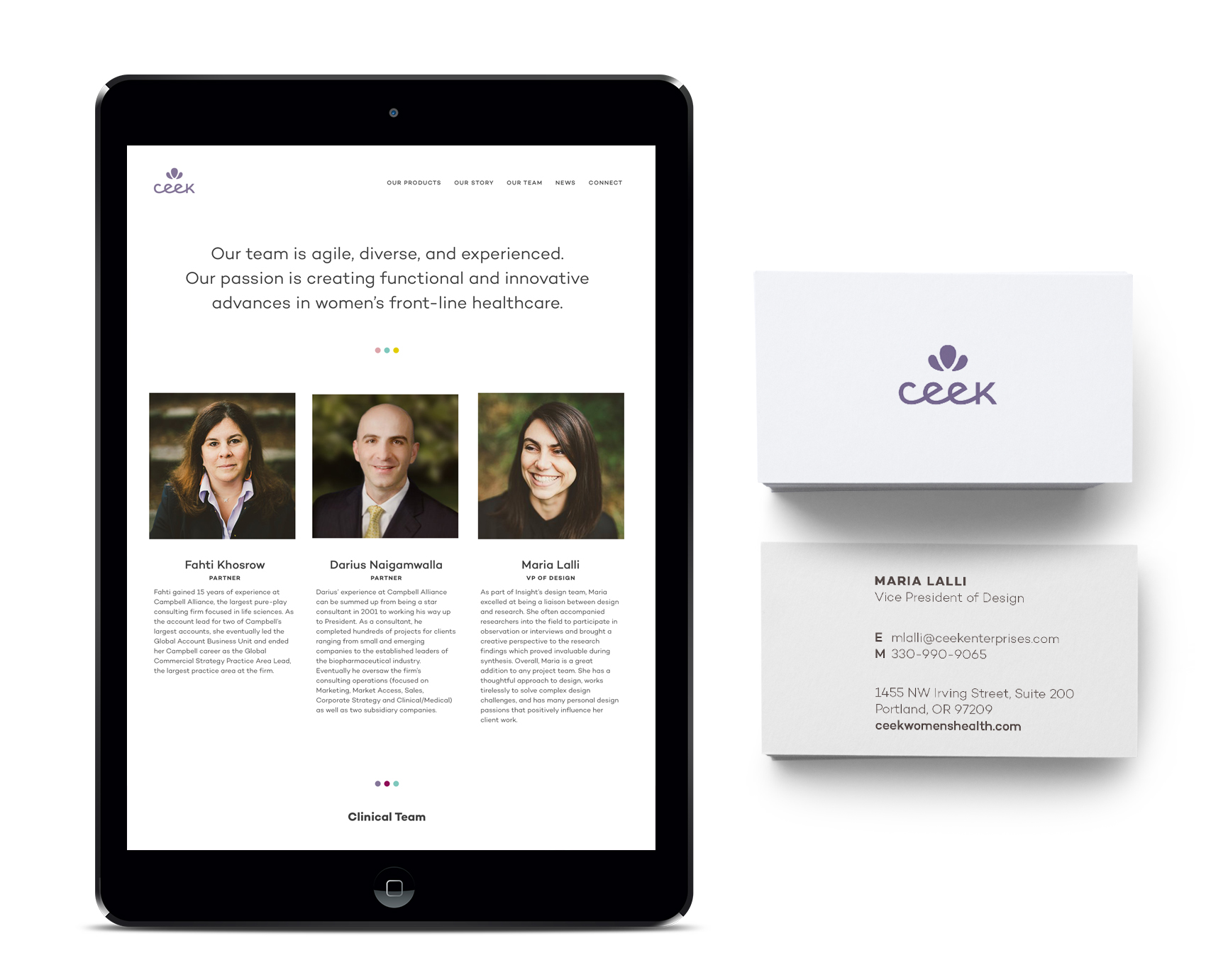
An interesting client I have been working with recently is Ceek, a product design and development start-up that provides innovative solutions for frontline women’s healthcare. Bucking the historical trend of men making products for women to varying degrees of success, this company focuses on products created for women, by women. Definitely an approach I could get behind!

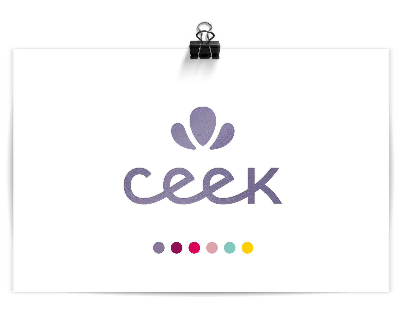
Ceek custom logotype in lavender.

Their logo was an exercise in custom typography and compactness as it needed to reproduce well on a variety of materials in small format (for example, as a deboss on a rubber handle grip). To aid in keeping the logo as big as possible at even the tiniest scales, a monoline x-height was implemented so the logo wouldn’t have to scale to accommodate the tallest character (since there are none!). A simple petal icon went through many iterations to become soft yet bold, feminine and somewhat regal, and have the right proportions to scale as well. A metallic lavender was chosen as the main brand color, differentiating it in the medical field which tends to employ blues (HEALTH!) and pinks (FOR WOMEN!) across the board. A broad palette of supporting colors were added to increase vibrancy and flexibility for future product lines and create a more nuanced palette than competitors, making the brand more approachable than clinical.

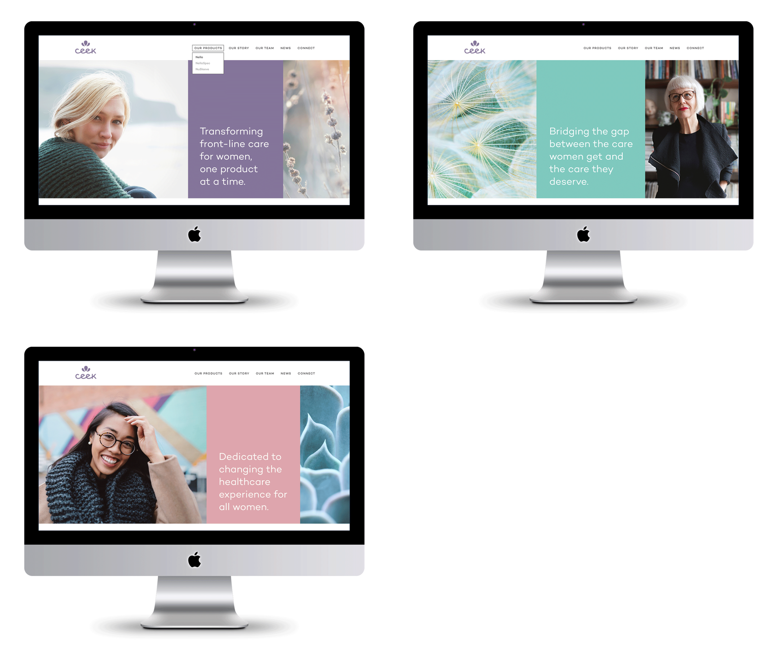
3 image banners for Ceek homepage, healthcare innovation for women.

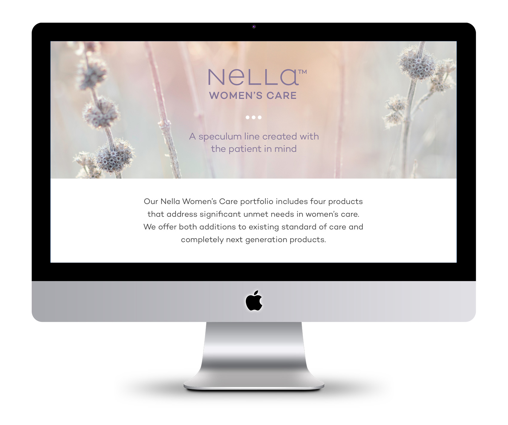
Ceek’s first foray is tackling the age old device of every women’s annual visit – the speculum – with a range of patient and doctor friendly updates in their product design. Shockingly, the device hasn’t had major updating since its invention in the 1800s. From a graphic design perspective, it was also not the most inspirational visual matter to present front and center. To communicate Ceek’s intentions and story, we focused on their leading goals and featuring a wide variety of portrait stories and subtle growth focused imagery. A complementary logotype for Nella, the first product line, was also created. In addition to design, Leighann Franson aided in brand copywriting and Katie Koteen implemented the website.

Product page for Nella, Ceek's first product for women's healthcare.

Ceek Women's Healthcare about page and business card.

Pin That Sh*t


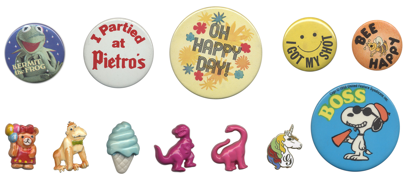
Like most kids I collected various things throughout my childhood, including buttons and pins. Most of my pins were from family travels, my parent’s political involvement in education, or participation in school events (see the full array here). Ramblin’ Rod would not have been impressed, but it was my collection and I was proud of it.

A few buttons and pins were collected of my own volition, and one of my prize pins was found in a deserted lot near my home around 8 years of age – a unicorn with gold metal accents and a multi-colored mane. Between childhood activities of building forts out of firewood stacks and popping tar bubbles on recently repaired roads, finding a monogram unicorn pin was a highlightable moment – even if it had a G on it instead of an M. Many days I wore this pin and thought “if only my name started with a G”. Alas. Here are a few favorites from my childhood collection.

pin collection from my childhood including a unicorn with multicolor mane

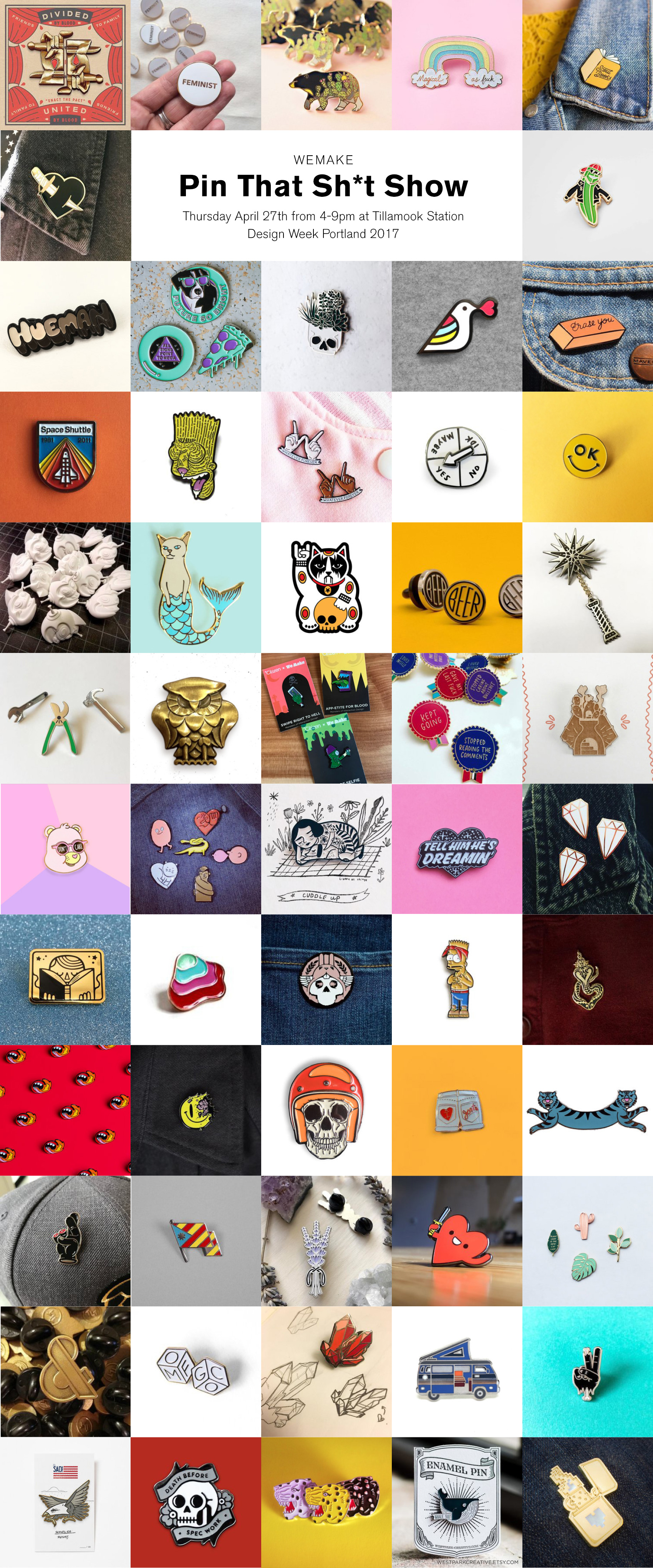
So, it seemed destined that one day I would participate in a group art show called Pin That Sh*t during Design Week Portland 2017. Over 60 artists from around the world donated pins, all of which will be for sale with funds donated to support arts education. Once I learned I would be a part of the show, I revisited my 1980’s collection and started on designing something new for the show.

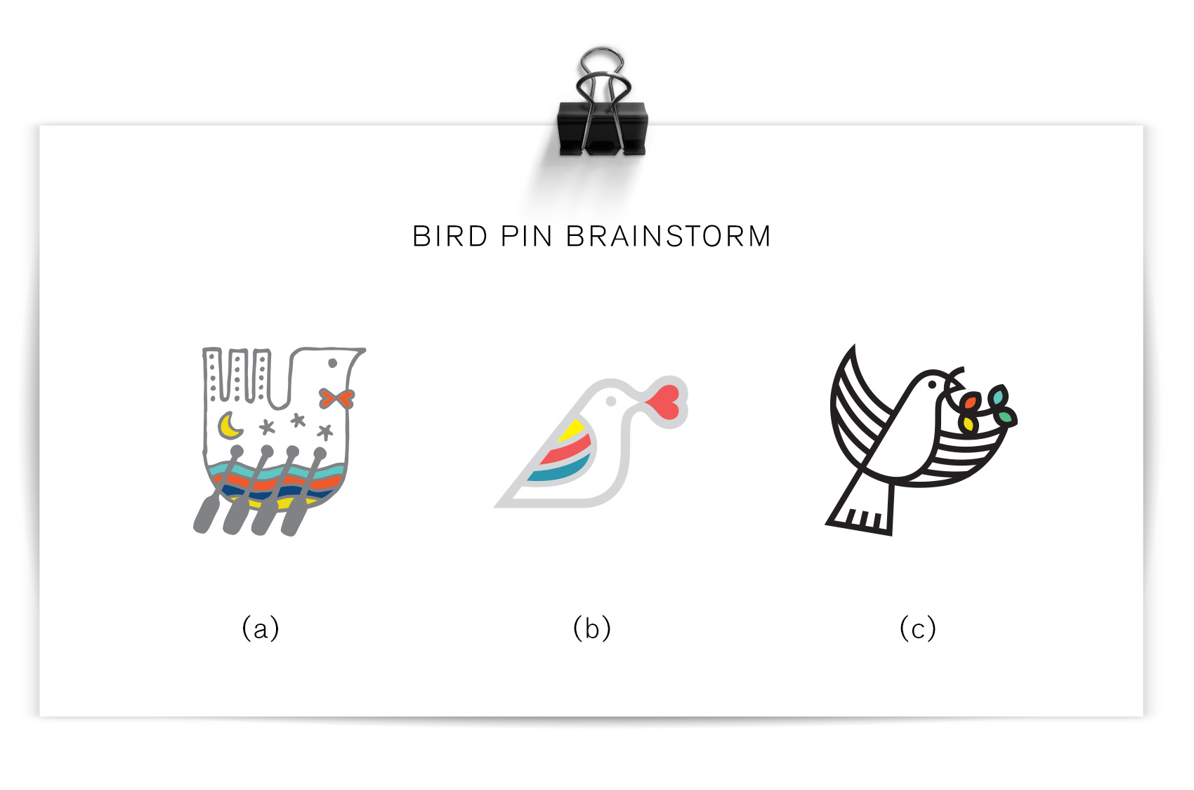
My brainstorming ran the gamut from textures to animals to random icons. A theme of birds became apparent which guided a more specific exploration of several bird pins, of which the top three were considered for the final piece. After feedback from studio mates, the simplest bird was adjusted to have bold black outlines, taking inspiration from my childhood unicorn pin but modernizing it in style. And really, what better way to converge ‘put a bird on it’ with the new hip trend of pinning everything in sight?

preliminary bird pin brainstorms

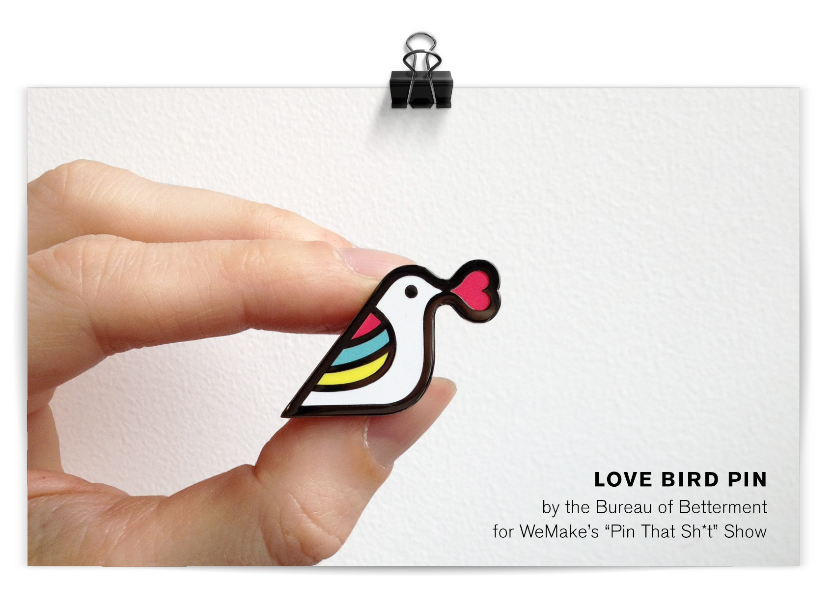
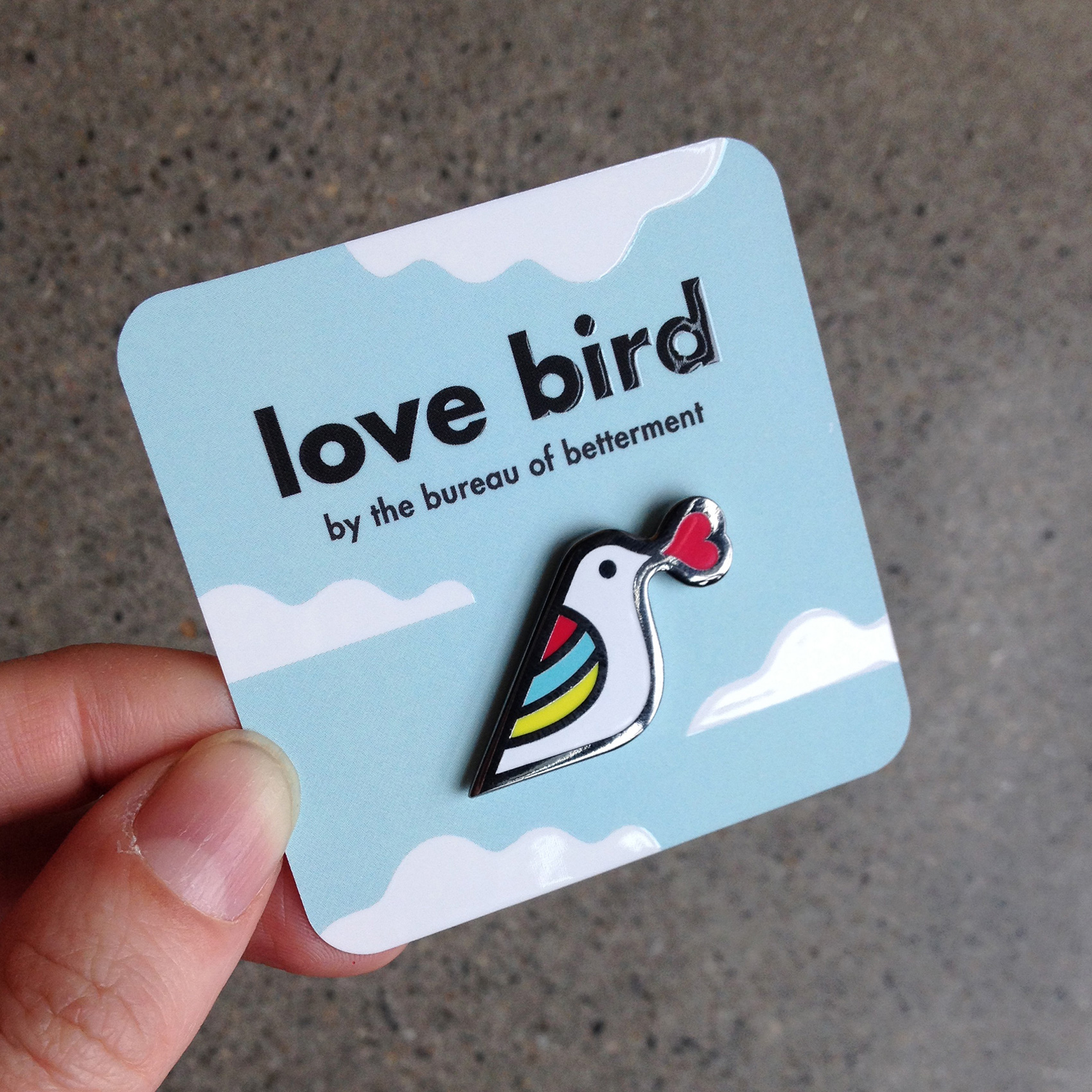
love bird with heart speech bubble and rainbow wings for WeMake Pin That Sh*t Show

Love Bird is a tiny yet highly visible fashion partner to any wardrobe or backpack choice. With a nickel metal detail and flat polished surface, its minimal design seeks to spread love and acceptance. It’s a bird with a meaning, but it’s also just darn cute!

Two larger collections are also a part of the show from Kate Bingaman-Burt and from Brian Stowell, and many artists donated more than one pin so that there will be over 600 pins on display. For a more comprehensive list of artists and their bios, visit WeMake’s event page.

The show opens April 27th at Tillamook Station (665 N Tillamook Street in PDX, OR), from 4-9pm. In addition to the pin display there will be activities and beer. Most pins will go for about $10, also known as very affordable art. Time to find a bigger jean jacket…

participant pins of Pin That Sh*t art show

The pin was produced through GS-JJ who make custom pins, patches AND belt buckles. To transport/display the love bird pin, I ordered custom cards from Moo. A square, rounded corner card with spot gloss on the title and white clouds was the perfect fit for the bird with both shiny and matte surfaces.

love bird pin with cloudy spot glass Moo Cards background backer

McAfee Cybersecurity Timelines


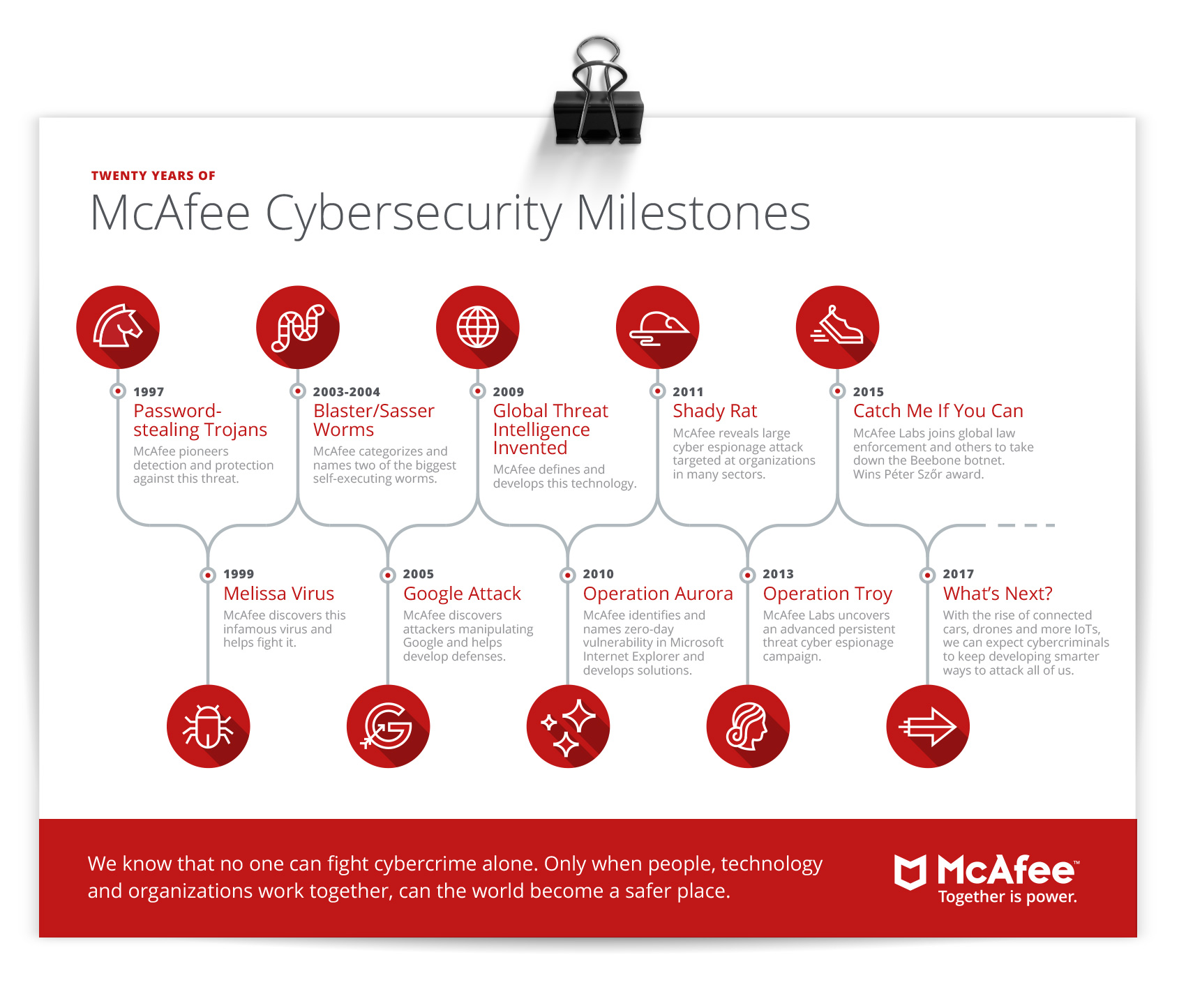
Working with Solid Branding for their client McAfee, the Bureau created a set of 20 cybersecurity related icons and a timeline infographic that was used for both McAfee’s involvement in cybersecurity and a generic version of general cybersecurity history, all done to match McAfee’s brand guidelines. Not being particularly techy or aware of the nefarious side of technology, working on this project made me a bit paranoid every time I opened up a device…are they watching?

Cybersecurity timeline for McAfee

Twenty cybersecurity icons for McAfee

Olympia Provisions Wurst Division


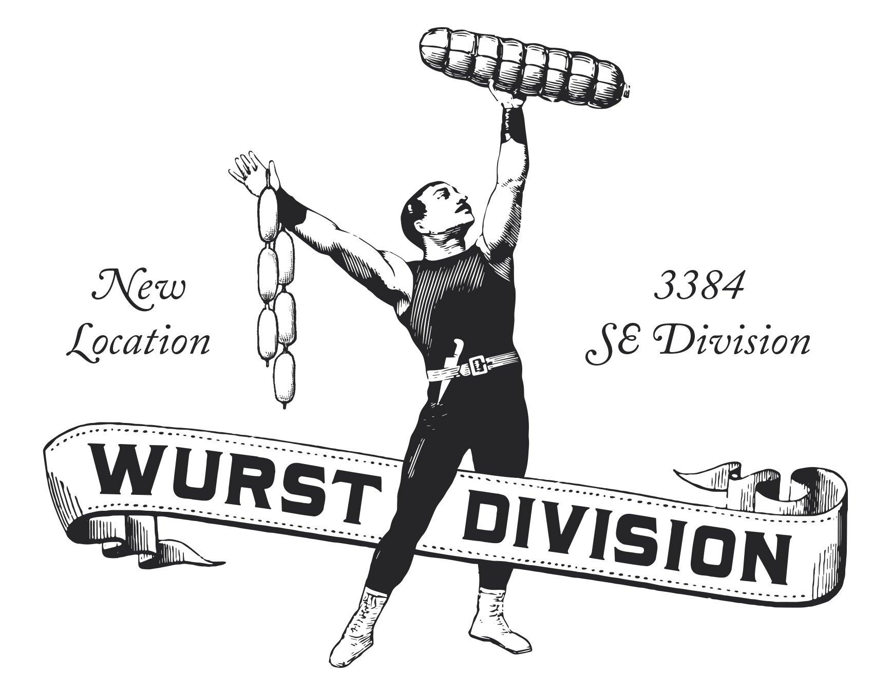
Drum roll please…for the opening of OP Wurst Division! Olympia Provisions’ offshoot restaurant series, Wurst, now has a new location on 3384 SE Division street. A renovation of the old Honky Tonk Taco building turned a teal & red taco joint into a high end sausage bar. You heard it – a high end sausage bar. The Bureau assisted by providing brand & signage suggestions including establishing a simple white, black and gold palette that takes advantage of the interior’s natural wood accents and a restrained use of signage combined with custom composed old-time woodcut illustrations.

Strongman sausage lifter announcing the new OP Wurst Division location in SE Portland

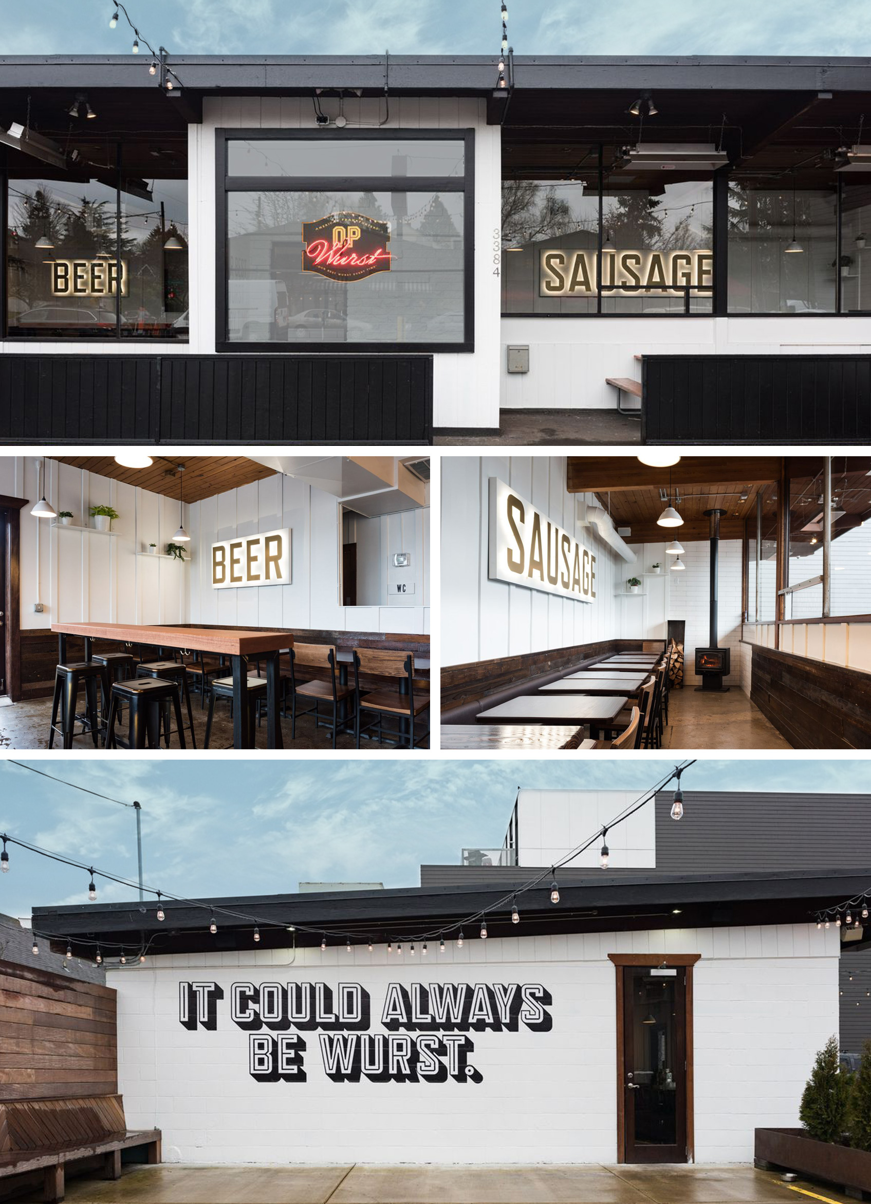
On the front facade two large backlit gold signs can be seen through the windows boasting BEER and SAUSAGE. What more do you need to know? Inspired by a hut on the top of Mount Hood that has no logo or branding other than BBQ written in 15-foot-tall letters on the roof, OP Wurst Division uses a minimal approach to great effect. The signage works double-time as cozy lighting while the bar is open and all-night-long advertising to passerby. Inside, the main impressions include a giant bar, gleaming rafters, and a newly installed fireplace in the west wing (otherwise known as the “wurst room”). When seen from outside the singular message makes sure you know what to expect. BEER. AND. SAUSAGE. (photos by Dina Avila)

acklit gold interior signage spelling BEER and SAUSAGE. Outdoor patio message: it could always be wurst.

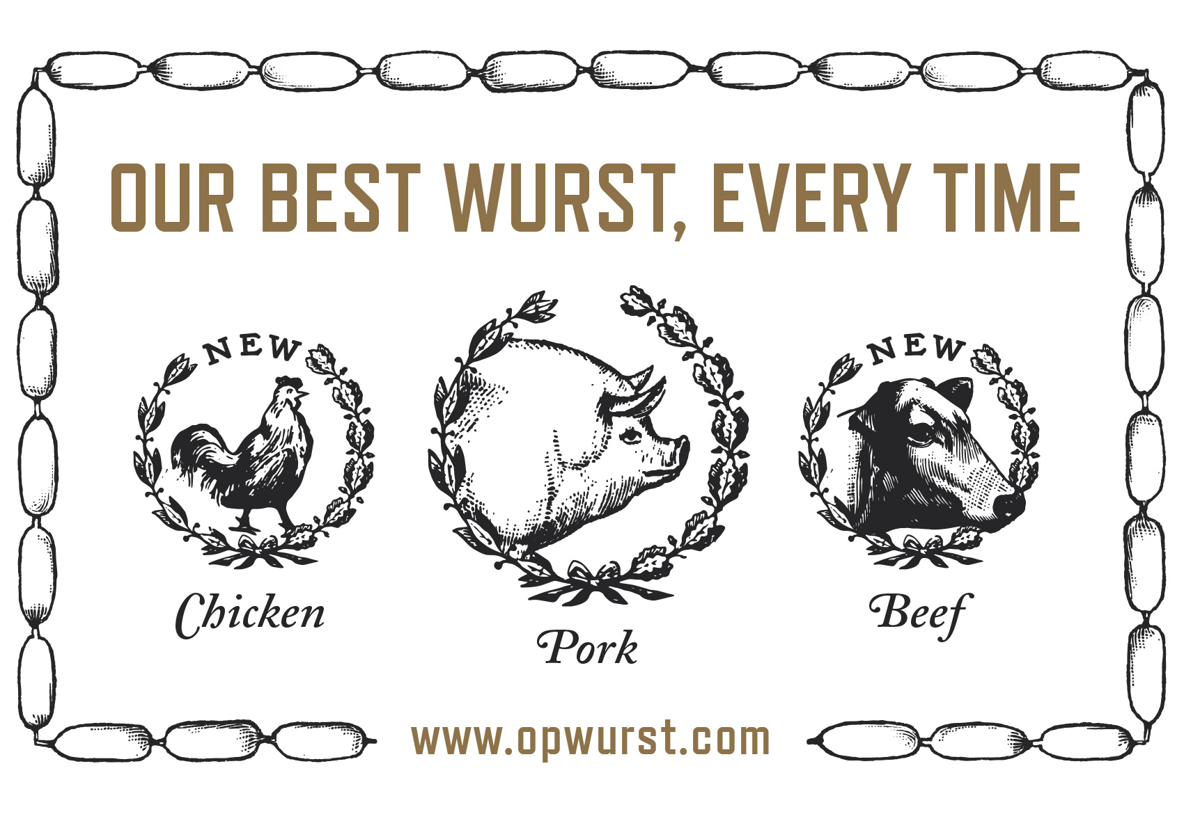
An outside patio mural boldly shouts a simple message to people near and far: It could always be wurst. Speaking of which, the menu has a plethora of hot dog options from traditional to way-out-in-left-field (there are even a few menu options for veggie lovers). In conjunction with the opening, Olympia Provisions is also expanding their sausage options from the standard pork to include both chicken and beef sausages. So hustle on over to Wurst Division and try a traditional dog or an experimental twist on the classic wurst.

wreaths heralding chicken, pork and beef sausage selection at OP Wurst