Glider Logo


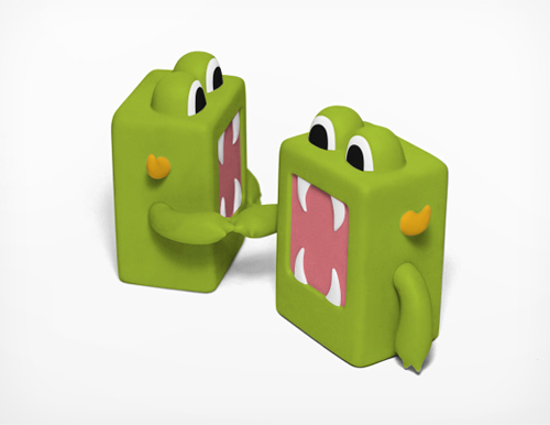
Recently I finished a logo for Glider, a company that in their own words “…is redefining word processing from the ground up to make organizing, negotiating, and signing documents as simple as it should be.”

Sounds good to me. Even though my efficiency orientated brain can easily calculate the time between meals, snacks, and how many rabbits can be drawn in the interim, my thought upon waking is not focused on BUSINESS TIME. Anybody who wants to make business time easier is a friend in my book.

The project consisted of a lightning round of design to prepare for a presentation at TechStars Seattle Demo Day, the #1 startup accelerator in the world. Things in this world are FAST. MONEY. BUSINESS. TIME. There are no RABBITS. However, the results were just what Glider needed – a simple, iconic logo symbolizing a transparent document. VROOOM.
And, they’re hiring. If you want to be a back-end engineer, sales lead, or UI designer in beautiful Portland, Oregon check it out.
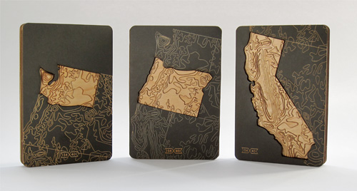
54-40 Packaging Prototype


My dad was a geography teacher, so growing up in a small town in Central Oregon my family participated in the local radio station’s morning Geo Quiz with the 3 other families in town who were also partial to such shenanigans. Over the years of answering questions correctly I collected a world placemat, spin-top globe pencil, globe keychain, and numerous stickers and erasures.

While the days of the Madras Radio Geo Bee are long gone, I still have a fondness for geography related trivia. So when I met Greg Jones at an ADX Feedback Loop event where he presented an idea for a topographic series of state products, I was psyched to help him make it a reality.

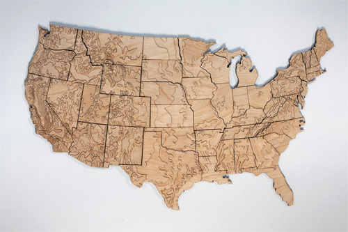
After some talk, we decided to collaborate on packaging prototypes for a small batch of products he wanted to sell to gather interest in his idea: a set of magnetic-backed US states made out of laser cut wood that show the topography of America. AWESOME!!!

Continue reading “54-40 Packaging Prototype”

C12 Energy Diagrams and Online Particles


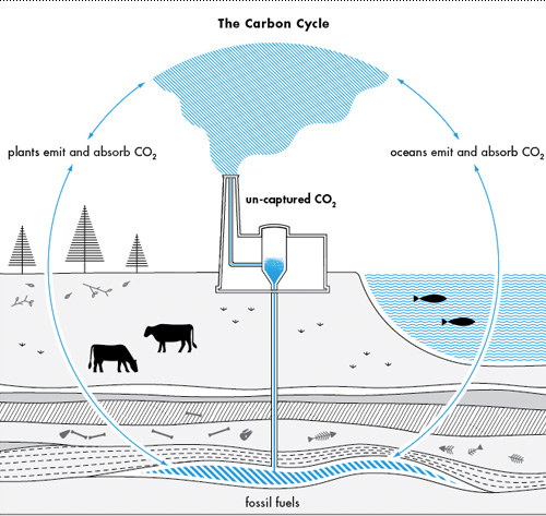
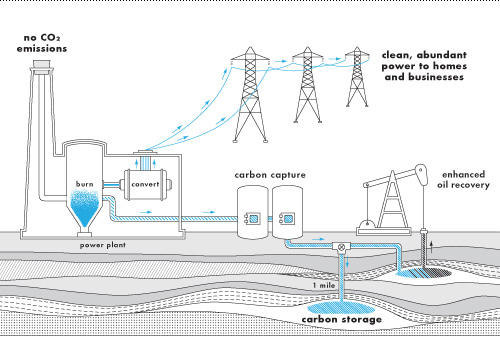
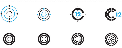
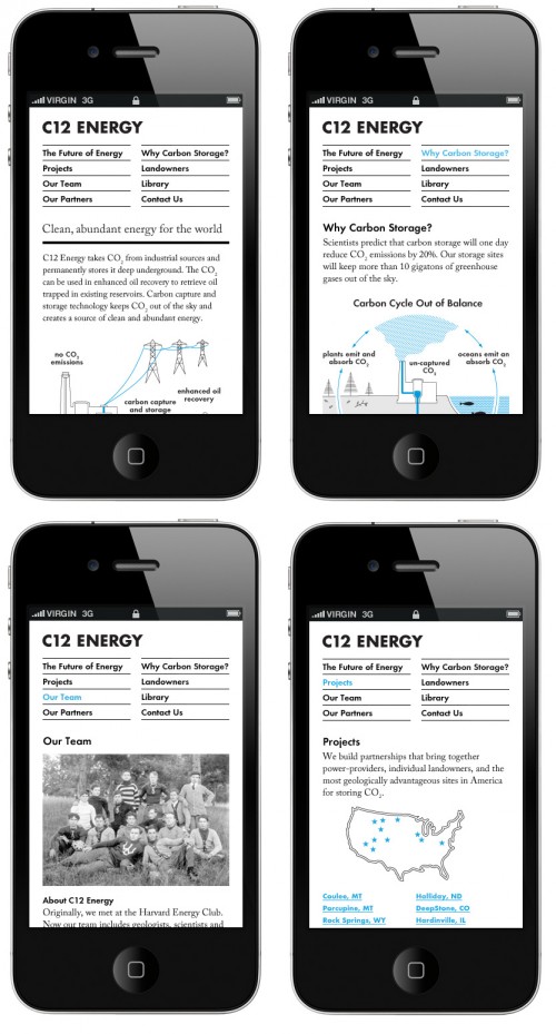
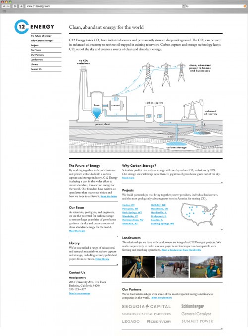
How do you explain a very long process in a very short amount of time? With a diagram! A recent project I worked on with Studio Jelly has now wrapped up for C12 Energy, a company that captures carbon from large-scale emitters. Here are some design snippets from the process of creating a logo, diagrams and website for C12. Their current website can be found at www.c12energy.com.

Nature's personal filtration system.
How to capture and store carbon.
Carbon diagram icon studies from the logo process.
Mobile site comps.
Website comp from mid-project. See the final site at www.c12energy.com.

Update from the Bureau Abroad


Scandinavian Airlines: the most prompt airline in all of Europe. Yep, that's their tagline.

It’s been 3 months since I took a leap and moved the Bureau abroad to Copenhagen, Denmark. Since then, I’ve worked on projects with US clients in Portland and New York, launched a Kickstarter campaign, and spent countless hours getting the Bureau up to speed in a new country, which includes but is not limited to:

1. Accountant to explain the Danish Tax Burden to me: check.
2. Danish Design Association networking events up the wazoo: check.
3. Sharing office space with the kind folks at Wemind: check.
4. Going to lots of museums: check, check, check.

And then…
5. My first Danish design gig: check!!!

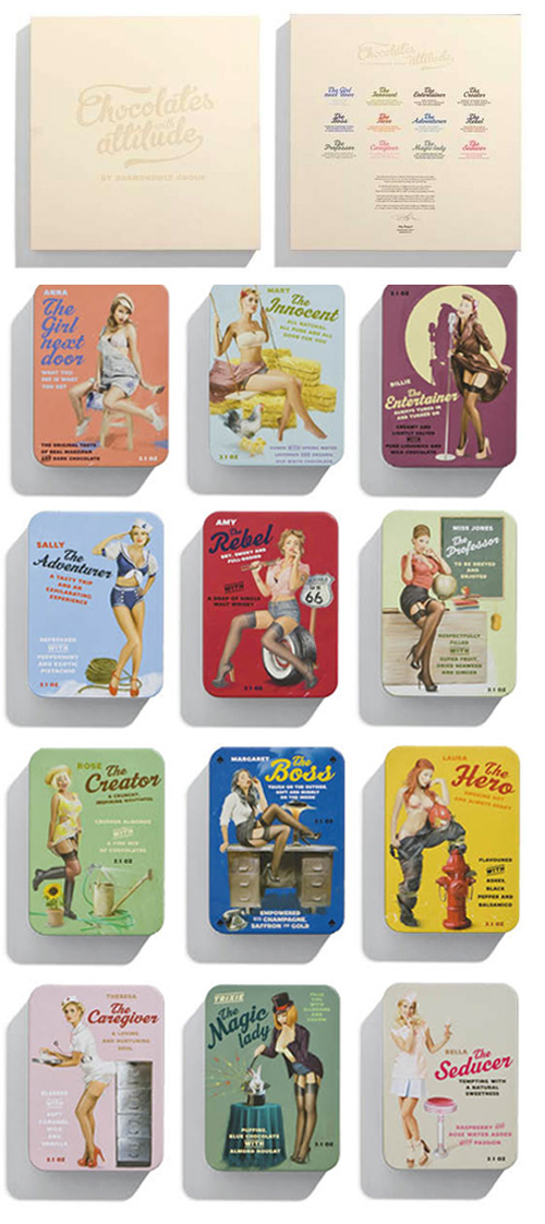
This is the first big payoff after quite a bit of nose-to-the-grindstone time. I will be working with a small local design studio called Bessermachen to help design a series of chocolate packaging. Plus, I get a meal ticket for their lunch plan where steaming hot lunch is served promptly at noon every day. If this isn’t a dream gig, I don’t know what is. Last year Brandhouse & Bessermachen’s “Chocolates with Attitude” make a big splash on the packaging design circuit, so this year will be a good challenge to help Creative Director Kristin Brandt make the 3rd edition just as great.

Bessermachen focuses solely on packaging design, which is one of my true design loves (in addition to designing for books, food and travel). Plus, Bessermachen pretty much means “make it better” in German – I think this is what you call kismet?

Bessermachen's "Chocolate with Attitude" series from last year - pin up girl tins each with their own flavor of custom made chocolate. Sign me up for taste testing!

Goodie Monster Snack Pouch


Update June 4, 2012: The next steps for the Goodie Monster are to find a home in a Portland area school, to make an impact at a local level directly with kids by providing a framework for eating healthily. Check out the Goodie Monster on Facebook, or contact Mark Jacobs for more information at mark@goodiemonster.com.

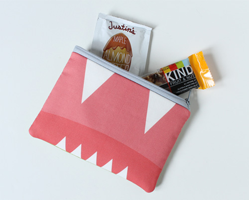
As part of our efforts to raise money to create more Goodie Monsters, we are offering rewards for people who support the project. This reward is a hand-made snack pouch with custom printed fabric and filled with some of the Goodie Monster’s favorite treats. Check out the campaign on Kickstarter.

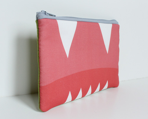
The Goodie Monster Snack Pouch measures approximately 4.5×7 inches and has a gray zipper, green back and custom monster mouth front. Thanks to Allisa Jacobs for crafting each snack pouch.

Goodie Monster Poster


Update June 4, 2012: The next steps for the Goodie Monster are to find a home in a Portland area school, to make an impact at a local level directly with kids by providing a framework for eating healthily. Check out the Goodie Monster on Facebook, or contact Mark Jacobs for more information at mark@goodiemonster.com.

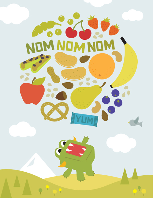
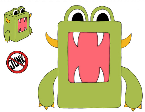
One of the rewards that we are offering as part of a Kickstarter campaign to make more Goodie Monsters is a poster. The Goodie Monster really loves to snack and has no problem telling the world all about it. Check out the project on Kickstarter and see some of the other great rewards we have for people who back the project.

Goodie Monster T-Shirt


Update June 4, 2012: The next steps for the Goodie Monster are to find a home in a Portland area school, to make an impact at a local level directly with kids by providing a framework for eating healthily. Check out the Goodie Monster on Facebook, or contact Mark Jacobs for more information at mark@goodiemonster.com.

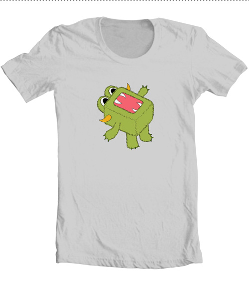
Mark Jacobs and I are in the midst of a Kickstarter effort to make more Goodie Monsters, so we are offering rewards for people who support the project. This reward is a gray American Apparel T-shirt with a hungry monster character on it. Locally screen-printed in Portland, Oregon, the shirt is available in Men’s, Women’s, and Toddler/Youth sizes.

Is he waiting for cherries and plums to fall from the sky into his gaping maw? Is he letting out a giant monster burp after having eaten too many fig bars? Is he merely bellowing his appreciation of healthy snacks? All of the above! To get a monster t-shirt and support us, check out the campaign on Kickstarter.

American Apparel gray t-shirt with Goodie Monster character screen printed on it.
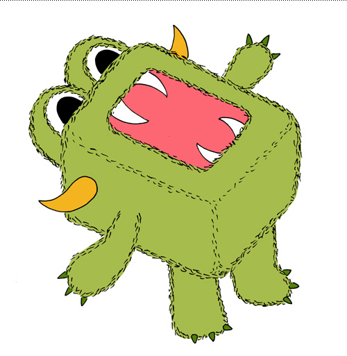
Goodie Monster practicing the tried and true "baby bird" maneuver.
He must have practiced a lot of yoga to get into this position.
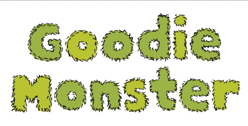
Goodie Monster says it with fuzzy type.

Goodie Monster Limited Edition Toy


Update June 4, 2012: The next steps for the Goodie Monster are to find a home in a Portland area school, to make an impact at a local level directly with kids by providing a framework for eating healthily. Check out the Goodie Monster on Facebook, or contact Mark Jacobs for more information at mark@goodiemonster.com.

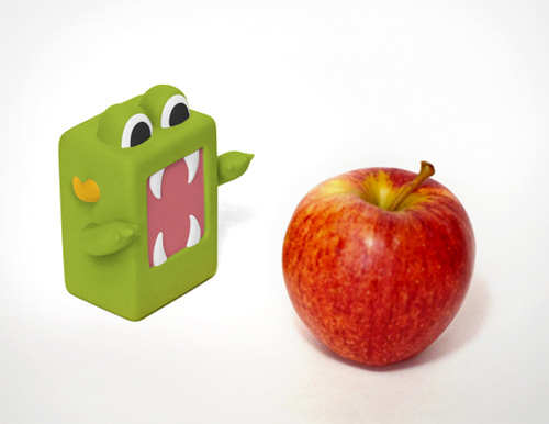
As part of our efforts to raise money to create more Goodie Monsters, we are offering rewards for people who back the effort. This reward is a 3″ custom designed miniature replica of the Goodie Monster with moveable arms, produced by Crazy Label. To get 1 of 100 toys produced and support the project, check out the campaign on Kickstarter.

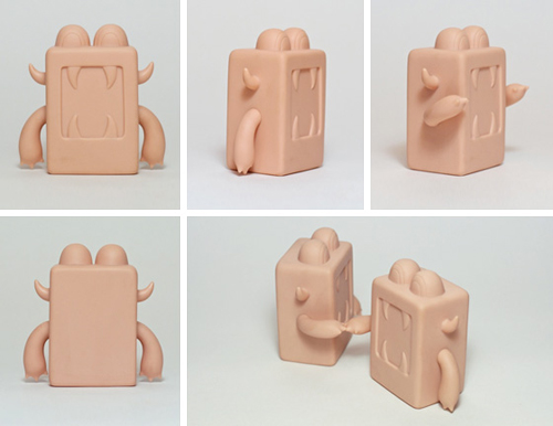
Initial sketches for the Goodie Monster toy.
Toy prototype master skins from Crazylabel.
Colored toy prototype - a very hungry but not very intimidating Goodie Monster.
Colored toy prototype - if there are two Goodie Monsters, fist bumps happen.

Sculpture in Place


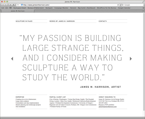
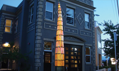
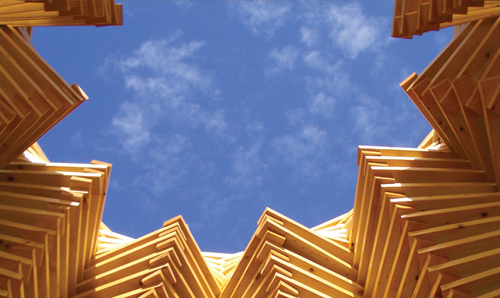
A small portfolio website I designed in collaboration with Studio Jelly recently launched for James Malbon Harrison, a sculpture artist and civic infrastructure expert. His work is simple and draws inspiration from pattern and relies on material use that hides the underlying structure.

Araminta by James M. Harrison
Daahoud by James M. Harrison
Aiorema by James M. Harrison
Gotham Tavern by James M. Harrison
Hands of Cantor by James M. Harrison

See the site at www.jamesmharrison.com.

We Can Be Heroes


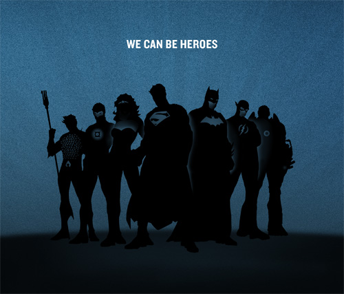
Welcome to the big leagues little rabbit. Last week both MTV and CNN reported on a project that I was lucky enough to work on for Warner Brothers/DC Comics while at Studio Jelly: a campaign titled We Can Be Heroes that was created to bring much needed relief to the Horn of Africa. The face of the campaign is not just one, but seven, superheroes. Together they comprise the Justice League, with each superhero representing a trait necessary for the triumph of good over evil.

We Can Be Heroes campaign for the Horn of Africa, funded by Warner Brothers and DC comics. The Justice League includes:  Aquaman, Green Lantern, Wonder Woman, Superman, Batman, The Flash, Cyborg.

My role working for Studio Jelly was to help set the tone and create initial artwork for the print campaign, shown in the snapshot above. Striking a balance between comic book cool and a cause helping humanity was a good challenge, and I think the end result is both badass and respectful. A short video was also created, directed by Benjamin Reece with creative director Jelly Helm and writer Kathleen Lane. The girl in the red coat is basically me and every other pre-teen at that age, and we’ve been trying to make up for it ever since.

Thanks for having me, Studio Jelly. I also want to thank Aquaman, Green Lantern, Wonder Woman, Superman, Batman, The Flash, and Cyborg for standing so still for their group portrait. Barring one small kerfuffle when Superman stepped on Batman’s cape, their composure and professionalism was excellent.