G is for Gravity
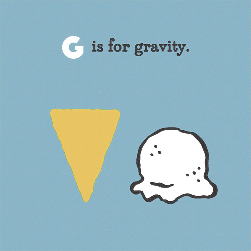
“G is for Gravity” is part of an on-going alphabet series for kids using math, science and geography vocabulary. Have an idea for a good word? Send it my way!
Love, Hanna
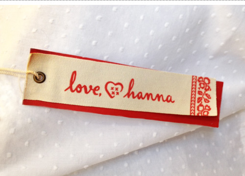
The last few years I have lettered phrases for Hanna Andersson’s catalogue (see it here and here). So when the Portland-based childrenswear company with Swedish roots decided to expand with a new line of clothing for mothers called “love, hanna”, they asked me to letter the logo in a similar style.

The usually jumpy and quirky lettering style was toned down a bit for the logo for consistency and legibility, and a Scandinavian woven heart icon was added under the art direction of Lynda Hodge, who also steered the branding of the line.
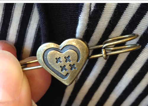
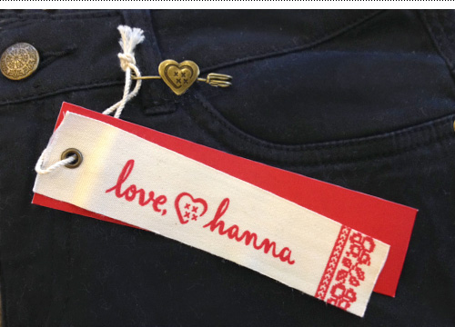
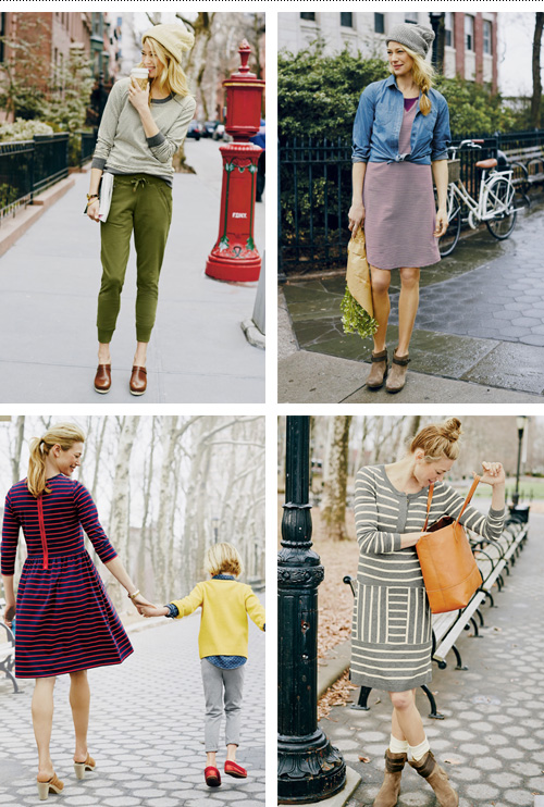
The line follows suite to their kid’s line motto of “let kids be kids” with classic basics that wear well – definitely not “mom jeans” while still being comfy and versatile.
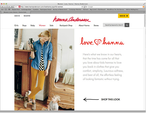
Hanna Andersson is known for their super soft and quality kidswear, so it’s no surprise that the blogosphere is picking up on the new line of easy but still stylish clothes for mom.
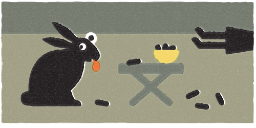
Me and My Pioneer Rabbit, and the Surprise Licorice Attack
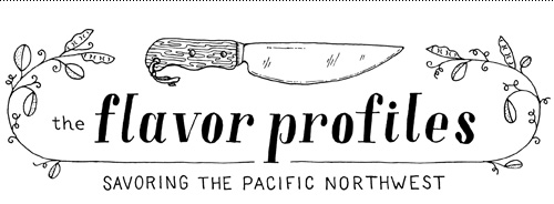
The Flavor Profiles Blog: Logo + Illustration
One of my favorite subjects to work with is food. I also love helping people start up their own thing, whether it’s publishing their own book, building a website service, or bringing a new product to market. So when writer Mona Johnson contacted me to create a logo and illustrations for her burgeoning food blog focused on the Pacific Northwest, it was a perfect match.
She wanted a spare and refined look paired with detailed line illustrations to punctuate her stories and beautifully understated and vibrant photography. After the first few posts, I think the combination is a success – check out her site here: www.theflavorprofiles.com.
The logo typography was hand-drawn, a trait Mona and I thought should be consistent throughout inked elements, but derived from didone fonts for cleanness and a sense of professionalism.
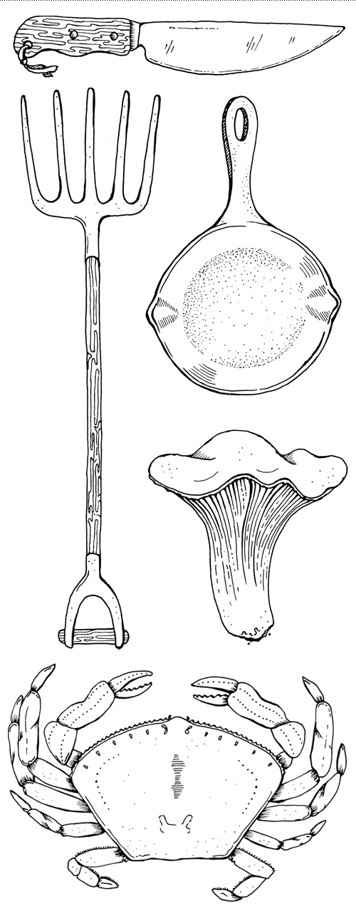
The illustrations were created at a detail level so they could be used either large and in charge, or as small icons sprinkled throughout the site.

A close up of the first five large illustrations made for The Flavor Profiles: knife, pitchfork, cast iron pan, chanterelle mushroom, and dungeness crab.
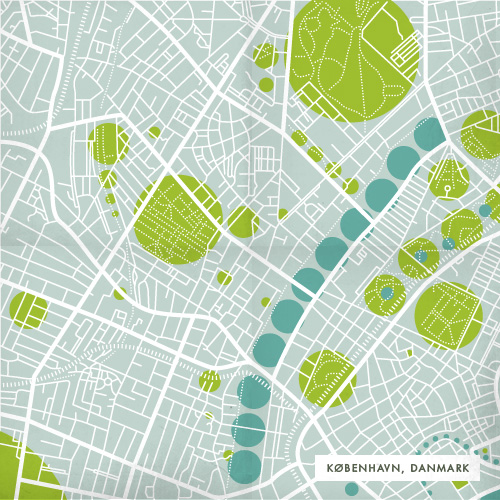
The Density of Things: Update
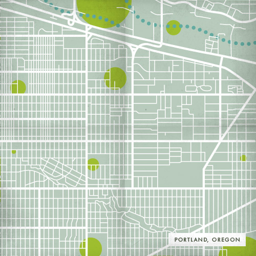
Since I recently moved from Copenhagen, Denmark to Portland, Oregon, I thought I would revisit a map project I did a few years ago exploring the layout of a city and my experience in it – here you have a comparison of then and now.
Icebreakers Book Update
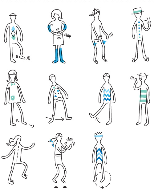
Earlier this spring I wrote about a book project called Icebreakers. I worked on the illustrations, cover design, and page templates for members of Postyr Project, who put together icebreaker activities using music, rhythm and sound as the building blocks for interaction. After getting funding to finish up the content and production of the book, it’s for sale now!
And here are some more illustrations from the project to give you a feel for it.
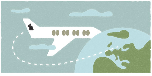
Me and My Pioneer Rabbit, on a Transatlantic Return
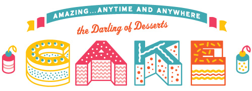
Cake Typography
Outfit No. 61
