Monster Drawing Rally V


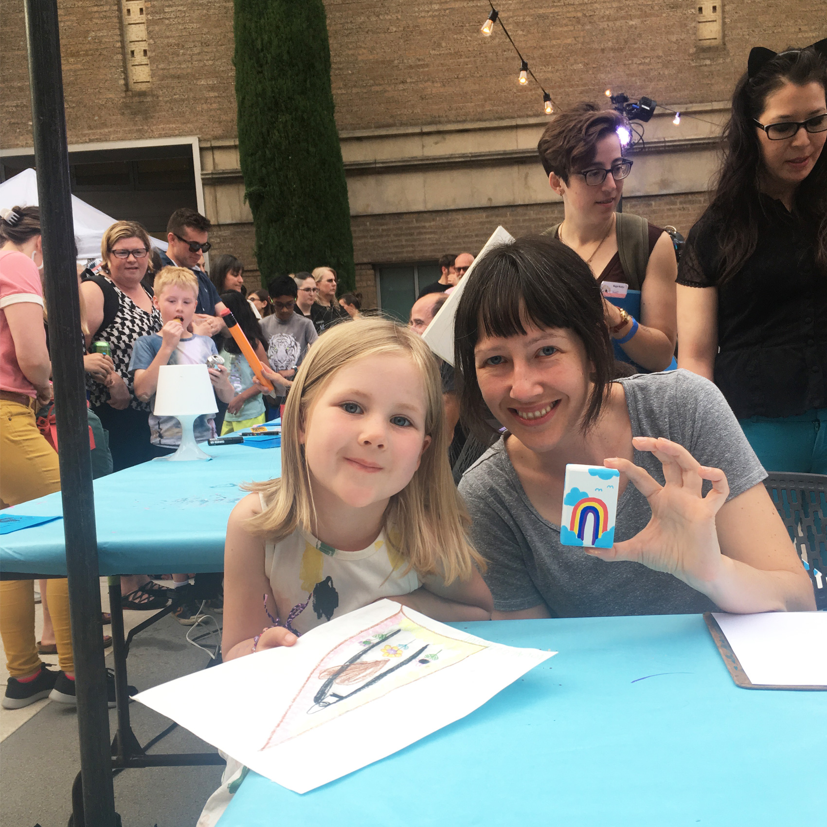
Earlier in July I participated in the fifth annual Portland Monster Drawing Rally. The event is a smorgasbord of artists (75 in all) who donate their time to drawing live at the Portland Art Museum courtyard. As each piece of art is finished, it goes to the auction wall where bidding takes place by drawing straws (with a flat fee for the art).

Proceeds support free school and youth programs at the Museum. It’s a super family friendly event with a kids drawing area. In fact, most of my fun questions come from the 10-and-under crowd as they ogle the process in super-fast-forward speed (each artist gets 1 hour to complete their work).

I’ve done all five drawing rally events that PAM has organized, and each year is different. I’ve tried detailed micron pen illustrations 2 years in a row (hard to finish in an hour, and difficult if you sit next to another artist who is a “vigorous eraser”), black & white magical box contents, and paper pennants with fun lettered sayings.

The boxes seemed to be the most popular so I decided to revisit that form factor this year with a new set of markers – POSCAS! I’m just starting to get the hang of these markers and they were well suited for this purpose. The main challenge of this year were letting various colors dry in between applying new ones, while always switching between multiple boxes. I generally stuck with a theme of “landscapes” but after these few experiments would like to work more on this idea.
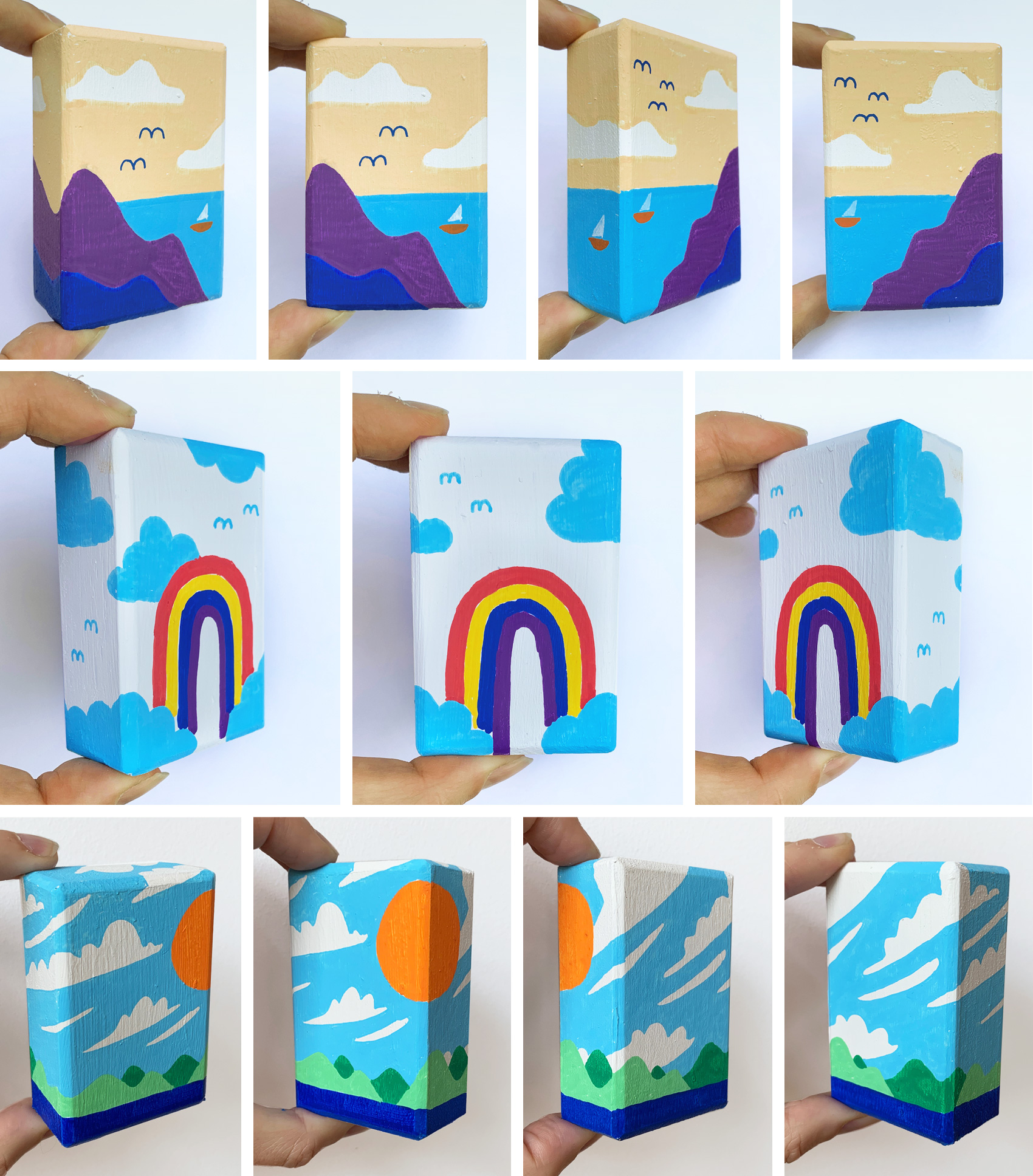
Thanks to my brother-in-law, Dan, who made me the wooden boxes!
Slow Down Series


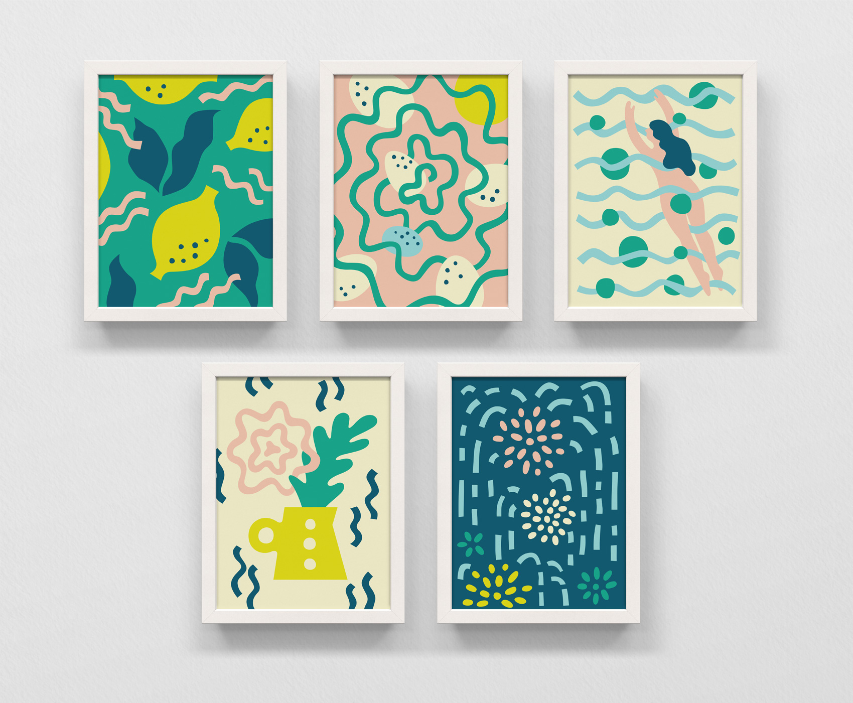
Five illustrations in a rudimentary style of: lemons and leaves, eggs in a nest, woman diving into water, flowers in a mid-century vase, and fireworks in a night sky.

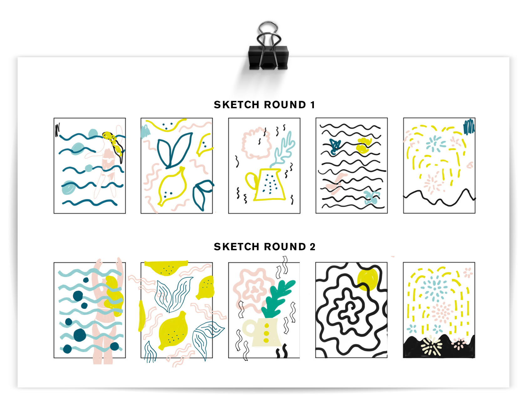
Inspired/triggered by a contest on Instagram, I used some extra time one day to experiment in a new style on the theme slow down. Some of my work is precisely executed (here, here, here and here) so this was good practice in trying to work in a looser, less calculated way while still creating a systematic style for the illustration series. Below you can see the two sketch rounds before working in Adobe Illustrator to make the artwork above: lemonade, bird’s nest, summer swim, fresh bouquet, night fireworks.

Sketches determining basic color and elements for the Slow Down series. Created on an iPadPro in Adobe Sketch.

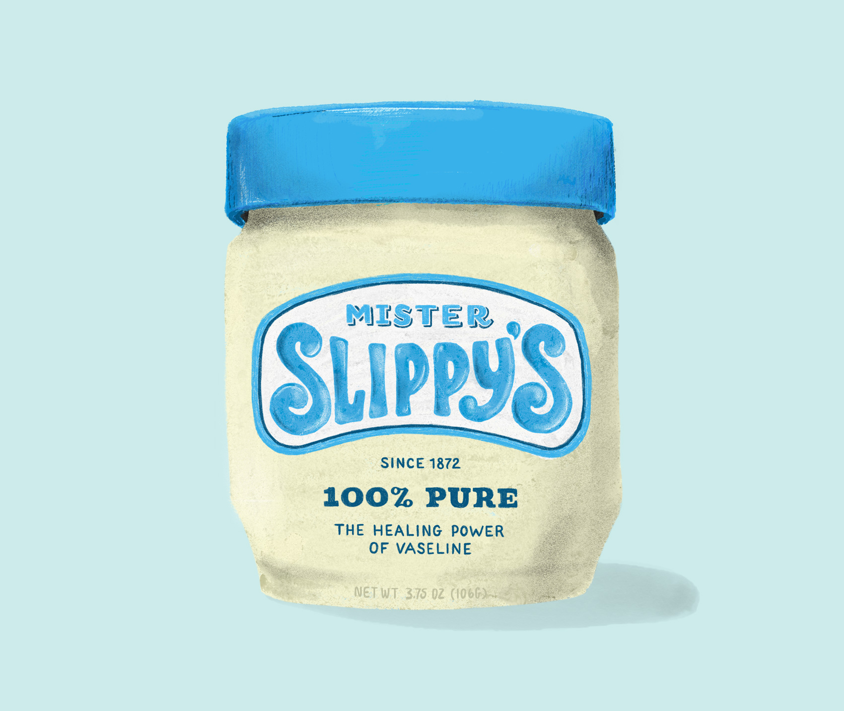
Old Brands New – Vaseline / Mister Slippy’s


IpadPro artwork of pencil and pastel drawing - reworking the classic Vaseline jar into a new packaging design.

Practicing some more on my iPadPro with different brushes, this time creating a new name and label for an oldie but goodie – Vaseline. The short development history of this product on Wikipedia is pretty interesting in it’s simplicity. Vaseline is one of many products which brand name has become genericized – instead of Vaseline being a specific brand of petroleum jelly, the name is used to describe all petroleum jelly products (more about all that here).

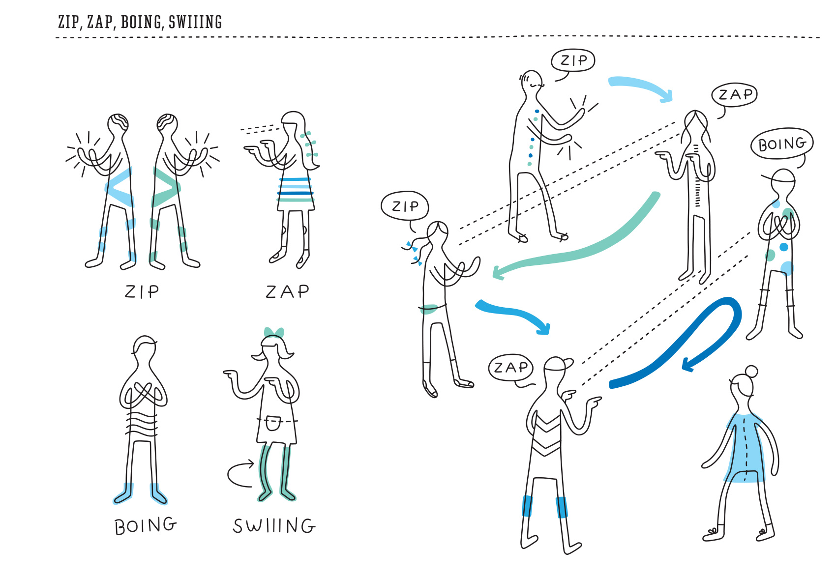
Icebreaker Book Diagrams


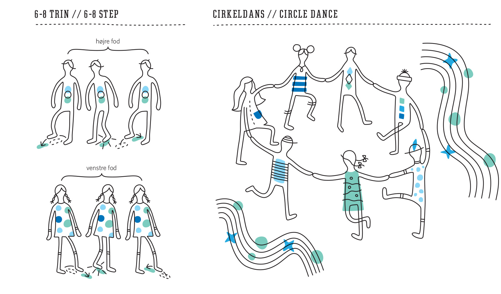
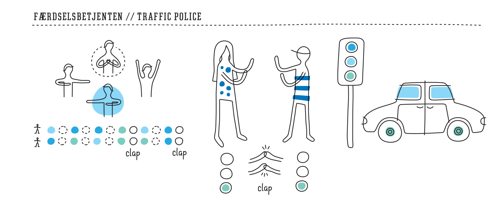
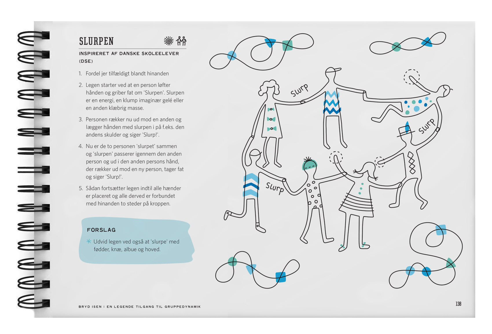
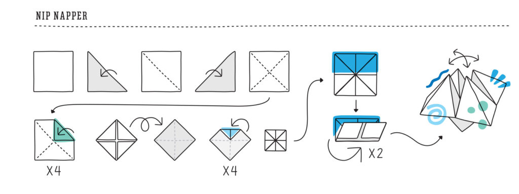
ICEBREAKERS - icons for the four types of activities

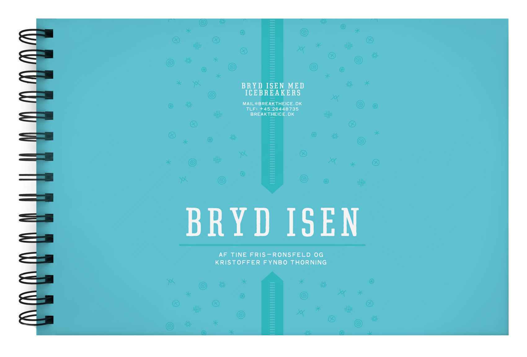
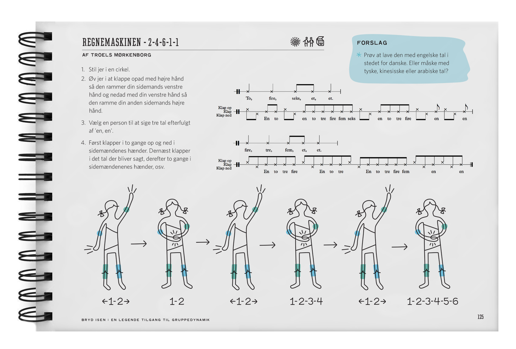
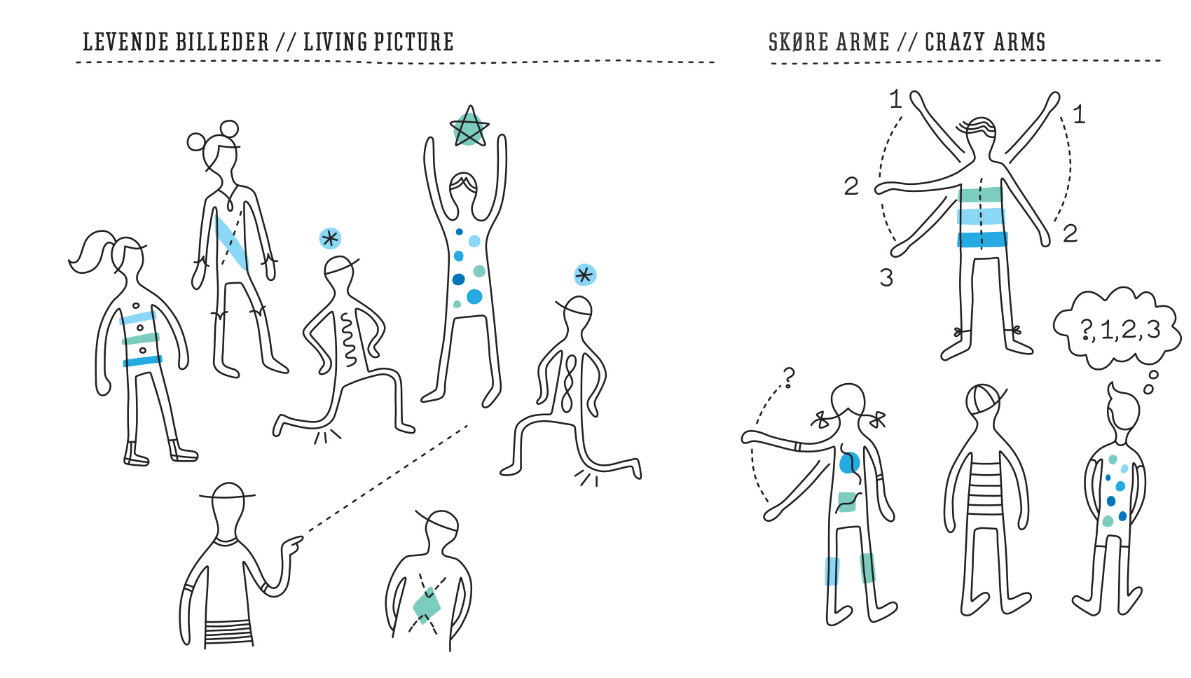
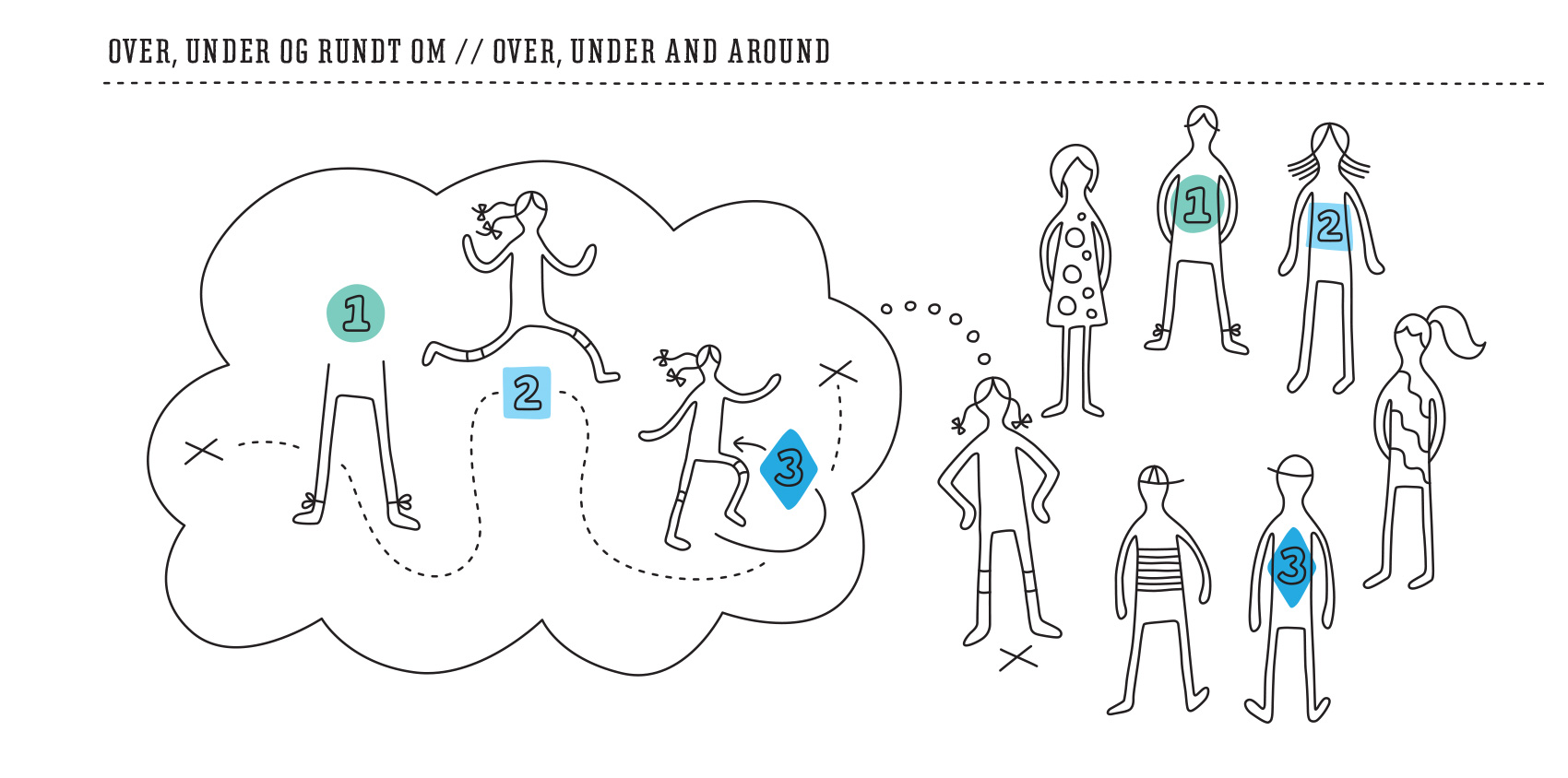
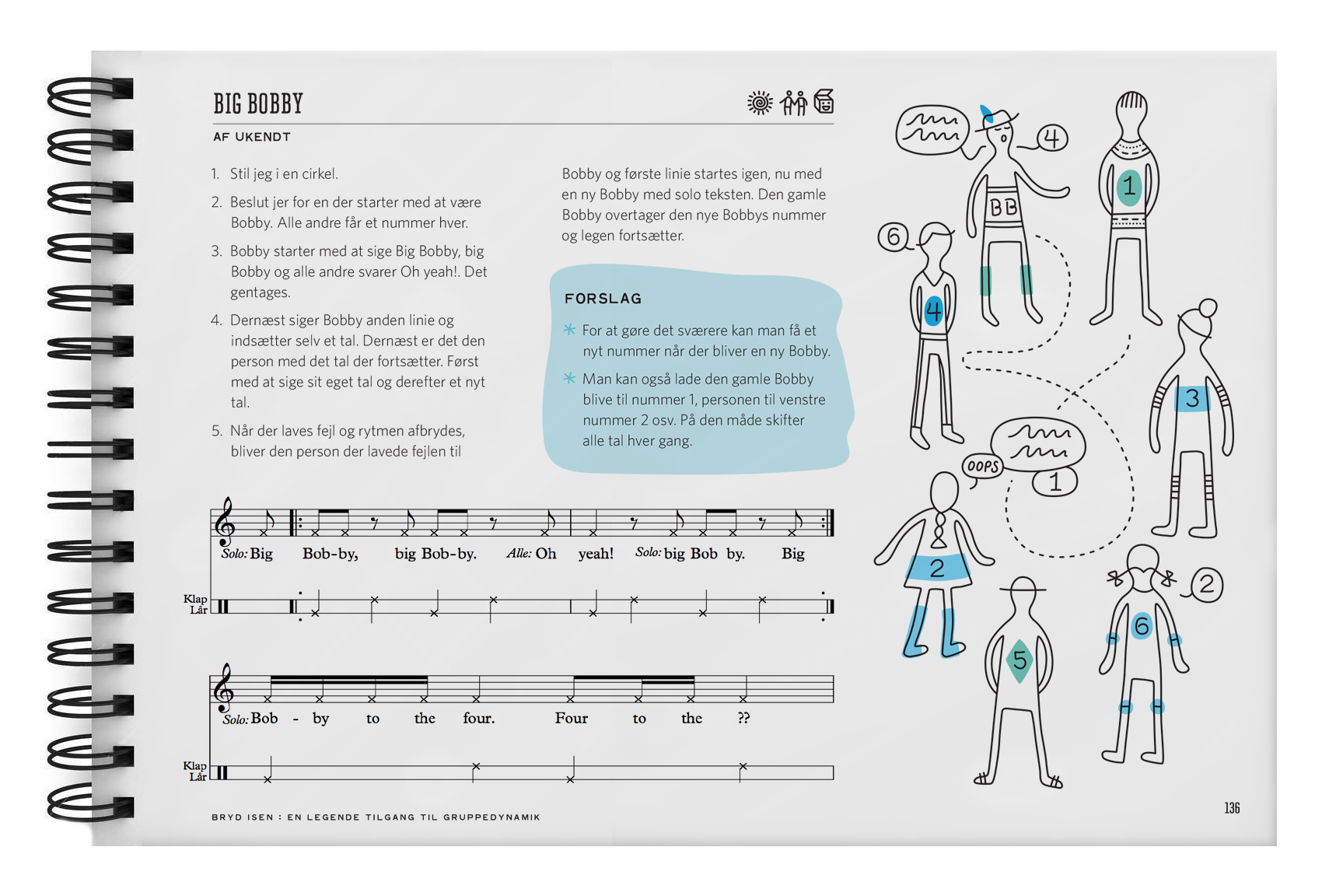
A few years ago I worked on the Icebreakers book – an activity book that combines movement and song to get large choral groups warmed up in a fun way. Developed by a Danish high school classmate and his modern a cappella group Postyr, the book is for sale at Break the Ice.dk.

This spring they published a second edition of the book, so I worked on a new series of diagrams to support the directions for each activity. The style of the illustrations was intentionally loose to allow for easily shaping the characters to various poses and configurations, which focused more on the action of the activity rather than the details of the characters.

Rainbow World Series Part 2


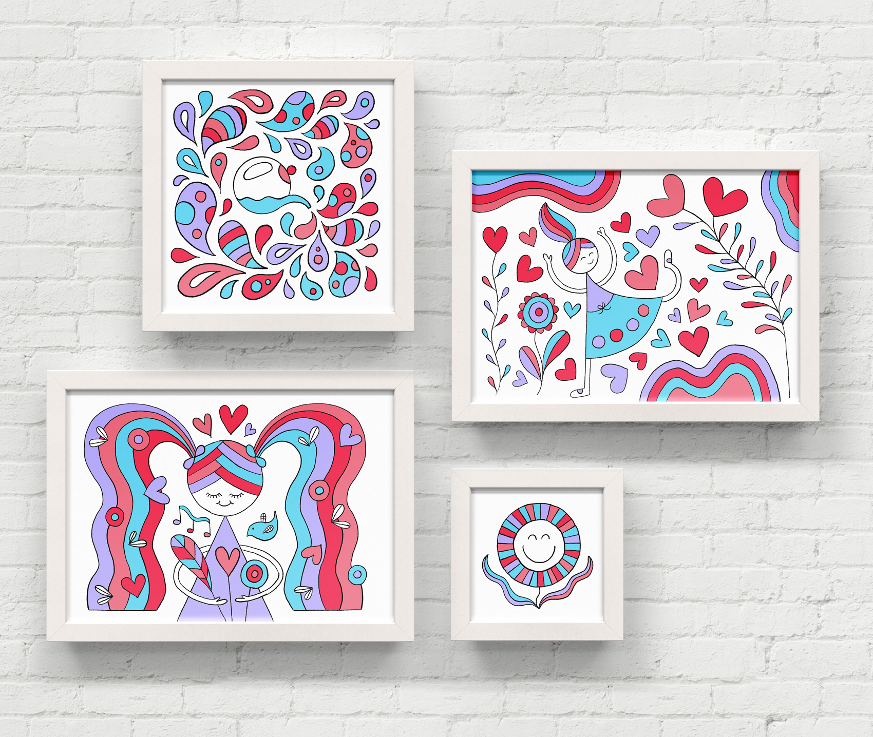
Series of hand drawn illustrations in rainbow colors: a watering can splashing droplets of water, a girl running through a flower heart flurry, a girl with pigtails holding a bouquet, and a happy flower face.

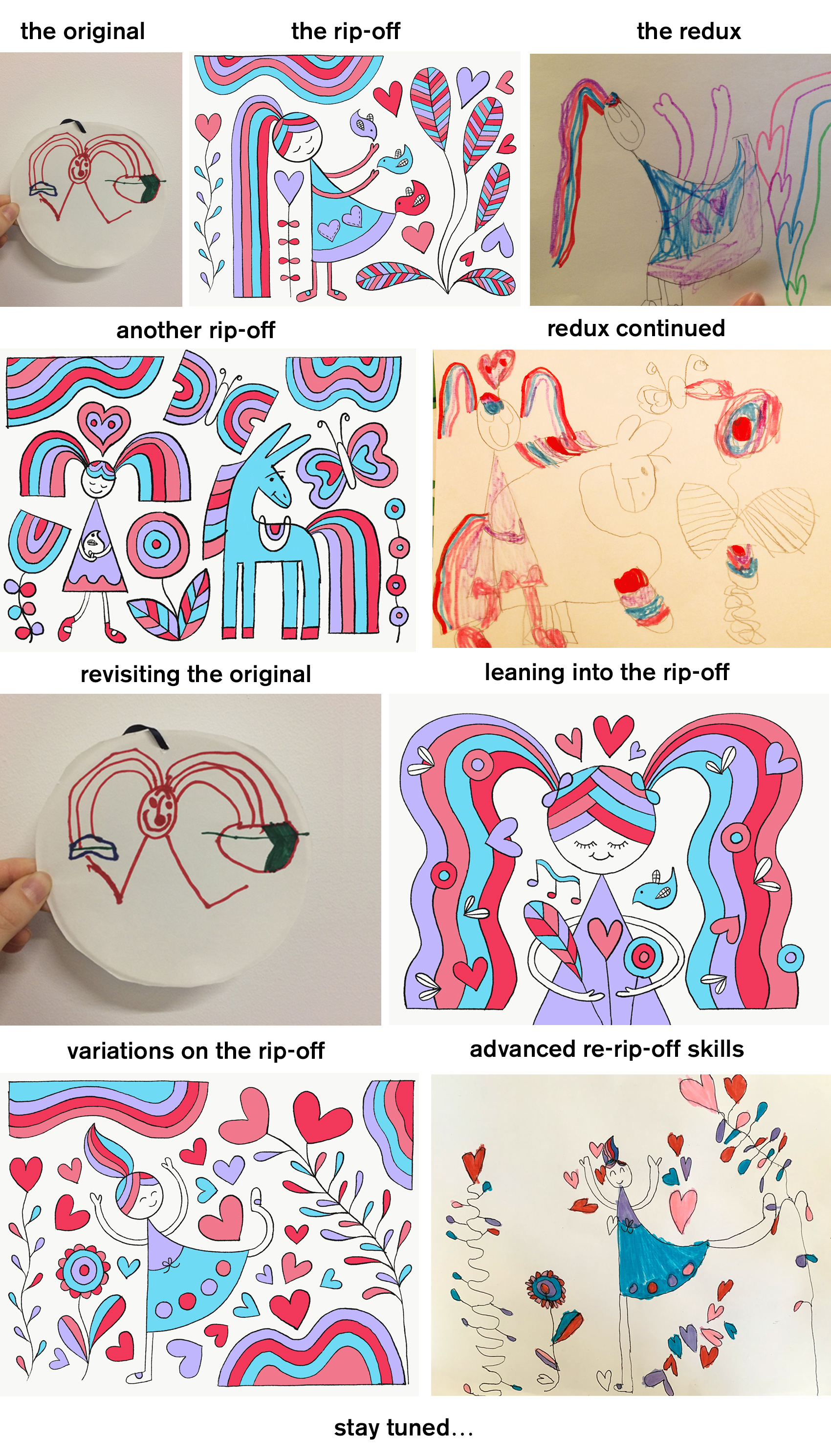
Last year I did a short series called Rainbow World, which explored using my daughter’s drawings as inspiration and subsequent re-inspiration. Here is another set of illustrations continuing in this style, this time influenced by an evening in the backyard watering plants. Below is the back and forth we’ve had copying each other…I am curious how long this thread will go.

Drawings showing the back and forth between my five year old daughter and my rip-off skills on each other's "Rainbow World" drawings.

Hire an Esquire Iconography


Earlier this year I worked on brand explorations for Hire an Esquire, an online service for finding the right legal consultant for a project. The illustrations and icons – set on making the legal profession and process of hiring a lawyer seem approachable, easy and fun – helped the internal team decide the overall direction their rebrand should take.

Hire an Esquire - choosing the right lawyer is easy. A lawyer for hire jumping out of a tablet, ready to work on freelance projects.

A blocky bold style was used with the companies selected teal and orange palette. With such strong colors, the rest of the elements were kept very simple and used knockouts of white.

Series of icons for law firm including quill pen signing, light bulb, search function, smart glasses, signature bubble, conversation and thought bubble.

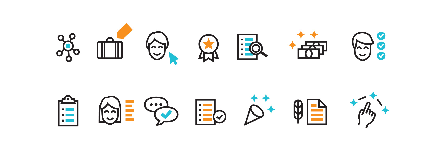
Stand-alone icon style was also explored to show how small visual accents could strengthen the brand presence when used consistently throughout their new site. While the final brand look ended up being a little more serious and traditional, the exploration process was key in helping decide how far to push the needle in their field.

Icon set for Hire an Esquire - network, briefcase, selecting a lawyer, top notch, searching resumes, paying/payment, requirement fulfillment, checklist/clipboard, lawyer profile, checklist, signing a document, connecting the dots.

Code/Art Shirt and Event Materials


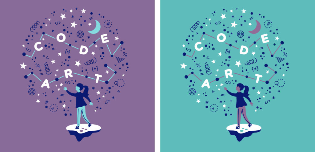
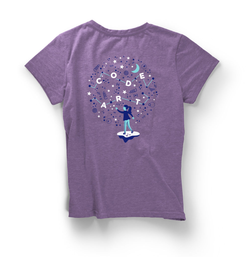
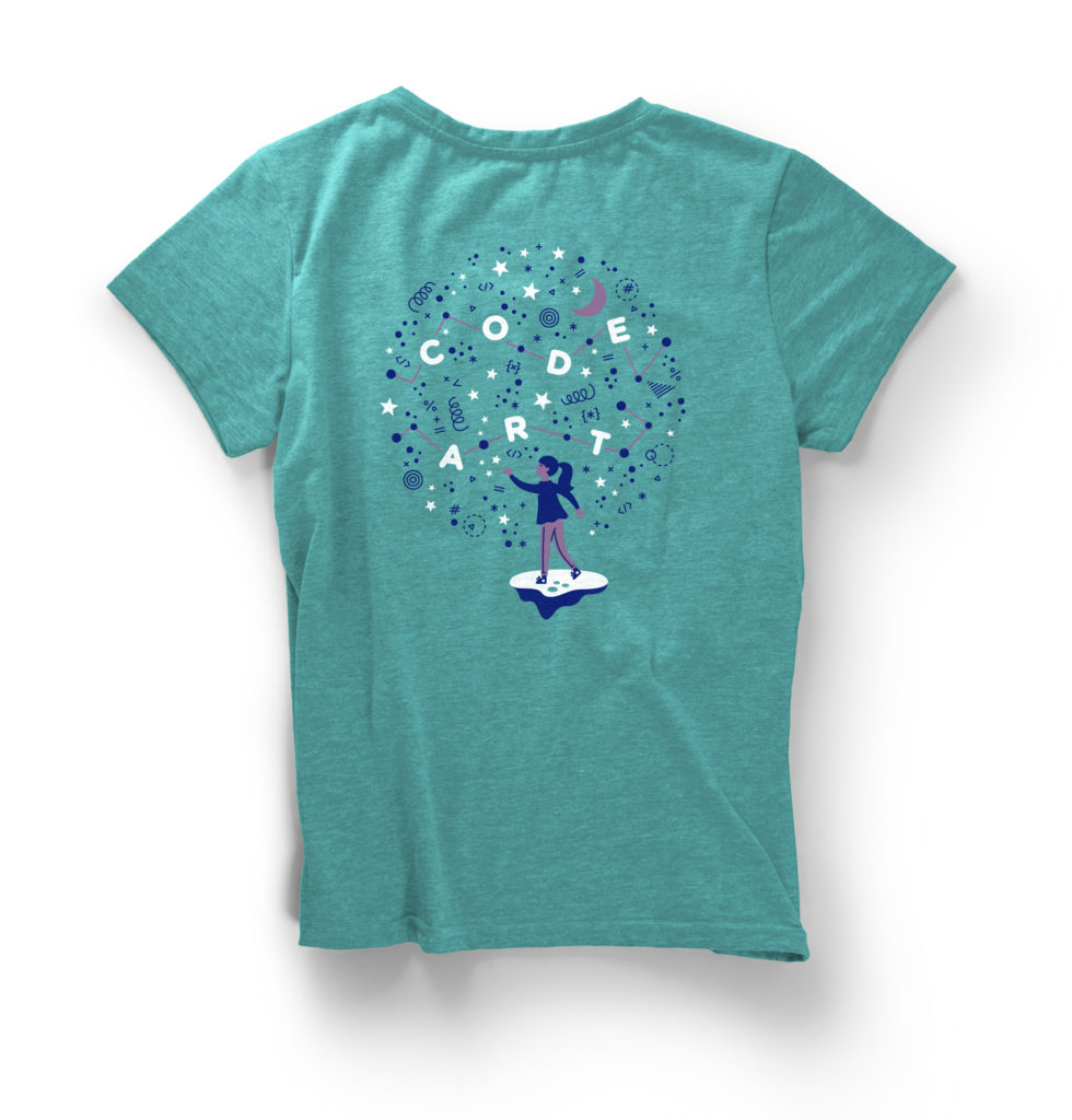
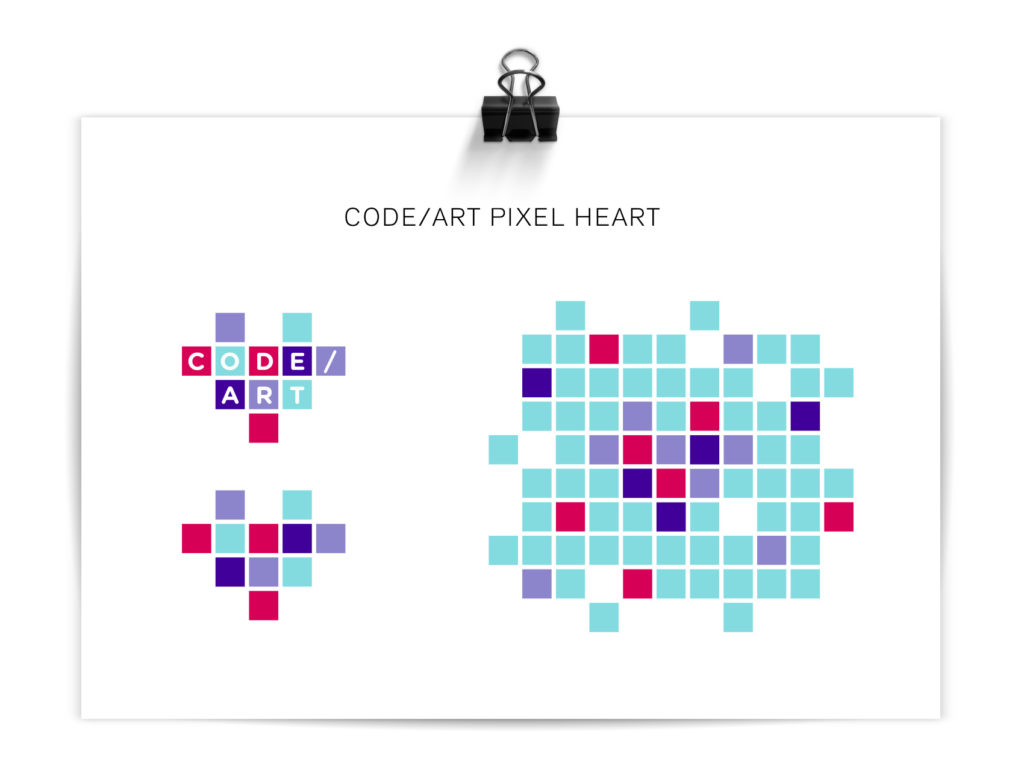
For the 4th annual Code/Art Miami event, non-profit client Code/Art wanted a new design for their participant and volunteer shirts. Previously I had made a series of pins and stickers using small icons, but for this project we created a larger Code/Art constellation design in 3-colors that could easily be printed on two different t-shirt colors (purple for participants, teal for volunteers).

Code/Art t-shirt design with a girl throwing code snippets into the sky to form a Code/Art constellation.

The t-shirt features a girl throwing code snippets into the sky to form a Code/Art constellation. Printed at Custom Ink, the design was arranged so that each color on the purple shirt translated directly to a color on the teal shirt to keep costs low on printing materials and time.

Code/Art participant shirt in lilac.

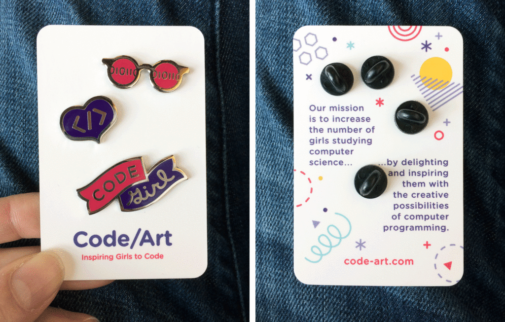
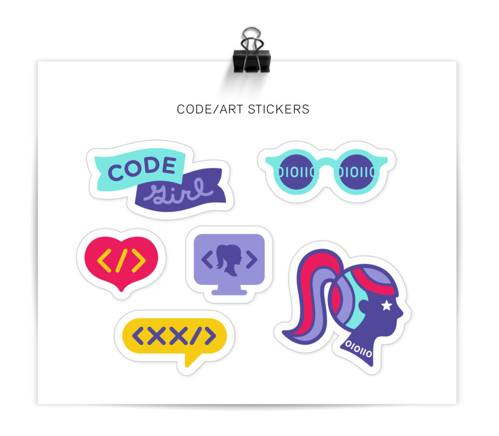
Over the last two years I had designed a series of enamel pins and decals/stickers that were given out to participants. These assets were leveraged internally to create a cohesive look for their events – a strong example of how using a few elements consistently can go a long way in creating a recognizable brand look.

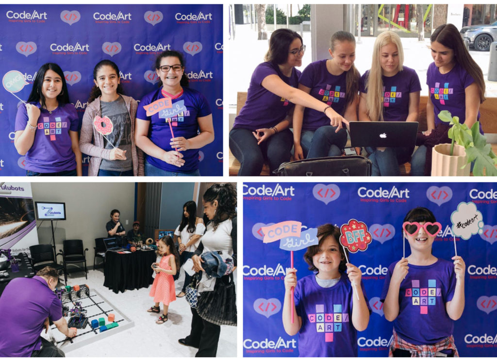
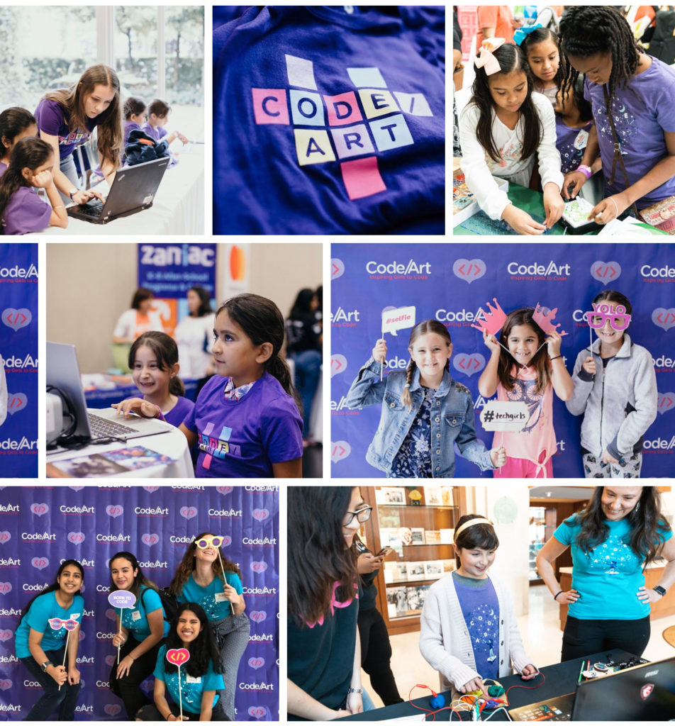
Code/Art event participants and teachers.

Because I still love me a good enamel pin collection, here is a repost of the series of enamel pins and stickers created over the course of a few mini-projects. These were designed for Code/Art participants – girls in their tweens and teens who explore code through art & creativity in guided Code/Art workshops. Read more about Code/Art on their website.

Enamel pin trio: 01100111010111 code sunglasses (cool shades), a </> heart, and code girl banner.” class=”wp-image-8341″/></figure>


<figure class=
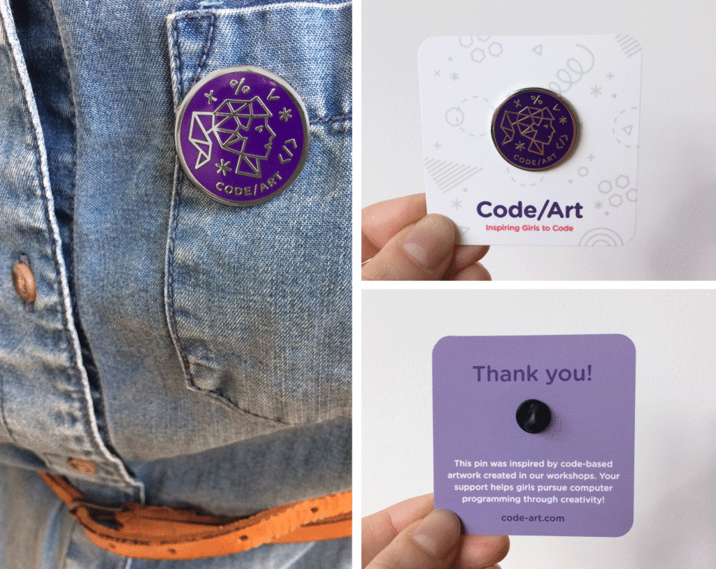
Code/Art donor pin inspired by participant art - featuring a constellation portrait of a young girl.
Girls in STEAM - Code/Art participants and teachers work on projects and take pictures in front of their photo booth.

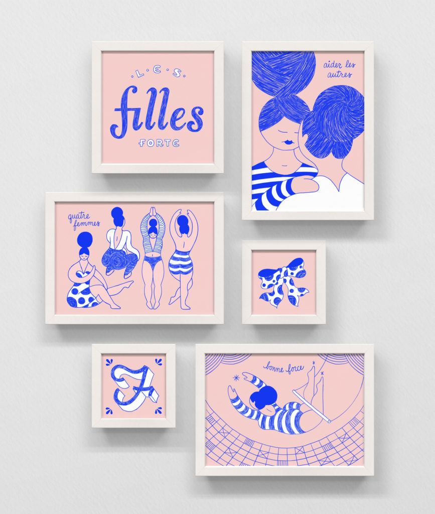
Les Filles Forte


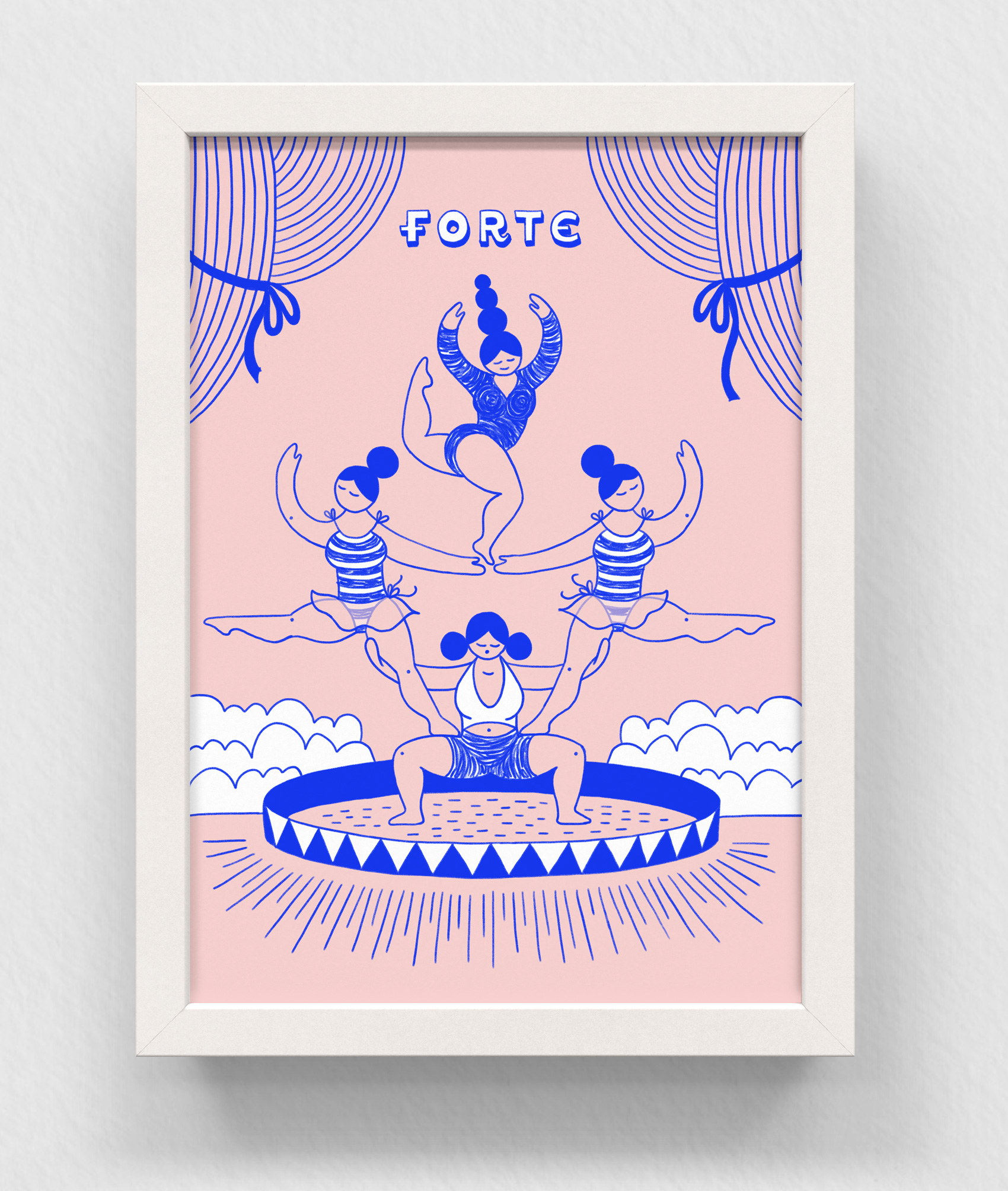
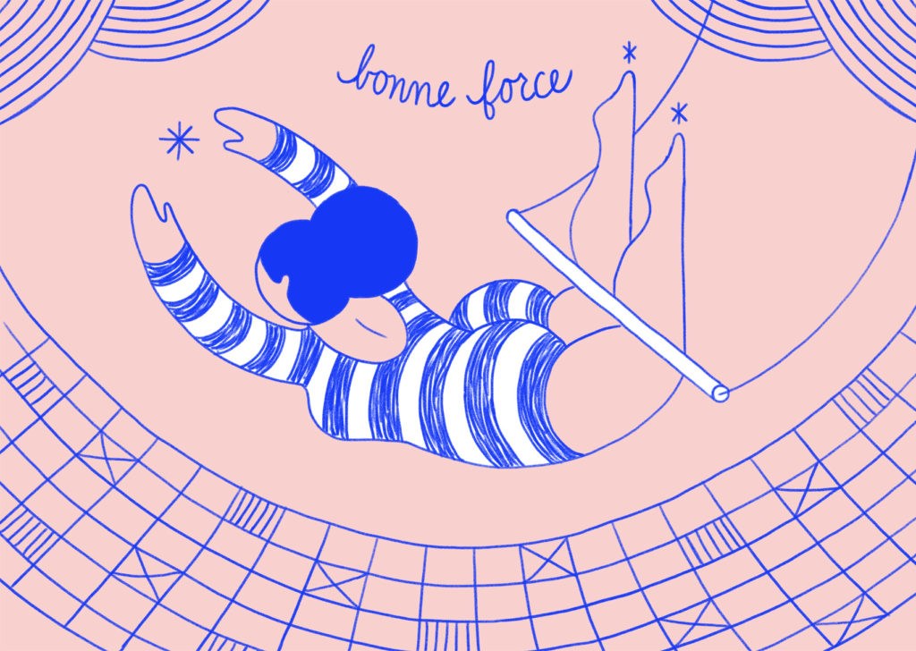
Frame series of pink and reflect blue illustrations in ballpoint ink / sketched digital pencil. Several women dancing and stretching, a trapeze artist, F is for Femme, and two woman supporting each other.

Learning new tricks is hard for old dogs, but recently I’ve been working more on my iPad Pro to integrate drawing on it into my design process. This series was testing out different brushes (finally settled on….regular old pencil) while also working on figure drawing skills. The sketches were then colored and adjusted in Photoshop.

I have yet to break out of the box on the iPad and draw on it differently than I do on paper; I still tend to use all the techniques I used when I drew in real life and had to scan all the parts to create the digital image. It might take a while before I can shift my mindset to a totally digital drawing workspace…now let’s just hope Google Translate did me right on the French translations.

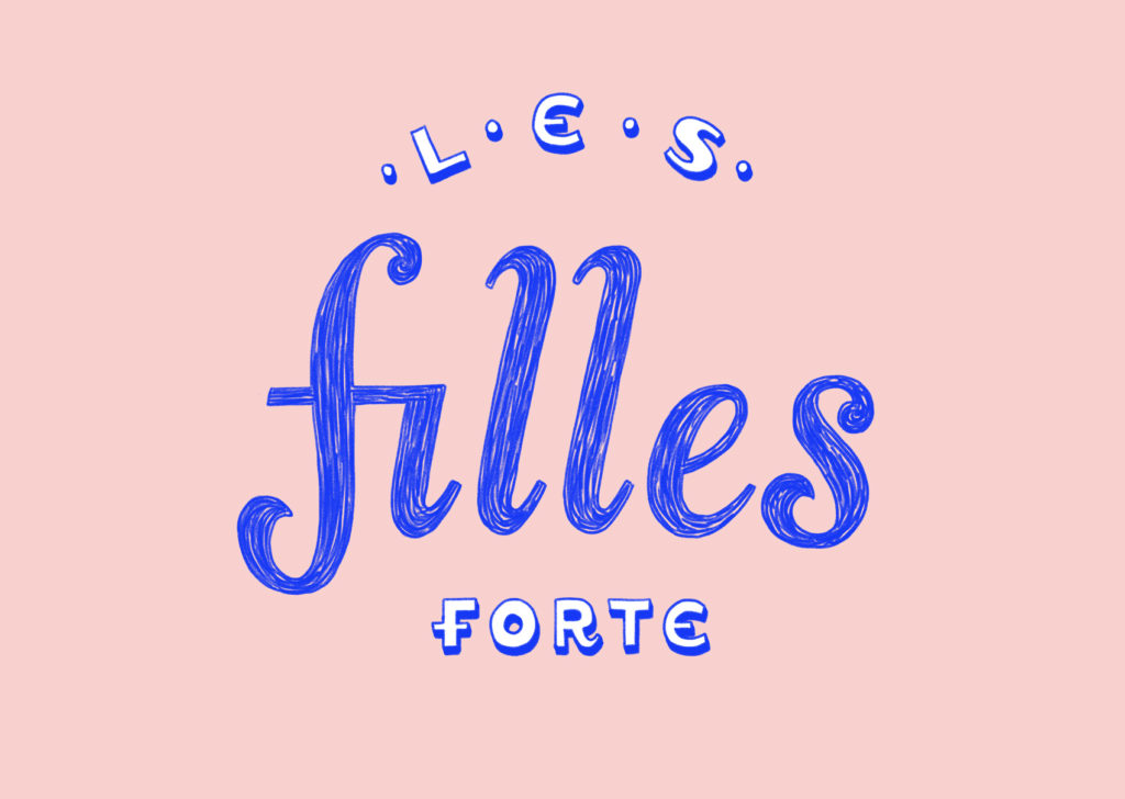
Les Filles Forte – The Strong Girls
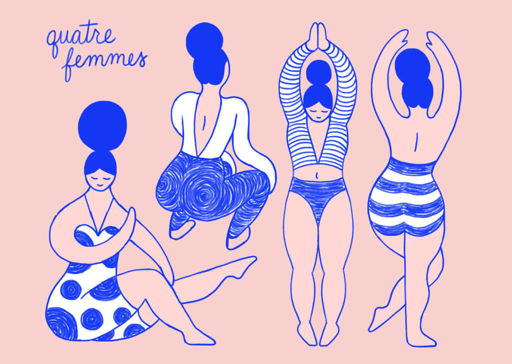
Quatre Femmes – Four Women
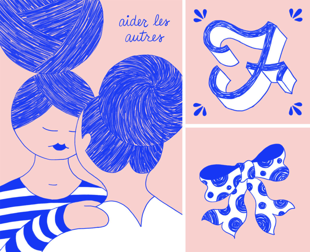
Aider les Autres – Help Others
Bonne Force – Good Strength

Pink and reflex blue artwork: Les Filles Fortes is French-inspired signage lettering, hand drawn on an iPad pro.
Pink and reflex blue artwork: four female figures stretching and dancing, wearing dots and stripes.
Pink and reflex blue artwork: two women supporting each other, with lots of sketched texture in their hair buns. F is for Femme (vintage drop cap) and a polka dot bow.
Pink and reflex blue artwork: a trapeze artist swings above the net, wearing a striped unitard. Bonne force.