Matchsticks and Lore


I’ve started a little thing called “Creative Night”, where a small group of friends gather to eat dinner and work on a project of choice that they bring with them. It is a great way to get inspiration, block out time for social creativity, get feedback, and follow along on other’s projects.

The theme for Creative Night #6 was ‘still life’. I chose to draw the closest thing to my Micron pen: a small box of matches. I also directly translated the Danish text on the packaging, so now you know that Safety Turn-on Sticks are widely available in Denmark. How you choose to use them is up to you.
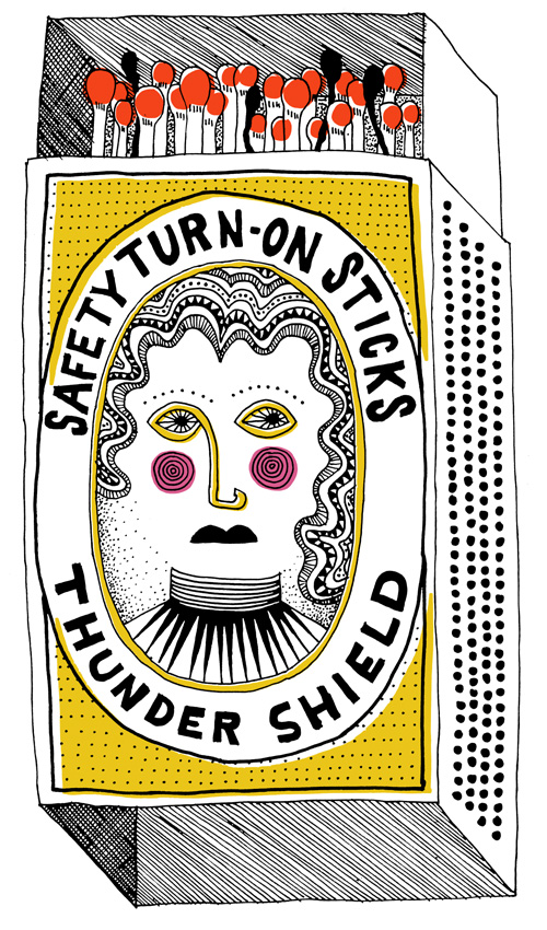
After staring at the mystery man on the box for an hour, I was curious who he was. Perhaps a Frederik or a Christian? Denmark’s history has plenty of those, all who have various castles, squares and monuments in their memory. According to the company that produces the matches, Tordenskjold, the dashing man is Peter Jansen Wessel Tordenskjold. Also, did you know an Aspen tree can make up to 370.000 matchsticks?
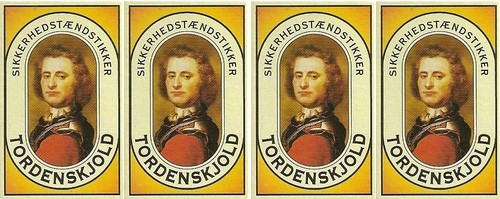
This matchstick box is present in nearly every Danish home, usually close to some tea lights. In fact, I have never seen another brand of matchsticks available. Talk about having a monopoly on hygge creation.

Peter Jansen Wessel Tordenskjold? What a name! And the man lives up to it. Peter Jansen Wessel was born one of 18 children in Norway. He was a troublesome child and ended up running away from home by hitching a ride on Frederik IV’s boat when he sailed home to Denmark. Once in Denmark he became a sea captain, defeated many a Norsk army, was bestowed the noble name “Tordenskjold”, and found an untimely end at age 30 when he died in a sword duel against Jacob Axel Staël von Holstein. Apparently dueling is verboten for seamen, so he was buried quietly without fanfare. Until 1865, that is, when he became the leading face of matchsticks at the suggestion of a matchstick maker’s wife. Ladies love a sailor…

Live hard, die young. RIP Tordenskjold.

Café Noir Infographic


Here are the results from my first direct freelance project with a Danish client – an illustration and info graphic project made in collaboration with food communicator Marie Sainabou Jeng for Café Noir.

Café Noir was hosting an event for Danish media in relation to their release of Aroma Editions, four new coffee products created with the coffee experience in mind, not just throwing back a cup of black liquid for the sake of an energy boost and scalding your uvula. The poster was created to give journalists key facts around Café Noir’s research, in addition to having a coffee tasting and some informational mini-classes about coffee.

Style-wise the piece was created to fit in with the Aroma Editions brand with illustrations that matched their packaging and were simple enough to be stand alone graphics in printed and online media.

The info graphic focused on the data that informed Café Noir to follow the story of taste in their new product line. For example, did you know that coffee has 28 distinguishable tastes and 66 aromas? Most people drink coffee because it is a part of their routine? Presented with these two facts, I think it’s high time that coffee drinkers get out of their rut and experience at least a few of the nearly unending flavor possibilities when it comes to being a coffee connoisseur.

Poster infographic for Café Noir.
Close up of selected illustrations in Café Noir style.

Testing, Testing


At times things feel like a test. A good test, an unknown test, a test that will explain something later, a test that will reveal surprising results, a test that is just plain fun. Due to a genetic splicing experiment between two people, my parents, I am equal parts implementor of MAKING THINGS WORK and EXPERIMENTS. Sometimes the functional part comes first, but I find when the experiment part comes first it leads to a function I never would have imagined. For example, a new way to cook an egg.

Experiment No. 1 - egg on a stick. A sunny side egg hanging precariously on a roughly hewn roasting stick.

CWA Packaging Typography


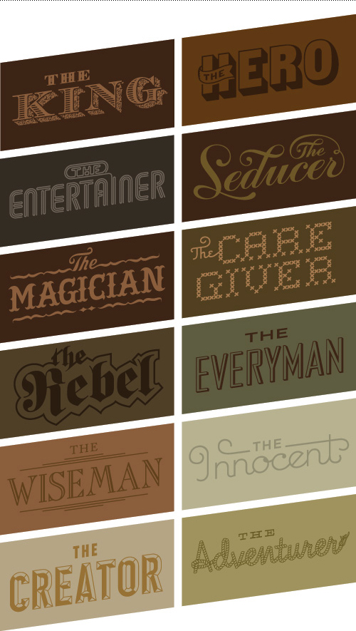
One of the larger projects I helped on this past summer while completing a freelance contract at Bessermachen was an internal packaging project. It was made for Bessermachen’s parent company, Brandhouse, and was the third annual edition of “CWA”. Twelve archetypes are used communicate Brandhouse’s way of approaching brands, and the delivery method is a series of chocolate packaging. My main role was to develop the typography that portrayed these archetypes.

Choosing or creating a typeface to convey an archetype, and having each archetype be distinct within the group, for an audience that isn’t designers is a good (challenging) challenge. The twelve archetypes included: The Everyman, The Innocent, The Entertainer , The Creator, The King, The Hero, The Adventurer, The Rebel, The Wise Man, The Caregiver, The Magician, and The Seducer.

To see the full case study and packaging series by Bessermachen, visit their website, or check out the packaging featured on the blog The Dieline.

Typographic archetypes.

Holiday Chutes & Ladders Game Board


Just in time for the holidays, here is a board game illustration I did for Xplane, a Portland, OR based company that focuses on Business Design Thinking. Basically they make strategies for businesses in visual format, often resulting in interesting diagrams and infographics. The client-provided concept was Chutes and Ladders, which was to be reinterpreted with the theme “corporate holiday party”.

The game of chutes and ladders as reinterpreted for "company holiday party survival guide 2012" for Xplane of Portland, Oregon.
Chutes and Ladders, Xplane Holiday Style

The piece was sent out to clients so they could fill any pre-holiday work breaks with a quick game, trying to avoid the open bottle of Jagermeister and vying to make a good impression with the boss’ spouse. Here is an 11×17 (tabloid) PDF of the game if you’d like to play as well. Try my silent dice.

Patterned and circus-inspired hand drawn 3D typography with textures.
Close up typography.

This was a fun project because Xplane works with a specific process that involves lots of upfront sketching and getting clear approval at each step of the project. After the initial sketch had been approved it was smooth sailing through the illustration and revision phases. Plus, my pioneer rabbit got to make a sneak appearance under the chute “inappropriate use of the office copy machine”. Poor bunny.

Spot illustrations for Xplane Holiday Game: bowl of porridge, drinks and pills, unfortunate antler costume, talking politics, getting a giant bonus, yule log on the television set, designated driver, jagermeister, disco ball, social jackpot machine, copy machine shenanigans, roll the dice.
Spot illustrations.