Holiday Chutes & Ladders Game Board


Just in time for the holidays, here is a board game illustration I did for Xplane, a Portland, OR based company that focuses on Business Design Thinking. Basically they make strategies for businesses in visual format, often resulting in interesting diagrams and infographics. The client-provided concept was Chutes and Ladders, which was to be reinterpreted with the theme “corporate holiday party”.

The game of chutes and ladders as reinterpreted for "company holiday party survival guide 2012" for Xplane of Portland, Oregon.
Chutes and Ladders, Xplane Holiday Style

The piece was sent out to clients so they could fill any pre-holiday work breaks with a quick game, trying to avoid the open bottle of Jagermeister and vying to make a good impression with the boss’ spouse. Here is an 11×17 (tabloid) PDF of the game if you’d like to play as well. Try my silent dice.

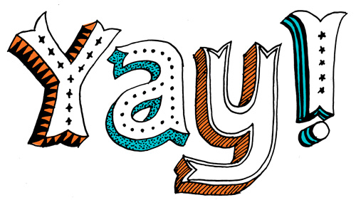
Patterned and circus-inspired hand drawn 3D typography with textures.
Close up typography.

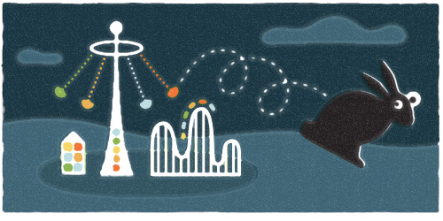
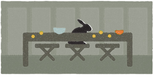
This was a fun project because Xplane works with a specific process that involves lots of upfront sketching and getting clear approval at each step of the project. After the initial sketch had been approved it was smooth sailing through the illustration and revision phases. Plus, my pioneer rabbit got to make a sneak appearance under the chute “inappropriate use of the office copy machine”. Poor bunny.

Spot illustrations for Xplane Holiday Game: bowl of porridge, drinks and pills, unfortunate antler costume, talking politics, getting a giant bonus, yule log on the television set, designated driver, jagermeister, disco ball, social jackpot machine, copy machine shenanigans, roll the dice.
Spot illustrations.

Yay!


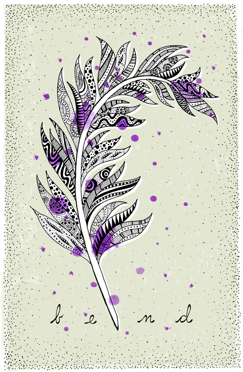
Here is a quick typography study I used to practice for an upcoming project. It’s a funny word when you think about it, that those three letters can be put together in a such a silly looking combination to create an exclamation expressing triumph, approval, or encouragement.

Yoga Space Illustration


One of the great things about illustration work is that it usually involves researching new subject matter, thus resulting in…KNOWLEDGE. Score. My general picture of yoga is “a stretch here, a stretch there, and a little inner peace”. After working on an illustration for Upswell for the Yoga Space, I now know that we have chakras. Five of them!

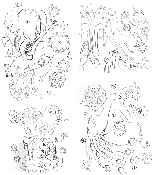
Upswell was to design a website for the Yoga Space and wanted illustration throughout the site, focused on one large illustration that could be broken into parts, each part using symbolism derived from the spiritual practice of yoga. The budget was fixed, so to make sure we were on the right track pencil sketches were explored first to get an idea of what elements should be used. This also shows that in the beginning things are ugly…or in design speak, “rough”. Usually they get better!

Four initial rough pencil sketches.

It is always a debate on how soon to show work to a client. If it is too unfinished, imagined possibilities might not be fully communicated. If it is too finished and not on target, you risk time intensive re-work. On this project it was possible to do very rough but quick iterations and get approval along the way, which saved time and allowed everybody in the project to have input where it counted.

Continue reading “Yoga Space Illustration”