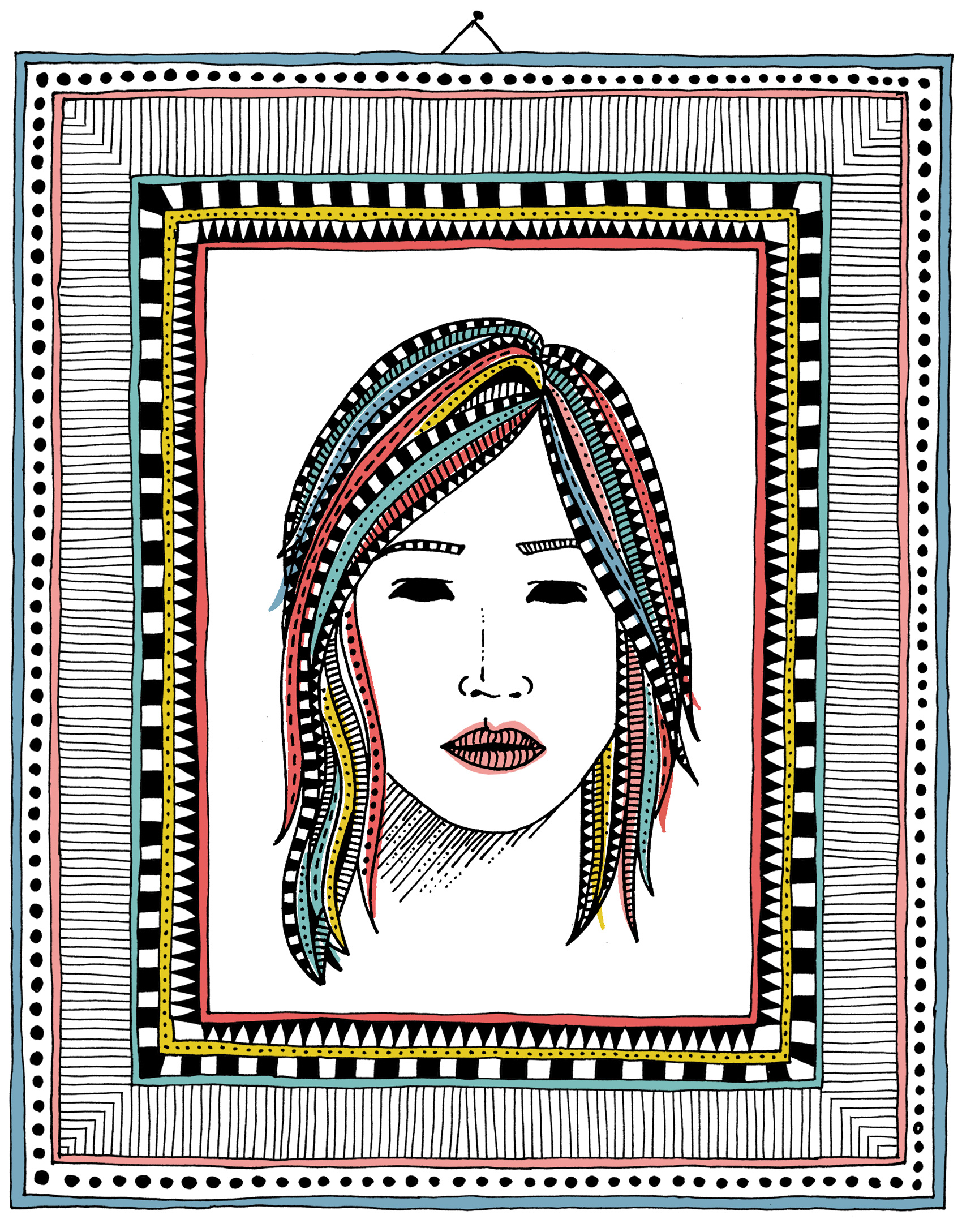
A new directory of women illustrators popped up on the internet recently, so I drew a portrait to be included. Visit www.womenwhodraw.com to see a glut of awesome illustrators (and hopefully my submission soon!).

A new directory of women illustrators popped up on the internet recently, so I drew a portrait to be included. Visit www.womenwhodraw.com to see a glut of awesome illustrators (and hopefully my submission soon!).
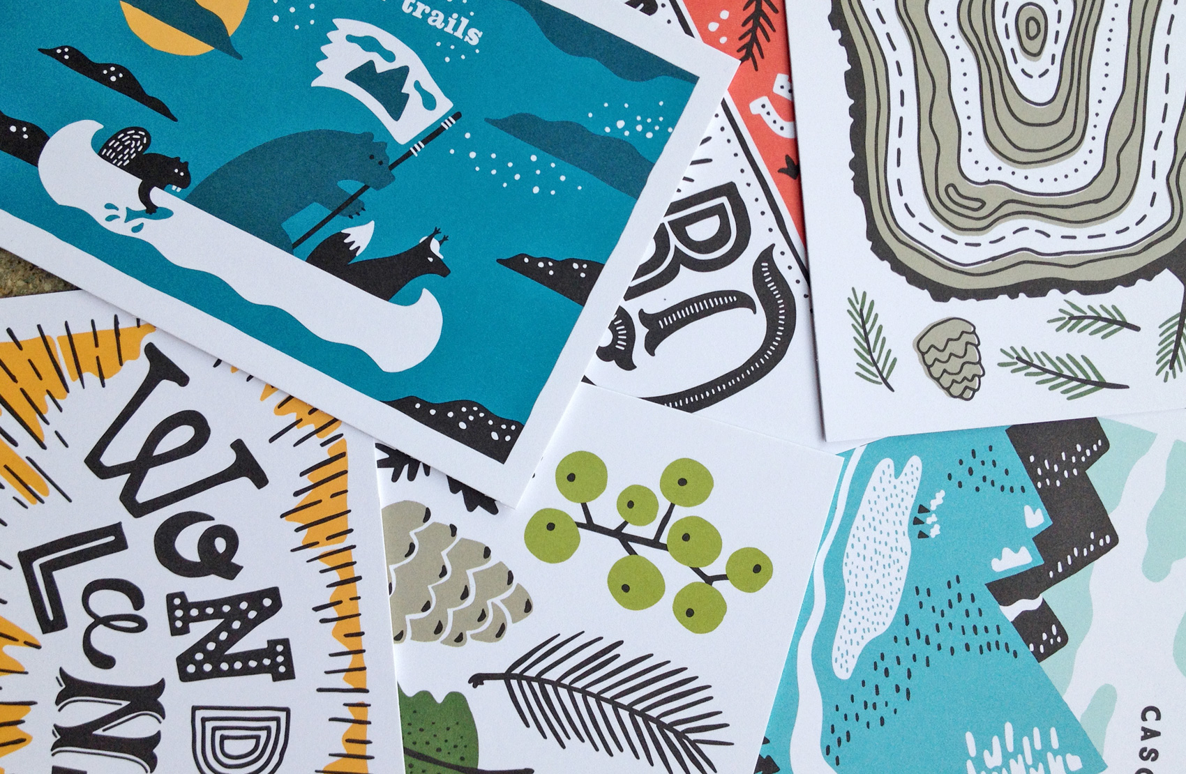
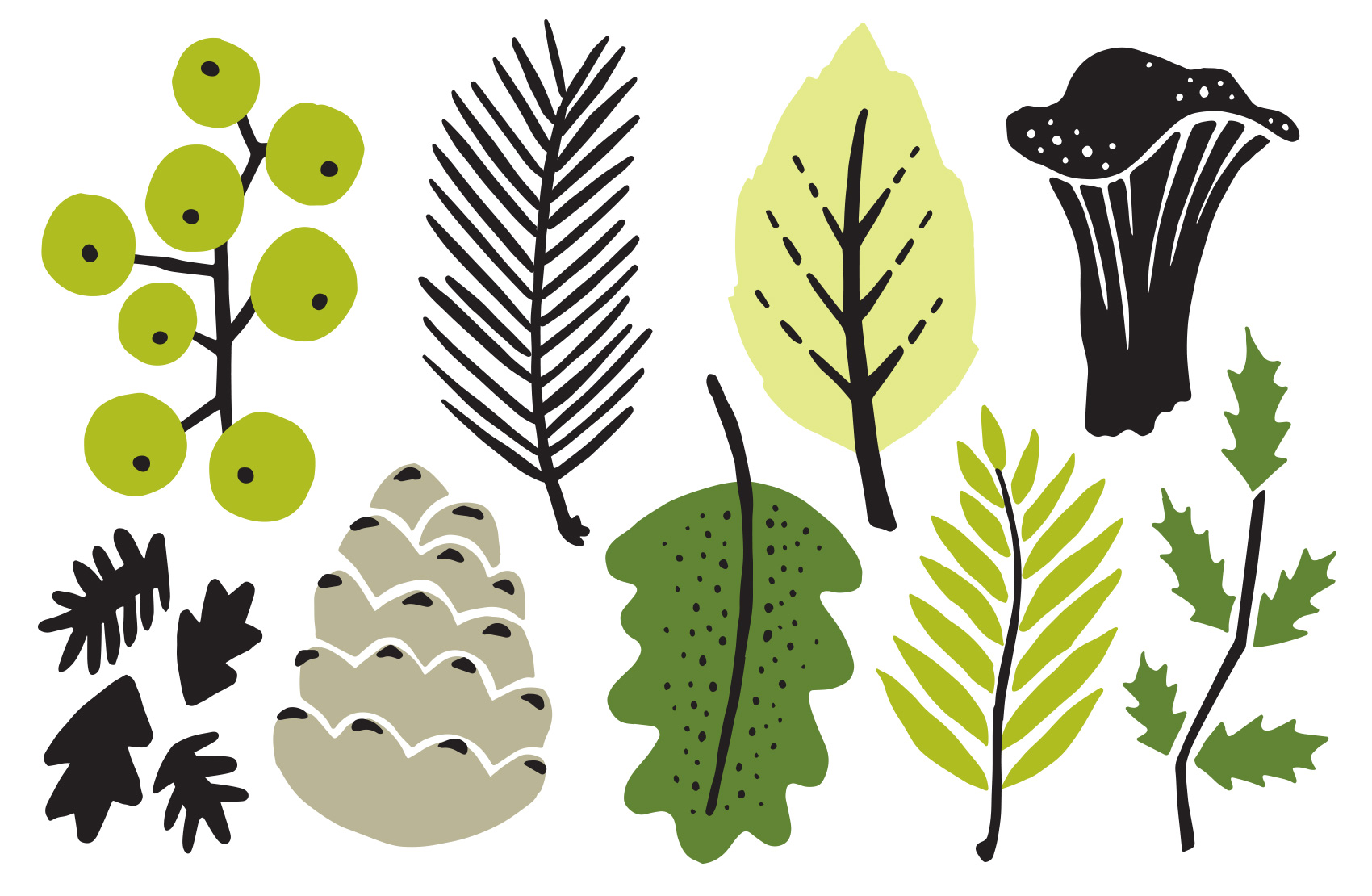
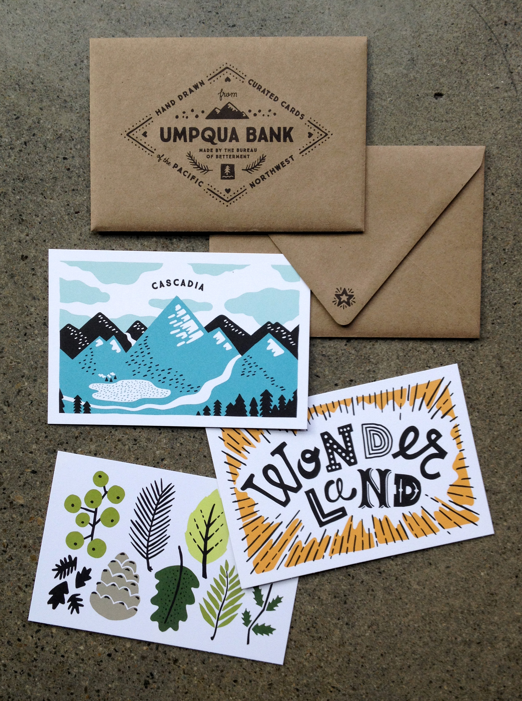
Here is the sixth and last card in a series postcards I illustrated for Umpqua Bank. They were used at the Portland Business Journal Luncheon and Seattle Design Series, mixed and matched in sets of 3 and delivered in a custom envelope. This card features NW-inspired foliage in shades of Umpqua’s lesser-used green palette.
I’ve had the pleasure of working on many projects with the Happiest Company in Portland*, Ruby Receptionists, and the last project was no exception. This project focused on creating illustration assets for their member services, or internal member-facing interface. Whether it is keeping track of calls, making custom availability settings, or managing contacts and data, Ruby and her accomplices are there to help every step of the way. Working from wireframes, I fleshed out the visuals needed to “Rubify” the web interface. Here are just a few outtakes from the project:
*title awarded by me, but I’m sure many would agree
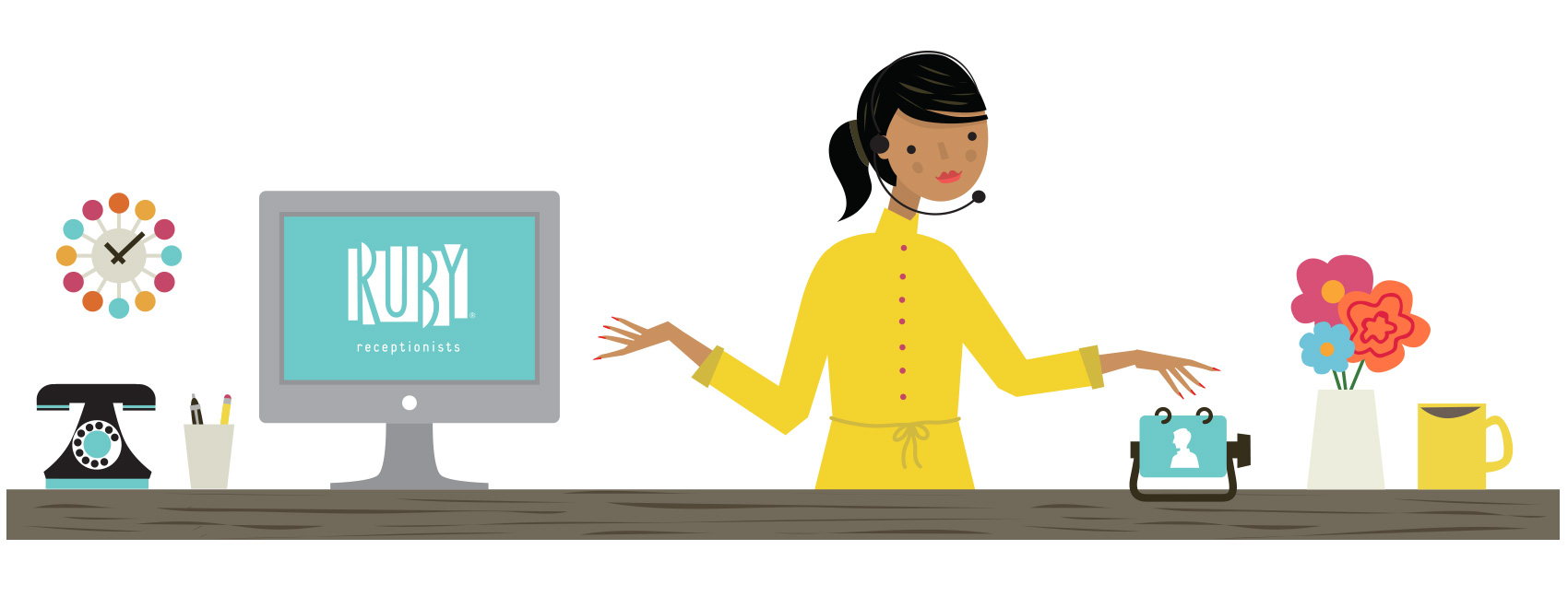
A series of large circular icons were created in a consistent style for reinforcing the tools being used. Mixing old visuals such as adding machines, retro clocks, will return signs and real live calendars adds a fun twist to using the online functions. The project scope included everything from tiny navigational icons to almost full screen illustrations, with over 30 assets created in total.
![]()
Even virtual receptionists need their beauty sleep, so a bonus round of icons for indicating it was “after hours” was made. A cocktail glass option didn’t make the cut, but I believe that Ruby might just have a little fun on Fridays after answering your phones all week.
![]()
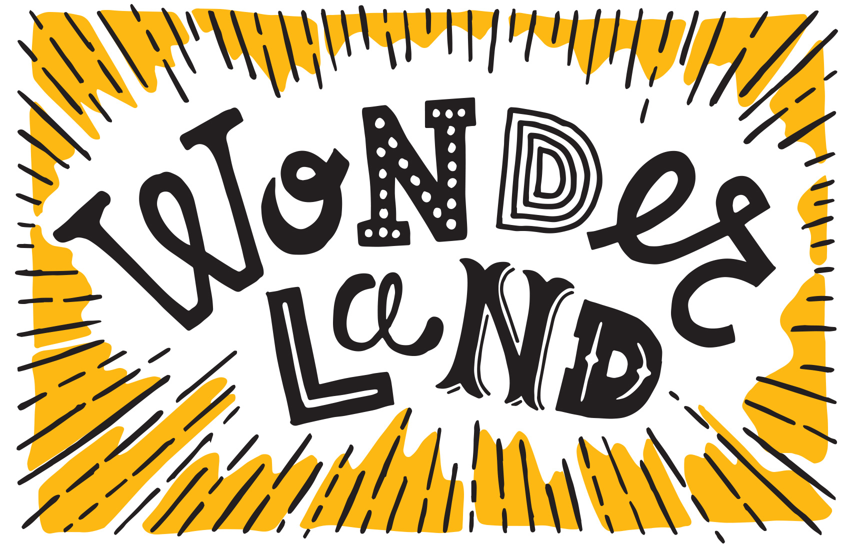
“Wonderland” is one of six postcards illustrated for Umpqua Bank with a Pacific Northwest theme. Derived from the old blue and yellow Oregon license plates that carried the slogan “Pacific Wonderland”, this interpretation came straight from the many childhood hours I spent with my dad in his 1979 red Dodge, traversing the roads of Central Oregon’s sunshiny plains.
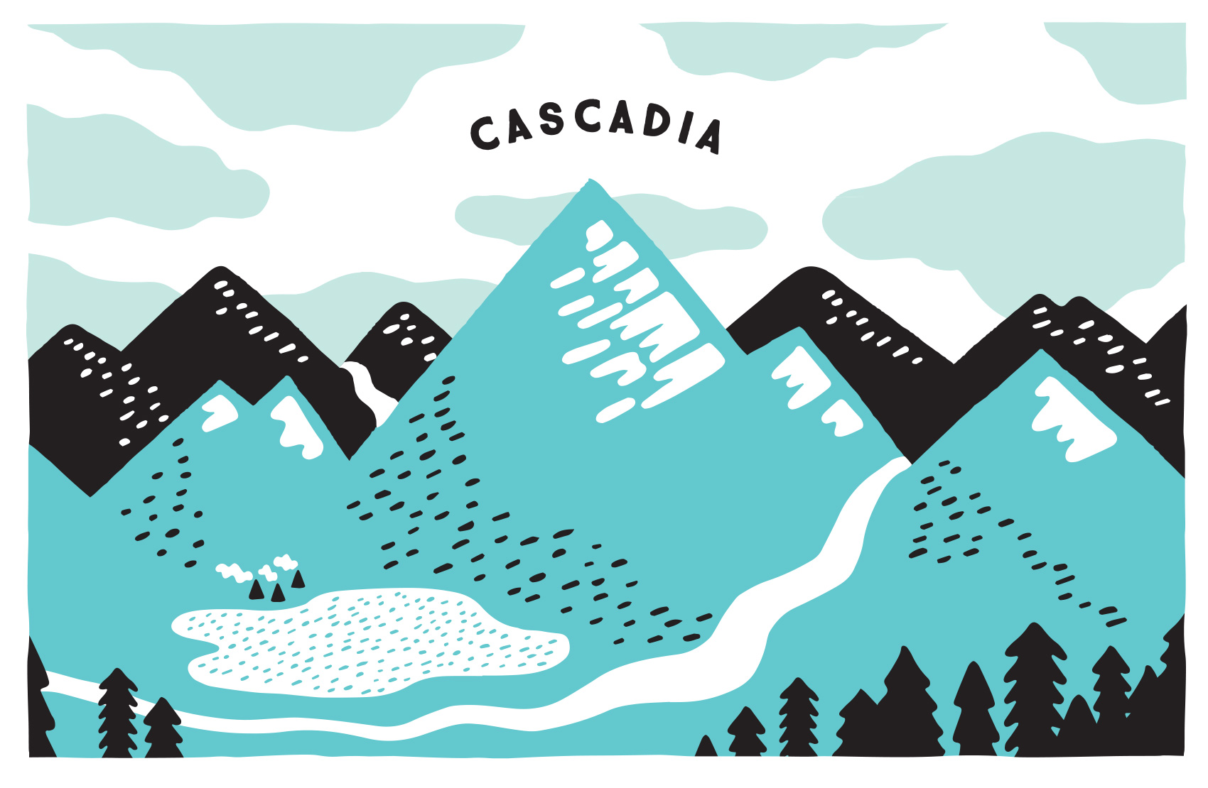
Here is the fourth card in a series of six postcards I illustrated for Umpqua Bank. They were used at the Portland Business Journal Luncheon and Seattle Design Series, mixed and matched in sets of 3 and delivered in a custom envelope.
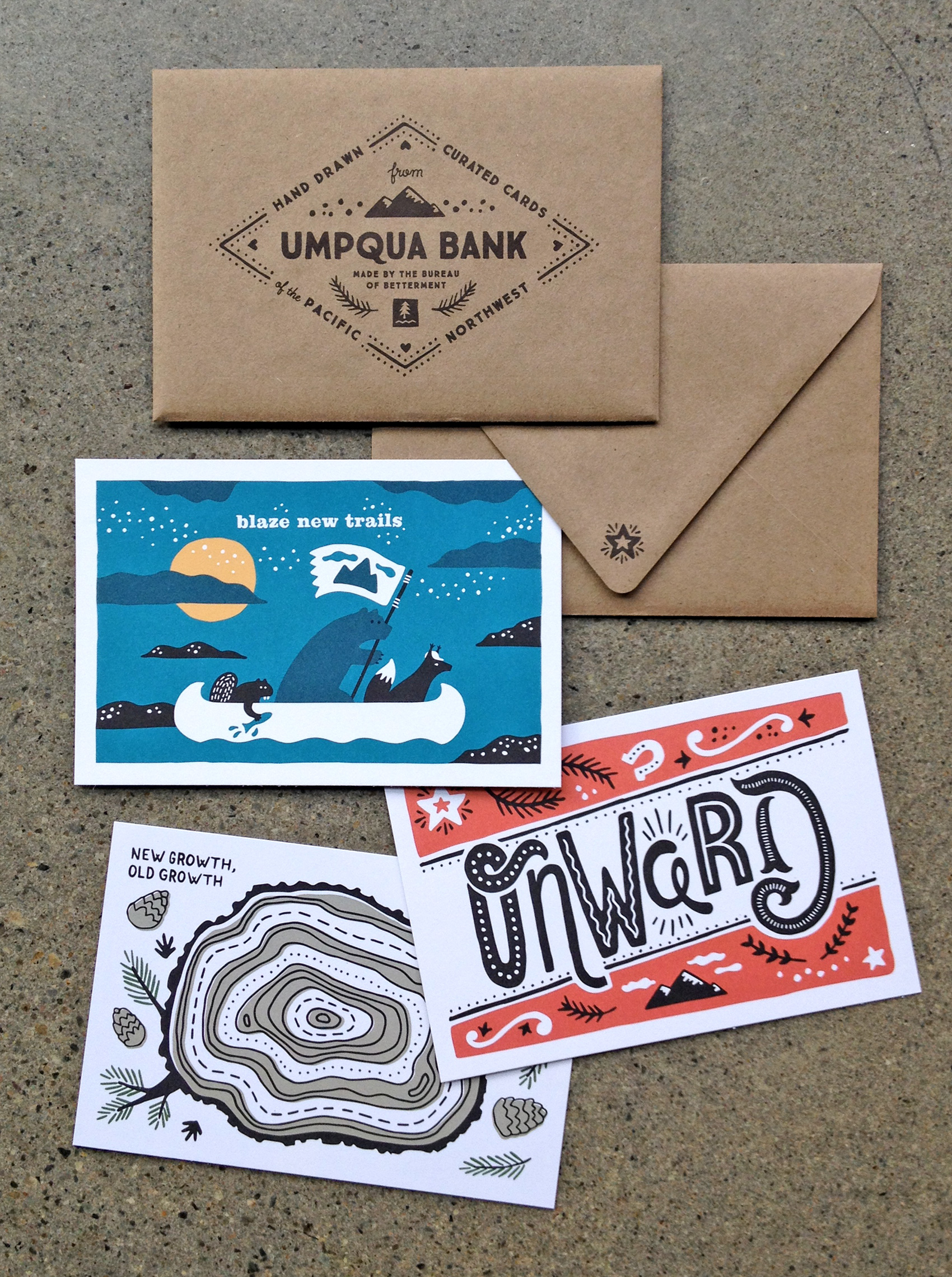
Here is the first half of six postcard illustrations I created for Umpqua Bank. A total of six cards were designed so smaller sets could be mixed and matched and handed out at events including the Portland Business Journal Luncheon and the Seattle Design Series. A sponsor-focused envelope was paired with them to emphasize that the cards were created specifically for the young and forward moving audiences they would be distributed in.
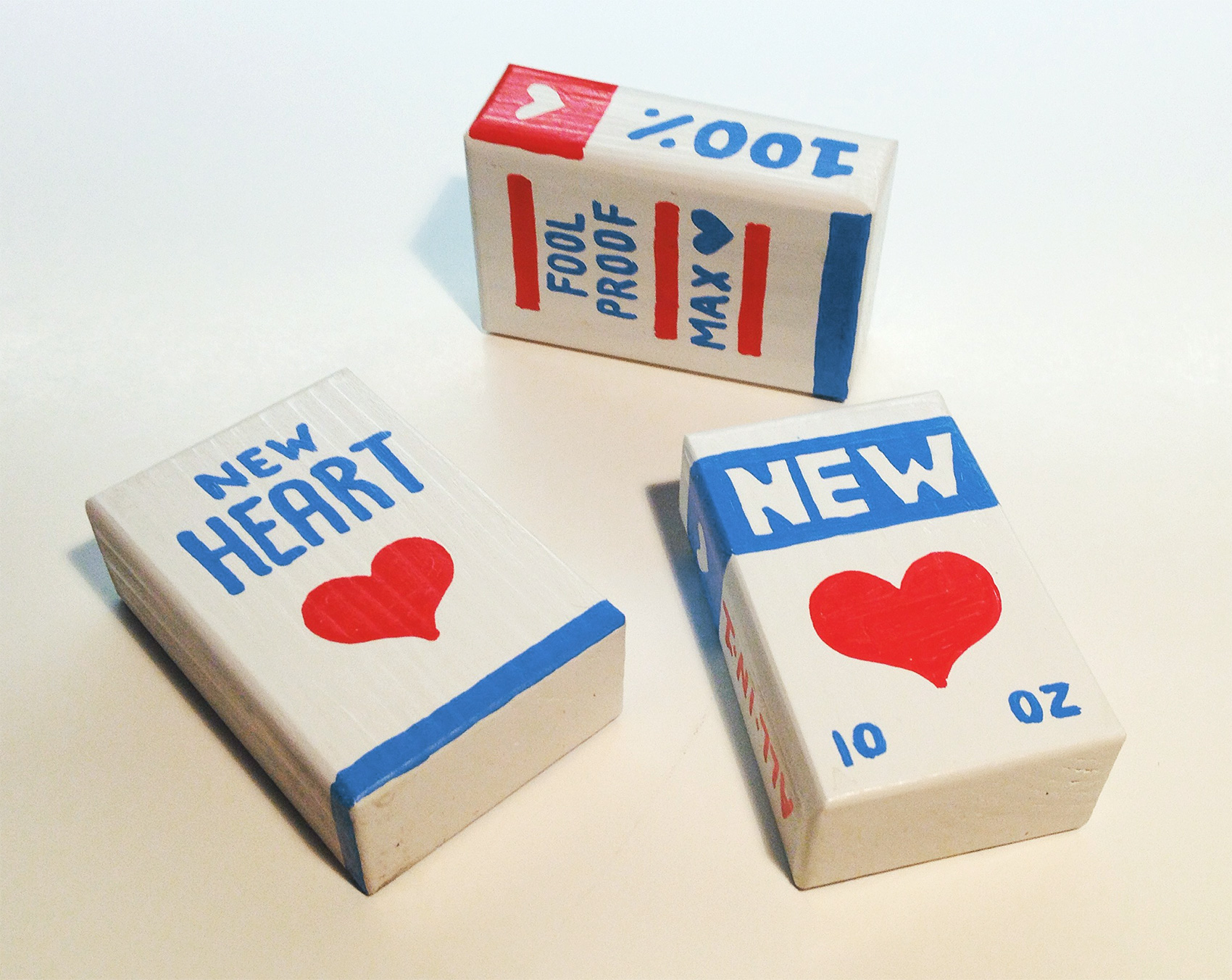
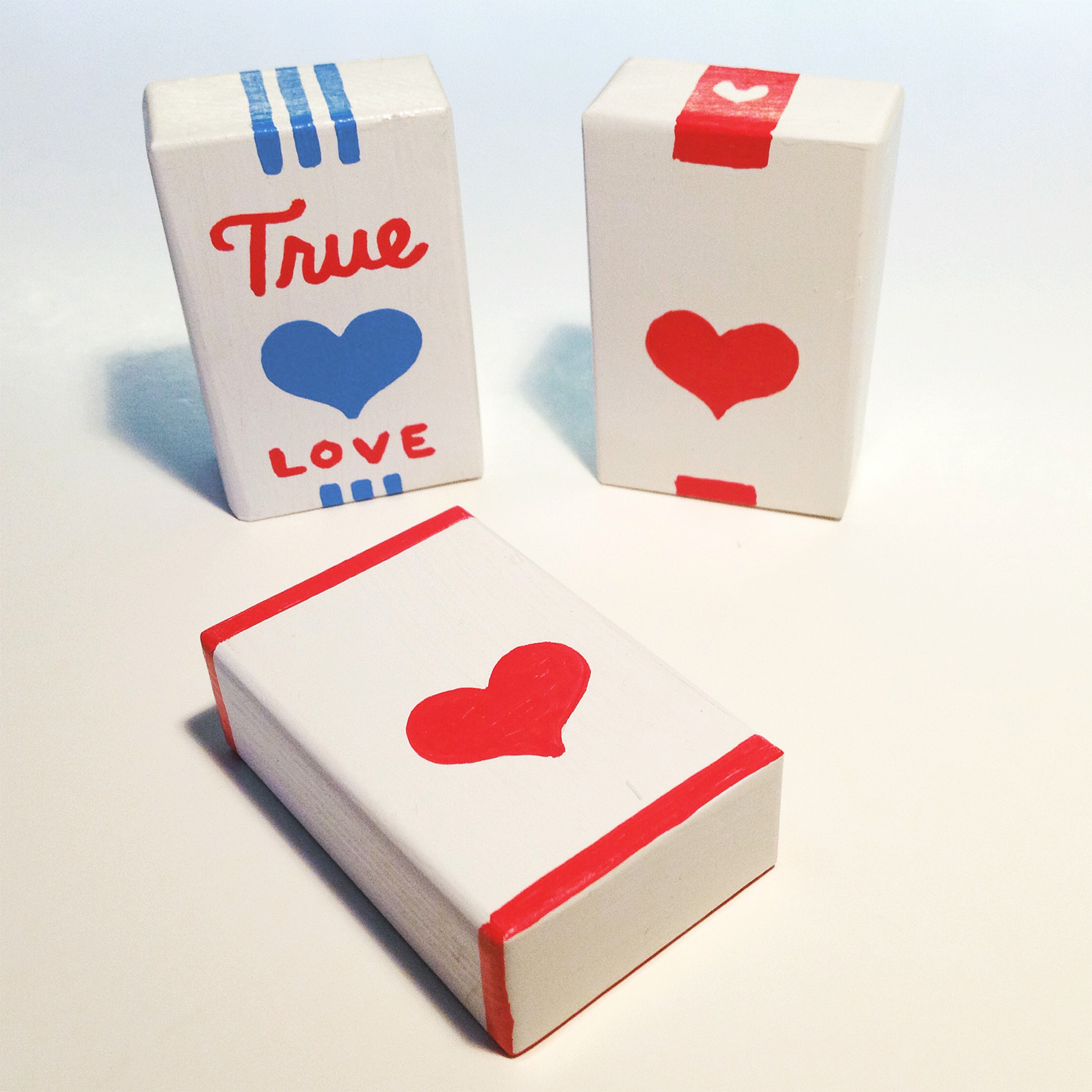
Here are some tests I have been working on for a group art show at Land Gallery happening February 10th titled 69 Love Songs. The show pays tribute to the Magnetic Fields album 69 Love songs with artists each interpreting a song. My song is “I Think I Need a New Heart”, and I’ve been working on tiny heart packaging (think cigarette package size) using painted wooden blocks and 2 colors of liquid paint Markal markers. It’s definitely a medium with limitations, which has been fun to work with.
Here is the second in a series of postcard illustrations I created for Umpqua Bank. A total of six cards were designed so smaller sets could be mixed and matched and handed out at events including the Portland Business Journal Luncheon and the Seattle Design Series. A sponsor-focused envelope was paired with them to emphasize that the cards were created specifically for the young and forward moving audiences they would be distributed in.
This one was particularly fun because I tapped into my roots growing up in rural Central Oregon for a cornucopia of western style lettering. Yes, I rode horses. Yes, most radio stations played country music. Yes, I imagined I might have been Laura Ingalls Wilder in another life. Onward you intrepid pioneer!
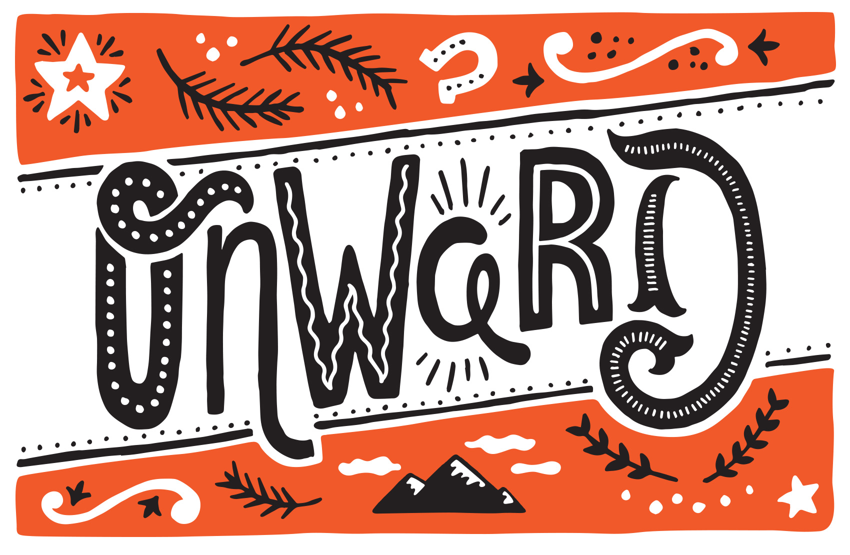
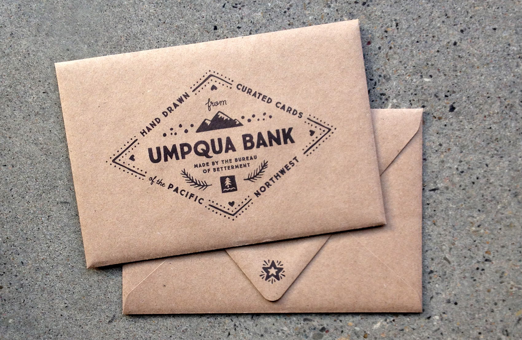
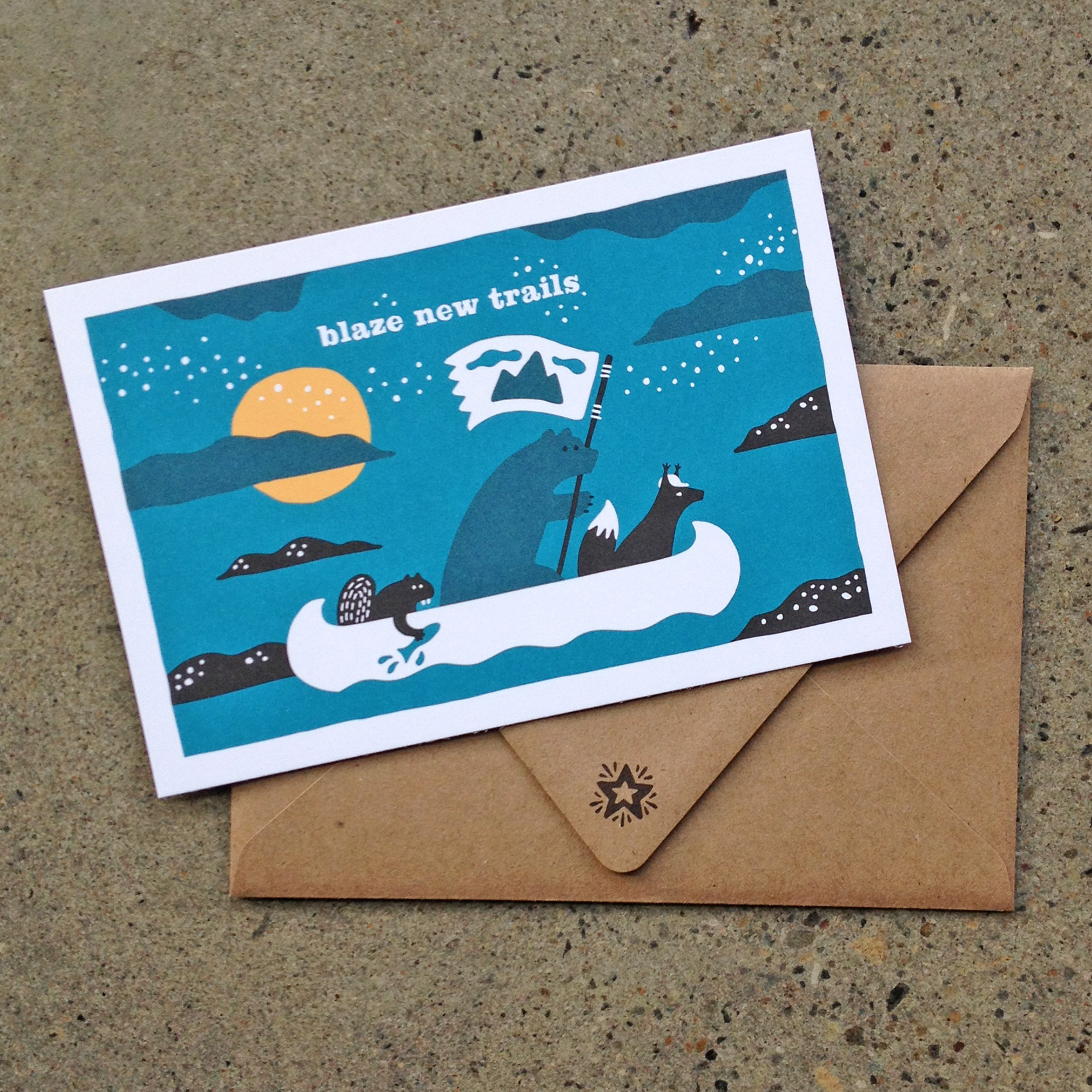
Here is the first in a series of postcard illustrations I created for Umpqua Bank. A set of 6 cards were created so smaller sets could be mixed and matched, to be handed out at events including the Portland Business Journal Luncheon and the Seattle Design Series.
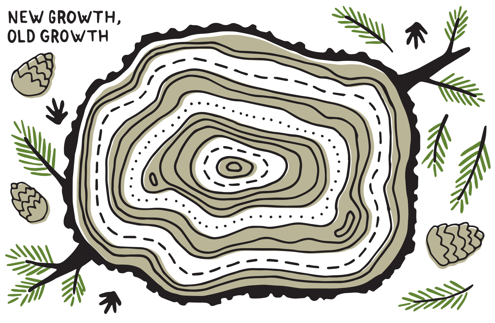
A sponsor-focused envelope was paired with them to emphasize that the cards were created specifically for the young and forward moving audiences they would be distributed in. The creative brief was open, with the theme of “Pacific Northwest” guiding each card’s content – coming up: Wonderland, Old Growth/New Growth, Cascadia, Onward, and some foliage.