Tofurky Moocho Logotype and Lettering for Packaging Design


A long time client-collaborator – Tofurky – has recently launched both a new product and their new website that feature lettering work by the Bureau. The new product line is called Moocho, which I worked on with Art Director Gary Huck to create a handlettered logo for Tofurky’s new division of dairy-free vegan options. The first series of product are 3 cheesecake flavors. We hit a balance between being bold on package, having a similar personality to other lettered & illustrated elements, being fairly non-gendered and feeling like the word.
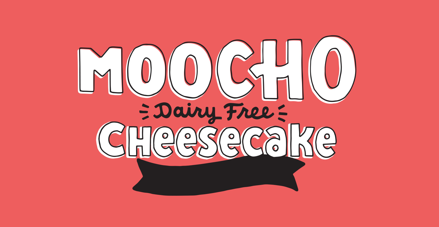
Hand lettered / hand drawn word mark for Tofurky brand MOOCHO vegan / dairy free cheesecake.

A technical portion of many packaging projects is fulfilling the legal requirements of packaging. This means that the brand name (Moocho), product name (cheesecake), any specific claims or identifiers (Dairy Free), and flavor (goes in the banner) all have to work together in a specific way in certain size proportions and order. To achieve a balanced look, the product name was lettered in mixed case with a very high x-height, and the claim was also created with a high x-height so it didn’t have to be very large compared to the brand name.

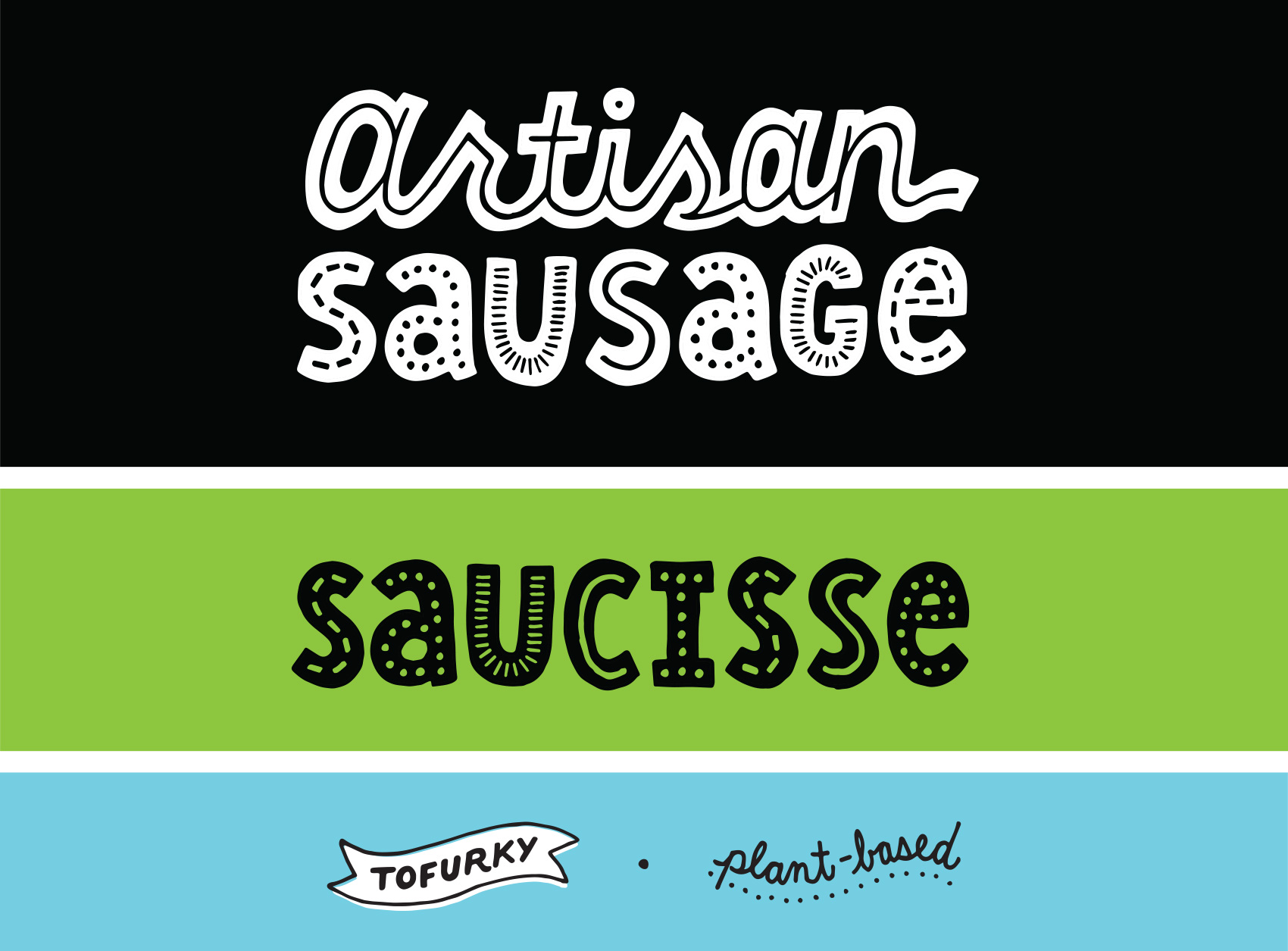
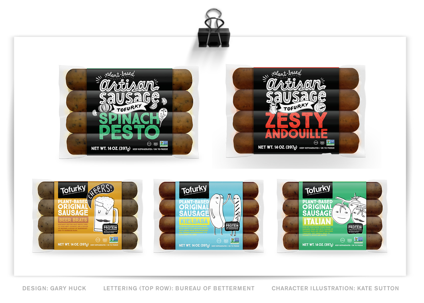
A part of the project was determining the right hierarchy between the parent brand (Tofurky) and the new sub-brand (Moocho). For that reason, Tofurky is represented by a lettered banner instead of the classic black box + logo combination on their other product lines, of which I’ve also created lettering for to differentiate their artisan sausage from the regular old sausages.

The design in general is clean and features the product next to their character illustrations, with color blocking and the brand name being the main on-shelf visual. This is a great way to create a big shelf presence and a recent trend in packaging as new products compete for scannability.
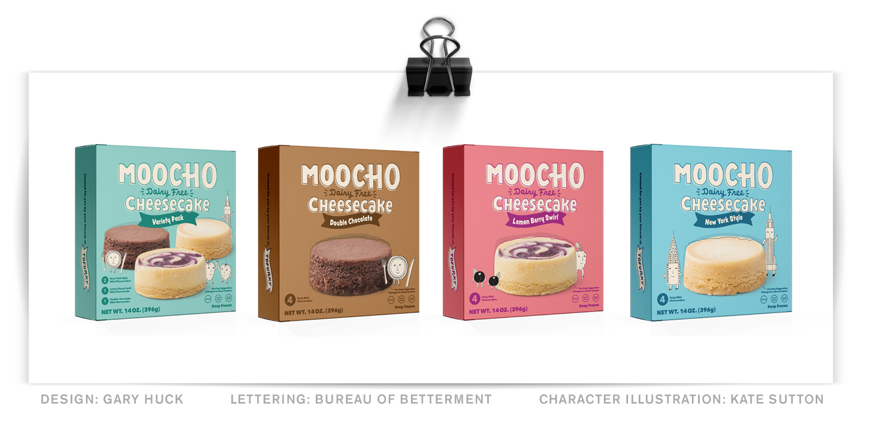
Series of four Moocho Cheesecake packaging boxes (design: Gary Huck) with a hand lettered MOOCHO word mark and product title and flavor.

In addition to the new Moocho brand, Tofurky has also launched their new website that uses various brand lettering I’ve designed as their loading images and visual support throughout their recipe and several about pages. So each time you switch pages, a variety of randomized sayings will pop up…Taste Bud High Five!!!
Naia Gelato Cup Packaging


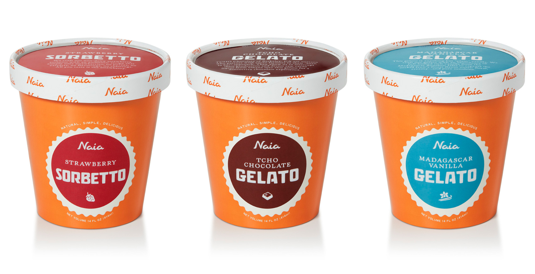
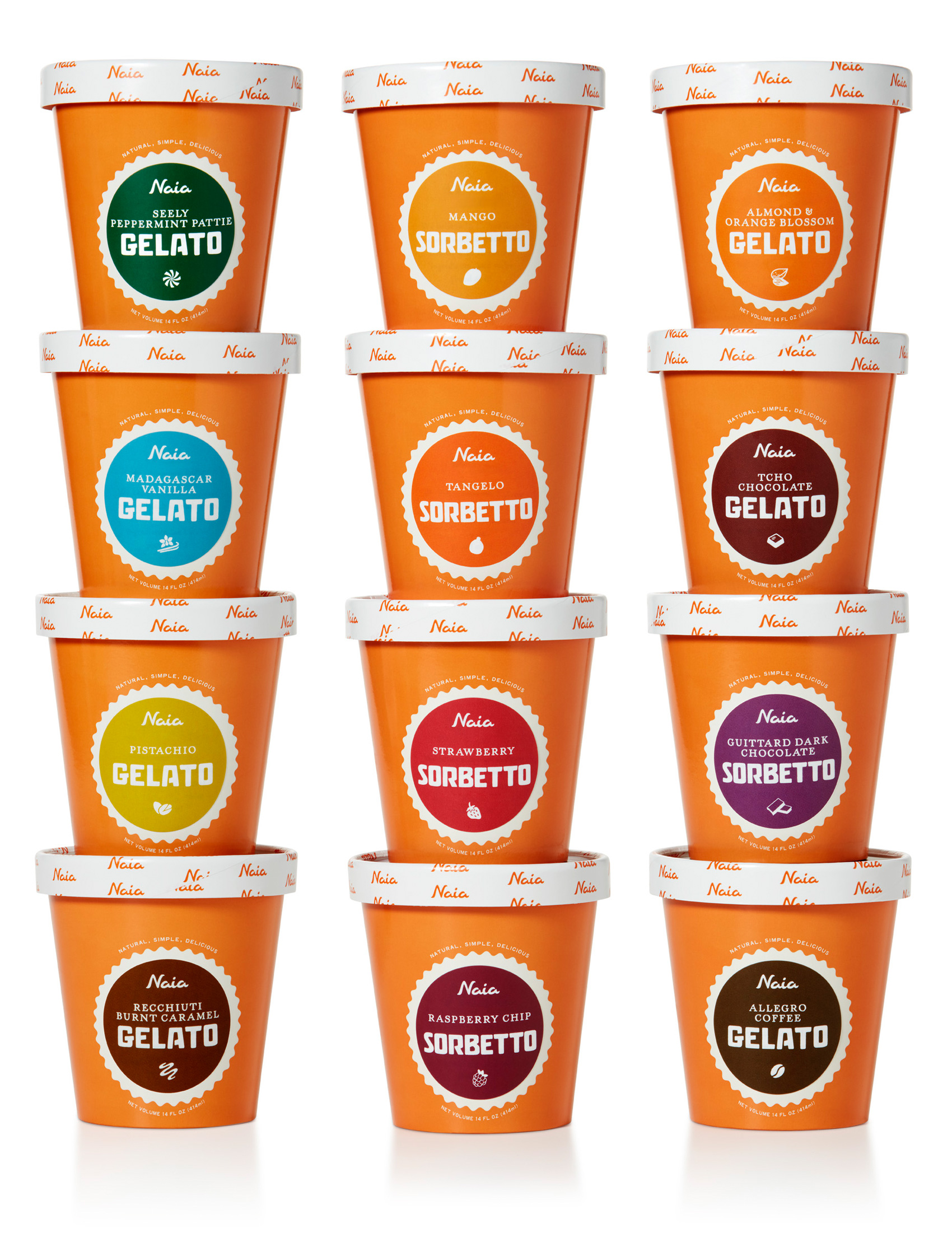
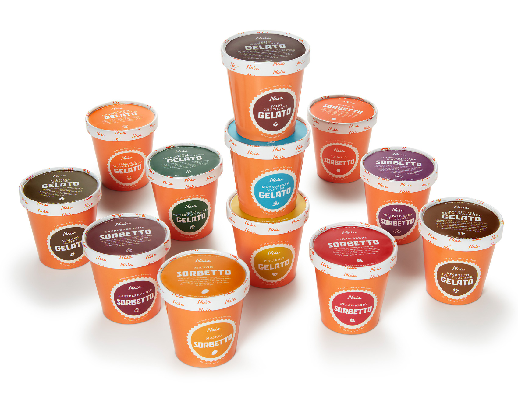
Long term client and collaborator, Gelateria Naia, has extended their gelato and sorbetto into a new format – the 14oz small tub. On this project, their signature orange was used as a background for the color-coding used on each flavor. Presented mostly in a top down freezer in grab-and-go areas, having a strong color presence on the lid was integral.

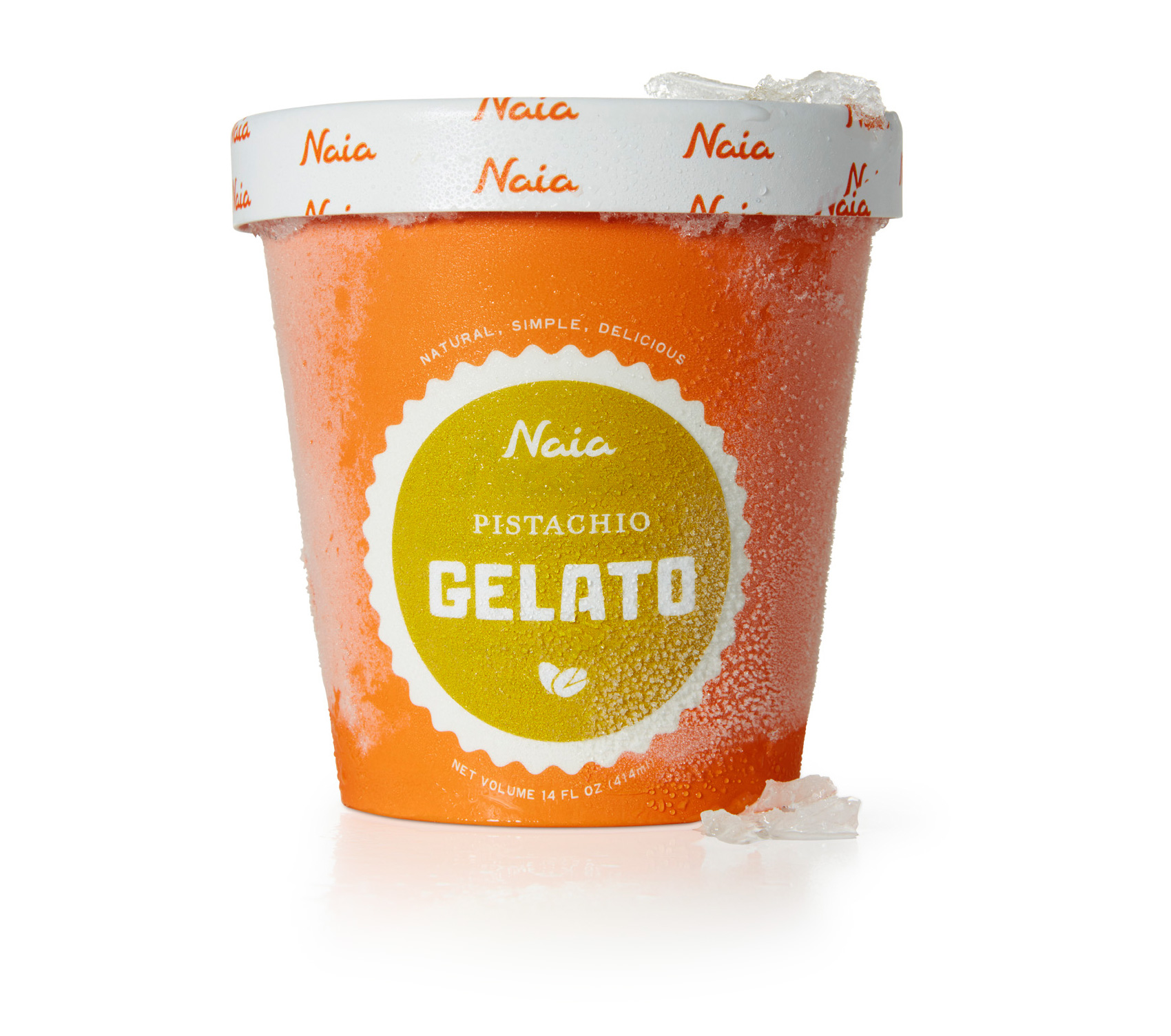
A major update / minor evolution to this brand was shifting their name on the packaging from Bar Gelato by Naia (also their namesake and inaugural product) to just Naia. Originally Bar Gelato made sense because it was their only product. However with the addition of sorbetto to the line-up, food regulations and approval got trickier with how the brand name only accurately described part of their product line. With this most recent packaging, Naia takes the lead as the brand name, and sorbetto and gelato can be used as the product identifier. Hierarchy on packages is critical for both the consumer, stocker, and fulfilling legal requirements. Pistachio is shown here because it’s my favorite flavor.

From a production standpoint, the cup was designed to be a standard issue brand orange with universal information, with a white scalloped template area into which a circular sticker could be placed to differentiate flavor. This type of design works well for product lines where it is hard to predict exact quantities of specific flavors, where flexibility in quantity/distribution of flavors is key, and when very small runs of speciality flavors are common. Naia often produces seasonal or specialty flavors, always experimenting with local producers to find nuanced and specific flavors. The rim of the cup was also a universally produced element, while the top of the lid was custom to each flavor.

A series of icons associated with each flavor has been used across many of Naia’s products, so they were employed again to provide a subtle indicator of the simple and pure ingredients. The custom lettered blocky font previously used in the logotype is now the headliner, providing some visual crossover recognition, as consumers were used to seeing BAR GELATO large and in charge on the previous packaging. And now, for a National Geographic-esque photo of a herd of gelato/sorbetto migrating across the icy plains of your nearest Whole Foods freezer case.

Chocolate Wafer Concept Packaging


One of my favorite types of design projects is packaging – specifically food packaging. It is also one of the more fickle types of projects. Sometimes products miss their window of opportunity, sometimes start-ups aren’t able to get an investor to put the product on shelves, sometimes budgets fall through or a product line is re-oriented. Specialty products are sometimes explored up until launch, at which point they are deemed unviable. Once an entire project was derailed due to a macadamia nut shortage. You just can’t plan ahead for these kinds of things!

Because of this, I have worked on almost as many packaging projects that have been shelved than have actually reached shelves. Gelateria Naia is my one exceptional client that has taken every product I’ve worked on to market (see a few projects here and here, with more in the works!). Even the packaging projects that make it to market often take a YEAR OR TWO between packaging design and hitting shelves. This is like 1,948,465 years in “designer years” – it’s definitely not an exercise in instant gratification.

Last year I worked on chocolate wafer packaging for a company that packages US and European products for the Chinese market. Because of quality perception and some food scares, the design brief presented an interesting mix of designing in a way the Chinese market was used to (bold, zingy, pop!) while making the product look and feel European-based. Unfortunately the project was put on hold, but I wanted to share a direction from the initial design round (with a placeholder product name). A more traditional approach was selected as the final, where I got to practice drawing the Swiss Alps and milk splashes, but is not shown here because it hasn’t been released. So while not everything makes it to market, it doesn’t mean it isn’t sweet!

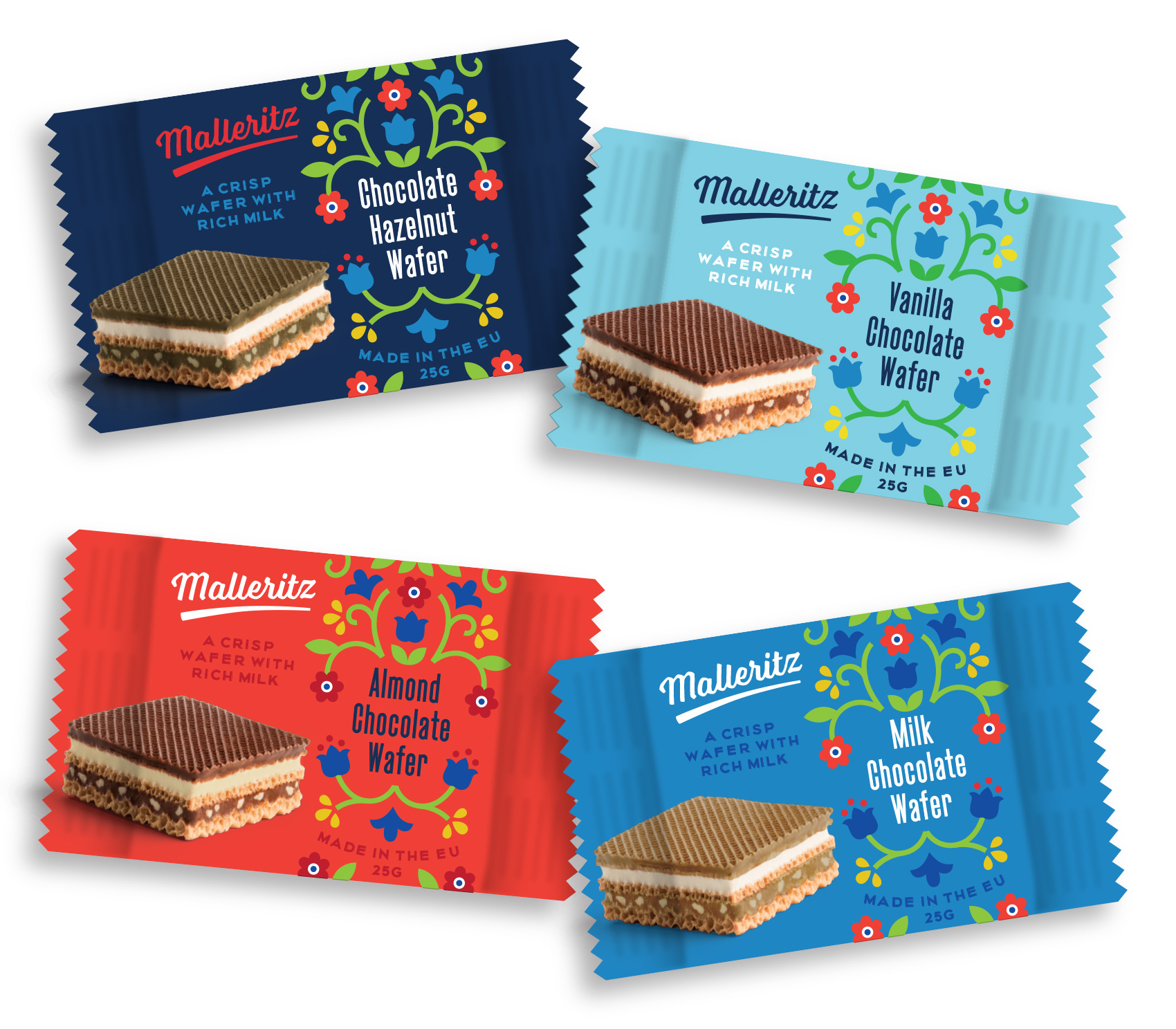
Concept packaging for chocolate wafers in four flavor ways: chocolate, vanilla, milk chocolate, and hazelnut. Illustration in a modern style but with traditional European motifs.

Olympia Provisions Holiday Card + 10% off


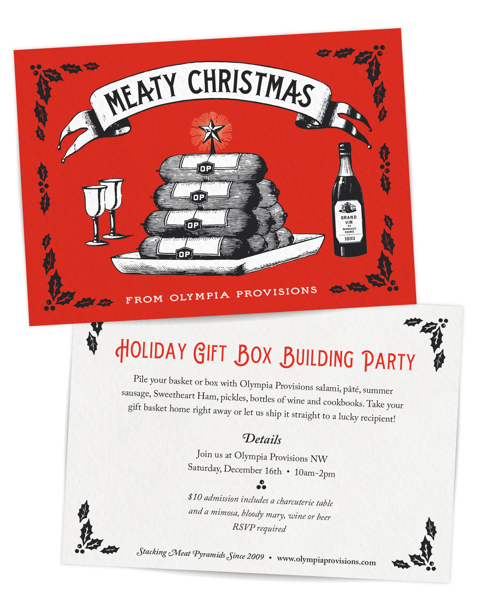
Tis the season for holiday cards and charcuterie. Following up on last year’s meat wreath, this year my client Olympia Provisions went for a more pyramid shaped meat art for their annual card – a stack of charcuterie bedecked with a merry star. Meaty Christmas!

Christmas pyramid of charcuterie - probably salami - from Olympia Provisions 2018 holiday card design.

On another holiday note, Olympia Provisions is hosting their second annual charcuterie box building party. Get your tickets here if you want to fill your own box or basket with meats galore and either take it home or send it to a lucky recipient.

MORE Deals! Deals! Deals!
Enter METTERULES as a promo code for 10% off online at Olympia Provisions.

Olympia Provisions Catalog


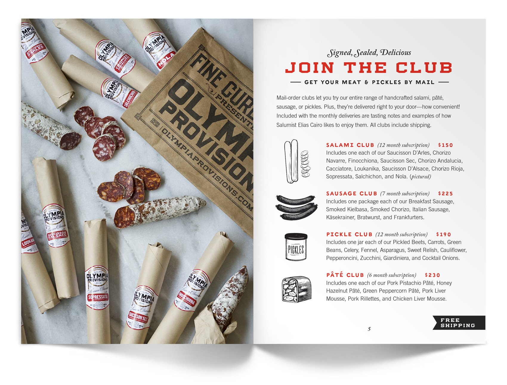
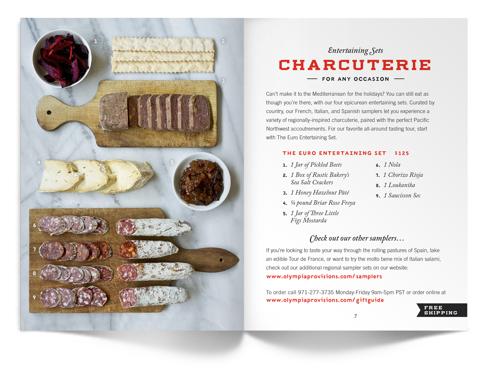
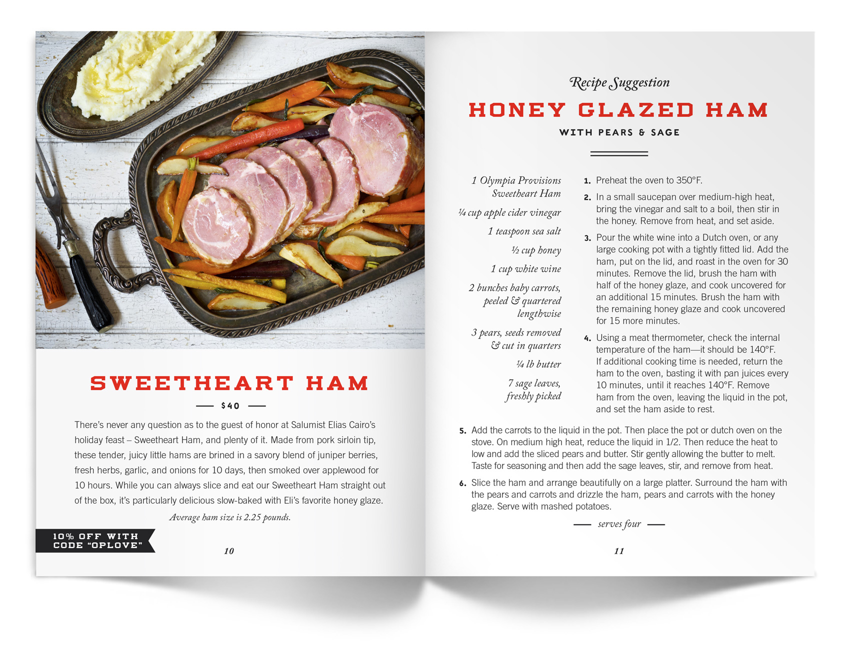
My most recent project for Olympia Provisions was creating their consumer catalog – a curated line-up of OP’s best charcuterie in a small, fun digestible size and format. It is used promotionally at farmer’s markets and trade shows and sent directly to customers, and later in the year will also function as a holiday gift guide. From a designer’s perspective it was also a lovely project because it combined a photoshoot with David Reamer, working with one of my favorite food copywriters Jen Stevenson, and detailed page layout (yum, stylesheets!).

While working “out of season” always feels a little strange, many holiday pieces are created in early summer to allow for wholesale order planning, product production, etc. In fact most of my work in May was focused on the Christmas season…

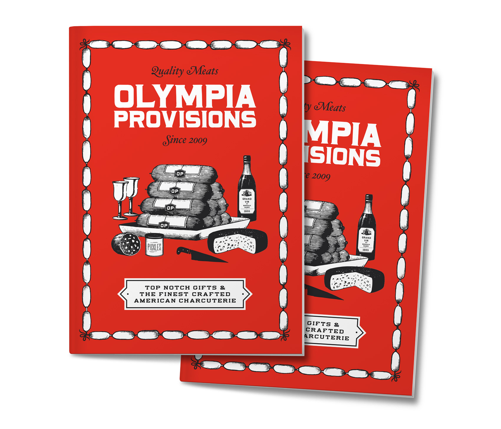
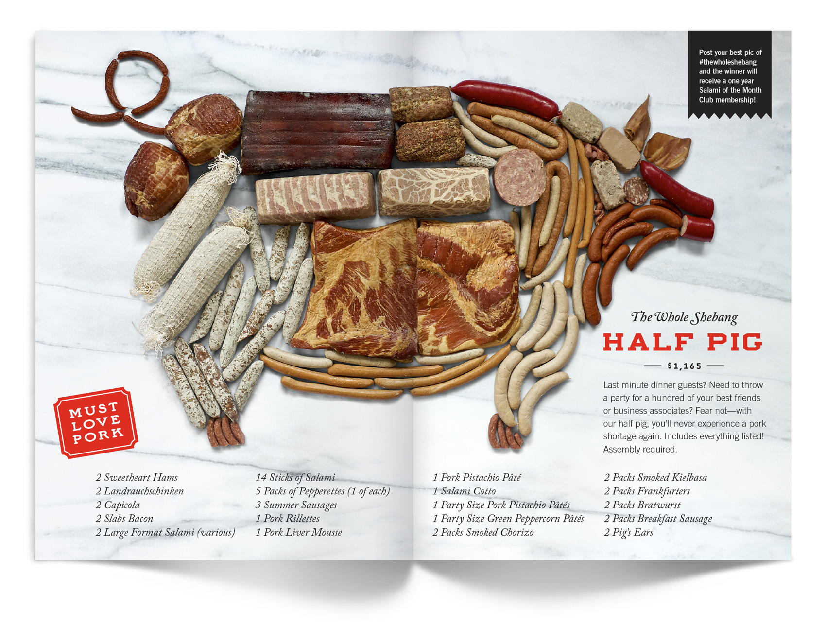
A bright red cover in a hand-held size of 5×7 inches catches your attention merrily and is festooned with a border of bow-tied sausage links. The cover artwork was painstakingly created from scanning vintage cuts, or letterpress images, and piecing them together to create the scene we wanted. Of special note is the The Whole Shebang spread, technically described as half a pig. Read more about the creation of the photo here, and may you never experience a pork shortage again!

Olympia Provisions holiday catalog - a red booklet with stack of sausage on display

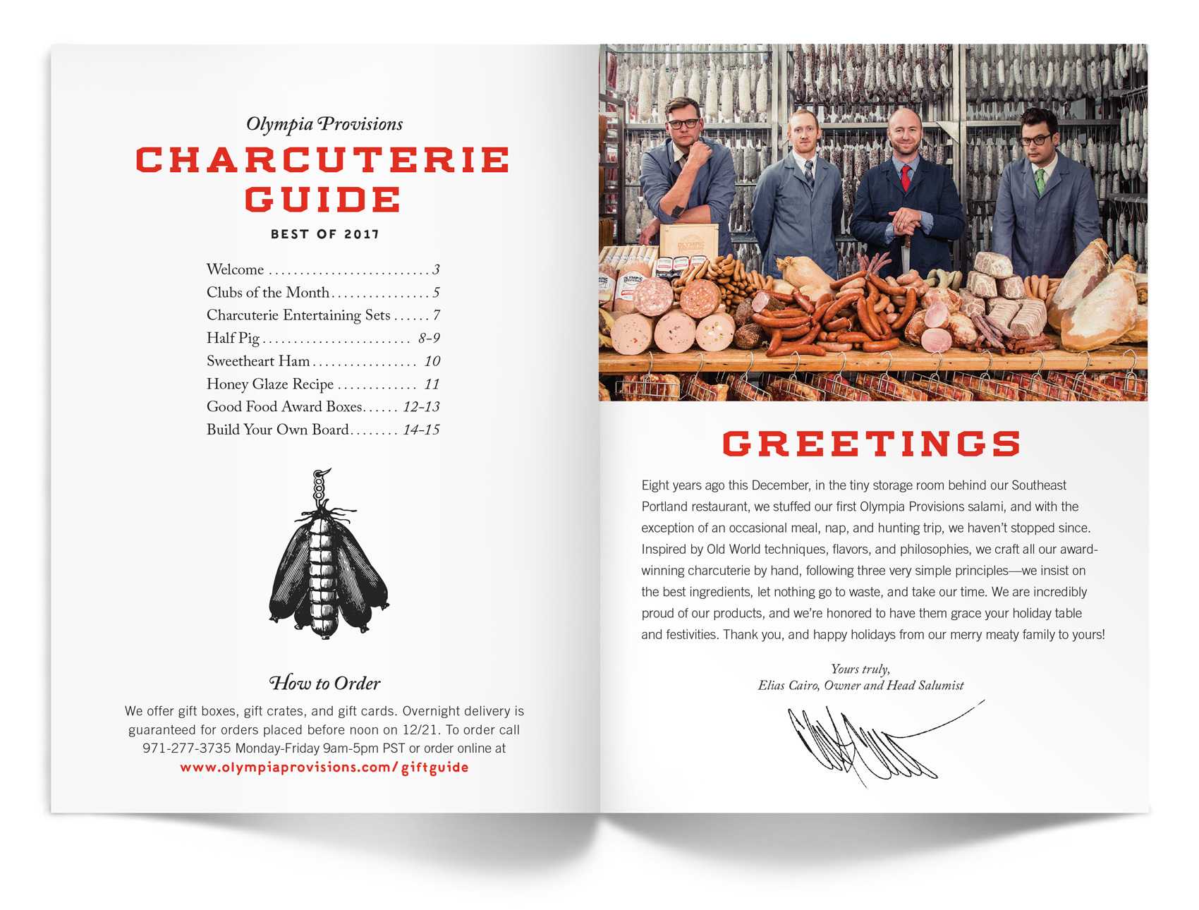
Welcome letter from Eli  for the Olympia Provisions holiday catalog.

Olympia Provisions clubs of the month: salami, sausage, pickles and pates.

Charcuterie gift sets from Olympia Provisions from their 2017 holiday catalog.

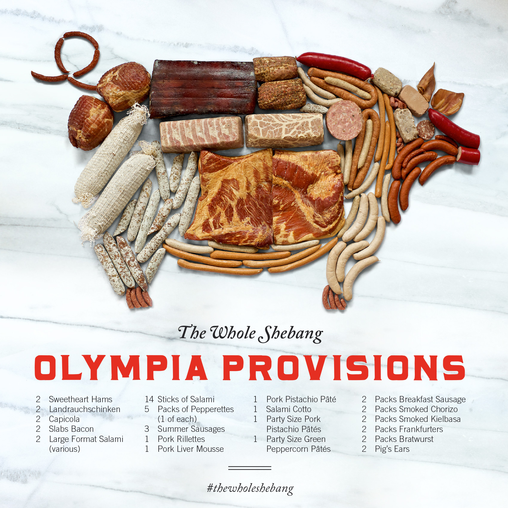
The Whole Shebang - half a pig from Olympia Provisions, with all the cuts of charcuterie arranged in the shape of a porky pig.

Eli Cairo's honey glazed ham recipe.

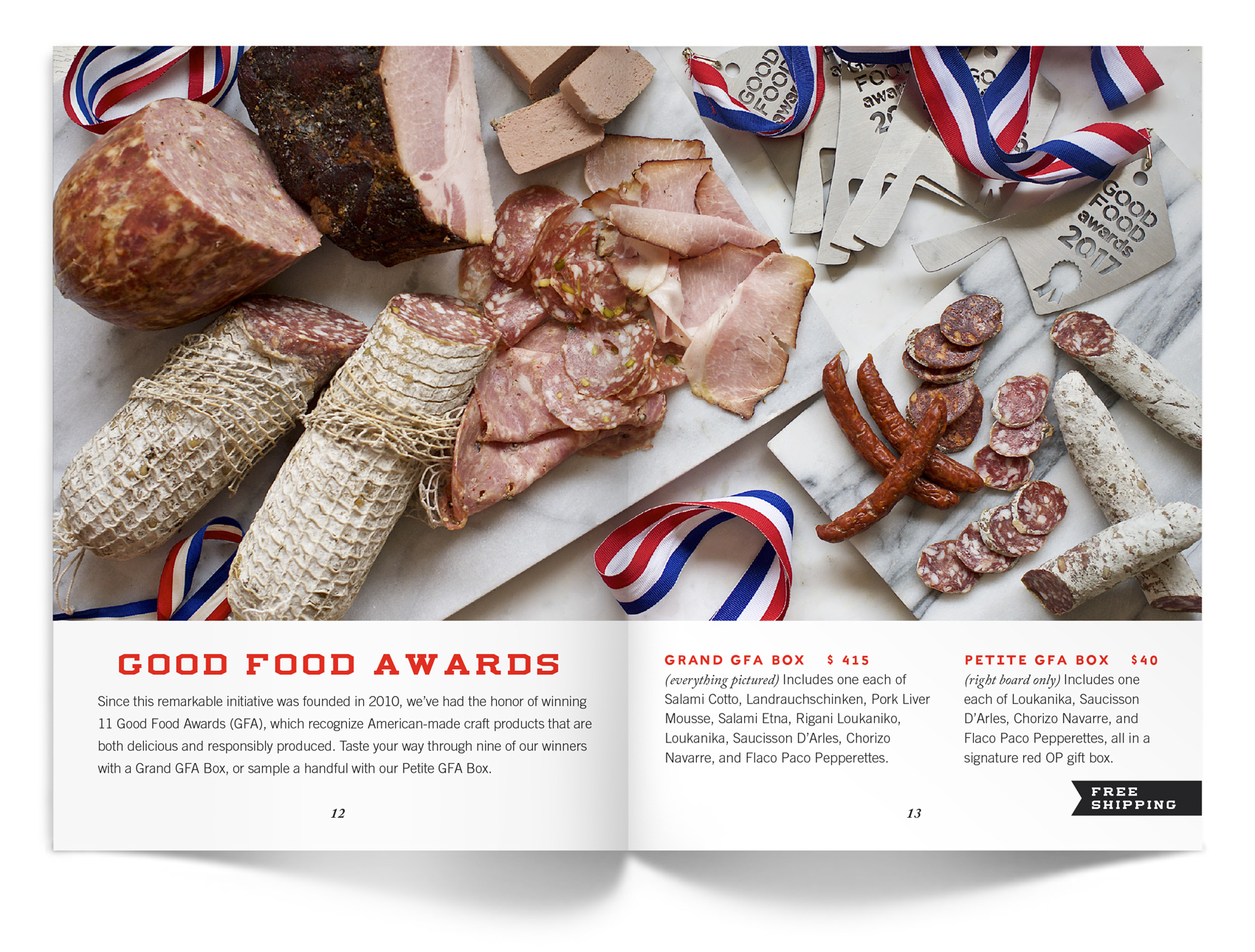
Olympia Provisions spread of Good Food Award winning charcuterie.

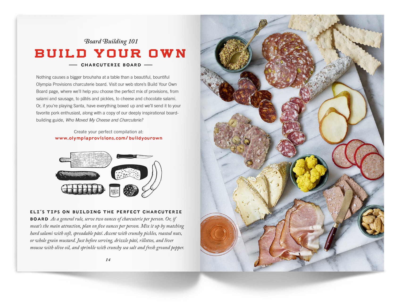
Build your own charcuterie board with Olympia Provisions.

Well Vegan Brand Refresh


Six years ago marked Well Vegan’s launch when Bureau developed the brand from scratch for food-entrepreneur Katie Koteen to market her vegan meal plan subscription service. This spring, with a ton of new site features and her first cookbook under her belt, Katie wanted a refresh for the logo and website.

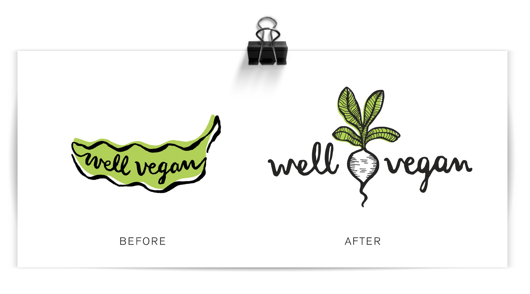
The first thing on the docket was a logo update. The friendly hand drawn script was a keeper, but legibility was increased by redrawing it on a level baseline and separating the two words with a visual – one of Katie’s favorite illustrations from the initial branding, a white radish. A pop of green was retained in the radish leaves, but the overall impression was more toned down.

before and after logo for well vegan, from a smiling pea pod to a white radish

The inaugural 2011 branding for Well Vegan included lots of hand drawn elements, borders, spot illustrations and illustration as main images (see it here). In 2017 Katie wanted to update the site based on the increase in photography and recipe posts, as well as make the site feel a bit simpler and cleaner rather than the homespun start-up it used to be.

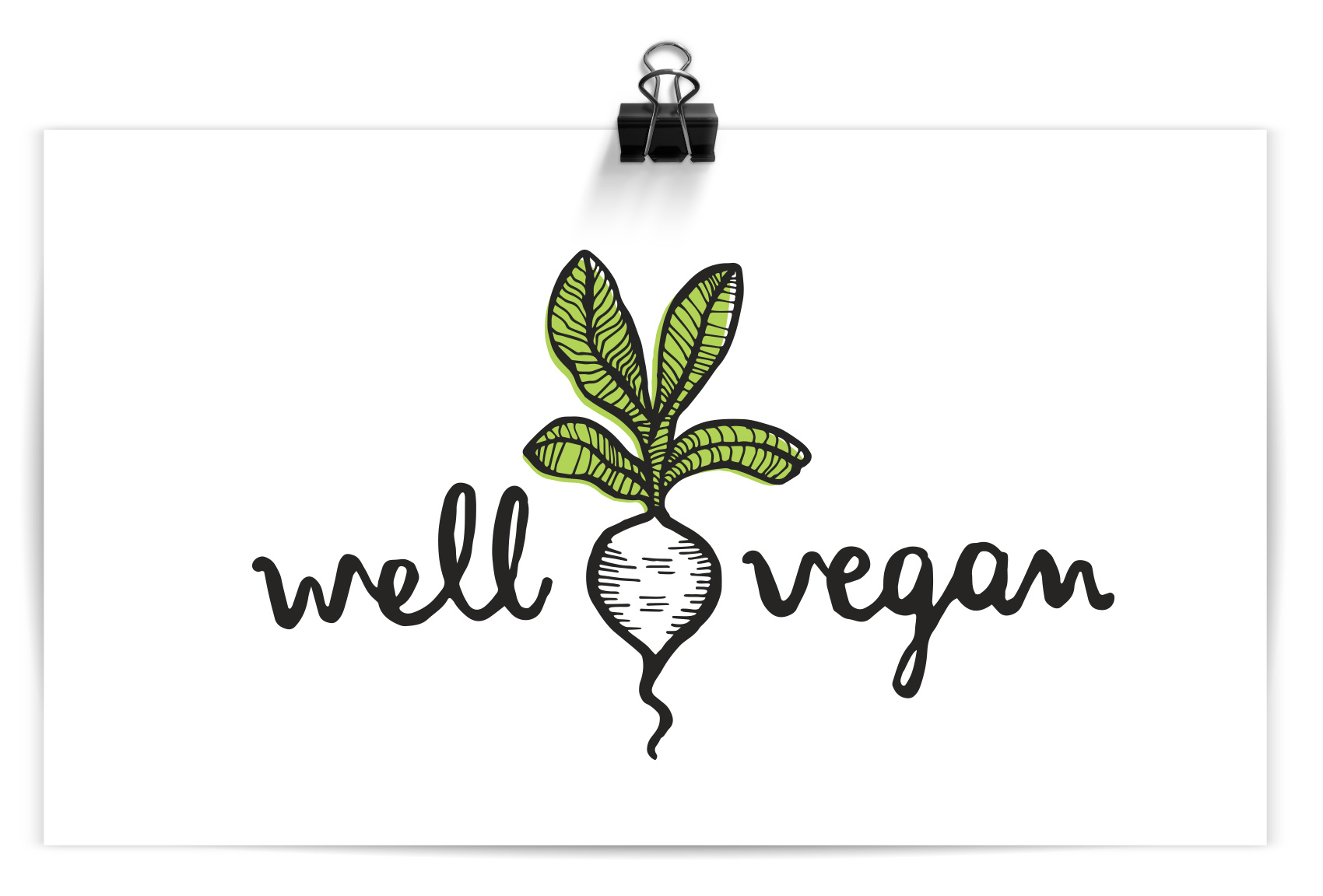
well vegan hand drawn logo in black brush pen with a radish illustration and green color pop

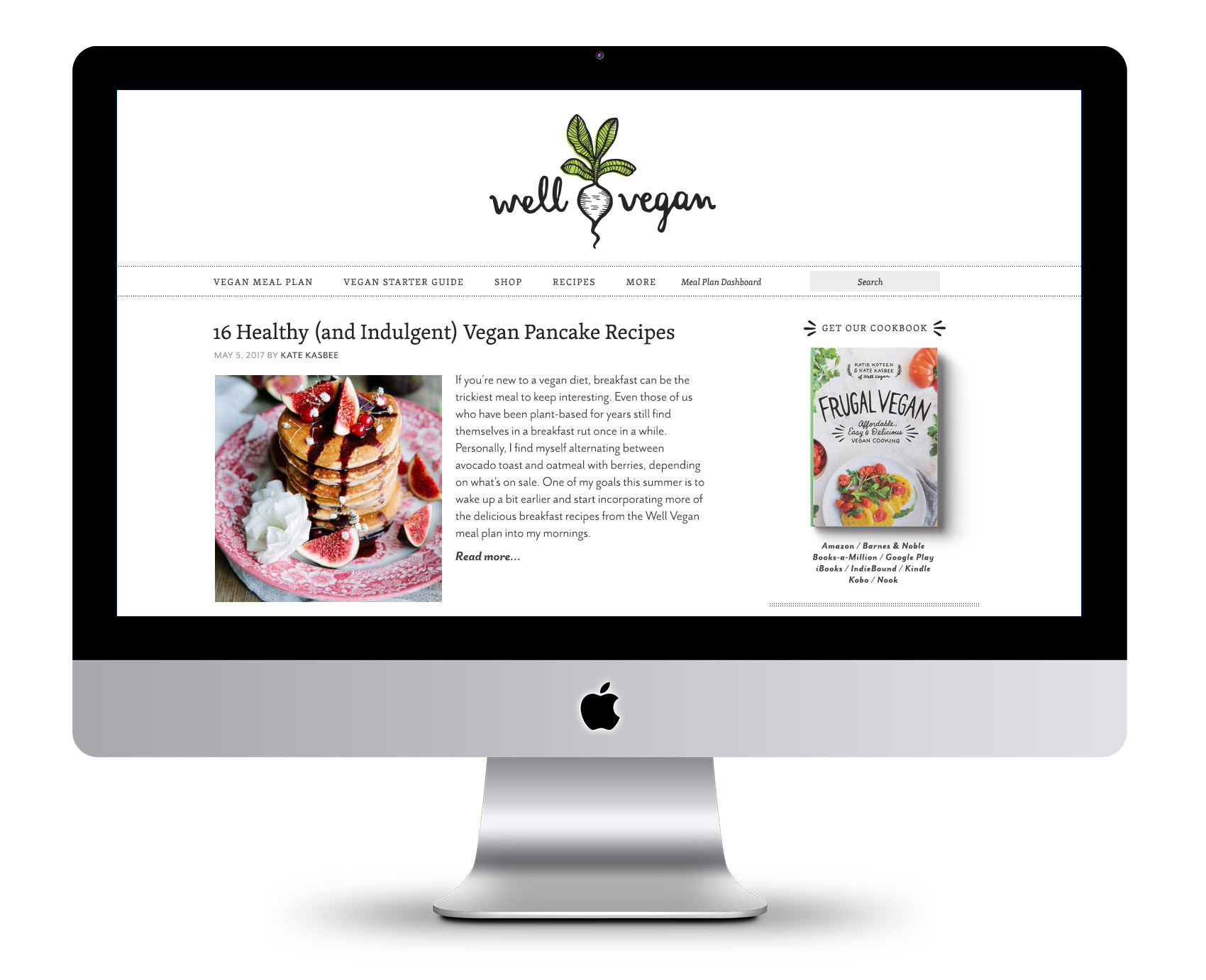
A major area of focus was paring down the use of illustration and color to allow the food photography to shine. Instead of being the main focus, illustrations were used as accents and often in black & white instead of full color. The fonts also were refreshed – headline and accents were kept in the friendly legacy font (Skolar) while body and informational text was updated to the lighter, brighter Mr. Eaves.

Well Vegan blog post design

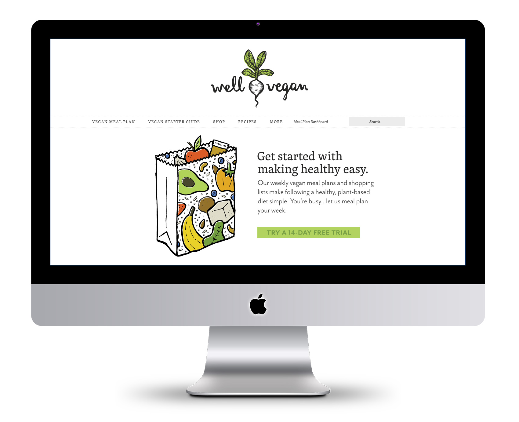
In the instances where illustration is used for main effect, we stuck with the black line-work style with color accents. This also left room for future promotional illustrations which had been a heavy favorite over the years with subscribers and the Pinterest crowd.

Illustrated grocery bag for Well  Vegan's plan page

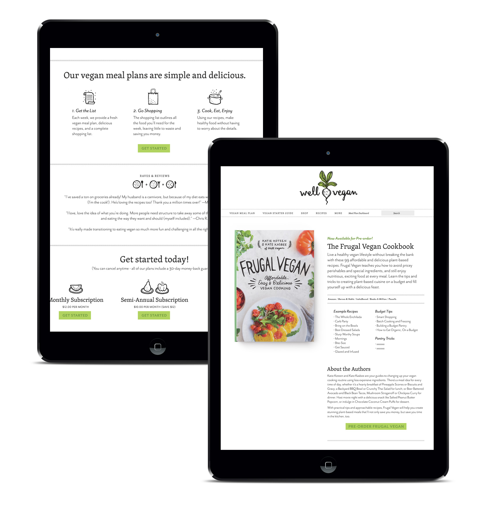
The new streamlined feel was leveraged lightly throughout the site and in the cookbook design, featured on the cover and as page accents. The book is currently available.

well vegan plan page and promotional Frugal Vegan cookbook page

Frugal Vegan Cookbook


From full-frontal meat spectacular to a dense foliage-laden tome of vegan cooking knowledge, my last two projects were on opposite ends of the food spectrum. This time the project at hand was designing a vegan cookbook: The Frugal Vegan! It’s no wonder half my blog posts are tagged MMMM, FOOD.

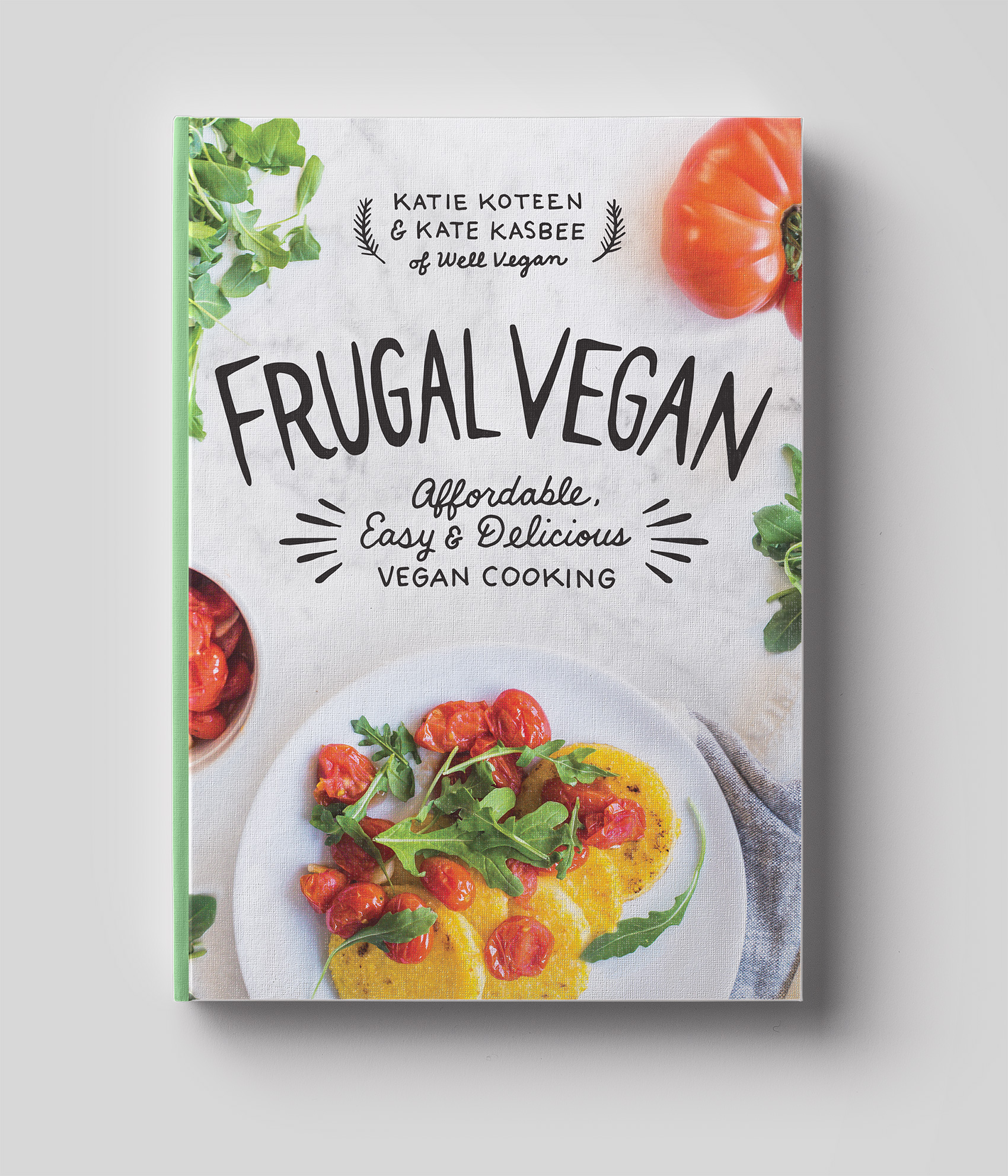
Well Vegan - Frugal Vegan cookbook cover with custom photo and hand drawn cover title

A friend and colleague I’ve worked with over the years recently published her first cookbook. Well Vegan is Katie Koteen’s online vegan meal-planning service. It was launched in 2010 and had been a side project of hers for several years, growing slowly with the addition of Kate Kasbee, then expanding the recipes and features on the site, and finally becoming a main focus of work which led to a book deal: Frugal Vegan: Affordable, Easy & Delicious Vegan Cooking. One of the most exciting parts of working with small business owners is seeing them grow their business and what direction(s) it takes over the years – this one is definitely on an upward trajectory.

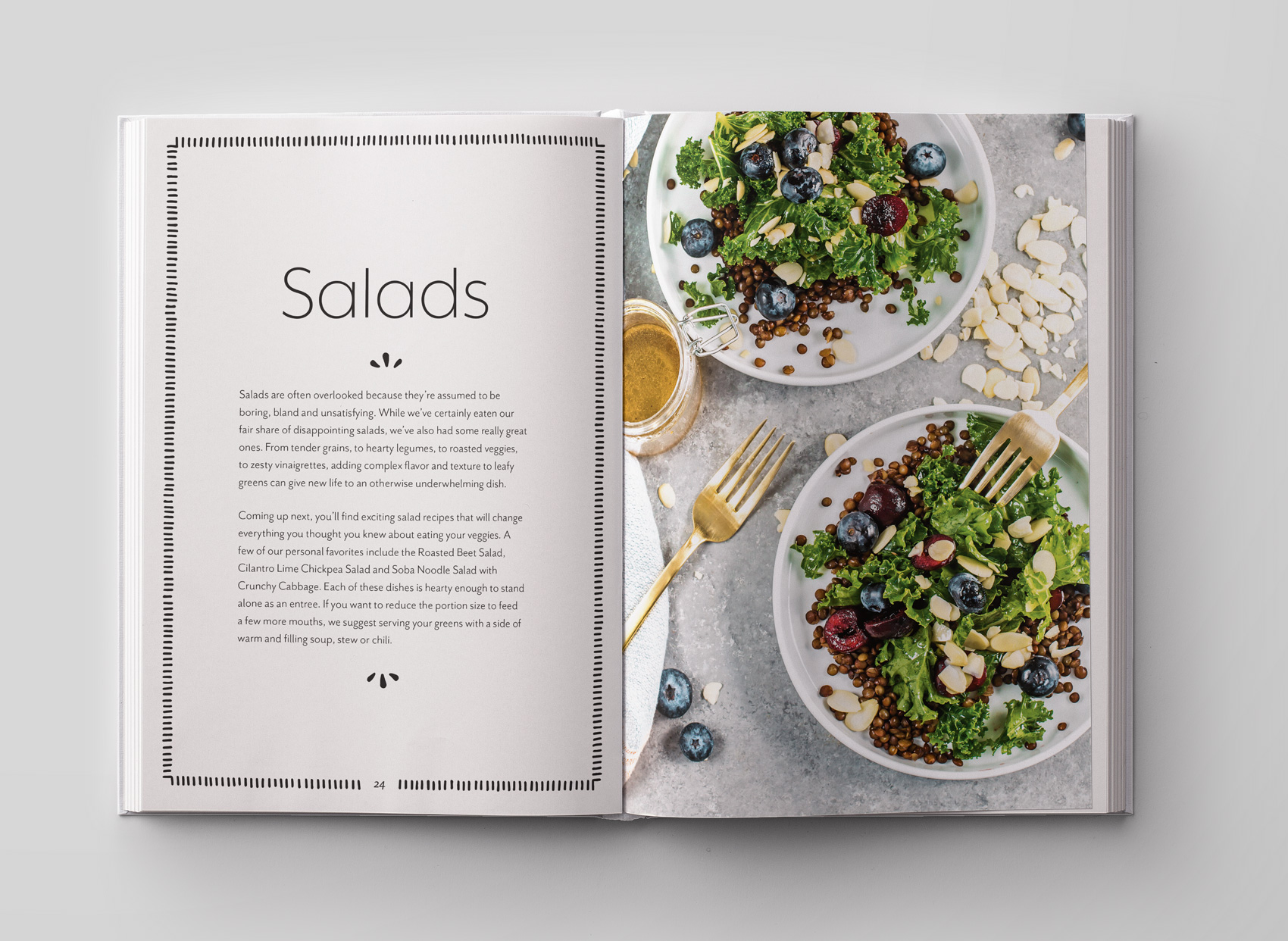
frugal vegan cookbook salad introduction page for healthy vegan recipes

Katie & Kate tested and refined 99 recipes that focus on budget-friendly vegan cooking. I got to taste a few recipes along the way, witness an upgrade from an unreliable stove to a gas-top range, and in the end was asked to help with the book design. The project scope was limited but made a nice difference – developing a cover with photo direction and hand drawn typography reminiscent of her Well Vegan brand and creating an inside template for recipes and chapter introductions. Photography was shot by Wonder Jam. The end result is a fresh and easy-to-read cook book with accessible recipes that even (gasp) I could make. Probably.

Frugal Vegan is currently available for pre-order.

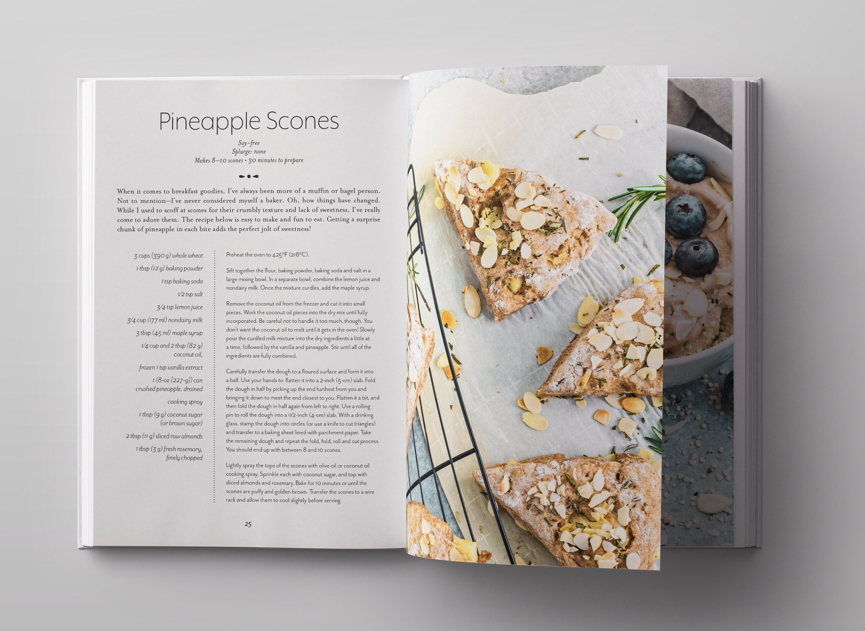
vegan pineapple scone recipe spread for Frugal Vegan cook book

The Whole Shebang from Olympia Provisions


A client that continues to provide fun and interesting projects, Olympia Provisions, recently commissioned the Bureau create a holiday gift guide (more to come on that another day). One of the main photo spreads was a compilation of all of their charcuterie in the shape of a pig, with the products placed approximately where it came from on the pig (give or take an artistic license or two).

olympia provisions charcuterie selection in the shape of a pig - the whole shebang!

The image was created by salumist Elias Cairo of Olympia Provisions placing all the meats in their respective areas, then myself adjusting the placement until it looked like your friendly neighborhood oinker if you were looking at it with X-ray meat vision. Photographer David Reamer shot the piece from a ladder, top down on a white sheet. The white marble was added in post production to give the pig a neutral background and showcase the variety of colors and textures (apparently fat marbling is a big deal in the meat world).

Now, I’m not averse to meat. I eat it. I enjoy it. I’ve even spent time in slaughter rooms on Eastern Oregon ranches during my youth and had my dad chase me to the hay barn brandishing a cow’s tongue (scary for an 8 year old). But in my last two decades of life I haven’t handled that much meat because a) I’m not the main cook in the house, and b) I live with a vegetarian. But handling 50 pieces of meat several times each for over an hour is a bit beyond what I ever though my job as a designer would entail. Suffice to say, I fulfilled my meat handling quota for the year on this project!

And, since this was a small part of their annual consumer-side catalog project, you can indeed buy The Whole Shebang (which is technically classified as a “half pig”) when holiday season rolls around. It’s a no-lose situation, and as we described this unique offering in the catalog…

Last minute dinner guests? Need to throw a party for a hundred of your best friends or business associates? Fear not—with our half pig, you’ll never experience a pork shortage again. Includes everything listed! Assembly required.

Olympia Provisions Inserts


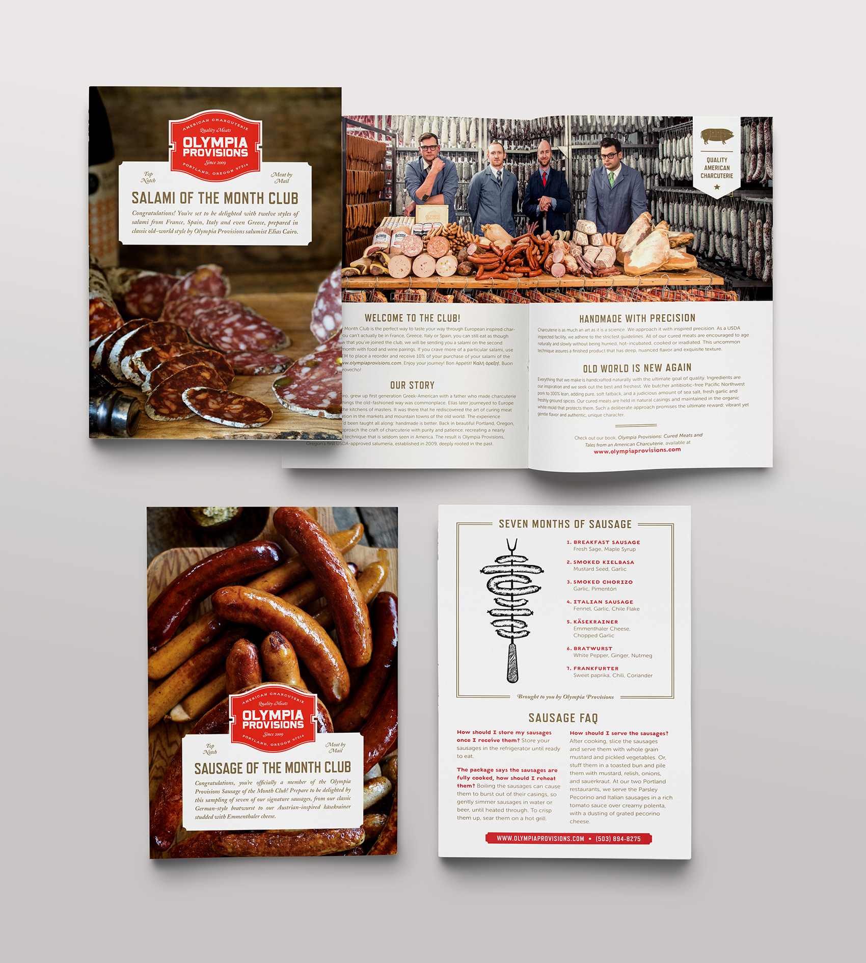
Olympia Provisions, of famed salamis and several restaurants in Portland, has several meat-of-the-month clubs. You heard it right! Salamis, sausages, pâté and pickles* all get the white glove treatment and can be delivered straight to your doorstep or gullet, whichever is closest to the mailman.

For each club the Bureau was tasked with designing informational brochures so members knew (for example) exactly what was in their salami, how best to serve it, what kind of romantic dates salami likes best, and revealing once and for all what that white stuff on the outside of a salami is (protective edible house flora that has a reputation that precedes it).

Unsure of what to get your sweetie for Valentines to tell them they are that special someone? Say it with meat.

collateral inserts for Olympia Provisions' club of the months - salami of the month, sausage of the month, pate of the month and pickle of the month

*Not technically a meat.