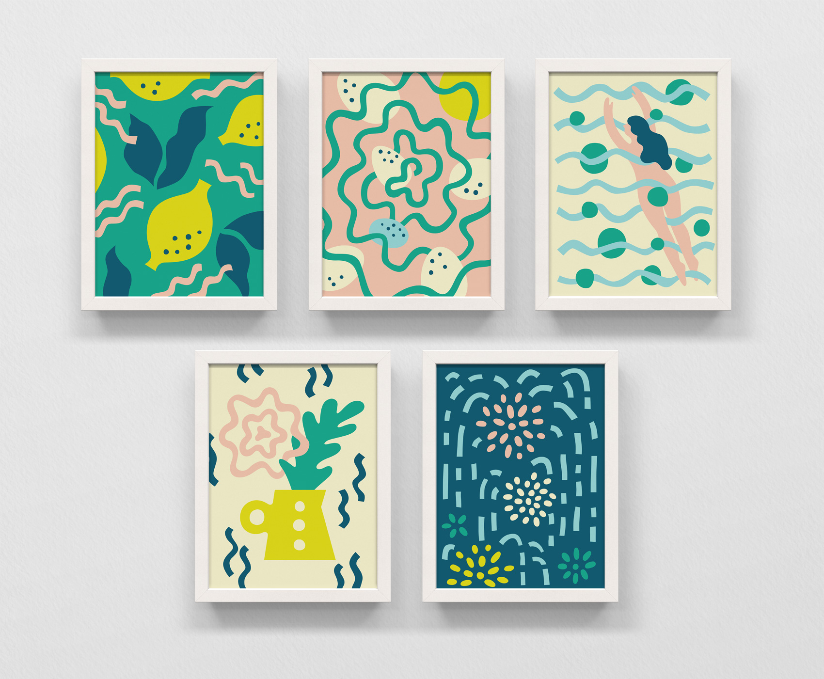
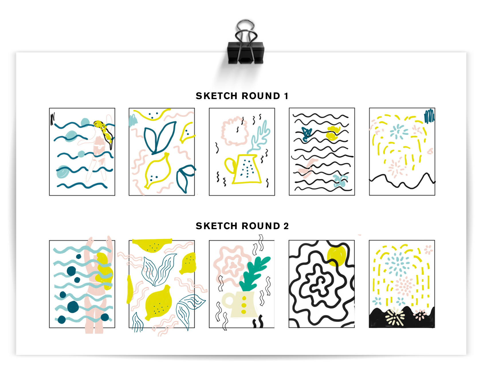
Inspired/triggered by a contest on Instagram, I used some extra time one day to experiment in a new style on the theme slow down. Some of my work is precisely executed (here, here, here and here) so this was good practice in trying to work in a looser, less calculated way while still creating a systematic style for the illustration series. Below you can see the two sketch rounds before working in Adobe Illustrator to make the artwork above: lemonade, bird’s nest, summer swim, fresh bouquet, night fireworks.
Holiday Gift Wrap AKA Pattern Palooza!
It’s that time of year again! The time when Danes, half-Danes, quarter-Danes and honorary-Danes go deep into Danish Christmas traditions, as previously documented here, here, here and here.
This year is extra special because I had the opportunity to design some scandinavian-inspired promotional gift wrap paper in collaboration with Laura Luethje from West Coast Paper Solutions and Randy Murray from Brown Printing. So without further ado…
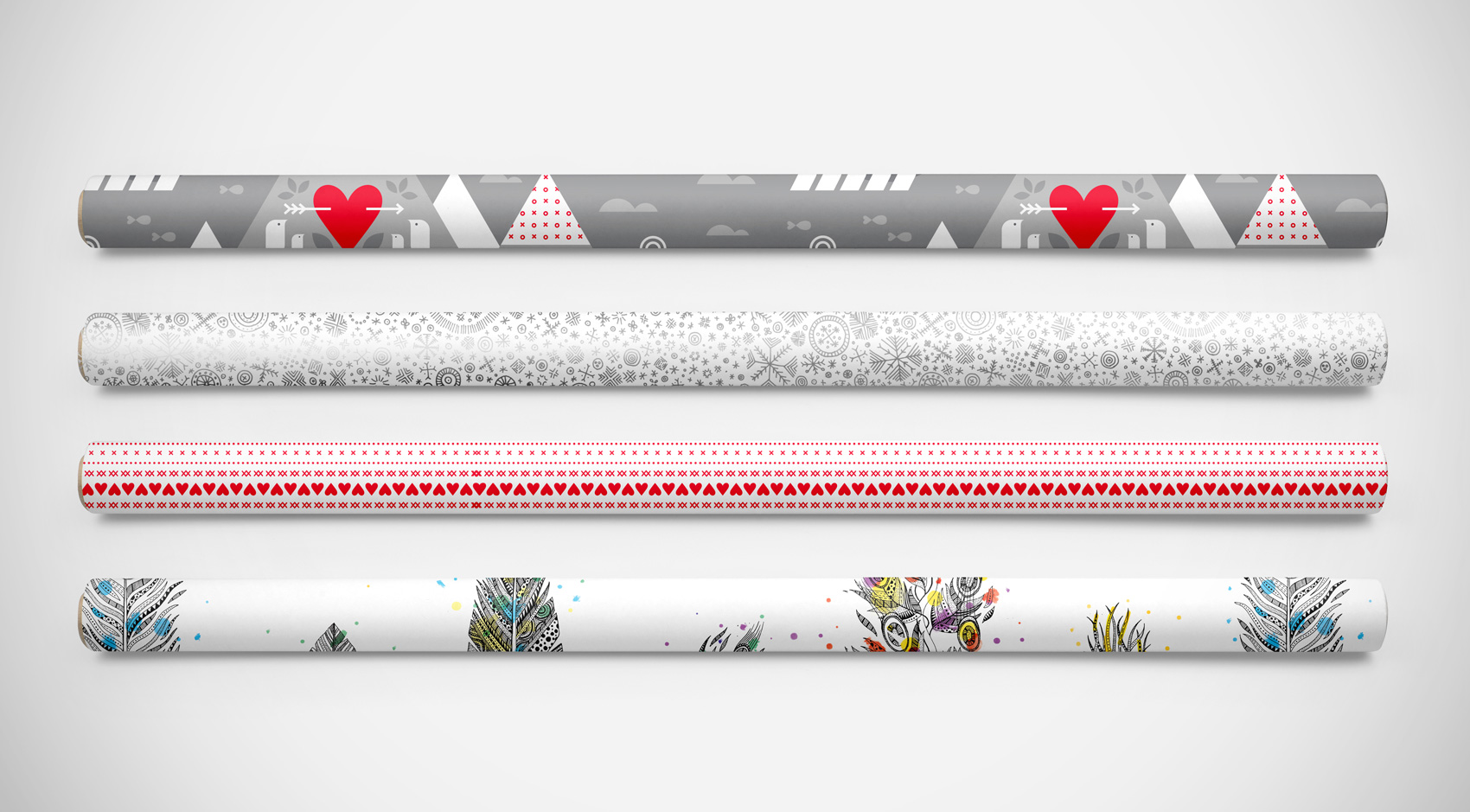
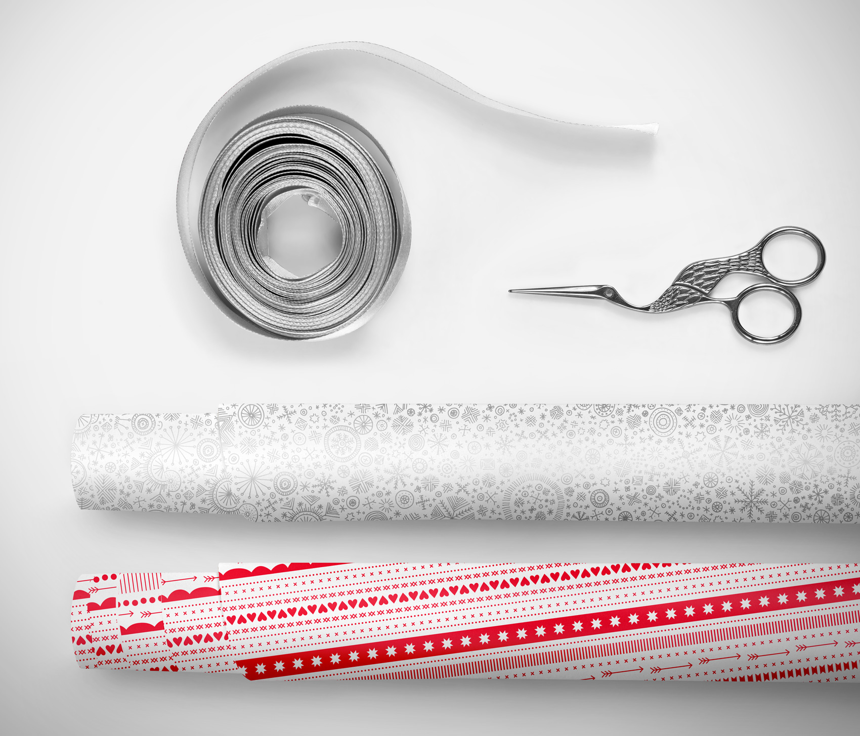
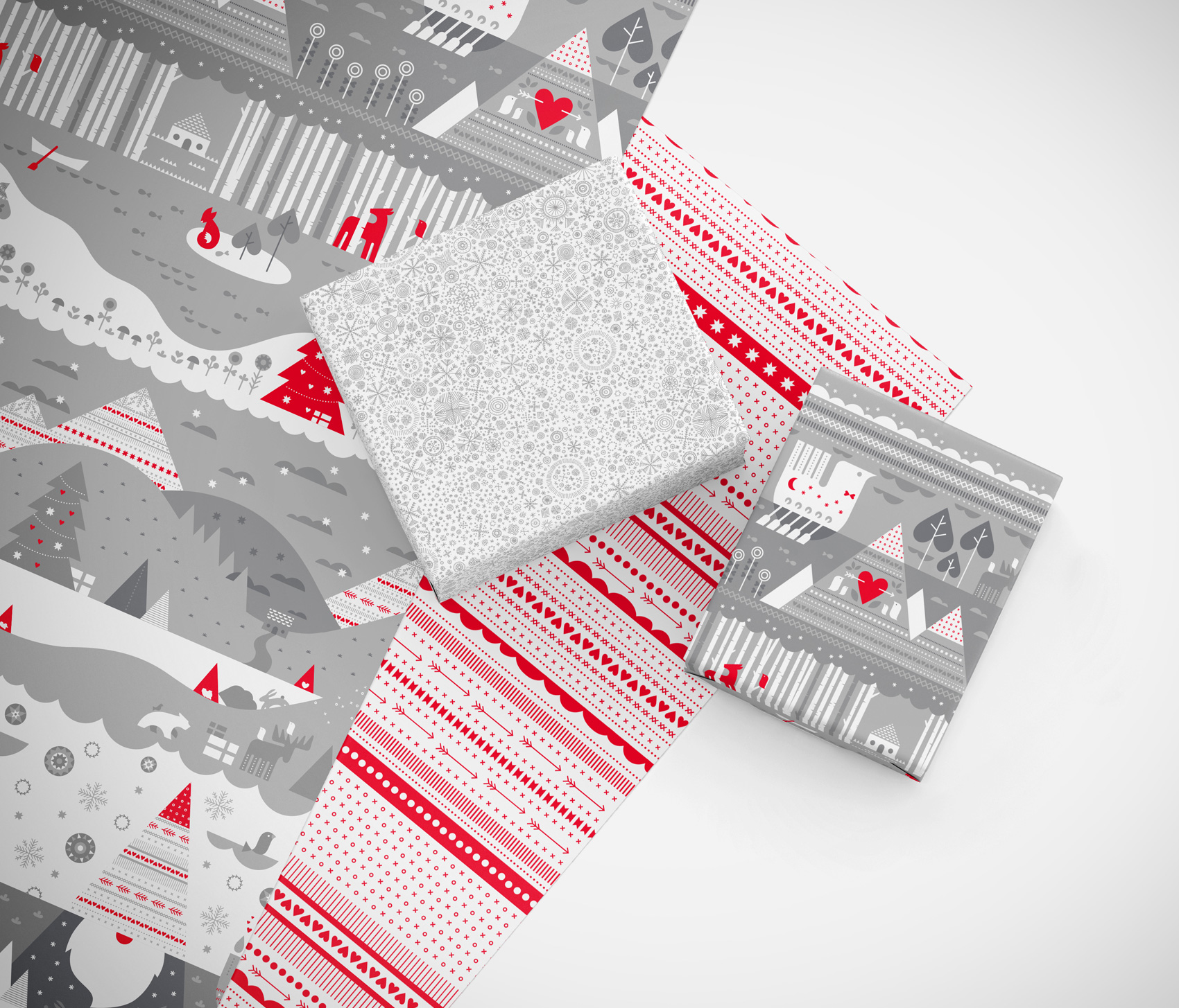
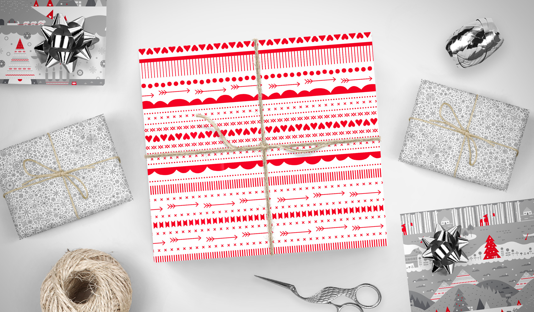
To create a series that was Christmasy without being too over the top, I opted for some patterns that kept it classy – abstract red ribbons and a snowflake flurry. On the back a tiered landscape of wintertime activity is revealed in tonal grays with pops of red, making it easy to mix and match between the three designs.
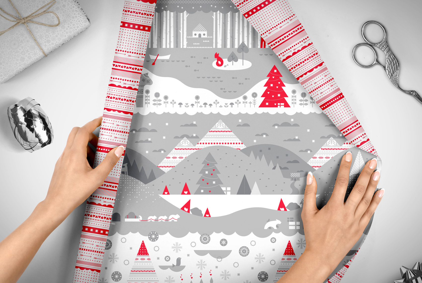
The WCP holiday wrap promo happens every year, and this year I was lucky enough to have Laura ask if I would create the designs. While West Coast Paper donated paper and I donated design, Brown Printing donated printing for a final product of two 2-sided promotional sheets produced on 70# Titan Dull Text.
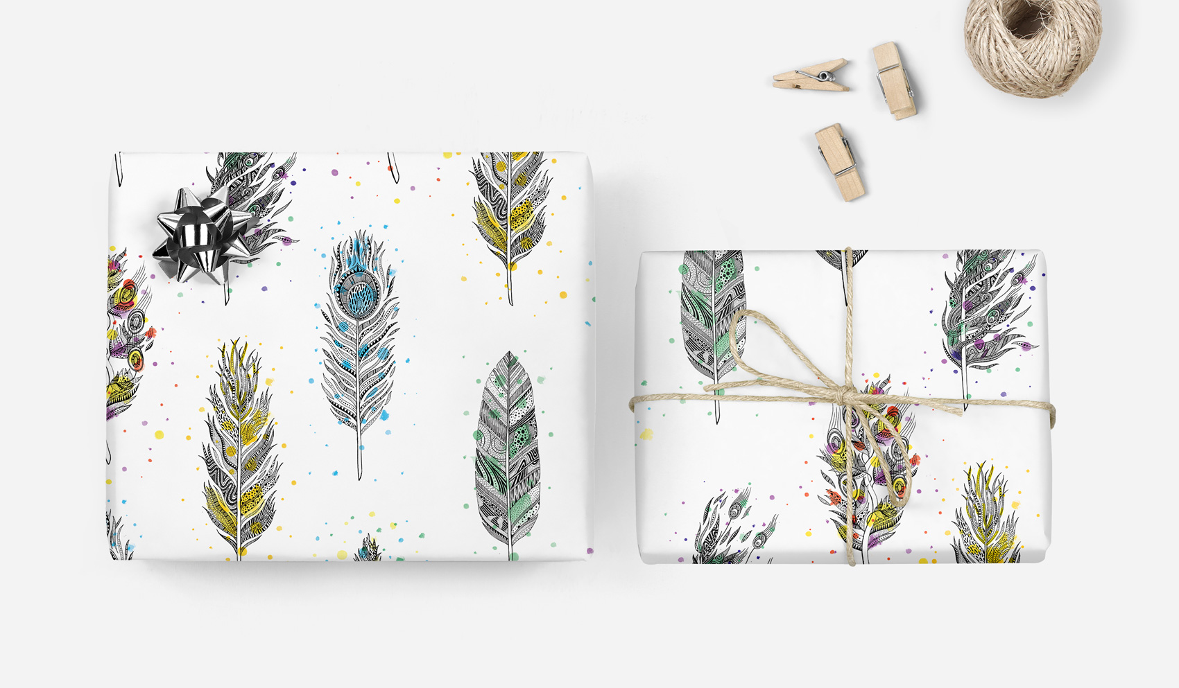
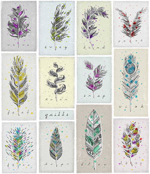
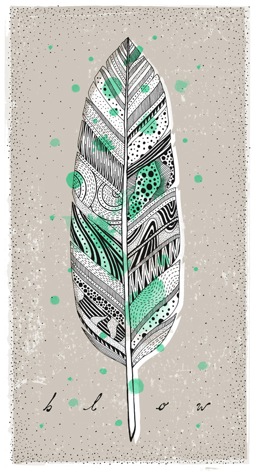
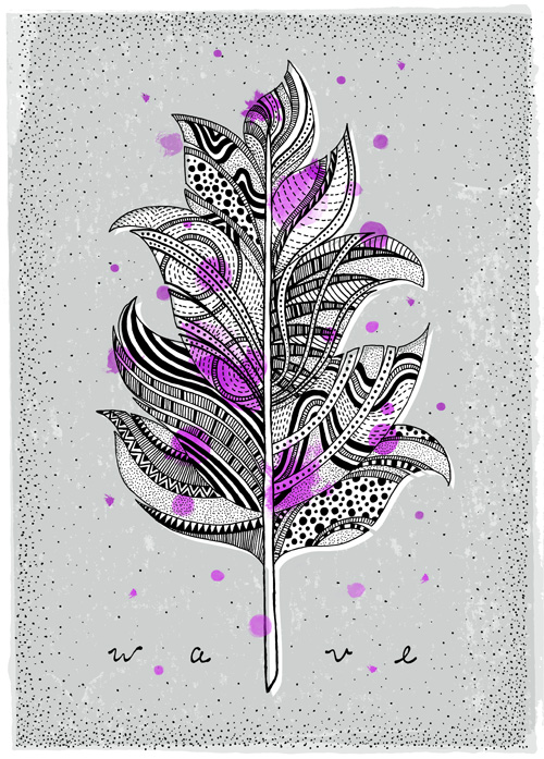
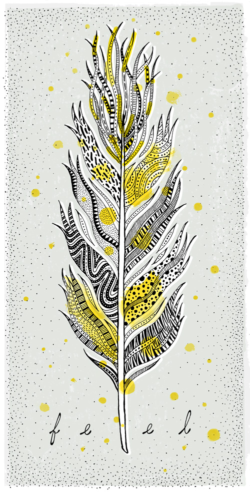
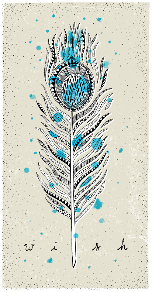
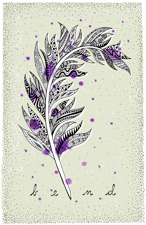
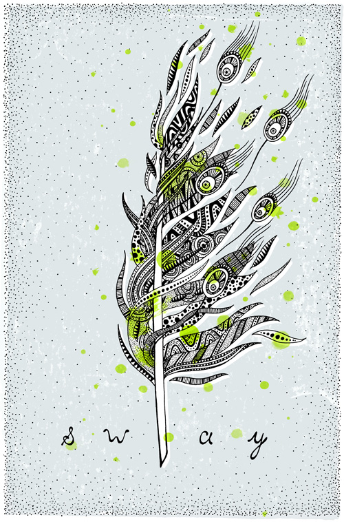
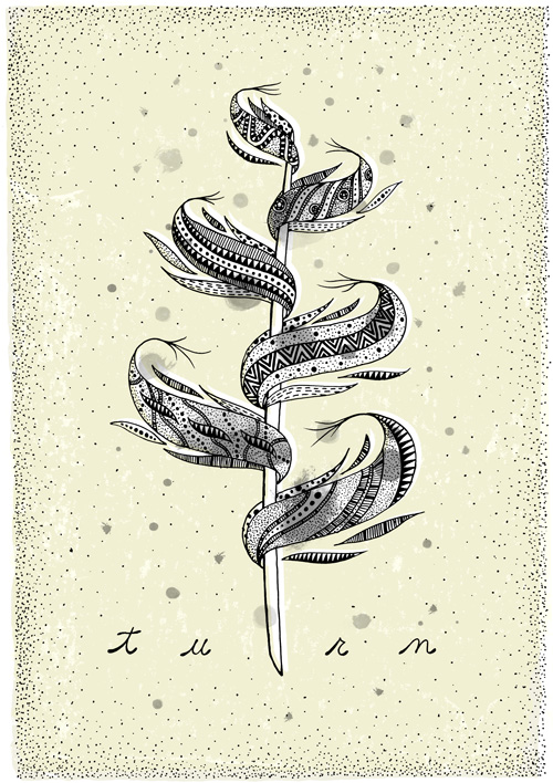
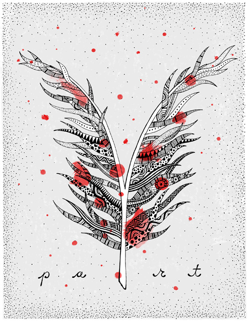
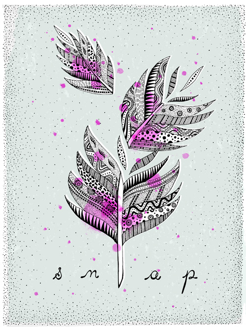
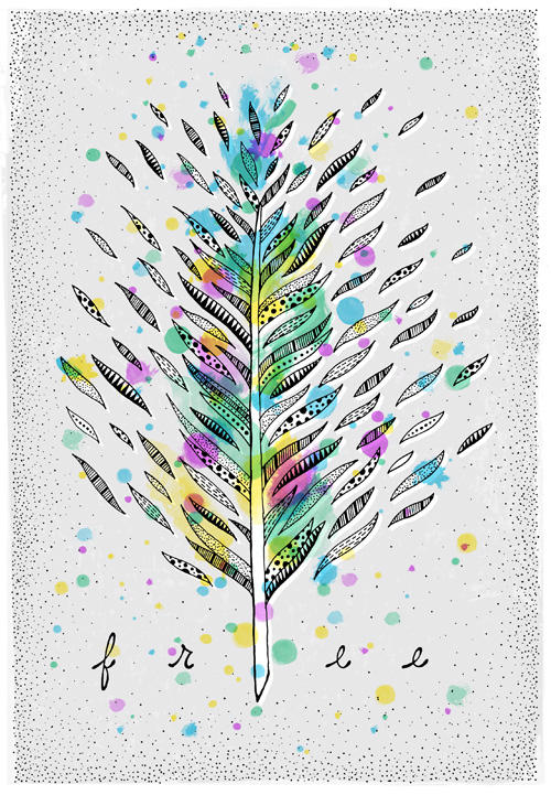
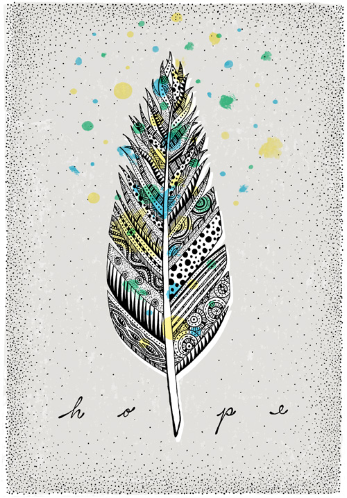
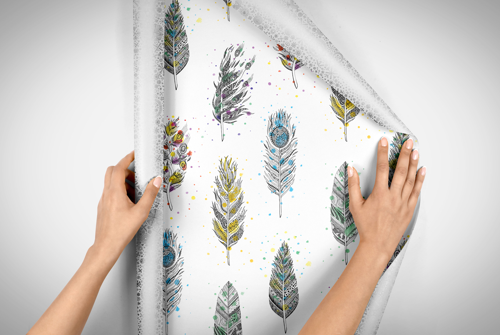
As a bonus, I slipped a non-holiday side onto one of the sheets. Hand drawn with black ink and digitally colored, the feather pattern is an excerpt of a twelve feather series from a few years ago. Hopefully it gives the gift wrap a life past December.
Self Portrait: Woman Who Draws
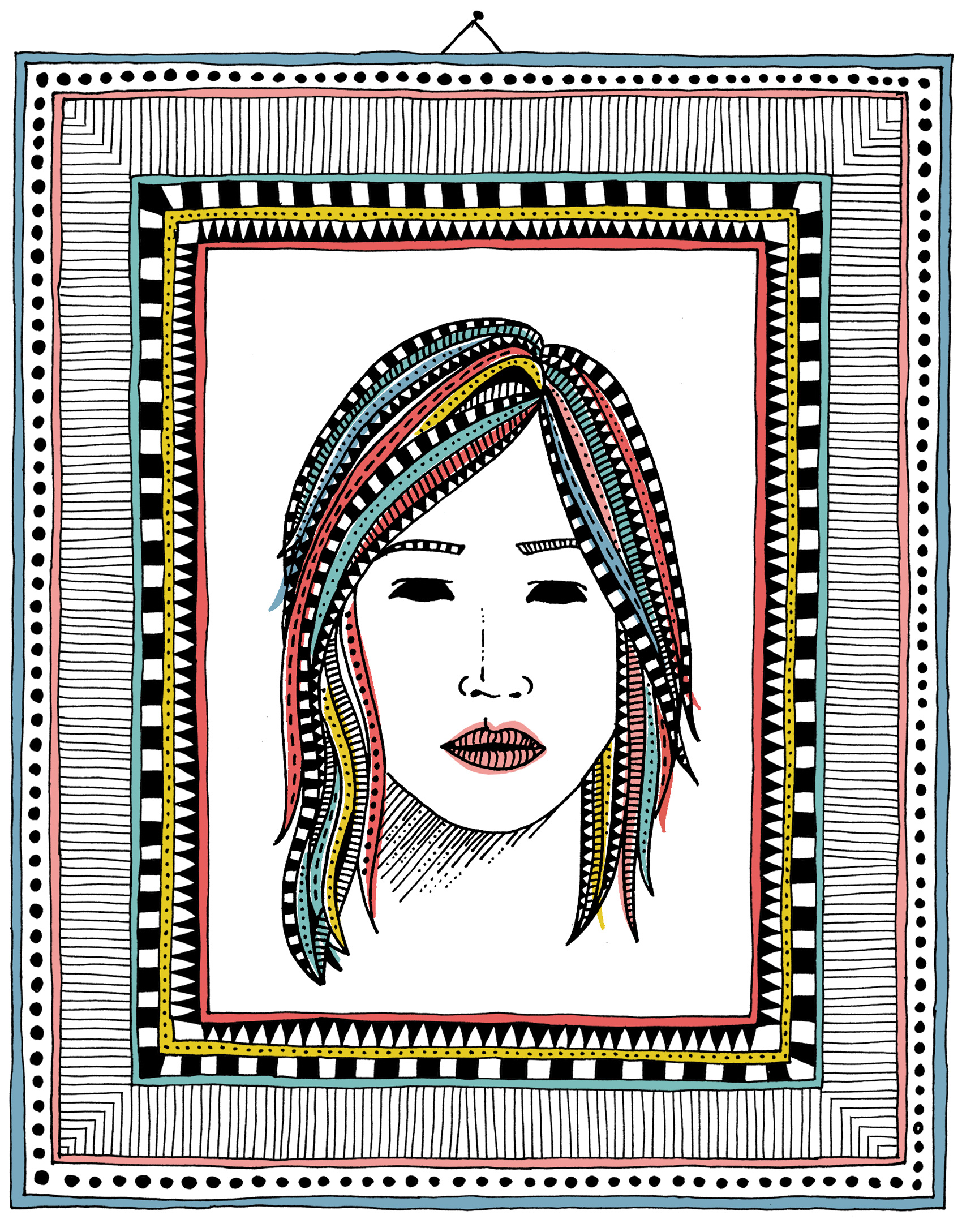
A new directory of women illustrators popped up on the internet recently, so I drew a portrait to be included. Visit www.womenwhodraw.com to see a glut of awesome illustrators (and hopefully my submission soon!).
The Whistling Bird of St. Petersburg
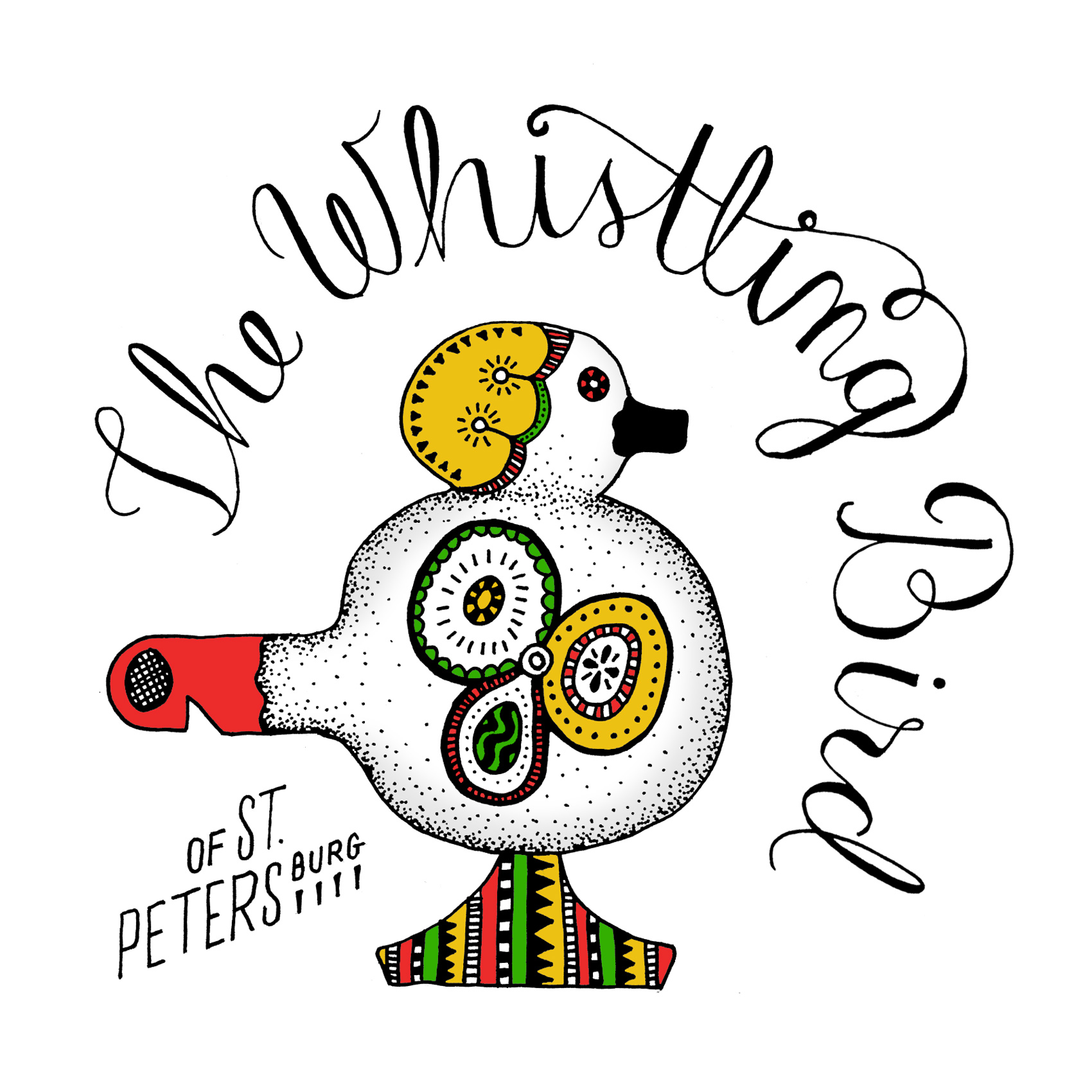
Here is another sketch from creative nights I host after hours. I usually grab the closest thing to me that isn’t the requisite cup of tea or cookie and spend an hour or so on it. This is a whistle my parents brought me from their trip to Russia for my daughter, who has a burgeoning collection of musical souvenirs from their travels. The script on a circle was a good exercise in pre-planning typography.
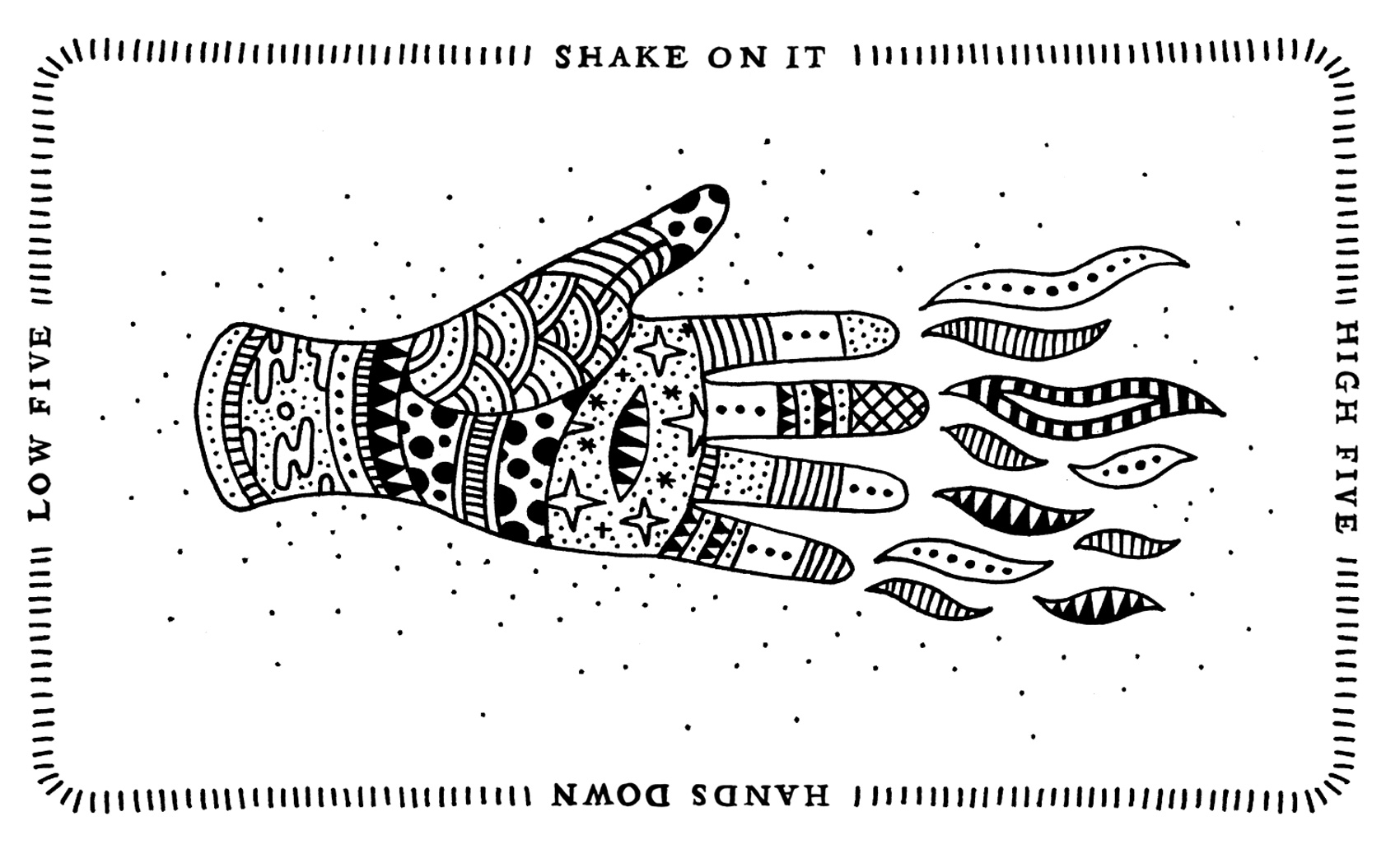
Four Way Handshake
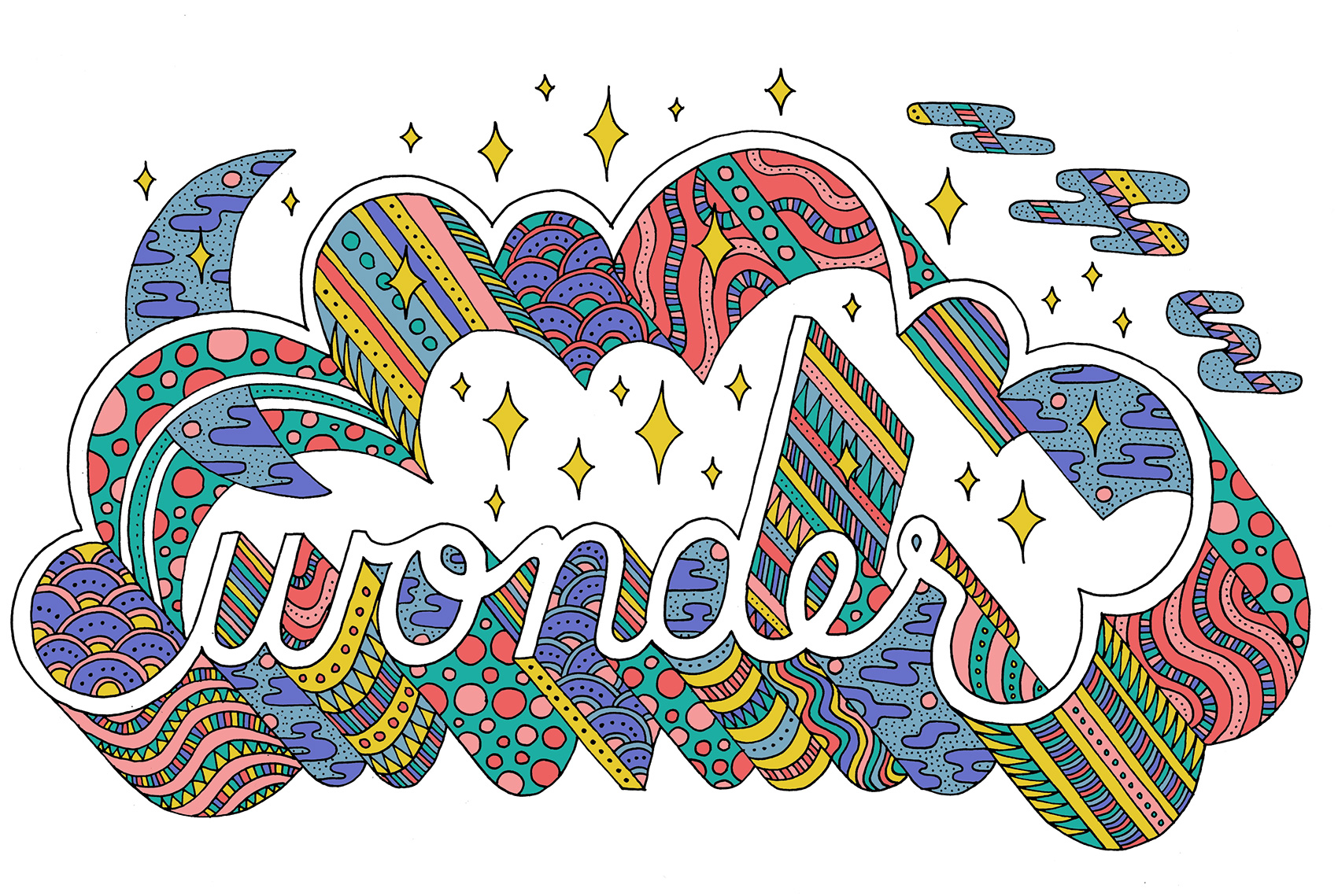
Wonder Typography
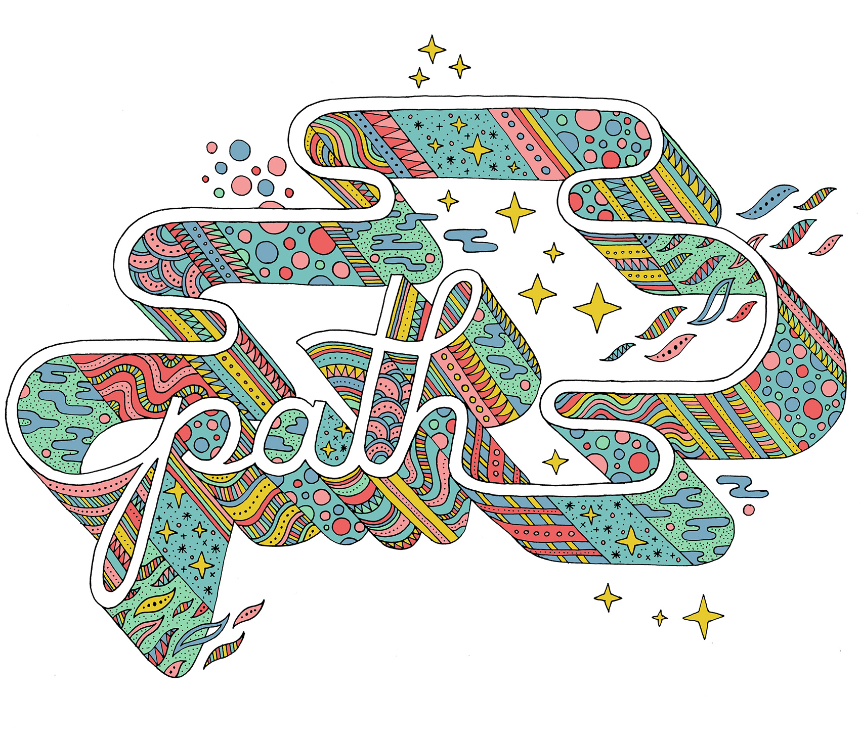
Path Typography
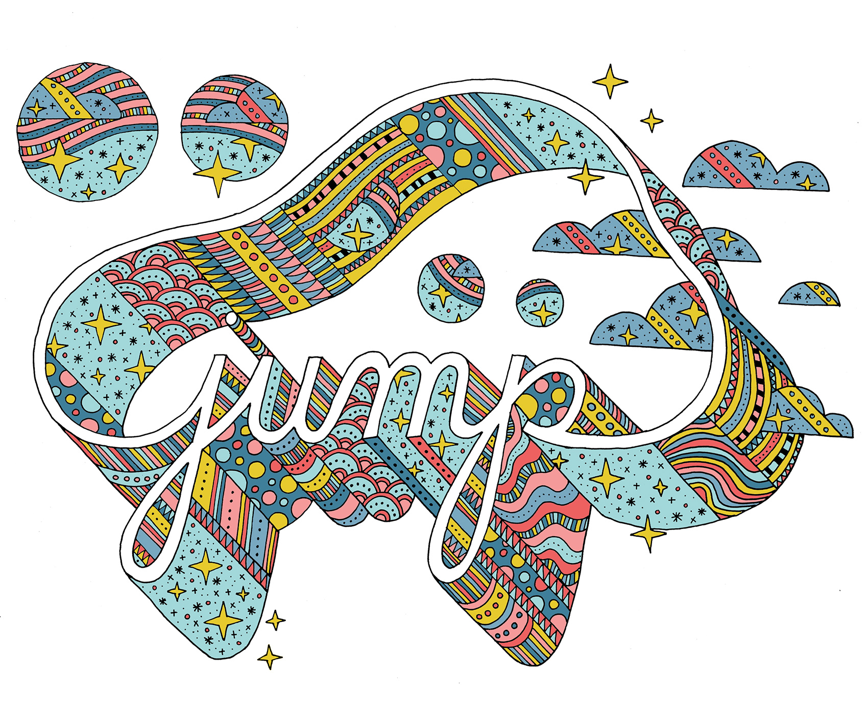
Jump Typography
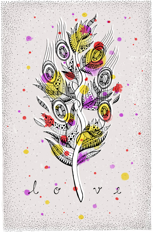
Quill Feather Illustration Series
The past year has been one of words. After moving from Portland, Oregon to Copenhagen, Denmark in 2012 I was surrounded by NEW. How do you describe what is happening? What do you say to people when they ask you inanely expected or intensely personal questions? How do you document the experiment of experiencing so many new things, you can barely keep up? Which ideas survive translation, which fail? Words can be wonderfully specific or frustratingly vague, and vice versa.
The past year was spent doing quite a bit of correspondence writing. On Facebook, in emails and postcards home (yes, the kind you send in the mail), with newfound pen pals…even sending letters in a bottle. And, writing single words accompanied by a feather.
The past year resulted in twelve illustrations of quill pens, the old fashioned way of writing your thoughts. Ink and time define what you can lay on a page, extraneous thoughts are omitted in favor of measured words, exactly the ones you want to use.