Pocket Rainbow Box


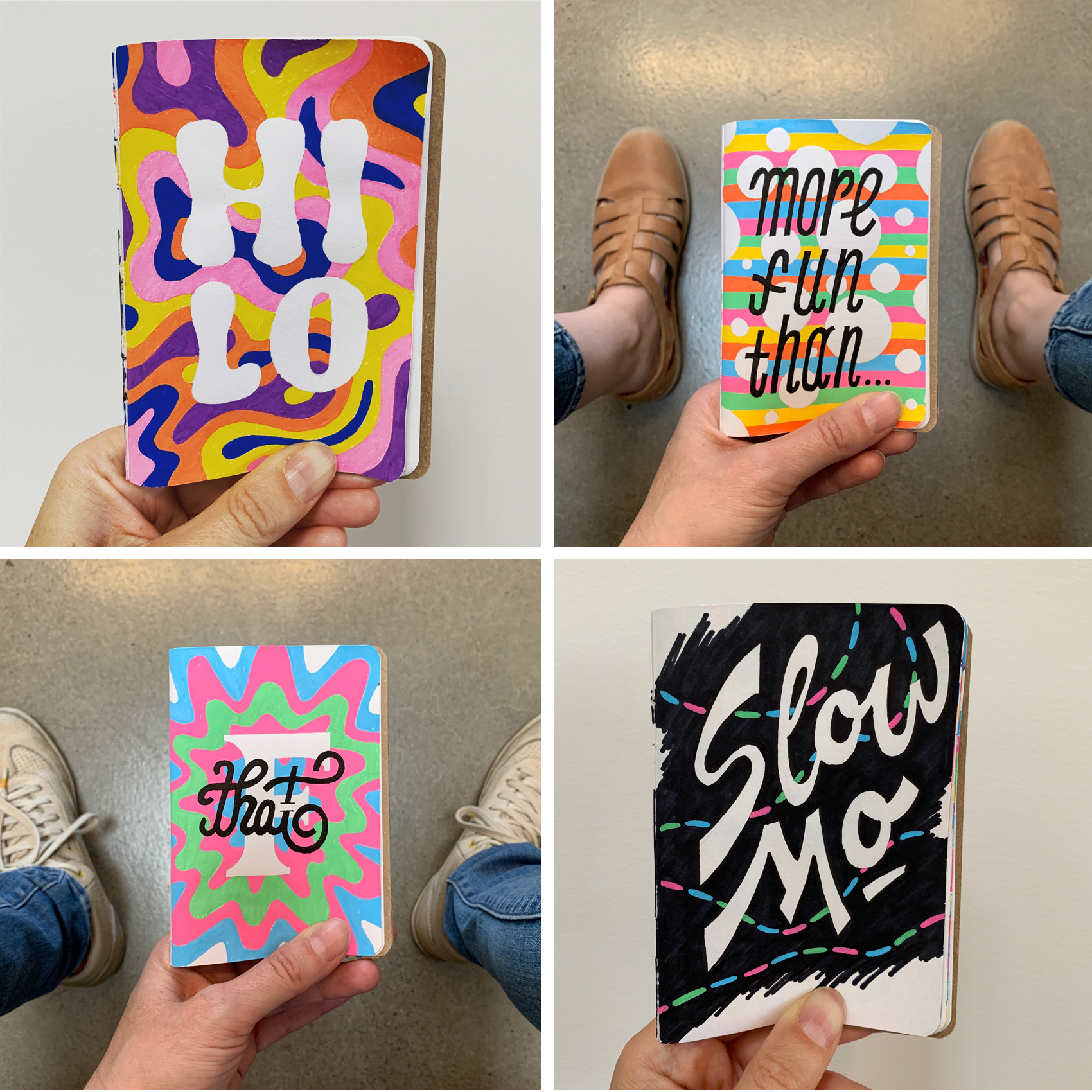
Posca markers used in a Scoutbook. Basically testing out things in slow motion which could have been done 10x faster on a computer.
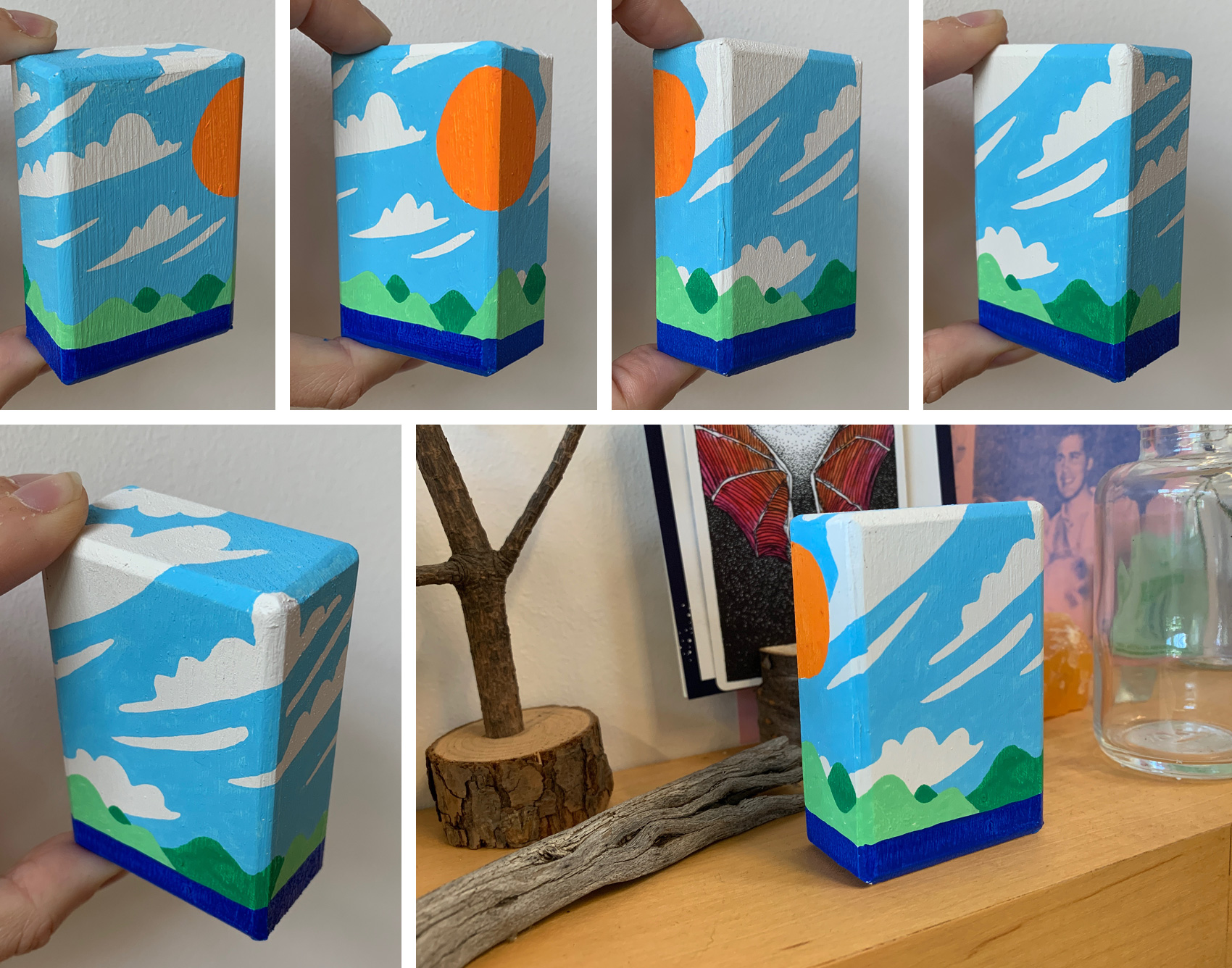
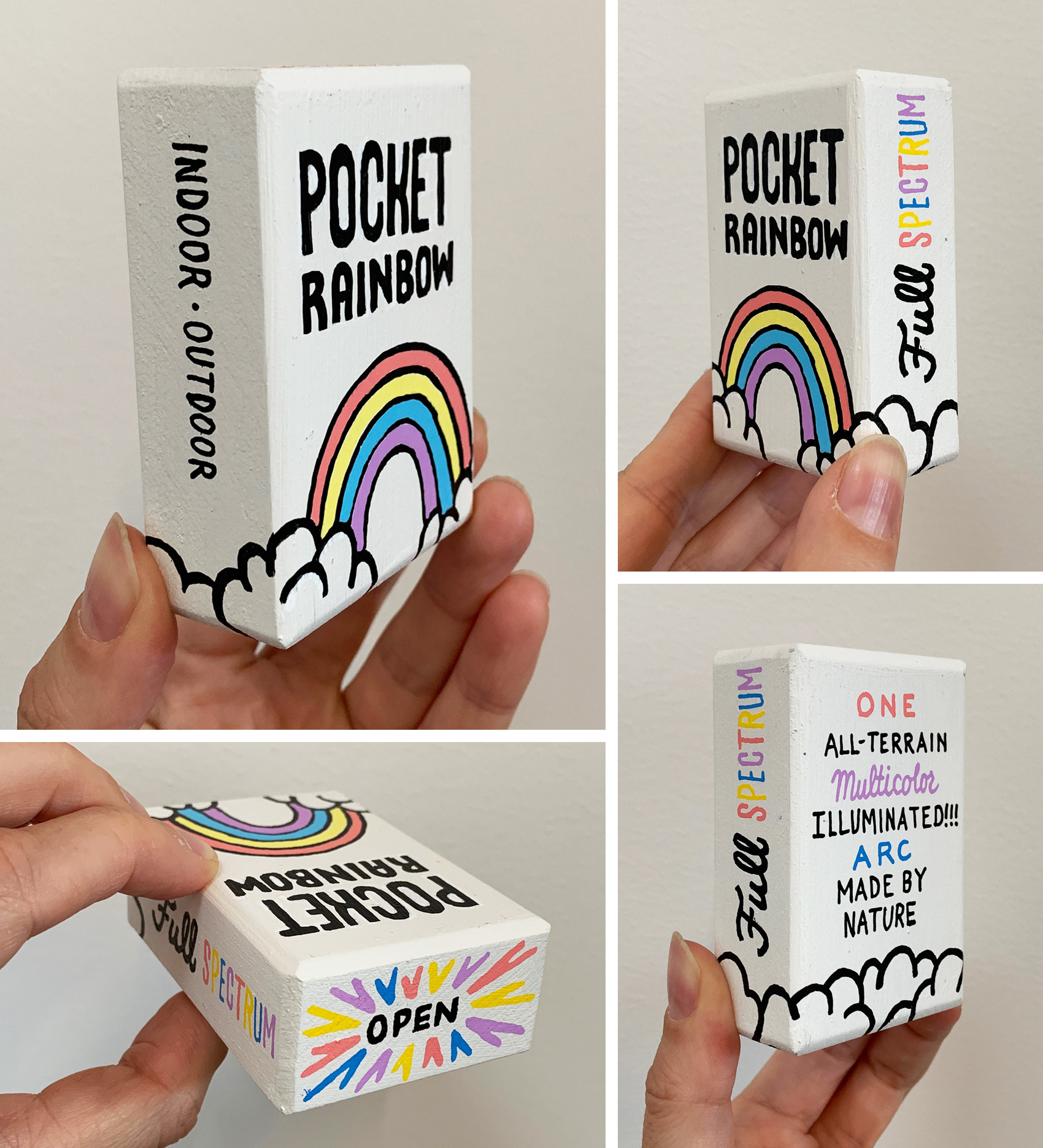
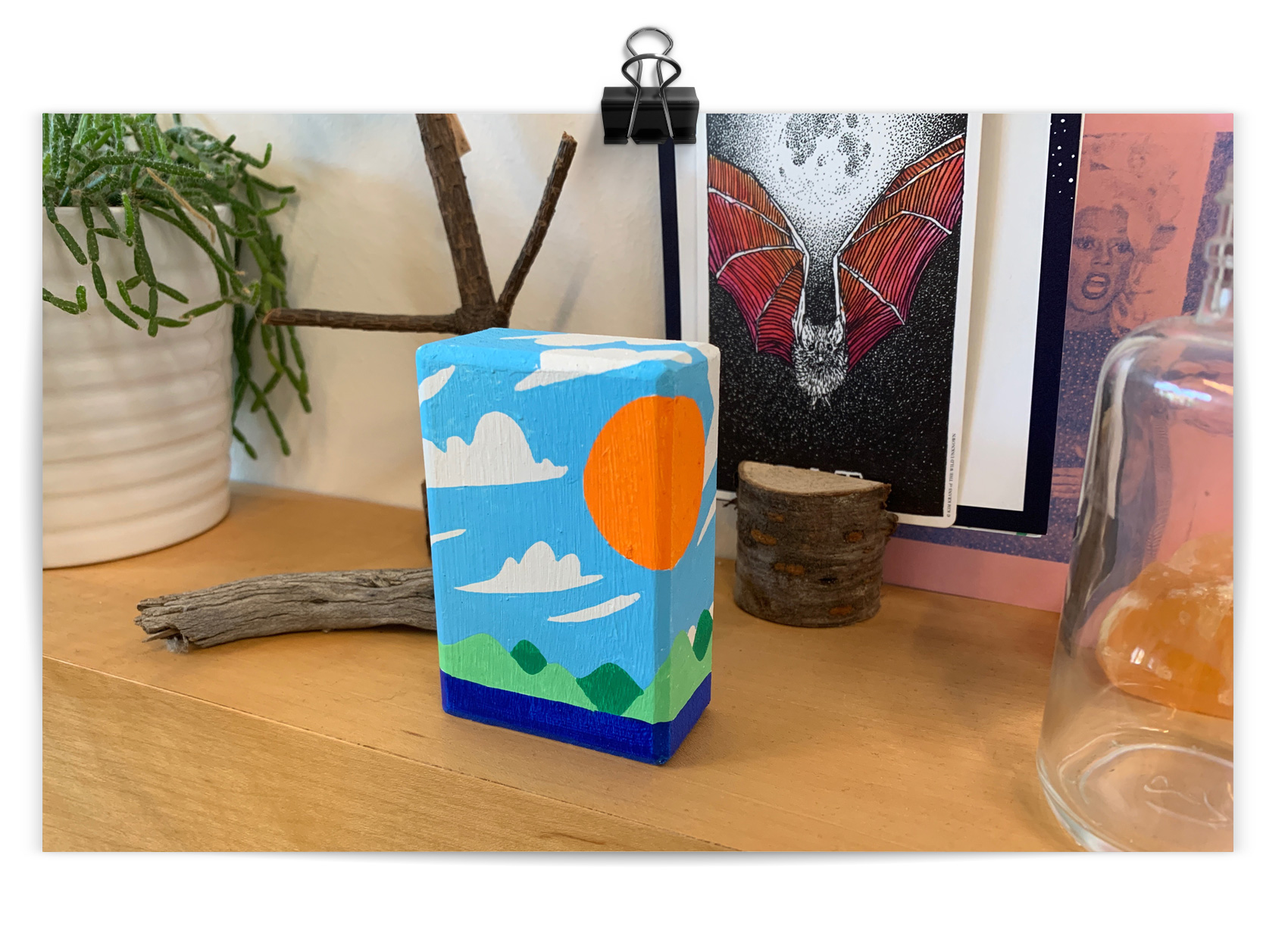
Over the past two years I’ve worked on and off in “box format” – drawing on small wooden boxes. The first series was creating 69 “I think I need a New Heart” boxes for a Magnetic Fields tribute show. The second series were black and white lettering/illustration representations of magical or fantastical products (new heart, dream dust, and several more including my favorite “pocket rainbow”). In its newest iteration, I’m working on landscapes that use the box to emphasize the infinite space of these vistas. My first attempt is an “island in a box” – the box itself being the island – and I’m curious to see where this leads.
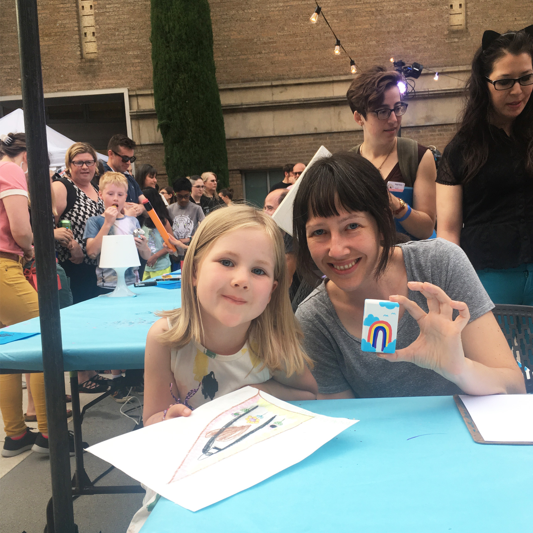
Earlier in July I participated in the fifth annual Portland Monster Drawing Rally. The event is a smorgasbord of artists (75 in all) who donate their time to drawing live at the Portland Art Museum courtyard. As each piece of art is finished, it goes to the auction wall where bidding takes place by drawing straws (with a flat fee for the art).
Proceeds support free school and youth programs at the Museum. It’s a super family friendly event with a kids drawing area. In fact, most of my fun questions come from the 10-and-under crowd as they ogle the process in super-fast-forward speed (each artist gets 1 hour to complete their work).
I’ve done all five drawing rally events that PAM has organized, and each year is different. I’ve tried detailed micron pen illustrations 2 years in a row (hard to finish in an hour, and difficult if you sit next to another artist who is a “vigorous eraser”), black & white magical box contents, and paper pennants with fun lettered sayings.
The boxes seemed to be the most popular so I decided to revisit that form factor this year with a new set of markers – POSCAS! I’m just starting to get the hang of these markers and they were well suited for this purpose. The main challenge of this year were letting various colors dry in between applying new ones, while always switching between multiple boxes. I generally stuck with a theme of “landscapes” but after these few experiments would like to work more on this idea.
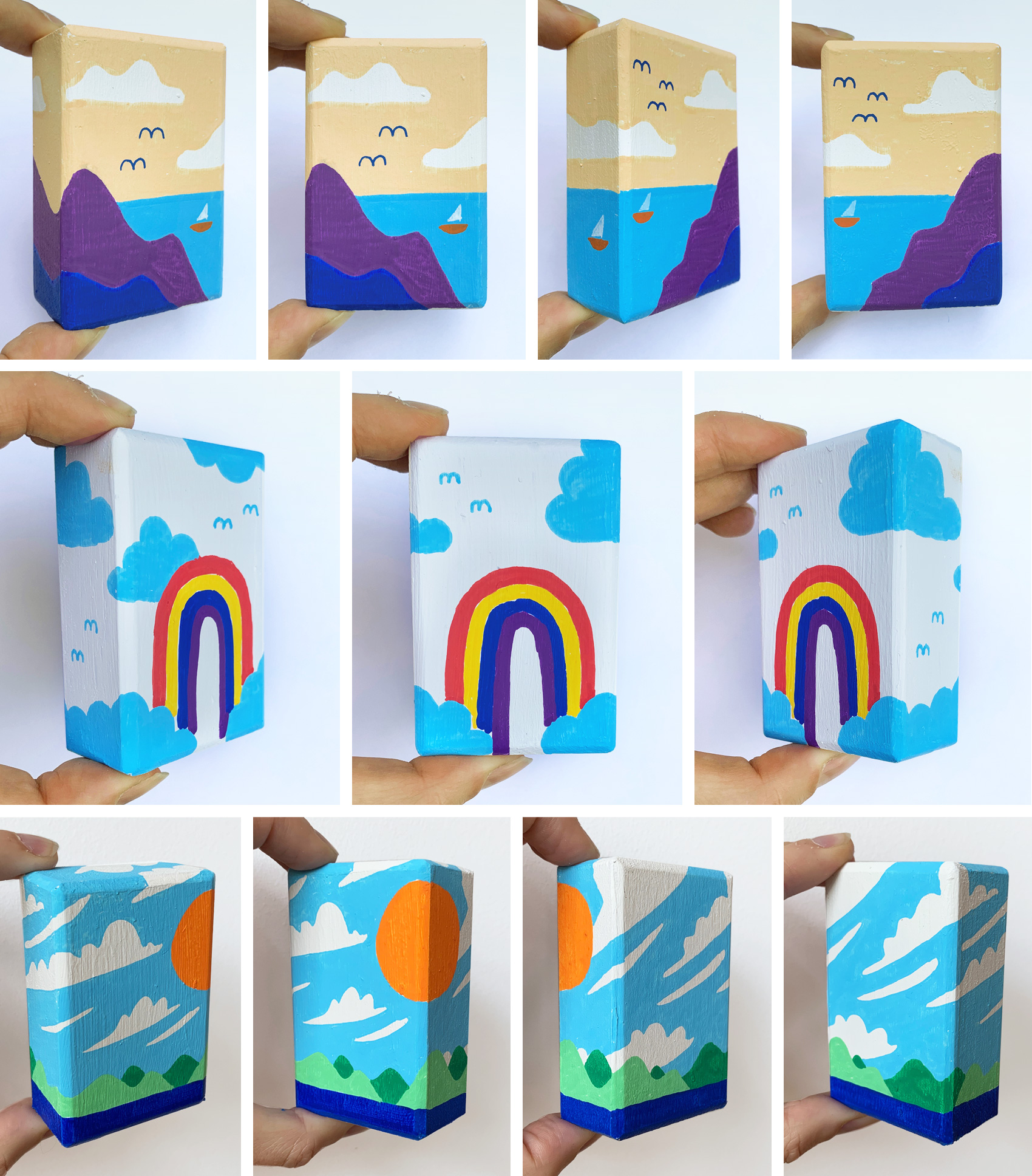
Thanks to my brother-in-law, Dan, who made me the wooden boxes!
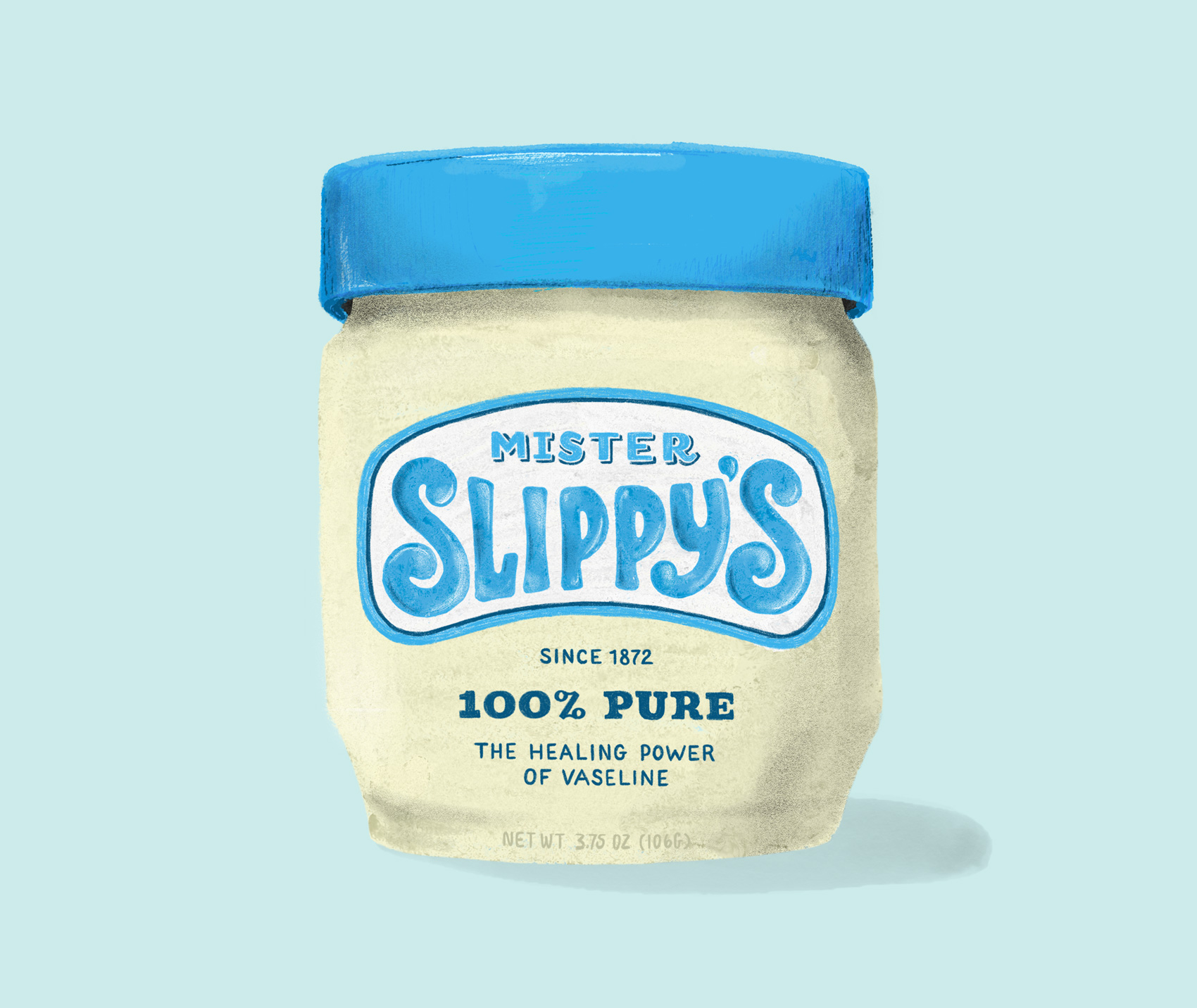
Practicing some more on my iPadPro with different brushes, this time creating a new name and label for an oldie but goodie – Vaseline. The short development history of this product on Wikipedia is pretty interesting in it’s simplicity. Vaseline is one of many products which brand name has become genericized – instead of Vaseline being a specific brand of petroleum jelly, the name is used to describe all petroleum jelly products (more about all that here).
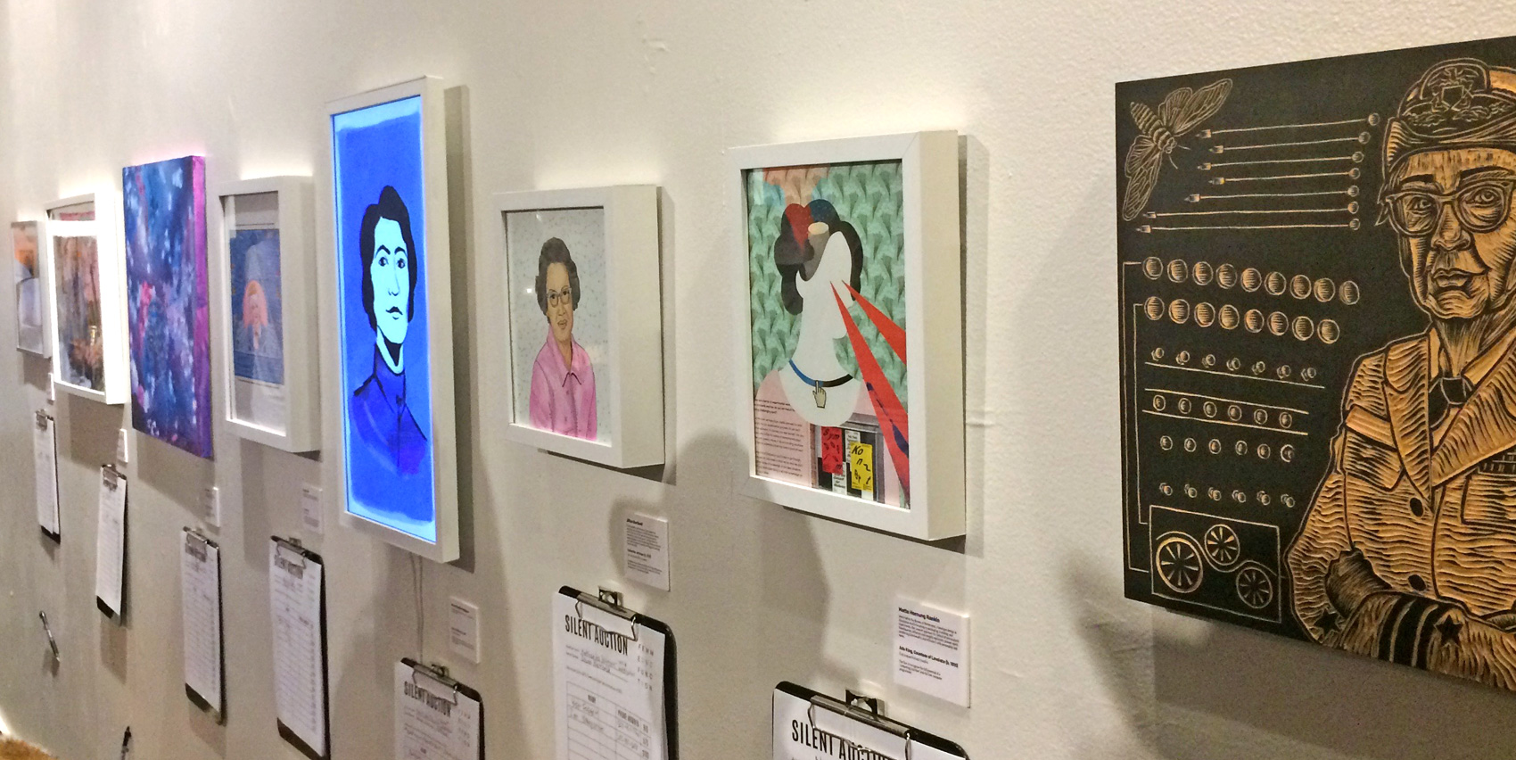
This fall I participated in a group art show organized by The Brigade, with the theme featuring portraits of women who are pioneers in technology. The show was titled Femme & Function and featured a wide range of mediums and contributions all made for silent auction bidding with proceeds going towards Girls, Inc – you can read more about it here on Medium.
I used the opportunity to create “off screen” with collage paper I had on hand, including an incredibly soft vintage piece of Swedish wallpaper I had received as gift wrap several years ago. This paper is so soft it’s almost a blanket, with gold and white screen printing worn down by time. My subject matter was Ada, Countess of Lovelace. I had read about her previously when doing some work for Code/Art (here and here) and had been taken by her interesting life. Trying out a new medium definitely gave me appreciation for true collage artists. My results are rudimentary, but the concept of a modern twist on the classic victorian portrait fits Ada and her before-her-time story well.
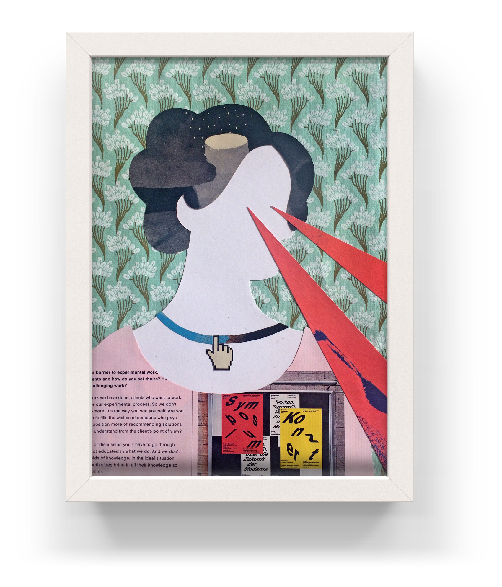
Unseen Visionary
Portrait of Ada Lovelace
size: 8×10″
cut paper / mixed media
As one of the pioneering women entrenched in developing computing technology and code, the accomplishments of Ada Lovelace (1815-1852) are often discounted, minimized, or attributed to her teacher and collaborator Charles Babbage, who concepted the first digital programmable computer. What most can agree on, however, was that Ada was the first to imagine the powers of computing applying to more than just numbers – she made the leap that numbers could represent anything, and therefore computers could be used to analyze innumerable sets and types of data, instead of solely numerical tasks.
Another test in using Posca markers, this time in a smaller format and combined with collage paper bits taken from the Mohawk Paper Maker’s Quarterly publication.
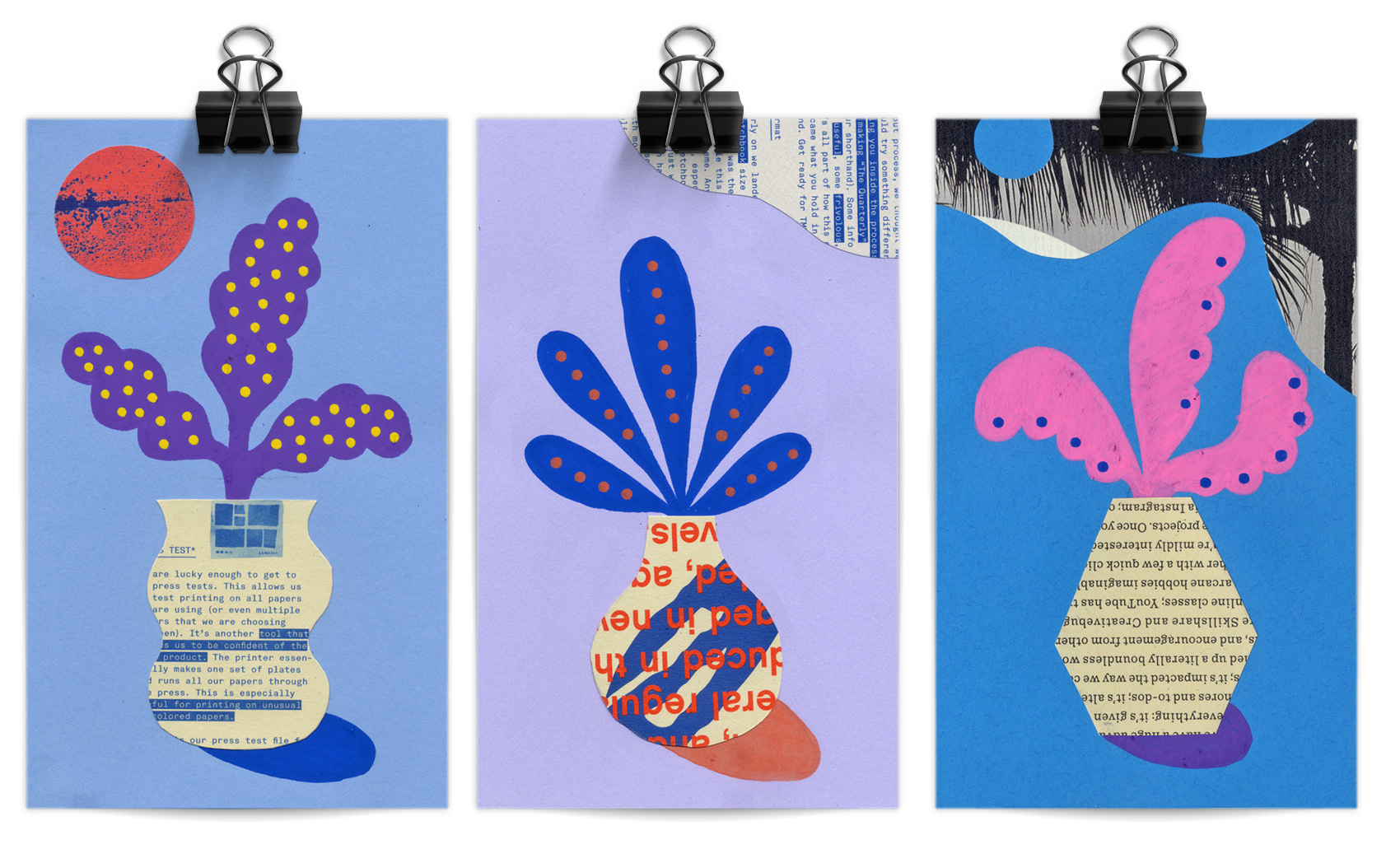
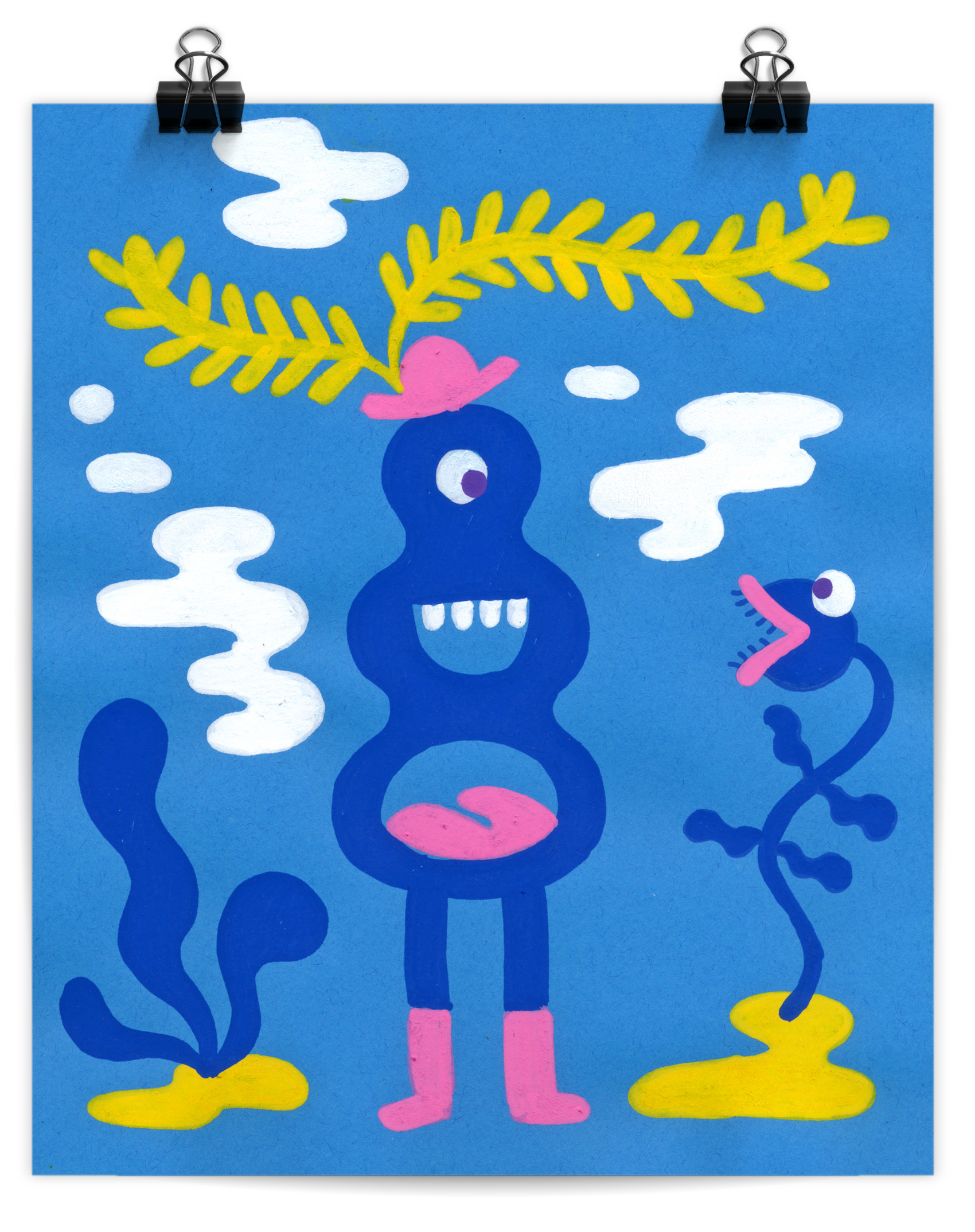
I’ve been testing out working with Posca Markers, which are opaque liquid ink markers. Advertised as “mark vividly on any surface” I’ve found that the type of paper used really makes a difference in how they lay down (or tear up the paper), and that some colors seem more opaque than others. Testing out a new tool or material always takes some getting used to, especially if you have an idea of how it’s supposed to work versus how it actually works. So far the best success I’ve had with Posca Markers are for simple pieces.
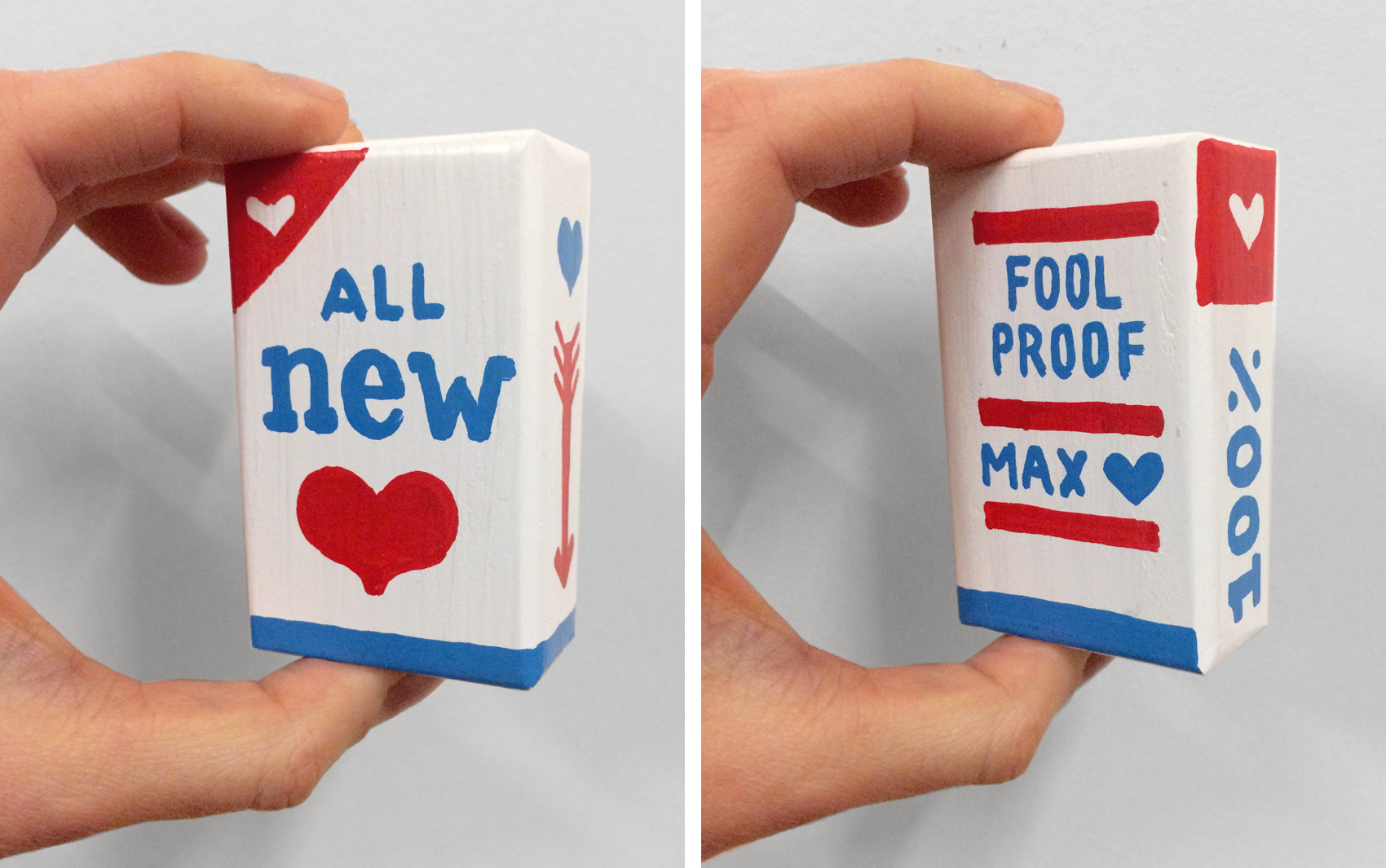
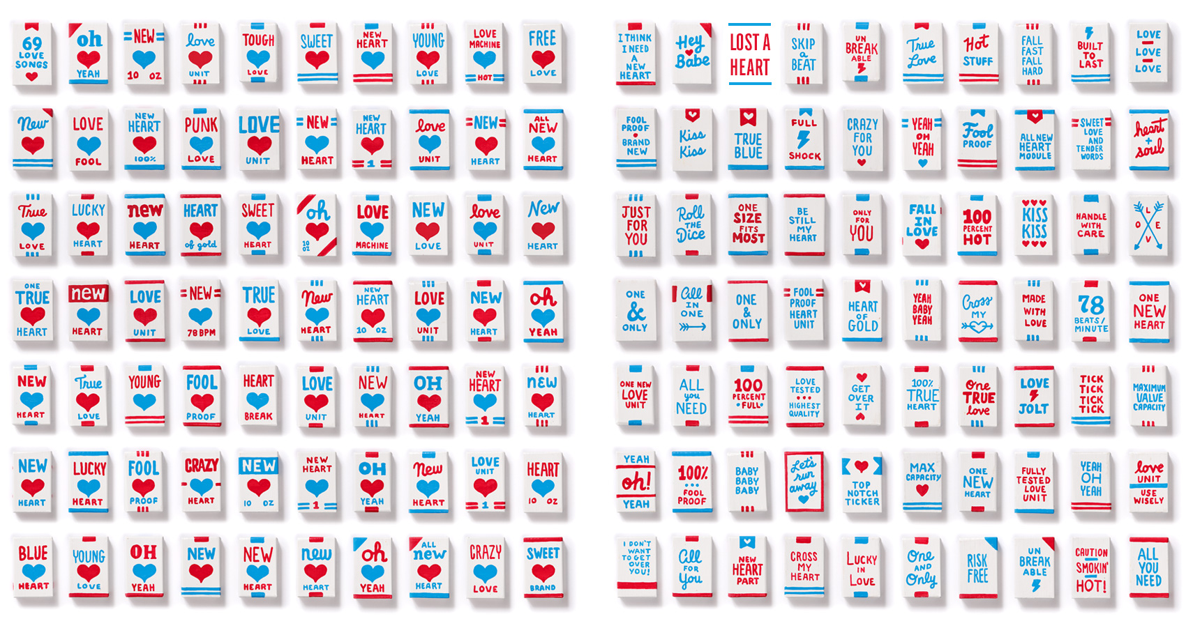
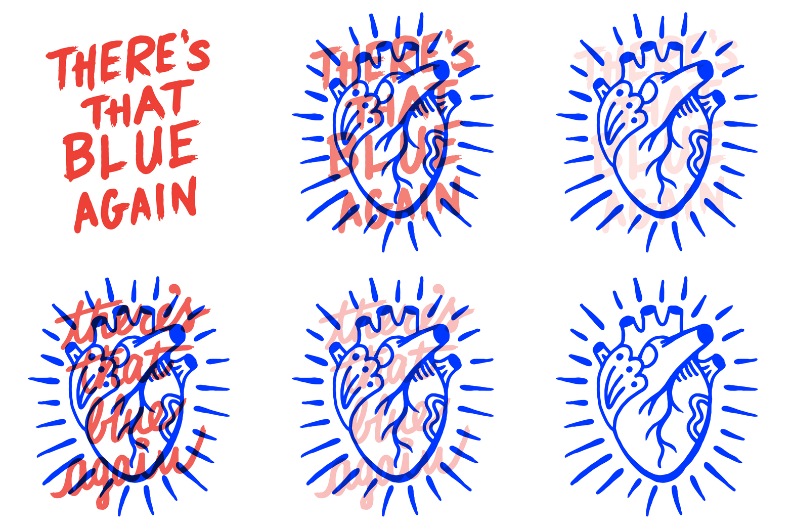
A year ago I participated in an art show at Land Gallery in Portland, Oregon organized by two design friends, Cielle & Michelle. The show was a tribute to the band The Magnetic Fields’ album 69 Love Songs, which has precisely that number of songs in varying genres. Cielle and Michelle rallied 69 designers and artists to each choose a song and make a piece of art about it. My song to interpret was “I Think I Need a New Heart”.
After signing up to participate, I immediately formed a task force within my shared studio space to work on the project in a more collaborative way. Two of my studio mates joined the show (hi Jen & Drew), and we spent many afternoons brainstorming and working on our projects. My initial idea of illustrating a new heart morphed into a packaging project (my favorite kind of project) that would feature not just one package, but SIXTY-NINE packages of new hearts. In 3D. Because you don’t buy just one raisin, you buy a whole lot of them. Historically I have a tendency to go all in, whether it’s outfits, rabbits, feathers, pianos or books, books, books, and this was no different.
The first major decision was what format the package would take. Paper seemed too flimsy – I wanted people to be able to pick it up with confidence, set it on their windowsill and not have it tip over at the slightest breeze. Something that could fit in your hand and had a good heft to it. A few years earlier I had painted a piano, and the idea of painting little wooden boxes seemed attainable* and would give the right feel to the packages – real but not too overbearing.
*Hahahaha you silly fool.
Lacking a skill saw of my own, I scoured Etsy for a resource to make me a lot of tiny wooden boxes. I found several people who made giant Jenga sets, which were kind of like the boxes I wanted. After several estimates and questions about wood paint later, Anthony Mirra made me a custom set of blocks to the size of 3x2x1 inches and painted them blank white.
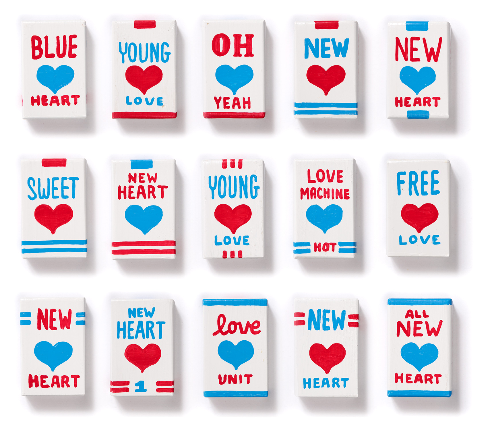
From my piano project I had a bunch of extra markers I hadn’t used that were industrial strength construction markers by Markal. They are thick, require lots of shaking before each use, and are made for withstanding outdoor construction site environments. EXACTLY the marker strength needed for making new heart packages. Luckily I had ordered a batch of blue and red markers which fit this project well in being limited in palette and representing the colors of blood both seen and unseen. In retrospect, I wished I had skinnier markers as the fat markers were hard to work with and limited the amount of text I could fit on a 3×2″ box.
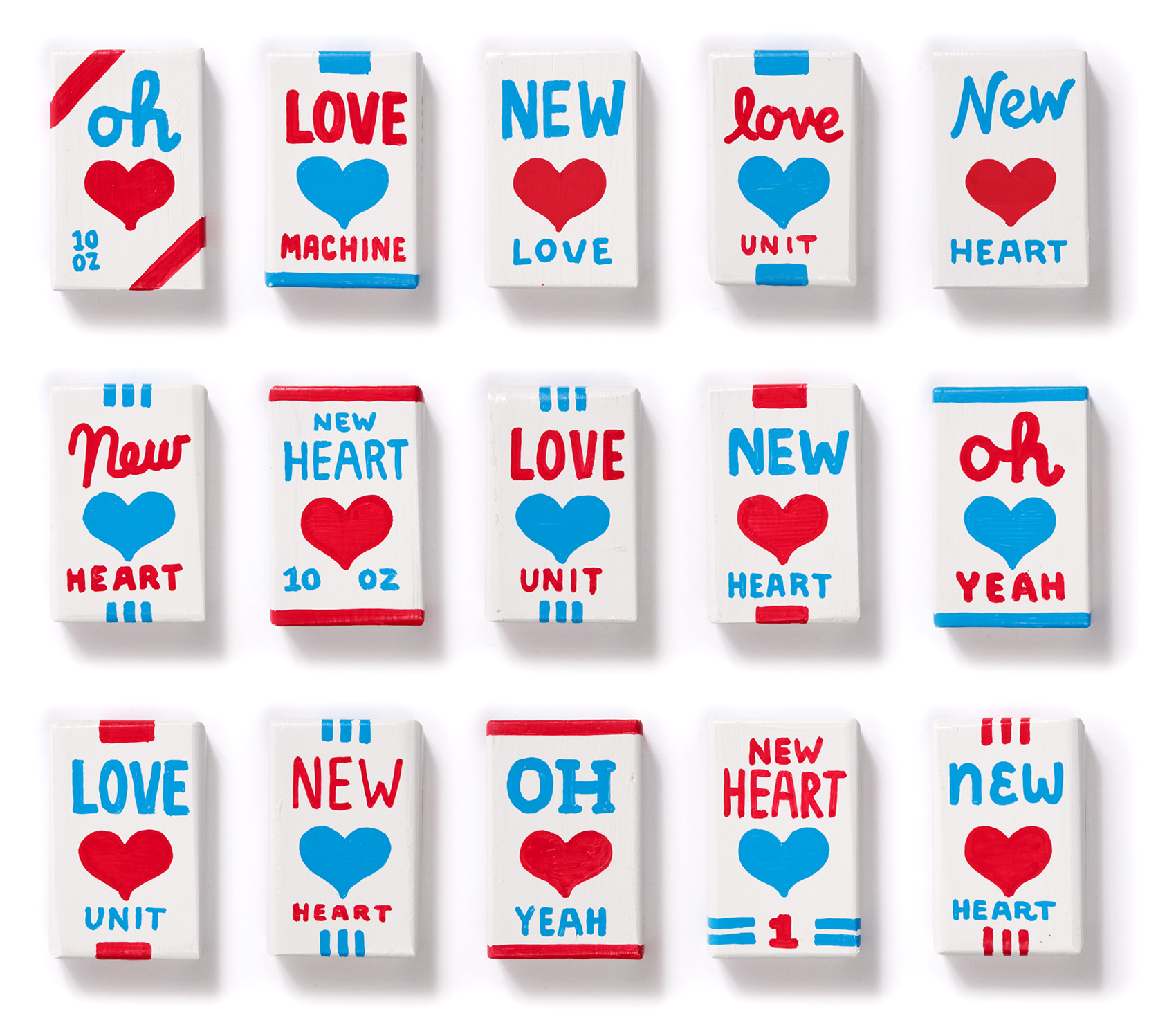
Materials in order, it was now time to start drawing so I whipped out 12 boxes and thought….boy that took longer than I expected. And those markers take a lot of shaking to get the ink to flow just right. In fact, their industrial smell is making me feel a bit light headed. Right around this point in the project I reached the DESPAIR & DOUBT phase that is a part of many creative projects. Will I be able to finish it? What have I DONE??? This was a terrible idea! How was I going to think of phrases for 69 box fronts, 69 box backs, and 138 box sides?!?!? The main reason for PANIC was that time was running short, and I had 57 more wooden boxes to paint in addition to a full client work-load.
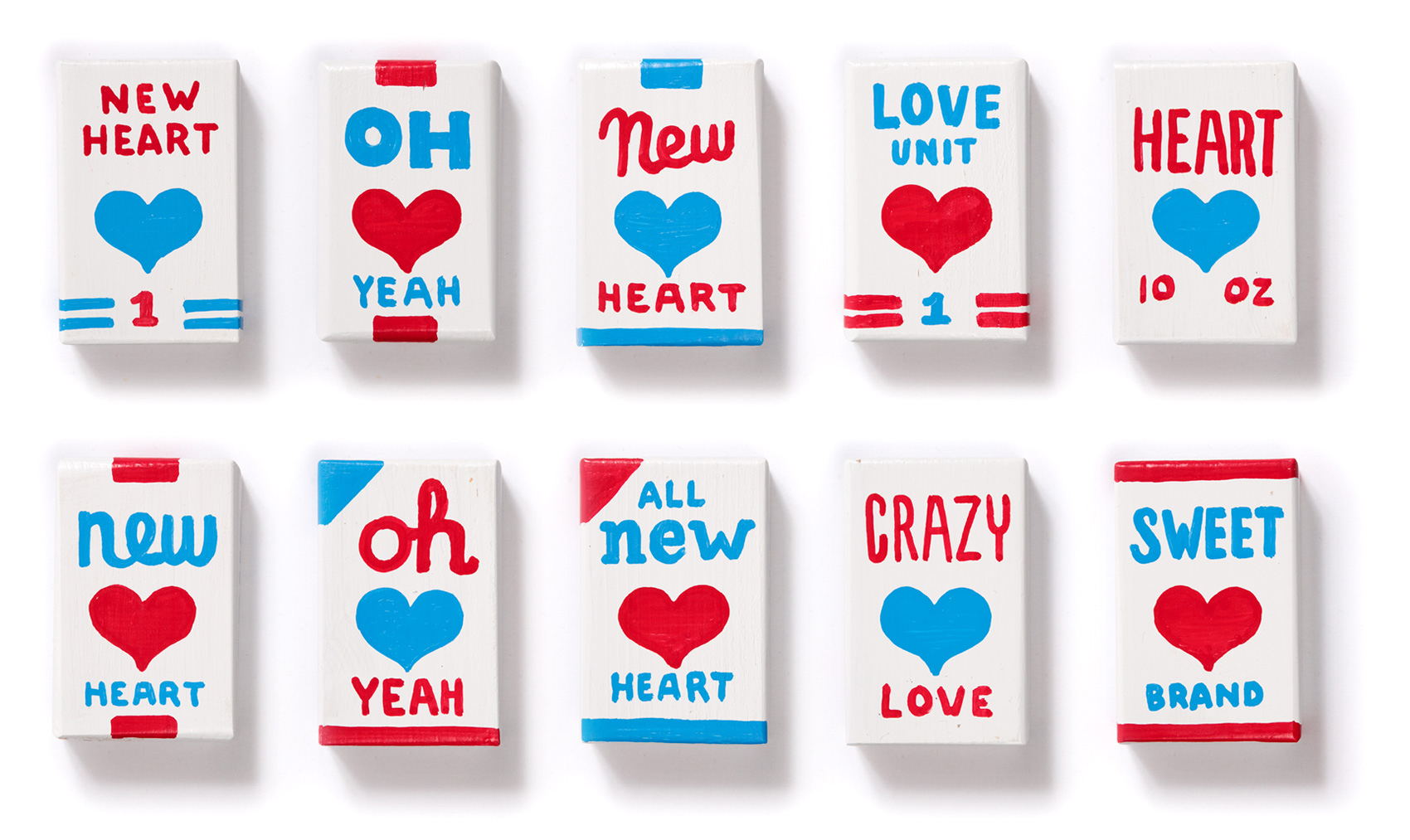
So I did what usually works well when I’m stressed out – applied my efficiency factor to the project. The initial set of 12 boxes had enough elements that I could apply them to batches of blocks at a time: 12 boxes of “triple stripes”, 12 boxes of “over the top ribbons”, 12 boxes of “top & bottom borders”. Combining that system with varying phrases in different lettering styles gave me 69 boxes at a much faster clip than the original 12. It also allowed the basic box elements to dry while I lettered other boxes, so I didn’t have to be quite so careful when holding the box and drawing on it (FYI drawing on a small angled 3D box with a fat liquid paint marker is harder than drawing on flat paper).
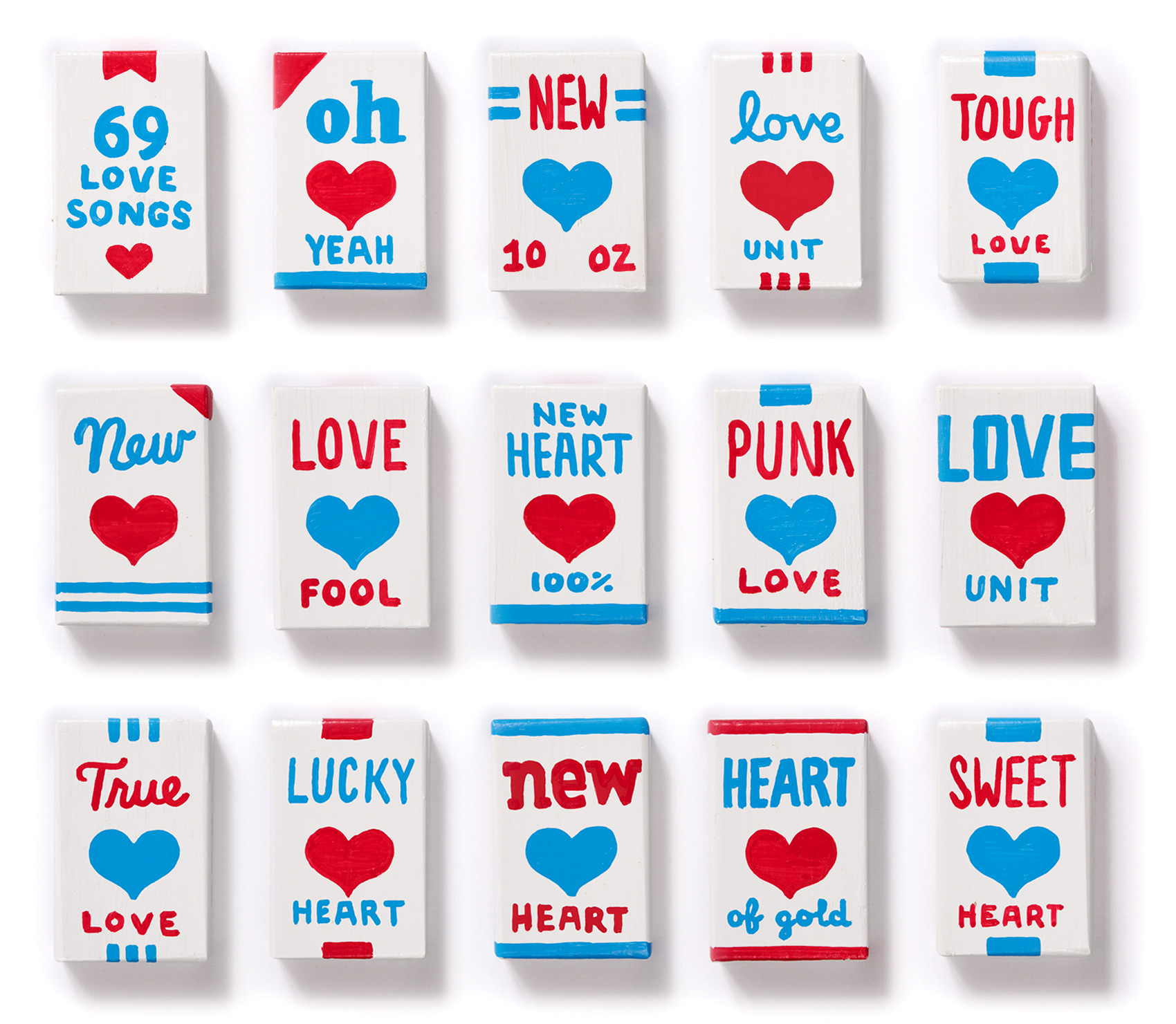
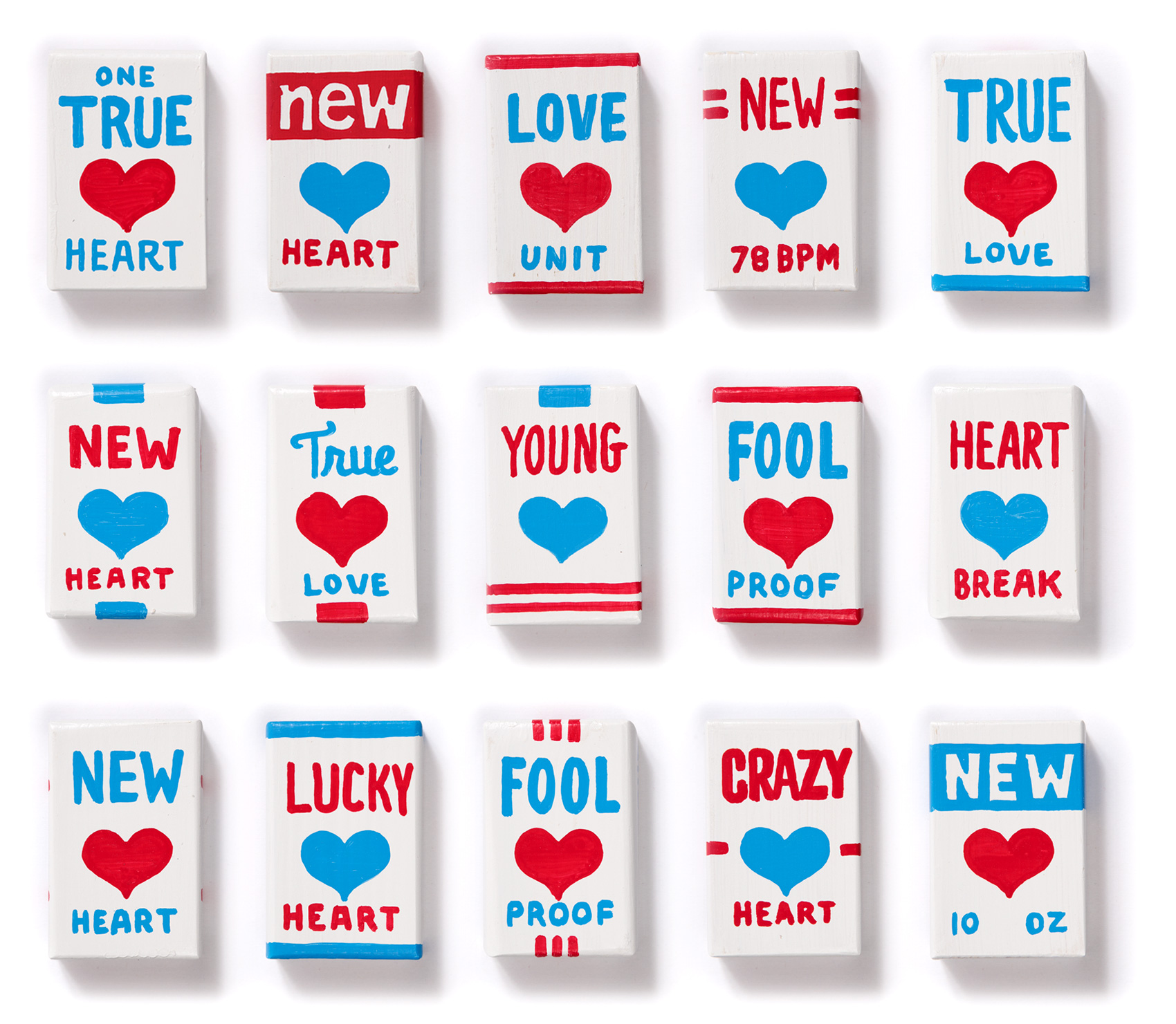
Sprinkled in between the New Hearts and Love Units are boxes with lyrics that reference other songs on the 69 Love Songs album such as “Yeah oh yeah”, “I don’t want to get over you” and “Crazy for you (but not that crazy)”. Each and every new heart is a one-off, numbered from 1-69, with almost the same amount of red hearts as blue hearts. Here are a few of my favorites…
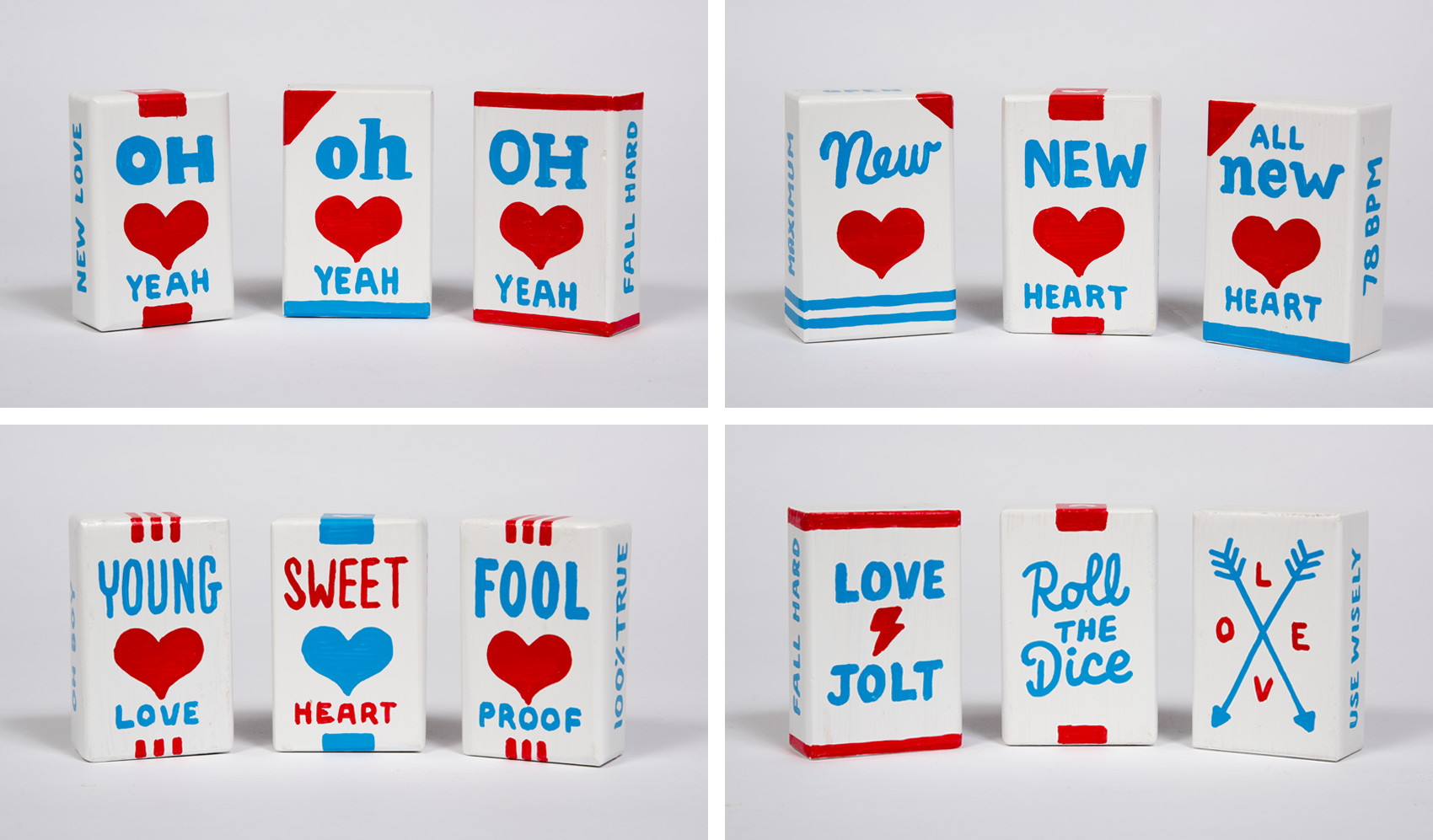
For anyone who has experienced heartbreak (once, twice, a thousand times?), you know it comes in all forms. Accordingly, each new heart was made to fix, make light of, or prevent the endless variations of heartbreak. One of my favorite side effects of the project is how groupings of the boxes read in a lyrically repetitive way that seem to have a life of their own – Sweet young fool heart! Oh new lucky love! New true love unit!
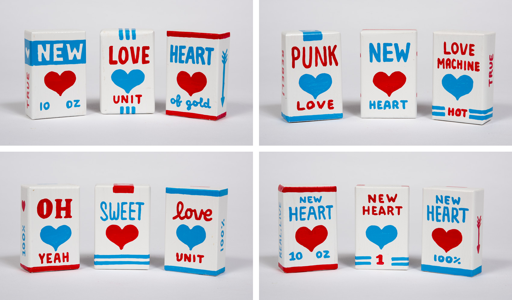
Shout outs for this projects go to many – Michelle & Cielle for having a fun idea for a show and making it happen – my studio mates for giving feedback and enduring endless hours of marker-shaking sounds – and all the influences in my life that have somehow instilled in me the desire and ability to follow through on projects that bring me satisfaction – go big or go home, right?
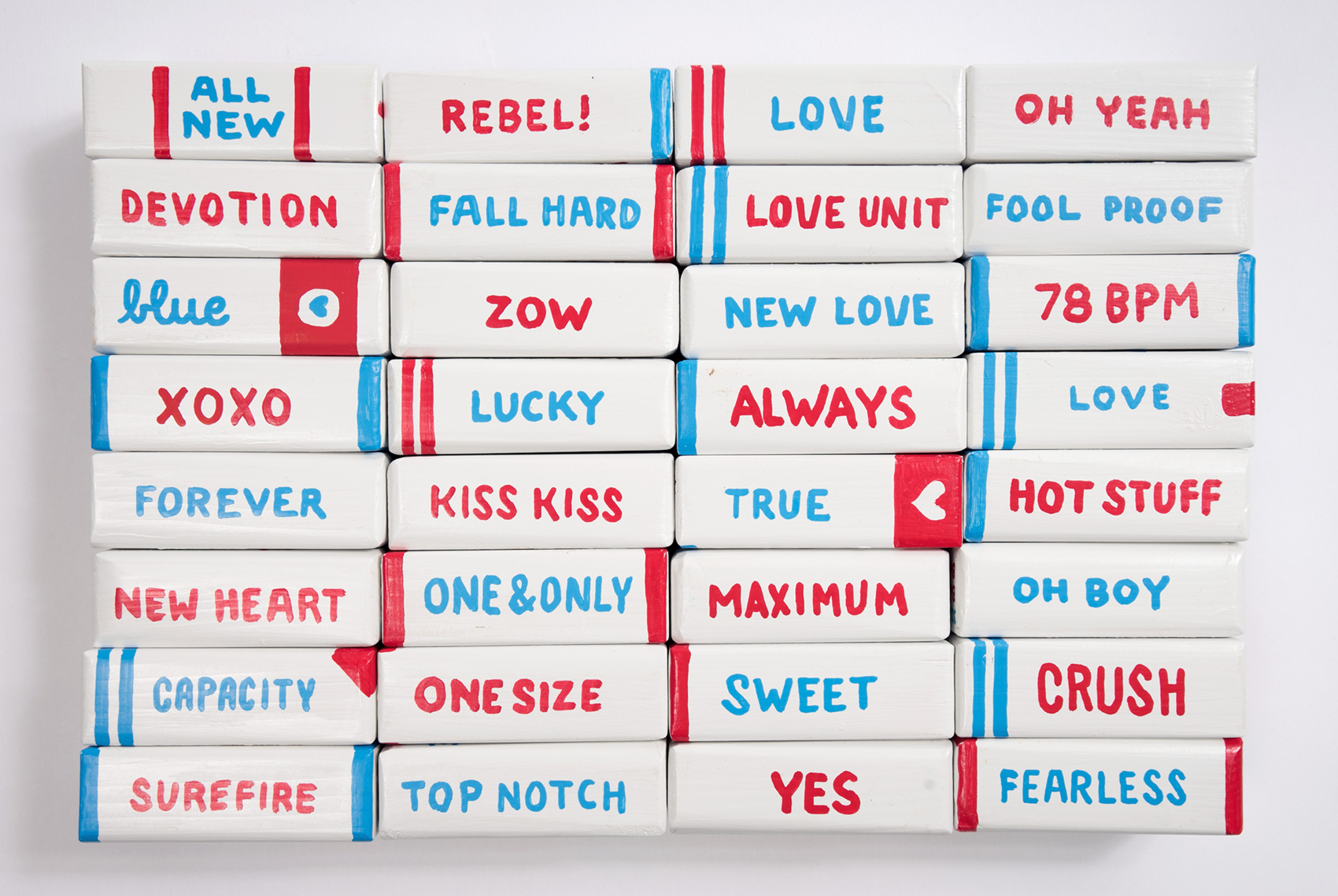
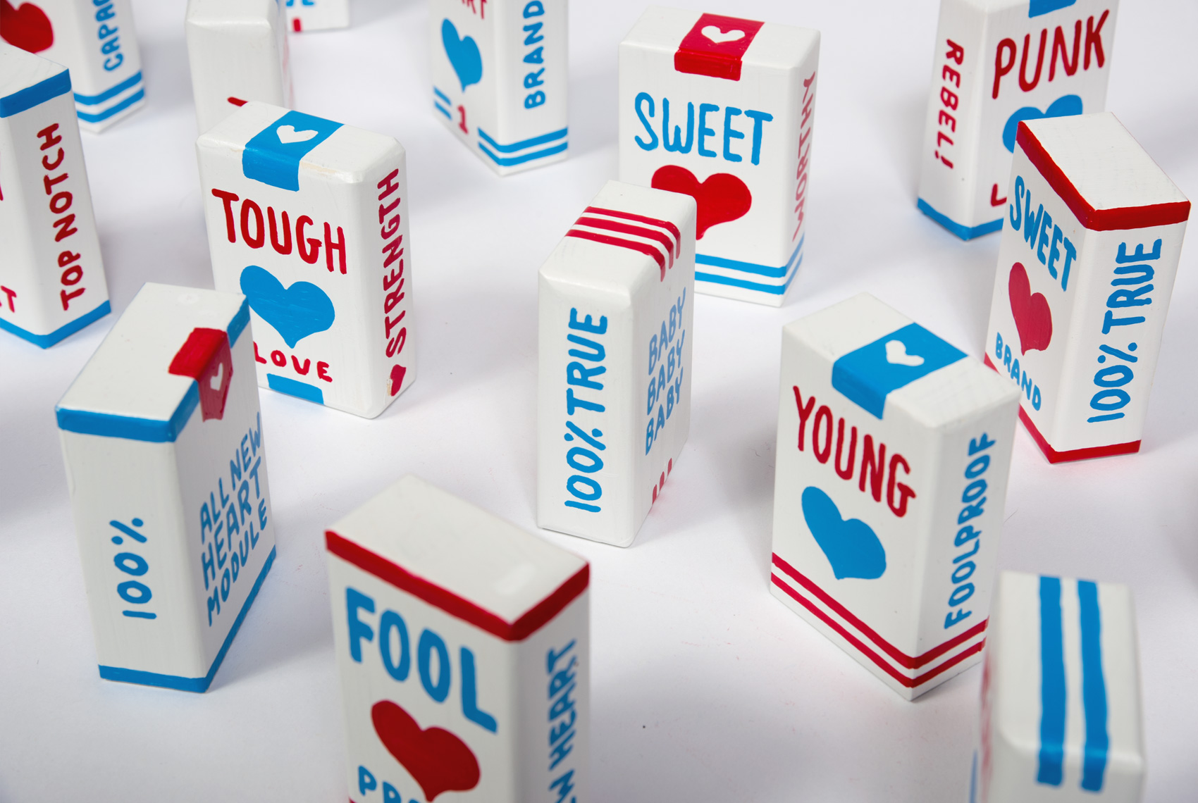
Looking back, I’m glad I went the extra 68 miles because I think the project benefits from the scale in quantity. The box-by-box execution is sub-par but I love the idea that heartbreak/new love/fresh starts/first loves/last loves/ is both so prevalent that we definitely need a stockpile of New Hearts, but in each single instance it is small and mundane – ubiquitous yet excruciatingly personal at the same time. Good luck to us all.
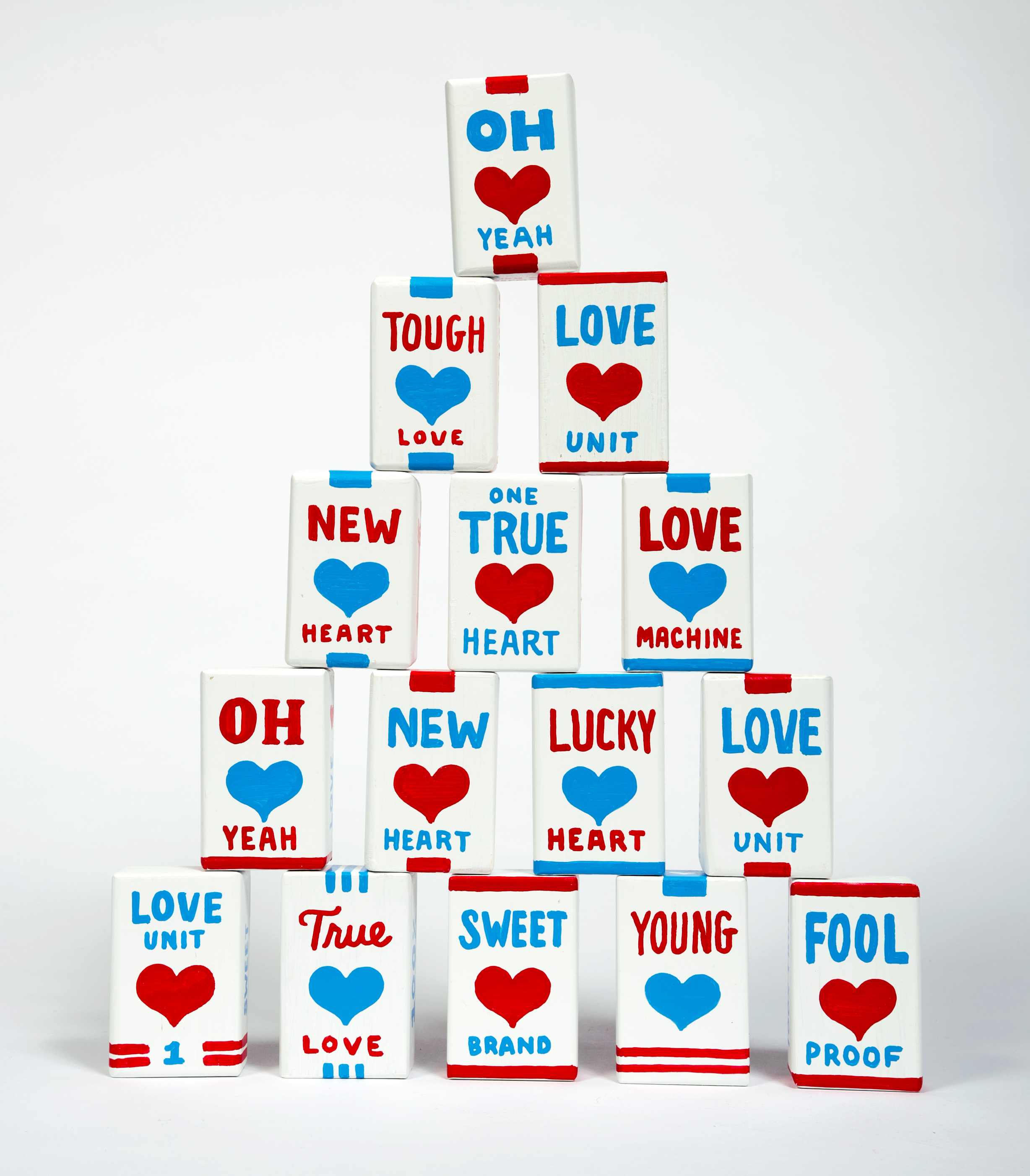
Thanks to Ian Whitmore for photographing the new heart packages and suggesting that we make a giant stack of them. Because if there is anything more precarious than Oh New Lucky Love then it’s a whole stack of it.
