Mouse Eating Peanuts and Other Drawing Practice


Last year I bought an iPad and decided I should try to utilize it in my work to (hopefully) save time and try something new. Old dog, new tricks. So far it has been equal parts frustrating, fun, and frustrating. Yes, frustrating is two of those parts – one for the technology part and the other for having to retrain yourself how to draw when you’ve been used to a Micron pen and Office Depot laser paper for the last 7 years.

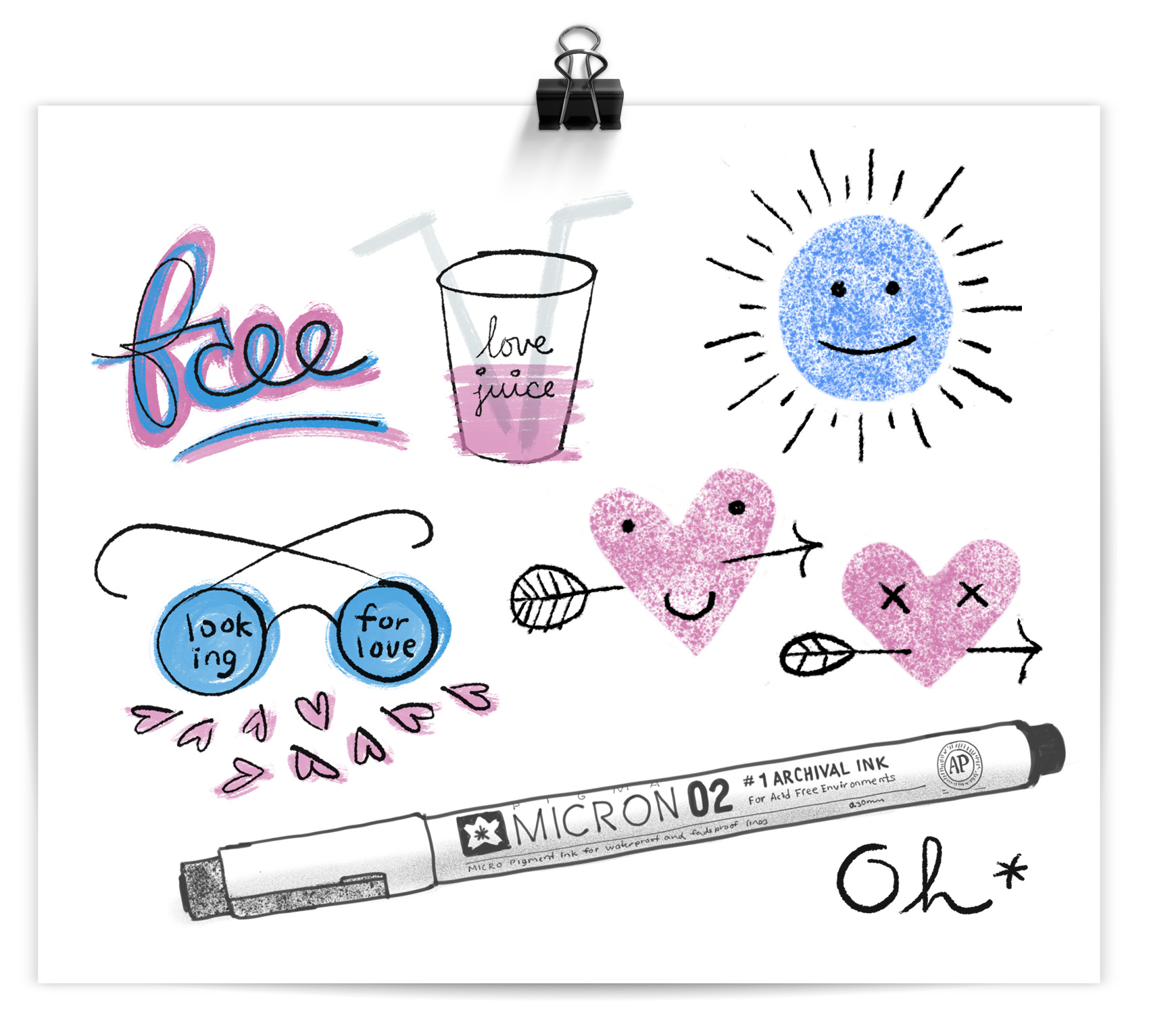
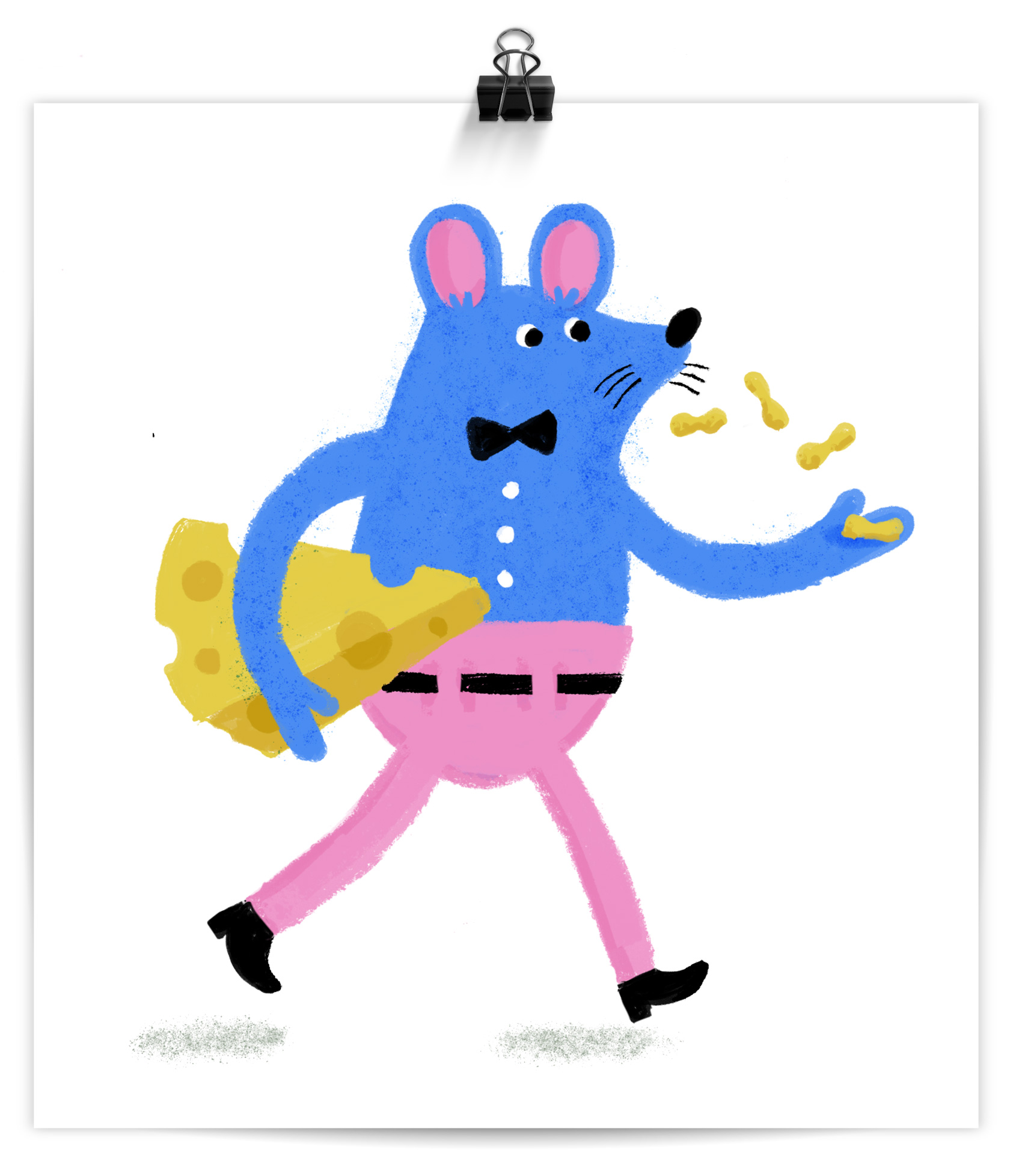
So far it has been most useful for creating the sketch phase of work in a fidelity that is higher than sketching on paper, but I haven’t been able to transfer any tasks I do 1-to-1 yet. Here are some of my more successful practice drawings, including a blue mouse in pink pants popping unshelled peanuts.

free typography, love juice cup, looking for love glasses, micron pen sketch

Strangely, the VERY FIRST thing I drew on the iPad was my Micron pen. The spatter brush is very addicting so I hope for a resurgence in 80s graffiti style so I can use it in excess. Also, whatever party this mouse is headed to, I want an invite. Look how confident he is in his high rise pants and low rise belt combination. This is a mouse with panache!

a blue mouse in pink pants carrying some cheese and eating peanuts

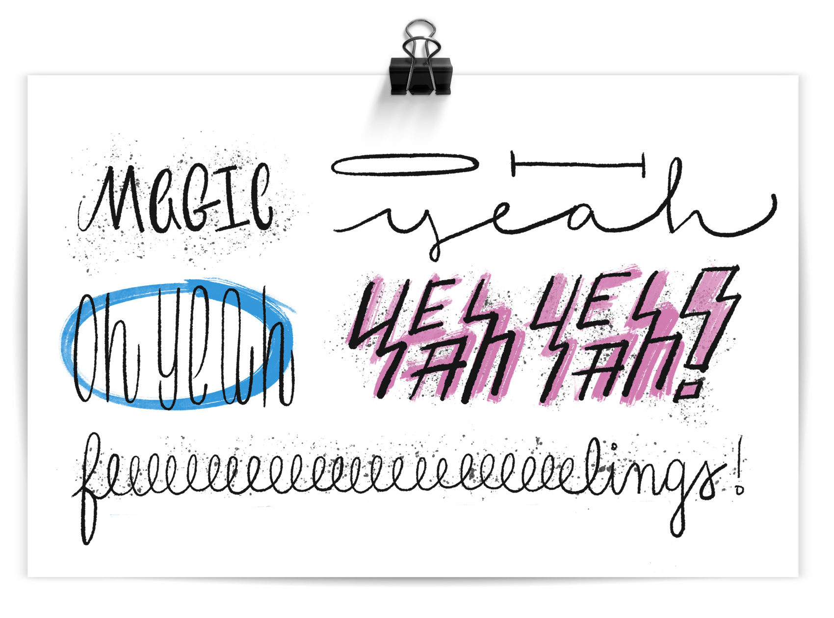
In summation: magic oh yeah, oh yeah, YEAH YEAH, feeeeeelings. I feel the beginnings of a catchy millennial pop song coming on…now only if my iPad could teach me how to play the guitar, I’ll be set!

hand lettering and illustrated typography: magic, OH yeah, 80s graffiti YEAH YEAH, and feeeeeeeeelings

Evergreen Calendar for Umpqua Bank


One of the reasons I love working for myself is getting to use most parts of my brain: design, intuition, research, organization, efficiency, critical thinking, non-critical thinking, and chocolate consumption. Which is exactly why I enjoyed this Umpqua Bank project designing an evergreen calendar – there were many interconnected parts that created the end result. The goal was to create a keepsake piece for new employees that reinforced the philosophy of Umpqua, which employees had just learned during their on-boarding training. The format chosen by the client was a desk calendar featuring 12 tenets, and that is where my work started…

An initial round of sketches was created to explore an “evergreen” form factor, ease of usability, creativity, and how it lined up with the per unit production budget. Everything from rotating columns, flippable panels, turnable magnets, reversible cards, and game-inspired counters and pegboards were a part of the first round.
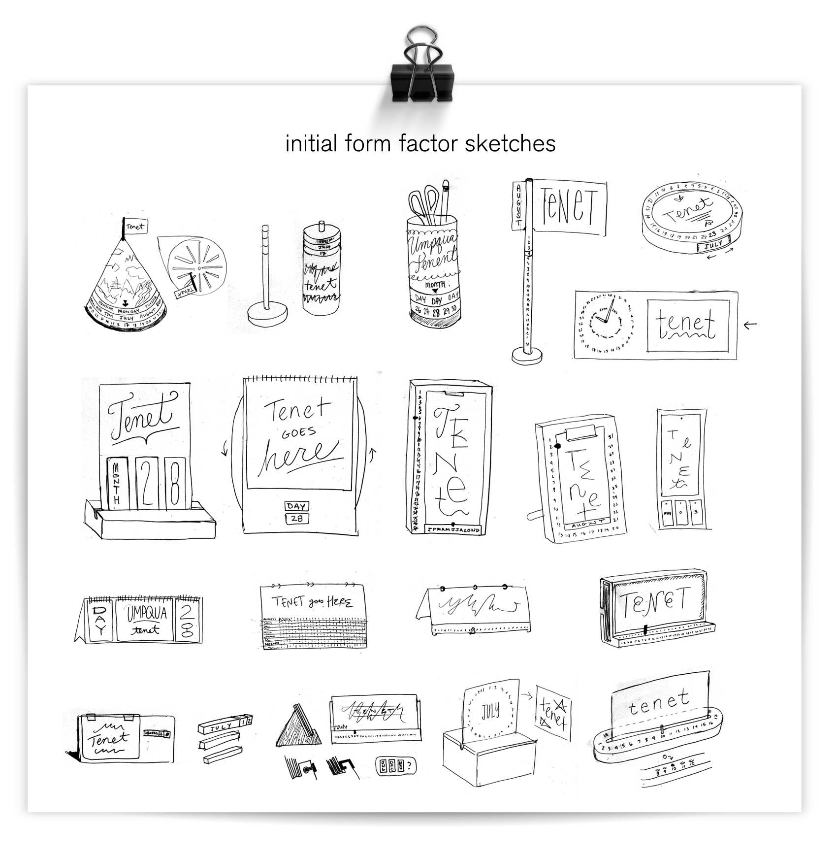
initial form factor sketches for an evergreen calendar

After the sketch presentation, the array was narrowed to three main form factors to price specifically. Umpqua wanted to focus on premium materials so some simpler options were chosen to give more of the budget to materials rather than form complexity.
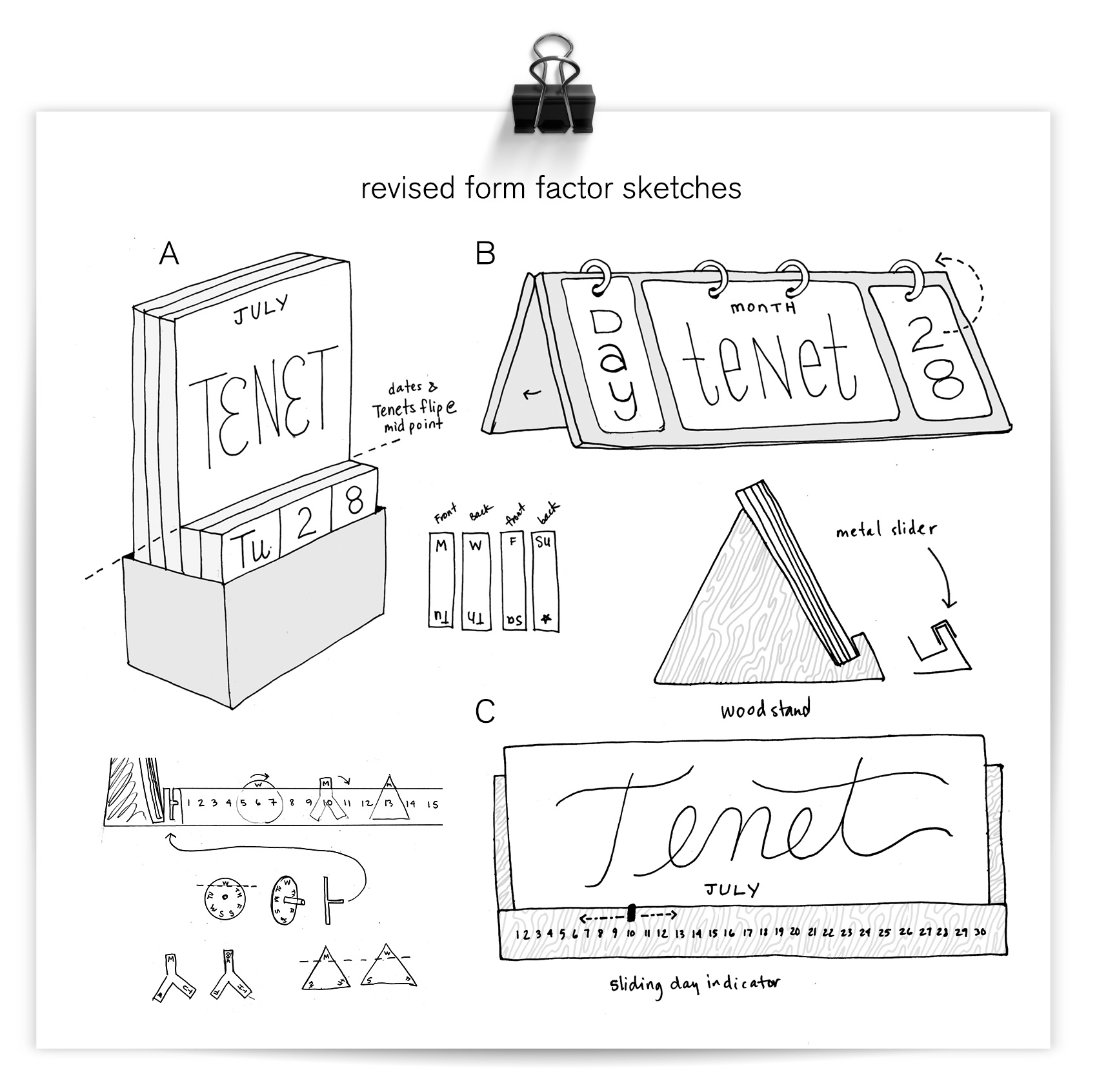
three refined evergreen calendar sketches

A combination of B and C was chosen to move into the visual design phase, with some modifications to meet the budget. After the form factor was nailed (for now), visual directions were explored to find the right balance of “Umpqua”, banking, fun, and feeling like a custom piece that could hold its own on a desktop. A few focus areas in the initial design process were how much emphasis to put on the date (month, day), how integrated the messaging and illustration should be, what style the illustration should have, and what color impression the calendar should have. The option chosen (C) placed the most focus on the tenet, leaving the dates to be purely functional to highlight the messaging and illustration.
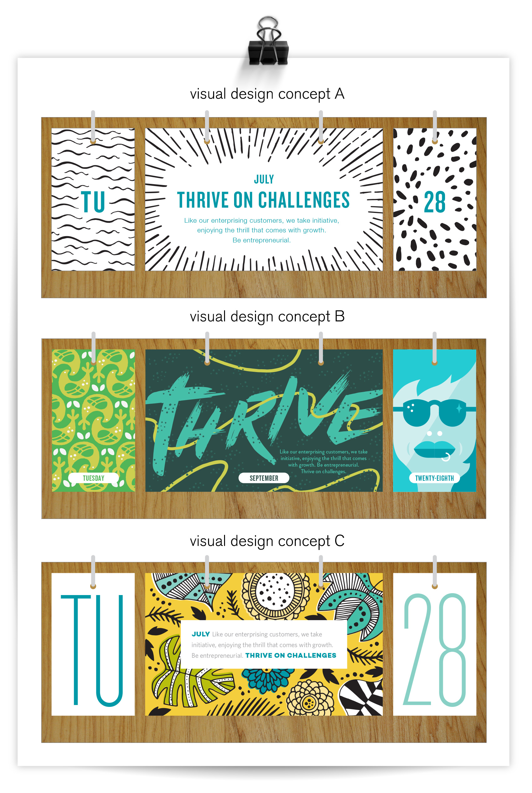
initial design concepts for Umpqua Bank evergreen calendar

Throughout the production process, the per unit budget was the major factor in determining the final form. The more parts there are to assemble in production, the higher the cost, so a simple solution was needed. In the end a compromise between materials and functionality was reached. A triangular wooden stand with a powder coated lip met the cost requirement, and could hold the tenets and dates in a nice presentation. A bit of functionality was ceded in that the panels have to be manually rotated instead of flipping them on fixed rings from front to back of the stand. Real projects = real budgets. IT BE REAL, FOLKS!
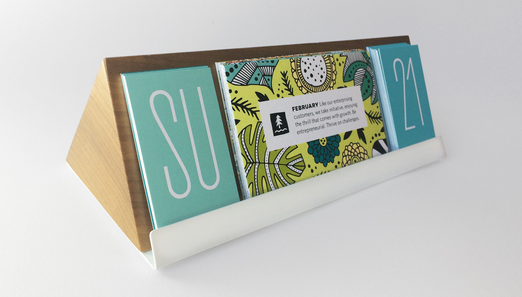
wood triangle stand with powder coated metal lip to hold evergreen calendar date and tenet panels

When the term evergreen calendar is used it usually refers to a calendar that can be used for any given year because it isn’t dated specifically. We took the term “evergreen” to the next level so both the information panels AND the form factor were evergreen. Umpqua wanted the option to switch out the panels, so the structure was designed to accommodate rotating messaging without it being a hassle to change out and didn’t create too much waste. An added bonus of the form factor was that it could also serve double duty as a picture rail, note holder, whatever, if users took the tenet and date panels out.
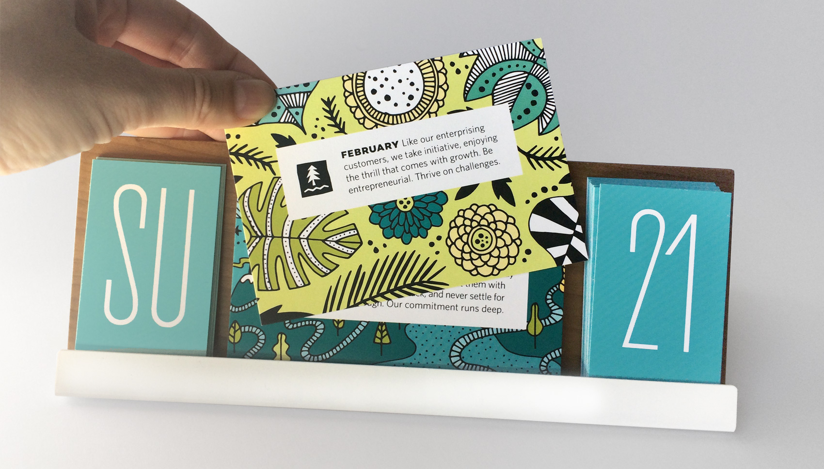
wood triangle stand with powder coated metal lip to hold evergreen calendar date and tenet panels

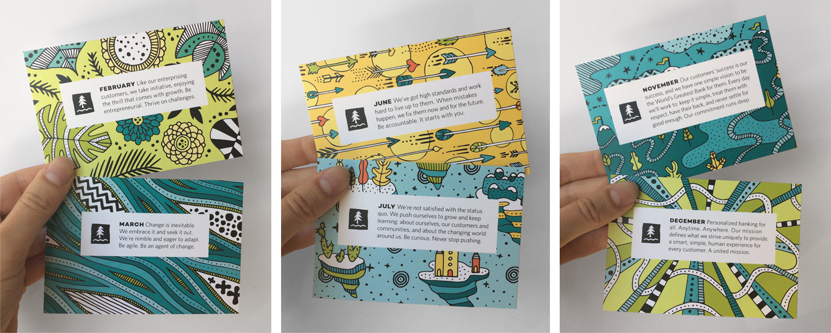
tenet panel series

Tenet themes were used to guide each illustration which were created in the Umpqua brand palette, which thankfully is quite broad with multiple blues, greens, yellows and oranges. Client provided themes included: strive, thrive/challenge, change/versatility, knowledge, collaborate, diligence, grow/curiosity, heart/kindness, betterment, generosity, commitment, and unity.
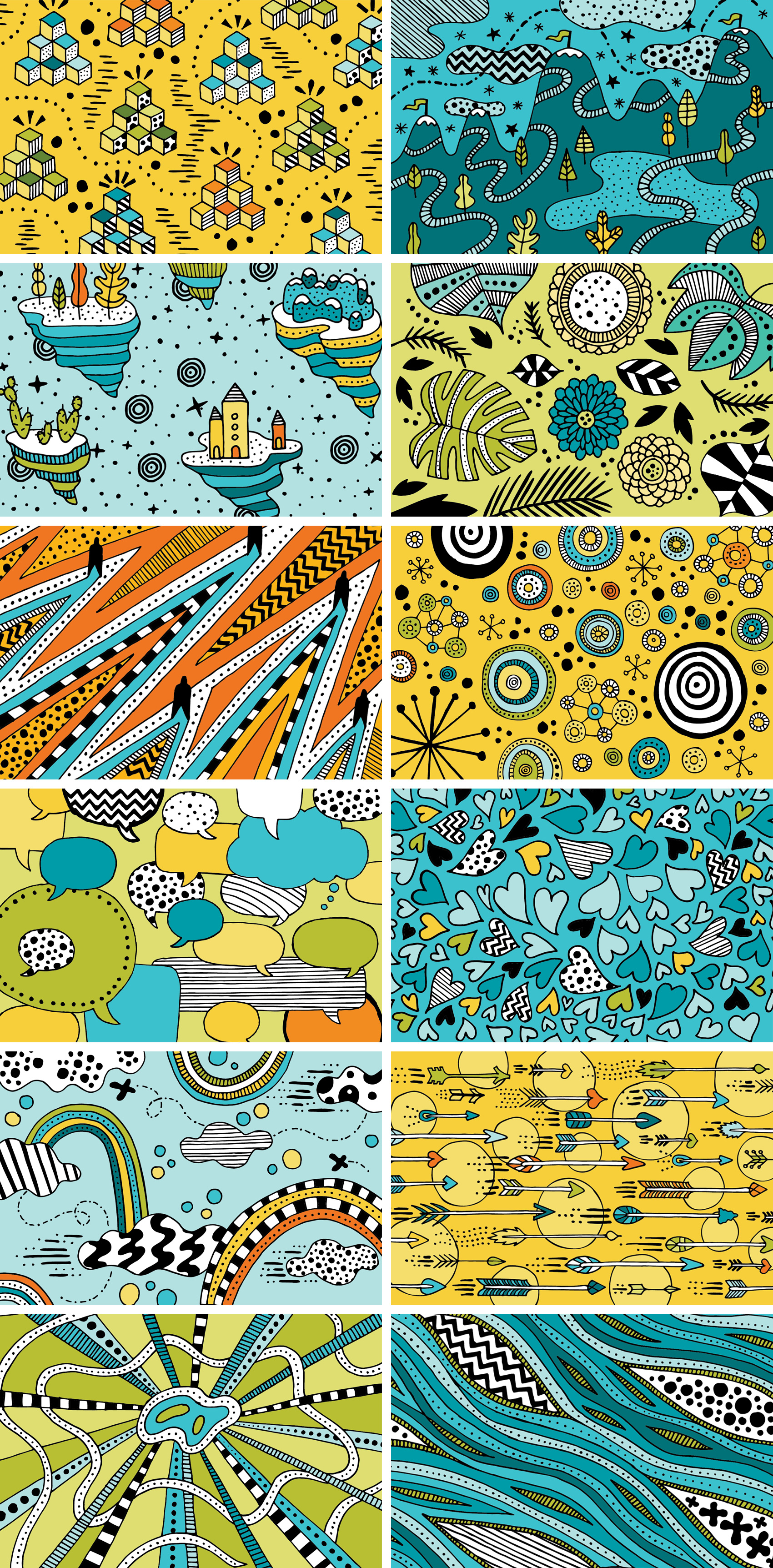
twelve hand drawn illustrations to match the 12 tenets of Umpqua Bank new employee training

Credits
Client: Umpqua Bank
Creative Director: Kylie Emers
Project Manager: Jason Resch
Calendar Stand Production: Axiom
Calendar Panel Production: Pod4Print
Monster Drawing Rally 2017


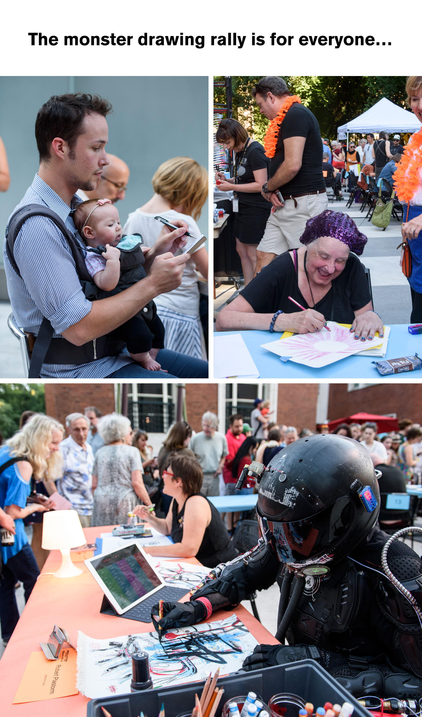
This year I participated for the third time in the Portland Art Museum’s annual Monster Drawing Rally. A fundraiser for art programs at the museum, it’s a night of fun and exploration with a special area for kids to draw and display their work. Spectators and artists of all kinds join for an evening of fast-paced art making. One of my favorite parts of participating is talking with the kids who watch me draw, seeing how curious they are and how art can place a 6-year-old and 36-year-old on such equal footing if you give it a chance. You like to use markers? Me too. You draw zebras? Yeah, I try that sometimes. You like the color pink? I mostly use black and white but colors are nice too. Art can be whatever you want it to be, that’s the great part.

Portland Art Museum's Monster Drawing Rally 2017 - all kinds of people come, young, old, really young, robots.

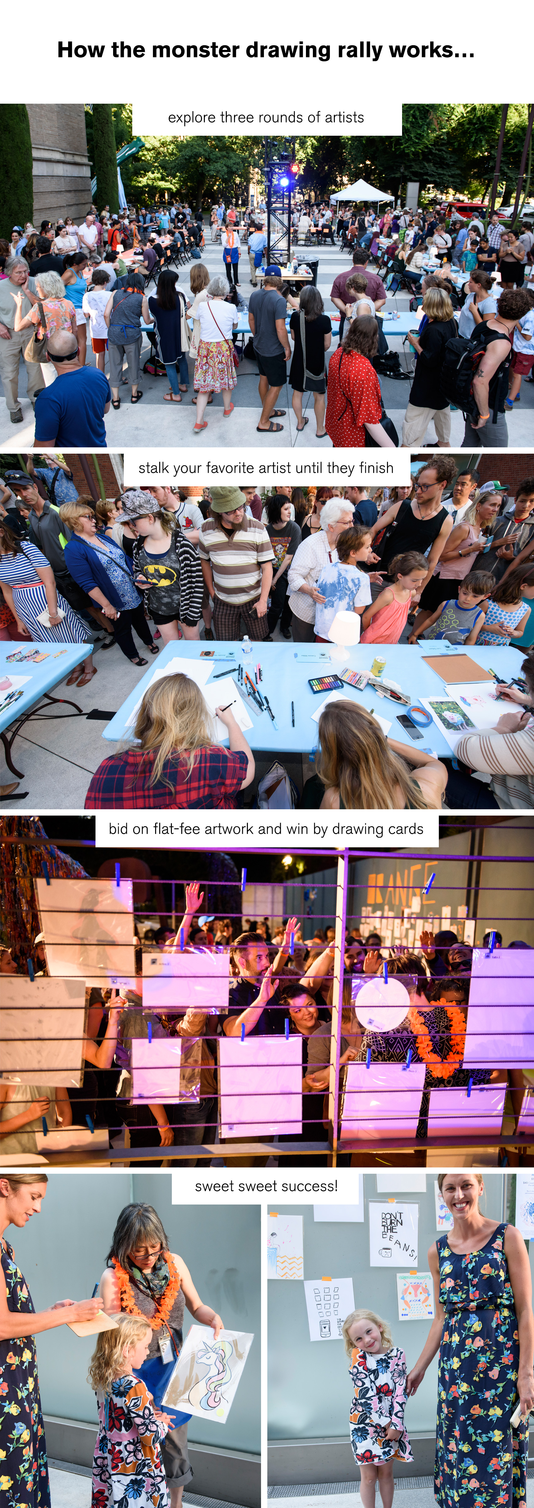
How exactly does the Monster Drawing Rally work? The format is simple, but it does help to know the basics when you arrive. Three rounds of artists each draw for an hour from 6-9:30pm, with 25 artists in each round. Each time an artists finishes a piece it is taken to the bidding wall, where whoever wants to buy it raises their hand. If multiple people “bid”, the winner is chosen by drawing from a deck of cards as artwork is all sold at a flat fee of $35. So it’s best to keep an eye on when an artist finishes their work and follow it straight to the wall so you can hopefully bid on it before anybody notices it’s there!

Portland Art Museum's Monster Drawing Rally 2017 - first: check out all the artists, second: stalk your favorites until they finish a piece of artwork, third: bid on flat-fee artwork and win by drawing cards, fourth: sweet sweet success!

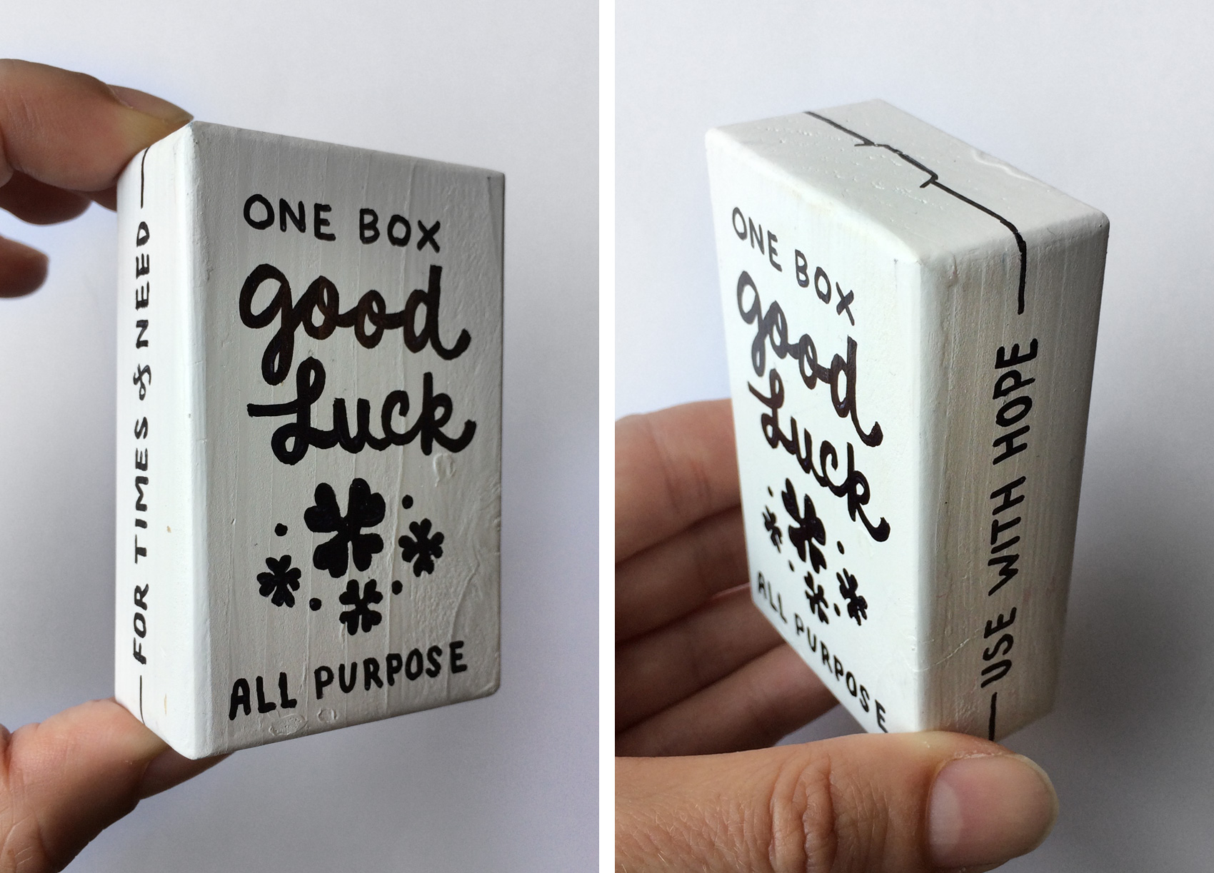
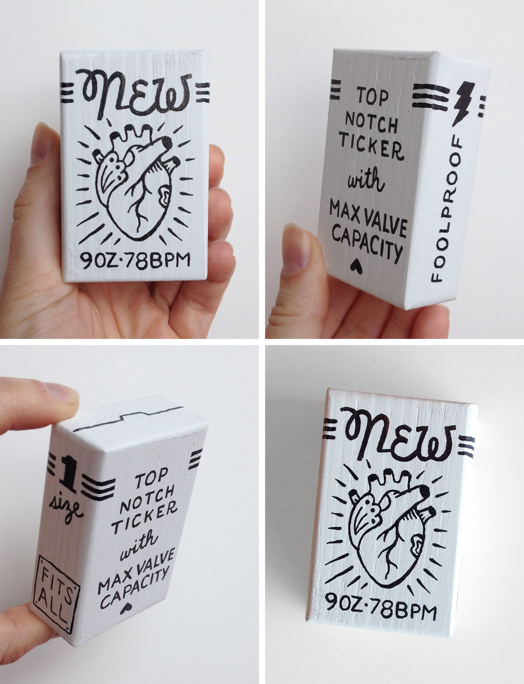
This year I decided to draw on some leftover white wooden boxes I had from another project (still documenting that one…). In the past two rally’s I had created some lettering similar to these typographic terrains, but they were much too complex to finish well in an hour at any kind of large scale. Having a very small format would let me create more pieces – I started the evening with a goal of four, and completed four! Doing a test box to make sure the timing was somewhat accurate helped a lot so I could just have fun and know I would be able to finish.

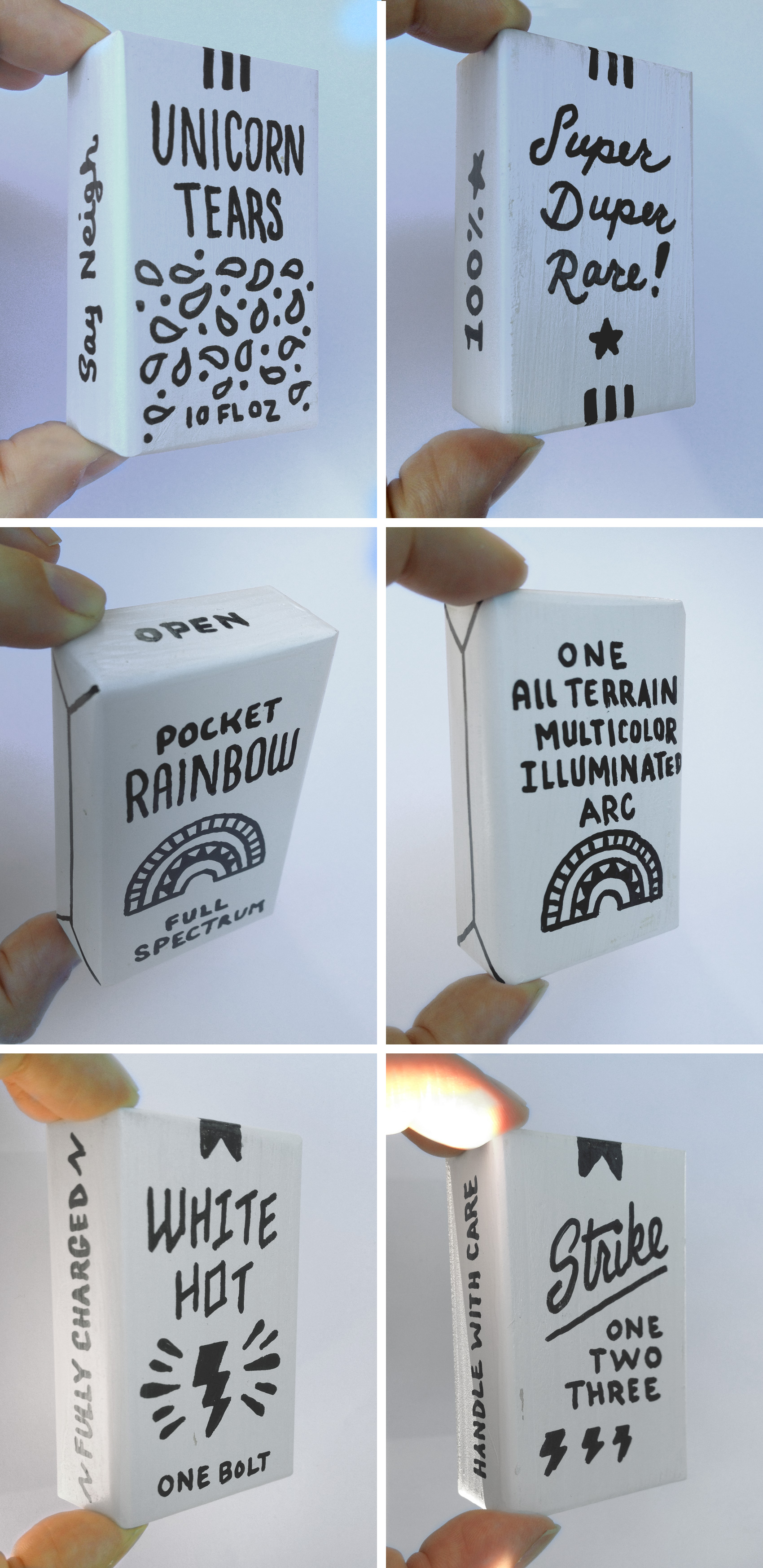
“Magic Boxes” was my personal theme, filling the imaginary packages with fantastic product that you can’t buy at your local supermarket. The first box was Pure Magic (with a warning to “use wisely”), but I forgot to take a photo of it. The rest of the boxes were Unicorn Tears (super rare!), a Pocket Rainbow (one all-terrain multi-color arc), and a White Hot Bolt of Lightning (fully charged, handle with care). One person suggested I put a puppy in a box but now that’s just silly!

Portland Art Museum's Monster Drawing Rally 2017 - Bureau of Betterment "magic boxes" including Unicorn Tears, a Pocket Rainbow, and one Lighting Bolt (fully charged).

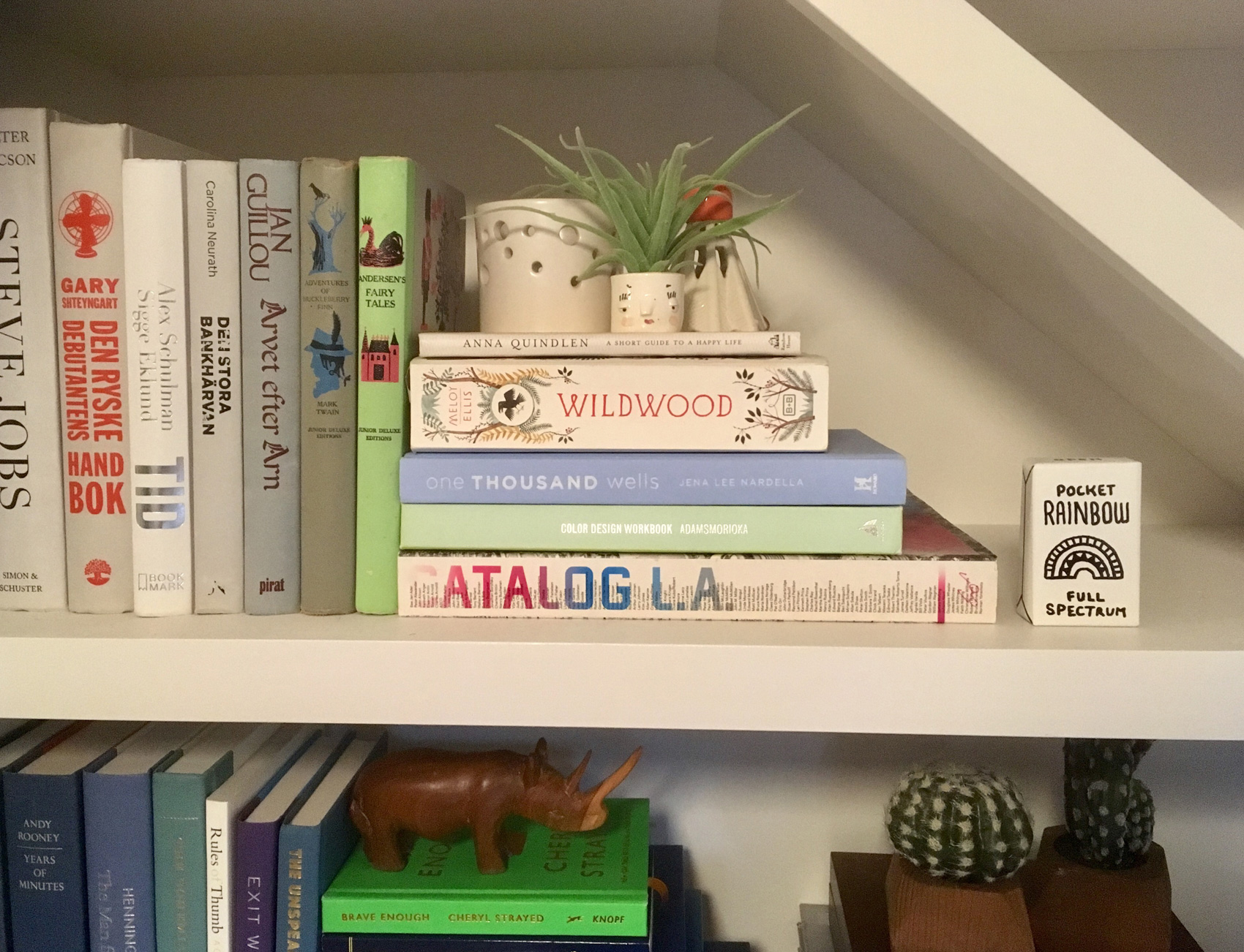
Even though I had planned ahead, no art project dos 100% smoothly. The markers I had planned on using somehow didn’t transfer well when I was outside, so I had to revert to a thicker-tipped liquid based marker. This meant all the phrases I thought would fit on a 2×3″ box were suddenly 30% wider, so it was a challenge to do tiny fat letters. Other than a few lines trailing off into super condensed letters, it went alright. Enough that all my little boxes flew off the bidding wall and I hardly got to see them after I had finished. One buyer even sent me a photo of their Pocket Rainbow box at home on their bookshelf – so cute!

Portland Art Museum's Monster Drawing Rally 2017 - the pocket rainbow finds a new home.

Illustration Test for Umpqua Bank


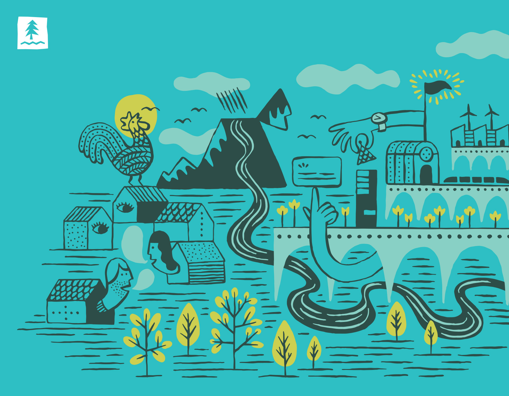
Following up on the icon and pattern tests I worked on for Umpqua Bank, the most relevant style was used to create a more in-depth scene to show how that style would play out on a larger scale. The result was a friendly ecosystem of neighbors, businesses, nature and city drawn with a brush pen and colored digitally. The drawing was geared towards animation, balancing simple and complex so that small details could easily find movement on screen.

editorial illustration test for Umpqua Bank combining a community of personal, business, landscape, nature & city

bank icon tests for Umpqua bank: personal banking, business banking, credit cards, home loans, checking

Monster Drawing Rally – Dream Dust Test


Tomorrow evening on Friday, July 14th the Portland Art Museum will host Portland’s third annual Monster Drawing Rally in its courtyard from 6-9:30pm. The event entails three 1-hour rounds of 25 artists creating art that is immediately put up for auction. All pieces are a flat $35 and proceeds fund free school programs at the museum. In addition to the live drawing auction, there is a kids drawing activity and food, drinks & music.

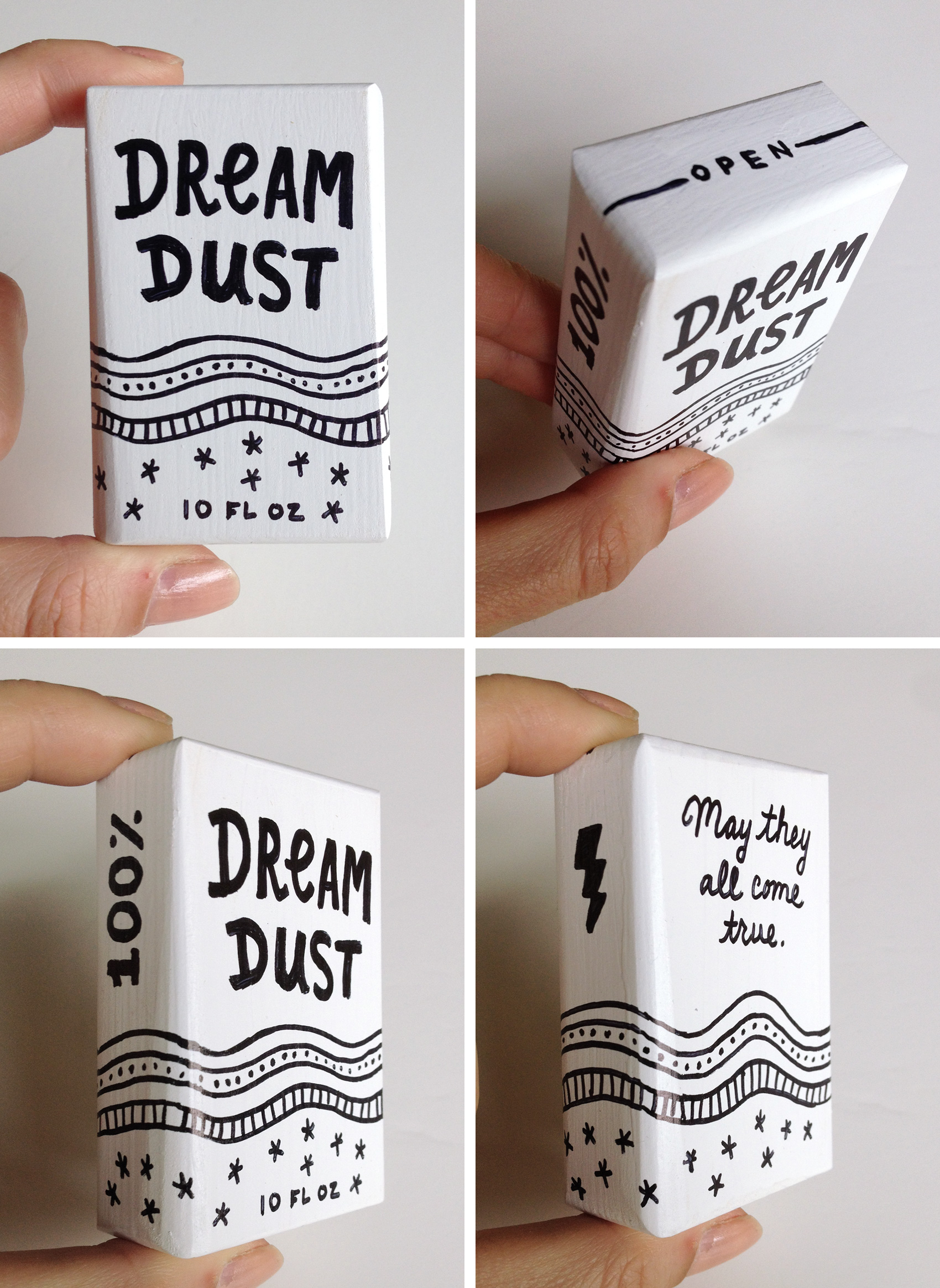
I’ve participated as a contributing artist the last two years and am excited to draw for a third year. This year I decided to veer away from the usual paper and pens – instead I’ll draw on tiny 3D boxes, creating packaging for contents you might not be able to pick up at your local SuperMart. Since I’ll have only an hour to work, a practice round was needed to time how long it took to complete a simple packaging design. Most of my ink drawings take at least several hours to make, which is not scalable to this event’s timeframe. “Dream Dust” was created in about 15 minutes, so I hope to knock out four boxes during my round. Box contents TBD…any ideas?

[update: see how the Monster Drawing Rally went]

Dream Dust faux packaging. An illustration test on a 3D white wooden box for the Portland Art Museum Monster Drawing Rally 2017.

Icon and Pattern Tests for Umpqua Bank


I’ve enjoyed working on so many projects for Umpqua Bank over the years, from building murals to 30-page mini magazines to postcards to desk calendars to identity systems. The most recent project was more experimental and without a true end deliverable – testing out different illustration styles to see what might be useful to a brand. In the spirit of sharing process and behind the scenes, here it is…

The work below represents a single round of illustration tests for icons and patterns. Personal banking & business banking was depicted as well as credit cards, home loans, and checking. Most of the patterns are generic and nature based to show style. The goal of the exercise was to test the limits of what styles might be appropriate for stretching their visual library. I drew towards ‘more fun’, ‘more ephemeral & cosmic’, and ‘more sophistication’.

Unless there is a clear style set from a brief, often my intent with the first round of of illustration trials is to provide a wide range so that comparisons are clear and to get a variety of feedback. Learning the pros and cons of three very different styles is much more educational than comparing three similar styles. After all, it’s not until the very end that you have to yell NAILED IT! Everything up until then is learning as much as possible so you can get it right in the end.

MORE FUN

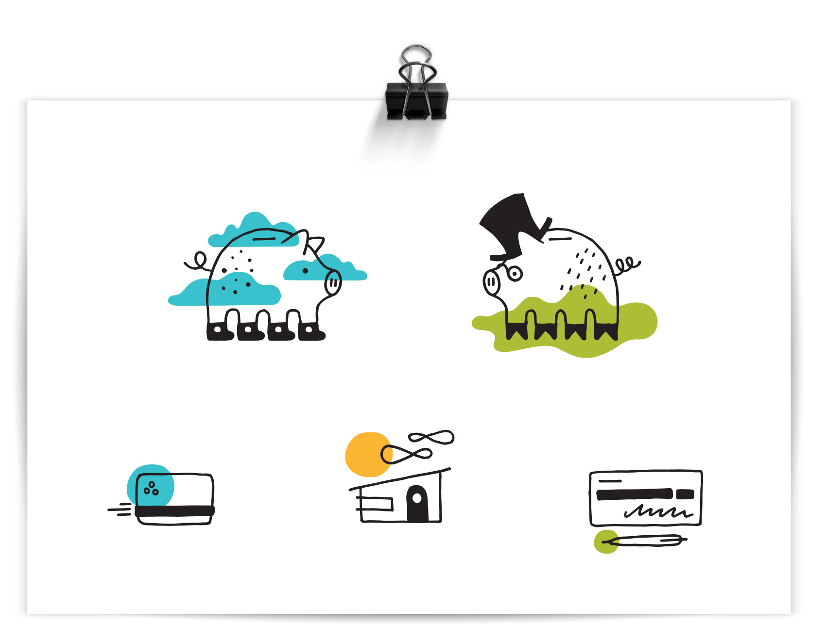
Out of all the banks I know, Umpqua is the friendliest and most playful in their branding. What if I only focused on that, and tried to forget it was a bank after all? The result was a piggy in converse and a piggy in a topcoat and spectacles, because duh. Color accents are used reinforce the icon message or provide flair. This direction was presented as “FUNBANK”: Approachable with a wink, using simple linework with pops color, and themes covering everyday life and twists on “banking as usual”.

bank icon tests for Umpqua bank: personal banking, business banking, credit cards, home loans, checking

pattern & illustration tests for Umpqua bank: landscape patterns

MORE EPHEMERAL & COSMIC

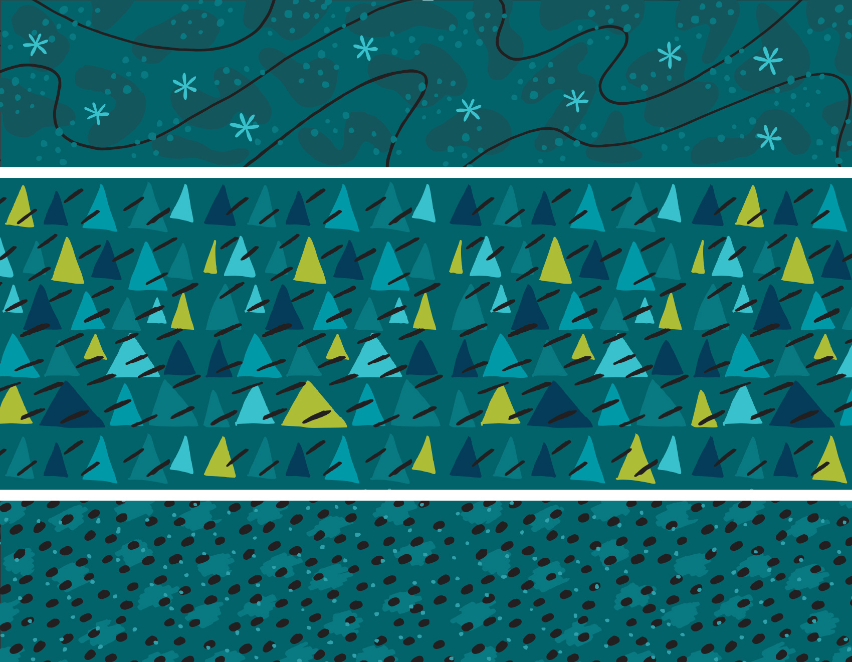
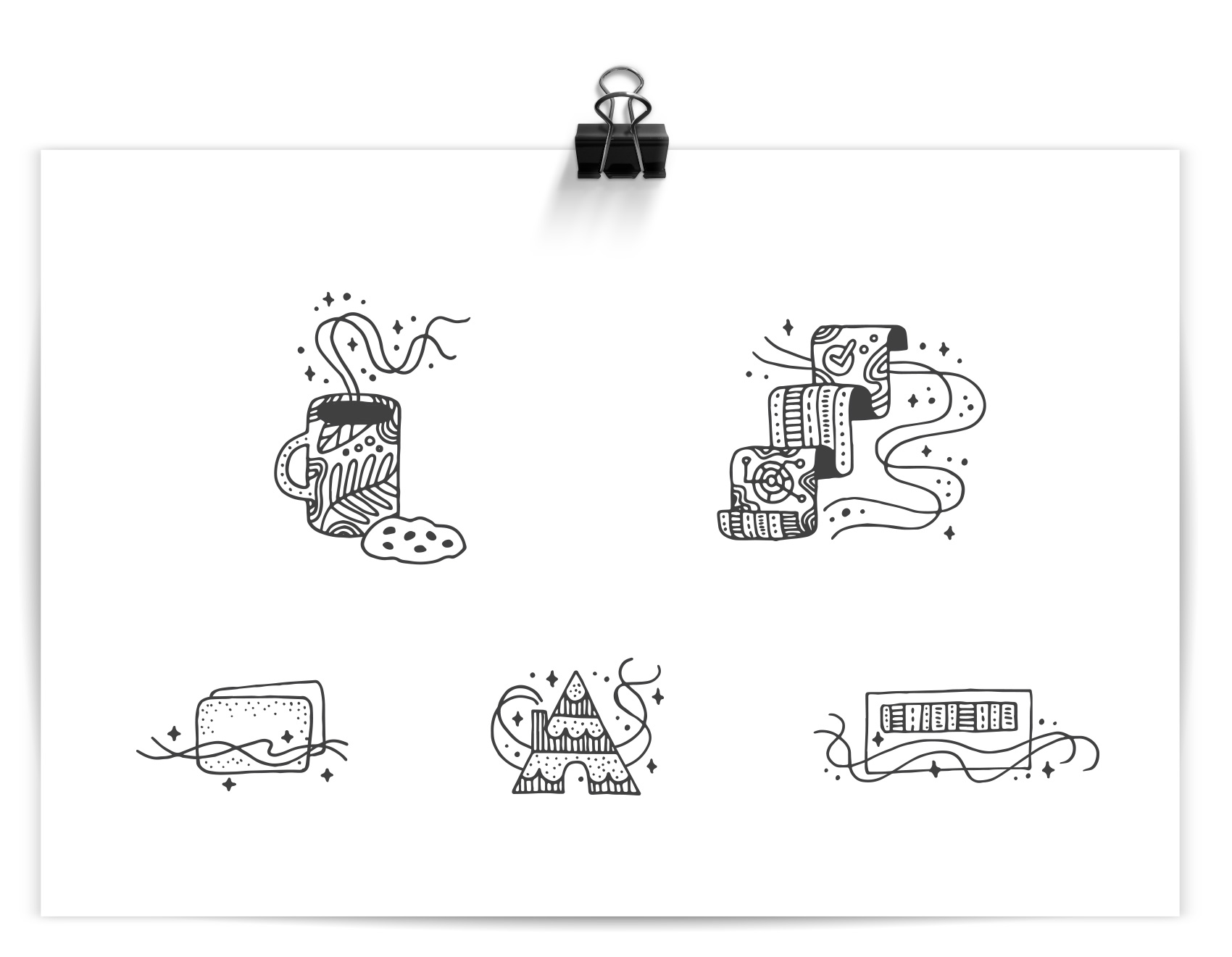
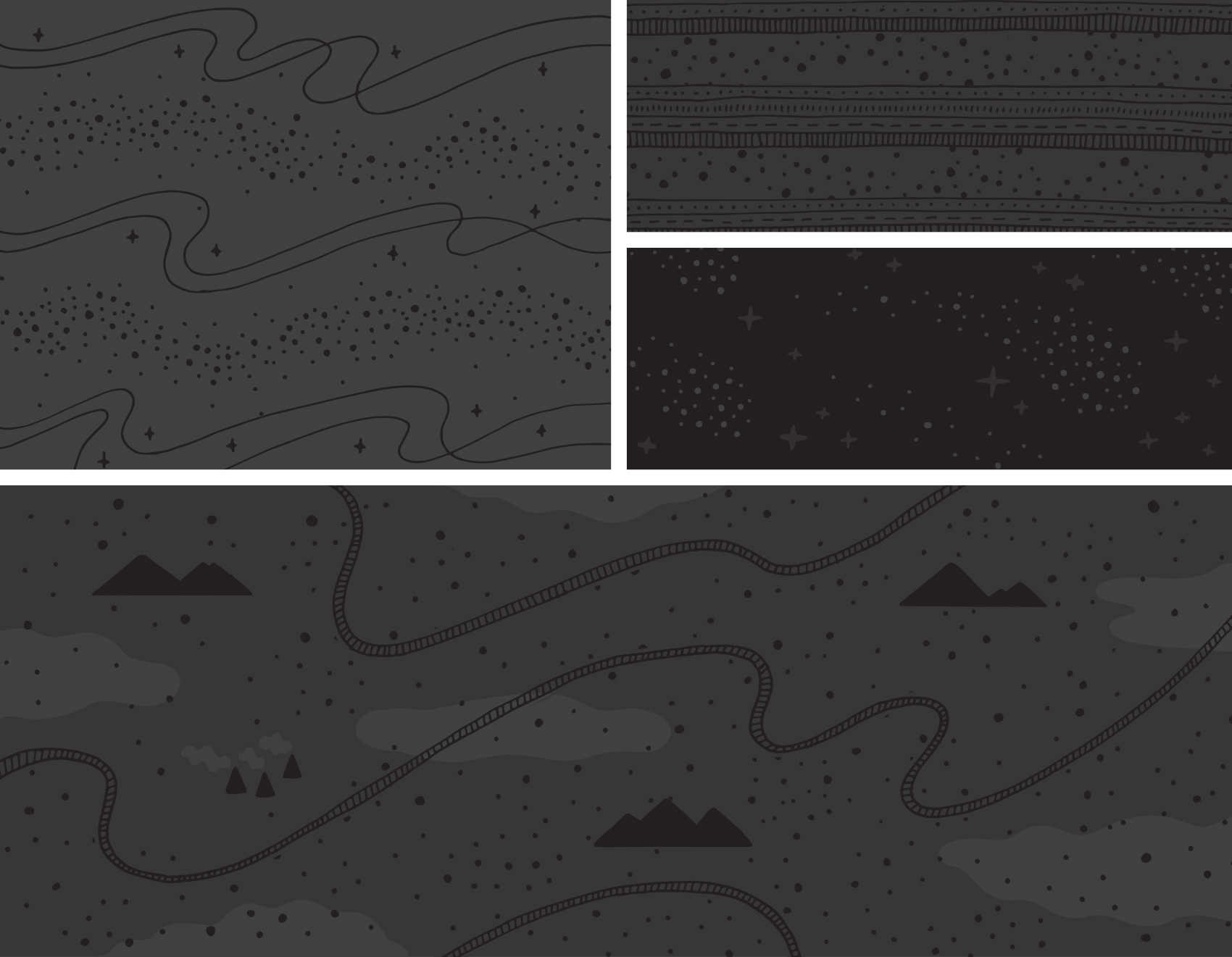
Straying furthest from their current brand, this direction took inspiration from some specialty projects I have worked on for Umpqua Bank that were less mainstream. Intricate patterning with almost a tattoo-like quality were not the top pick, but an interesting study. The sparkly “magic factor” used throughout the series was meant to communicate Umpqua’s ‘special factor’. IF ONLY personal banking consisted of drinking coffee and eating cookies. This direction was presented as “IT’S MAGIC”: Playful and intricate with unexpected, detailed linework, this direction explores themes of service, delight, and magic in the mundane.

bank icon tests for Umpqua bank: personal banking, business banking, credit cards, home loans, checking

pattern & illustration tests for Umpqua bank: cosmos

MORE SOPHISTICATION

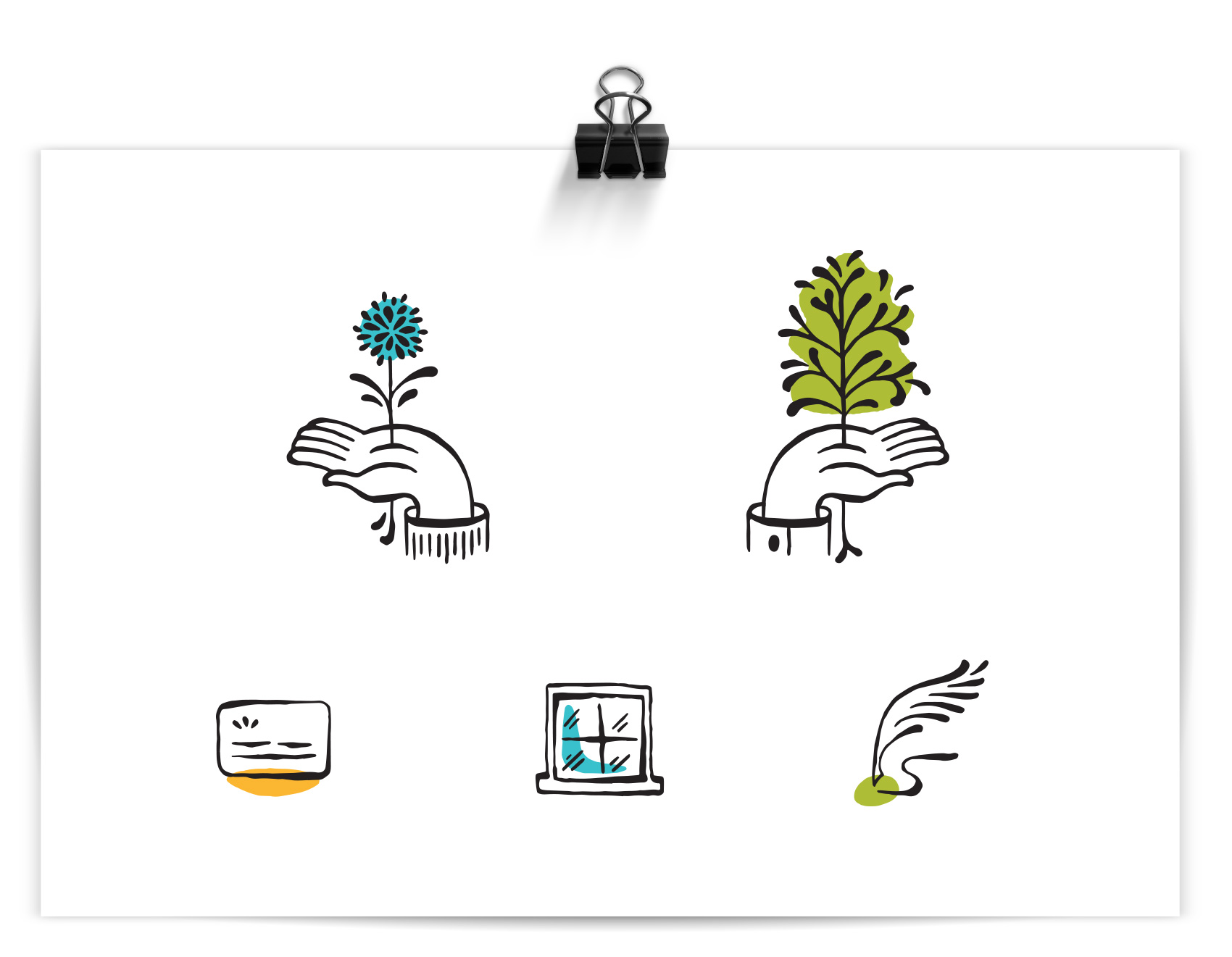
This style was a favorite and used as a starting point for further exploration (future post coming soon!). A controlled brush line provided a humanistic quality and felt more editorial and high-end than their current icon library. This direction was presented as “THE HUMAN TOUCH”: Refined and organic, using gestural linework with themes of growth and movement. (side note: this direction also gave me hand cramps)

bank icon tests for Umpqua bank: personal banking, business banking, credit cards, home loans, checking

pattern & illustration tests for Umpqua bank: nature based squiggles

That’s all folks – a work-in-progress showing the process of testing illustration styles for an un-banky banking place.

The Whole Shebang from Olympia Provisions


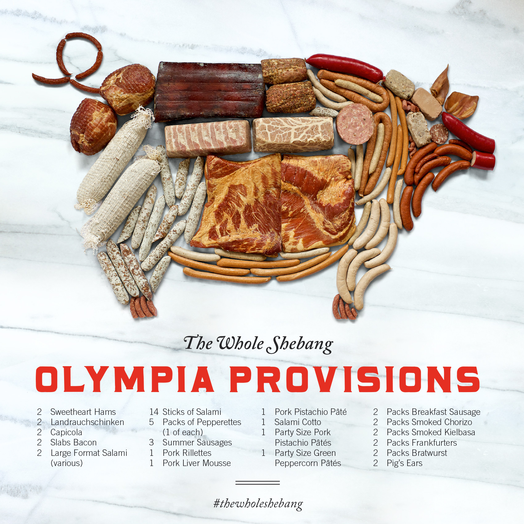
A client that continues to provide fun and interesting projects, Olympia Provisions, recently commissioned the Bureau create a holiday gift guide (more to come on that another day). One of the main photo spreads was a compilation of all of their charcuterie in the shape of a pig, with the products placed approximately where it came from on the pig (give or take an artistic license or two).

olympia provisions charcuterie selection in the shape of a pig - the whole shebang!

The image was created by salumist Elias Cairo of Olympia Provisions placing all the meats in their respective areas, then myself adjusting the placement until it looked like your friendly neighborhood oinker if you were looking at it with X-ray meat vision. Photographer David Reamer shot the piece from a ladder, top down on a white sheet. The white marble was added in post production to give the pig a neutral background and showcase the variety of colors and textures (apparently fat marbling is a big deal in the meat world).

Now, I’m not averse to meat. I eat it. I enjoy it. I’ve even spent time in slaughter rooms on Eastern Oregon ranches during my youth and had my dad chase me to the hay barn brandishing a cow’s tongue (scary for an 8 year old). But in my last two decades of life I haven’t handled that much meat because a) I’m not the main cook in the house, and b) I live with a vegetarian. But handling 50 pieces of meat several times each for over an hour is a bit beyond what I ever though my job as a designer would entail. Suffice to say, I fulfilled my meat handling quota for the year on this project!

And, since this was a small part of their annual consumer-side catalog project, you can indeed buy The Whole Shebang (which is technically classified as a “half pig”) when holiday season rolls around. It’s a no-lose situation, and as we described this unique offering in the catalog…

Last minute dinner guests? Need to throw a party for a hundred of your best friends or business associates? Fear not—with our half pig, you’ll never experience a pork shortage again. Includes everything listed! Assembly required.