Xplane Poster Trio


I’ve worked with Xplane several times in the past. They have offices in both Portland and Amsterdam, and focus on Business Design Thinking. Over the past few years they have changed ownership, but have recently returned to their roots. To help communicate this recalibration and new start, I illustrated three vision posters for the company. The content and structure of the diagrams were decided internally by the Xplane team and my job was to interpret the blueprint sketches to final illustrations.
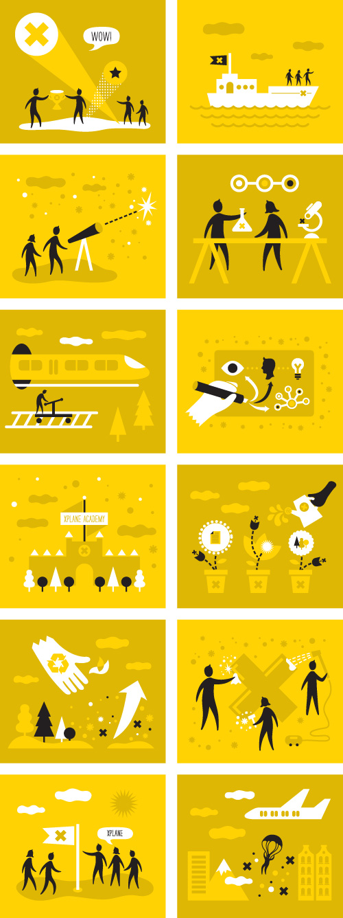
Individual icons from the poster project.

See the full posters after the jump, or read Xplane’s blog post about the project.
Continue reading “Xplane Poster Trio”
Umpqua Private Bank Website


I’m happy to share a project I’ve been working on for Umpqua Bank. The site is for their Private Bank that focuses on the needs of highly monied clients. I use Umpqua Bank for my business needs and their customer service (and chocolate treats when you visit in person) are unparalleled. This is a bank I can get behind so I was glad to be brought onto the project.

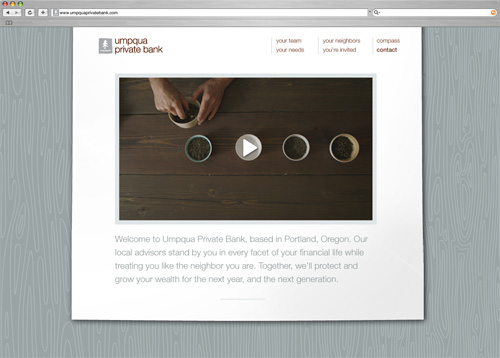
The task was to translate Umpqua’s sunny and upbeat public facing visual identity to a more formal space online without becoming a dry biscuit of financial conservatism. A custom tiling wood pattern background was made to reflect the use of wood in the interior of the bank while all content is contained on a piece of digital paper. Umpqua brand fonts were used in a large and friendly manner with short digestible text.

To populate the site, Chris Hornbecker took portraits of the private bank team with both the typical serious banker face (no smile), and the Umpqua face (smile!). Juliet Zulu created a video featuring one of their customers, Steve Smith of Smith Tea, which is shown on the homepage. I worked directly with Mark Jacobs who works in the Creative Strategies Department at Umpqua (and was also my partner in making the Goodie Monster in 2011). Matt Distefano of Umpqua coded the site.

Here are some shots of the site, or you can visit it here and see the exquisite video vignette.

Homepage with video by Juliet Zulu.
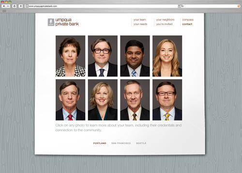
Private Bank team portraits by Chris Hornbecker.
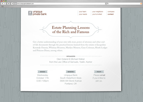
Why yes, I'd like to plan my estate like the rich and famous. Step one: acquire estate.
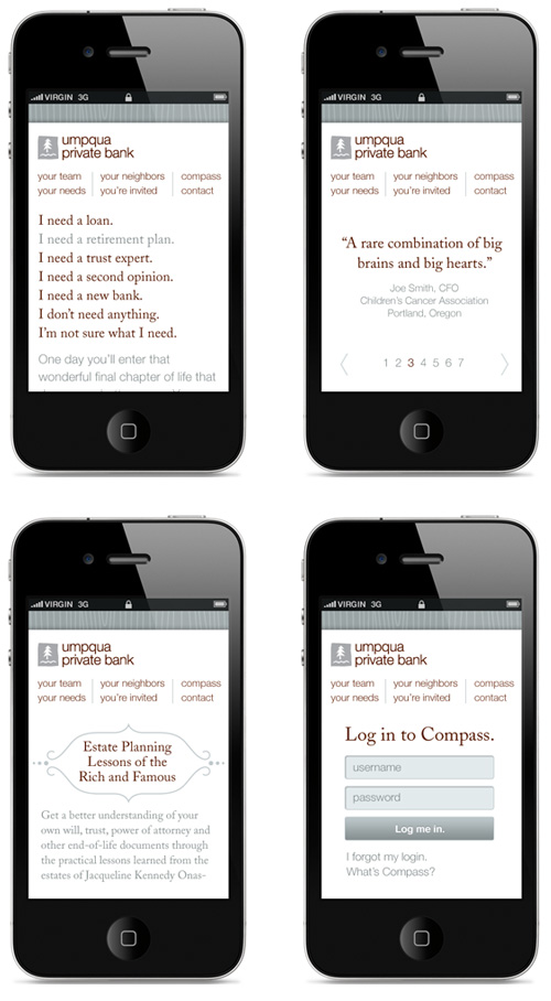
For little screens and big fingers.

I’m a fan of Mark Jacobs, I’m a fan of Smith Teas, and I’m a fan of Umpqua Bank.

TRIPLE SCORE!

Café Noir Infographic


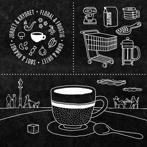
Here are the results from my first direct freelance project with a Danish client – an illustration and info graphic project made in collaboration with food communicator Marie Sainabou Jeng for Café Noir.

Café Noir was hosting an event for Danish media in relation to their release of Aroma Editions, four new coffee products created with the coffee experience in mind, not just throwing back a cup of black liquid for the sake of an energy boost and scalding your uvula. The poster was created to give journalists key facts around Café Noir’s research, in addition to having a coffee tasting and some informational mini-classes about coffee.

Style-wise the piece was created to fit in with the Aroma Editions brand with illustrations that matched their packaging and were simple enough to be stand alone graphics in printed and online media.

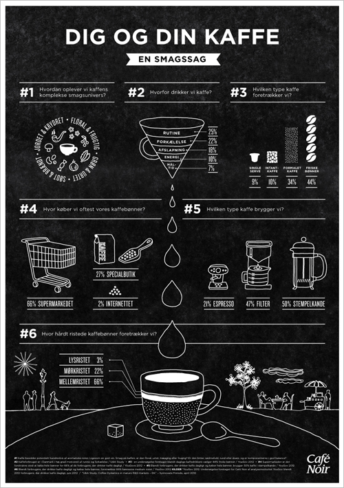
The info graphic focused on the data that informed Café Noir to follow the story of taste in their new product line. For example, did you know that coffee has 28 distinguishable tastes and 66 aromas? Most people drink coffee because it is a part of their routine? Presented with these two facts, I think it’s high time that coffee drinkers get out of their rut and experience at least a few of the nearly unending flavor possibilities when it comes to being a coffee connoisseur.

Poster infographic for Café Noir.
Close up of selected illustrations in Café Noir style.

CWA Packaging Typography


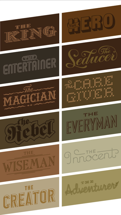
One of the larger projects I helped on this past summer while completing a freelance contract at Bessermachen was an internal packaging project. It was made for Bessermachen’s parent company, Brandhouse, and was the third annual edition of “CWA”. Twelve archetypes are used communicate Brandhouse’s way of approaching brands, and the delivery method is a series of chocolate packaging. My main role was to develop the typography that portrayed these archetypes.

Choosing or creating a typeface to convey an archetype, and having each archetype be distinct within the group, for an audience that isn’t designers is a good (challenging) challenge. The twelve archetypes included: The Everyman, The Innocent, The Entertainer , The Creator, The King, The Hero, The Adventurer, The Rebel, The Wise Man, The Caregiver, The Magician, and The Seducer.

To see the full case study and packaging series by Bessermachen, visit their website, or check out the packaging featured on the blog The Dieline.

Typographic archetypes.

Hauler Challenge Typography


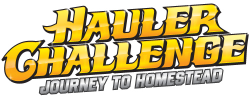
Here is a typography project I worked on for the Portland, OR interactive agency Pop Art for an app called Hauler Challenge (available here). Yes, you can pretend to race Freightliner trucks, the official hauler of NASCAR®. This is one of those things I never would have known existed if I weren’t a designer – being asked to work on such diverse topics as veganism, freight trucks, and monster vending machines is a true pro of this job. Here it is in all it’s glory and genre-fulfilling greatness – CUSTOM SHINY FAST TRUCKER TYPE!

Holiday Chutes & Ladders Game Board


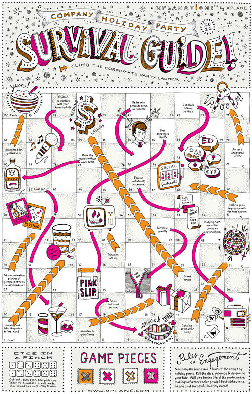
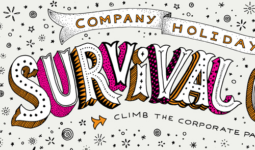
Just in time for the holidays, here is a board game illustration I did for Xplane, a Portland, OR based company that focuses on Business Design Thinking. Basically they make strategies for businesses in visual format, often resulting in interesting diagrams and infographics. The client-provided concept was Chutes and Ladders, which was to be reinterpreted with the theme “corporate holiday party”.

The game of chutes and ladders as reinterpreted for "company holiday party survival guide 2012" for Xplane of Portland, Oregon.
Chutes and Ladders, Xplane Holiday Style

The piece was sent out to clients so they could fill any pre-holiday work breaks with a quick game, trying to avoid the open bottle of Jagermeister and vying to make a good impression with the boss’ spouse. Here is an 11×17 (tabloid) PDF of the game if you’d like to play as well. Try my silent dice.

Patterned and circus-inspired hand drawn 3D typography with textures.
Close up typography.

This was a fun project because Xplane works with a specific process that involves lots of upfront sketching and getting clear approval at each step of the project. After the initial sketch had been approved it was smooth sailing through the illustration and revision phases. Plus, my pioneer rabbit got to make a sneak appearance under the chute “inappropriate use of the office copy machine”. Poor bunny.

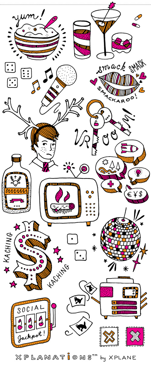
Spot illustrations for Xplane Holiday Game: bowl of porridge, drinks and pills, unfortunate antler costume, talking politics, getting a giant bonus, yule log on the television set, designated driver, jagermeister, disco ball, social jackpot machine, copy machine shenanigans, roll the dice.
Spot illustrations.

Glider Logo


Recently I finished a logo for Glider, a company that in their own words “…is redefining word processing from the ground up to make organizing, negotiating, and signing documents as simple as it should be.”

Sounds good to me. Even though my efficiency orientated brain can easily calculate the time between meals, snacks, and how many rabbits can be drawn in the interim, my thought upon waking is not focused on BUSINESS TIME. Anybody who wants to make business time easier is a friend in my book.

The project consisted of a lightning round of design to prepare for a presentation at TechStars Seattle Demo Day, the #1 startup accelerator in the world. Things in this world are FAST. MONEY. BUSINESS. TIME. There are no RABBITS. However, the results were just what Glider needed – a simple, iconic logo symbolizing a transparent document. VROOOM.

And, they’re hiring. If you want to be a back-end engineer, sales lead, or UI designer in beautiful Portland, Oregon check it out.

Yoga Space Illustration


One of the great things about illustration work is that it usually involves researching new subject matter, thus resulting in…KNOWLEDGE. Score. My general picture of yoga is “a stretch here, a stretch there, and a little inner peace”. After working on an illustration for Upswell for the Yoga Space, I now know that we have chakras. Five of them!

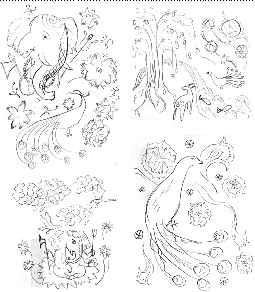
Upswell was to design a website for the Yoga Space and wanted illustration throughout the site, focused on one large illustration that could be broken into parts, each part using symbolism derived from the spiritual practice of yoga. The budget was fixed, so to make sure we were on the right track pencil sketches were explored first to get an idea of what elements should be used. This also shows that in the beginning things are ugly…or in design speak, “rough”. Usually they get better!

Four initial rough pencil sketches.

It is always a debate on how soon to show work to a client. If it is too unfinished, imagined possibilities might not be fully communicated. If it is too finished and not on target, you risk time intensive re-work. On this project it was possible to do very rough but quick iterations and get approval along the way, which saved time and allowed everybody in the project to have input where it counted.

Continue reading “Yoga Space Illustration”