Update June 4, 2012: The next steps for the Goodie Monster are to find a home in a Portland area school, to make an impact at a local level directly with kids by providing a framework for eating healthily. Check out the Goodie Monster on Facebook, or contact Mark Jacobs for more information at mark@goodiemonster.com.
–
At long last, Mark Jacobs and I have been hard at work the last few months working on figuring out the next steps for the Goodie Monster. Now, we are ready to raise money to make more Goodie Monsters and share more healthy snacks with people. We’re really excited about this and hope that you are to, so check out our campaign on Kickstarter.
Sculpture in Place
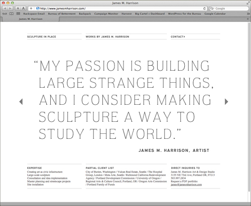
A small portfolio website I designed in collaboration with Studio Jelly recently launched for James Malbon Harrison, a sculpture artist and civic infrastructure expert. His work is simple and draws inspiration from pattern and relies on material use that hides the underlying structure.
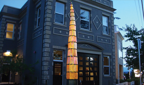

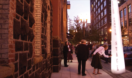
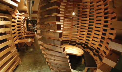
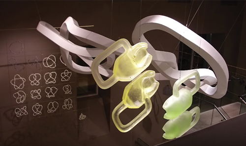
See the site at www.jamesmharrison.com.
Salad in a Jar
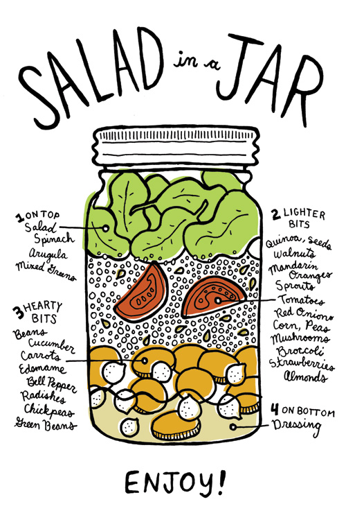
Well Vegan, the site I helped design and launch last month, is in full swing now. One of their most recent blog postings caught my eye as being handy, so we decided to use the content in a promotional postcard. “Salad in a Jar” is a practical, and very cute, way to build and transport a salad without having it turn into a mushy conglomerate of soggy vegetables. It’s all in the layering technique – check out Well Vegan’s blog post for the full instructions on how to construct this healthy lunch-on-the-go.
We Can Be Heroes
Welcome to the big leagues little rabbit. Last week both MTV and CNN reported on a project that I was lucky enough to work on for Warner Brothers/DC Comics while at Studio Jelly: a campaign titled We Can Be Heroes that was created to bring much needed relief to the Horn of Africa. The face of the campaign is not just one, but seven, superheroes. Together they comprise the Justice League, with each superhero representing a trait necessary for the triumph of good over evil.
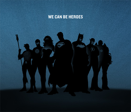
My role working for Studio Jelly was to help set the tone and create initial artwork for the print campaign, shown in the snapshot above. Striking a balance between comic book cool and a cause helping humanity was a good challenge, and I think the end result is both badass and respectful. A short video was also created, directed by Benjamin Reece with creative director Jelly Helm and writer Kathleen Lane. The girl in the red coat is basically me and every other pre-teen at that age, and we’ve been trying to make up for it ever since.
Thanks for having me, Studio Jelly. I also want to thank Aquaman, Green Lantern, Wonder Woman, Superman, Batman, The Flash, and Cyborg for standing so still for their group portrait. Barring one small kerfuffle when Superman stepped on Batman’s cape, their composure and professionalism was excellent.
Well Vegan (Hold the Pickled Herring)
The most recent project I’ve been working on, Well Vegan, just launched at the New Year. I enjoy eating healthy food frequently and on a regular basis, so when my friend Katie asked if I would help make it easier for vegans to do the same, I jumped on board. I’m not a vegan, but I have some vegan friends, and seeing some of them struggle with finding a variety of things to make that were also meeting their nutritional needs made this project hit close to home. Katie’s personal motivation to start Well Vegan stemmed from having her young daughter suffer from food allergies that were only ameliorated by switching to a vegan diet.
The first task was to create a logo for Well Vegan. After a short design brainstorm, the theme of “it’s in the greens” bubbled to the top, and resulted in a happy pea pod bursting with, well, veganism.
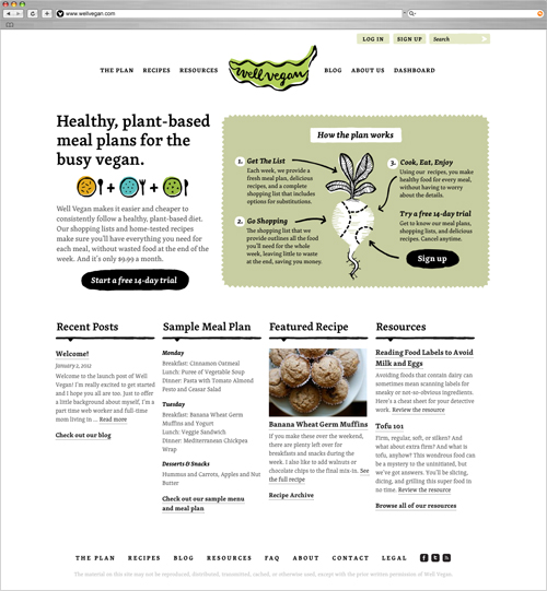
The second and main task was to design a website. Katie wanted the site to reflect her healthy, simple, and homespun take on veganism. Visually, this is reflected by using the approachable and versatile font Skolar alongside rough-edged and spare illustrations.
Basically, Well Vegan is a repository of vegan recipes that are partnered with shopping lists and weekly meal plans that take all the hassle out of planning how you are going to sustain yourself. Sure, some people take joy in shopping and figuring out each and every meal, but others just want to get the job done without spending hours poring over recipe books and making lists. Using Well Vegan for $9.99 a month gives you all the tools necessary for eating home-cooked meals most every day. And if that’s what it takes for some vegans to eat healthier on a regular basis, I’m all for it.
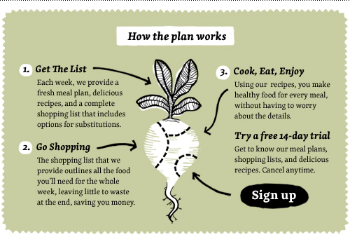
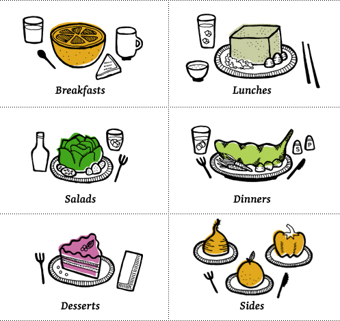
Some people might have the misconception that vegan food is bland, but with the right recipes it can be anything but. A series of illustrations were made to let the ingredients take center stage and focus on the uncomplicated nature of the vegan diet. I’m not sure eating a tofu cube that large is realistic, but it gets the point across! Send me some giant chopsticks and I’ll let you know how it goes.
I even got to use my new favorite phrase on the error screen, making this my favorite error screen second only to the consolation trout I made for Under the Table with Jen.

If you’re interested in checking out the site and what Well Vegan has to offer, visit www.wellvegan.com, or follow them on twitter at @wellvegan.
The Timbers Say Thanks
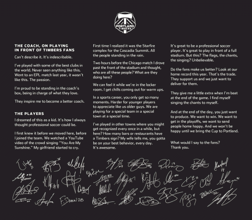
Here is a nice little ditty I worked on for the Portland Timbers soccer team thru Jelly Helm Studio. I’m not the biggest sports nut around, but I do appreciate the talent and dedication it takes to play a game well. The part that usually rubs me the wrong way is the untouchable icon status that sports figure often inhabit. As my dad would say, “They put their pants on the same way as you do, don’t they? One leg at a time?” Sure enough. So when I was working on this piece, I was pleased that the tribute giving was going both ways. YES, the players are fantastic. YES, the fans are also fantastic. THANK YOU to the whole Timbers community for being what you are, and for the exchange being two way, three way, four way, the best way.
Story Cards
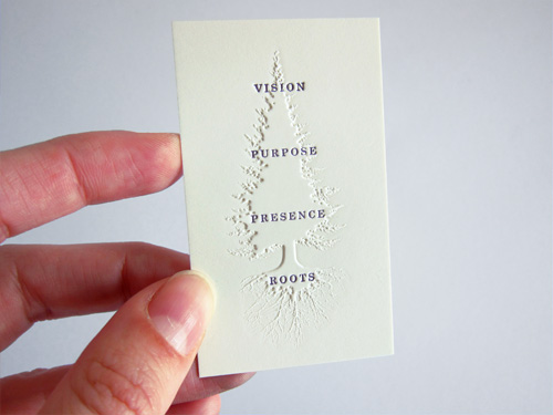
As a follow up to the business cards I designed for Jelly Helm Studio, here are some additional cards that show a little bit about how the studio approaches things. All of the cards were letter pressed on cream colored Neenah Classic Crest #165 cover.
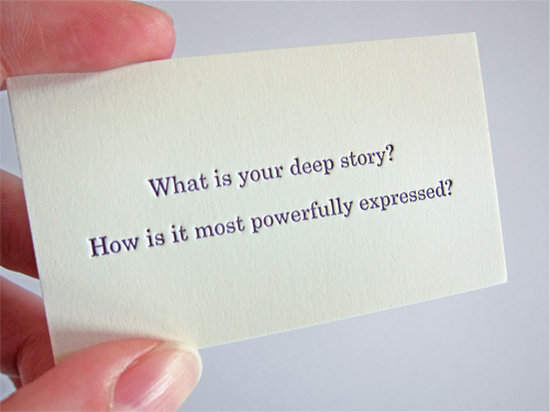
The cards were printed at Brown Printing, where they were very helpful in trying out an unusual combination of printing techniques: first embossing (raising) the paper in a tree shape, and then letter pressing text (pushing the paper down) on top of the tree shape. For all that pushing and pulling of paper with the text being pressed into both the tree and non-tree area, it turned out pretty well.
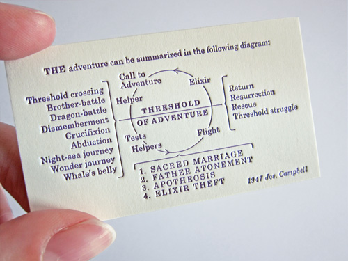
My favorite of the three cards is this reproduction of a diagram by Joseph Campbell. Wikipedia says “…his work is vast, covering many aspects of the human experience”. No small task to fit onto a 1.75×3 inch card, even with some rejiggering on our end so the large original diagram translated well to a tiny version of itself.
Keen “Green Thumb” Type
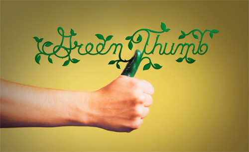
Here is the last of the type and illustration I did for some Keen videos for their Recess is Back site. The work was done through North, a local design/advertising agency. I am more of a black thumb, but I still enjoyed creating this vine-like typography.
Keen "Green Thumb" Type
Here is the last of the type and illustration I did for some Keen videos for their Recess is Back site. The work was done through North, a local design/advertising agency. I am more of a black thumb, but I still enjoyed creating this vine-like typography.

Calling Cards for the Digital Era
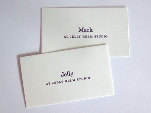
One of the projects I’ve worked on recently for Jelly Helm Studio was to design the studio’s business cards. Several ideas were sketched out (monograms, pop-up castles, and a series of tableaus, among others), but early in the brainstorming process we decided that simple was better. To support this direction, internet research turned up calling cards from way back when.
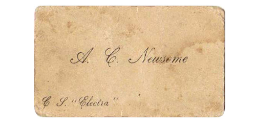
Most business cards from days of yore included only the person’s name. Additional notations on the card (in the lower corners) were left for specific reasons and were part of the intricate etiquette system surrounding the calling card, which are detailed in The Gentleman’s Guide to the Calling Card. We took the calling card structure and updated for the 21st century. Done and done.
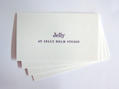
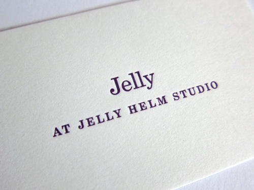
The smaller-than-usual cards were letterpress printed by Kyle van Horn of Baltimore Print Studios with a nice deep plum ink on French Muscletone Whip Cream. During the project, Kyle sent us this slip taped to a furniture cabinet at the Baltimore Print Studios.
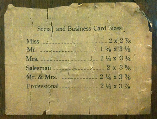
According to this, Jelly Helm’s business card size (1.75″ x 3″) is somewhere between a Miss and a Mister. According to me, it’s just the right size to carry the information on it.
