Here’s a sneak peek at a very large side project I’ve been working on for the past 5 months. Much more, coming soon!
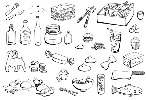
Here’s a sneak peek at a very large side project I’ve been working on for the past 5 months. Much more, coming soon!

The genesis of this project started quite a ways back, in ’05 or ’06 when Kyle Durrie took a letterpress class from me at the IPRC. I teach there frequently, so I see many students come and go with varying levels of interest in letterpressing. Many dabble a bit but never fully embrace the craft of it, which requires patience, skill and more patience. Kyle, however, decided to make it her mainstay and formed Power and Light Press.
A few years later we both became members of Em Space, a printing and book arts group. There I got to know her a bit better, her effervescent nature and gusto for everything letterpress. So I wasn’t surprised when she put up this Kickstarter video for her latest idea: building a mobile print shop and touring the US teaching letterpress.
The project got funded and I was thrilled to imagine Kyle in her trusty letterpress van on the open road, nothing but her and some moveable type. Wanting to get in on the action, I offered up my computer skills so she could have a logo and website to help make her adventure an even bigger success.
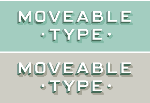
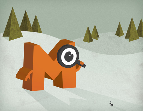
Kyle gave me some inspiration to start with, from which I made this hand drawn 3D type reminiscent of both old building signage and of those interchangeable letters that Gutenberg thought were a good idea. Turns out he was right.

Matthew Johnson also volunteered to help out by setting up a wordpress site that Kyle could update with the latest events from the road. Follow along on her adventures, see when she might stop by your town, or request a visit from one of Portland’s leading ladies of letterpress at www.type-truck.com!
I looooooooooove to work on food identity and packaging, so when Substance contacted me to help work on a new gelato product, I was psyched! Their long-time client Gelateria Naia was preparing to unveil a gelato in bar form, and needed branding to support their pilot efforts. While Substance managed the project, marketing and created the Bar Gelato website, I was focused on making a custom logotype and labels for their first run in stores.
After lots of sketching, we agreed a “just gelato” approach was best, using a simple and bold type treatment reminiscent of window signage. Orange worked two shifts as a bright and cheerful color that stood out against the bars while nodding to colors used in Naia’s branding.

To get into the gelato mindset wasn’t hard, as I often think of what’s for dessert after I’ve finished lunch. And I was in luck, because Naia had sent Substance a batch of sample gelato bars, which I nabbed six of for a personal tasting session. And thus began the Great Gelato Hoarding of 2011. Knowing that I only had a limited supply, each night I cut 1″ chunks off of each bar and then stapled shut the cellophane wrapper to keep it fresh for the next “serving”. Out of 6 bars, I made about 30 mini-desserts (except for the hazelnut bar which I ate in one sitting because I couldn’t help myself). These gelato bars are the most delicious thing I’ve tasted in a while!
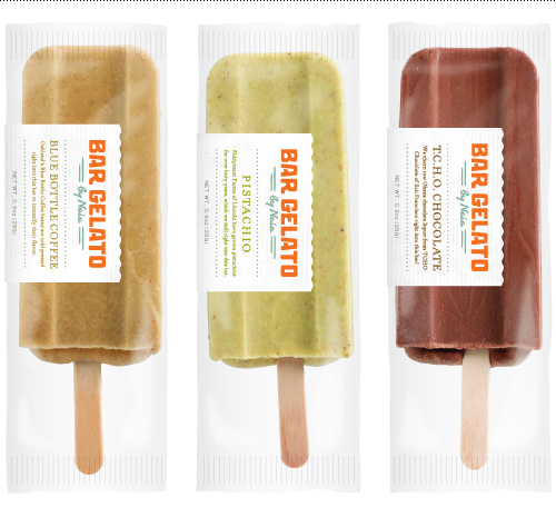
The first roll-out of Bar Gelato in San Francisco and other Central Coast California locations has gone very well, and I encourage any of you Californians to stop into a Whole Foods to try a bar or two. OR, buy some and put them in one of those styrofoam coolers made for shipping things like special Danish hotdogs or other perishables, and send them to me. I will take gooood care of them, I promise.
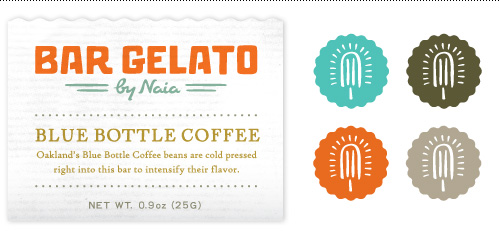
Thanks for having me, Substance…and to any other artisan food creators out there who provide samples to inspire their designers – bring it on!
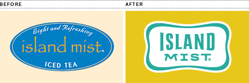
I’m excited to finally share a project I worked on at the beginning of 2011 for Boyds Coffee. The project entailed updating their logo and branding for Island Mist, a line of iced teas. Their previous logo used the font Papyrus, and the people at Boyds wanted to nix it…I felt like I had hit the designer jackpot! The new logo is a refined version using a “cool pool” border and some slightly retro island-inspired type.
Another portion of the project was to create flavor labels for dispensers in restaurants and convenience stores. Most of the competition used giant images of iced tea in a glass, usually splashing out of it with lots of ice everywhere. It kind of looked like watered down coke. It’s my belief that you don’t always have to SHOW people watered down coke to make them want iced tea. So for Island Mist’s new dispenser wraps we chose the next closest thing to induce thirst: a series of summer beach illustrations.
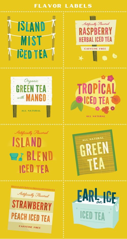
A bevy of spot illustrations were also created to populate the wraps and be used in various point-of-sale and marketing materials. Here are a few of them…
Recently I had the opportunity to spend a few days with Jelly Helm Studio working on two giant fan murals for the Portland Timbers. You’ve probably seen the official billboards and branding around town, and soon there will be a billboard featuring four fans chosen through popular vote by the general public.
When the namesake of the studio first told me about the project I had about 3,817 internal conniption fits thinking about the size of file it would generate, and then got down to it. Which meant placing photos of 1,200 soccer fans into two 10×15 foot and 7×21 foot murals.
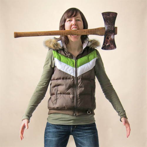
To get into the right mindset, I wore my Timbers-themed outfit, held my own miniature photo shoot and did my best impersonation of a sports fan.
After spending a fair bit of time with the fan photos, the giant grid of Timbers support began to grow on me. I’m not a sports nut, but seeing the range of soccer enthusiasts, from grizzled grandpas to sweet little girls, showed off one of the better sides of sporting culture – solidarity. Here are a few of my favorites… Continue reading “Calling All Timbers Fans!”
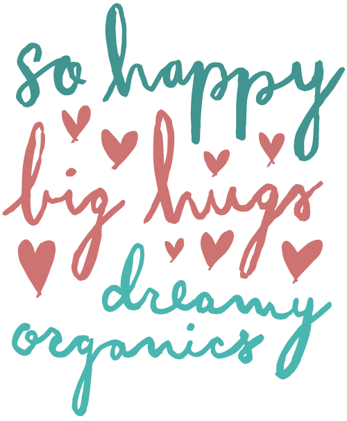
A few months ago I did some lettering for Hanna Andersson’s spring catalog and retail environments. In their own words, “Hanna Andersson makes soft, quality basics inspired by our Swedish heritage”…and some rad striped pajamas in sizes for the whole family!
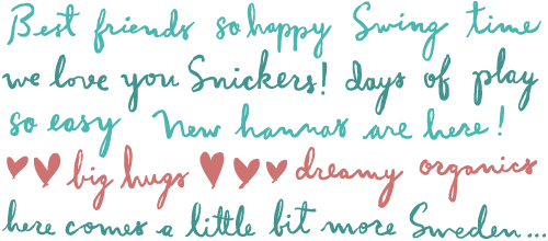
The client wanted a playful messy script that didn’t look like a font. I always enjoy working with custom type and letters, so this project was right up my alley. After completing the phrases using a brush pen, they were traced so they could be used at a large scale in-store.
You never know what job will come your way next as a free-agent designer. Case in point: drawing a cow (I really mean steer) diagram for Feel Good Anyway’s IFC promo for SXSW (appears at the 30 second mark).
This short stint of steer-drawing took me back to my childhood because I grew up in Steer Country. Every summer we would spend endless days near Grass Valley, Oregon on our friend’s farm for the annual castration/innoculation/slaughter. We played in the hay barn, took Bubba the lab with us into the hills to sic rattlers, counted how many young calves got their nuts cut off, and hand-ground pounds and pounds of beef for the year ahead.
Enough reminiscing; check out more of Feel Good Anyway’s work for the Independent Film Channel – it’s good entertainment from some very talented dudes.
At the end of last year I was lucky enough to help create branding for an idea called Mister Museum. Sometimes when a new client crosses your path, you just KNOW it was meant to be. Here is a stylized version of the Bureau’s first meeting with the man behind Mister Museum.
MM:
BB:
MM:
BB:
MM:
BB:
As you can see, I was psyched to help build a voice for such an interesting client. We decided a logo, website and e-newsletter were the best things to start Mister Museum off on the right foot. So, I got to work. I started with a typical brainstorming exercise, the word cluster, a very useful tool in case you get stuck in a creative fire swamp. Continue reading “Mister Museum, The Debut and Making Of”
In September I landed one of the larger projects I’ve tackled since going solo – branding and packaging for a start-up Hawaiian gift company. I love to work on packaging, especially if it is food related, so this was a great gig. Unfortunately, due to a macadamia drought, the packaging component was put on hold midway through the project. Major bummer! Designers get used to strange things derailing projects, but I never imagined a nut shortage would be one of those things.
Nuts or no nuts, the client still needed a logo and website, so I finished up those elements while we waited for the macadamias to make a comeback (still waiting).

I created a straightforward logotype with tone-on-tone sky and surf colors, intentionally steering clear of the clichéd palm trees and hula girls that adorn many a Hawaiian logo. The logo needed to be used in various situations, so a few options were created to accommodate different uses. Continue reading “Kahuna Gift Company Logo”
Did I ever mention that I like to eat? It comes up every once in a while, so I thought I’d share a compilation of all the illustrations I did for “Under the Table with Jen”, an online compendium of all the best places to eat in Portland, Oregon. Check out the site at www.underthetablewithjen.com.
