Naia Gelato Cup Packaging


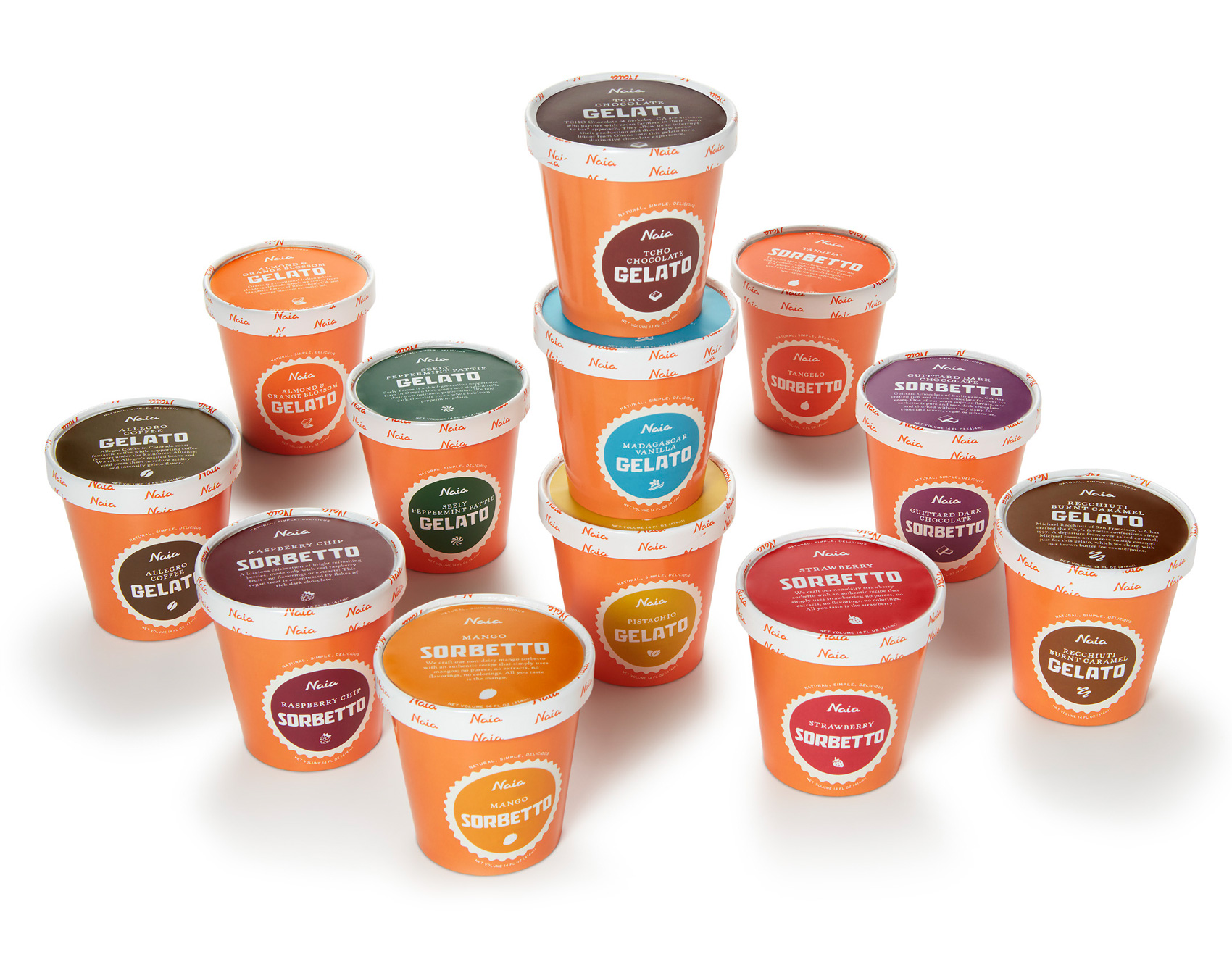
Long term client and collaborator, Gelateria Naia, has extended their gelato and sorbetto into a new format – the 14oz small tub. On this project, their signature orange was used as a background for the color-coding used on each flavor. Presented mostly in a top down freezer in grab-and-go areas, having a strong color presence on the lid was integral.
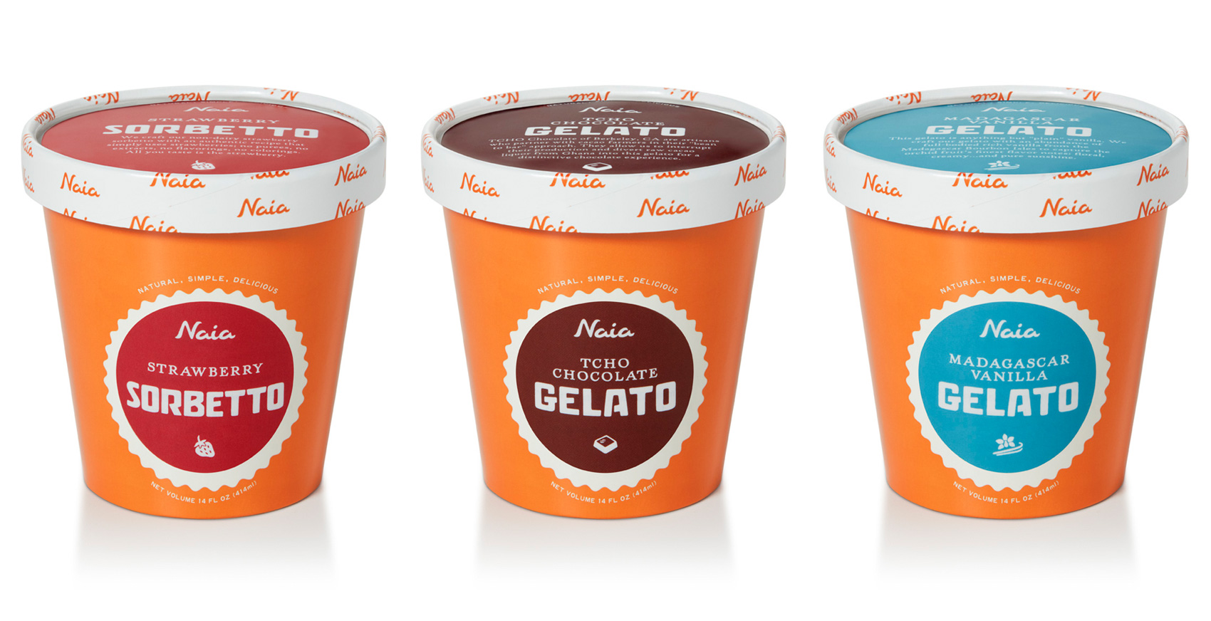
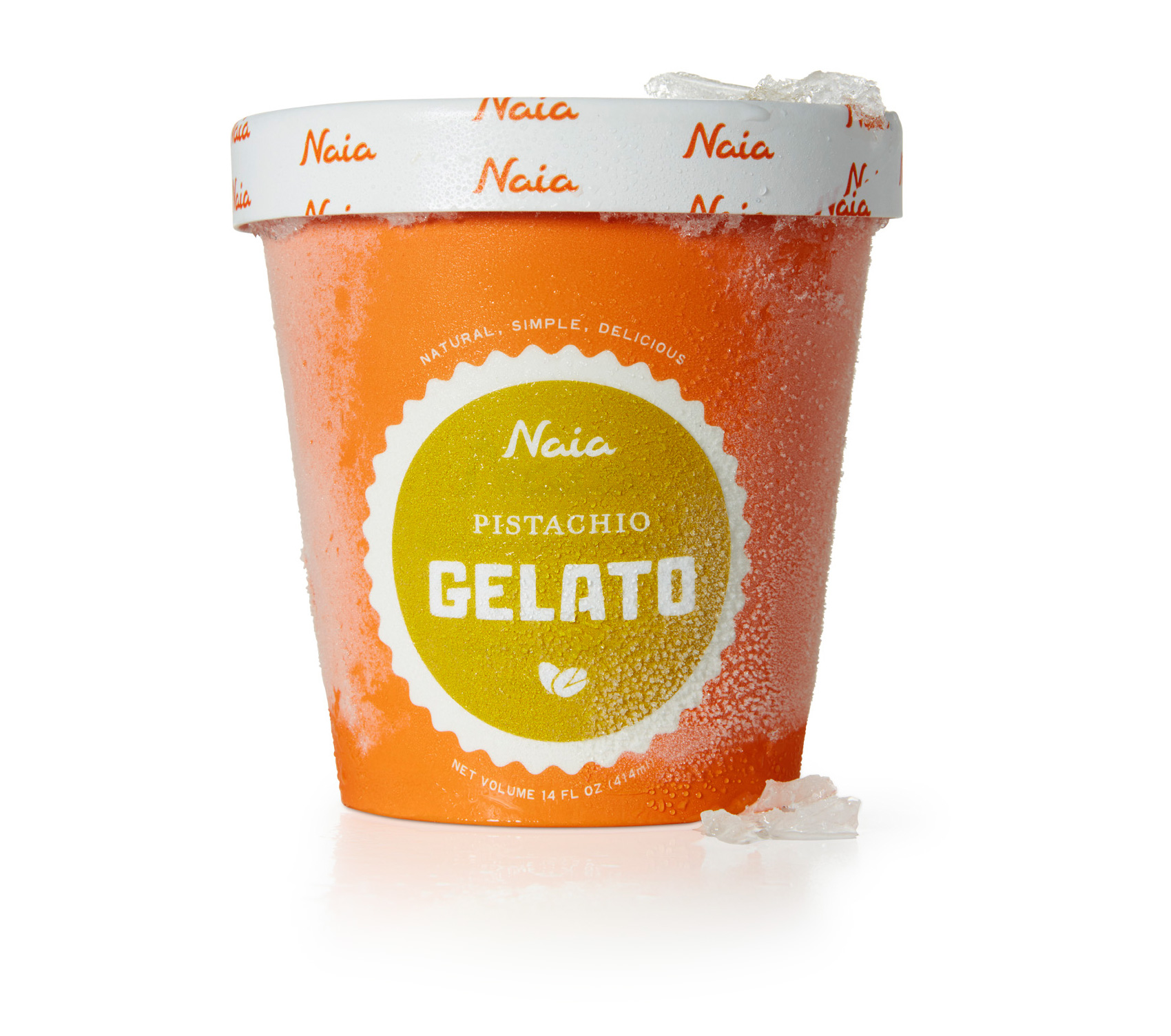
A major update / minor evolution to this brand was shifting their name on the packaging from Bar Gelato by Naia (also their namesake and inaugural product) to just Naia. Originally Bar Gelato made sense because it was their only product. However with the addition of sorbetto to the line-up, food regulations and approval got trickier with how the brand name only accurately described part of their product line. With this most recent packaging, Naia takes the lead as the brand name, and sorbetto and gelato can be used as the product identifier. Hierarchy on packages is critical for both the consumer, stocker, and fulfilling legal requirements. Pistachio is shown here because it’s my favorite flavor.
From a production standpoint, the cup was designed to be a standard issue brand orange with universal information, with a white scalloped template area into which a circular sticker could be placed to differentiate flavor. This type of design works well for product lines where it is hard to predict exact quantities of specific flavors, where flexibility in quantity/distribution of flavors is key, and when very small runs of speciality flavors are common. Naia often produces seasonal or specialty flavors, always experimenting with local producers to find nuanced and specific flavors. The rim of the cup was also a universally produced element, while the top of the lid was custom to each flavor.
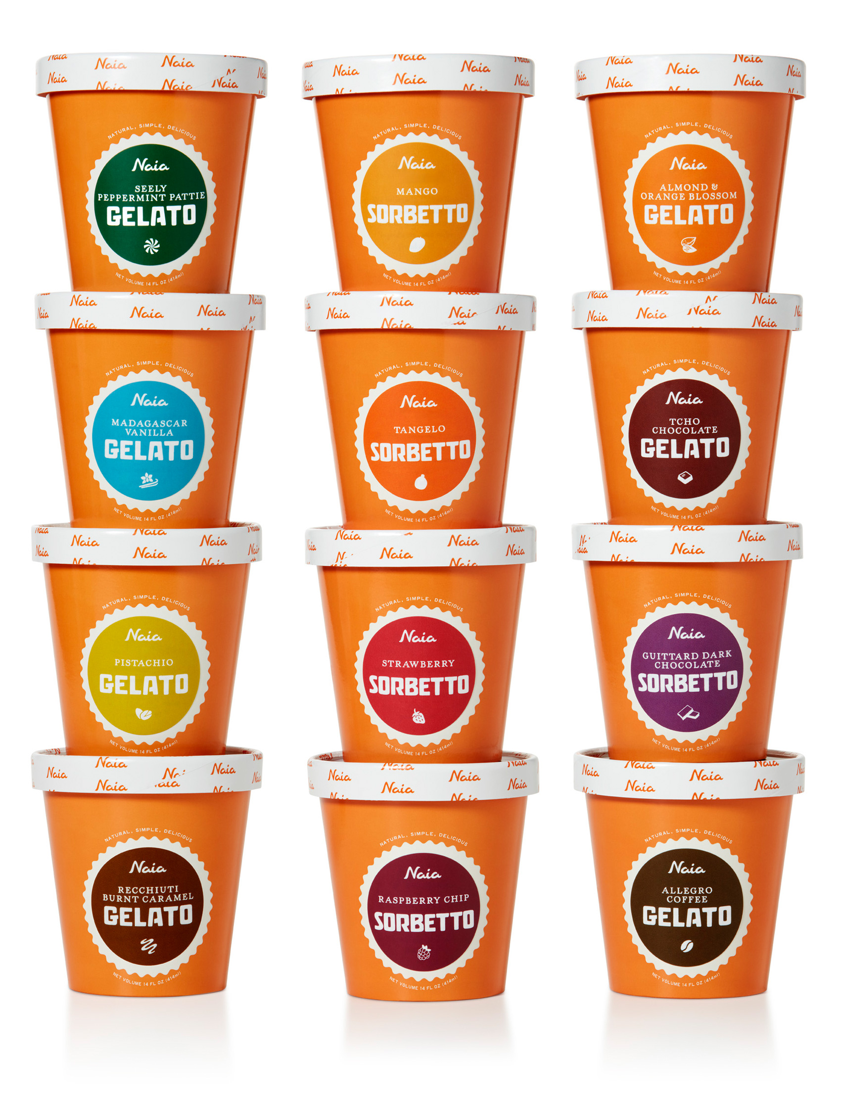
A series of icons associated with each flavor has been used across many of Naia’s products, so they were employed again to provide a subtle indicator of the simple and pure ingredients. The custom lettered blocky font previously used in the logotype is now the headliner, providing some visual crossover recognition, as consumers were used to seeing BAR GELATO large and in charge on the previous packaging. And now, for a National Geographic-esque photo of a herd of gelato/sorbetto migrating across the icy plains of your nearest Whole Foods freezer case.
Tofurky Lettering


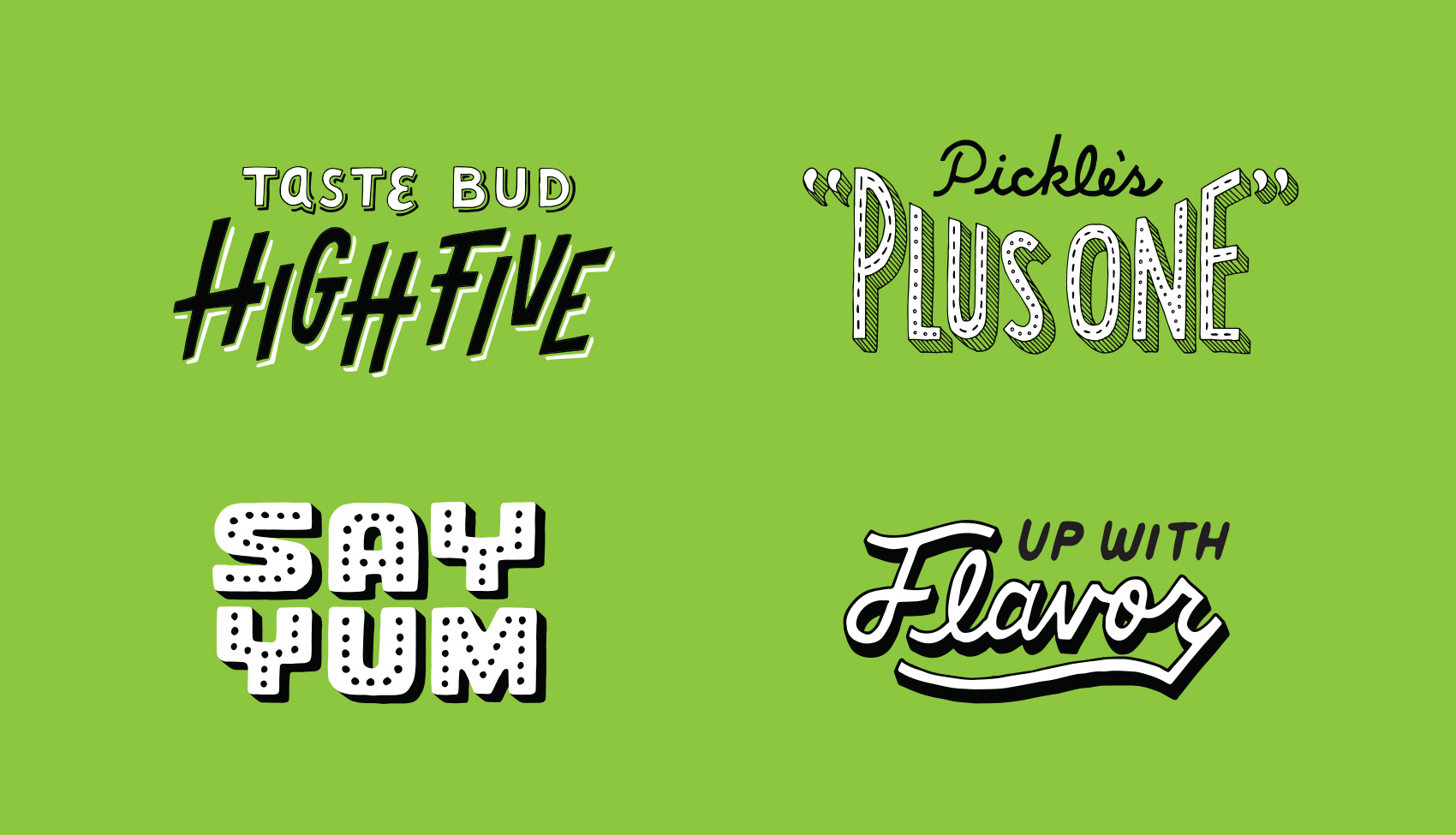
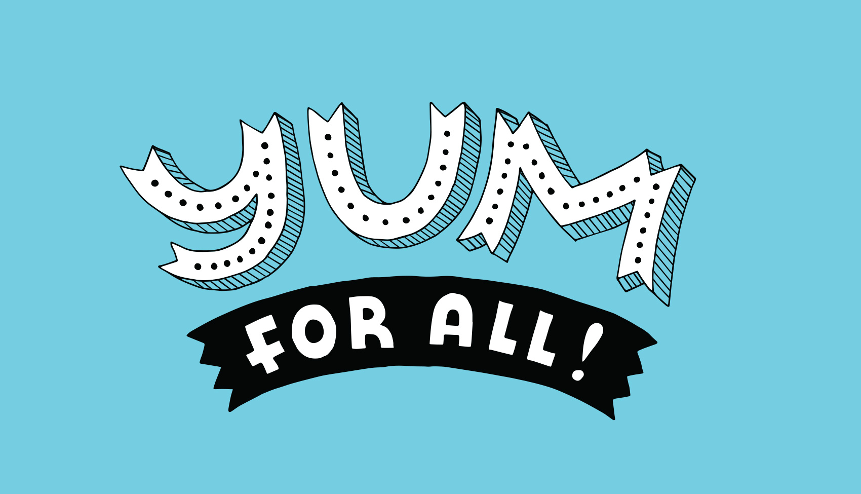
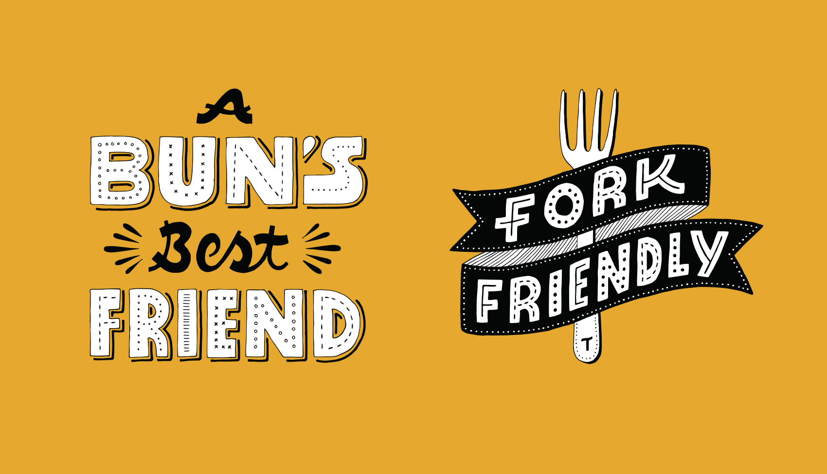
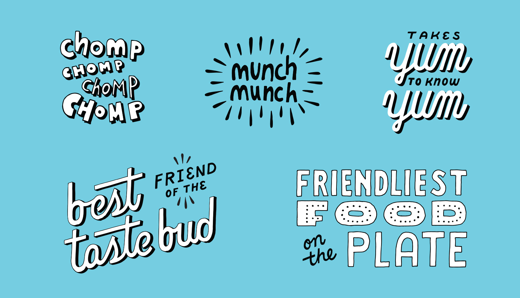
After the first round of brand lettering done in 2016 went over well and was used extensively, Tofurky requested another batch of phrases to be illustrated to build out their brand assets even further. While a variety of lettering styles is represented, two main goals of this series was to have some consistent details throughout and have each phrase take up about the same proportion of space so they were easy to use in groups or in similar areas of packaging, POS, and other areas of branding.

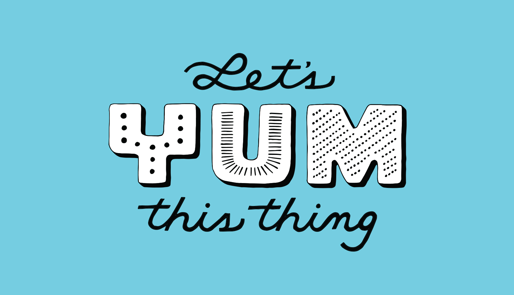
Let's Yum This Thing - rallying cry in hand lettered typography for Tofurky.
Quartet of hand lettered phrases: taste bud high five, pickle's plus one, say yum, and up with flavor.
Yum For All hand lettering.
A Bun's Best Friend and Fork Friendly banner hand lettered phrases.
Small hand lettering bits and pieces: chomp chomp chomp, munch munch, takes yum to know yum, best friend of the tastebud, and friendliest food on the plate.

Born to Bake Book Cover


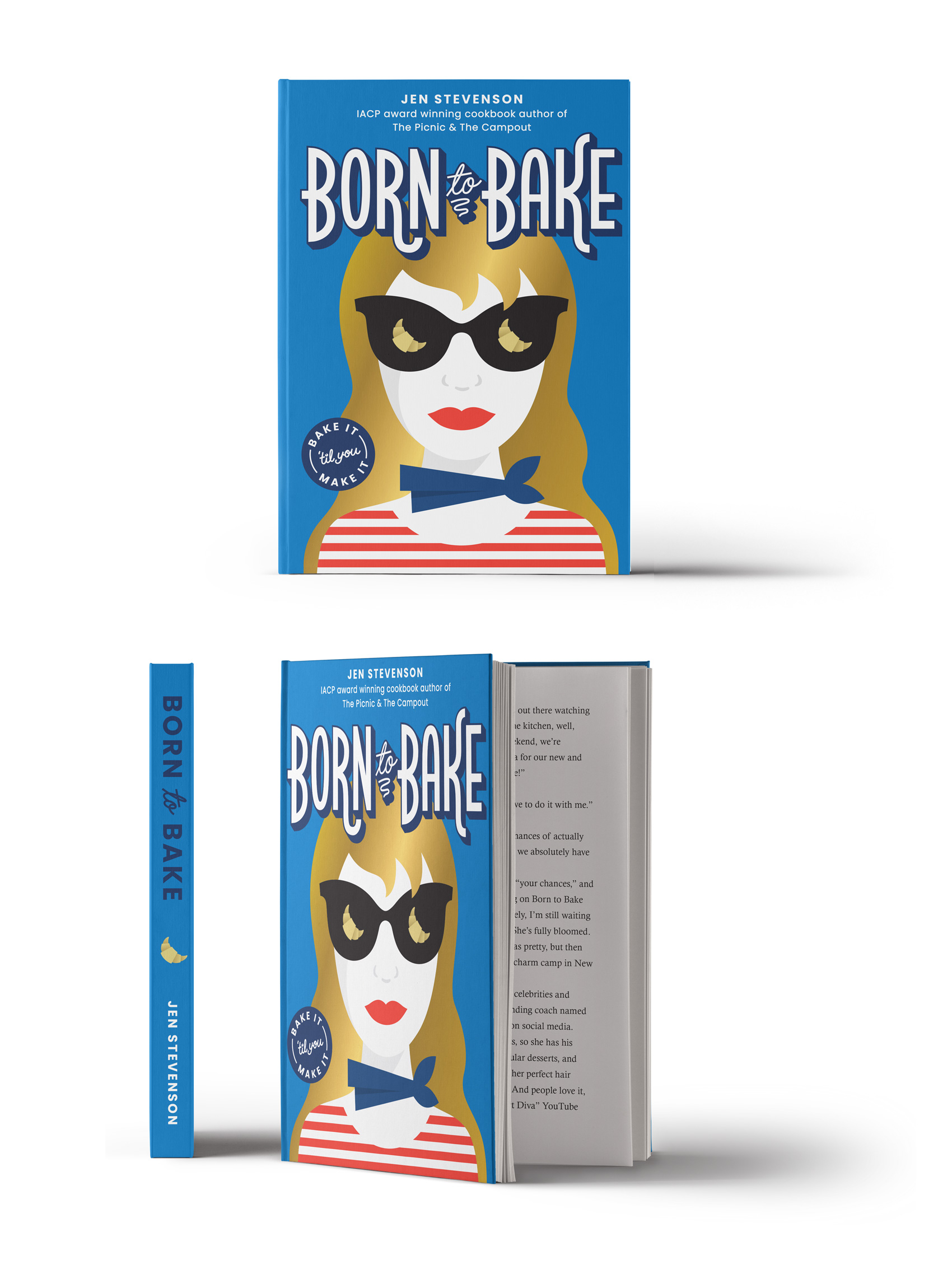
Over the years I have done many projects and non-projects with my intrepid foodie friend, Jen Stevenson. From her first guidebook and blog, to watching her become an award winning author for The Picnic and The Campout, we have eaten our way through a decade of friendship.

On the side, Jen churns out young adult literature and publishes them as e-books – the latest being Born to Bake, a story about a teen who enters a baking competition to earn money to go to culinary school in France. To add another book collaboration under our belts, I created the cover for it. Bake it ’til you make it!

Chocolate Wafer Concept Packaging


One of my favorite types of design projects is packaging – specifically food packaging. It is also one of the more fickle types of projects. Sometimes products miss their window of opportunity, sometimes start-ups aren’t able to get an investor to put the product on shelves, sometimes budgets fall through or a product line is re-oriented. Specialty products are sometimes explored up until launch, at which point they are deemed unviable. Once an entire project was derailed due to a macadamia nut shortage. You just can’t plan ahead for these kinds of things!

Because of this, I have worked on almost as many packaging projects that have been shelved than have actually reached shelves. Gelateria Naia is my one exceptional client that has taken every product I’ve worked on to market (see a few projects here and here, with more in the works!). Even the packaging projects that make it to market often take a YEAR OR TWO between packaging design and hitting shelves. This is like 1,948,465 years in “designer years” – it’s definitely not an exercise in instant gratification.

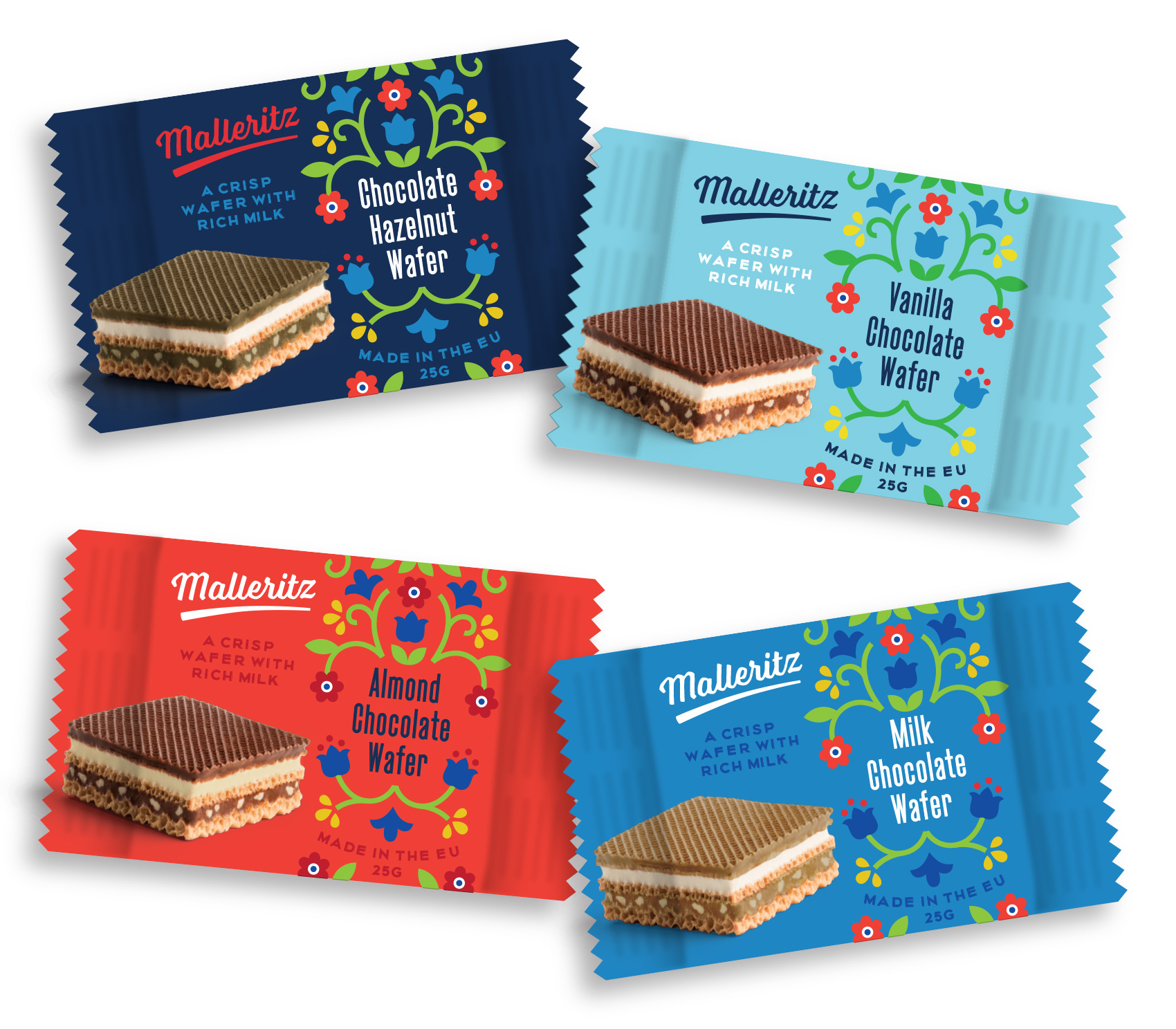
Last year I worked on chocolate wafer packaging for a company that packages US and European products for the Chinese market. Because of quality perception and some food scares, the design brief presented an interesting mix of designing in a way the Chinese market was used to (bold, zingy, pop!) while making the product look and feel European-based. Unfortunately the project was put on hold, but I wanted to share a direction from the initial design round (with a placeholder product name). A more traditional approach was selected as the final, where I got to practice drawing the Swiss Alps and milk splashes, but is not shown here because it hasn’t been released. So while not everything makes it to market, it doesn’t mean it isn’t sweet!

Concept packaging for chocolate wafers in four flavor ways: chocolate, vanilla, milk chocolate, and hazelnut. Illustration in a modern style but with traditional European motifs.

Concept Illustrations


Most projects I work on have piles and piles of unused work that don’t make it past the concept phase. This gets archived and usually never looked at again, unless I have a future project where I can use it as reference. Some of this backlog of work reminds me of all the times I tried something new or different, only to have the client choose a style that was safe or most matched my portfolio. Sometimes I’ll take rejects and rework them for my own personal edification. Mostly they languish…unless I post them on my blog!

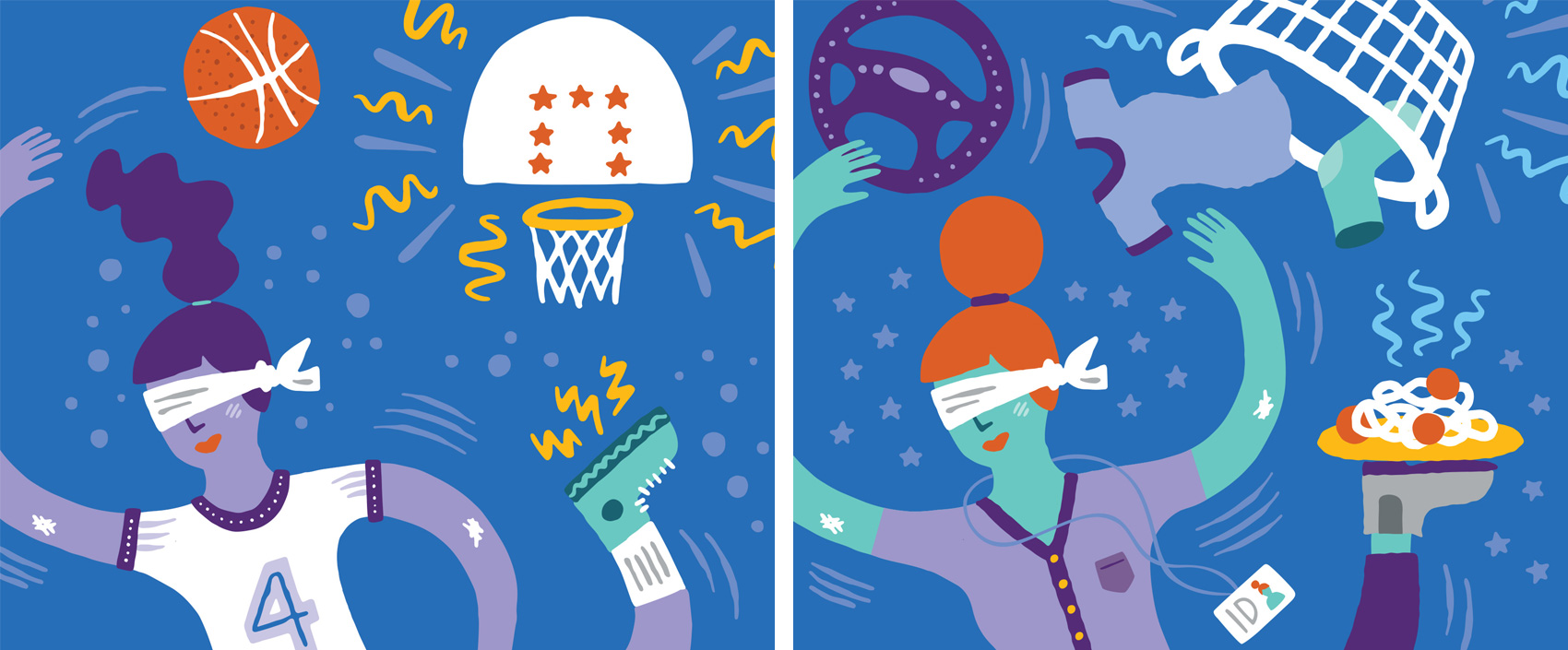
Here are two images created for a campaign targeting both parents and teens on the same subject matter, with the headline “You got this”. This direction didn’t make the cut during an A/B social media test, in which some of the feedback was so cutting you’d wonder if people would say this to you in person. Some of the best outtakes went something like this “I hate this so much I want to look away”, “This is ugly. It looks like a child made it”, and “Pointless. Stupid”. The chosen direction (not shown) had similarly scathing comments (of course in conjunction with perfectly neutral and positive comments). Can’t please everybody!

Illustration of a teenage girl tossing a basketball into a hoop. // Illustration of a mom tossing clothes into a laundry basket

Code/Art Participant Pins


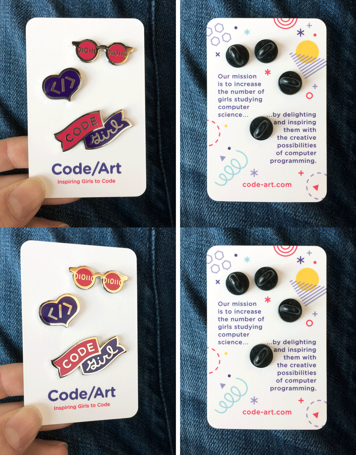
Woohoo! To follow up on the Code/Art donor pin from last month, I’m happy to share a series of three pins designed for Code/Art participants – girls in their tweens and teens who explore code through art & creativity in guided Code/Art workshops. I had my own button and pin collection in my younger years (read: 1985-1990) so working on this series was flashback fun. Plus any time I can work with an organization that helps girls GO FOR IT, it’s all I can do not to hire a skywriter.

enamel pins for girls who code - a "code girl" banner, </> heart, and code sunglasses

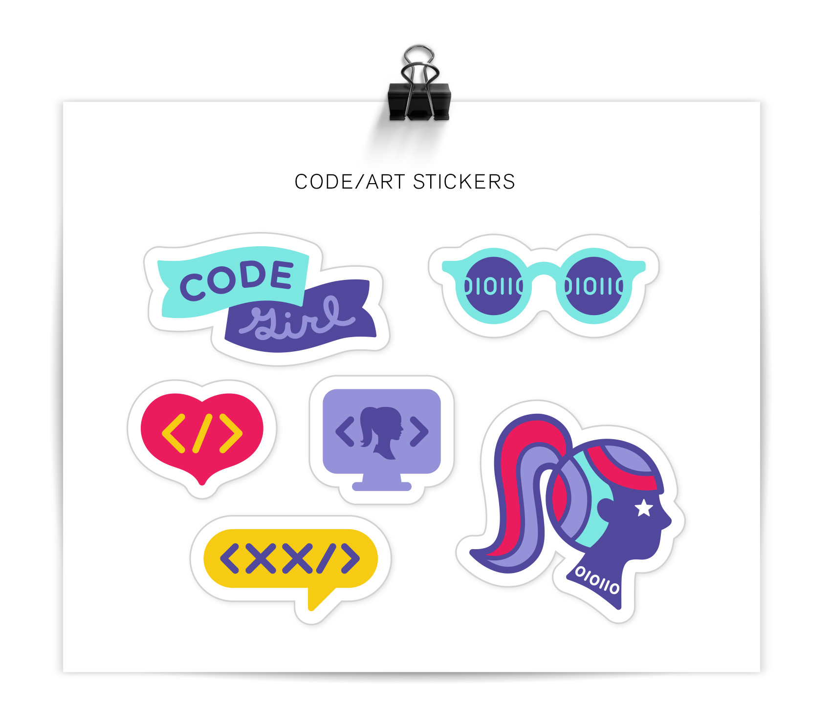
MOO cards has been a steady companion of mine to provide pin backers that are sturdy and good looking, and this time was no exception. Along with the pins, participants also get stickers to kit out their computers, peechees (do those even exist anymore??), or other flat surfaces. The style and colors were derived from their core brand, but the project had lots of room for exploration. Read more about Code/Art on their website.

stickers for code/art girls including "code girl" banner, code sunglasses, </> heart, <xx/> and code girl brooch

Code-Art Donor Pin


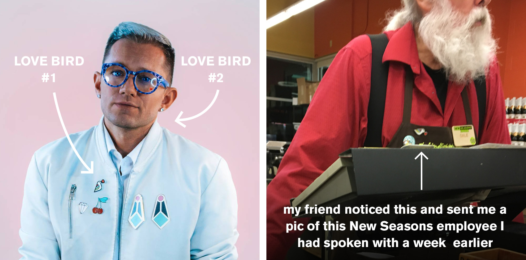
Last year I checked off a designer to-do by creating an enamel pin for a Design Week Portland event called Pin That Shit. After the show, the extra pins I had ordered were given out to people as both business cards and old fashioned goodwill. As with many side projects created Just for Fun®, people took to it – from Sparkle Daddy Aaron Rayburn to an employee at New Season’s who engaged my 3-year old daughter in a discussion about art while he checked our groceries. Love Birds for everyone!

love bird pin in the wild

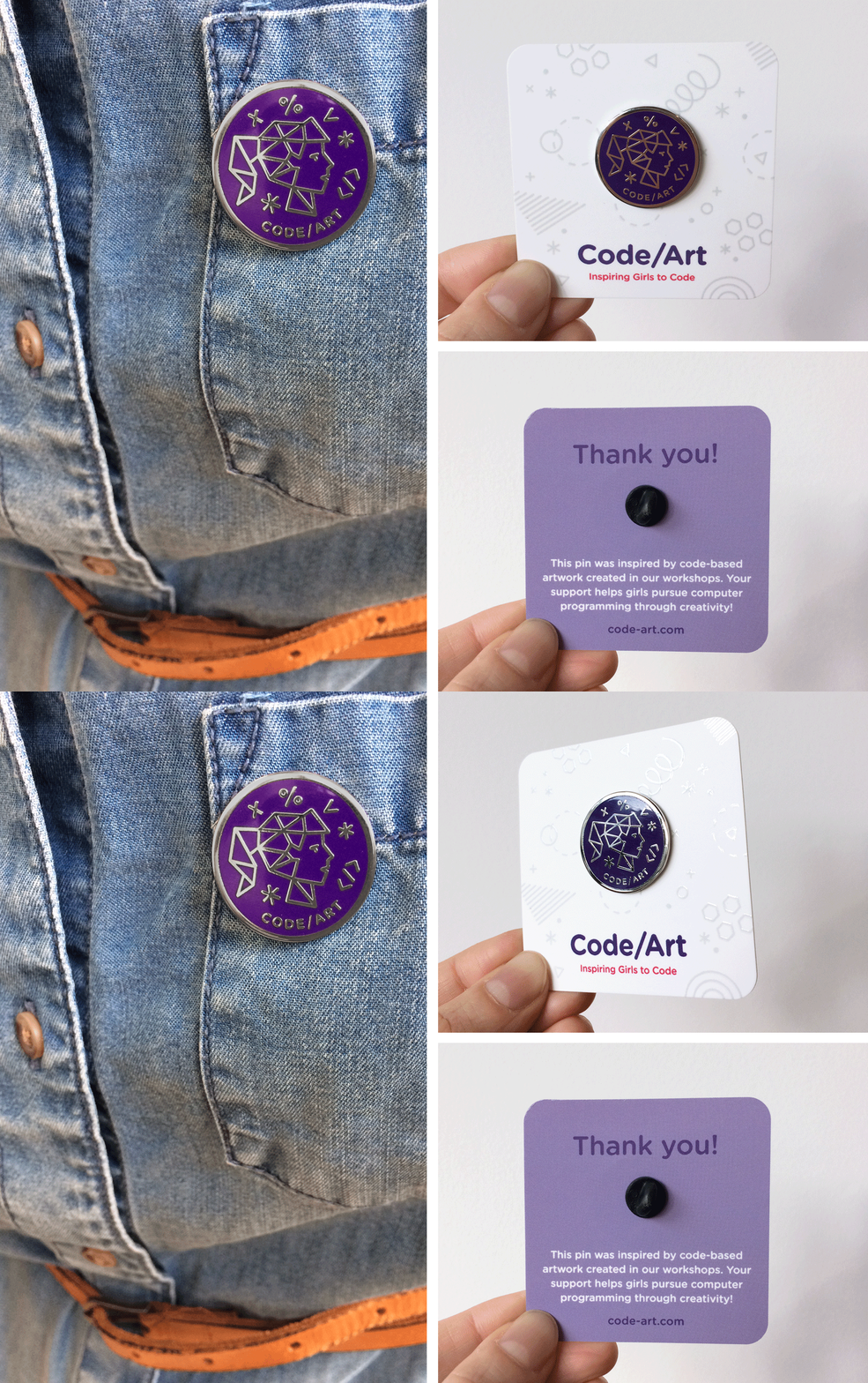
After a Moo Card blog post including my Love Bird was published, future client Amy Renshaw reached out to me about designing a series of pins for her organization Code-Art. Code-Art encourages girls to explore coding through art, and puts on workshops to give girls the opportunity to learn coding within their own interest areas. HIGH FIVE Amy. The first of many pins I designed for Code-Art was a donor pin to gift to supporters of her organization. Inspired by projects made in Code-Art workshops, it is a modern twist on the classic brooch portrait. We used Moo Cards again to create the pin backer with matching spot gloss accents. SO SHINY.

code art girls coding camp enamel pin

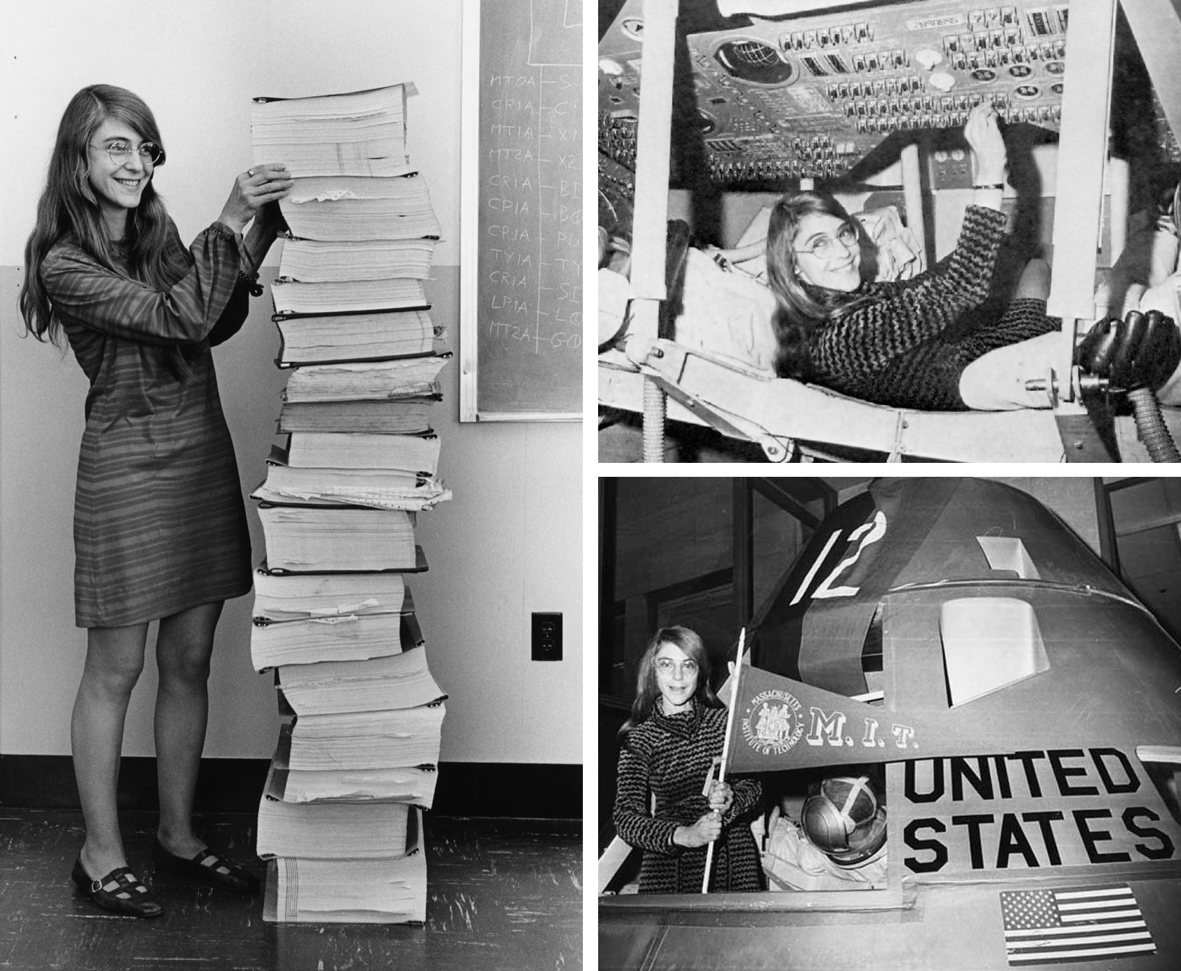
The theme of being a pioneer, present in many of my side projects, drew me to this organization and especially reading the stories of early female coders who led the way in the field, such as Margaret Hamilton and Ada, Countess of Lovelace who is often recognized as the first computer programmer. Margaret was instrumental in the code for putting a man on the moon. GO MARGARET! Reading their stories and seeing the photos (below Margaret stands next to a stack of code used in the Apollo mission) makes me both proud and frustrated at the pace of the representation of women in so many roles of society.

Amongst many other things, these stories made me want to support Amy and Code-Art’s mission to the umpteenth degree. And if you’d also like to support or donate to CodeArt find more information here. As a registered nonprofit 501(c)(3) all donations are tax deductible.

three photos of female coder Margaret Hamilton who worked for Nasa and helped with the Apollo mission

Olympia Provisions Holiday Card + 10% off


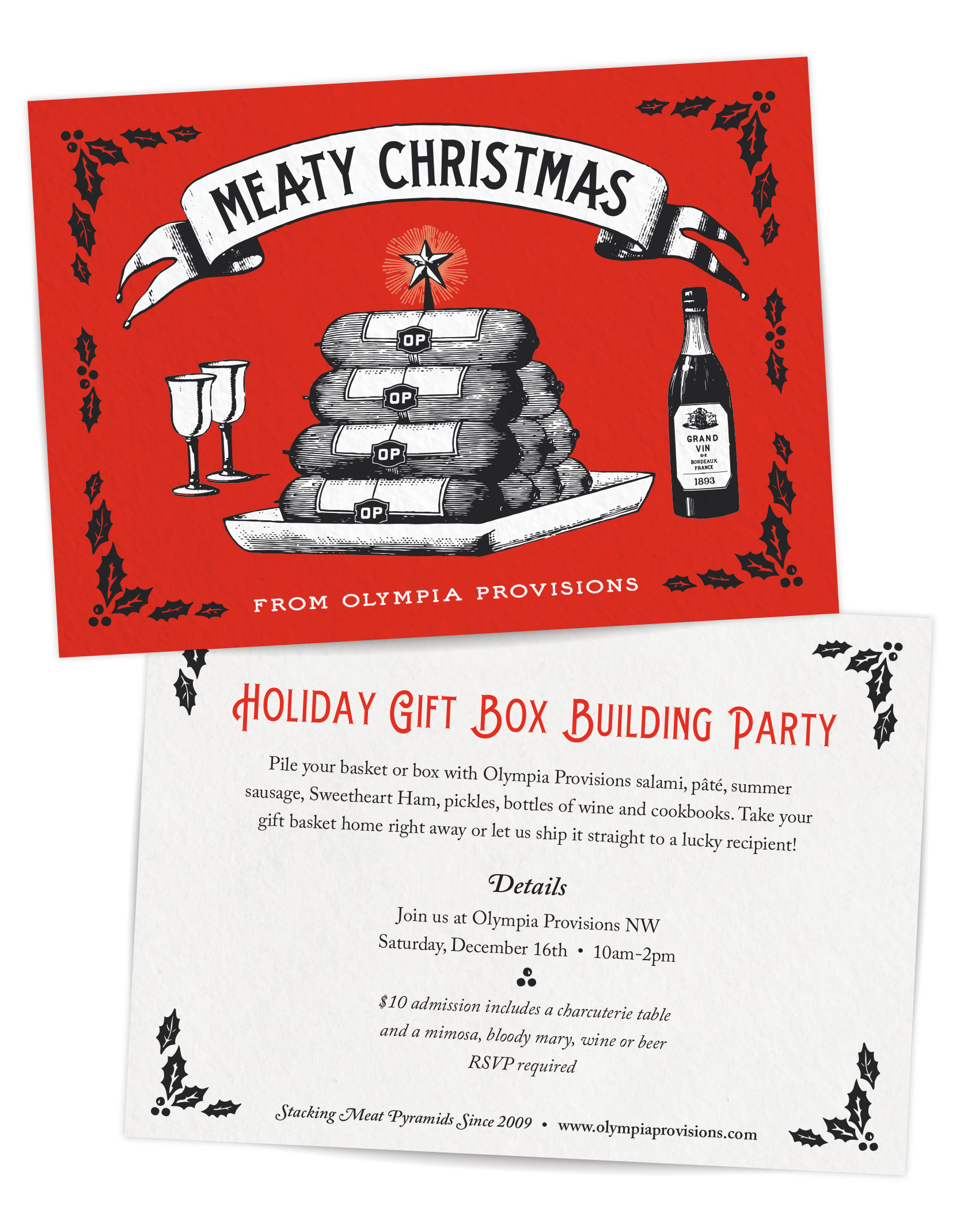
Tis the season for holiday cards and charcuterie. Following up on last year’s meat wreath, this year my client Olympia Provisions went for a more pyramid shaped meat art for their annual card – a stack of charcuterie bedecked with a merry star. Meaty Christmas!

Christmas pyramid of charcuterie - probably salami - from Olympia Provisions 2018 holiday card design.

On another holiday note, Olympia Provisions is hosting their second annual charcuterie box building party. Get your tickets here if you want to fill your own box or basket with meats galore and either take it home or send it to a lucky recipient.

MORE Deals! Deals! Deals!
Enter METTERULES as a promo code for 10% off online at Olympia Provisions.

Bonne Maman Advent Calendar Packaging


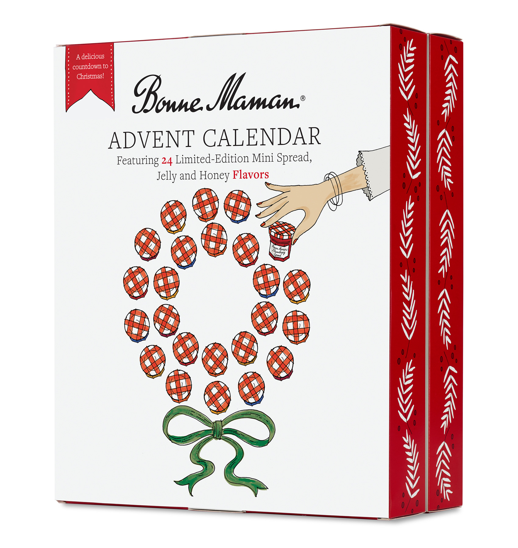
Front of box for the Bonne Maman advent calendar features a wreath of mini-jars of preserves  with the classic red and white checkered lid, one being plucked for enjoyment.

As a part-time Dane, I love a good advent calendar as part of my Christmas celebrations (read how Danes do xmas here). So when I got the opportunity to design and illustrate the annual advent of mini-preserves and jellies for Bonne Maman, I signed up faster than a sweet tooth gets a cavity. After a brainstorming round with several ideas presented, the concept of a wreath shape of 24 tiny Bonne Maman jars fit the bill by communicating “advent calendar” and being a simple holiday visual that was good for both distance viewing and close-up inspection.

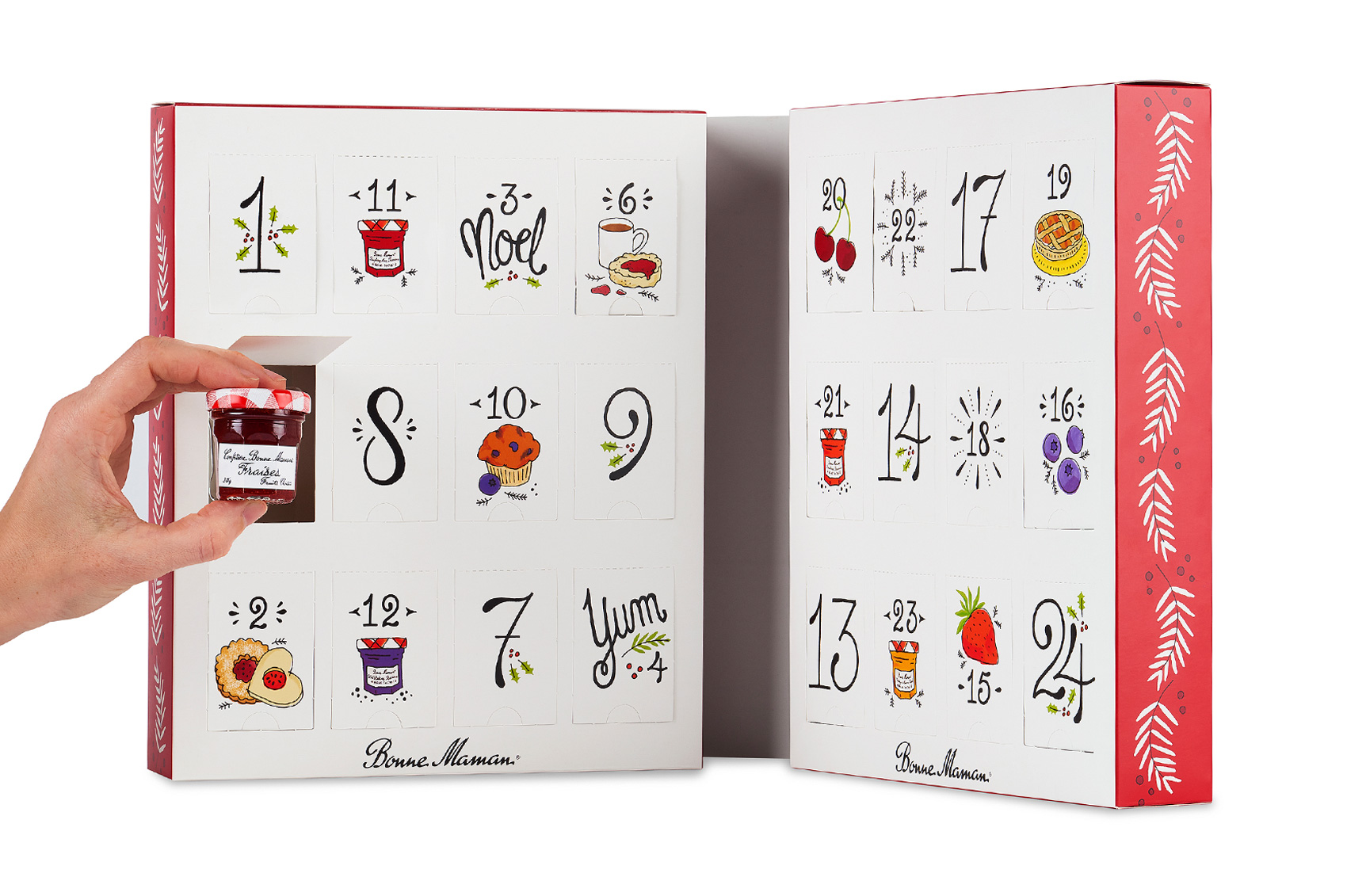
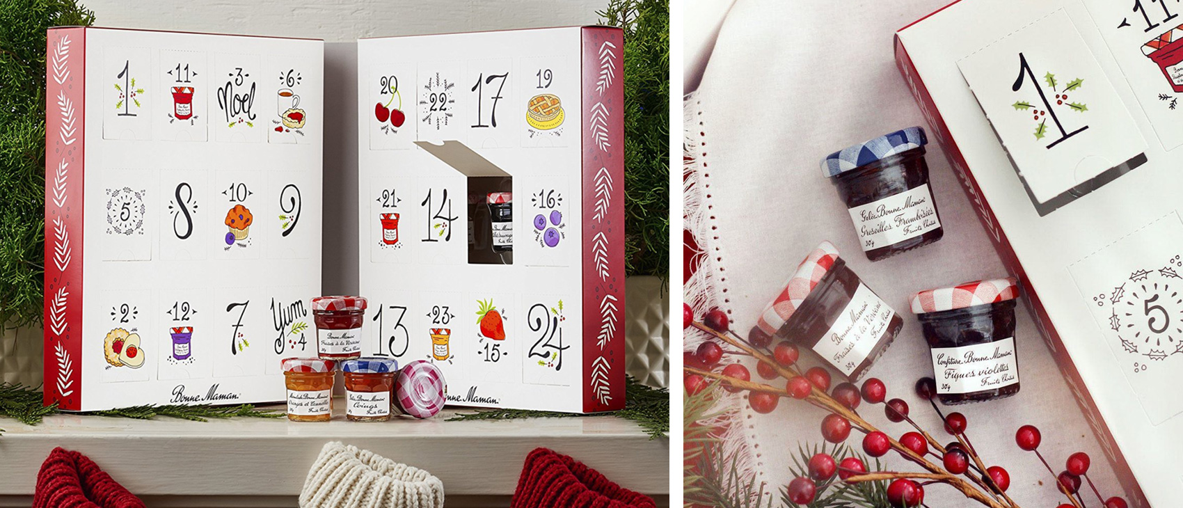
Inside of box for Bonne Maman advent calendar with custom illustration and french-inspired hand lettered numerals, full of holiday cheer - sprigs of holly, bursts and sweet treats.

This project was fun for a few reasons, only of them being drawing teeny tiny jam jars (actually preserves, but I like the sound of jam better). The project was contracted through R/West, a Portland-founded ad agency whose creative director happened to give me my first real design job. Back in the mid-2000’s I worked with Elizabeth Morrow McKenzie when she ran her own studio, and she gave me my first introduction to packaging, hand crafted lettering and so many other firsts that are invaluable when getting started in your career (and especially important if you didn’t go to art or design school like myself).

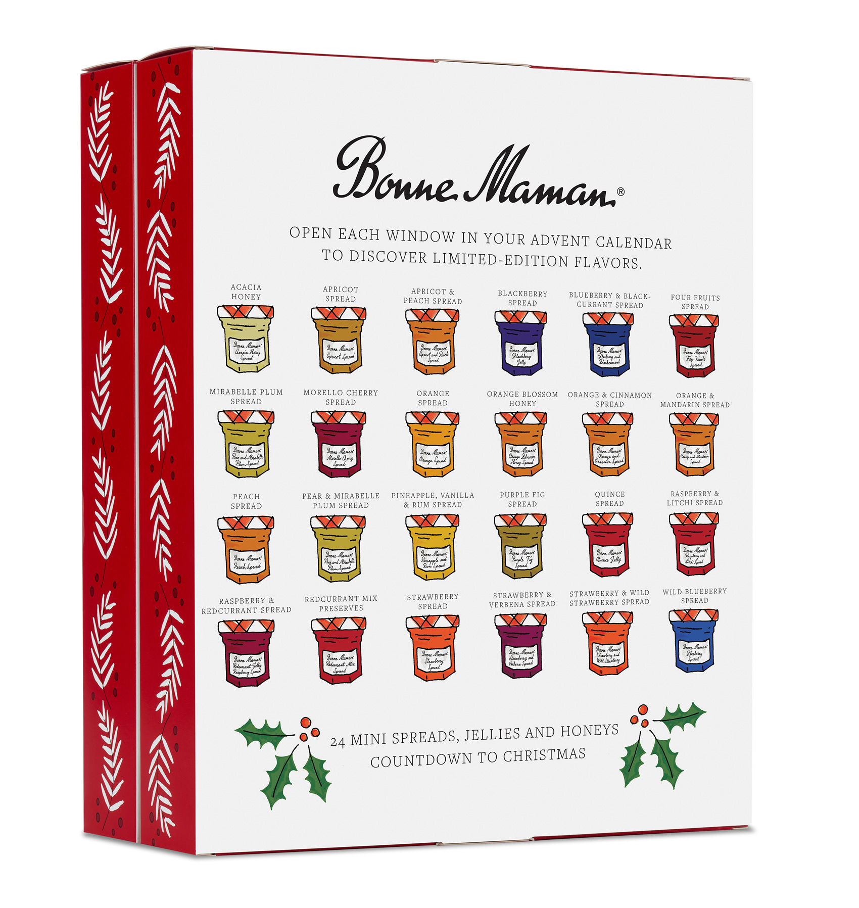
Back of box packaging for the Bonne Maman advent calendar shows all 24 mini jars of jellies, spreads and honey.

The project was a quicky, the kind of “blink twice and it’s over” gig. But when all is said and done time always flies for me when I’m lettering Frenchy numerals or drawing muffins. Built primarily for sale in Costco, the box opens up to reveal the 24 doors that house miniature jars for each day leading up to Christmas. The box is wrapped in a sleeve that is more minimal than the inner packaging and contains all the fine print and nutritional information. Presented in stacks of large cardboard trays, the primary visuals needed to be Christmasy from a distance.

The Bonne Maman advent calendar is so festive you want to put it on your mantle!

I was going to put a bunch of FOR SALE links so everyone could buy this for their mom/cousin/sister/co-worker but the advent calendar was so popular it SOLD OUT. Sorry, nothing available at Amazon, Costco, World Market…anywhere. Instead, here are a few extra illustration excerpts from the project…and yes, I did hand-letter every single label individually in tiny Bonne Maman script.

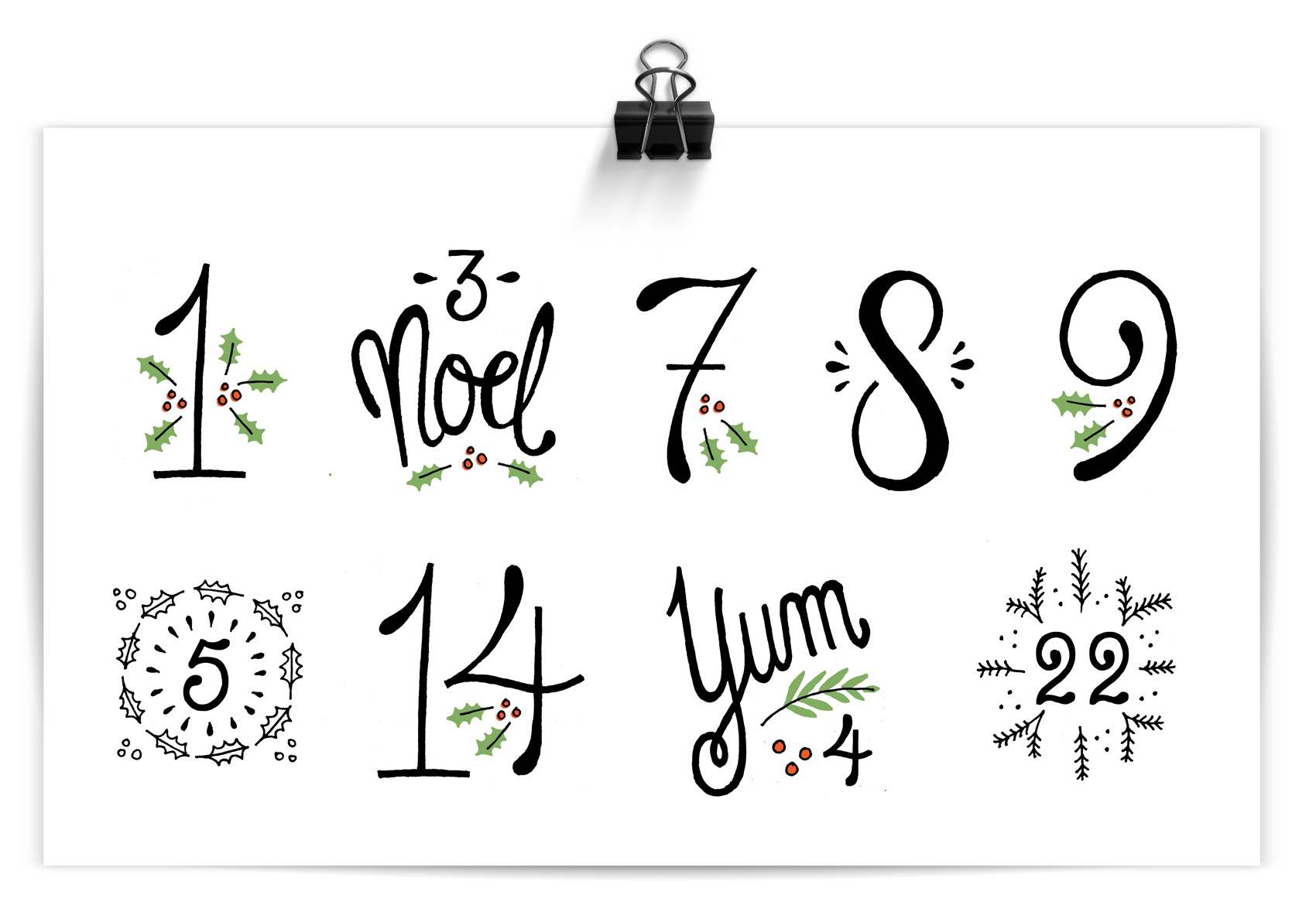
Hand lettered french-inspired numbers and numerals with holiday and Christmas flair.

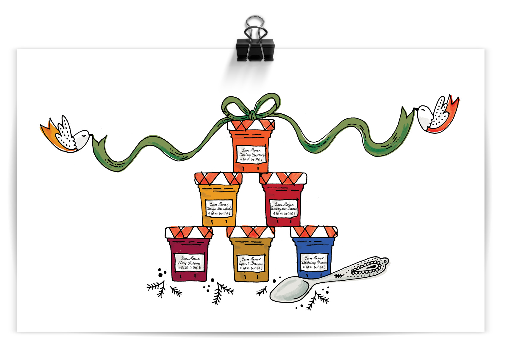
A very Cinderella inspired stack of french preserves from Bonne Maman.

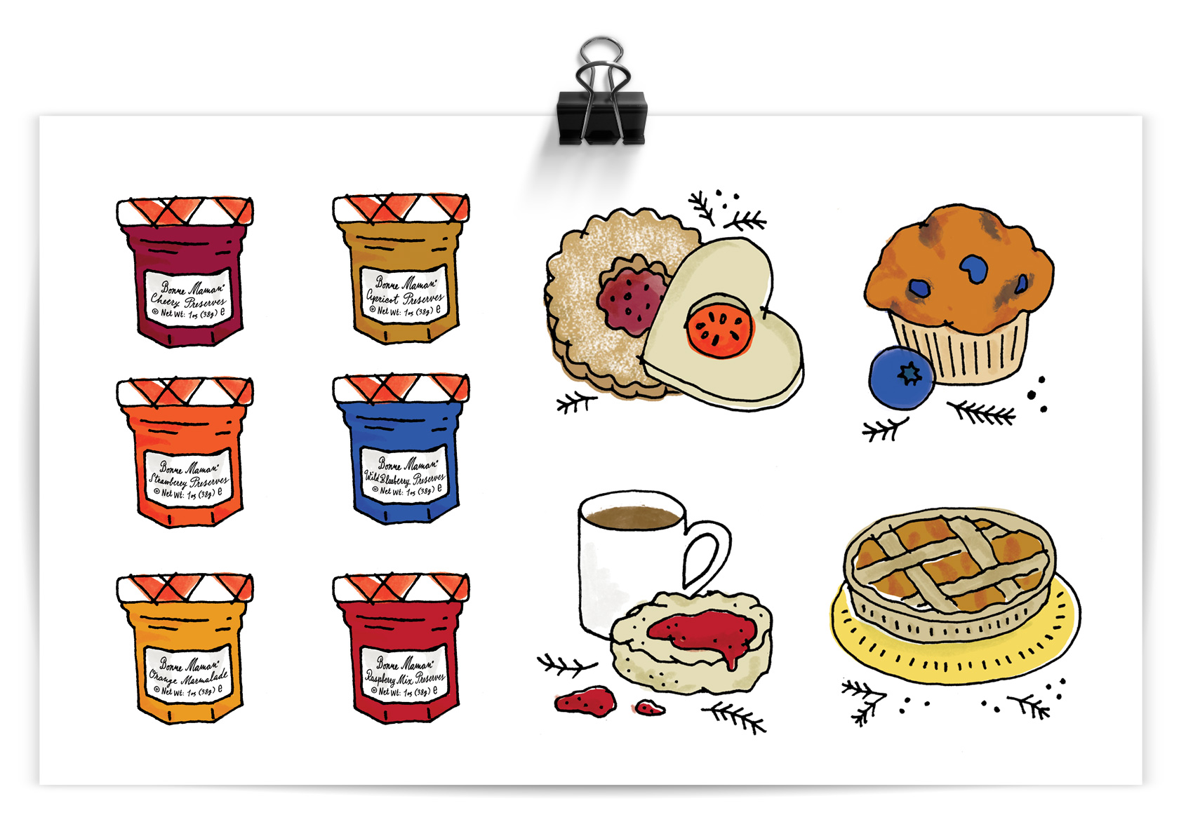
Illustrations of tiny Bonne Maman preserve jars and sweet treats they can be use for.

Client: Bonne Maman
Agency: R/West
Creative Director: Elizabeth Morrow McKenzie
Brand Manager: Annatova Goodman
Designer & Illustrator: Mette Hornung Rankin/Bureau of Betterment
Designer: Anna Naef