Umpqua Postcard Series: Blaze New Trails


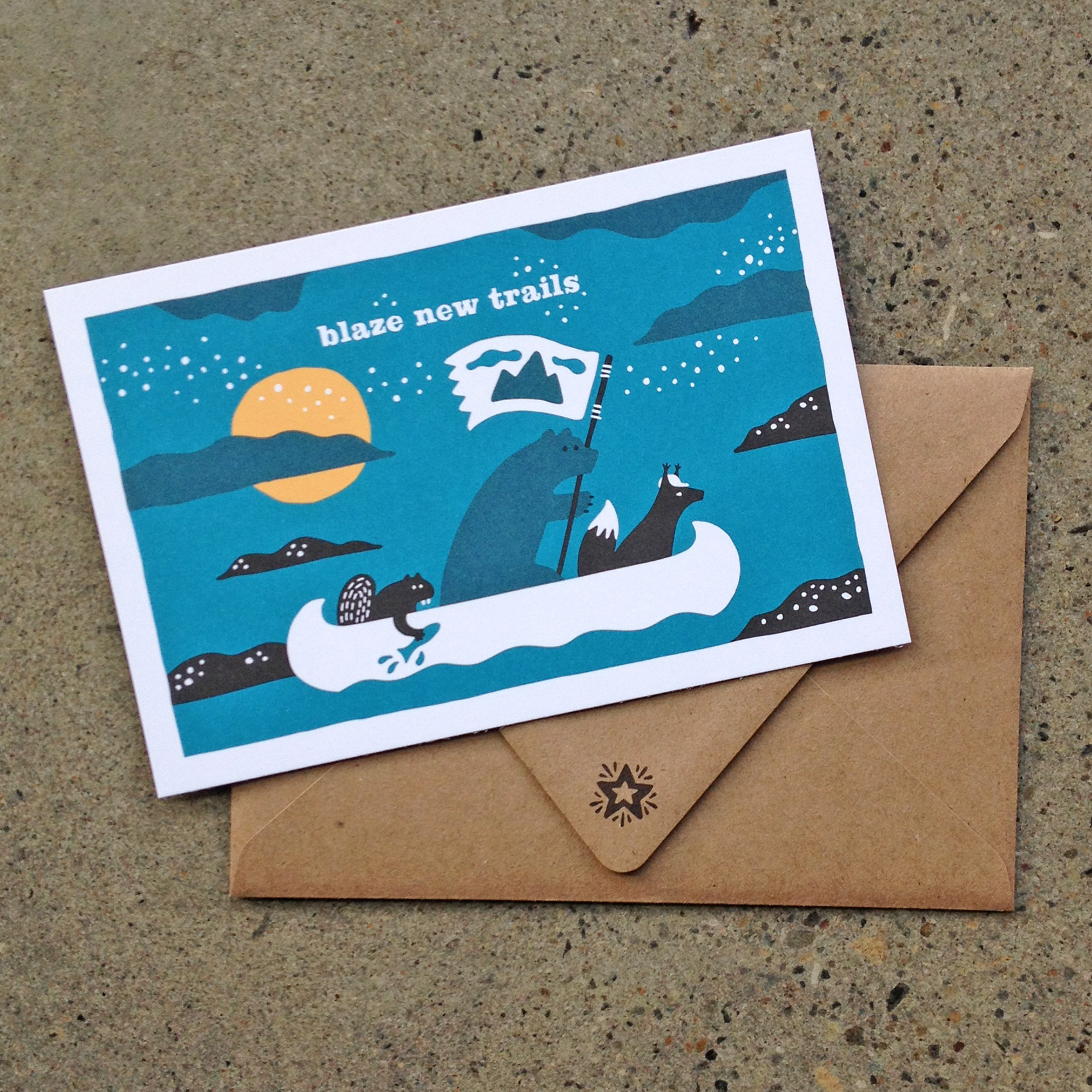
blaze new trails: illustration of a beaver, bear and coyote in a canoe, sailing along a nightcap

Here is the first in a series of postcard illustrations I created for Umpqua Bank. A set of 6 cards were created so smaller sets could be mixed and matched, to be handed out at events including the Portland Business Journal Luncheon and the Seattle Design Series.

A sponsor-focused envelope was paired with them to emphasize that the cards were created specifically for the young and forward moving audiences they would be distributed in. The creative brief was open, with the theme of “Pacific Northwest” guiding each card’s content – coming up: Wonderland, Old Growth/New Growth, Cascadia, Onward, and some foliage.

Olympia Provisions Holiday Card


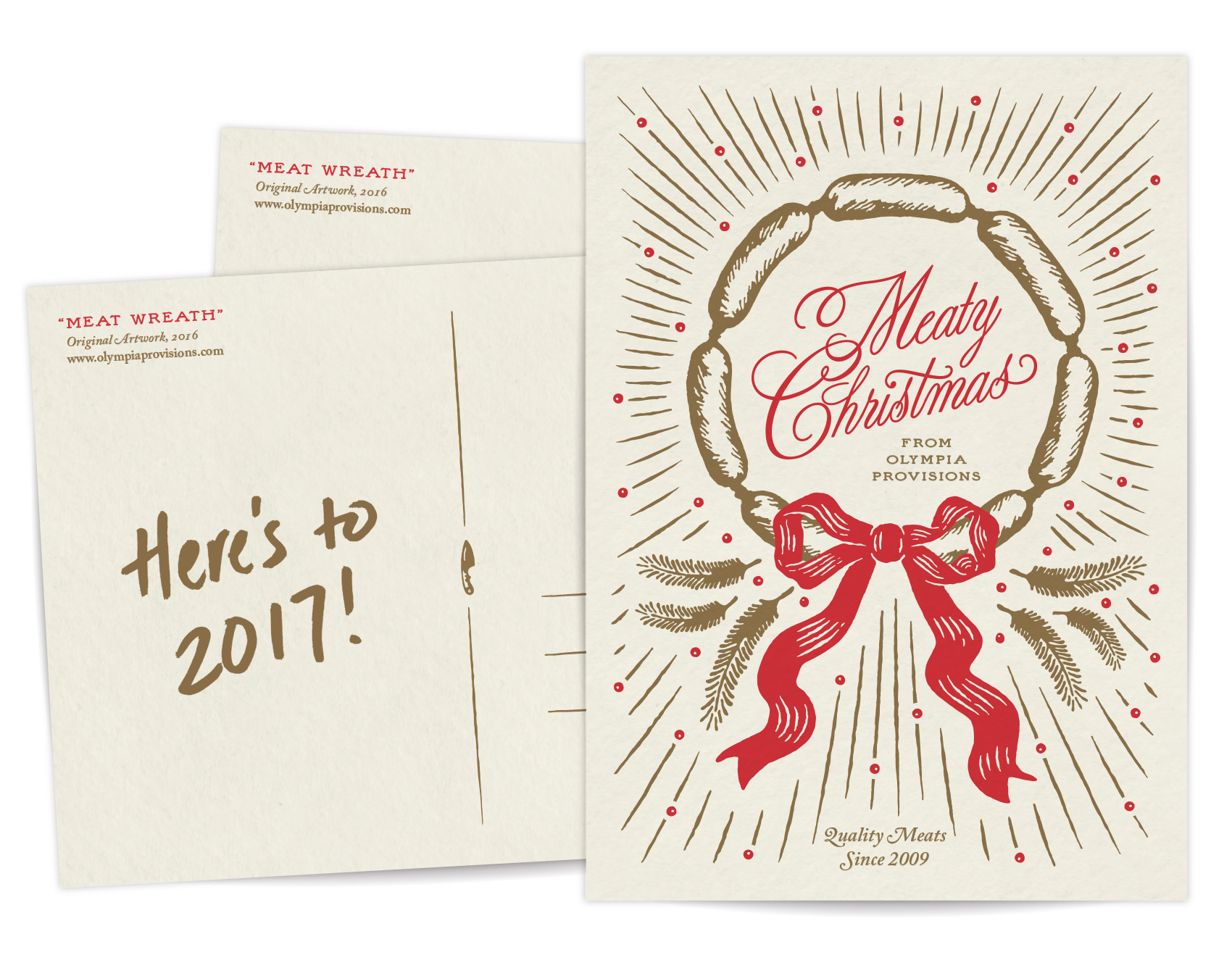
I’ve recently been designing collateral and packaging for Olympia Provisions, a fine meat-centric cluster of restaurants in Portland, Oregon and purveyor of American Charcuterie. Their branding is already top notch, so when the opportunity popped up to create their holiday postcard, it was purely fun. The process on this was super succinct with just a rough sketch of the idea before approval for design & illustration. Guess you can’t fail with the formula of meat + wreath. Meaty Christmas to all!

OP-Holiday-Card

Thanks to Hayden Walker for illustration skills that helped keep the project on time and on budget. A recent graduate, Hayden is a new to Portland and has helped the Bureau over the last few months on several projects, including the Oregon VS Oregon beer label design by decade.

Bandit Books Logo


Bandit Books is the two-pronged business of my friend Katy Meegan, focusing on bookkeeping for creative businesses as well as bookmaking and creative projects. Katy and I met at the IPRC over a decade ago as fellow letterpress teachers. We continued our friendship and shared love of books at Em Space, and for many many years Katy was half of the duo Keegan Meegan which offered letterpress and design services.

This summer Katy was taking her next professional step in combining her organizational and bookkeeping skills to help other creatives with their businesses. Over some evenings drawing together in my nook we talked about how that would look, which led to working together on her logo.

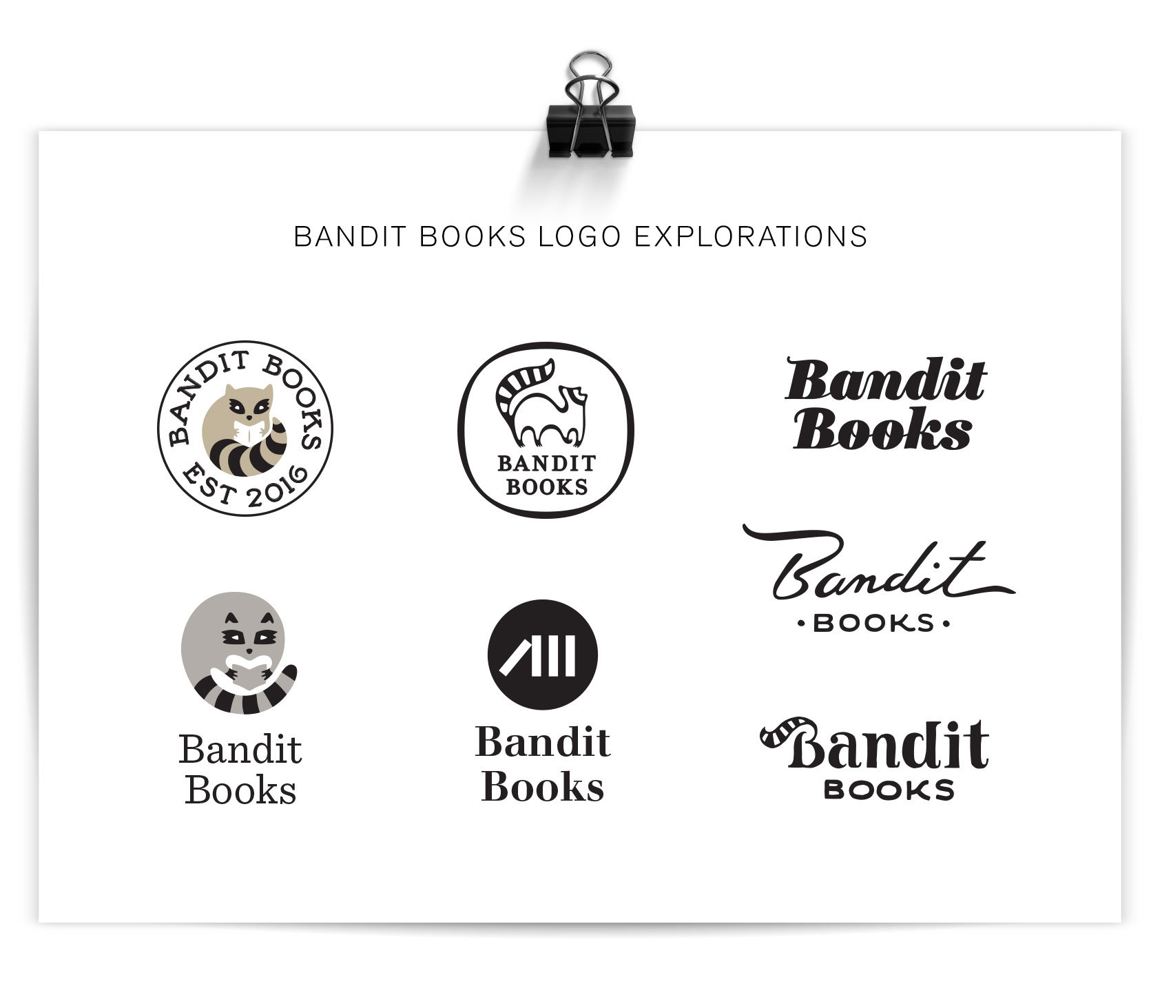
Katy knew she wanted a raccoon in her logo – it was her spirit animal and spoke to her as a symbol for not being your regular bookkeeper. Because of this, the first round of logos was very specific and concentrated on coons. Coons! Coons! Coons! I am a big fan of character studies, so I went about it trying to answer things such as: Can a raccoon reliably hold a book? If a raccoon were a typeface how would it look? How would a minimalist Scandinavian designer make a raccoon icon? Can a raccoon be as clever in a logo as in real life? The logo process shows the efforts of answering these questions.

lots of raccoon centric logo explorations for Bandit Books

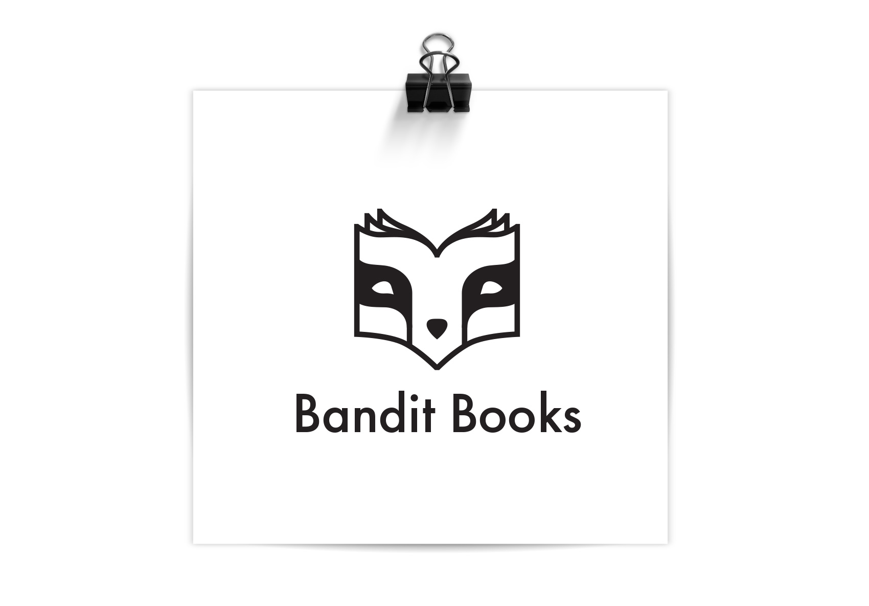
After the first round, Katy was certain that the right raccoon for her was a mashup of a monoline raccoon portrait and the profile of a book, and the face of Bandit Books was born. The quality of the logo lent itself well to reproduction in letterpress, paying dues to Katy’s background in that arena, and the font was chosen so she could hand typeset other materials in the job case workhorse Futura. I’ll be posting more explorations on the brand materials soon. In the meantime, if you know a creative business looking for financial organization, you know who to call: Bandit Books.

bandit-books-logo

Tofurky Holiday Headline


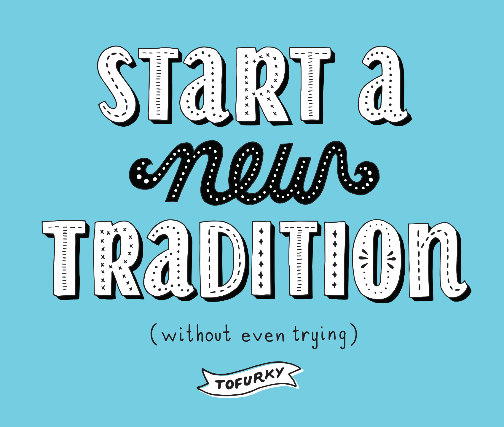
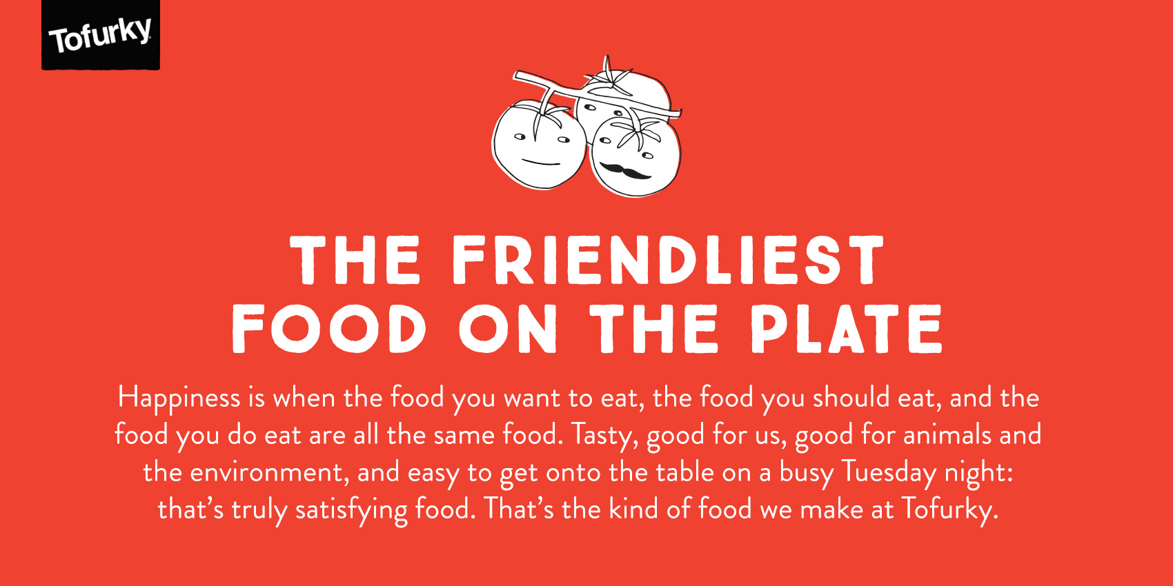
Here is a headline I lettered for Tofurky (through CD Gary Huck) to use in their holiday ads promoting their meat alternative products geared towards Thanksgiving, Christmas and the like. It was created in the same vein as the lettering library I created for Tofurky, but with a (relatively) more formal feel to the piece.

tofurky-holiday-headline

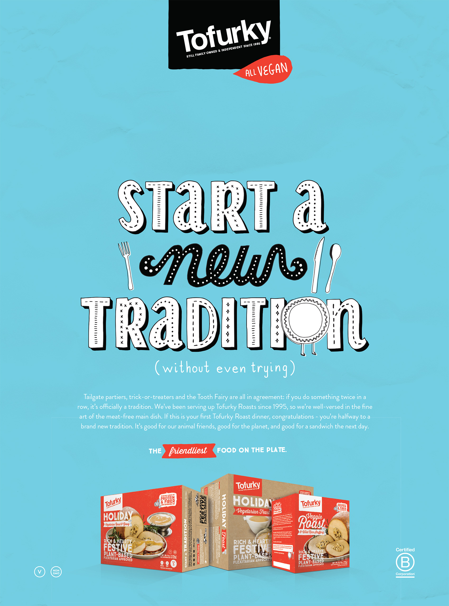
As a person very focused on food, and traditions, and therefore food traditions, I liked the message of this. Being a carnivore, I skate carefree through each meal eating whatever I please. Pretty much the only thing that stops me in my tracks is a stewed cabbage. For vegetarians and vegans it isn’t always as easy, especially during traditional meals centered around meat or in areas where people aren’t as aware of what being vegetarian/vegan means. So all you vegginuts, Tofurky has you covered for whatever tempeh/soy/non-meat based holiday feast you might want to gorge on. Here is the lettering incorporated into one of the ads.

tofurky-holiday-headline-ad

Ruby Receptionists online sign-up website


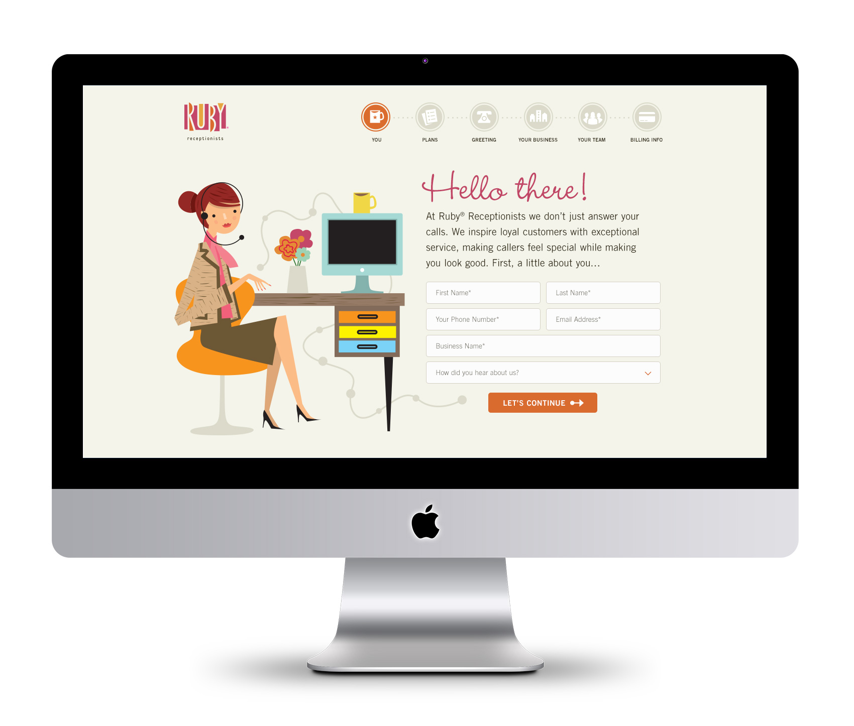
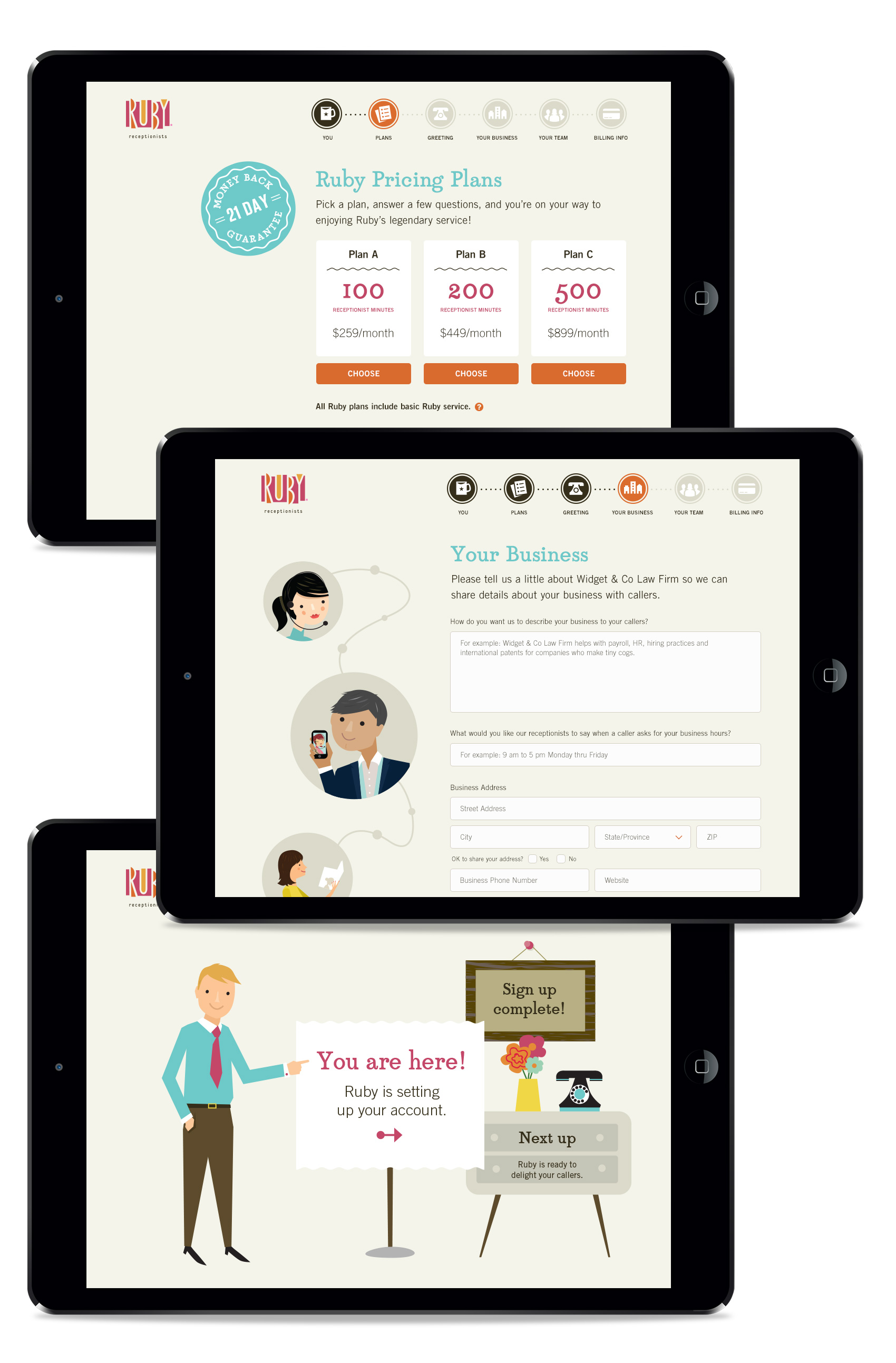
Another Ruby project from the last few months was helping the team, led by Terri Haswell, UX manager, to provide graphic assets for their online sign-up site. In addition to the structure and content getting an overhaul, the graphics were designed to make the process simpler and easy to understand while getting the basic information needed to help and retain new customers, all while providing a great first impression of what working with Ruby feels like.

Ruby-OLSA-homepage

I love working with Ruby’s illustration library and creating new scenes with the Ruby character and all her accoutrements. To reinforce the step-by-step process of signing up, we created an iconographic navigation path that highlights user progress. Translating the usually large and detailed illustrations into small icons was a good challenge in keeping the Ruby flair intact at a small size.

Ruby-OLSA-icons

At each step along the way, Ruby and her cohorts provide friendly assistance and encouragement in filling out 1) personal information, 2) choosing a plan, 3) selecting a greeting, 4) completing business information, 5) filling in team members, and 6) payment. Here are several more screens (the last screen is a “designer pick” that wasn’t used as a final).

Ruby-OLSA-backpages

Ruby Receptionists icons


Over the past year I’ve done several projects with Ruby Receptionists. A virtual receptionist company that focuses on friendly service, their brand is characterized by colorful and cute 50s-60s inspired illustrations of Ruby and her cohorts. And when I say “friendly service”, I really mean it. Think about the warm fuzzy feeling you get from, say, watching an old episode of Sesame Street where all the characters hug after an adventure. Well, that’s how it feels to correspond with Ruby. In that vein, one of my efforts was working with Marcella Vail, Director of Employee Engagement, to create an icon library for internal use in presentations, powerpoints, online media and generally peppy publications for the Ruby team.

Ruby Receptionist icons

More Tofurky Lettering


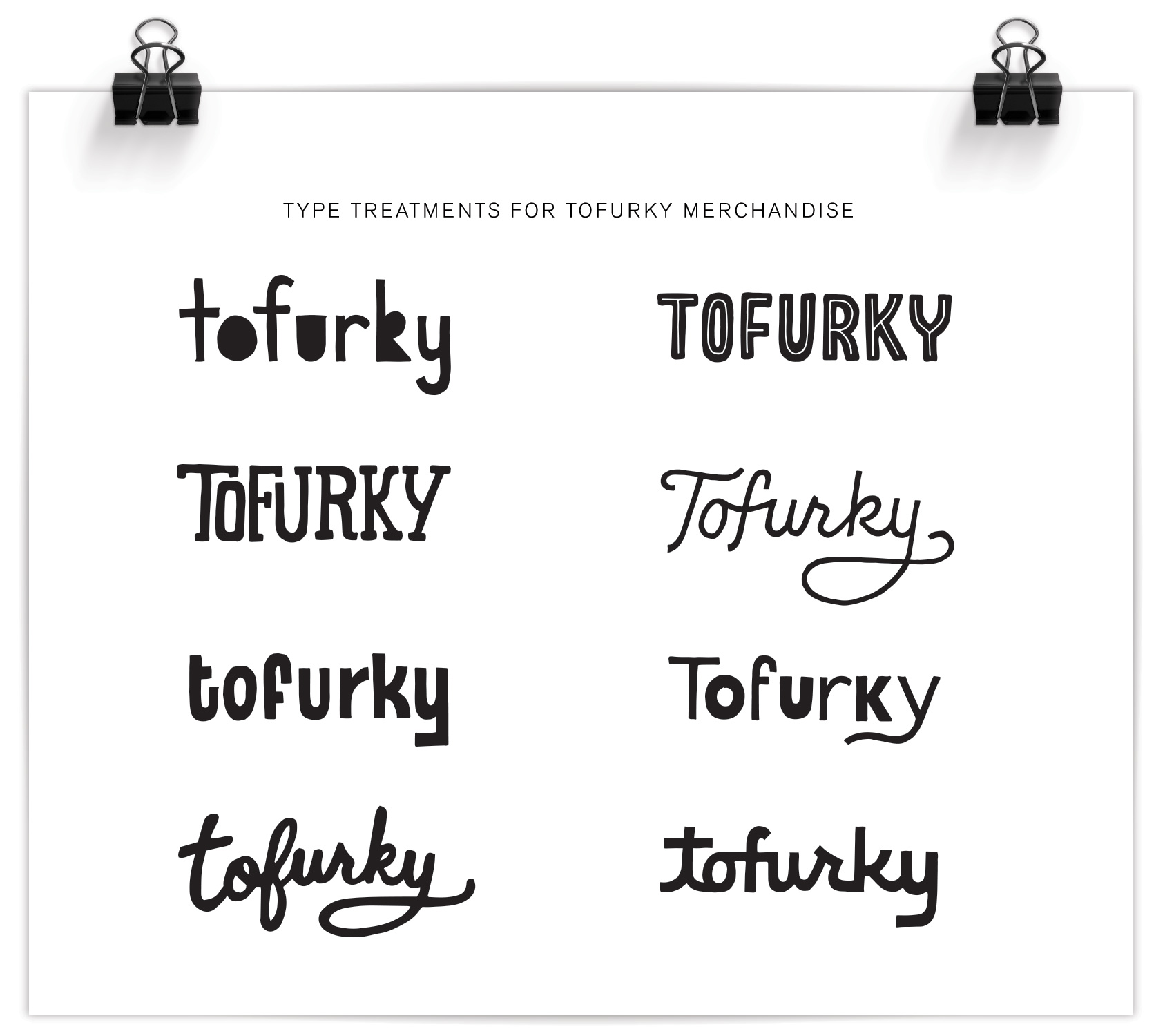
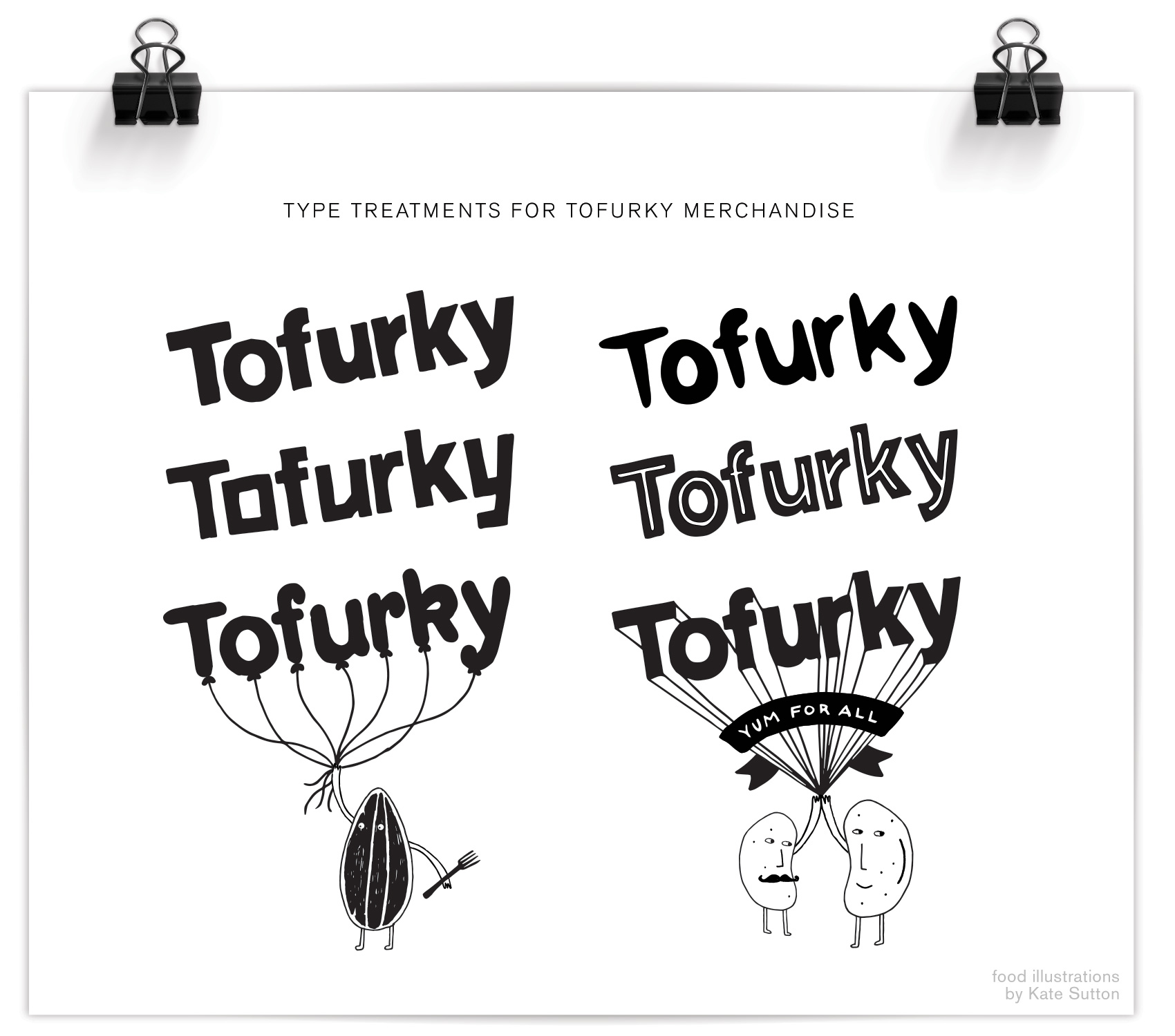
Here is another snippet from a longer-term lettering project I’ve been working on for Tofurky. Below is the second set of two series exploring their company name in a casual, hand drawn style (see the first set here).

Tofurky-merchandise-type-treatments

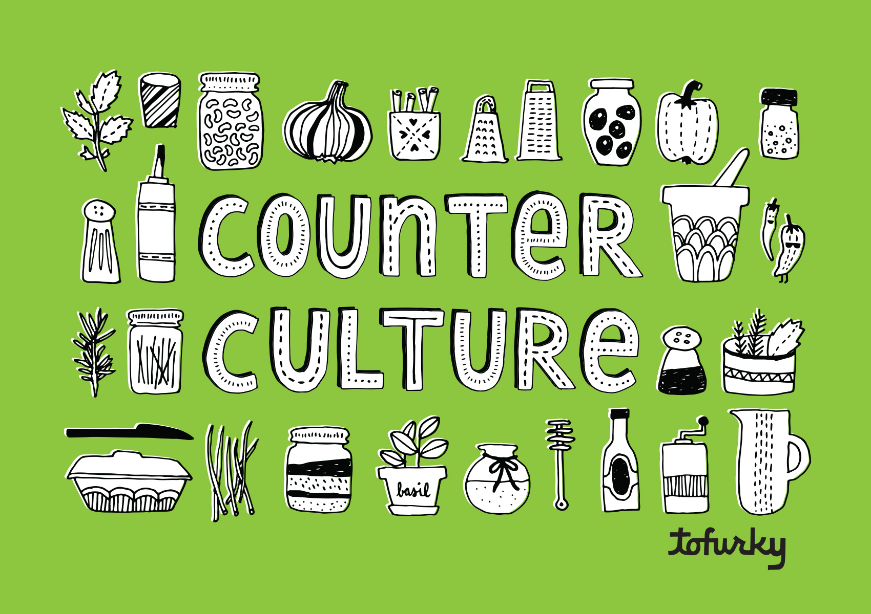
As part of their online content the company posts recipes and tips under the name Counter Culture, which I gave some bling in this lettering piece. I also got to draw a bunch of small ingredients to go along with the type (matching their current brand illustration look), and implement one of the type treatments from above.

Tofurky-counter-culture-typography

Tofurky Lettering


This summer I’ve been working with Tofurky on various projects, all rated very high on the level of fun had. Tofurky is a local company from Hood River, Oregon that makes meat-alternative products, including their inaugural product of a non-Turkey that also gave the company its name (a spoonerism of FAUX and TURKEY). While not a vegetarian myself, the brand resonates with me because of its positive and intentional mission as well as the playful way they communicate it. Food should be fun after all!

tofurky-brand-banner

The first part of the project was to make some logo spin-offs so there was a casual and unique way to insert the Tofurky brand into secondary branding without feeling too serious. Two sets of Tofurky “nametags” were created, the first of which is shown below. For this series the defining feature was mimicking the angle and basic form of the Tofurky logo, but altering the letterforms so they are more playful. It also involved working with Tofurky’s current brand assets, which included an awesome set of illustrations done by Kate Sutton of animals, trees and little beans and lentils just doing their thing. Integrating these brand assets into the new work was both fun and a good way to illustrate in a specific style. Success? Well I’ve never seen a pair of beans high-five that hard, so yeah.

Tofurky-merchandise-type-treatments-2

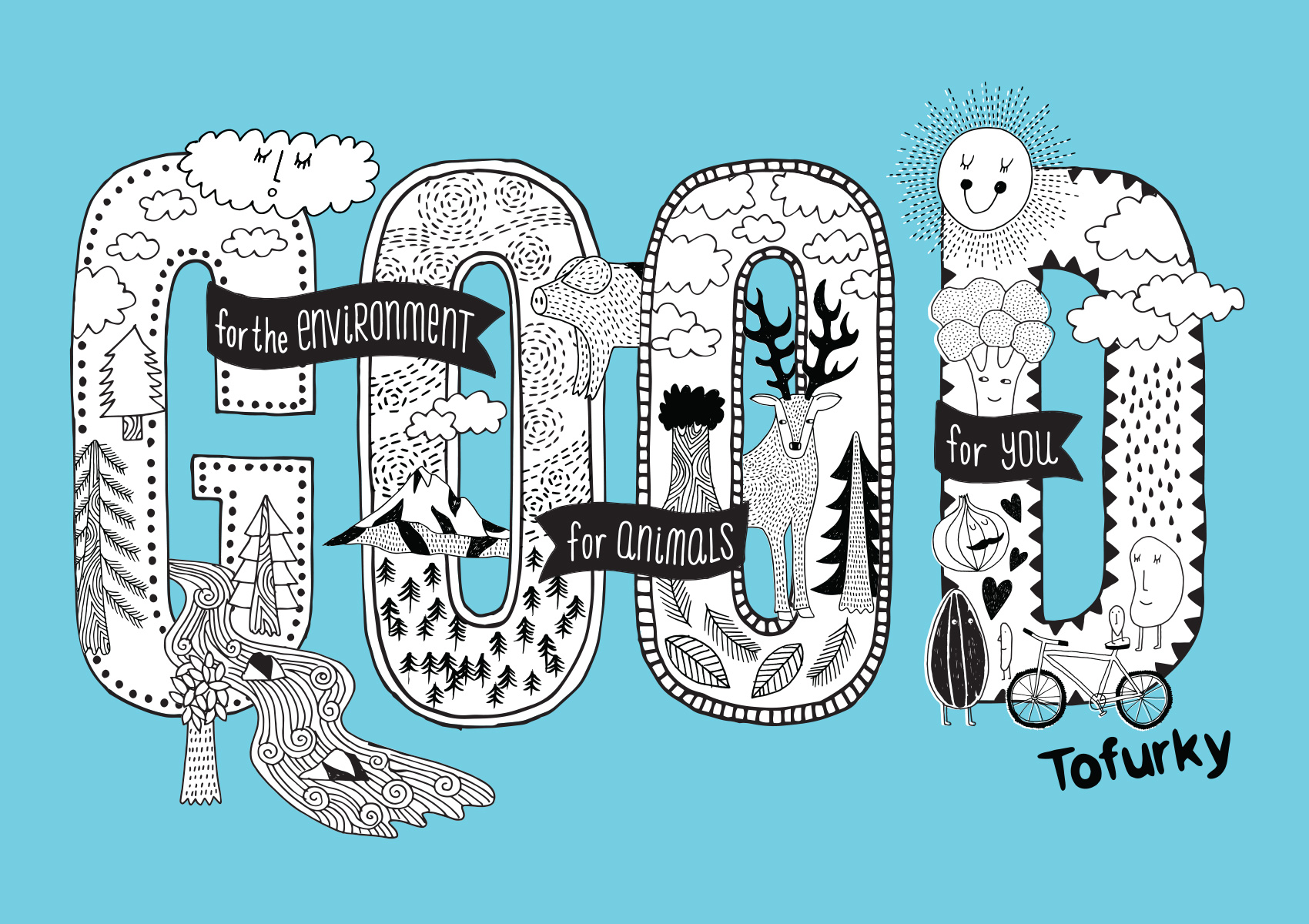
The next step of the project was to build a library of hand drawn lettering assets to use in their merchandise and promotion. Working with independent creative director Gary Huck, we made a slew of brand sayings and lettering/illustration combos, the first of which is being used on a tote bag and is a great representation of the Tofurky mindset: good for people, good for animals, and good for the environment. Hard to argue with that. We focused on the repeated word so it was a quick read and compact compositionally, with details of the saying appearing in banners around the main message: GOOD. A combination of Kate’s and my illustration fill the GOOD type so it’s a complete mash-up of type & illustration. My favorite kind!

Tofurky-good-typography

That’s it for now – stay tuned for more work from the Tofurky lettering project…

Home Cranked Packaging


I’m excited to finally say TA-DA and share a special project from last year – packaging and branding for Home Cranked ice cream mix. This is an organic and premium quality ice cream base that you can use to make any flavor imaginable, brought to you by the folks at Naia Gelateria. Just use the plain base to add any ingredient to make crowd pleasing flavors or perhaps a palate-testing flavor for your more adventurous ice cream eating cohorts. Or if you’re in a pinch, chug the plain base straight from the carton to satisfy instant ice cream cravings. Any way you cut it, YOU WIN.
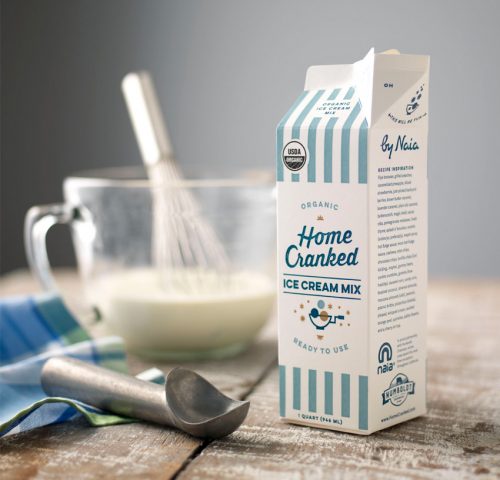
Packaging design for Home Cranked ice cream mix.

This project was in my wheelhouse for oh so many reasons. First, ice cream. I mean, ICE CREAM. Second, it was a print packaging project which had the fun limitations of being 4 colors and printed with flexography that has certain parameters in which it looks good. The design also needed to accommodate for potential new products. Lastly, I got to work with a crack team.
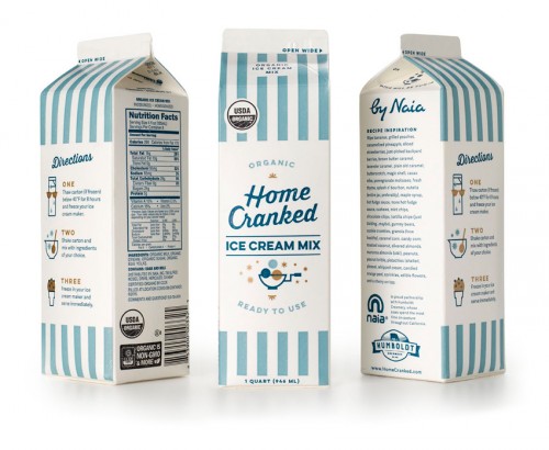
Carton packaging design for Home Cranked ice cream mix, showing all three side of the carton.

I was brought in by Owen Jones to help Naia create the Home Cranked brand from scratch. The Bureau created the logo, packaging, illustrations, branding and guidelines while Owen managed the project, implemented the site, marketing, social media strategy, and additional brand efforts. I even got to pull in food writer Jen Stevenson to make a delicious contribution of words that really made the packaging sing. Having worked with both Owen and Naia in the past, it was a trifecta of design positivity and collaboration. Or, as Jen would say: scoop savant, this is your destiny!

Currently Home Cranked is on a test run in Whole Foods Markets in California, but if things go well it could be coming to a store near you. Stay tuned for a more in-depth post on the logo, branding and icon set soon…in the meantime check out Home Cranked online.